i wanted to pick a social issue that i was very passionate about for this topics, but anything too personal i think would have limited my desire to create and get really into the work because i'd feel like i was plopping my insides out onto a table for everyone to look at. i picked a topic that i've experience first-hand and one i know that is universal, especially for people my age. My mum is a member of Slimming World and has been on and off since i was little, and now i'm at the age where our bodies look very similar she is still looking to lose weight and doesn't fully understand why i am happy with my body the way it is. i want this project to be a love letter to her in a way and help her understand what it feels like for your parent to strive towards a body smaller than your own.
i was also inspired by this very good song called 'My Mother and I' by Lucy Dacus, i had originally seen a photo of the lyrics written down on paper and assumed it was a poem, i tried googling the words and its a song !!! by an artist i like!!! the first verse are the lyrics that had the biggest impact on me and reflect my topic well,
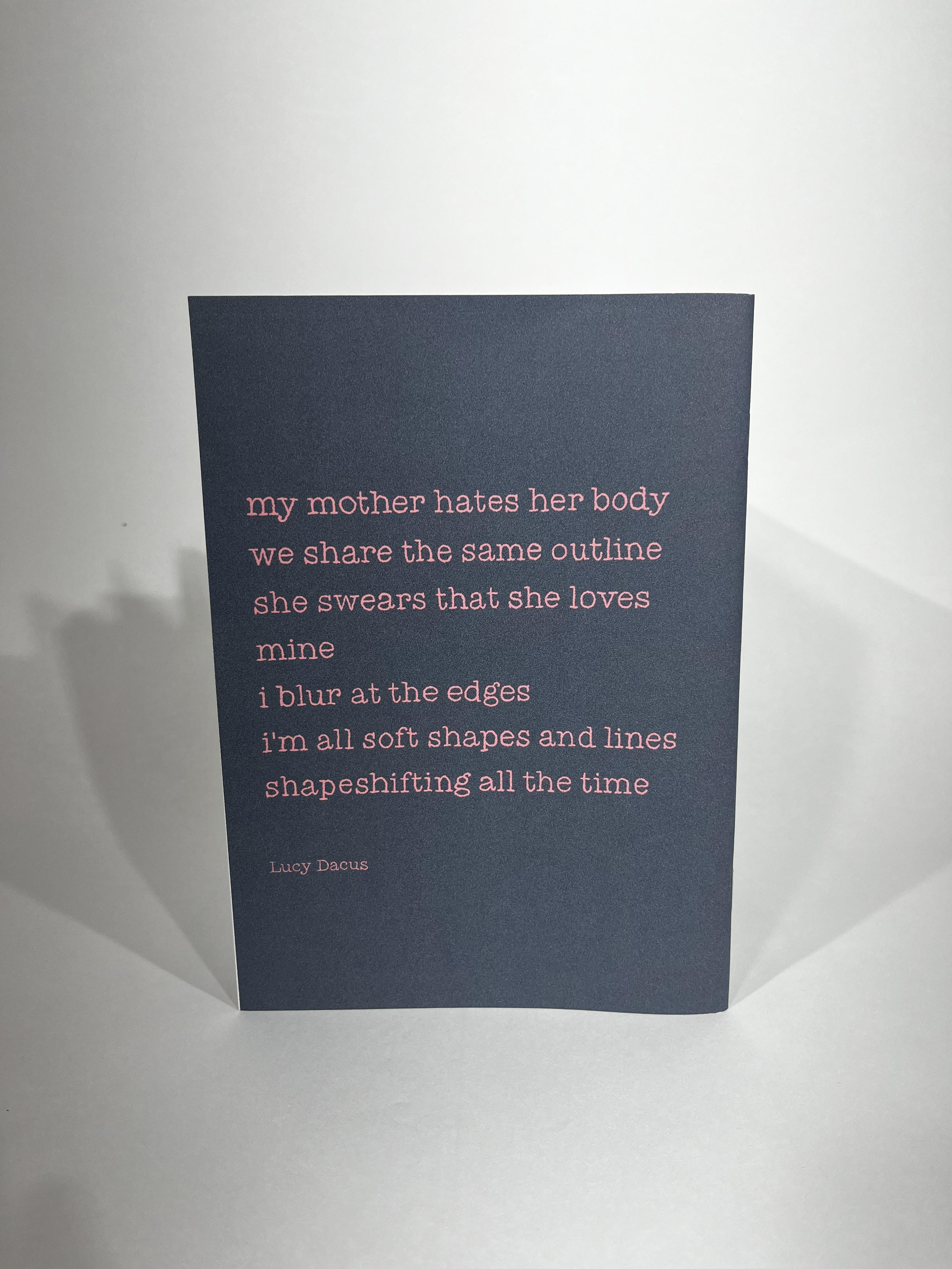
My mother hates her body
We share the same outline
She swears that she loves mine
I blur at the edges
I'm all soft shapes and lines
Shapeshifting all the time
We share the same outline
She swears that she loves mine
I blur at the edges
I'm all soft shapes and lines
Shapeshifting all the time
i feel like it captures how people can't see their own beauty, can see the same beauty in someone else, which is also what i want to show in my project. i don't want my book to blame women for how they view their bodies, i want to shine a light on how believing and preaching damaging views about your body can effect and influence other people.
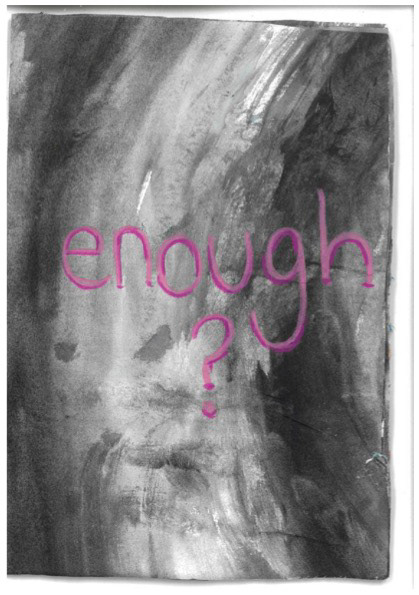

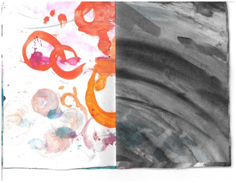
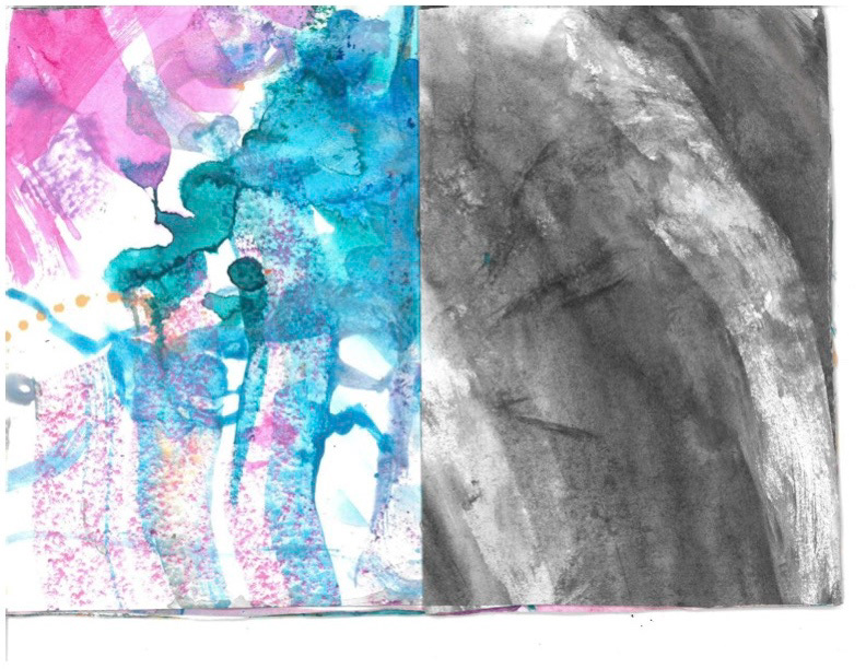
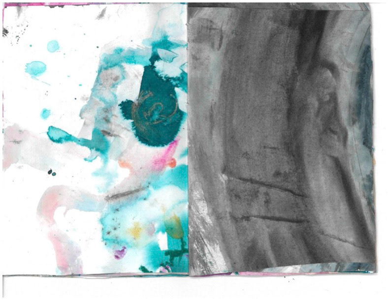
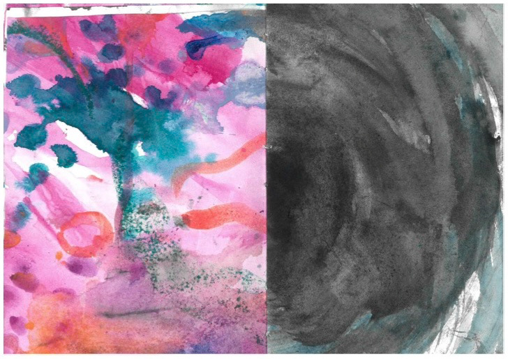
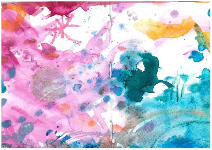
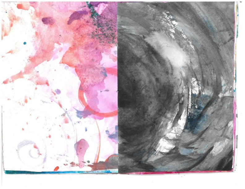

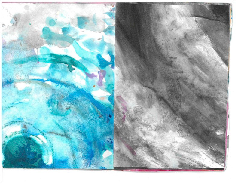

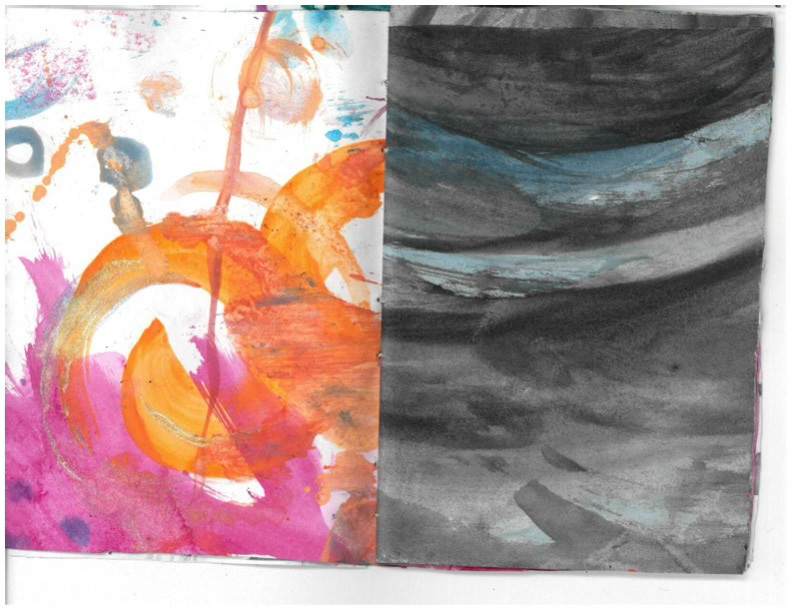
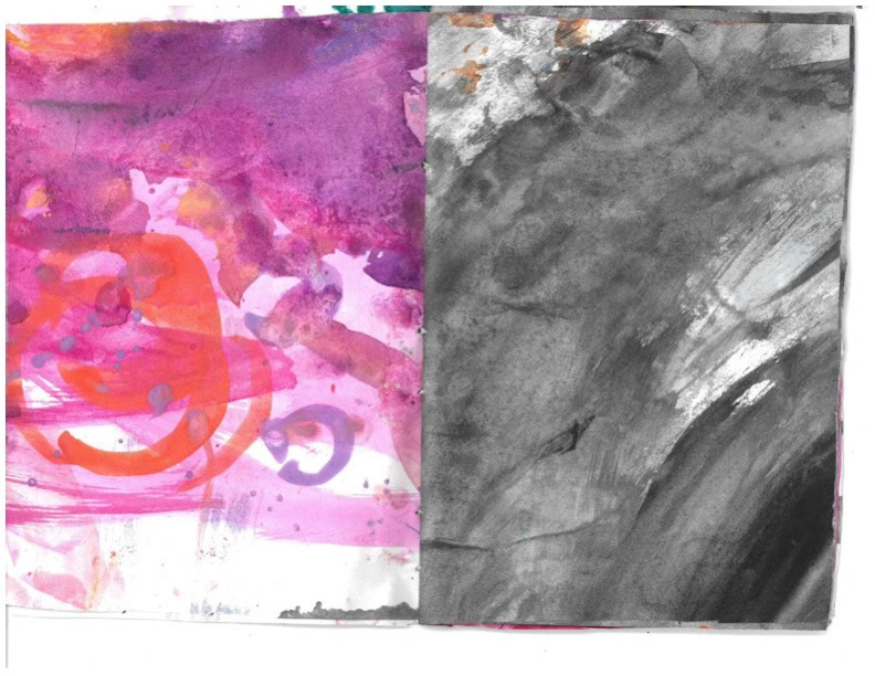
i AGGRESSIVELY enjoyed the abstract book day it was so fun i got slightly concerned i should have done fine art but i remembered i hate it and that its only fun for a couple hours. i had never done the word association prompt before but it really helped with coming up with some motifs that relate to my subject. i think circles reflect a cycle of feeling comfortable/ uncomfortable in your body, especially depending on the current 'ideal' body trends. i used the spiral (especially the big black mega death spiral) to symbolise how you can spiral into your thoughts and bad habits. the colourful side is to show the utopia of losing weight and feeling all free and happy. the dark side is to show the reality of never reaching the magical colourful time and falling further into a hole of getting smaller. i called the book 'enough?' because of the feeling that you're never small enough/ fit enough/ pretty enough. if i did this again i'd put the middle of the spiral as the. centre page because i think it would have made a bigger impact and would have represented my topic better
possible little character design! still not sure if i want to draw humans or humanoid-blobby people. normal people make the book for accessible to people who have never read a zine before, but the blobby people and much easier to imagine as yourself because theres no recognisable features.
heres some of the exploratory illustrations that i did after the abstract book workshop! i was inspired by the spirals and ink bleeding. the first one is a Slimming World circle in whirlpool (i tried to elaborate on the spiral more) but tragically the page ripped and the oil pastels didnt repel the ink like wax crayons lol my mistake, so im going to keep working on it via procreate. i really like the next paintings i did! i was abit stuck on what to draw so i painted the 'crouching Aphrodite" sculpture, because she is a very common icon to look back on when people talk about body image. on the page opposite i wet everything and let some of the green bleed over, then i used my florescent pink ink dropper to draw the outline again. i wanted it to all bleed and dilute everywhere in reference to the lyrics from the Lucy Dacus song
I blur at the edges
I'm all soft shapes and lines
Shapeshifting all the time
I'm all soft shapes and lines
Shapeshifting all the time
and i really like how it looks. i wish the scanner had picked up the florescence of the ink better because it more striking in real life. i like that it reflects the idea that no-ones bodies are replicates and everyone looks different. you can't truly compare yourself to anyone because there is no way that we can look the same.
over the weekend i tried to test out a possible style of painting for the book, i wanted the colours and looses of wet medium to still be there because its what i think i'm best at, but i tried to render it more with some coloured pencils. combining my two favourite materials !!! i really like the outcome, i tried to leave the edges loose because some of my feedback from first year was that i over-work my illustrations when i think of them as a 'final piece' which i agree with lol i definitely do. i might include one or two pages with detail like this in my books to contrast with all the ink and bold lines that i usually do.
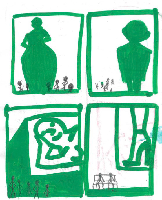
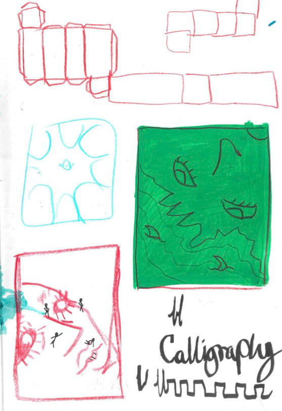
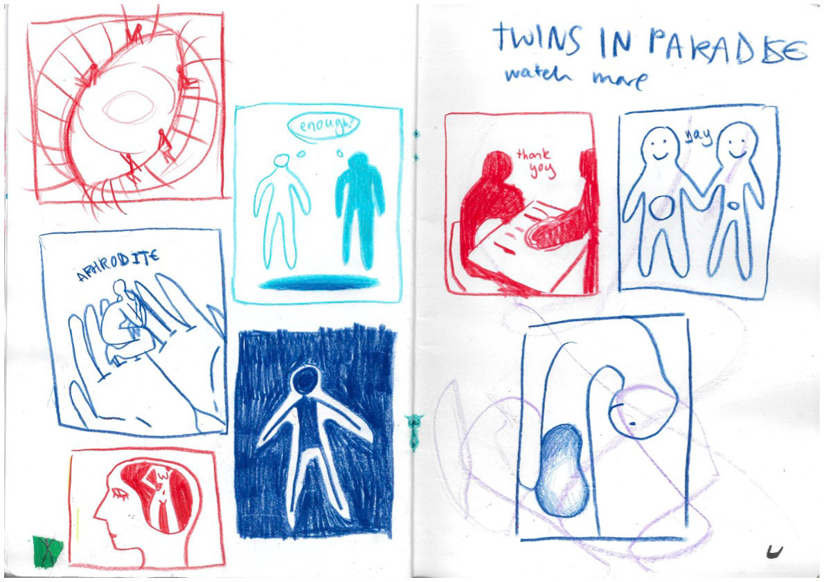
i really enjoyed the contrast workshop on monday, i find it useful doing quick sketches to look back on if i'm stuck later on in the project. a lot of these thumbnails i wouldn't have been able to make without the examples from the lecture before, so i stayed and did more after the workshop. i definitely got better at creating contrast in my compositions through-out the workshop, so i'm going to try and make this regular practice for me and make some long-term progress. most mondays after the workshop a few of us stay behind and watch animations/ music videos/ short films on the big screen in 202 for inspirtation and i think it definitely helps me get some unusual/ interesting ideas, especially short films like this one (warning it is sad but in a colourful way)
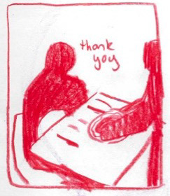

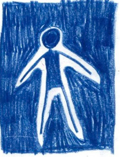
these three are my favourites, i even like the blobby stickmen style that i normally only use for sketches. i might have a combination of my stickmen and more detailed figures in my book i think it'll be fun to mess around with. i also like how i shaded the dark section on the far right thumbnail i like how scratchy it looks. i like the idea of these being on a big empty page either white or with a really light wash of ink so all the focus is on the little design. i think the middle one will work especially well for this.
i also did a little print test to check how the colours come through on different papers, because i use ALOT of colour and i want it to look as vibrant as i can MANAGE! i definitely like the bottom one the most, which is the thicker mohawk that they stock in the print shop, i like that it is slightly off-white and that its got a grainier texture. my next step is to talk to rob about getting the pink neon to print right because i want to use fluorescent ink in my paintings and the scanners dont capture it very well.
we started animation! i've been excited for this as i've only ever used really basic stop motion in my reels for my tattoo account, i'll put them underneath because this has been a BIG leap. i first made a photo stop motion with the sketches above, and then painted over them in procreate. i wanted the blobs to represent a mother and daughter because thats my aim audience for this project, and i think it does that well however i wish i animated the purple blob flying away rather than joining back up with the mum blob because i want to show them as seperate. i was inspired by the moving blobs we were making in creative coding that can respond to noise, so im going to explore animating with them more.

heres the sound-reactive blob i made in creative coding that inspired my first little animation!
in our Monday workshop we were given a mini brief to respond to a sound track through animation and i had a GREAT TIME.
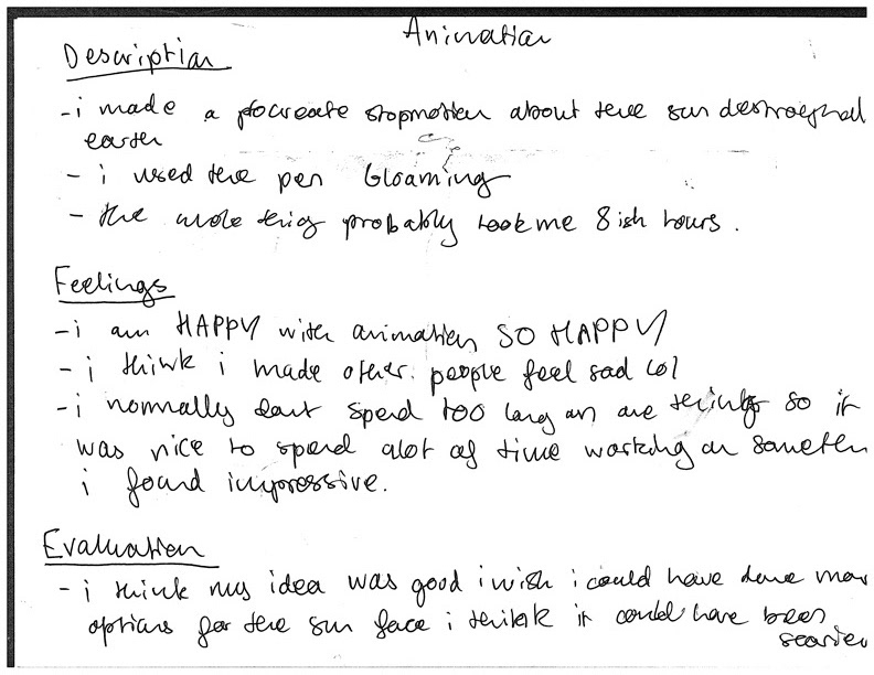
i made a procreate animation of about 80 frames and it look me 8ish hours, so 10 frames a hour. i'm proud of the outcome and i hope it made people feel SAD i wanted to see if adding some humans into the animation would stir some kind of emotion because seeing a picture of the earth crumbling doesn't do much unless you're reminded of the lives that are on it. if i had a longer time frame i would have storyboarded more to figure out some better compositions, and would have looked at some different sun designs as he's not as scary as i'd like i want his to STRIKE FEAR into the hearts of people watching. i think my animation was successful because i was ambitious, as per usual but normally it's to a fault, and i fully committed to making a animation that interacted with changes in the music. i also think that because i didn't focus on seamless movement i was able to produce a longer video, and i think the jumpiness of the frames fits the fast-paced massive song. i've learnt that being ambitious with my work helps it stand out and sometimes its fun to have quantity over 'perfect' quality.
i hope that paragraph looks good because we did a reflection work shop on Thursday and so now i feel eloquently spoken in terms of my portfolio :) this weekend i'm going to plan out my book pages so i can be getting them done during the start of the next project.

i finally managed to sneak into slimming world and talked to the leader of the group and it was INTERESTING to say the least she was shocked i am happy with myself at my weight bless her i also took some reference pictures of some of the things they had lying around, these pound and half-a-pound monkeys are my favourite. i'm going to try and go again because i bet they'll let me draw in the corner.
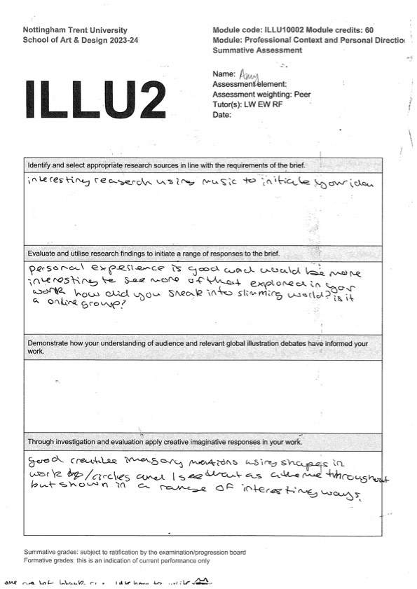
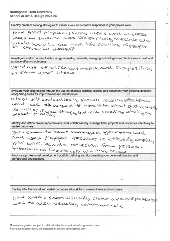
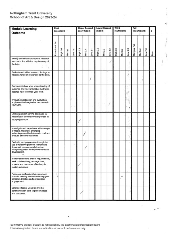
on monday we did peer review!!! i love peer review i like seeing how other people see my work from an outside perspective and i loooooove looking at what other people are doing. i'm happy with all the feedback i got and i agree with a lot of my feedback. i'm also really happy that whoever assessed my work thinks i'd get a upper second :) my main feedback is that i need to get started with my zine pages which i'm doing while we have free time this week so all in all it was a really good peer assessment for me!
after having a talk with chie she suggested i use a restricted colour palette because i love using every colour i can get my grubby little mitts on, but this does mean my work doesnt always look cohesive. i followed a couple of youtube tutorials on how to create a restricted palette and the combo on the right is my favorite because all together the colours look very soothing and friendly but combining the darks with the light it makes a really nice powerful contrast, such as the pink with the navy blue.
i also made a handy little checklist, abit like a storyboard, to use so that i didnt forget any good ideas i had and to make sure i had the right amount of illustrations. its also fun to see how these tiny thumbnails turned into the final pages it makes me feel very proud :')
the slimming world monkeys were the first page of my zine that i got finished!! its also the only page that i used oil pastels for, i was on an oil pastel kick at the time and i DO like how it looks but i like how paint is abit transparent and watery more. i kept it in because i was still very proud of it and i had fun making it so i though it deserved a place in the zine. i also think the pastel gets the fuzziness of the sock monkeys well, probably better than paint.


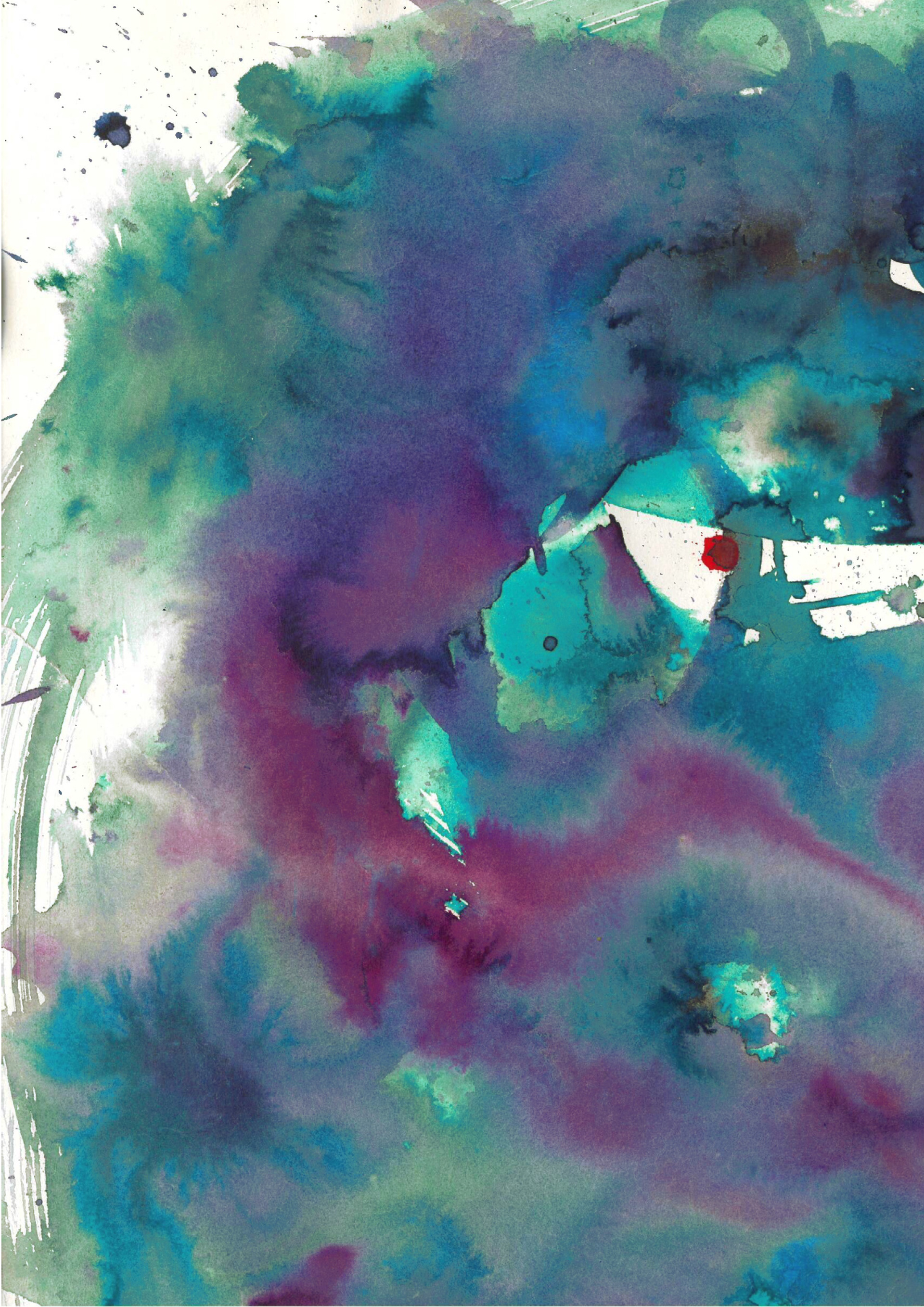

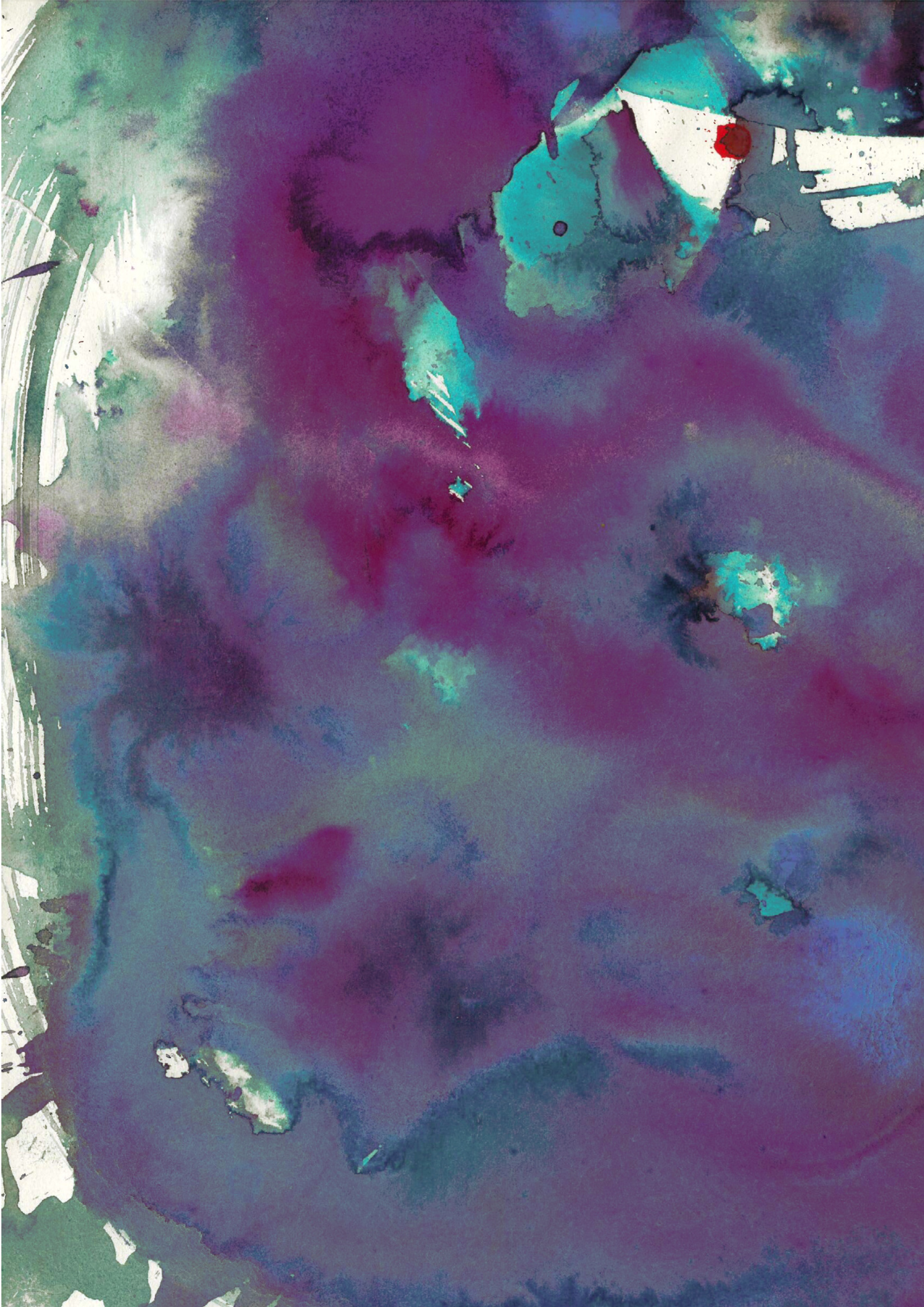
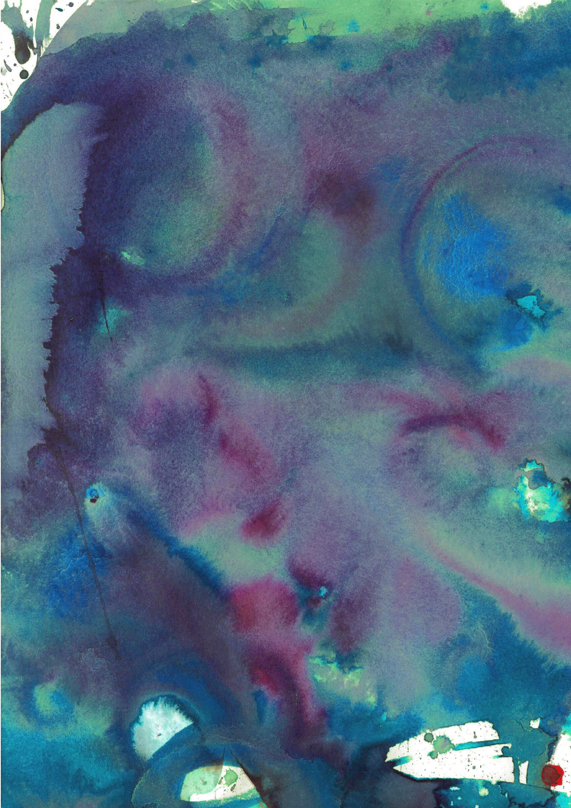
i made these abstract pages similarly to the zine we made in workshop at the start of the project. i wanted them to be unassuming (blues and green floaty ink) but the dark section and the little splodges of red make if a bit ominous (like slimming world) which is GOOD and i hope it come across that way. i also wanted there to be some breaks from all the direct visuals. i tried to add some of the circles to show how dieting can be a dangerous cycle but i don't think they are as effective as my original abstract pages.


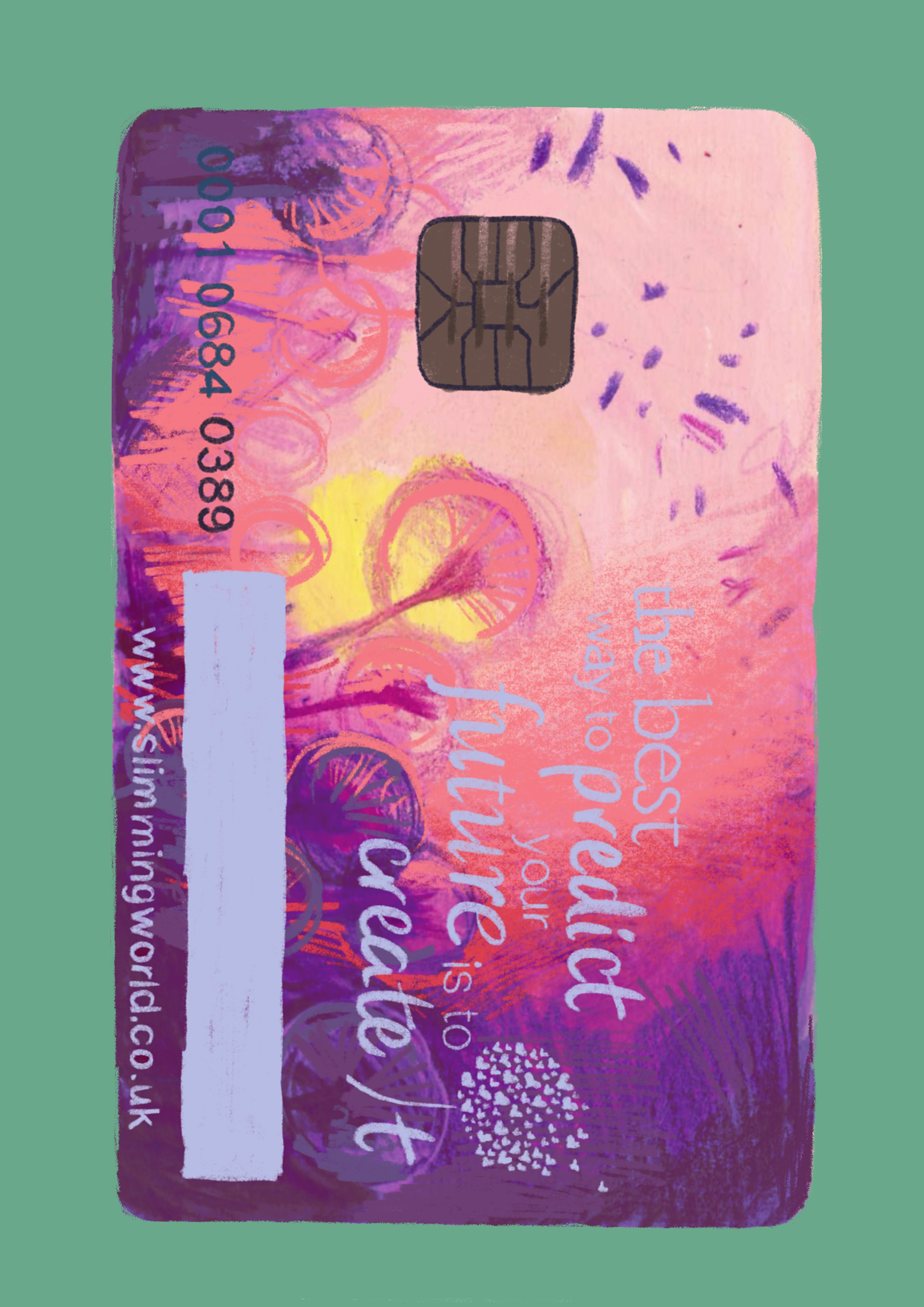
the NEXT set of pages i finished were these slimming world card paintings that are on back-to-back pages so that when you turn the page its like the back and front of an actual card!!! as i was doing this project i realised a lot of lads don't really know what slimming world is, as it's not marketed towards them or spoken about with them by their mums. while not completely, i feel like it is very much the norm for girls to grow up seeing their mother going to slimming world every week and knowing about dieting from a young age. i wanted to do this with the pages so people felt like their were holding the card in their hand, especially people have know idea what it is. i think the feeling of holding something emphasises how real it is.
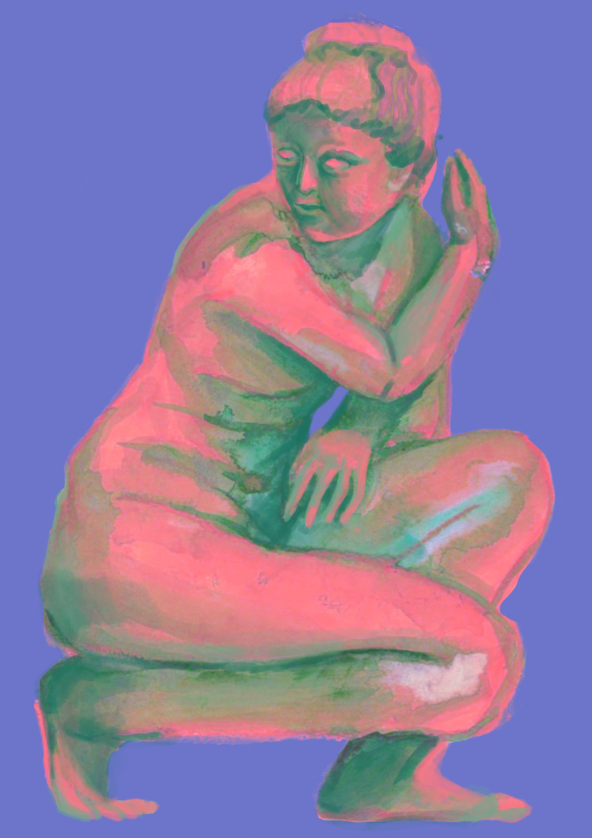

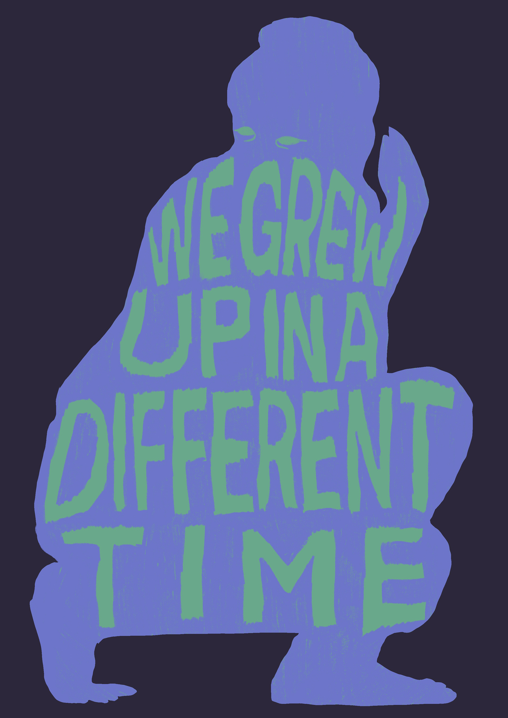
THIS pair of pages are my favourite its a painting of aphrodite from earlier in the project, i did try to paint it again but i couldn't get the freeness that i originally had so i chucked it into procreate and changed the colours along with refining it slightly to make the silhouette more impactful and clear.
i used aphrodite to show how the 'ideal' body type changes constantly, and how the body type you grew up idolising will stay with you through life. my mum, when we ask her why she wants a smaller bum or broader shoulders, always says that we grew up in a different time where people want a bigger bum and smaller shoulders and that she can't understand why we would want that. the difference between mothers and daughters 'ideal' body never really gets spoken about but is one of the biggest reasons for passive-aggressive comments and arguments. most people in western society wouldn't consider aphrodites body beautiful but people sculpted this body when trying to portray the GODDESS of BEAUTY!!!! and sculptors today would carve someone completely different! i find it really interesting and wanted to bring the idea that beauty is constantly changing into peoples minds
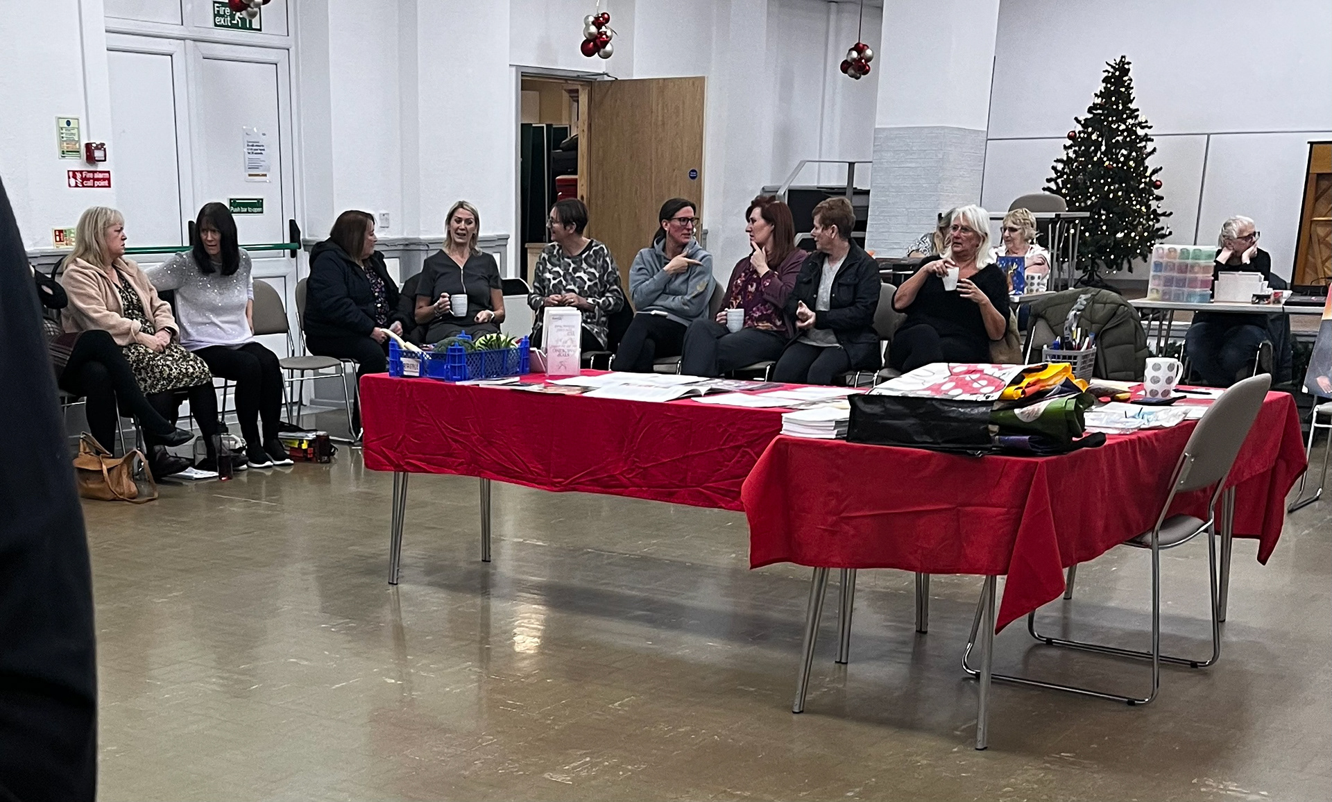


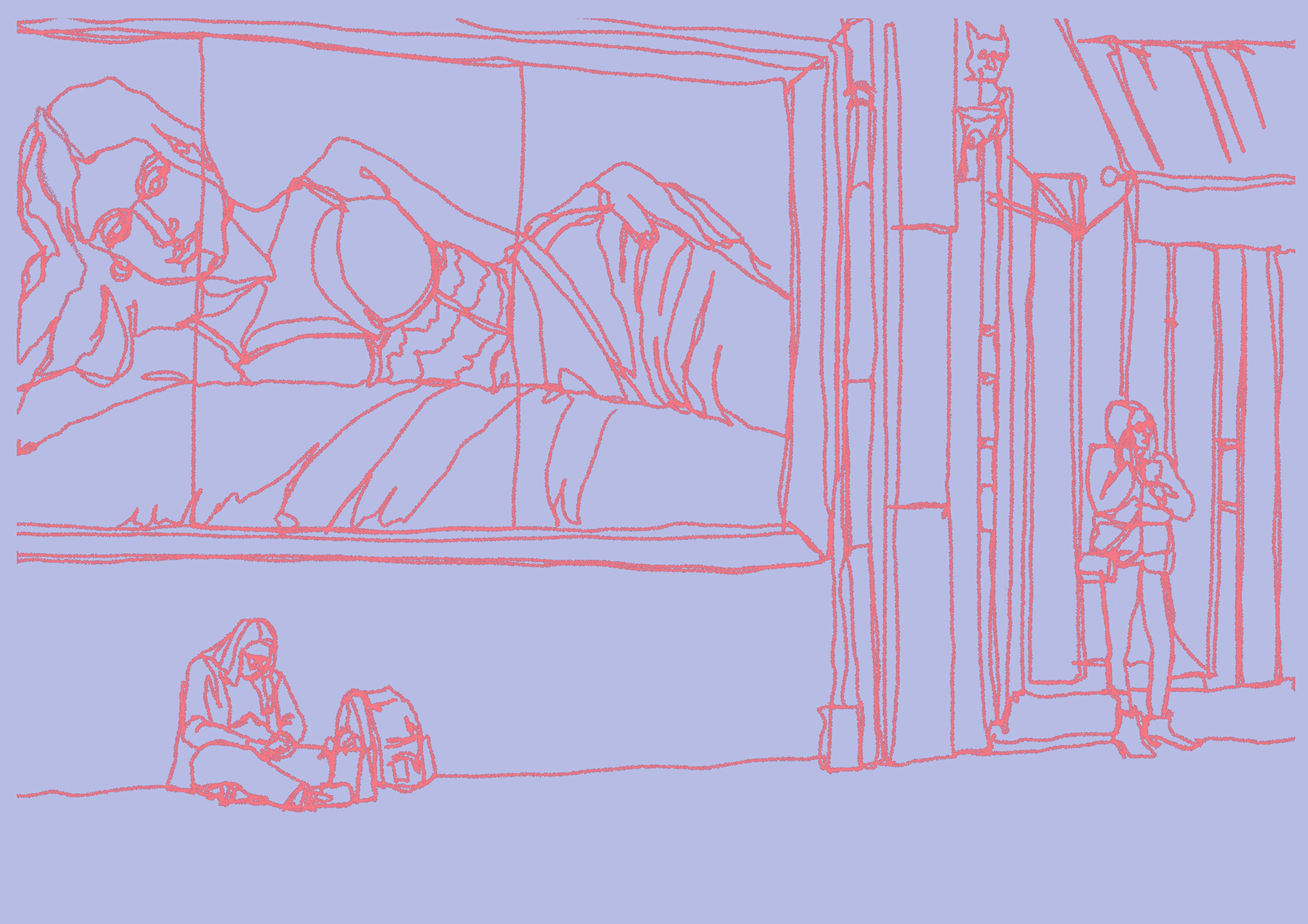

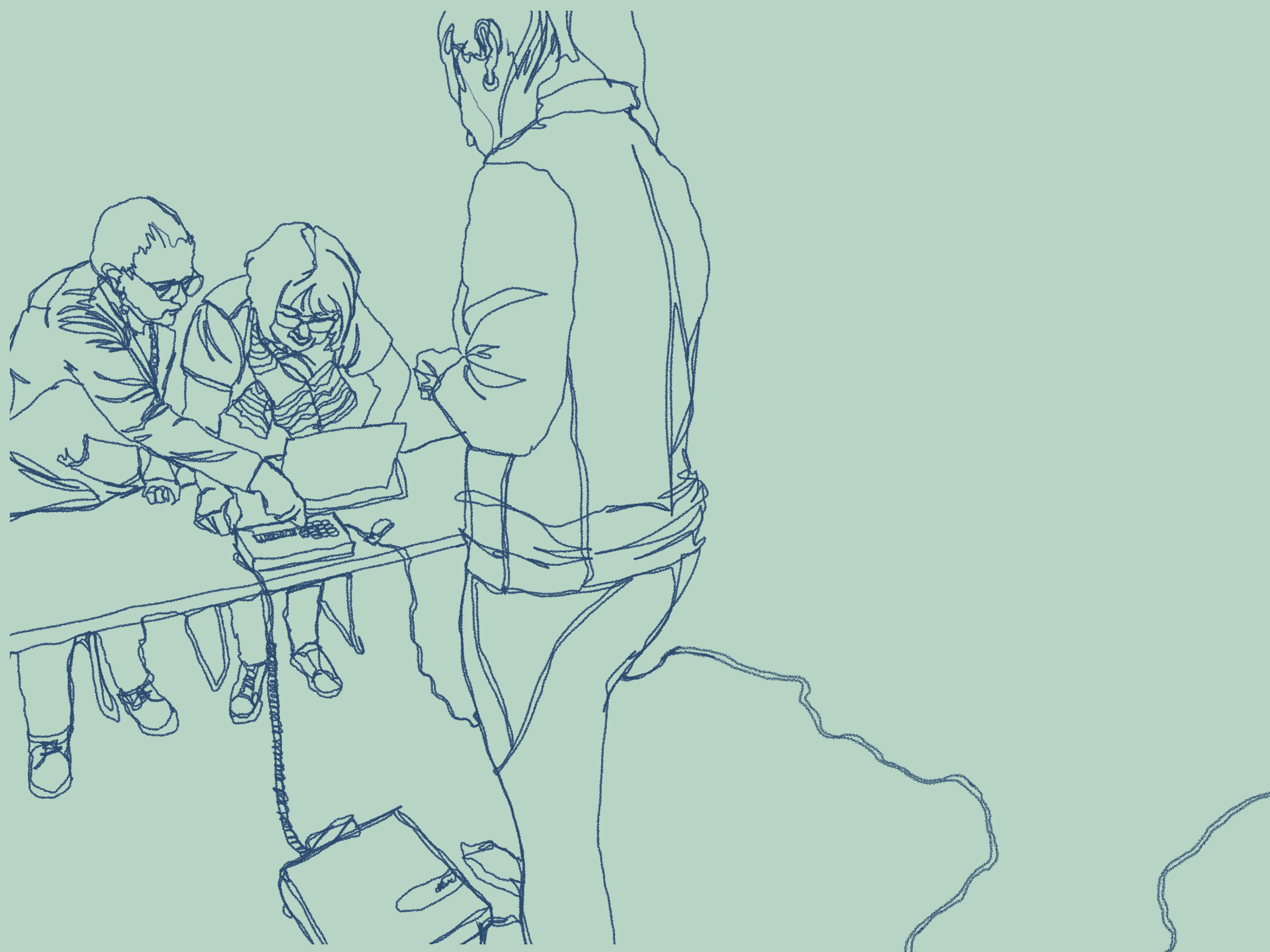
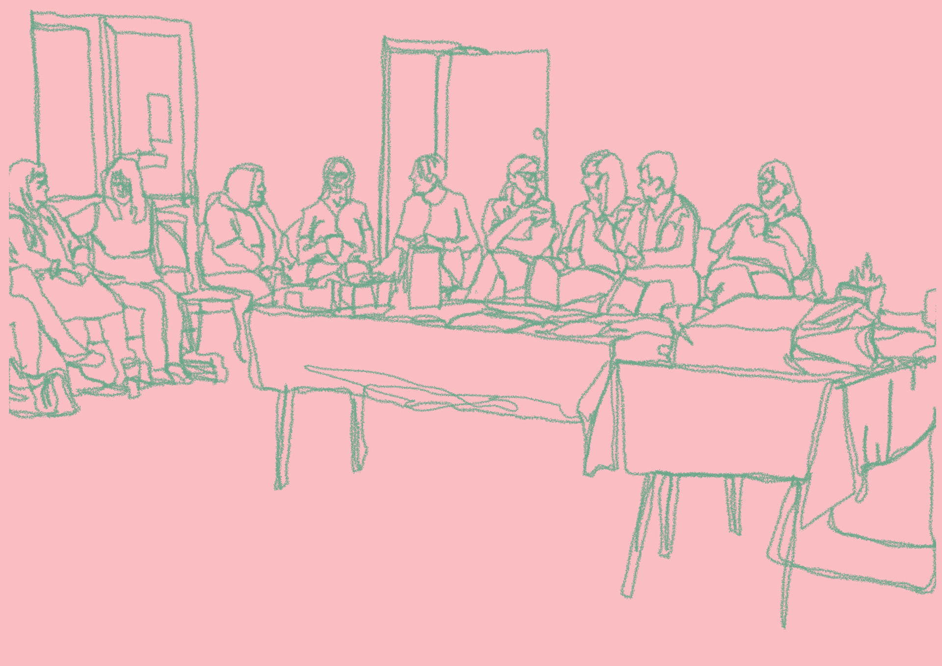
these continuous line drawings are based on photographs that i took at my mums slimming world group, or billboards i found in the news. i didn't want to bully slimming world too much because i know a lot of women find community and friends within the group, and that it does genuinely help some people, i just wanted to highlight how the community has very outdated and dangerous undertones.
my favourite is the bottom one! i remember taking the picture and thinking it looked like a renaissance painting all very dramatic and pointy. its one of the parts i find weirdest about slimming world (getting weighed and if you weigh over your goal you have to pay :0). i like how the wire trails off and everyones peering over the scales. its a dramatic composition for something thats been normalised, but i think paying if you havent lost mass IS dramatic
i put in these line drawings to break up all the detailed paintings and it think it works well. also emphasises that i used a colour palette when you see just two colours on their own
COLOUR PALETTES CHANGE THE GAME GOING TO USE THEM FOR EVERY PROJECT !!!!


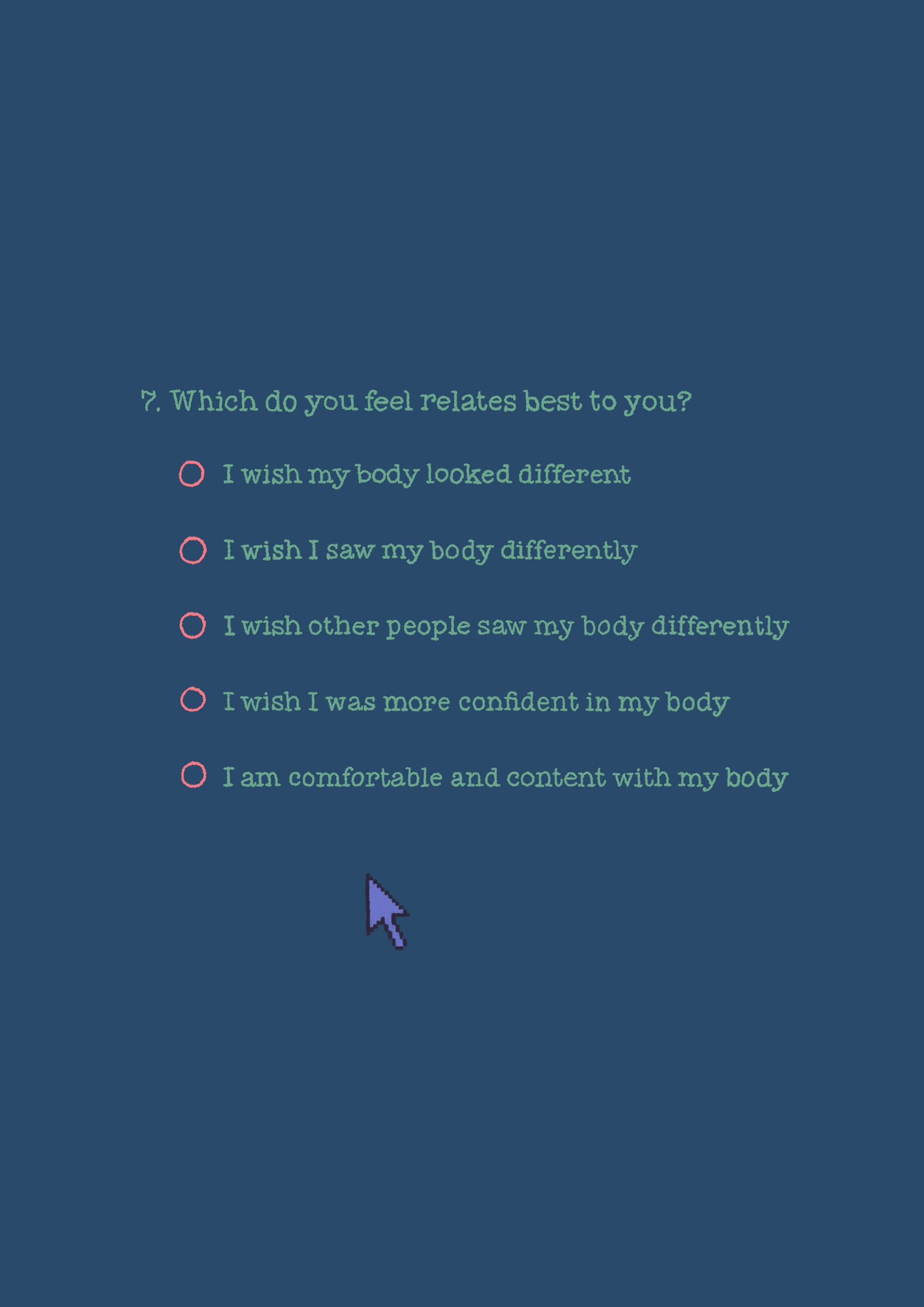
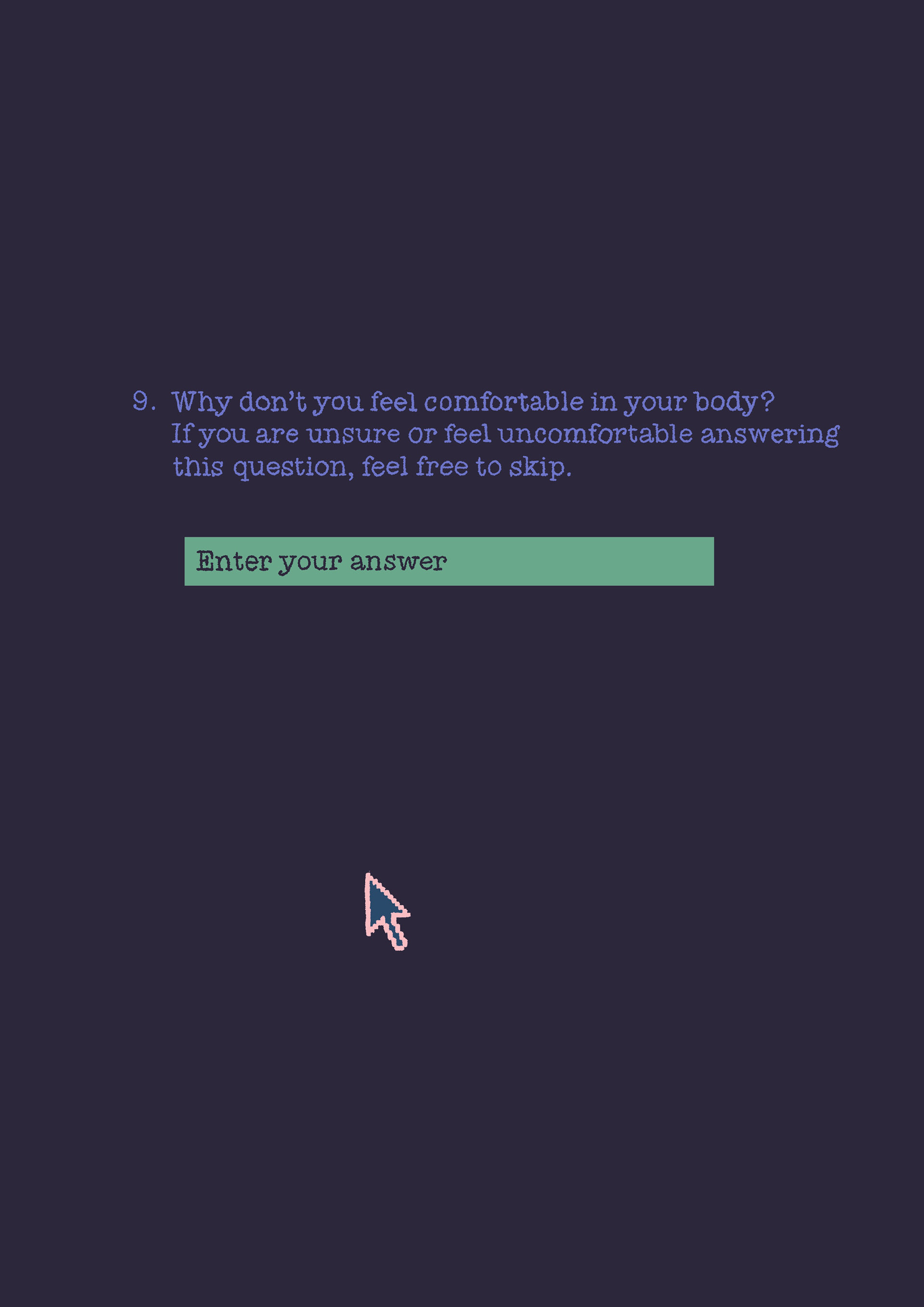

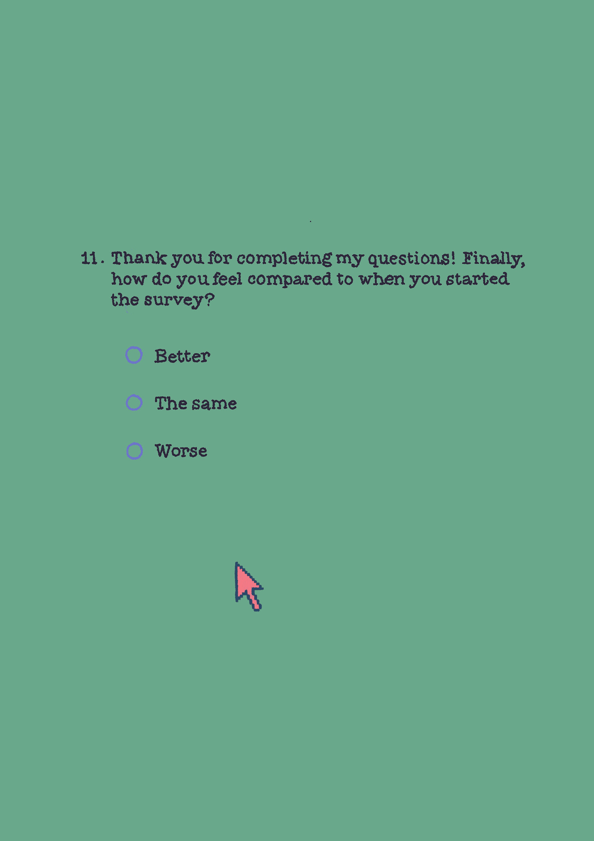
including these pages made me feel proper smart :) as part of the project i've ran a survey to get some primary data that is mainly going towards my audio visual side of the project, but because it took AGES to do and i was proud of it i wanted to include it in my zine!! i wasn't able to include any actual responses, but i liked the idea of my zine placing the audience in the position of someone completing my survey, hence the little mouse hovering over the questions! i wanted the imagine in between the questions to be like the mental images of what someone might think about when completing each question (that's why there are some gaps in the numbers so clever).
collecting my own data has made me feel even more connected to the project because now i feel like i'm doing my work for my community as well as the women close to me. alot of women at my mums slimming world group filled in my survey and i wish they could see the responses so they understood they weren't alone it makes me sad sad sad but i think because i care so much im able to make some really good work!!! i will definitely be doing my own research in the future because it makes me feel more connected to the project and the people im aiming my work towards :)
heres the link to the response summary and the QR code for the survey ! have a read its sad but it makes me happy that ive been able to work on this issue for my project and try and make some change.
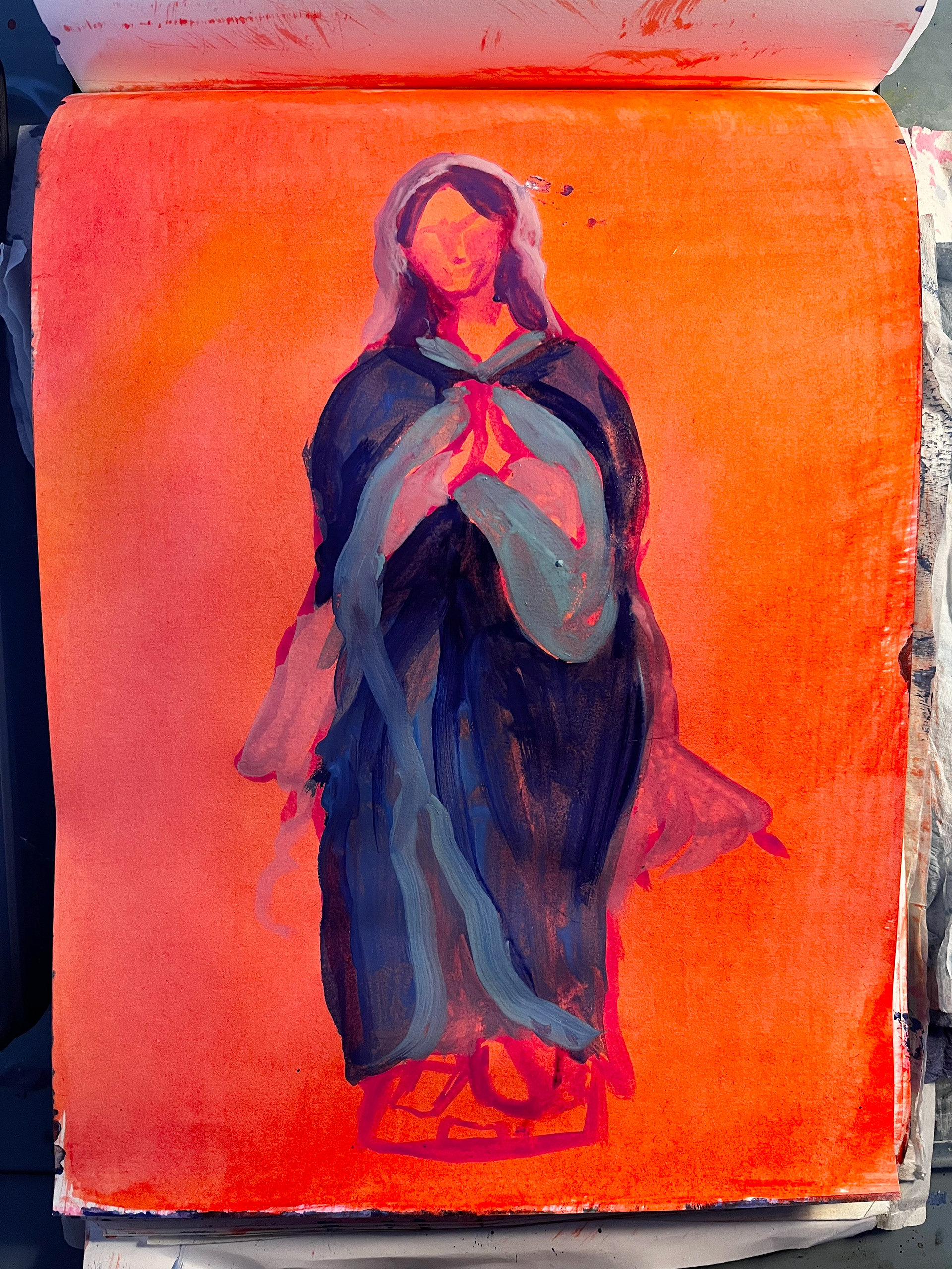
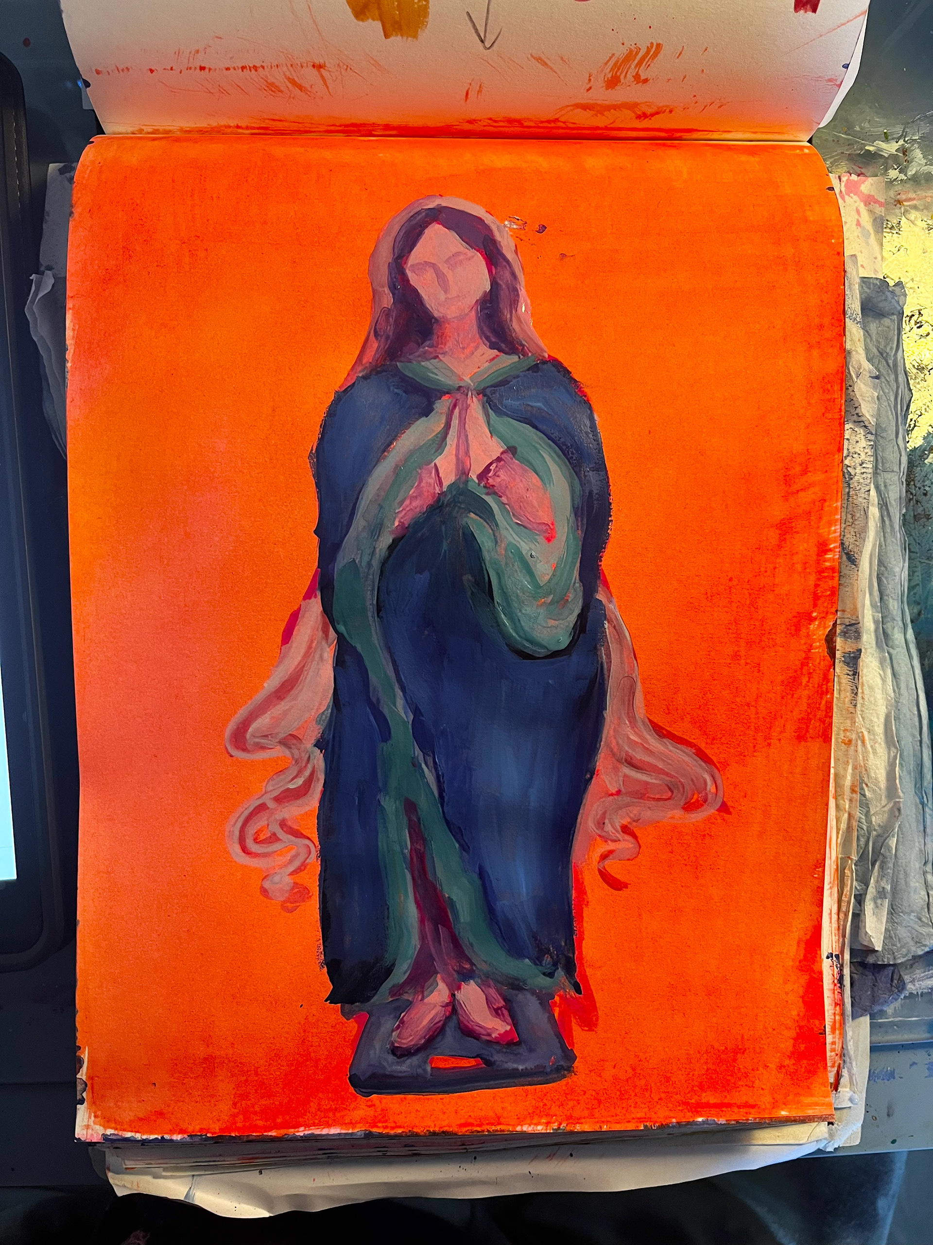
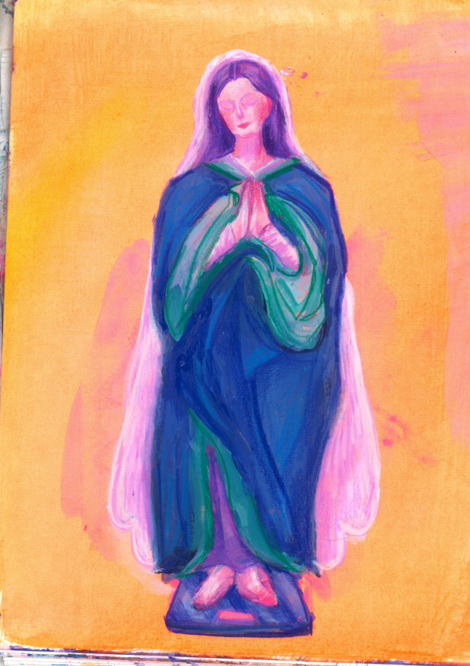

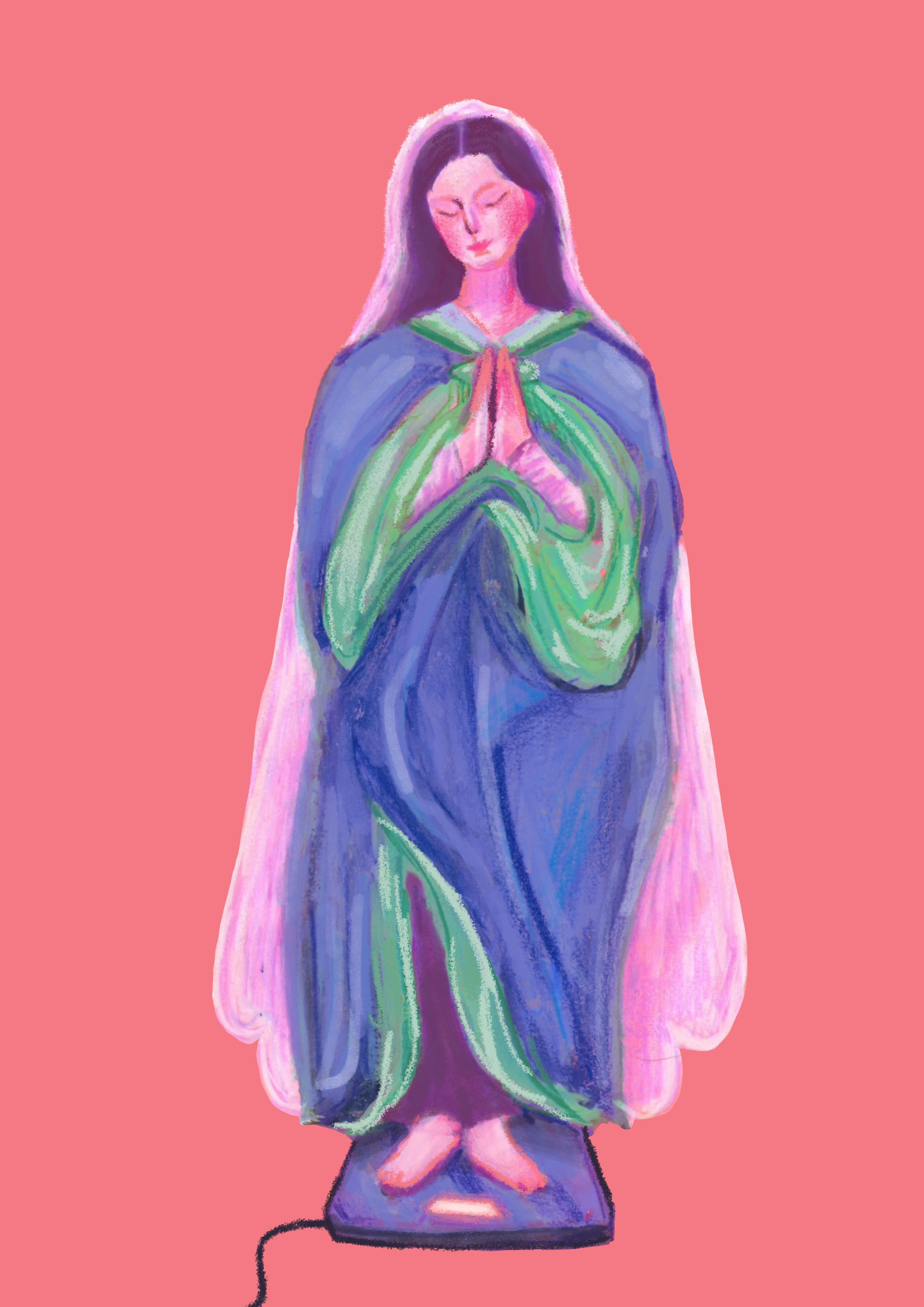


i recorded the process for this one!!! im so happy with this page because it came out EXACTLY how i wanted it to yippee!!!! i had the idea of the virgin mary on the scales because of the religious language used within slimming world (syns), and because im pretty sure, as a non-religious person, that it was never mentioned that she was thin but shes always shown as thin and conventionally attractive. maybe god picked her because she'd look good on a church wall or over time she's been shaped into an 'ideal' by the church. ANYWAYS i thought it would be stupid to imagine her dieting and praying she's lost weight so i wanted to include it. i want to make people question why all these famous figures are thin and pretty.
i used gouache and pencil crayon, scanned her in, altered the colours and refined some details because her clothes were not falling like clothes should oops. i also played around with her lovely religious glow it was a hard choice between the halo and the spikey halo but i'm happy with what i chose!!!
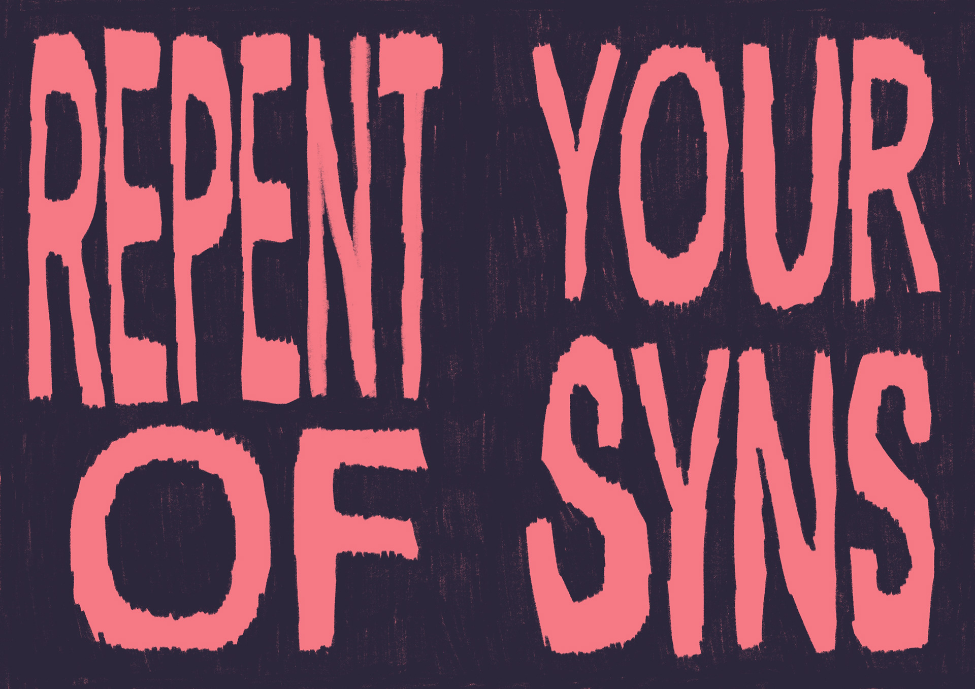
can't even say i hate type because ive never really cared about it lol HOWEVER since doing more social media stuff for work i've found having the hand-drawn look to type is LOVELY and helps it stand out as personal! i chose this big old type because i want the words to look big and looming and ominous and i think i did a good job! i used a procreate pencil that wasn't opaque so that little scratches of the background came through because i didnt want it to look really squeaky clean digital like where is the fun in that. definitely going to use this again and maybe mess around with the font that i use as a guide imagine it with SCRIPT wow it would look so good :') also im not a terrible speller its a term used by slimming world to describe certain kinds of food,
i think it's a terrible idea to relate 'treat' food to committing a sin but each to their own.
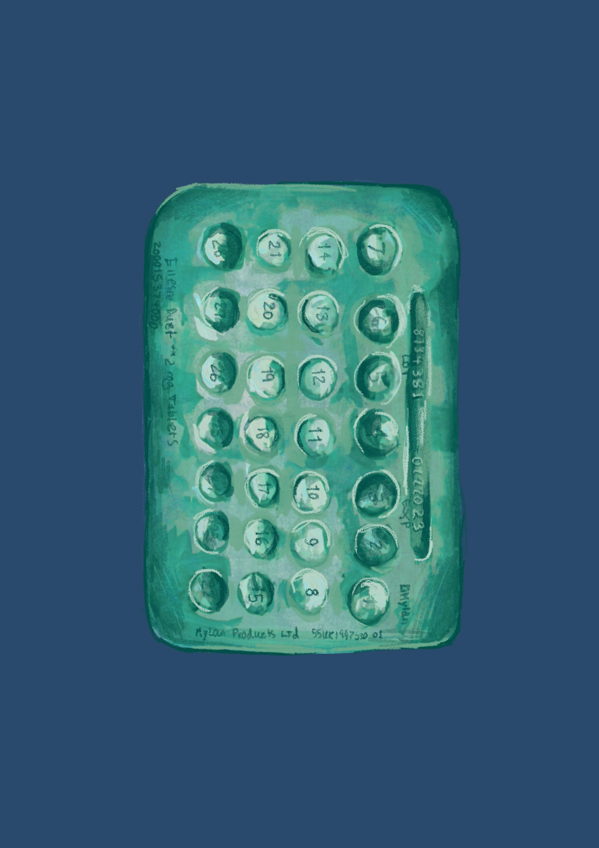
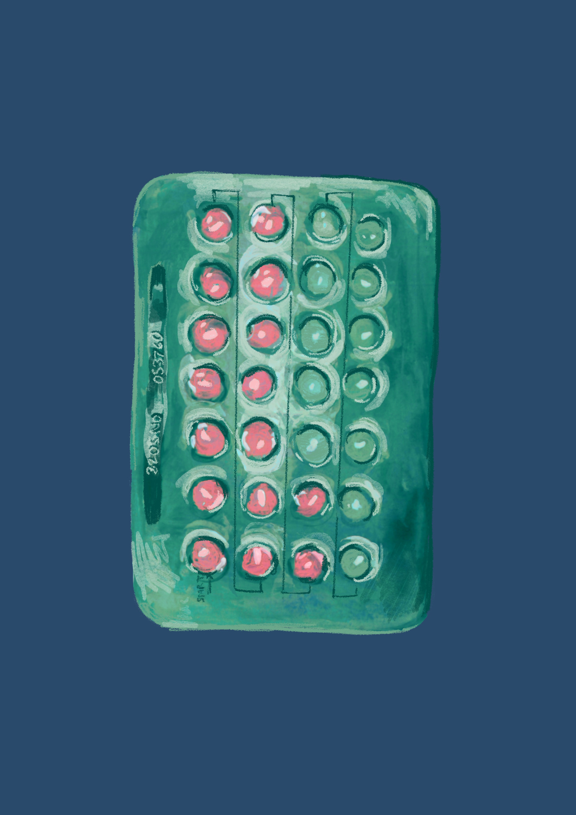
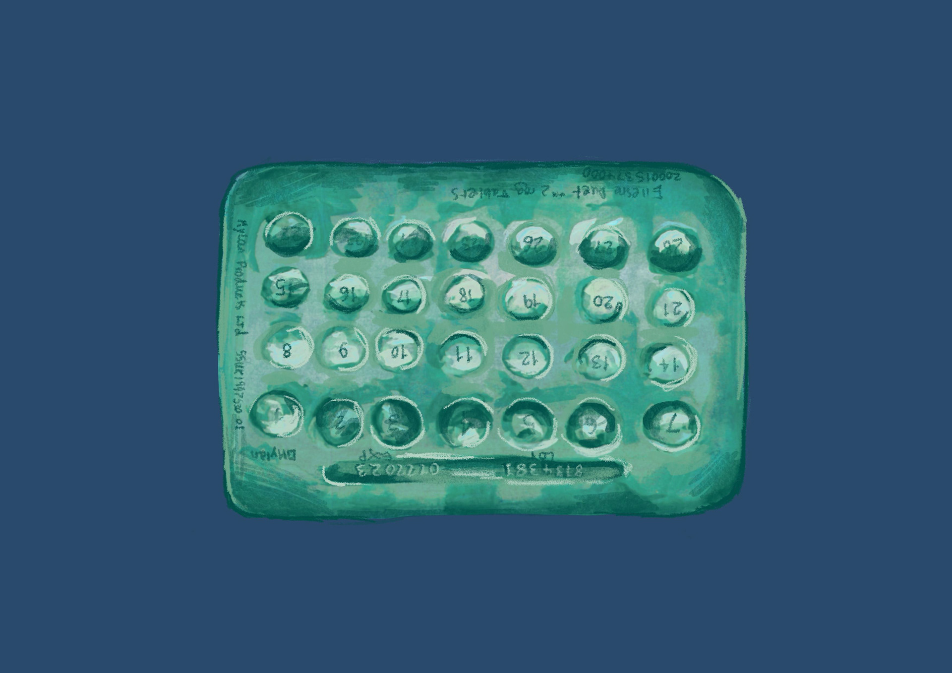
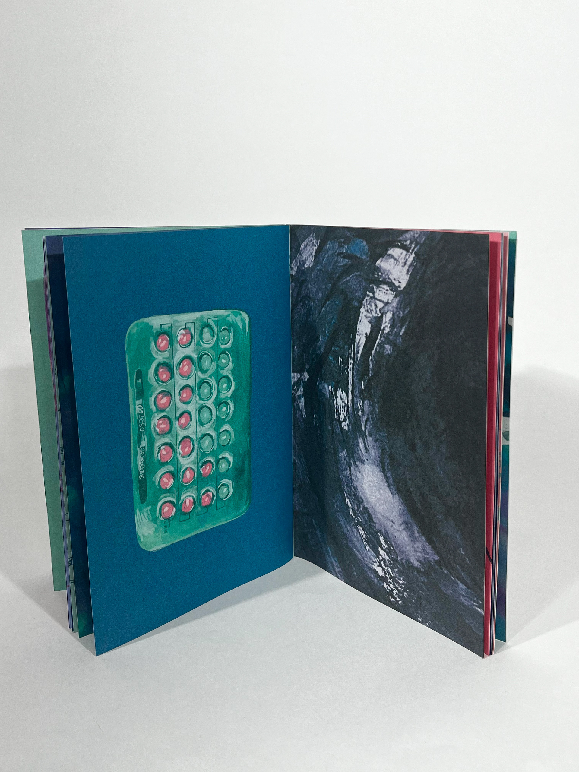
another set of pages that became victim to the flippy-page-back-and-front-of-an-object-special :) this is a picture of my mums HRT tablets. the menopause has been massive for my mum and most other women in the world but only started being talked about like 2 years ago? it can literally change the chemical composition in your body? it felt important to include the HRT in a book aimed at mothers and middle-aged women because they can be life changing medication. also fit my colour palette well ;). i like how my scruffy layered style looks against a flat colour background, its helped make my book look cohesive and compliments my style well, im going to use it alot more in the future.

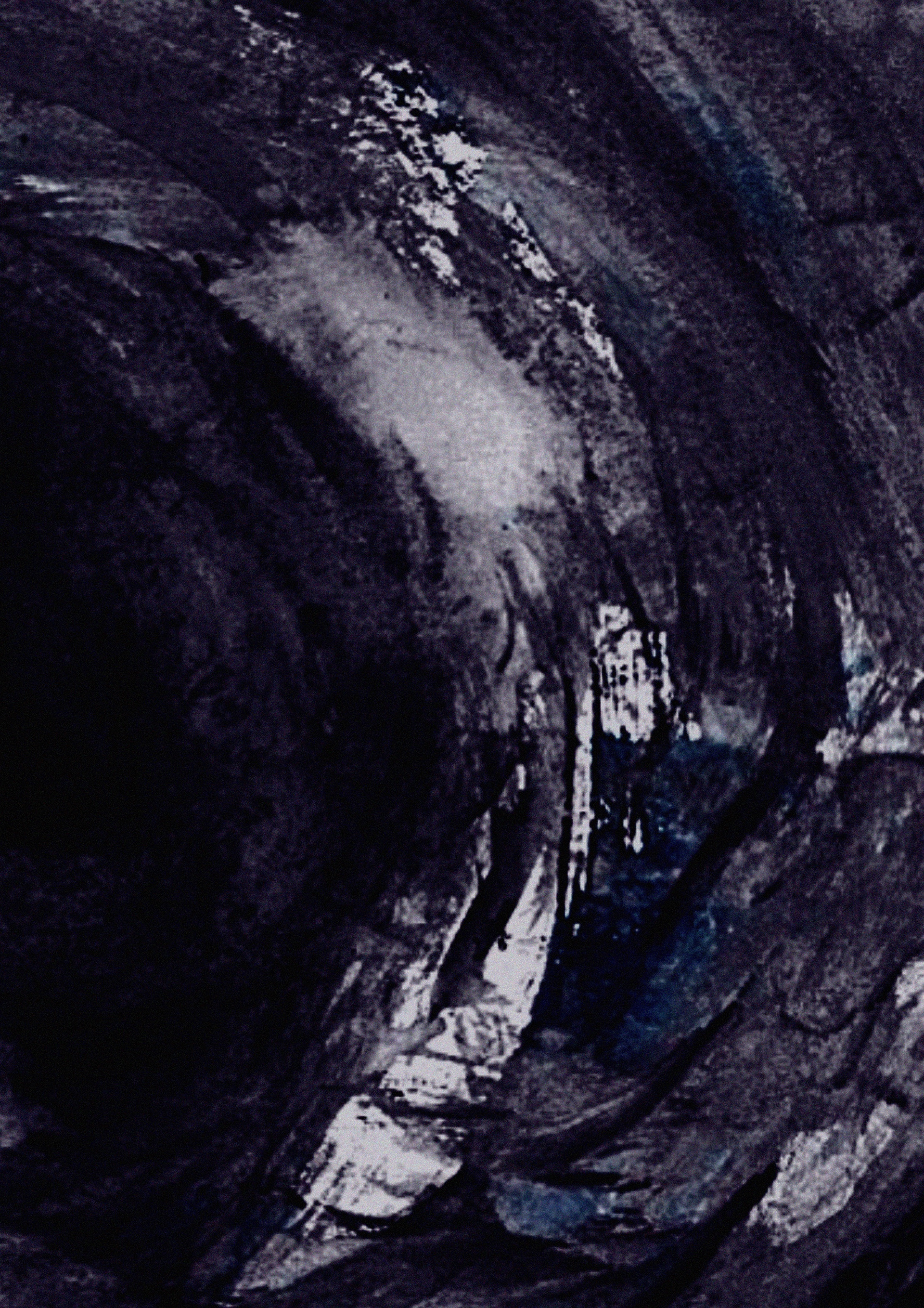
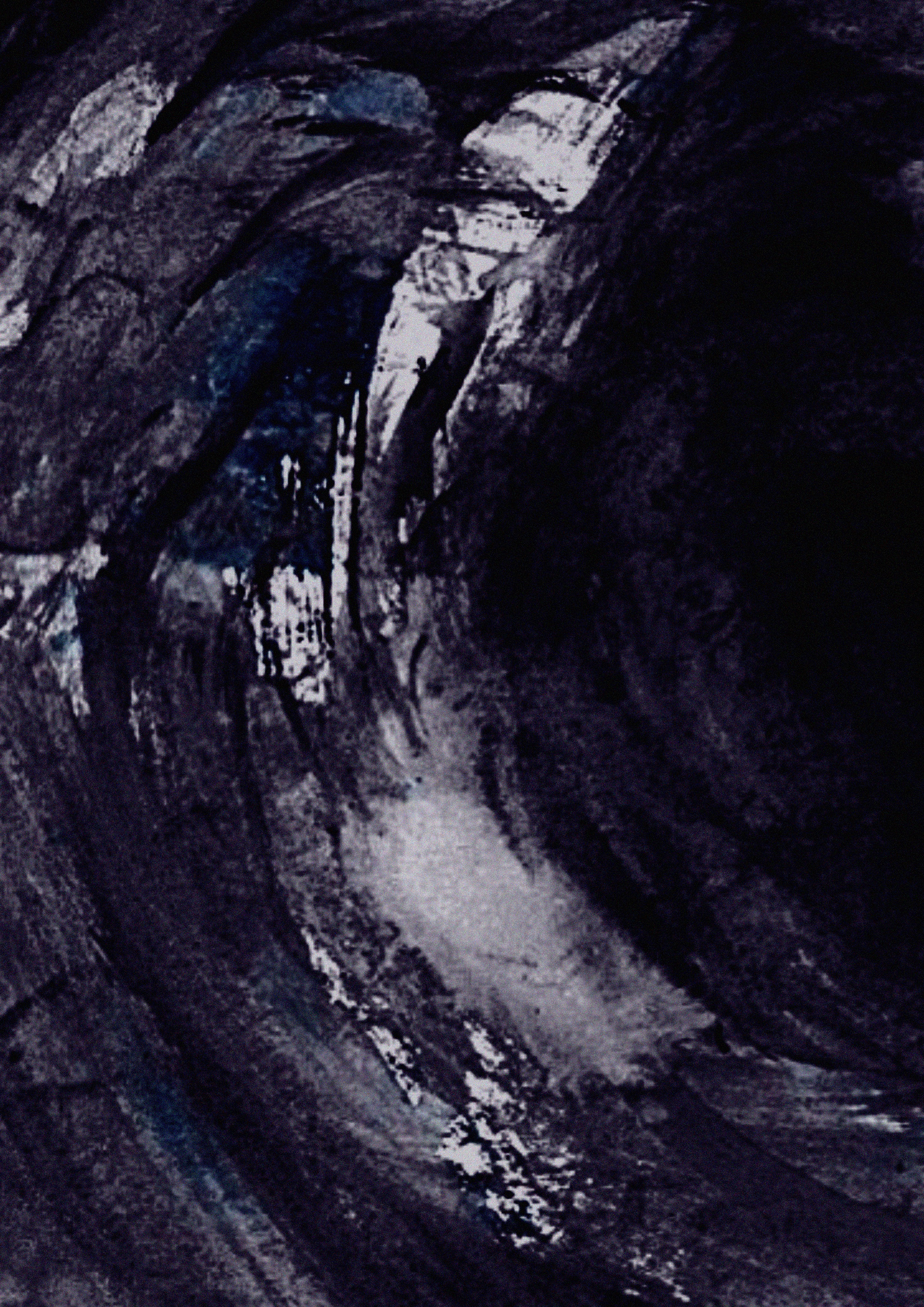
wo lovely black hole of death paintings i used like bookends for the REPENT OF YOUR SYNS pages ! i wanted them to stick out from the rest of the zine and i purposely made them extra-pixelated and noisey to contrast with the rest of the lovely smooth high-quality images. they were the original black hole pictures from the abstract zine we made right at the START of the project as i liked them too much not to use. i've loved adding abstract pages in between my standard illustrations, i feel like they're a breather for the eyes and people can apply their own feelings to them. for example, my mum sees boobs in one of the abstract pages and thought i'd done it on purpose because a lot of women are self-conscious about them at that age. absolutely did not mean to do that but if people can see something in my work even i don't see that makes me happy :)
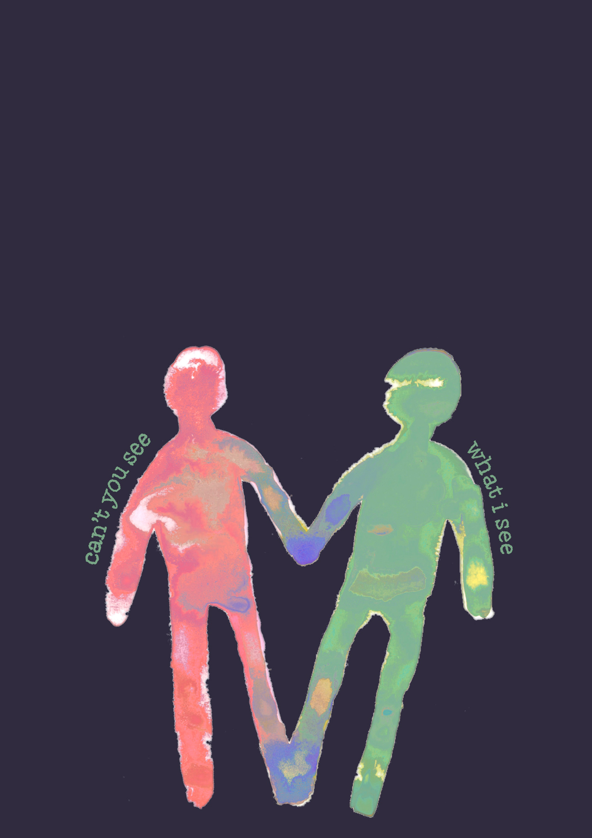
this is my LEAST FAVORUTIE PAGE purely because i think its abit sloppy even for me. if i had found a way to use the gouche all watered down on black paper it would look so much better. HOWEVER i do like the composition and the idea, i wanted to show how you cant see your own beauty but can find it very easily in someone who looks similar to you, because you can see their insecurities. i do also like how the colours bleed together, i just wish id spent more time on this or maybe made it a double spread with a person on either side, but i'm glad i did it so i could learn from this and try the two characters holding hands in the fold of the book for another project!
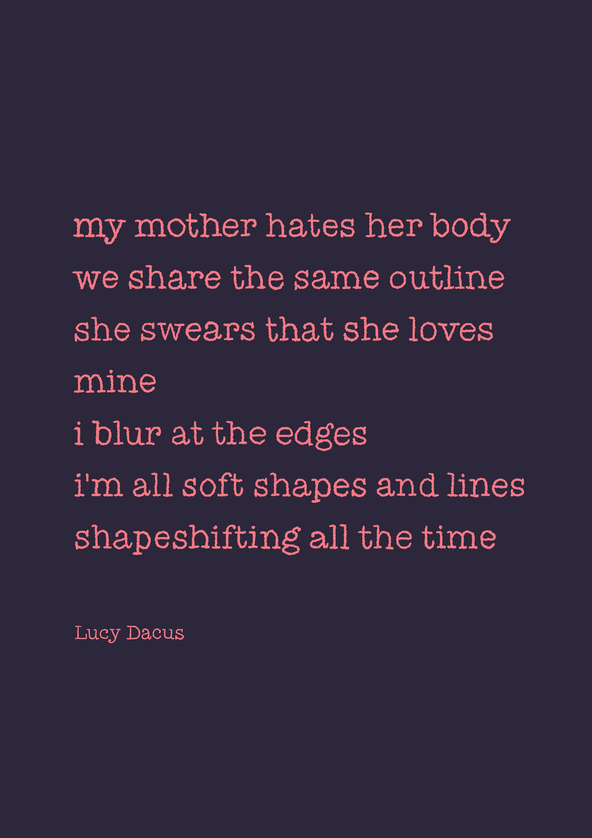
FINALLY we get to talk about the blurb good lord that was a lot of writing phew. i wanted to somehow directly link the zine to the Lucy Dacus song that inspired me to take this direction in this project and get all nice and PERSONAL. i thought the best way was to use a quote as the blurb, rather than a page in the book, because it emphasises that this book is basically me trying to tell my mum she is lovely and that the world is mean for making her think shes not. the direct connection to my mum can only really been seen by me in this book and the audience aren't going to know its a loved one that inspired the project by only reading the content so this quote wraps it up nicely and lets me explain myself a bit, like writing 'love, ella' at the bottom of a card!
im definitely a music over film person, so i want to incorporate music into my work more because i listen to A L O T of it and it does influence a lot of my work but i never show WHY so im happy ive been able to reference this very good song in my final piece :)
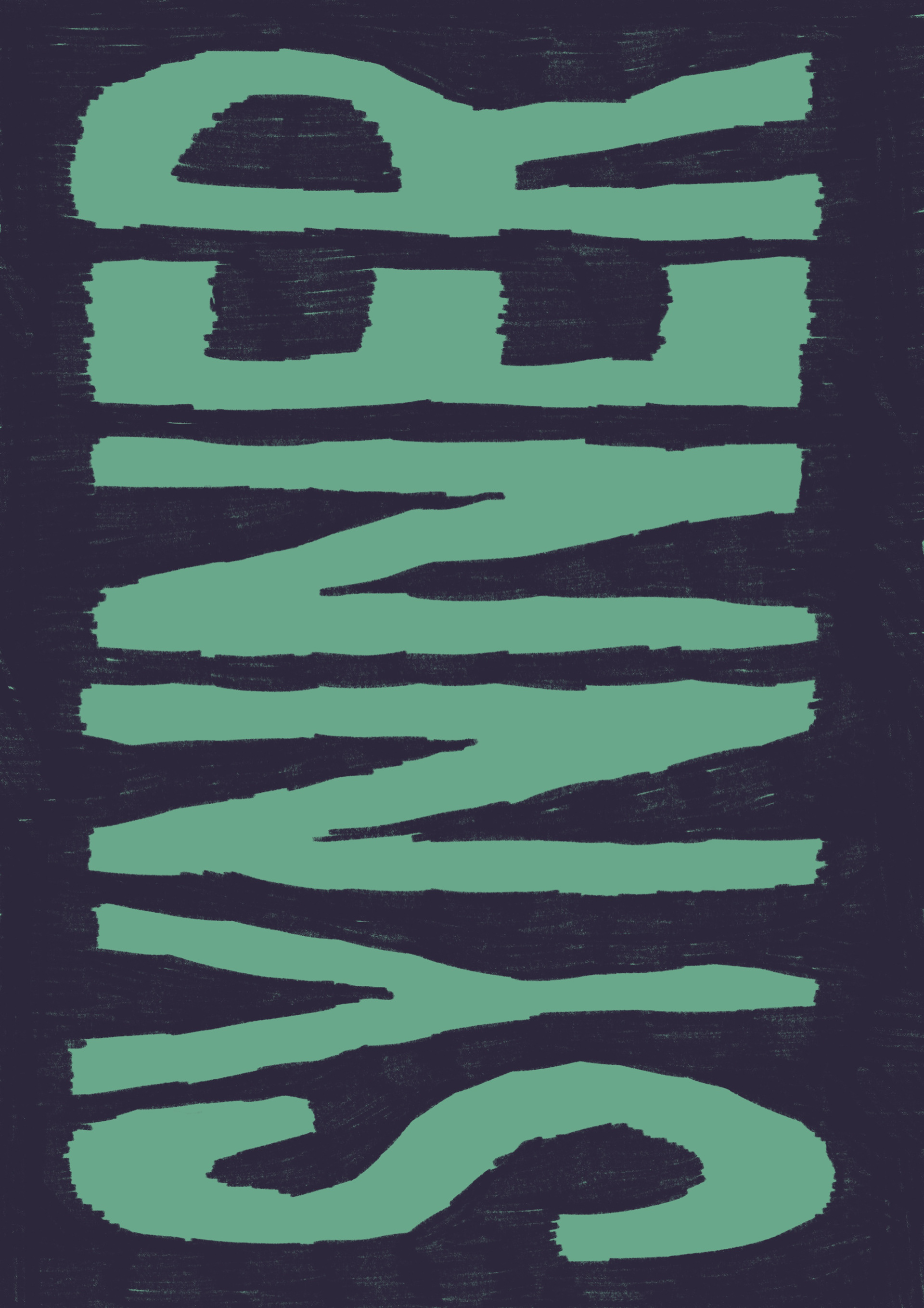

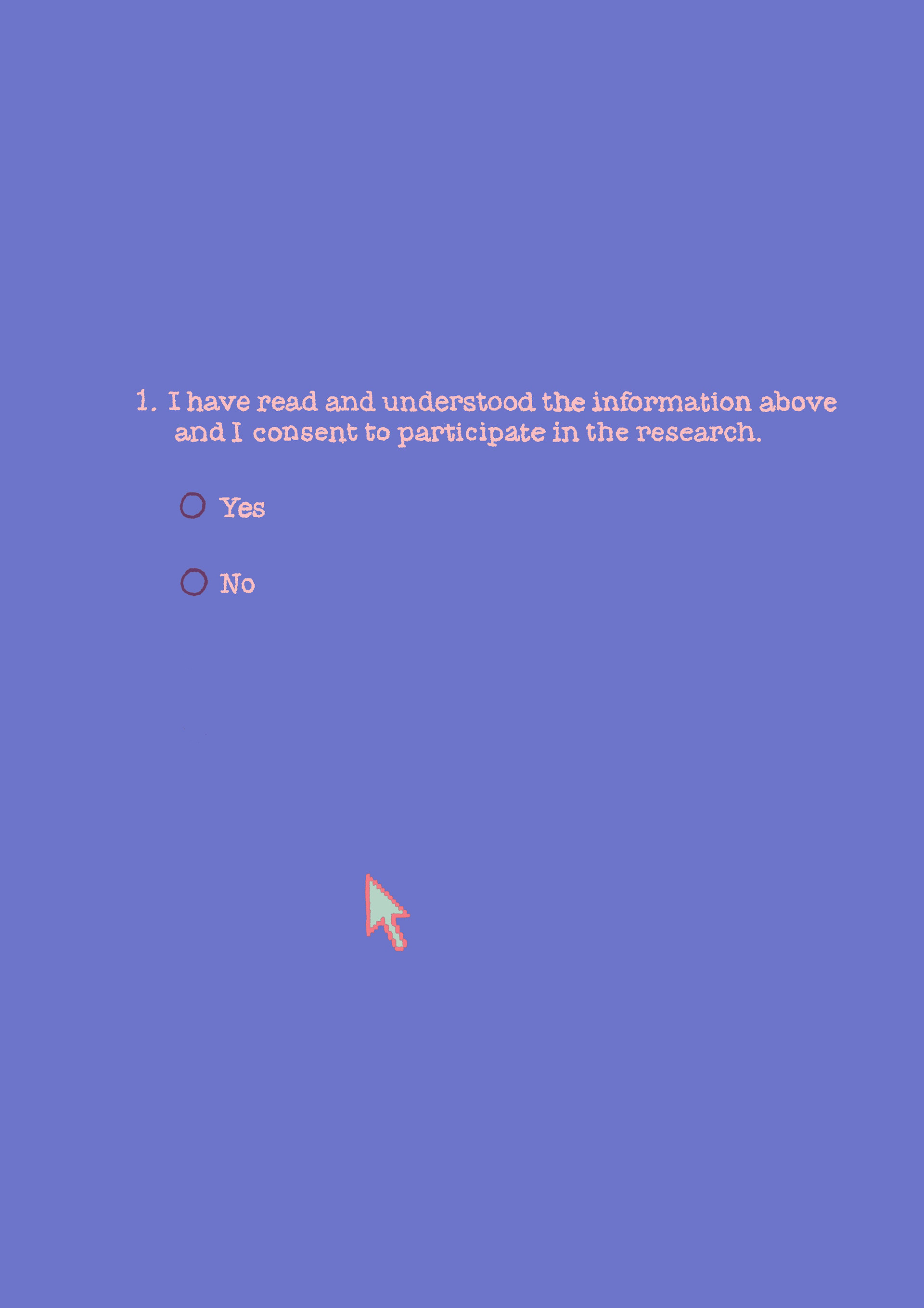
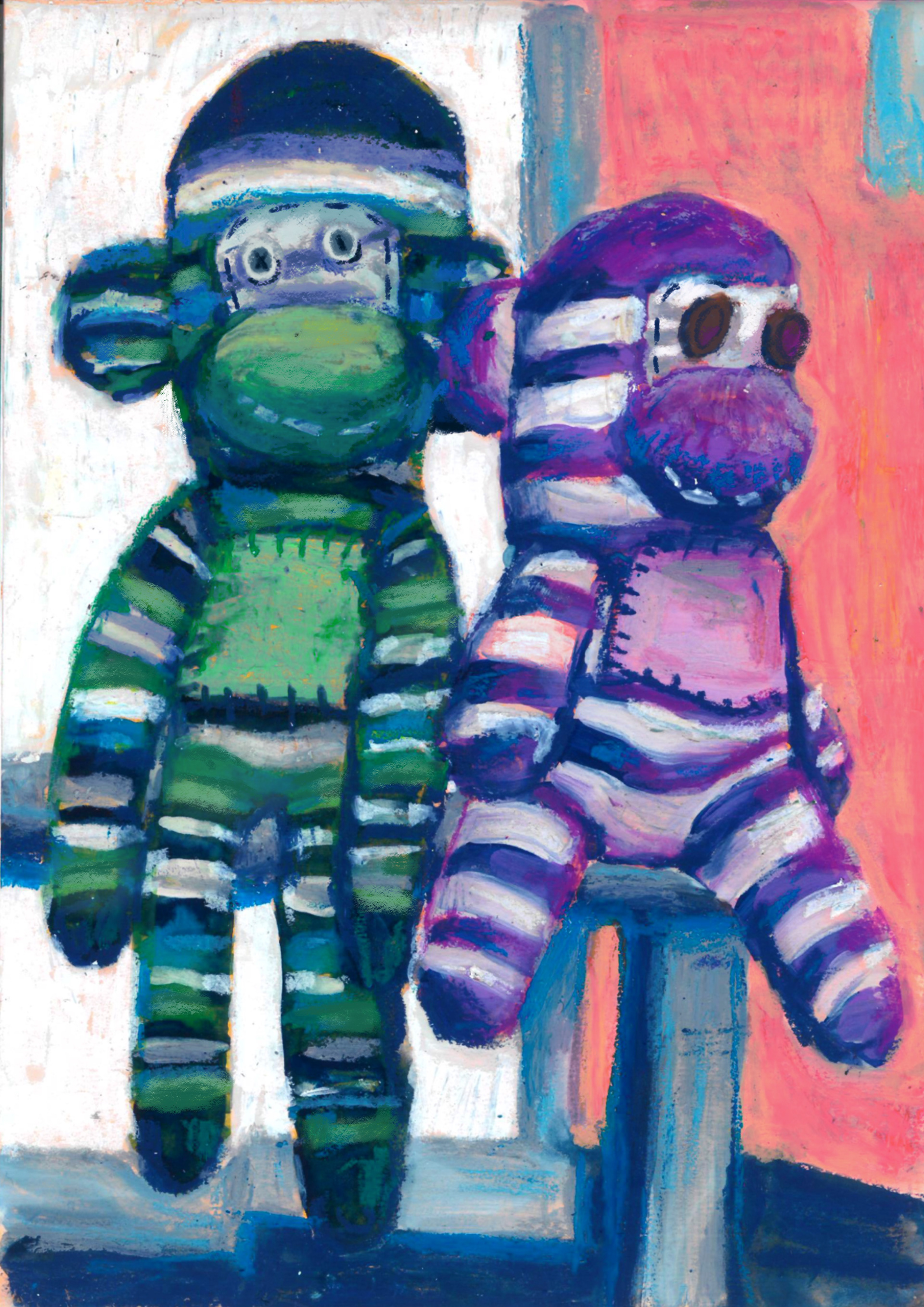
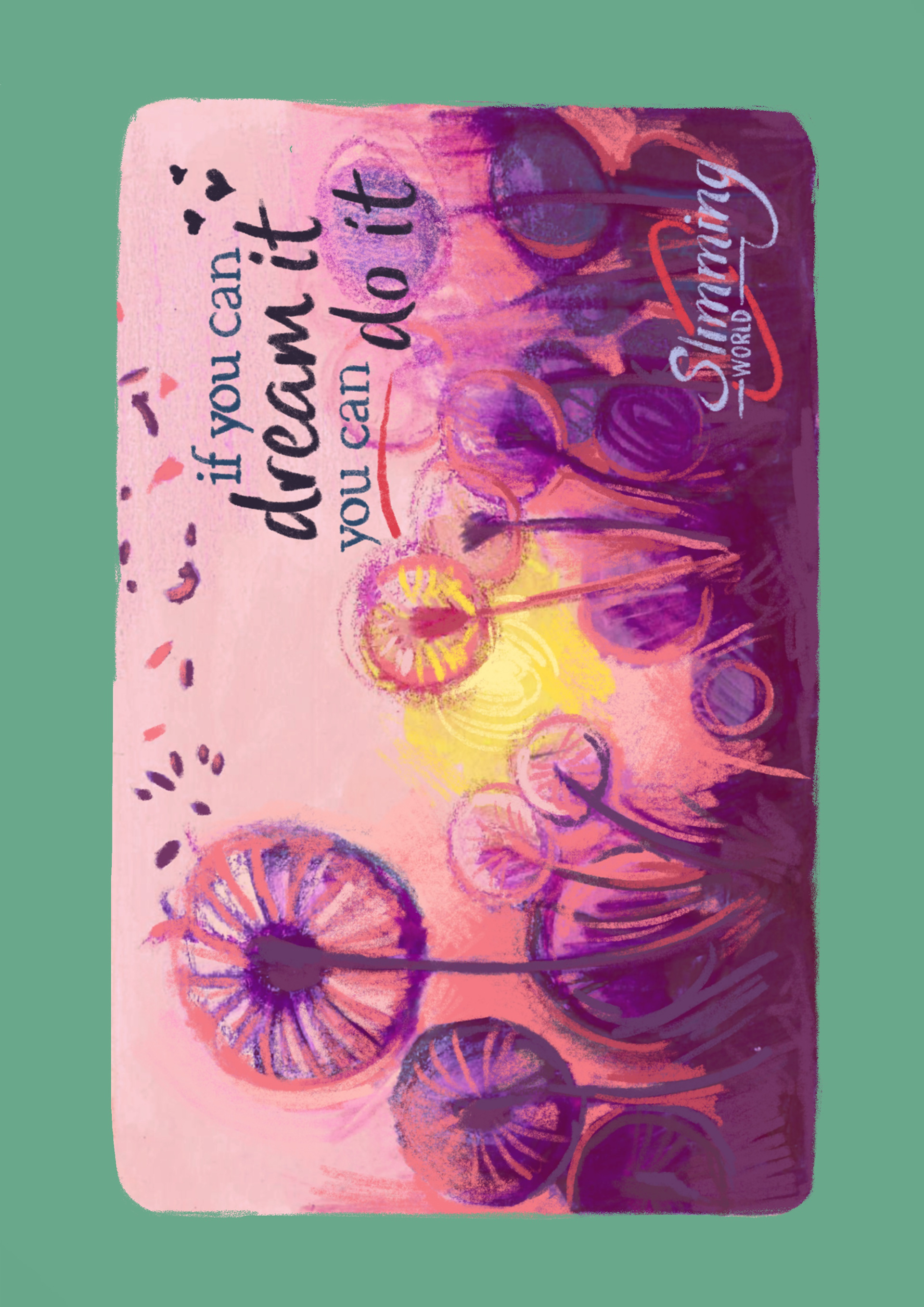









heres the final order and layout of the book!!! for the first proper zine ive made i am VERY PROUD it feels like my little child is this what having a baby feels like if so im going to pop out 20 it was really fun and good for my brain to just sit at my desk every night and paint and draw i never get to do that anymore. very much like art therapy with a deadline.
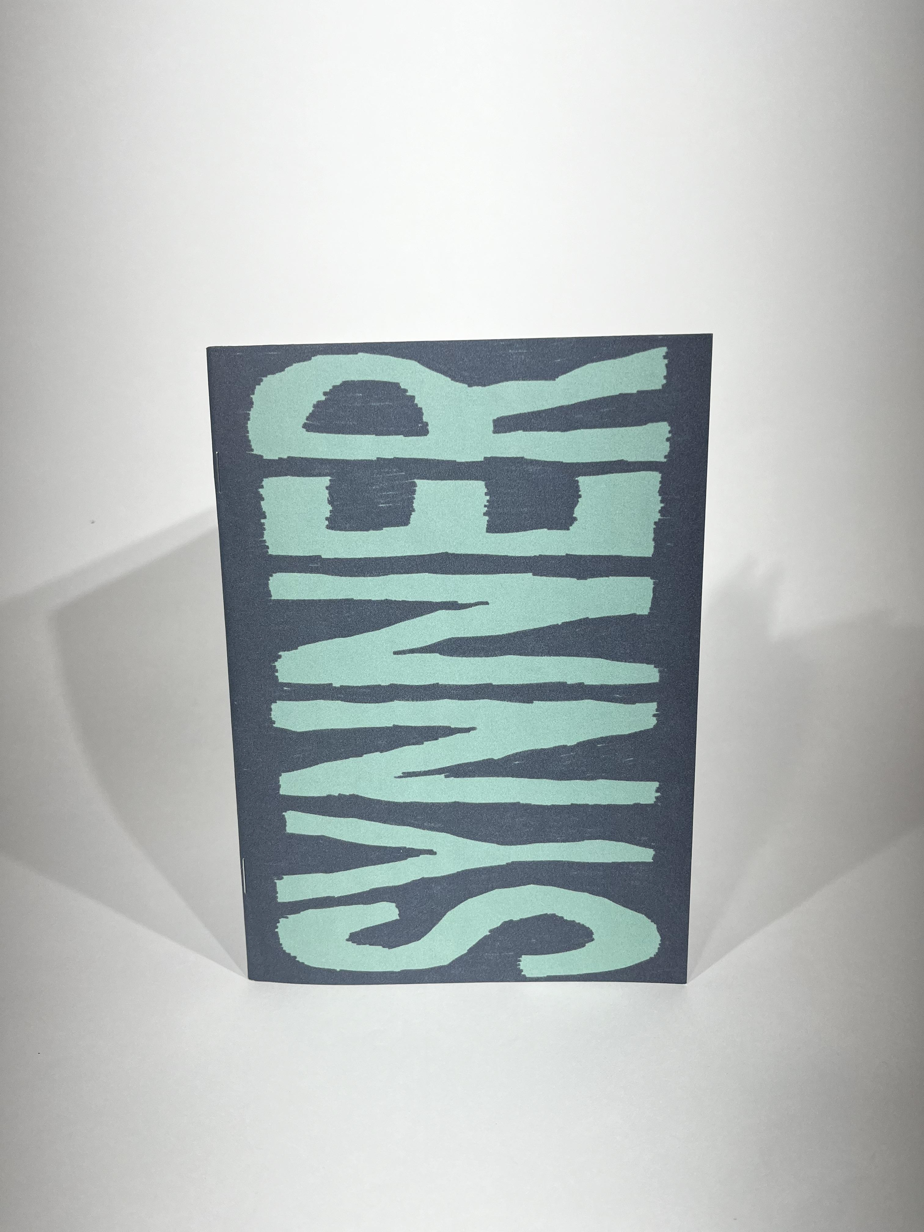
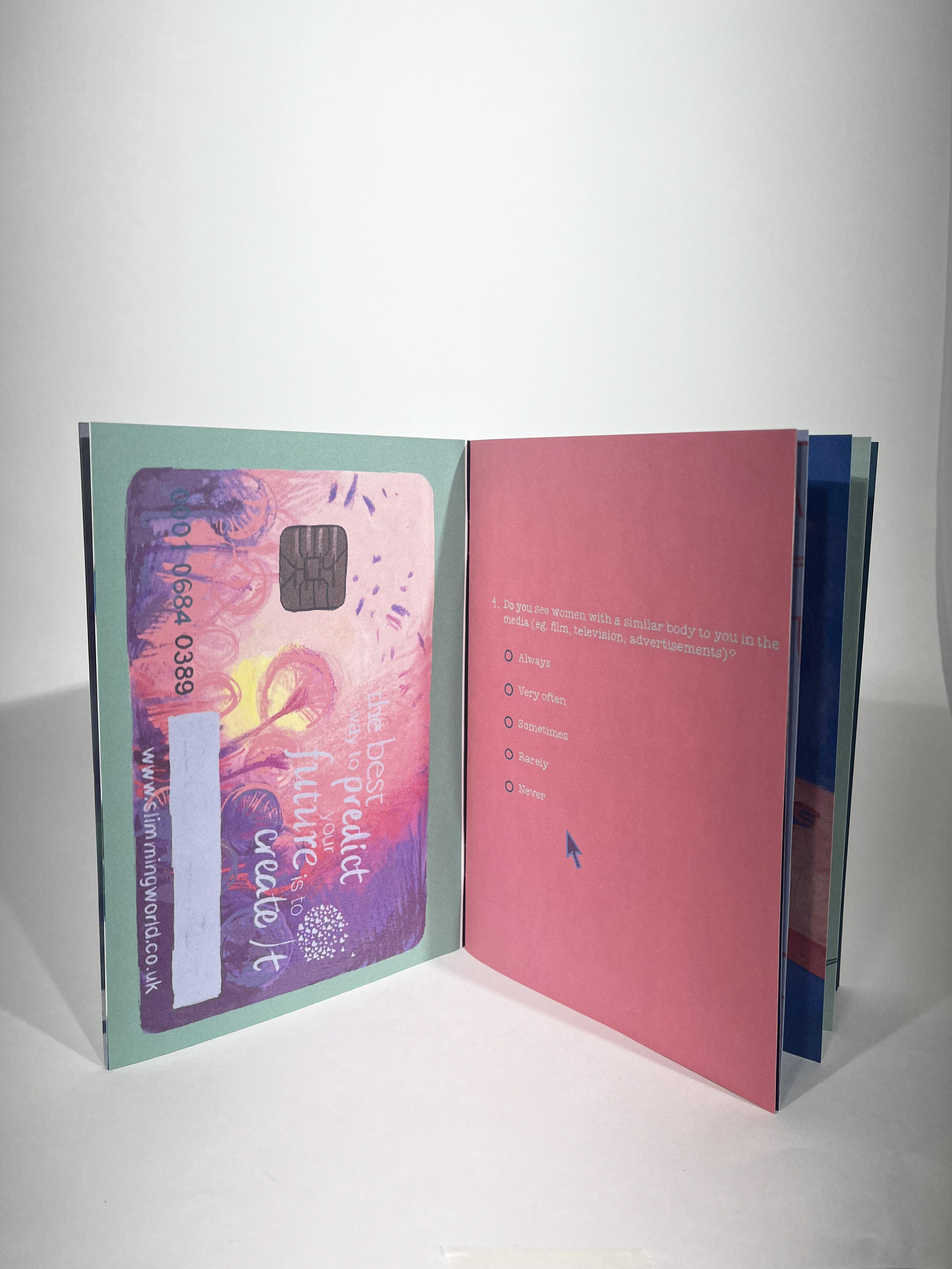
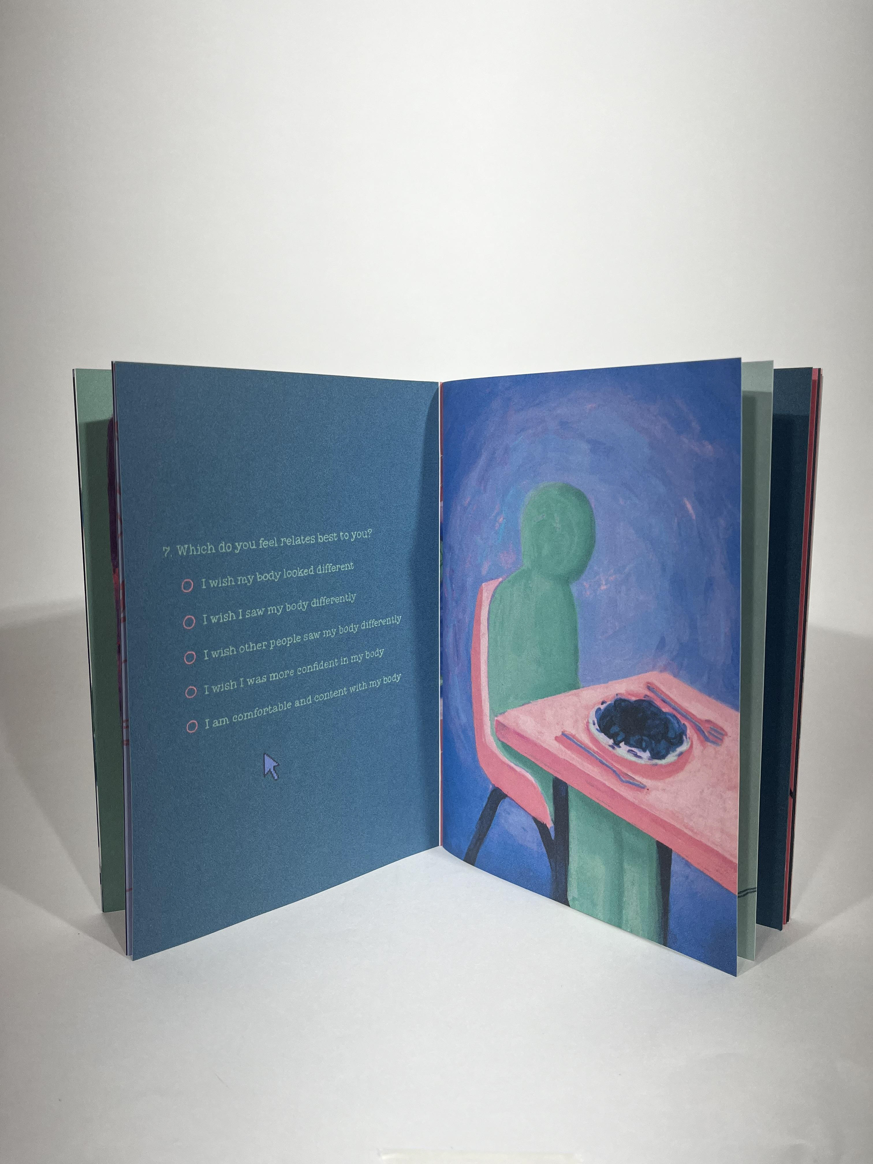
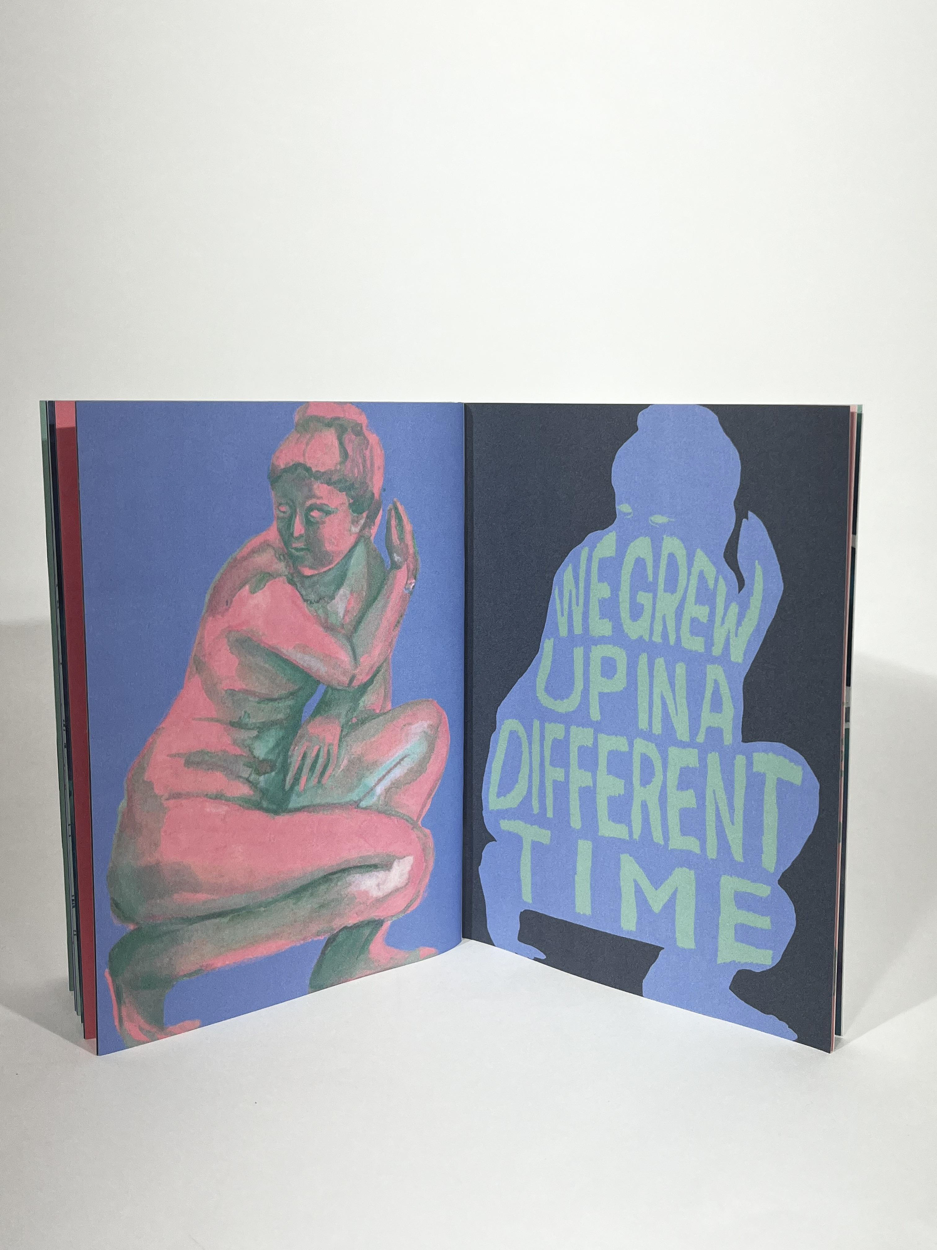
was so painfully PROUD of my zine (and because it fit the requirements) i entered it into the creative changemakers competition!!! ive never entered my work into anything that wasn't a live brief before so im excited to see if i get some feedback and maybe get shortlisted my fingers are crossed!! :)
FROM FUTURE ELLA : George won the competition. It was really nice to go to the presentation for the competition winners. I've got to talk to some of pages that was really fun one of the third years Lily is booked in for a tattoo for once I finish uni which now we are in May that's next month so I'm very excited and it was very nice to talk to Ellie I'm a very proud of George will have a group photo and it was very nice to have one box of the symposium as well I think my favourites was a honours and Isaac's but they're always my favourites but this whole project been nice. I've loved it so much and I love making work that to me has a purpose in can help specific groups of people
I'm glad this was the first big projects we did on the second year course because it made me explore all the things that I wanted to do in first year and it set me up to do some really good projects after!!! It was good for me to do a project that was personal and a big project that took a lot of work and that I was able to do it in a media that i was comfortable with, but was just pushed to the maximum of what I think I could handle. It was a lot of work compared the projects in first year and it was the first time that I've made something like this and had to use indesign in this way, because in first year and only used it for the book cover project and that was very minor, so opened my eyes in a lot of ways and it was the first time that I had done primary research for a project. it was also the first time id done a colour palette and that was massive for me, and its definitely affected the rest of my projects afterwards and is something that I'm going to keep doing throughout third year and onwards!!!
I think it was good for me to feel uncomfortable in a project too. I wasn't comfortable with how personally it was and other people reading it and I'm glad I did it because I felt better afterwards. I felt a lot better about the work I made and the people affected, and it went down really well with my target audience. I don't know whether zine making something that I want to do in the future because it takes such a long time but with this one and with thelive brief it's definitely changed my mind, especially because these are both such separate different kinds of zine, one has a narrative (live brief) where in this one is the narrative is less linear and more ambiguous and I'm glad that I've done two that are very different so I can see which one I prefer. I like both and I always thought I'd lean more towards amplify zine because it's ambiguous and there is less focus on storytelling, but after the live brief I can't decide which is my favourite and its DEFINITELY something that I want to play with more in third year and have a go again.
