i'm really excited to start the module after the first session, i loved coding in secondary school but wasn't allowed to pick it as an option because it conflicted with my timetable, so i'm glad i get to re-visit it now. most of my illustration work is focussed on colour and movement so i'm hoping i can find some generative artists that do work thats abstract and colourful. i'm only slightly worried about my computer skills in terms of writting understanding code because its not something that comes naturally to me.
the lecture and article we were recommended to read from the first weeks session were really interesting especially the ana ridler lecture where she paints her own resources to feed into the AI in an attempt capture her style at that specific time, hopefully if i ever have an excessive amount of free time in the future i will do that too. it helped me understand the positives of AI better because i was purely going off of my friends HATRED for AI, but really i think their fear is of their artwork being stolen rather than the idea of using AI as a medium.
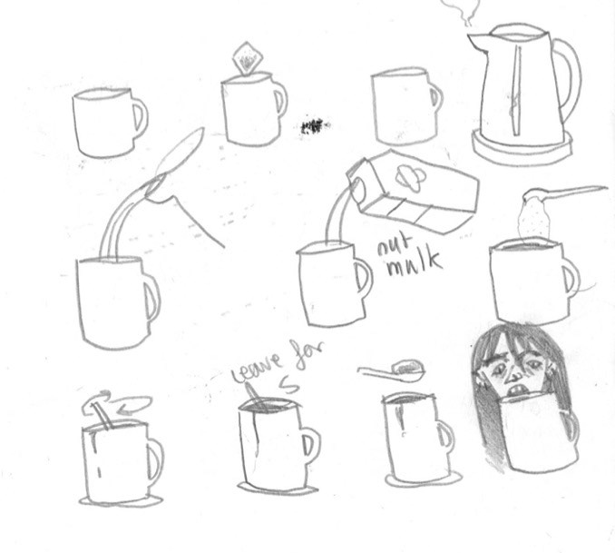
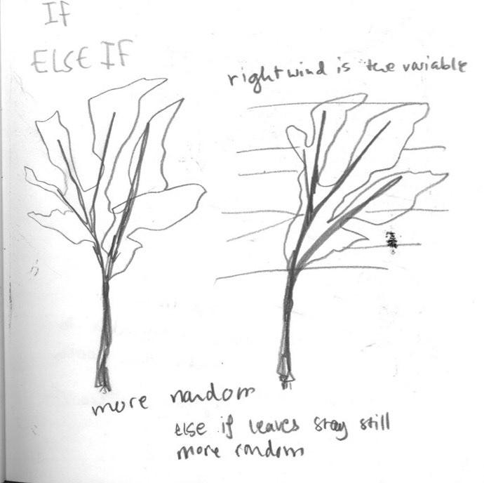
we looked a lot at the idea of coding in a visual way, which helped me a lot. the 'making a hot drink' exercise made a lot more sense to me in term of how detailed our commands to Processing need to be and how the code needs instructions rather than descriptions. we learnt IF statements and ELSE IF statements which i understand as being like a crossroad for the programme, its just the part when its written in a big chunk of code that i struggle to comprehend it, however i've found if i split the code up into sections its a lot easier to read.


for week 3 i found some generative artwork i REALLY liked they almost look traditional, for example the first two by Tyler Hobbs look like mosaics to me. i use loads of vibrant colour in my illustrations so i can see why these appeal to me, especially the last one by Jazzbery Blue because of how the colours are interacting with each other like little rainbow pearls.
we learnt how to add pictures into our code and manipulate them, mine is a bit basic but i think its funny and it shows i can use the code. i'm also glad i know how to save the movies so i can put them on here. i think this has been the most useful skill for me to learn, even if i'm just using a photograph for the background, i could use scans of my illustration work in my code to combine the two.
this talk was very informative and scary but in a needed-to-be-scary way, i had a VERY vague idea of how algorithms worked and this explained it really well, while highlighting an issue with youtube that i had no idea about before. i want to watch more talks by James Bridle i think how he explains things is exciting so i reckon i could absorb a lot of information from them.


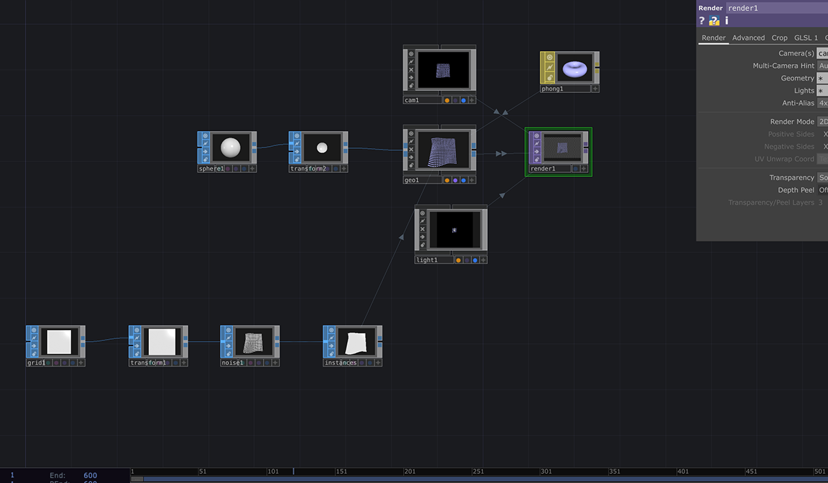
next we did projection mapping, which is used a lot in gallery installations and events like festivals. using touch designer you can place images/ animations onto whatever surface you project on WITH EXACT SHAPES which i thinks really cool and useful. id love to use to to make some kind of real-life collage with loads of moving pictures on different levels of a surface, like a brick/ tile wall with each tile being a different thing :0 we made a cardboard cut out to project onto but we didn't have time to make a projection, hopefully i can finish it some time next week ! ps. there are the artworks i found this week, i love the controlled blurriness of the middle on and the composition of the first and third :)
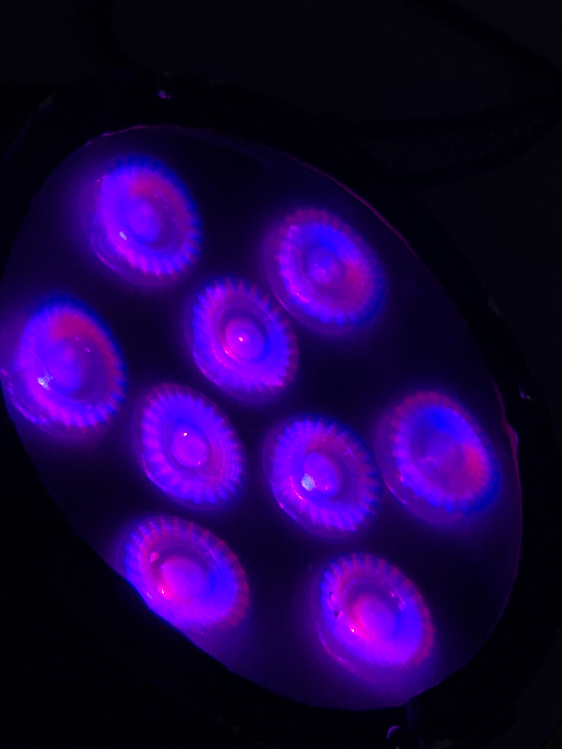
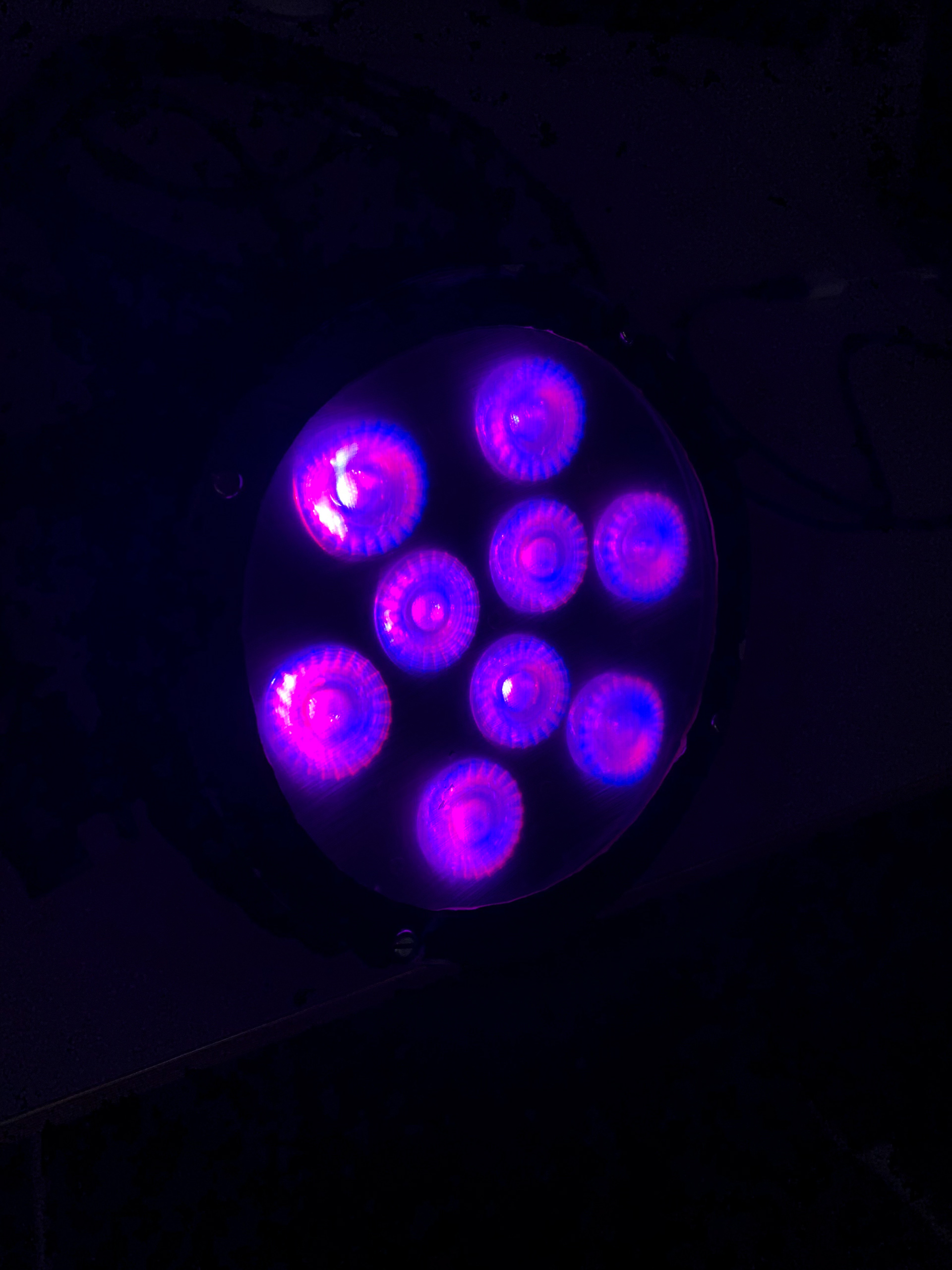
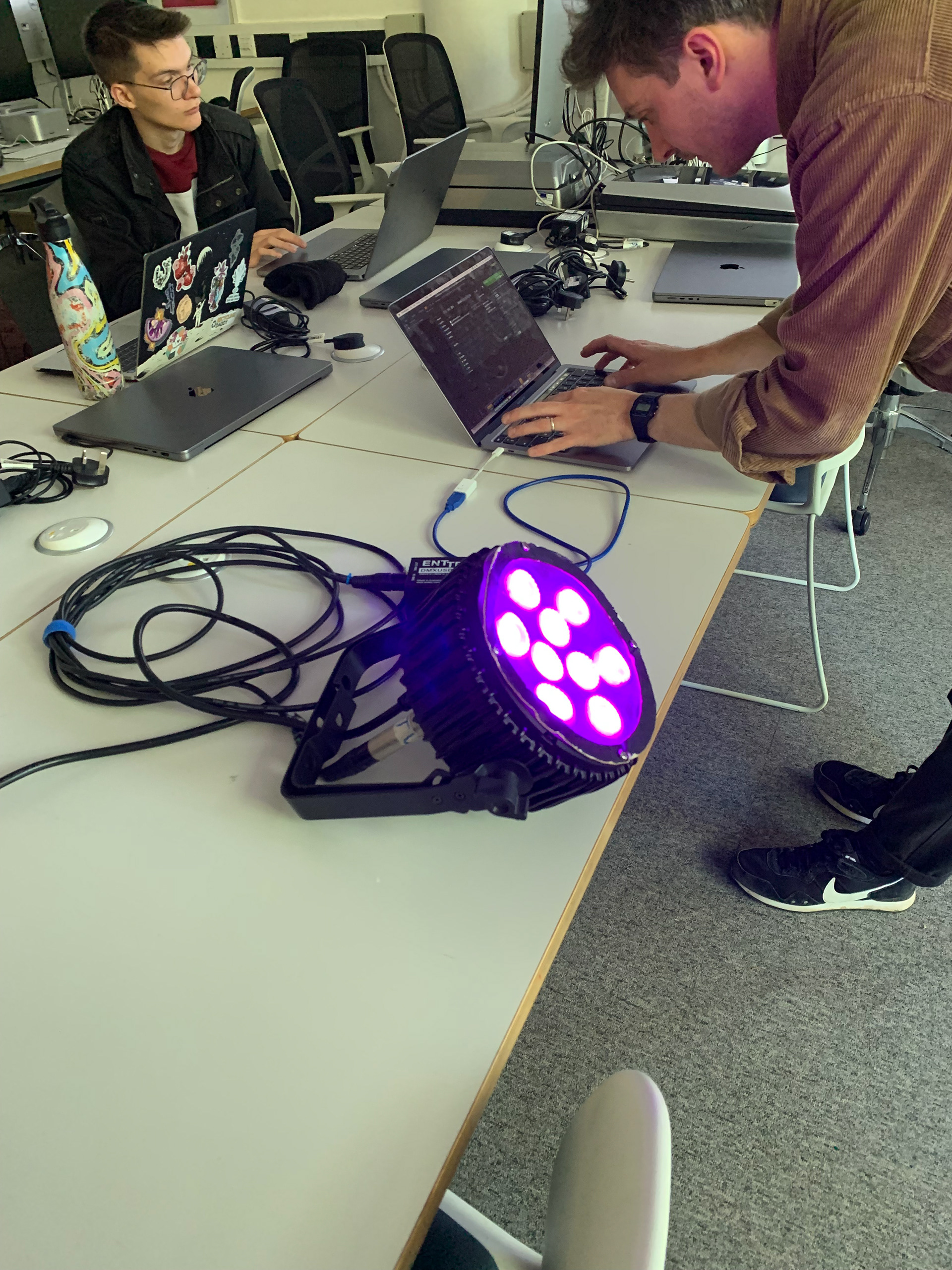
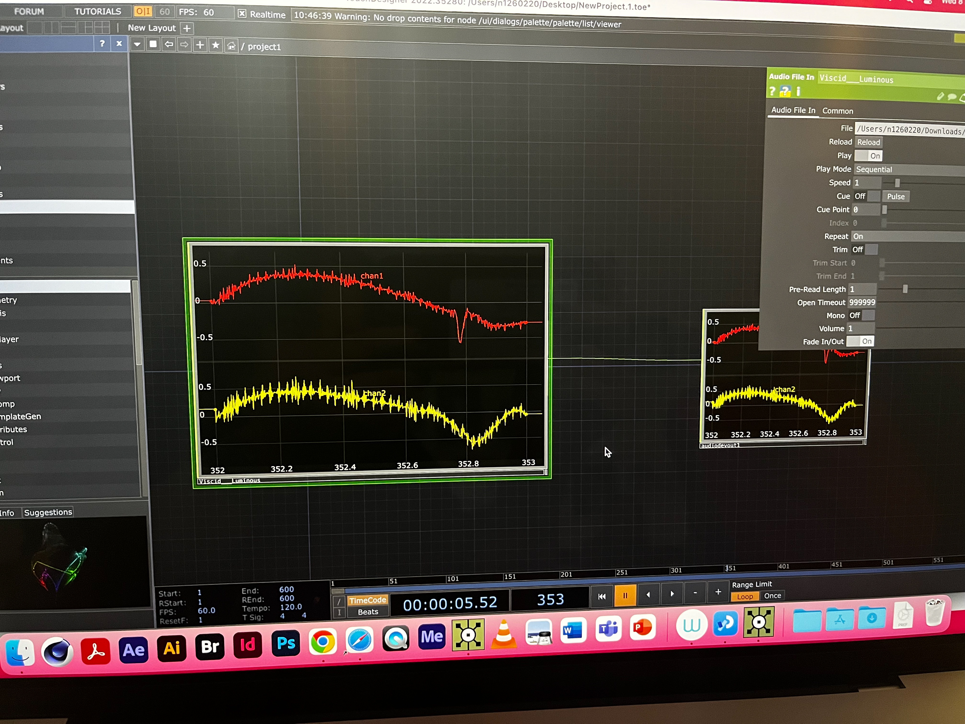
this week we learnt about SOUND REACTIVE VISUALS!!! very exciting!!!!
these are normally used at festivals and concerts (eg. deadmau5, aphex twin) to make the lights and projections react to the music, and its also use a lot in gallery exhibitions. on touch designer you can make your visual to react to any part of a track, such as the bass or the drums. you can even control it using a live microphone, such as in the video above where its reacting to christian speaking.
sound can be broken down into four separate values; frequency(Hz), amplitude, wavelength, and speed. using these four values you can create sound patterns! for example, an oscilloscope is a tool that uses hertz to measure and display frequency (like an ECG) and Jerobeam Fenderson uses this to draw with sound. they create repeating patterns and shapes by controlling the hertz of the sounds that feed into the oscilloscope. the video underneath is literally a zoomed in shot of the oscilloscope screen.
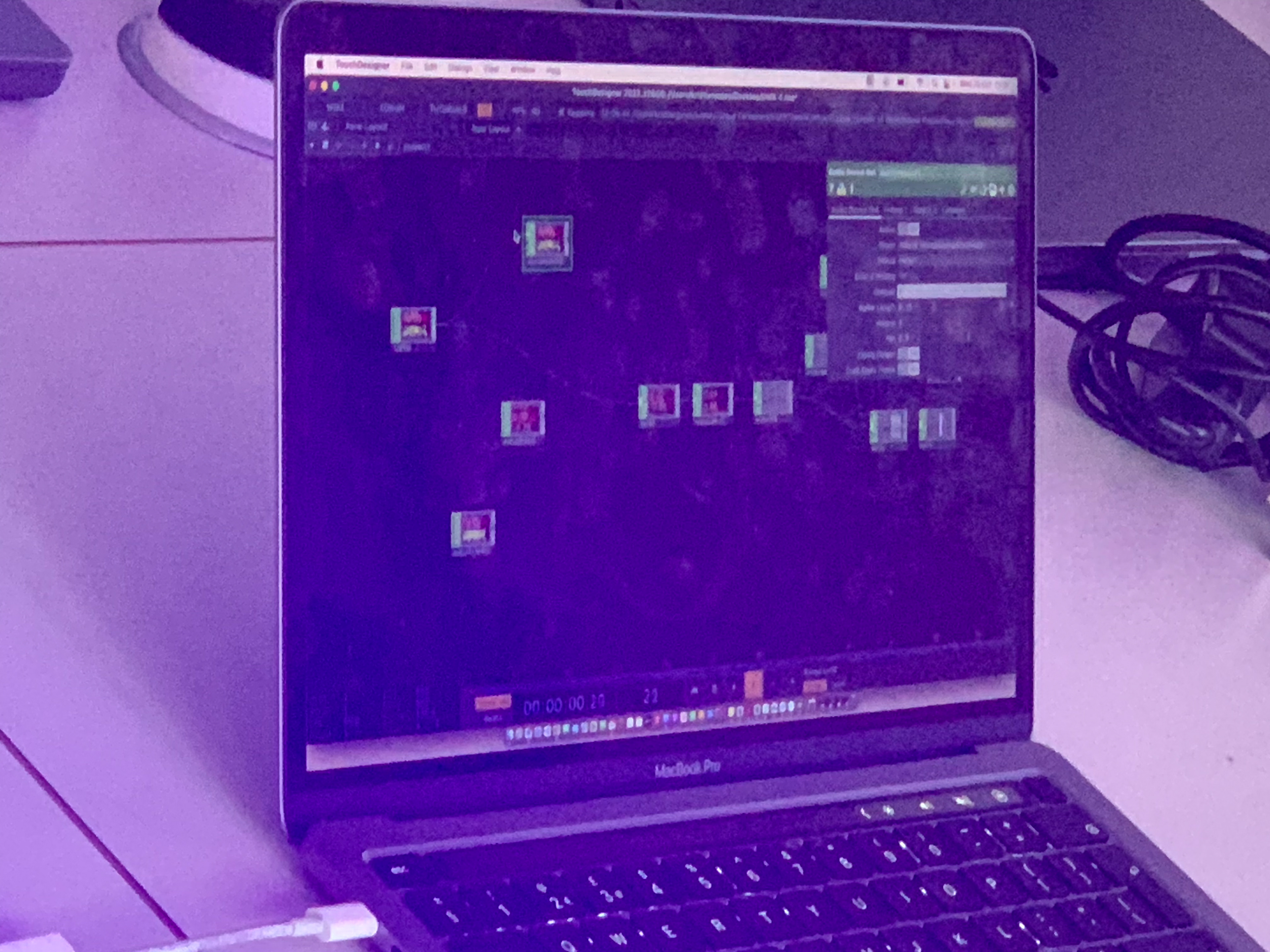
had our first go on Touch Designer! i cannot explain how much easier this is compared to Processing, being able to piece everything together VISUALLY is making a massive difference i how i understand everything. Me and Jas had a go at putting together some sound-reactive code and its starting to look like some of the artwork that i've been finding and enjoying so i'm very happy. i think this is going to be really useful for my illustration work and i even used the blobs and how the light reflects off them as inspiration for a little animation i did! i cannot WAIT until i have some free time to book out one of the laptops and see how it reacts to speech as im planning on doing some interviews for my project :)
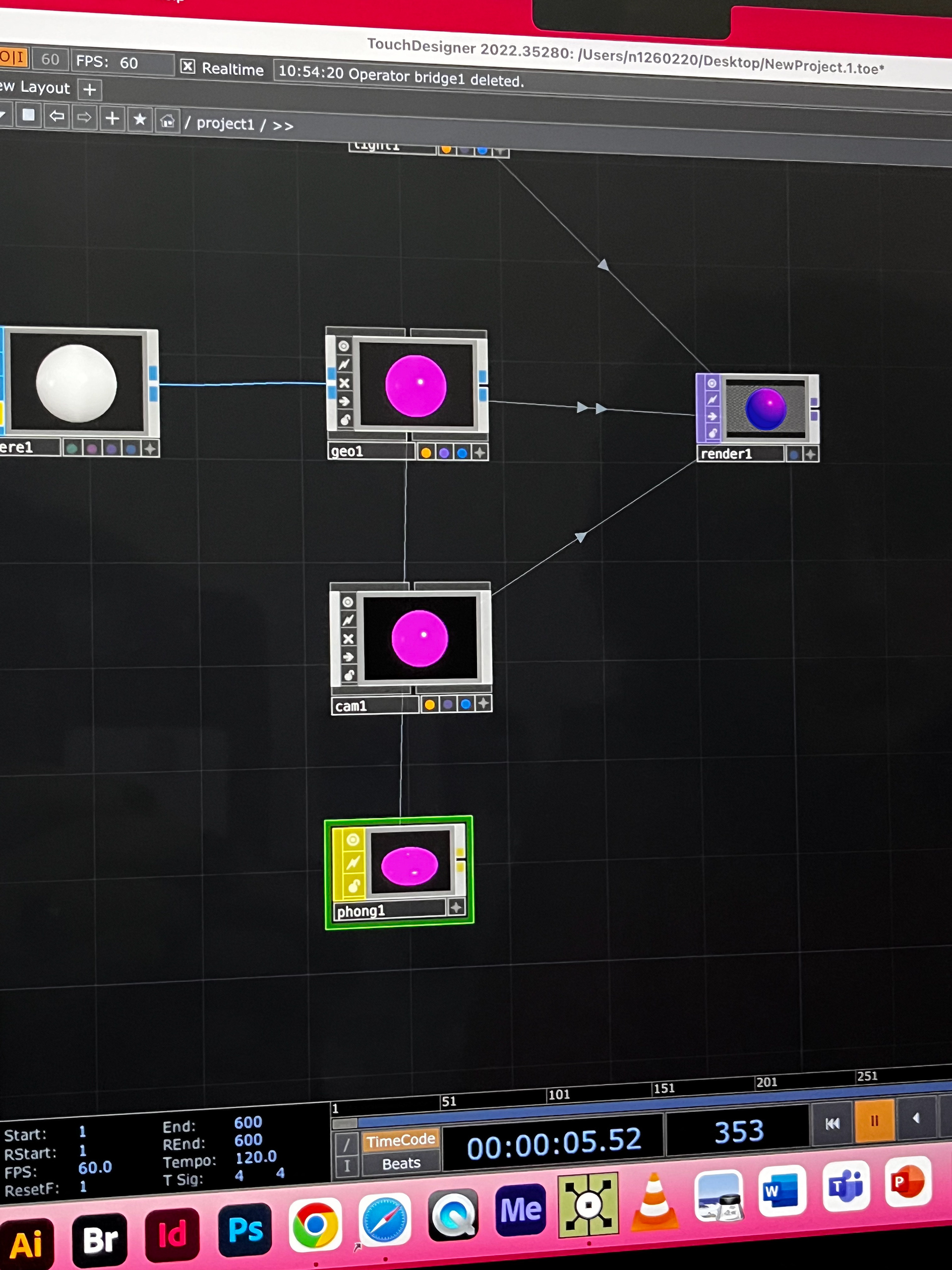
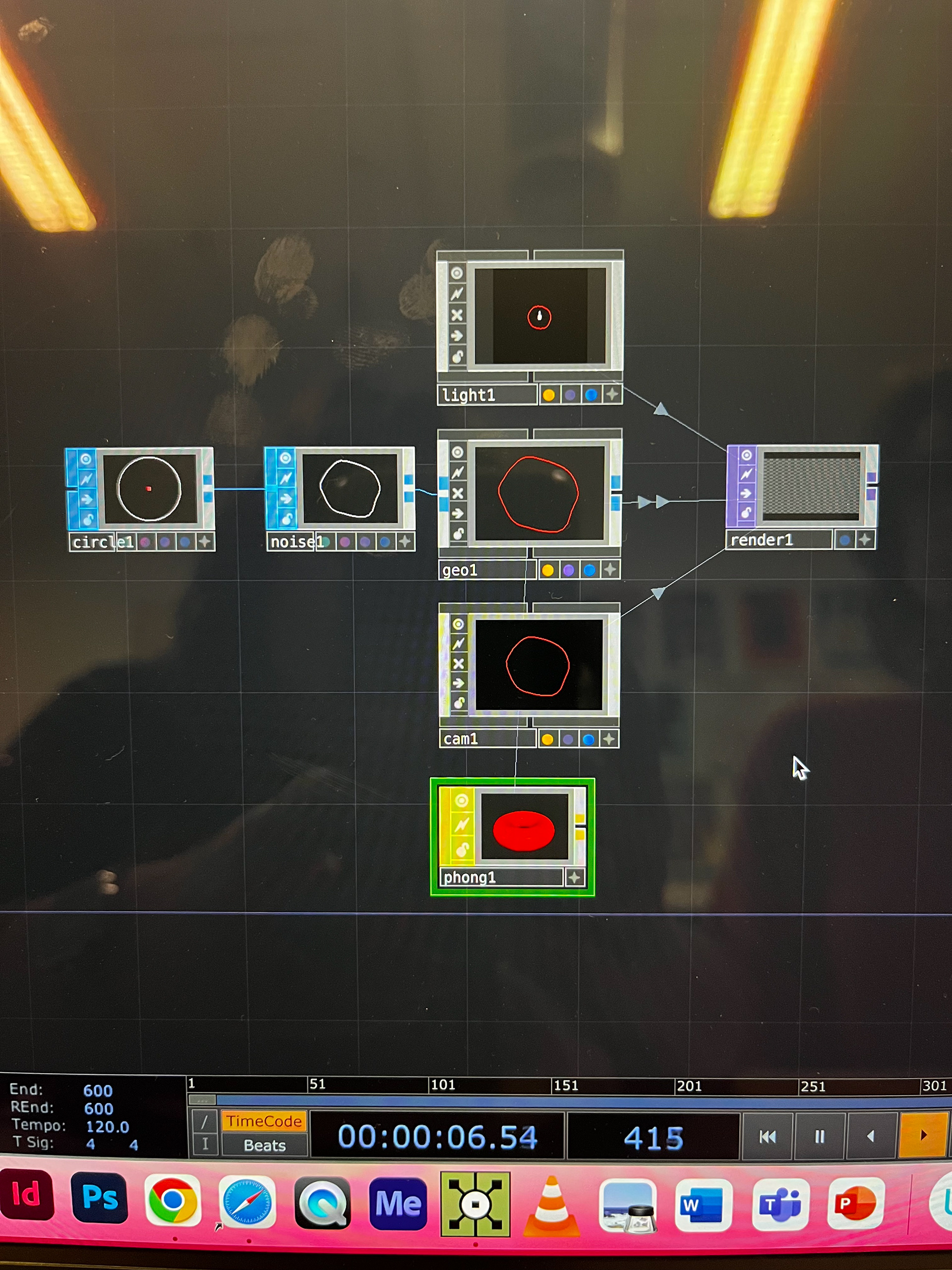
below is the animation i made! my project is aimed at mothers and daughters so i made something that i feel represented that and how daughters are different to their mothers but you feel like you will always carry part of your mum through your life.
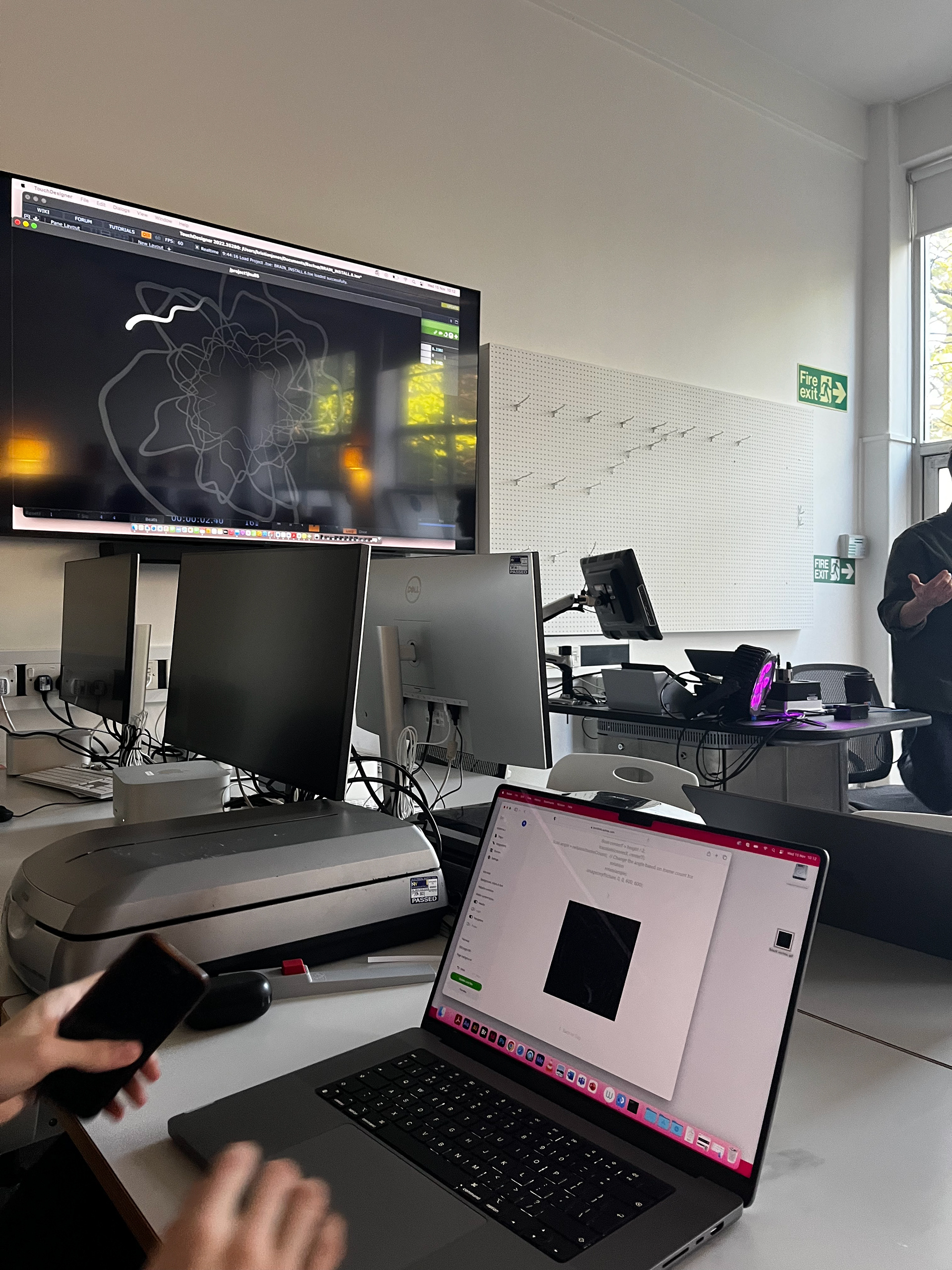
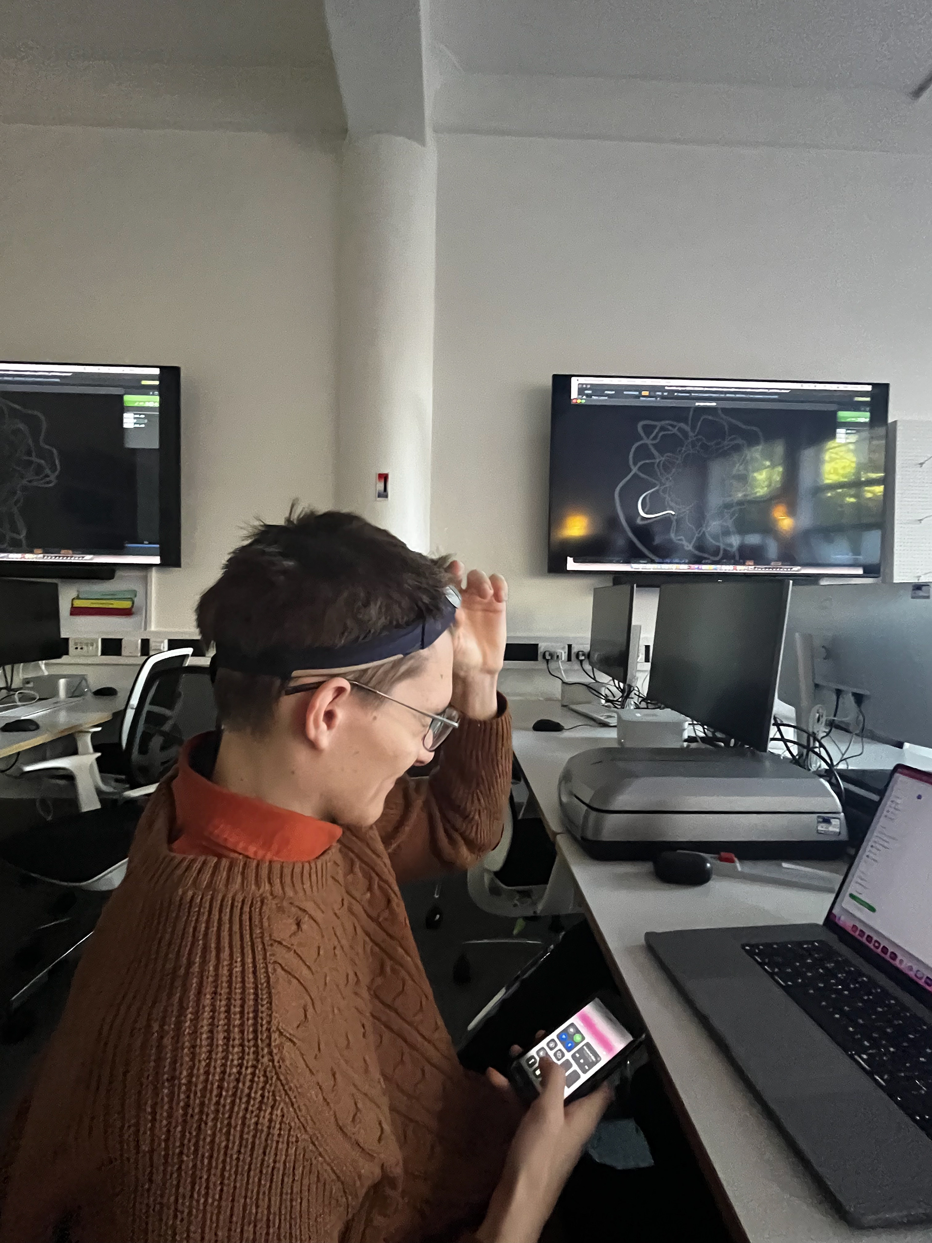
last week when i came into 205 sam had a new headband on didn't want to question it incase he was exploring fashion and the magic of headbands however it was a coding thing. christian has linked the meditation headband that sam was wearing to touch designer, and whenever sam concentrated the line would move closer to the centre of the circle, when he lost concentration the line would stray from the centre. the headband is a electroencephalogram that measures electrical activity and records it in number, which means you can then chuck these numbers into touch designer and visualise them.
very cool very science fiction. would be cool to look at how different your brain waves are compared to your speech patterns in terms of the blobs.
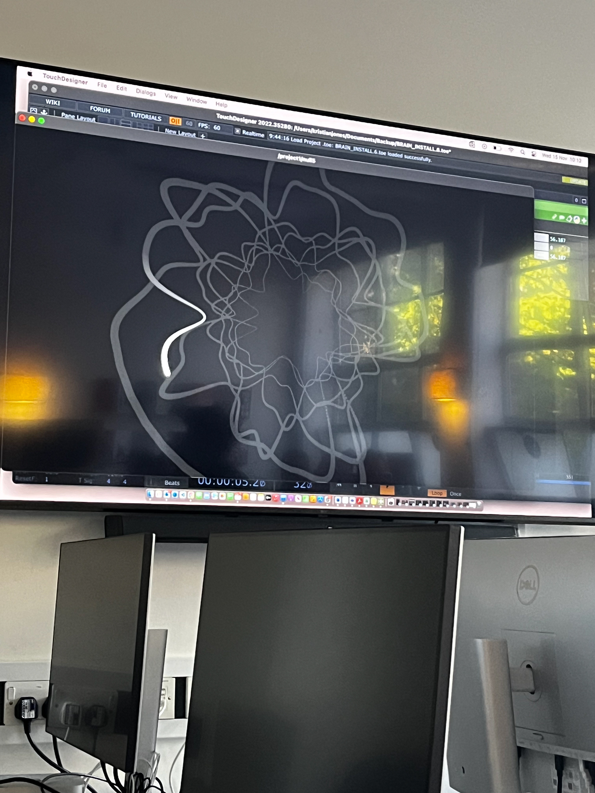
today we messed around with touch designer and it was GREAT fun we altered live videos, we made some really cool moving dots that looked like a flock of birds that reacted to sound and to the movement of your mouse, and me made a little mouse control dot line which is my favourite because of the texture and the colour changes :) a lot of touch designer is learning what matches with what and exploring how things are affected by the numbers you input into them (sound, light, data).
for the exhibition i'm thinking of being AMBITIOUS and using touch designer to make a flash sheet so i can TATTOO THEM ON PEOPLE!!!! no way wow so cool :0 i know that some simple vector drawings, or ones similar to what the oscilloscope makes, would do really well as tattoos and i reckon i could get at least 4 whole people to get the designs but i will work on that lol. i will rally the troops on instagram. the 3rd artwork below is a music visualisation, which i'm not sure if actually counts as generative art but its really cool anyways. i wonder if i could get people to send in a song they love and me feed it into touch designer to make a flash design, and then i could tattoo it. all a very loosey-goosey plan at the moment so i will figure out the logistics of it :)
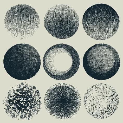
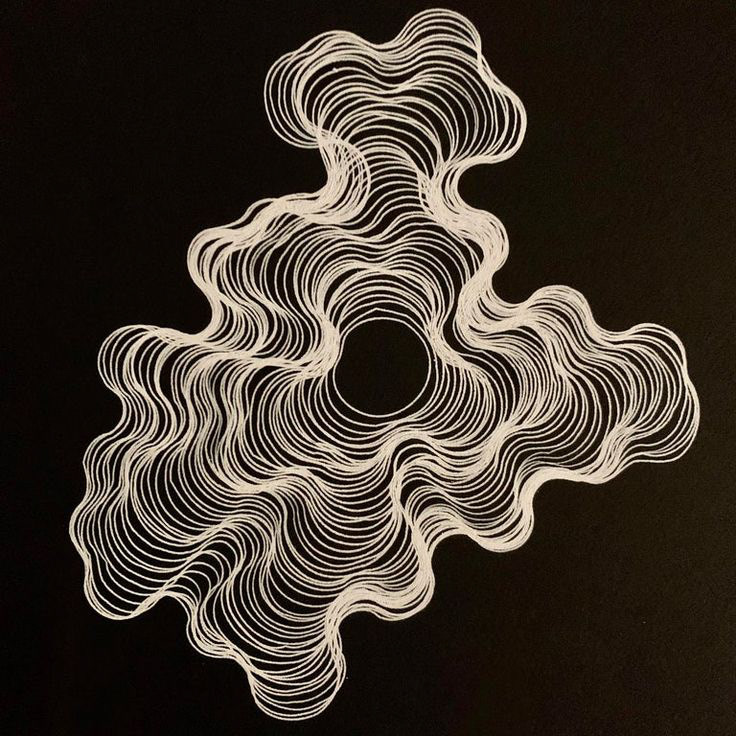
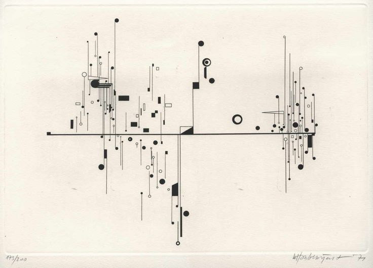
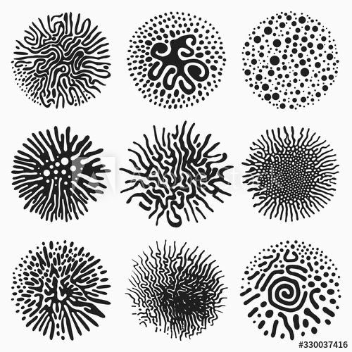
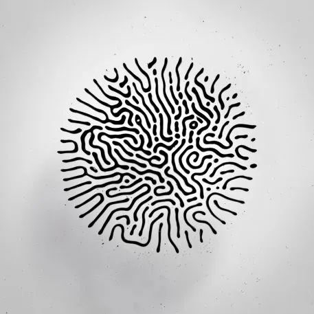
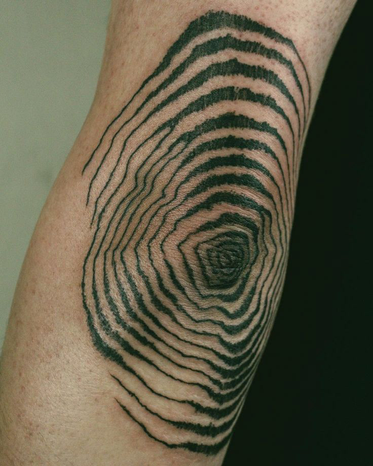
week 8 adding texture
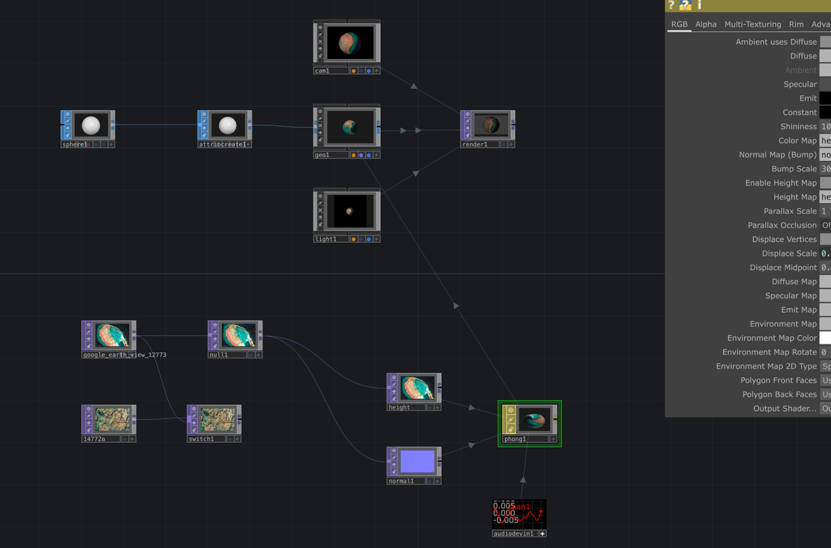
this week we experimented with adding textures to the moving blobs from a couple weeks ago, i feel like this is something that could be really useful to me in terms of tattoo design and for my Amplify animation!
i also think its a lovely way to make references for planets too, and i think it would be nice to make a texture with traditional materials, scan it in, and turn it into a texture on a sound-reactive visual. i also liked the words rotating the centre i think it would make for a great digital poster!
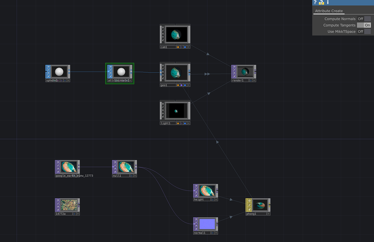
dark room day :)
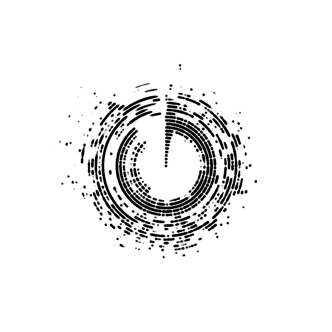
today started building the code for my first attempt at a audio visual wheel! i found this tutorial really useful as a starting point for my designs and they explained everything in a way that i understood despite this video covering a few things i didn't already know. this was my first outcome using the song Don't Delete The Kisses- Wolf Alice, if you can listen to the song you can see how the numbers extracted from the beat/vocals/bass and how they've affected the visuals (especially the synth right at the start and how its a perfect wave !!)
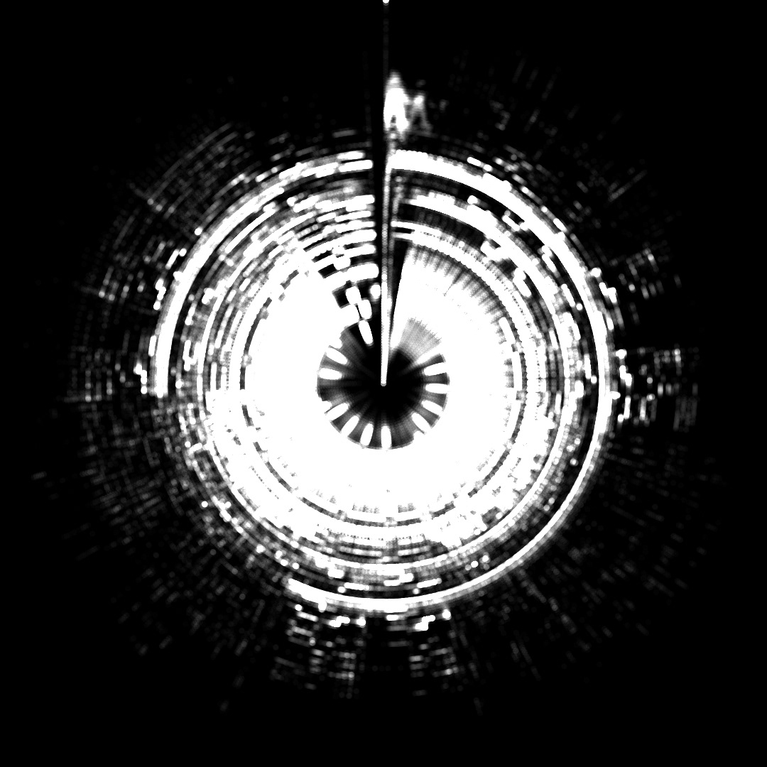
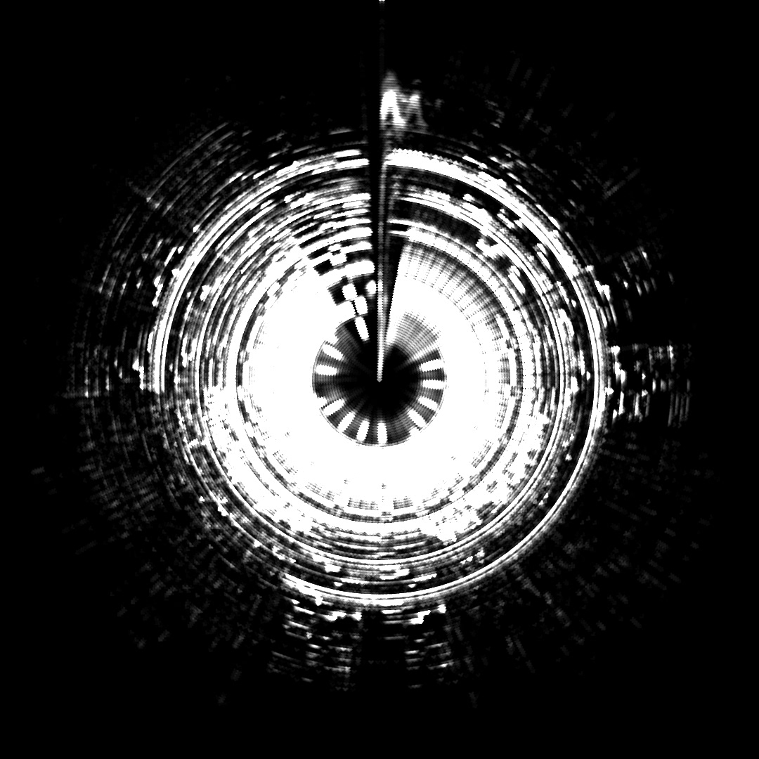
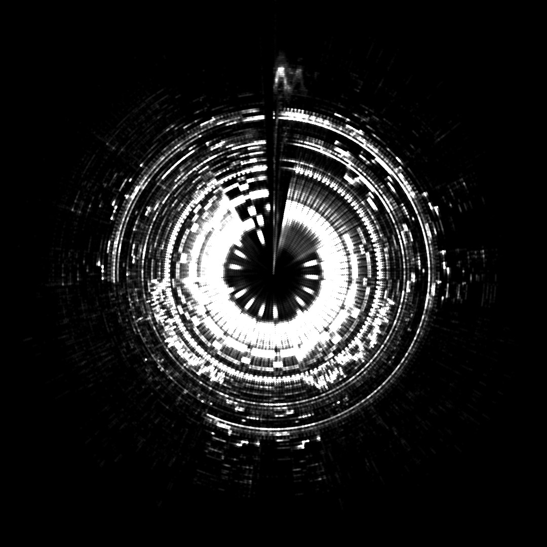
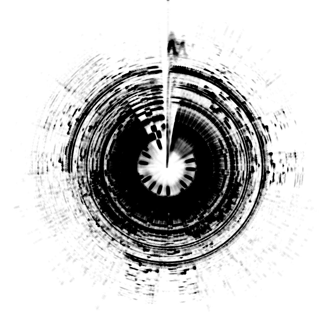
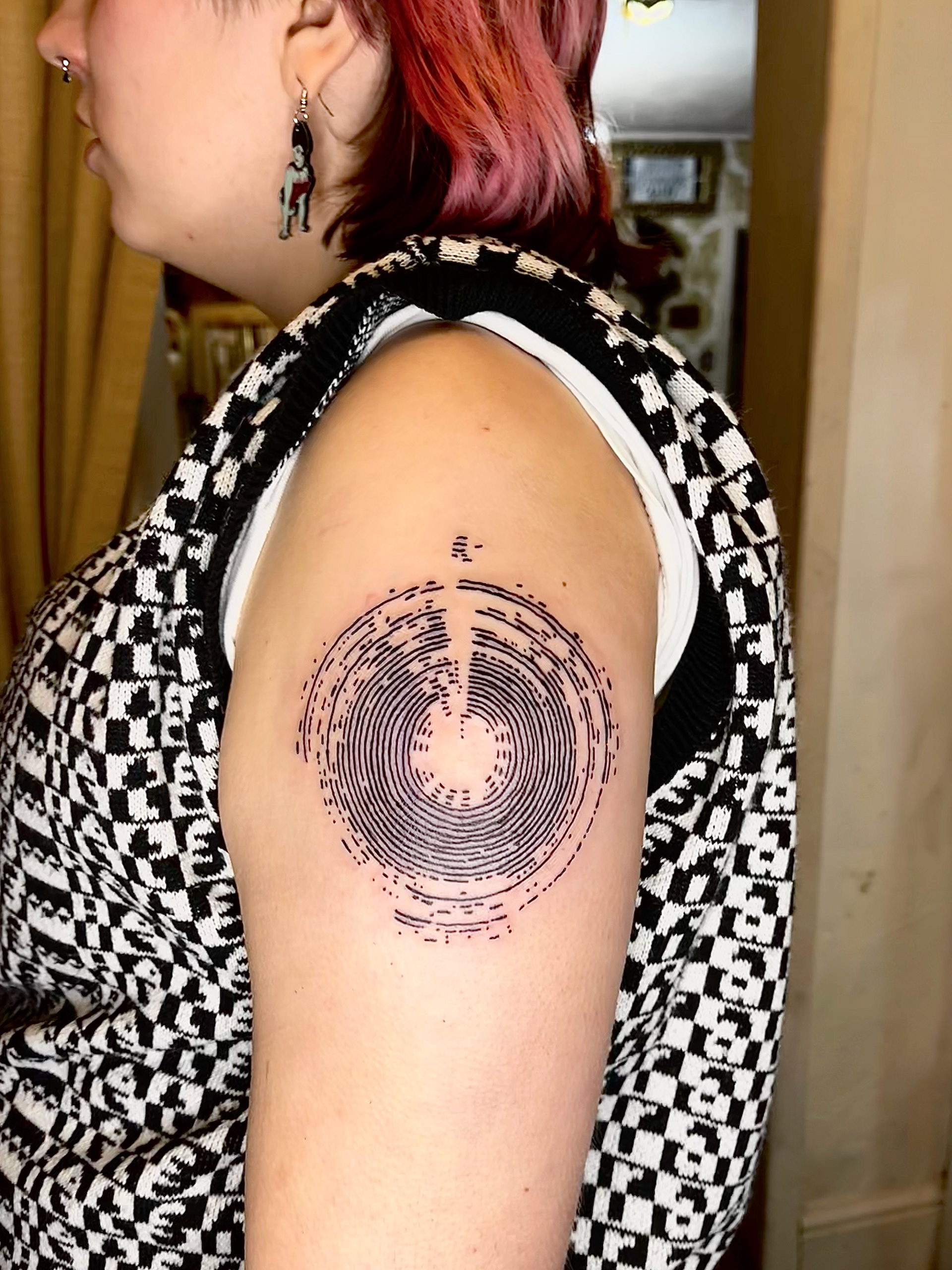
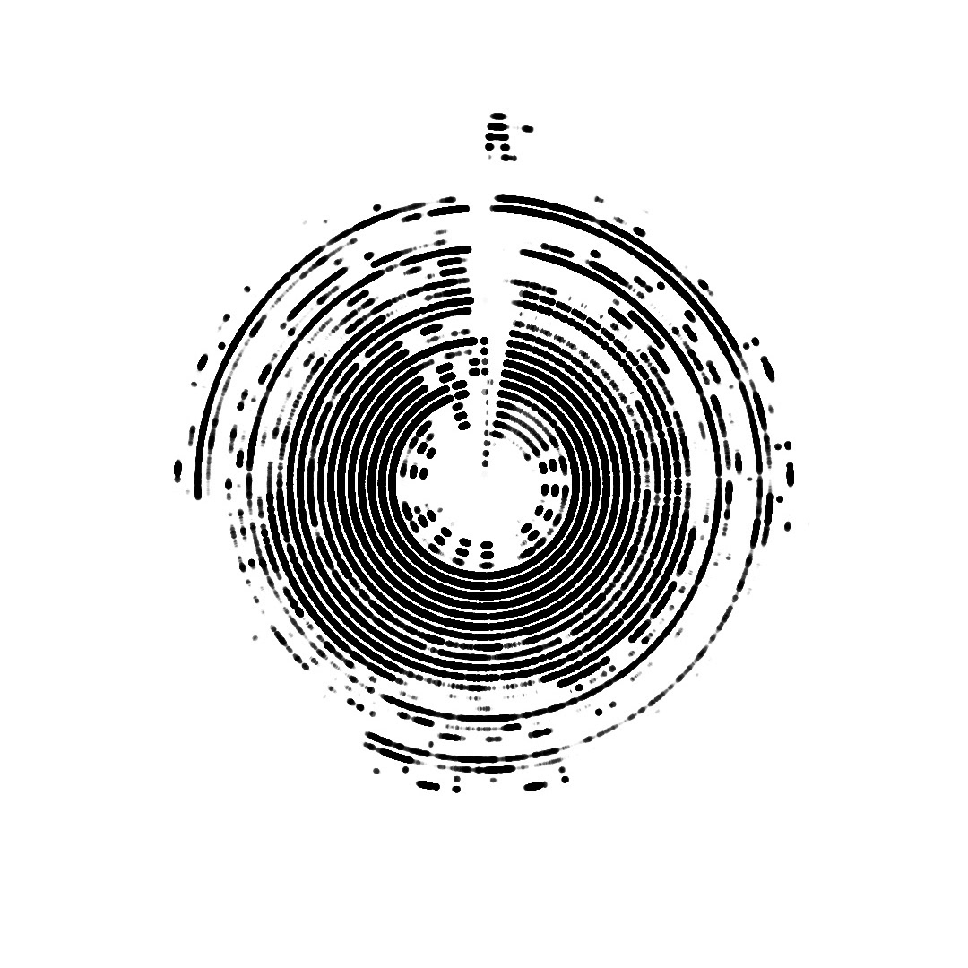
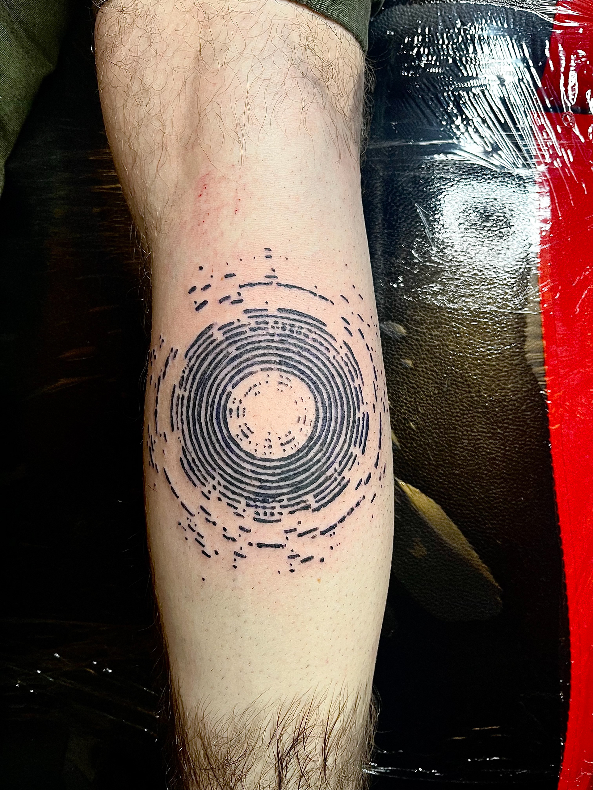
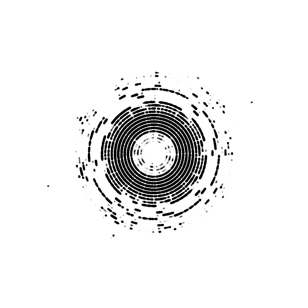
once i had the base code i could play around with it :) here i was trying to find the ideal line thickness that would translate best as a tattoo while still trying to keep as much detail as possible. i needed to eliminate all the really fine lines within the main outline so it could be stencilled easier. the final one worked best for this so i chucked it into photoshop to invert it and remove the mid tones.
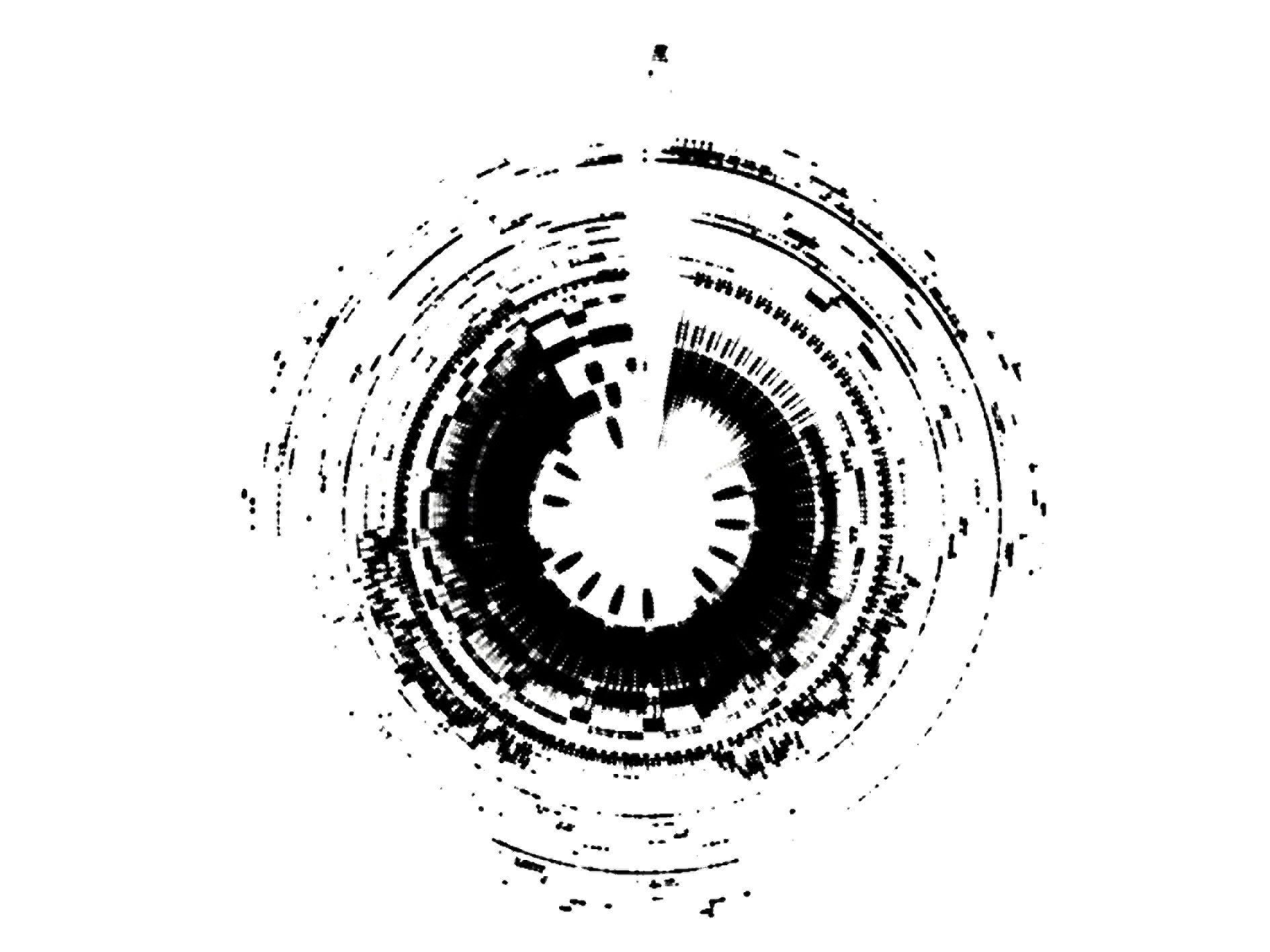
this outcome didn't have the consistency of line that i wanted. i wanting some CHUNKY lines so i went back in touch designer and messed about a bit more. i found that if i made the wheel draw with lots of close together spheres rather than with a line i got a much thicker consistent line.
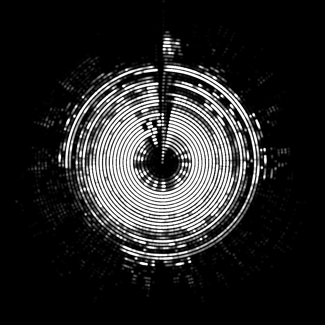

below is a video showing the code in action! its a pretty long video but i LOVE watching the wheel go round and i think its interesting to watch how the bass/vocals/synth is interpreted in the pattern.
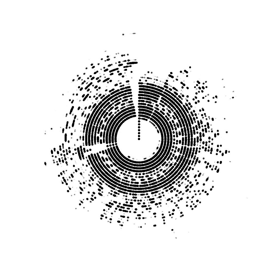
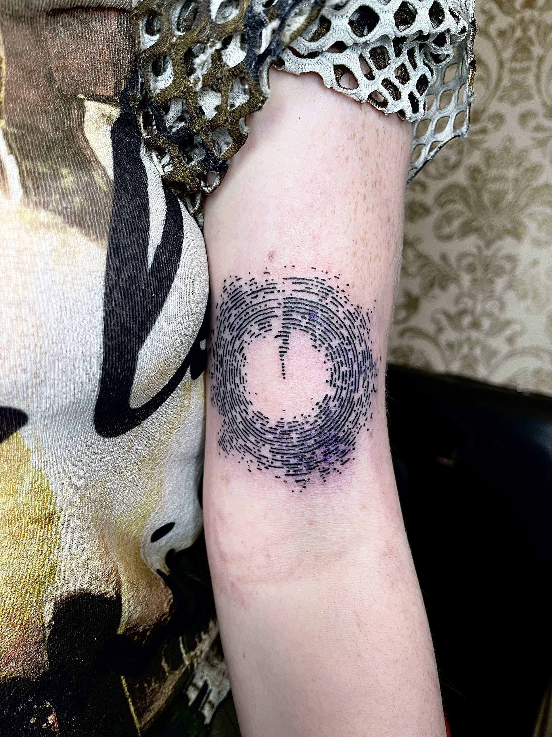
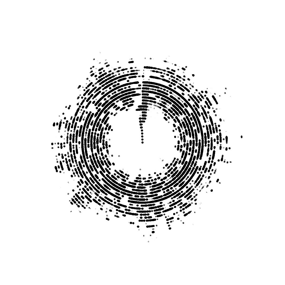
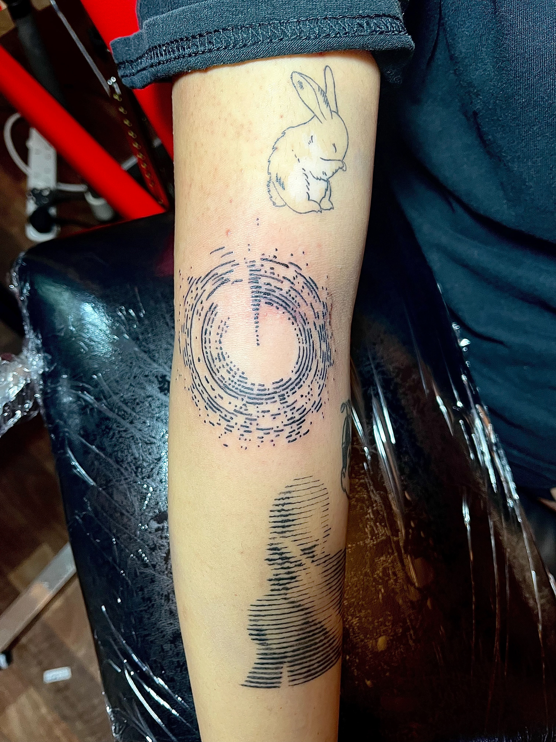
using spheres instead of line gave me a much easier design to tattoo as i know this would be MUCH easier to stencil up. i further simplified the design by limiting the range of data being drawn from the audio, so it meant less lines but the finer details were visible. i did also try using rectangles instead of spheres but this outcome was more angular so didn't have the smooth tree-ring look i was aiming for. now i was happy with the outcome i made some mock-ups to show placement ideas and a couple other examples to display for different styles of song (acoustic compared to electric-based) and i posted it up on instagram!!!

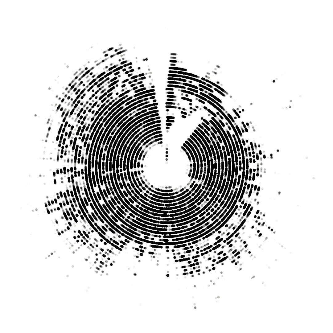
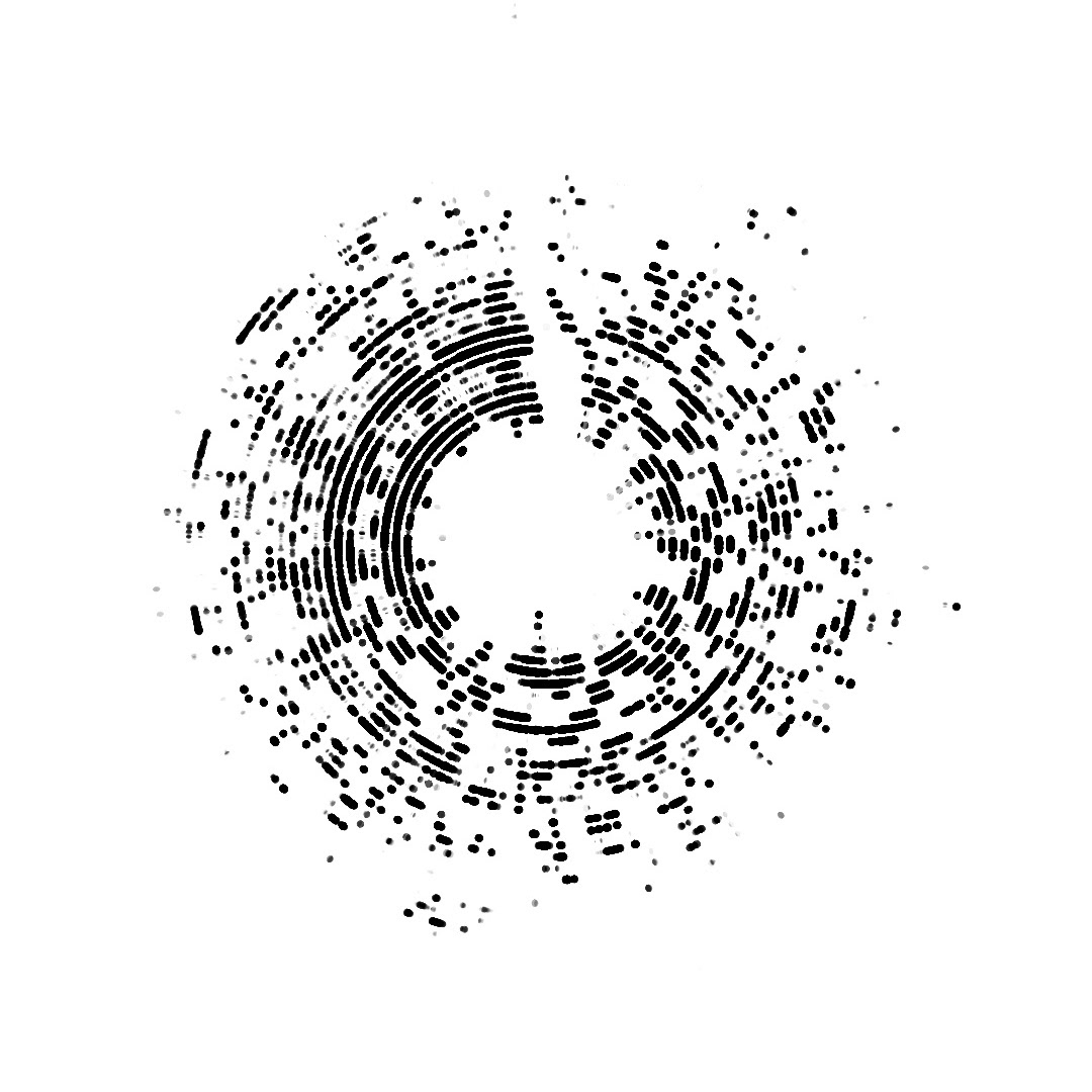
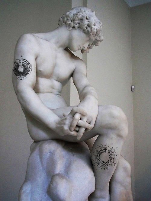
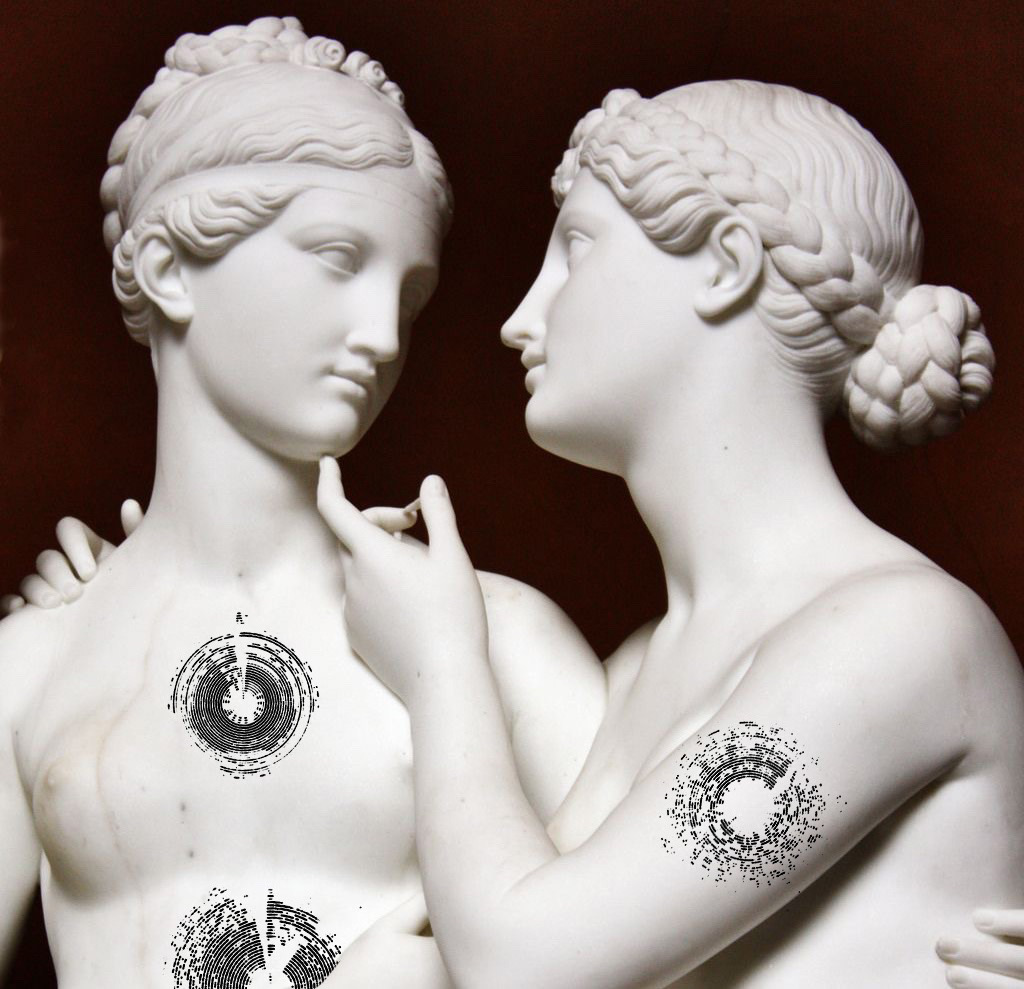
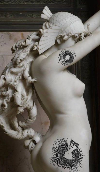
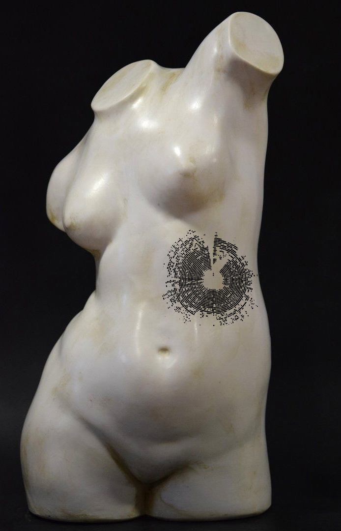
you can check my instagram to see the original post, i did very well in terms of my normal flash drops!!! i think because it's customisable and abstract it did a lot better than my standard flash that are illustrative style. also there aren't many people midlands-based that do audio visual tattoos so more people are willing to travel to me!
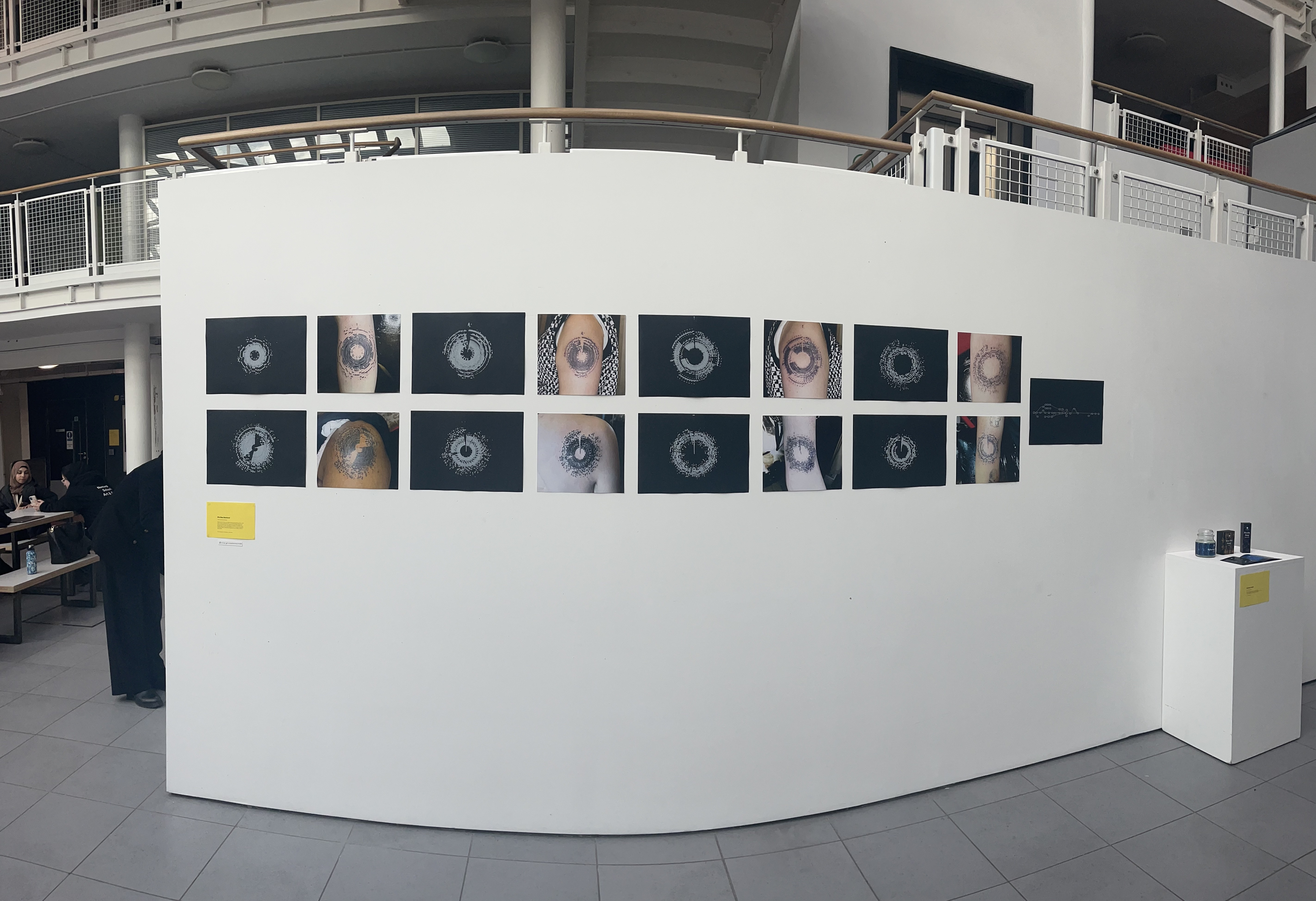
below are all the code designs i got done before the 17th, when i printed off everything for the exhibition, but i have about 6 more left to do this month !!! i'm going to keep these designs on offer after the course is finished because people seem to like them and their very relaxing for me to tattoo because its easy just tracing the stencil. it makes me feel like a laser cutter.
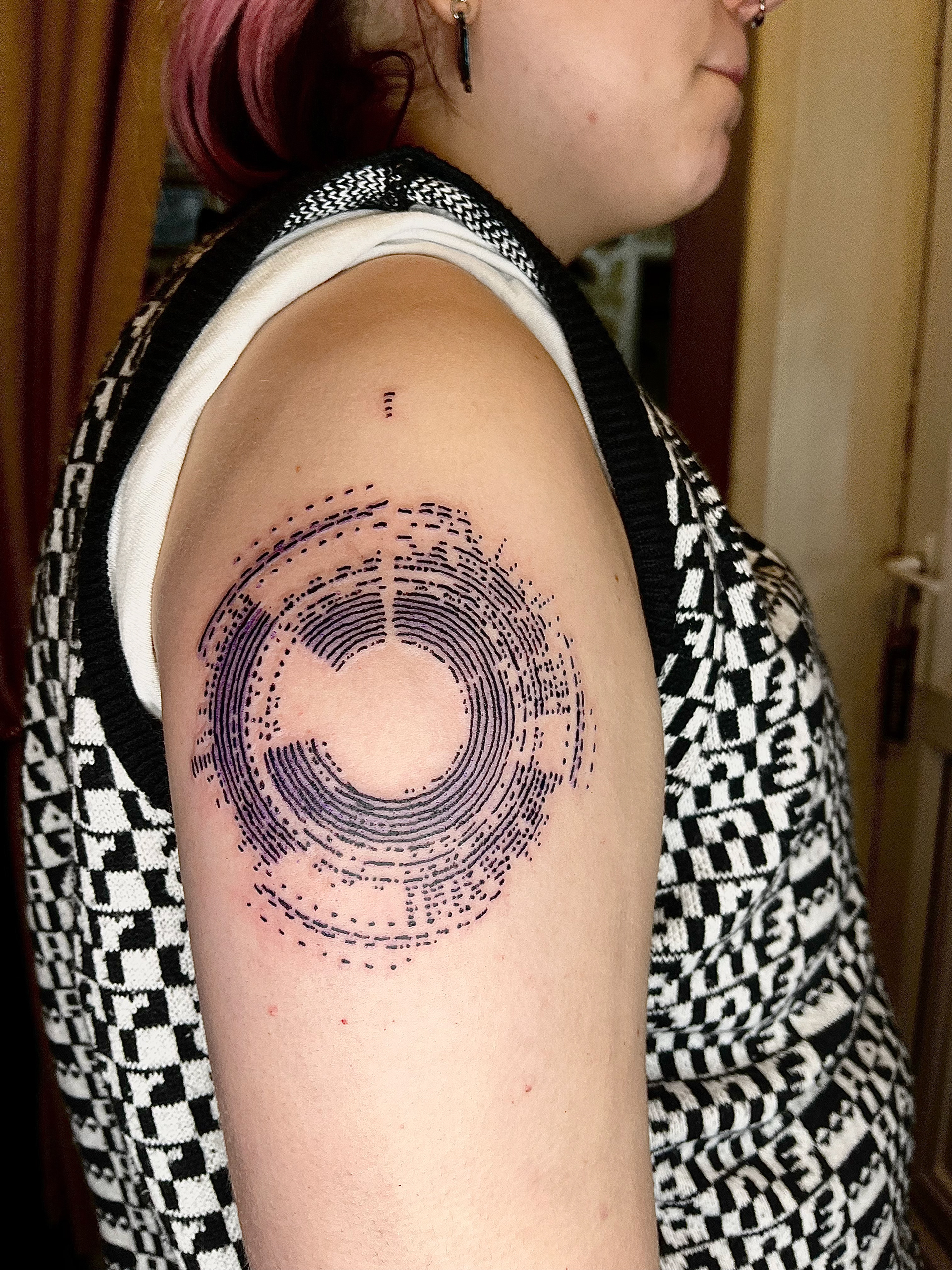
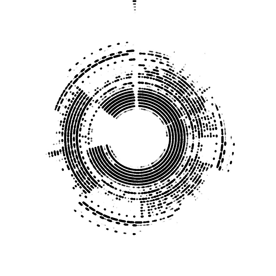
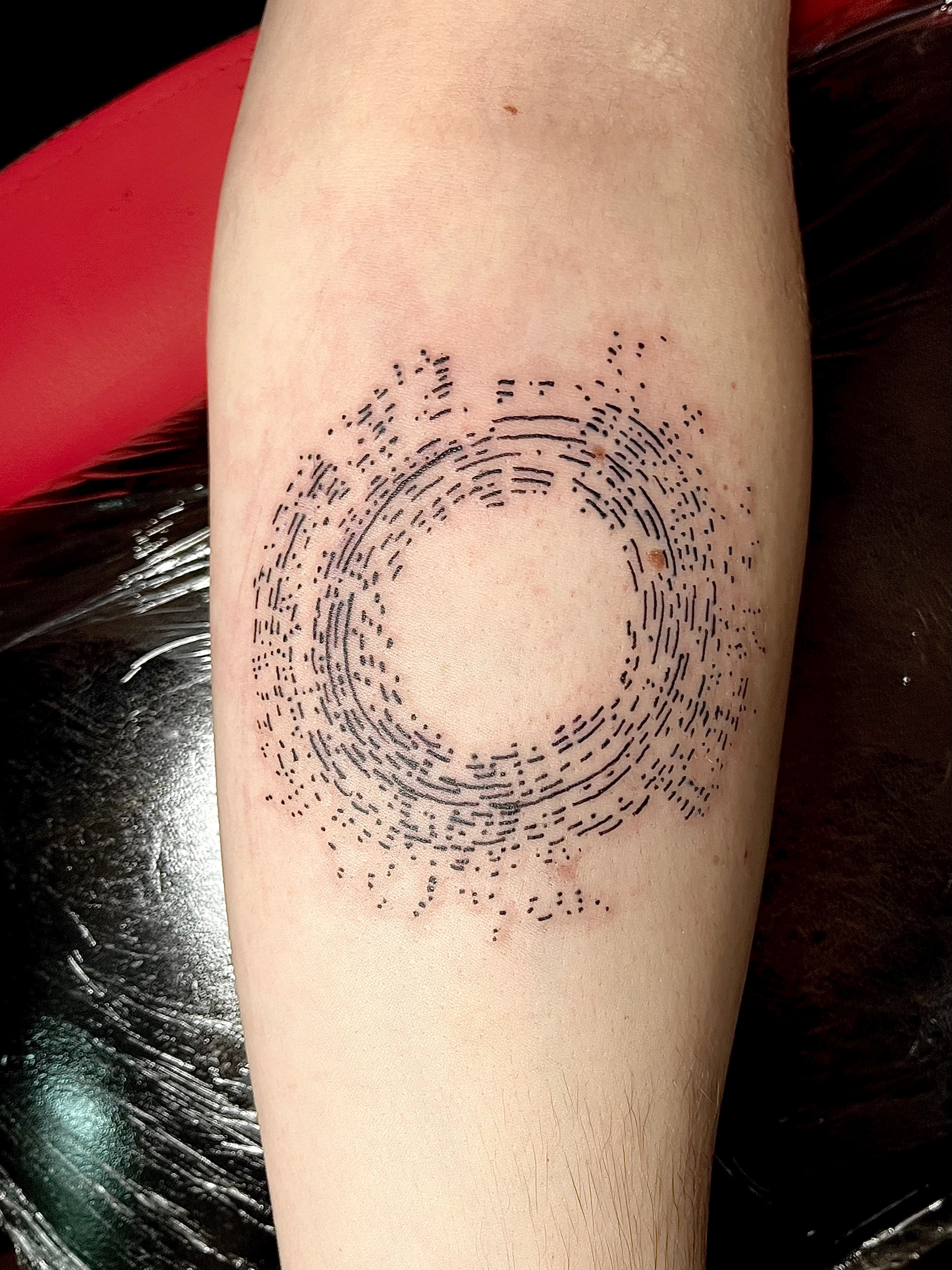
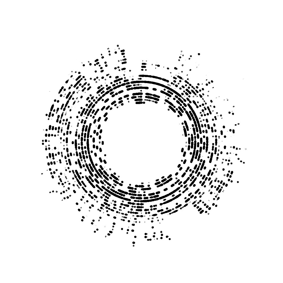
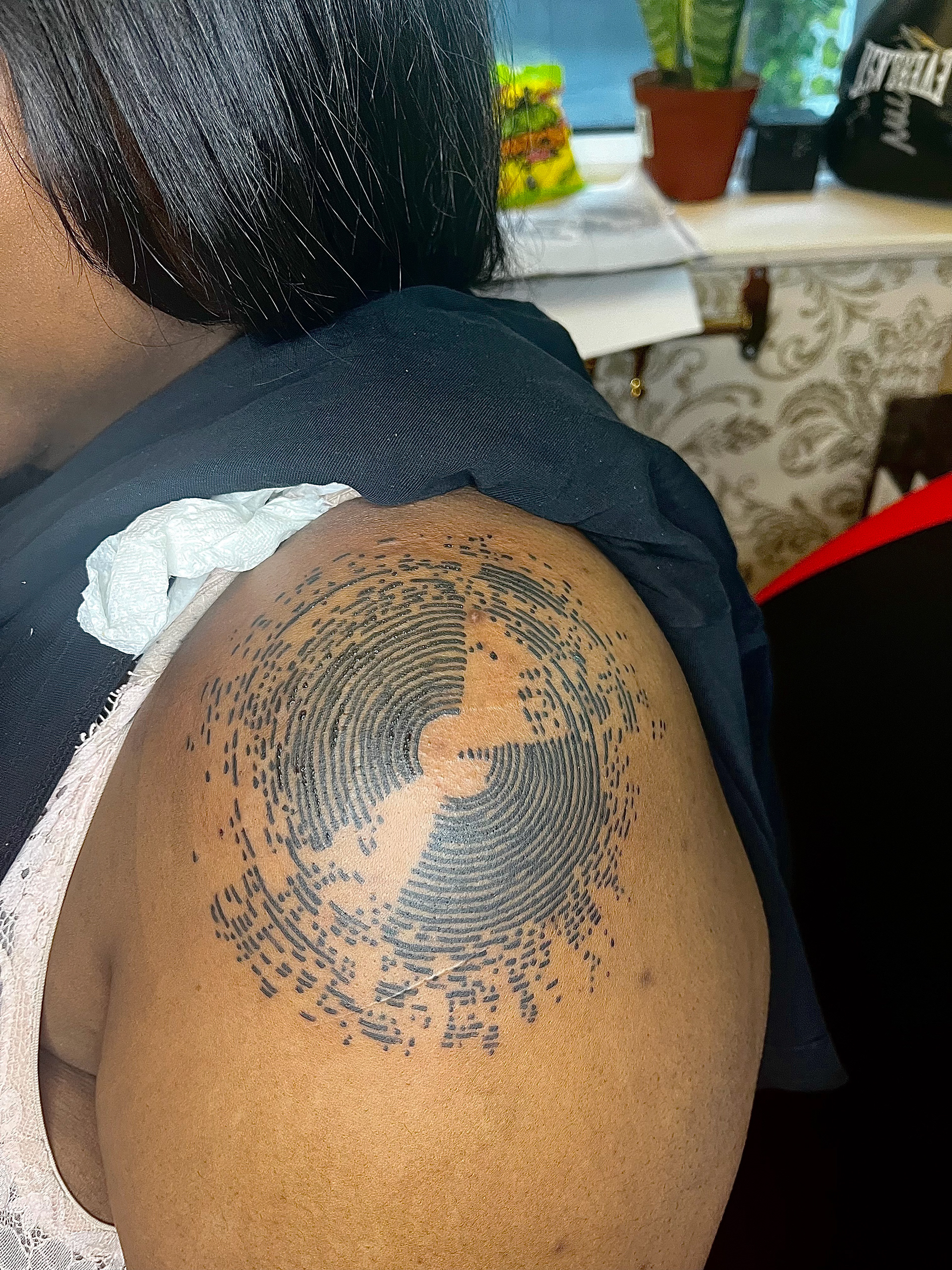

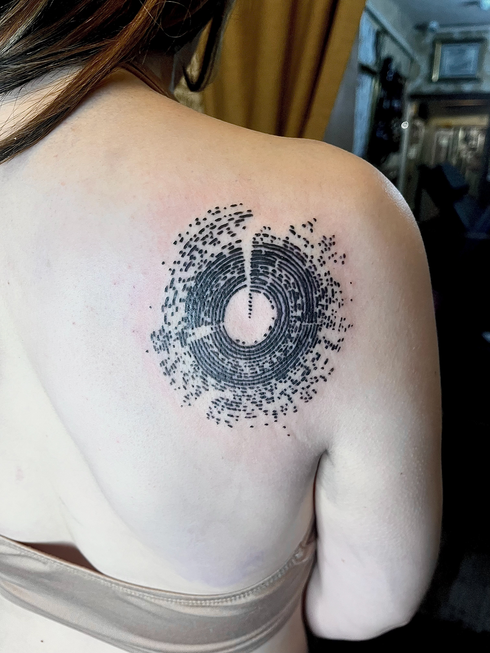
below is the exhibition we ran!!! i had loads of fun and it was my first time using the print hub in bonington to print the white ink on black, to mimic how the design looks when i pop it out of TouchDesigner. it was lovely to see everything displayed and my mum and dad came to have a look i was very proud they bought me a piece of cake as a well done it was bloody lovely. i also got to talk to new people about my project and i ALWAYS love talking about tattooing as you can imagine so it was a great day for me !!!
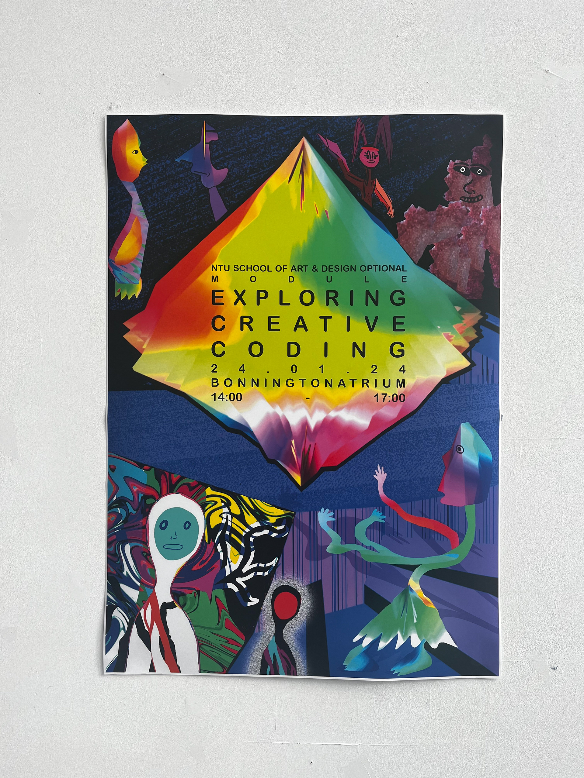
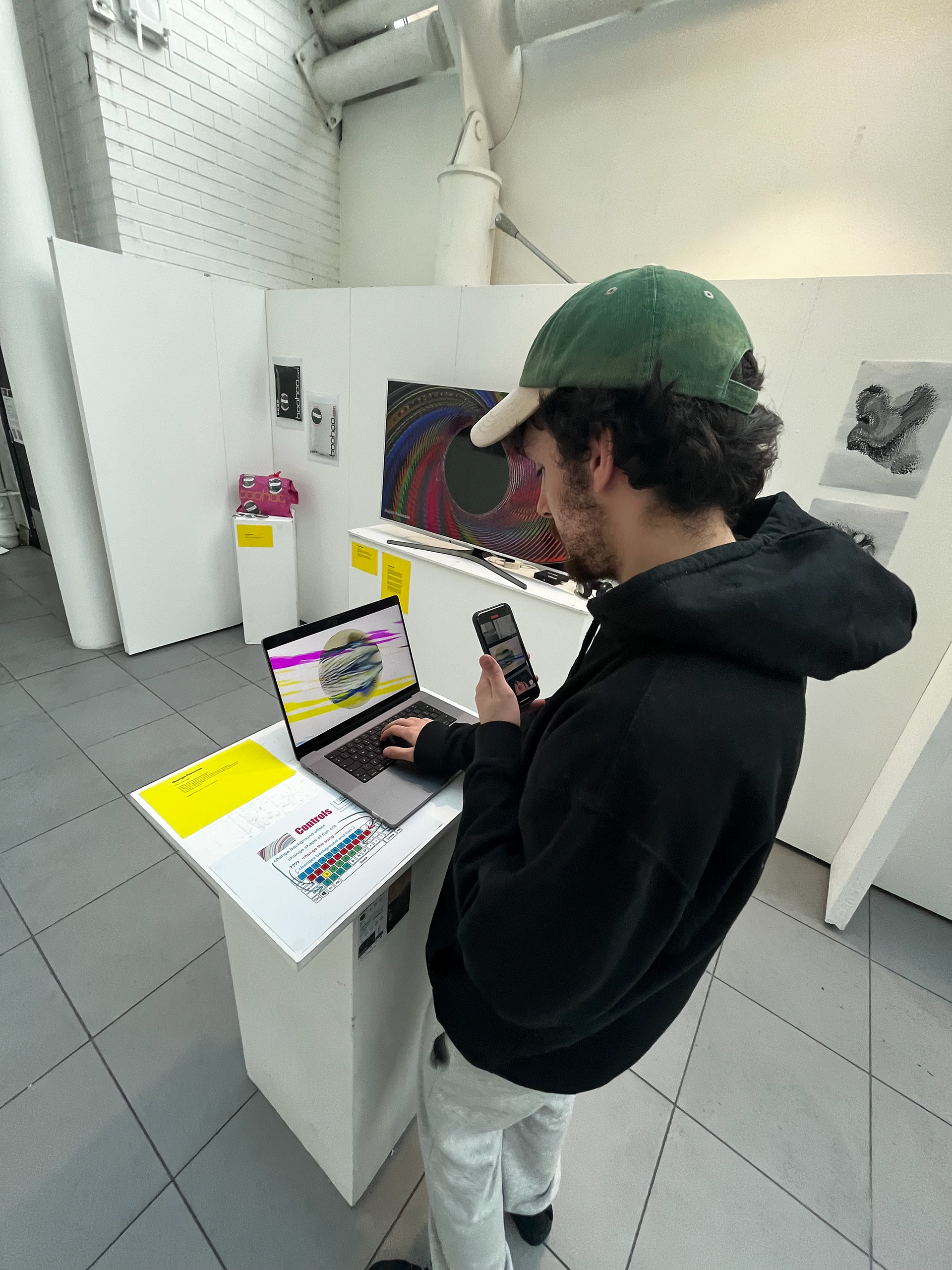
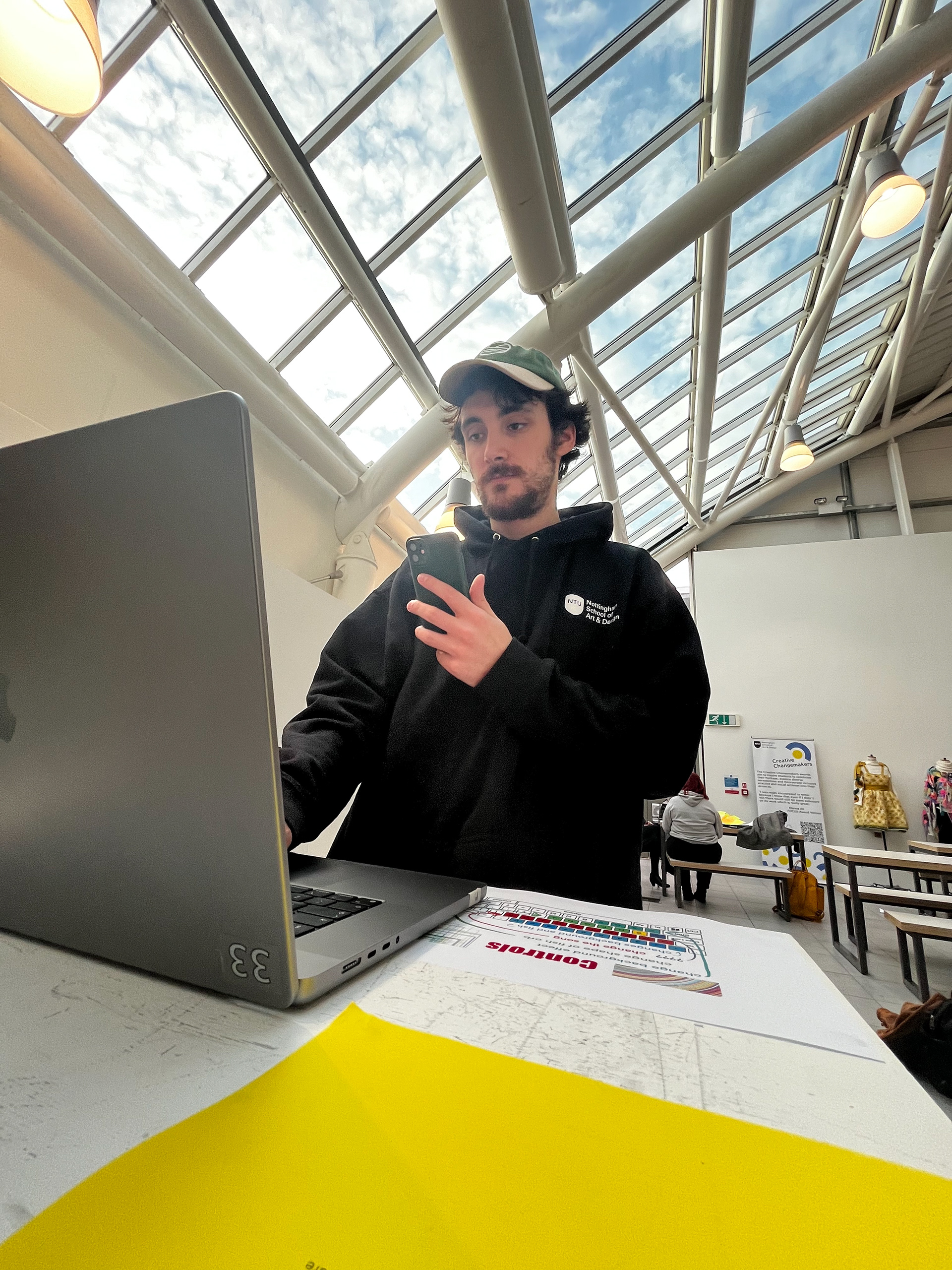
i've had THE BEST TIME doing this module and i can't wait to do more with coding in illustration and in my career! also its massively helped me grow my portfolio at work and i've become quite well known for these designs now so all in all it was a good choice of optional module for me :)
