i got the Joe Kessler brief HORRAY!!!! it was my first choice because i am a little bit obsessed with his books so i am very very very excited to start this project. during the briefing were Joe was talking us through the book he's working on right now, i KNEW i was going to pick that brief and straight away my brain went to a daydream i had when i was 14 and on holiday on the coast of Italy . i was a really miserable 14 year old and i'd daydream of having big bird wings and flying around cliffs and sea and i'd feel free and happy.
i did brainstorm lots of other ideas that i wanted to do, one being based off the god-entity at the end of an online-horror story called 'The Left-Right Game' and him coming the the village where i live and befriending a blind women, and a couple others about cells in oranges and fun stuff like that. i talked to luke and my tutor group and we though the bird dream is the simplest idea that i can put the most meaning into!


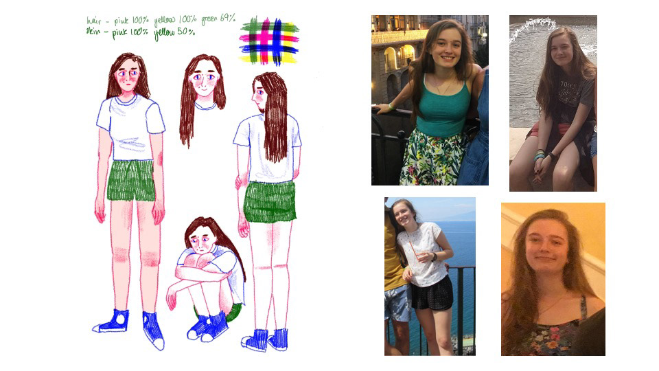
here i am on the holiday in question! i had just turned 14 and i was NOT having a good time at school or in my head. it's also that terrible age where your mum still has some control over what you wore, especially on holiday, and this was during my emo phase so i was MISERABLE wearing tropical-print shorts. i wish i could go back now and give myself a big hug because ages 11-18 were a tricky time bless teenage ella.
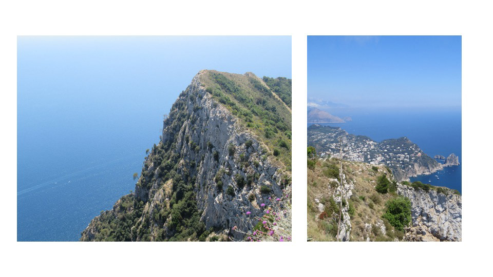
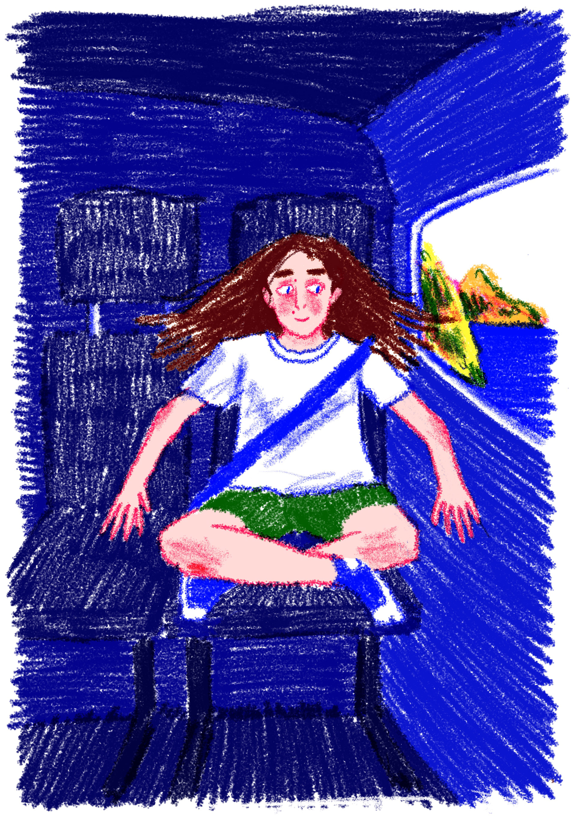
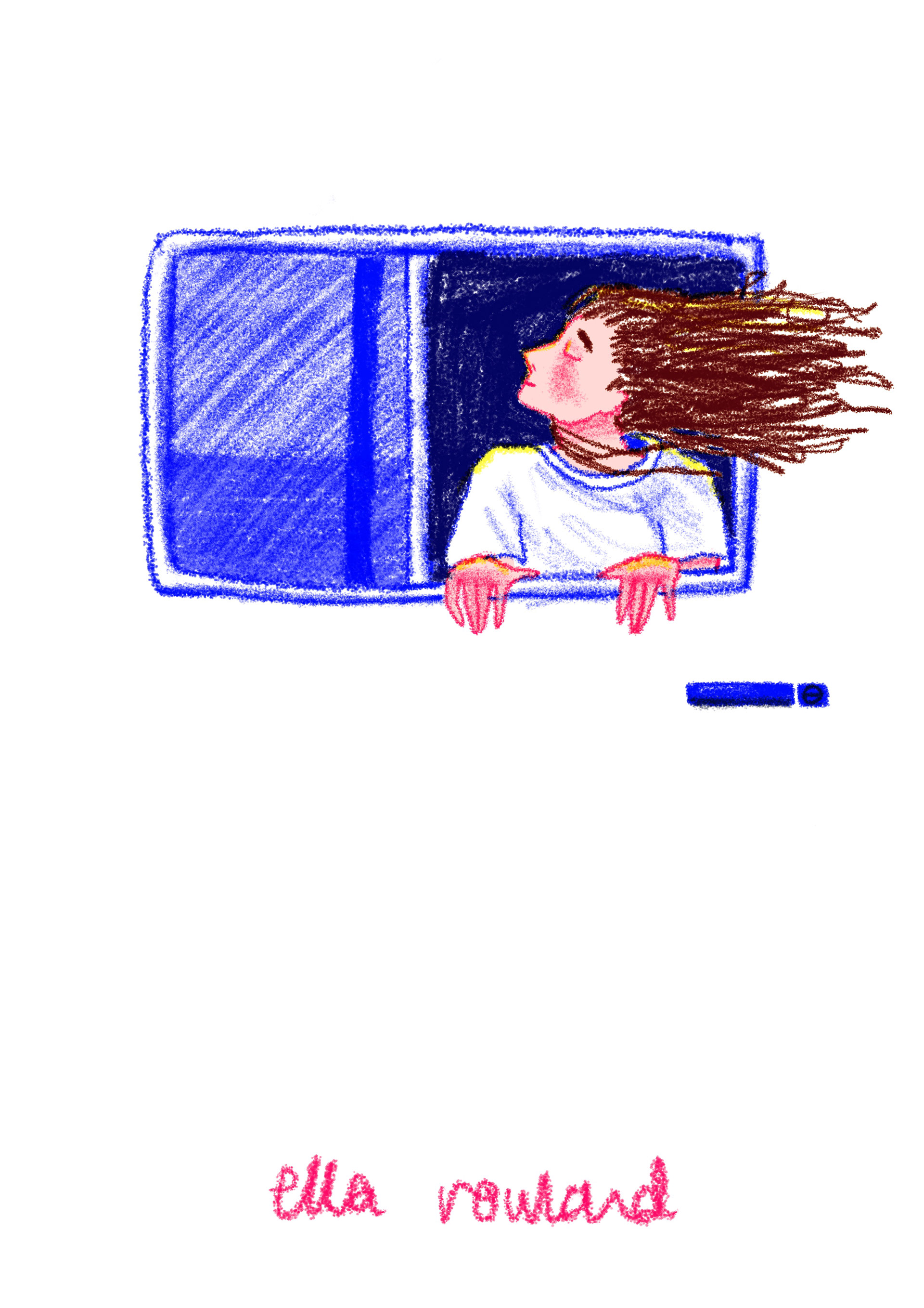
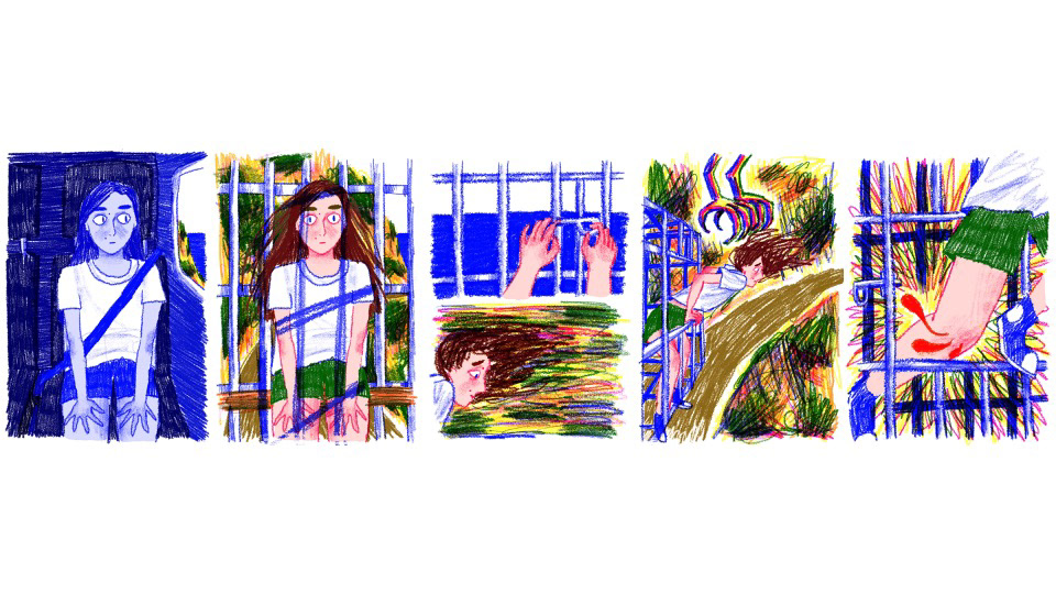
my motivation for the story is to try and show how i felt safe but trapped, and that scared but free always seemed to me like the better option. the whole holiday i felt like i was in a cage of my own head that was stopping me from having fun and being a happy little 14 year old. i remember being on a bus going down this road on the side of a cliff facing out to sea and staring out wishing that i could grow enormous brown falcon wings. i wanted to fling myself out the window and nose drive down the cliff with these wings and fly out over the sea touching the water with my hands and doing loops. it felt like the only way i would feel completely free at that point of my life. tragically i'm TERRIFIED of heights but the idea of screaming my head off and the adrenaline made the daydream a lot more exciting and freeing.
seven years later i do feel like i have massive wings and im throwing myself into scary things in life and i do properly feel free and happy, so i reckon it's a good time to reflect. i've also noticed that i create much better work when the topic is something that's directly affected me, like the amplify project, because i can work though it like its visual therapy and i think it's good for me to spill my brain onto the page.
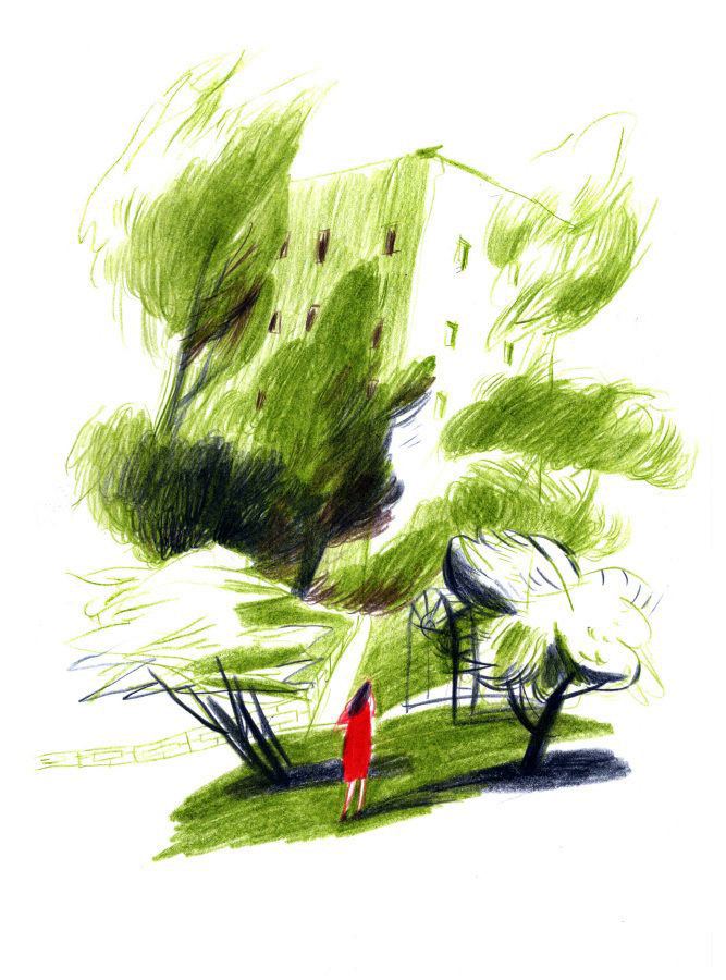
Ksenia Kopalova
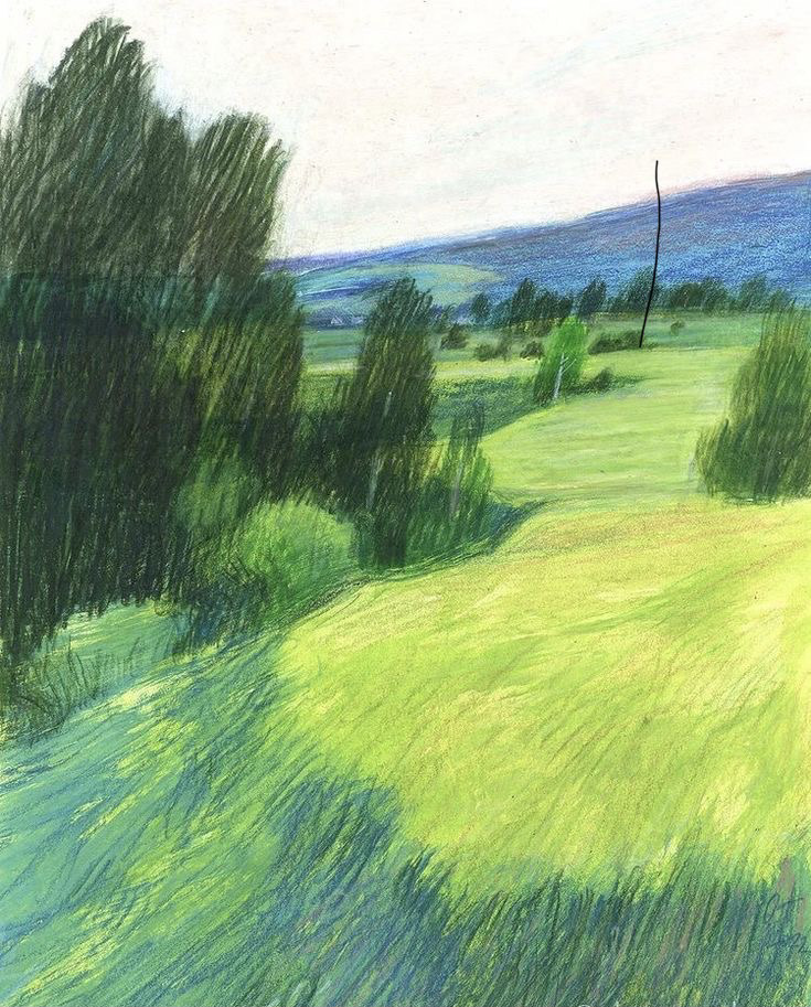
Olga prusakova
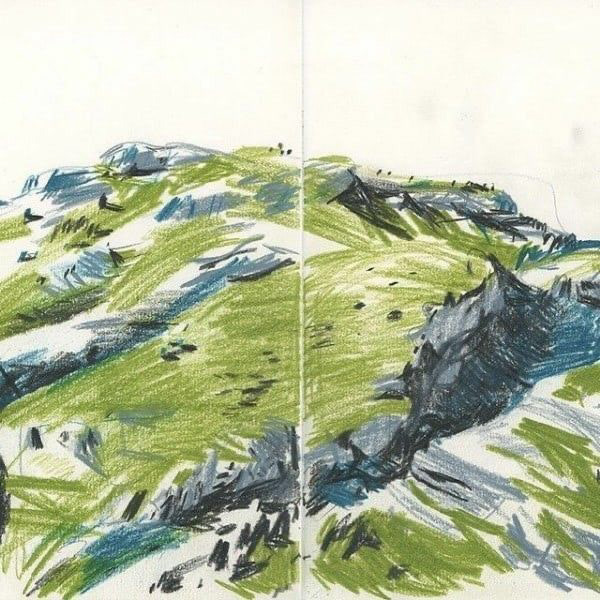
benoît guillaume
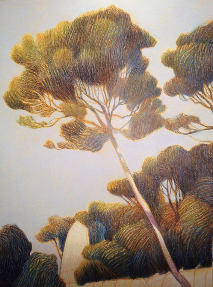
Andrea Serio
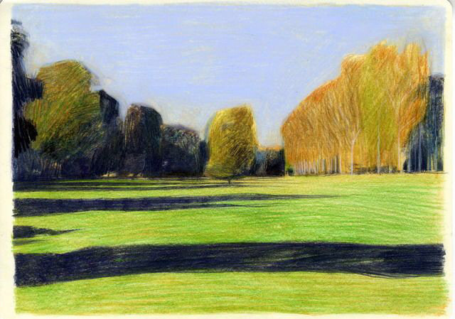
Andrea Serio
These are examples of the kind of movement I want to create with the pencil pen, i want each illustration to look loose and abit like its an observational drawing. Even though I’m doing it digitally I still want it to look fluid like the wind is blowing through the trees and the sea is rippling I am a flat colour H A T E R. even though these illustrations capture the feeling of sunset from all the burnt oranges and browns (and I’m using a restricted colour palette) I want scenes to look warm and bright so I’ll be overlapping pink and yellow to get the peachy orange.
ELLA FROM THE FUTURE - I think I achieved this very well !!! I used a base sketchy texture on all the mountains duplicated in both yellow and pink at a lower opacity, and then worked on top of that with all 4 colours. It worked really well and made it look like sunset which led me to mess around with bolder shadows and highlights throughout the illustrations.
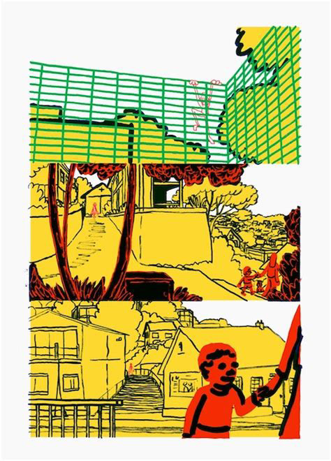
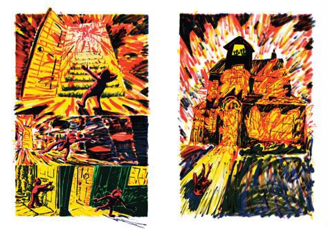
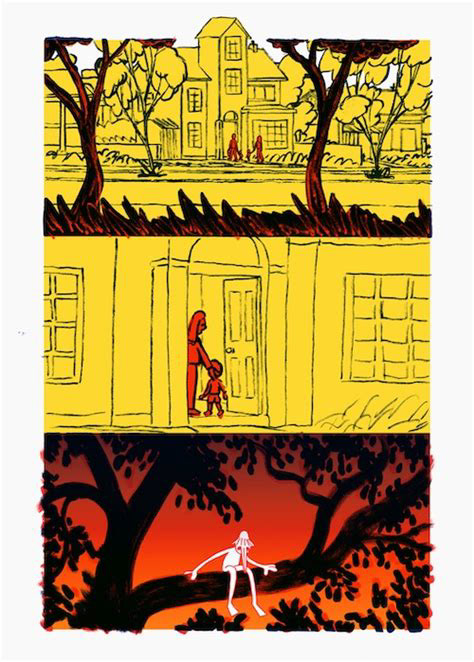
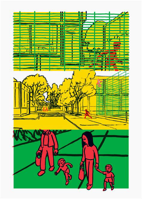
I also looked at a lot of Joes work because I was already a fan of his comics so I had to book the gull yettin already, and I'm a really big fan of how are use his perspective in all of his drawings so even if this character design is really simple and his background is only ever done in simple lines it always has the correct perspective and how the world looks behind the character is always correct to how it looks in real life. I think that's why his books are so nice to look at because it's like we're looking at it through our eyes balls, but we've got glasses on that make everything flat colour.
I also love how are you draws the fire in this book because up until then it's all been flat colour you can't see much texture and it's not much variation in the line but in the fire scenes you see hes used a dry old felt tip pen and the edges along the border and much rougher and im really inspired by this and inspired by the texture and how he shows how the scene looks but also how the character feels and how the time is passing in this moment, and I really want to try and do that in my book if I can.
Another thing that really like is how and some of his illustrations some parts of the pictures peek out from over the top of the borders, so on the fourth image you see how the top of the roof peaks out and had a feat poke out on the last image. I love stuff like that. It's like breaking the fourth wall but in illustration and it makes anything that's poking out of the board have a movement :0 !!! if you couldn't see their feet poking out from the bottom of the green box he probably wouldn't be able to tell as well that they were walking in that direction and I love it. It makes me salivate. It's the best thing in the world so I want to have some of that on my story too.
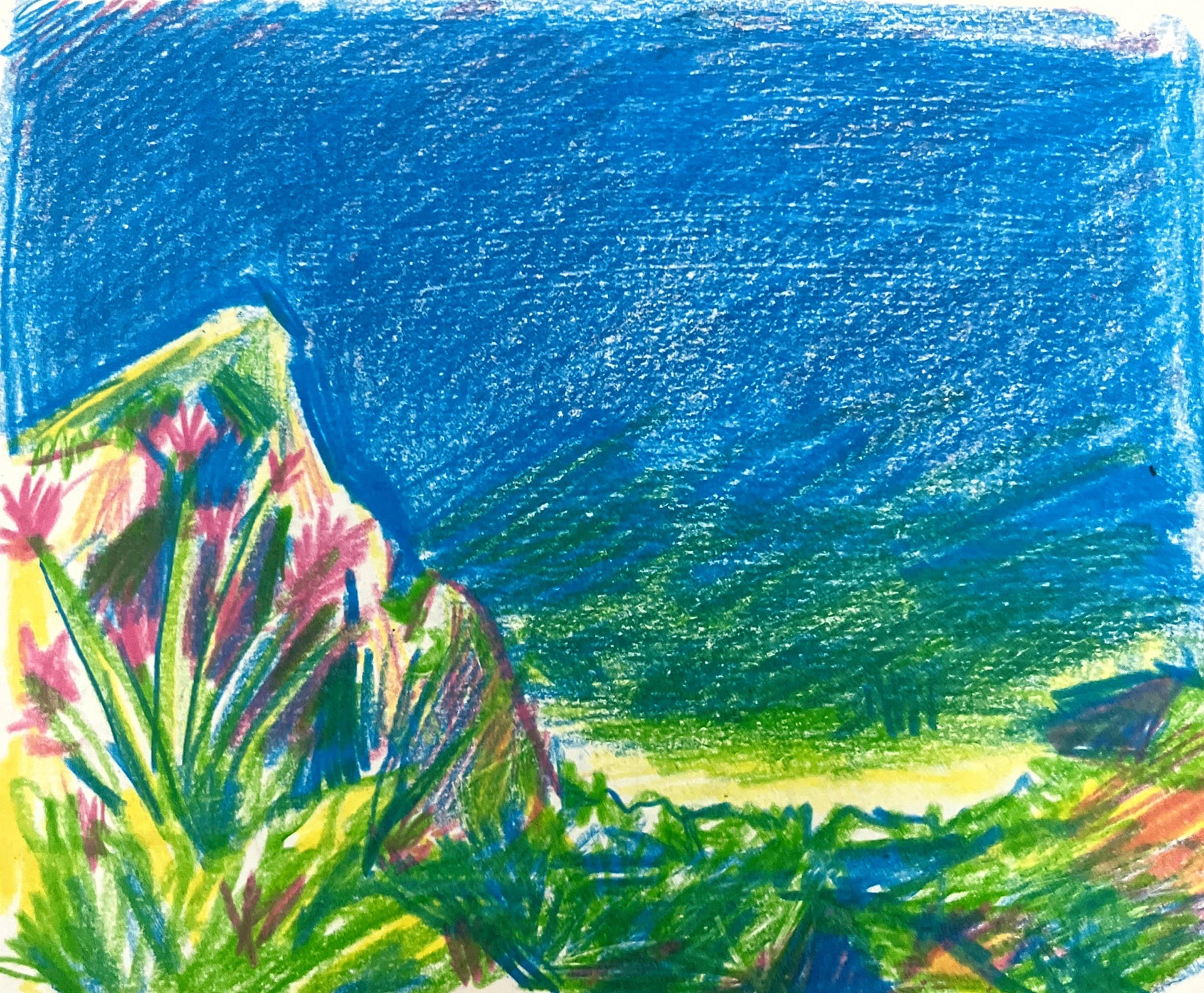


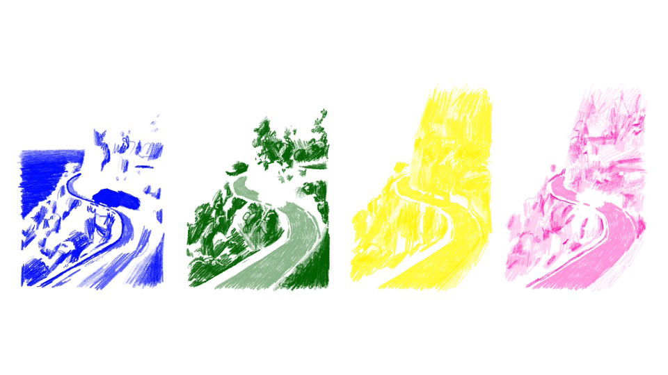
because i knew i wanted to riso this i made a little test for the colours i might use! i chose a picture from the holiday and sketched it out on paper with my pencils to look at how i would naturally draw this without having to worry about layers. i then scanned it in and messed around to figure out the best way to create the layers. i found for me the easiest and loosest way was to make separate layers for each colour on procreate and then make them all multiply layers to see how the colours might overlap. im happy with it but i want to use a scratchier brush like procreate pencil because i dont like when things look smooth (i used 6B for this one).
i was also going to pencil draw each layer from a master copy using a template and lightbox, but i think its going to be too tedious and i have more control using procreate as it means swapping around layers and messing with the overlapping more time efficient.
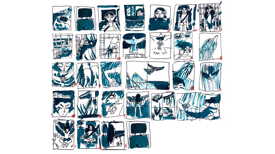
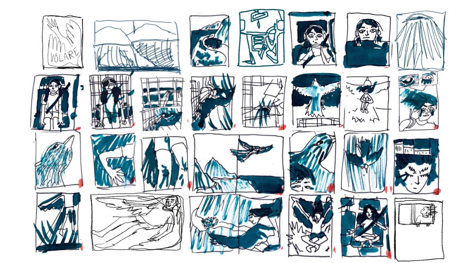
i knew this was going to have lots of pages because it was a big idea, and the maximum for the brief was 36, so i let myself go crazy and pretend i had no restrictions when storyboarding so that i could have lots of options when condensing the pages down after. also all creativity leaved my brain hole whenever i have to thing of a page composition that isn't just one picture as the whole page. by having lots of pages i wanted to include, it forced me to think of ways to fit everything in on page, like having split pages or tiny boxes to show movement.
this is what i managed to finalise it down to 32 pages but knowing me i'll probably swap some things around half way through. at the moment im happy with it though and i'm glad i managed to chop lots of unnecessary pages out plus make some split pages too and i think they work well so somewhere along the course i must have gotten better at that YAY!!! i'm not going to have perfect borders around everything but there will be some sections of white along the sides of the pages i think with the pencil texture it'll look nice and crunchy.
now i've done the storyboard i'm REALLY excited to start making this and get some proper riso tests done when we go back after the easter holidays so i have them in time to show Joe at the halfway meeting. im aiming for 3-4 finished pages to show, along with all the sketches done so i can put them together in a mock up.
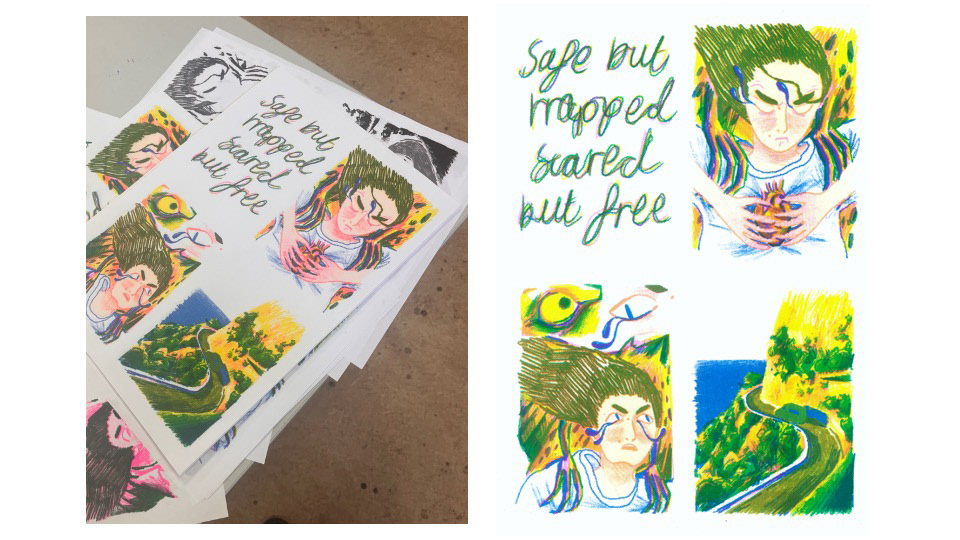
i also decided on a possible title, since the whole sensation i'm trying to explain is feeling safe but trapped in life and having the urge to do something completely out of your comfort zone as a way of gain control of your surroundings, for the time being i'm calling it "safe but trapped, scared but free" which is a LONG title and doesn't feel COMPLETELY RIGHT but its a good start :)


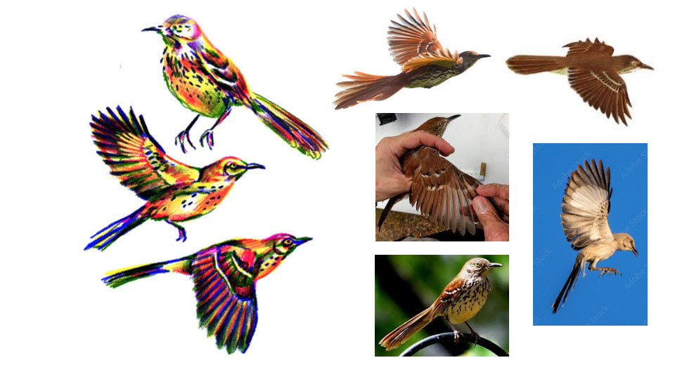
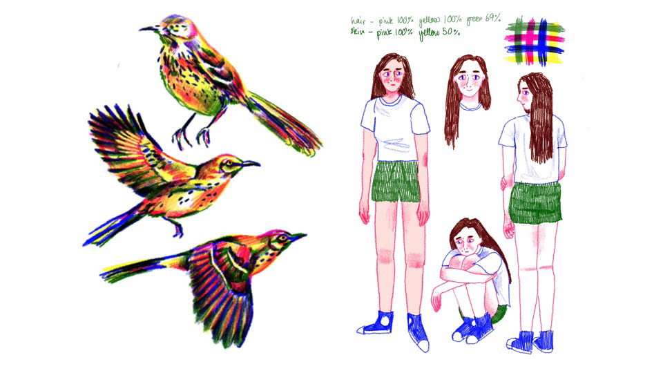
now i had a better idea of what i was doing i had to pick a bird!!!! i went through alot of bird watching websites because i knew i wanted a common garden bird and not like an eagle or a peacock, but i wanted one with some variety to its feathers so it would be fun for me to draw. i picked this brown thrasher thrush because he looked nice and normal but he's got a fun freckled belly and yellow eyes. i wanted striking eyes because in a lot of the frames i focus on the eyes of the bird in comparison to little ellas, and the birds with fully black eyes had less emotion and noticeable direction of their stare. i also knew i wanted a brown bird i'm not sure why maybe ill figure that out at some point.


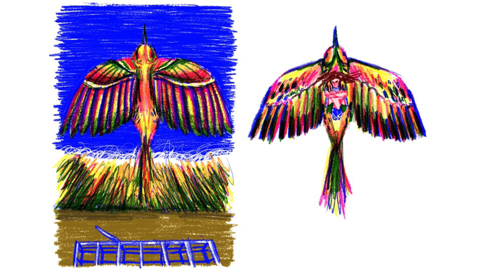
before i could start any pages i needed a reference to use to make sure all my bird look at least SLIGHTLY cohesive. while i'll probably let more white show through on the final pages when bird is surrounded by lots of colours, im still very happy with how he looks and i want to keep bird slightly more realisic than the surroundings and my character. i think it makes him more menacing and powerful. also way more fun for me to draw i find birds tricky not as bad as horse but still difficult so i want a little challenge to keep me occupied. i have no idea how this well riso so tests will definately be needed because i like him having more depth and darkness than his surroundings and if the riso comes out bad i still want to find a way to add darkness to the feathers and such.
and here some little references + riso tests for little 14 year old ella :') i'm going to keep the lines and design for her very simple and wobbly because i want it to reflect how i felt i look all the time all awkward and wobbly. ALSO one of my biggest illustration struggles is making things look too clean and neat when what i'm best at is big colourful messy work and i know i've definitely gotten better at keeping my work consistent through the projects in terms of how loosely i draw, i think because this book can be more abstract its alot more forgiving to my messiness. i want my character to contrast to the big colourful extravagance of the bird because i think it's nice foreshadowing. i am much more confident in myself now and wear lots of colourful clothes and makeup, and i think that right now i feel like the person that i am is someone who 14 year old me definitely needed a hug from, so i'm (in my head) imagining the bird is me now trying to shake old ella around and show her that the boundaries i thought were everywhere were only ever really in my head
i love this project SO MUCH it's like therapy and i'm so excited to make this its like im letting people look into my 14 year old brain and show them why i am how i am today


this is my first test page!! :) i wanted to look at how little ella and the bird would contrast and whether it would be too busy with all the colours but i dont think it is and im VERY HAPPY WITH IT!!!! YYSYYAYAYAYAYA!!! im so happy the bird has lots of depth in the colours and that i chose to keep the human design very simply they contrast well and i really like the pencil texture!! i want to try and get 2 more pages done in time for the interim crit so i can riso them and show joe.


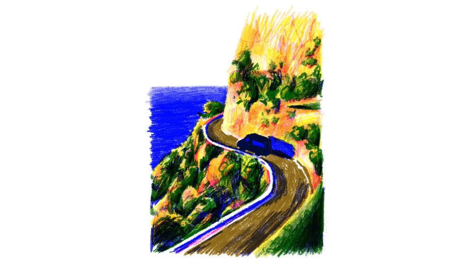
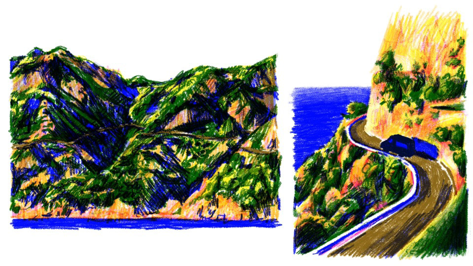
this is my favourite test page i feel like you can taste all the colours its so lovely and because i had to use yellow and pink it looks like the sun it setting. i also like the shadows on the road i tried to colour in the direction of the object so i made my pencil strokes follow the direction of the road and im happy i did it makes all the different sections of the drawing look like their flowing in their own special ways. im going to try and keep the direction of movement contrasts throughout the book because i reckon it helps break up all the big blocks of pencil shading.
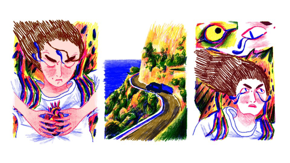
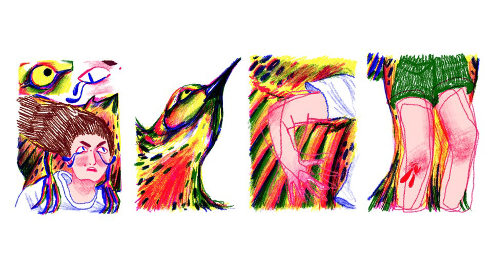
This test page isn't my favourite I think the concept seemed better in my head and would work better with materials that were more lights and buildable so I could create a kind of glow coming from the heart but the fact that I was using very bold colours and a gritty textured pencil meant I couldn't get the glow that I wanted however I like the concept I like how the tears look and I like the emotion on my face I think it's much more emotive and telling compared to the first test page I did which in more flat in 2-D to me. I'm not sure if I'm going to include this page in my final book, but I really enjoyed making it and I enjoyed drawing a more zoomed in version of the bird feet!!! KAW KAW BIRD FEET
tried printing on riso and it did NOT go to plan :') everything lined up right and it was going really well until the last layer im not entirely sure what happened but its like all the green took over the page and overlapped alot of the other colours kind of washing it out. its definately an easy fix if i could print again but just pritning thsi page with 4 colours cost 8 BLOODY POUND so i dont really have the spare cash floating around to print 30 pages worth :(
i spoke to the print techs about a way to imitate litho-graphy without the special printer and they recommended i use https://icolorpalette.com to find colours tbat look similar to the colours i was using when printed!! ive printed these out and now ive just got to pick which ones look vibrant enough for me so i can get my colours BRIGHT AS POSSIBLE while printing cheap !
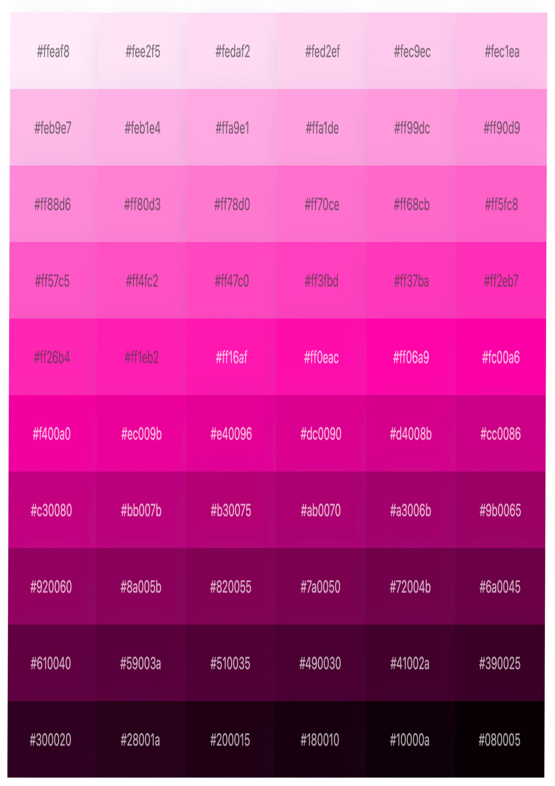
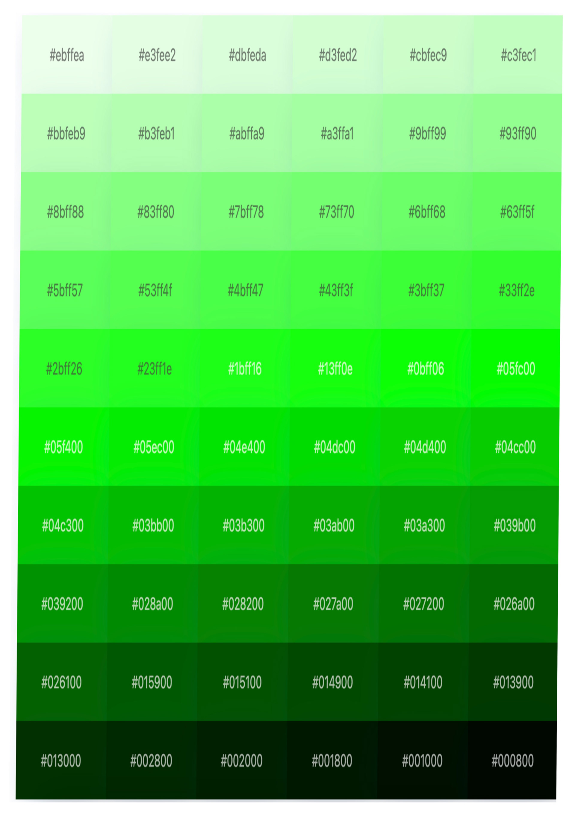
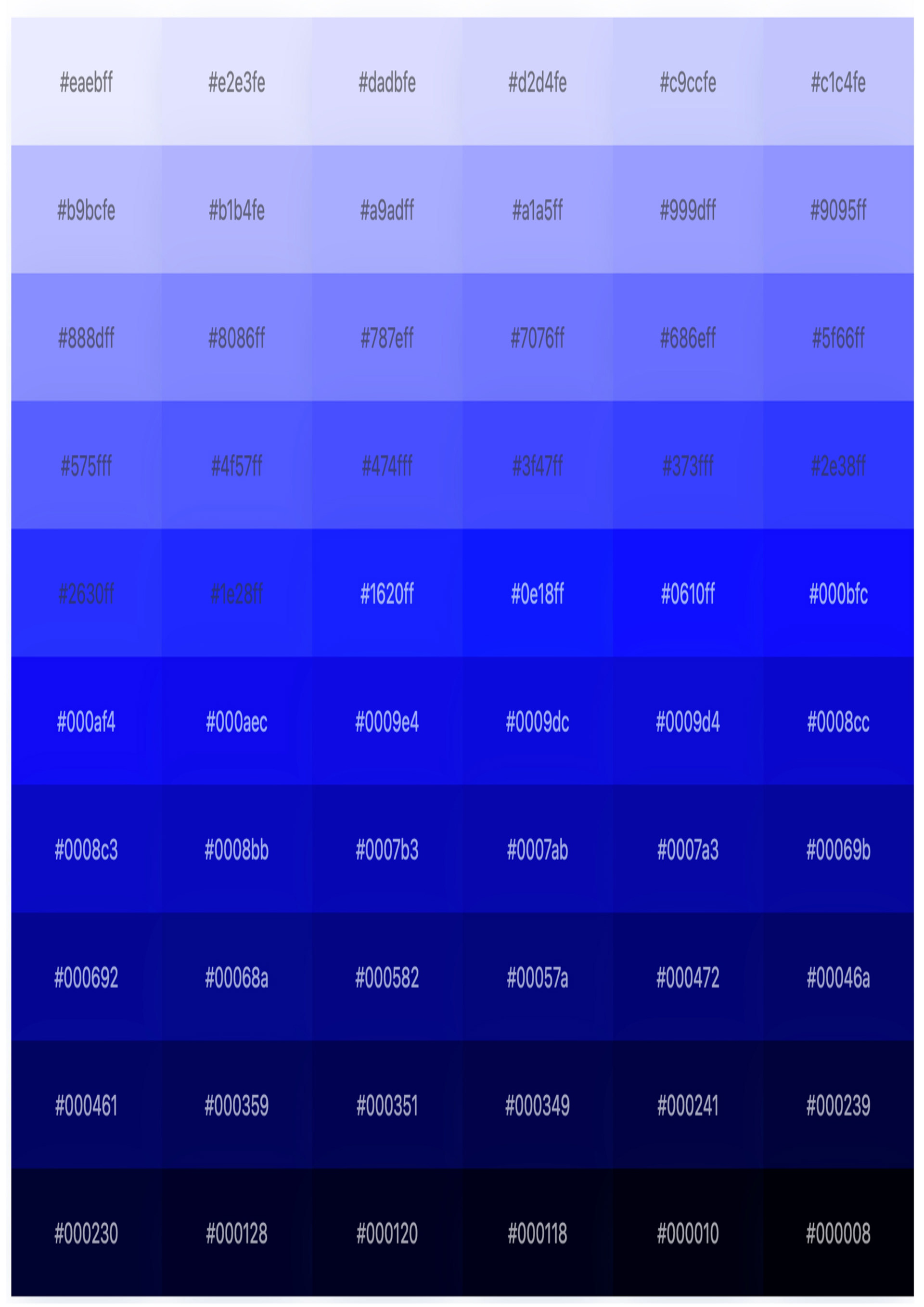
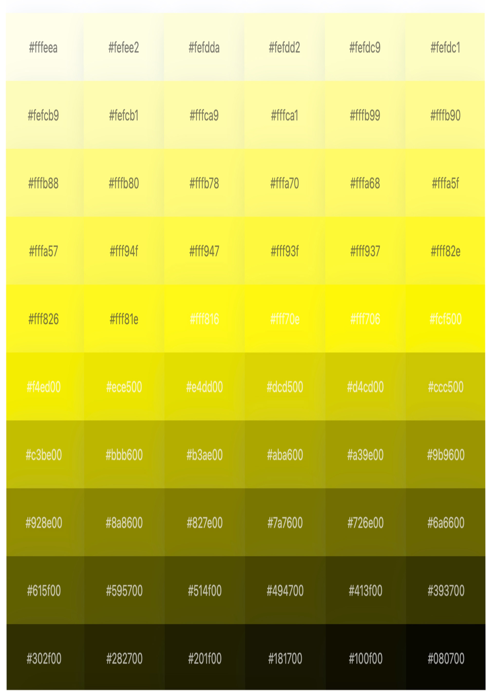
i found that using these colour grids I'm printing off a laser printer works best for me because I wanted my colours really bright especially the orange and the yellow it was really important that are used a paper in the printer that capture that I don't have my book would look as good if the colours werent vibrant. using the laser printer it's also really cheap alternative especially because my book already looks a little bit like riso it just doesn't have the texture that riso gives, but I reckon in the future there could be ways around this because I could apply a texture over my whole page before I printed it, and then that might make it look more organic, even though it's just coming from a laser printer.
I also talked to a third year about how they got their fluorescent pink so bright and I ask what printer they used and if it was expensive, and they recommended me to the laser printer because it's so cheap and easy to use and if really accessible because we have LOADS at uni horray!!!
this is a recording of me flicking through my dummy book that are used for the presentation. it was really good for me to make it anyways and try out some binding techniques like coptic binding. it also made me understand how my pictures would look on the actual page rather than tiny little format on my iPad. I think it made my presentation a lot better and I've never made on these before and it was really useful for my brain, so I'm gonna make them again whenever I'm making a book or narrative.
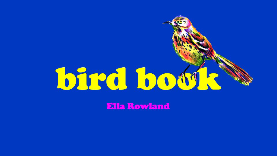





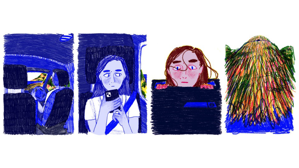
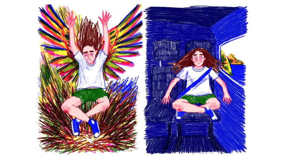
im typing this STRAIGHT after the interim crit so i can remember everything im thinking and other than absolutely speeding through my presentation because i was nervous and sam had been the presentation before me with a really good idea BUT i got some really good feedback all of it makes sense and im happy!! my biggest feedback was to set the scene of the story more to make the nonsense that happens after seem even MORE fantastical and also to break up my work abit so theres more negative space!! also a graphics student suggested to show the change in atmosphere from being inside the van to being outside by starting with one colour (blue) and then the outside be rainbow i am DEFINITELY going to do that very very clever big up the graphics students.
I'm also really happy with how my presentation looked. I think it was engaging because of the bright colours, and even though I sped through it at like speed of sound everyone still seem to understand what I was talking about, and Joe understood the story and what I was trying to get across, and I think that was probably due to the pictures and having everything explain visually so even though I was near tears and a cardiac arrest everything was fine :)
joe said i did some things very well too which makes me HAPPY because im really proud of what i made so far, and he also brought up my riso tests and how they went wrong. he suggested toning down my colours slightly so they look better in print and to embrace the wonk in riso but im fine with wonkiness and its the problem that i accidentally made everything g r e e n on accident and that its also too expensive for me i didnt explain that part very well oops
WOO so happy that's over i have been SHITTING BRICKS over the presentation.
this is my altered storyboard from after the interim crit. I had drawn the extra pages that set the scene and slow the pace of the story down, and I also made sure I did a little bit more negative space to break up the continuous pages of colour and line. I still need to look at the front and back cover, but I'm going to do these last because I think I'll have a better grasp on the story once I finish all the inside illustrations and I think I'll be able to produce something better then rather than wasting time making it now and then regretting it and remaking it before the deadline. I also deleted the unnecessary pages of the back of the car seat. I think this was me thinking I was being really c l e v e r and showing a continuous cycle but I didn't need it and there were other ways I can show this, and it's not a continuous cycle its not the point of the story.
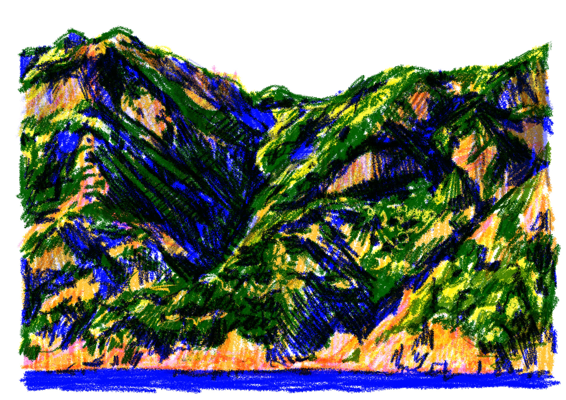
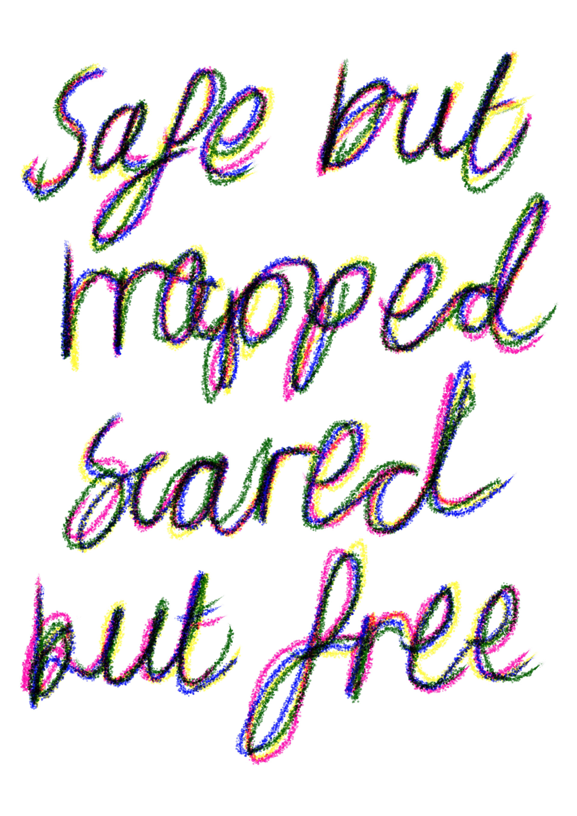
the pages i got finished after the interim crit, i followed joes advice of adding a big scene-setting pictures, so i made the first pages a double spread showing the mountain-side to create perspective and show how MASSIVE the big hills were. i also did a text test to see how i might show off the colour layers (i ended up using this for my front cover but in a different font, i don't think my book needed any text :)).
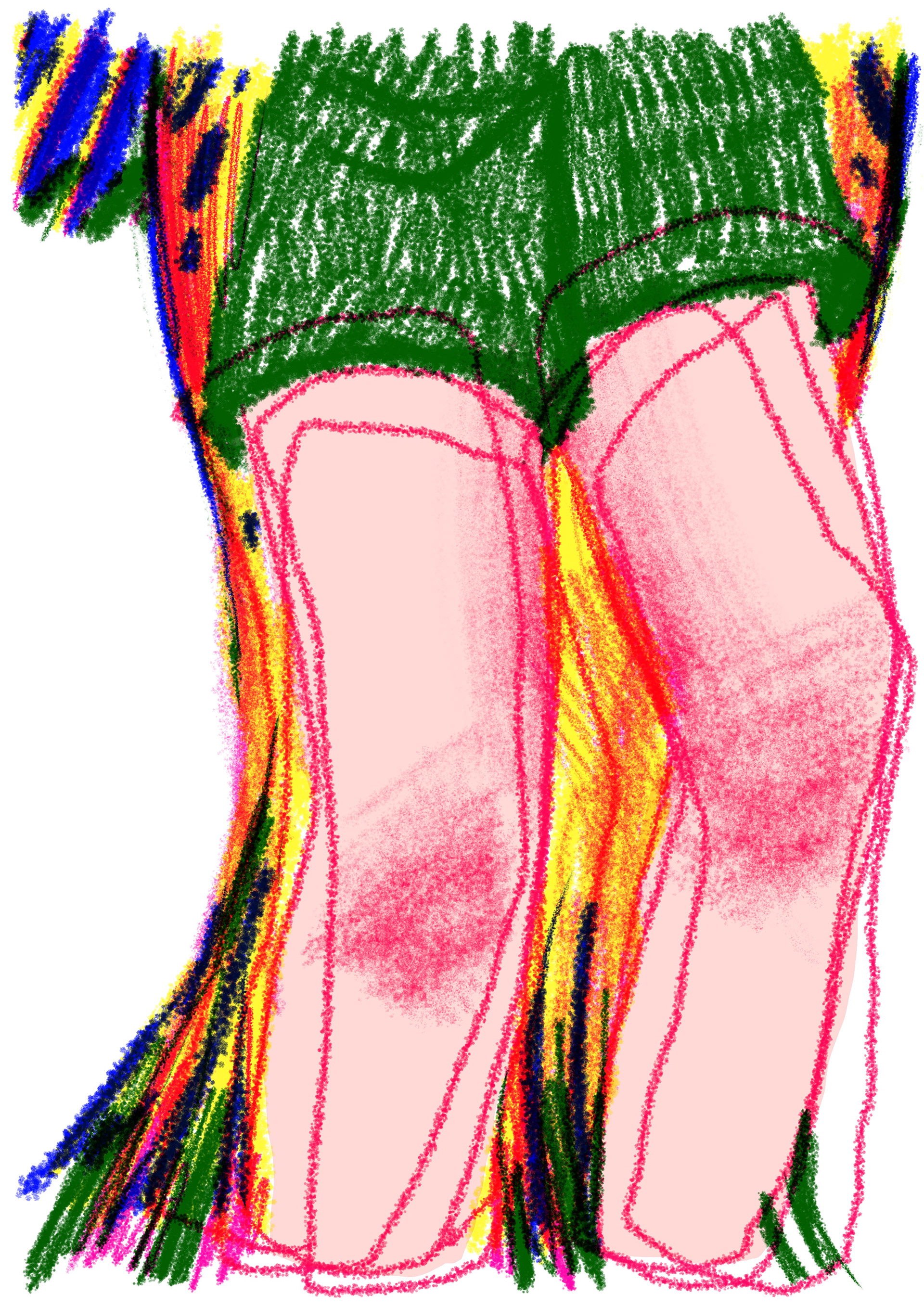
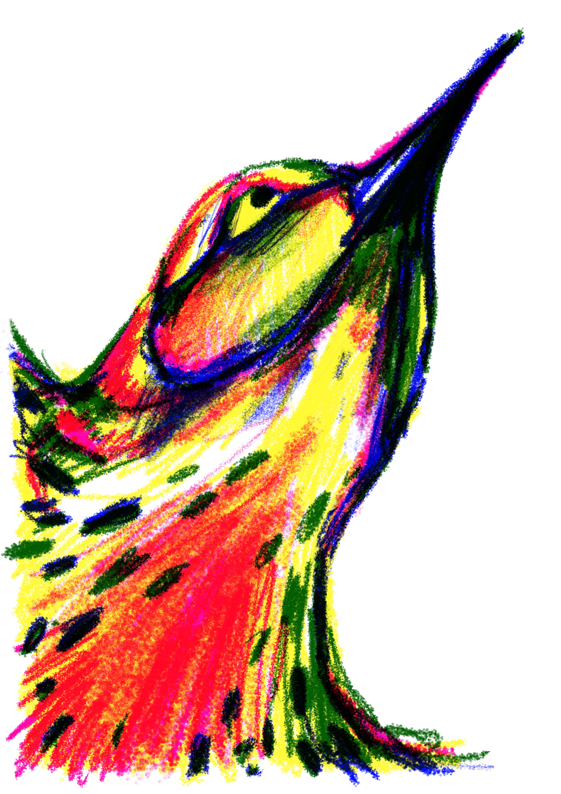
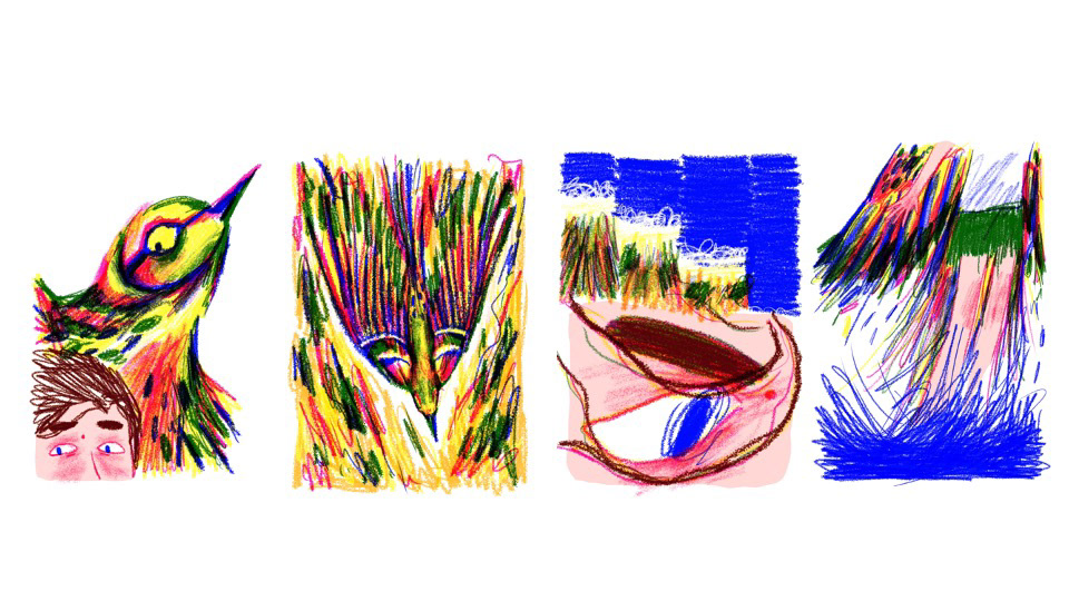
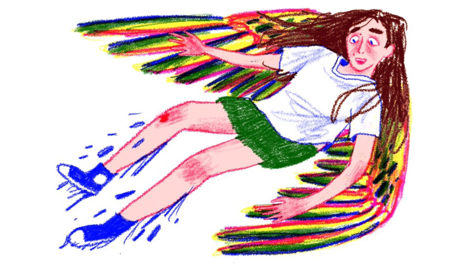
i made the first page showing the shaky legs i tried a couple ways for doing this but overlapping the lines gave the impression of movement and nerves without being TOO obvious i didnt want to do wobbly shake lines on either side of the legs #BORING. i did the below angle of the birds face and im REALLY HAPPY with this one, i like that it fills up a whole page so you get a sense of the SHEER SIZE of bird and i love all the pink on this pages it contrasts with all the blues greens and yellows of the scenery in the last couple pages :)
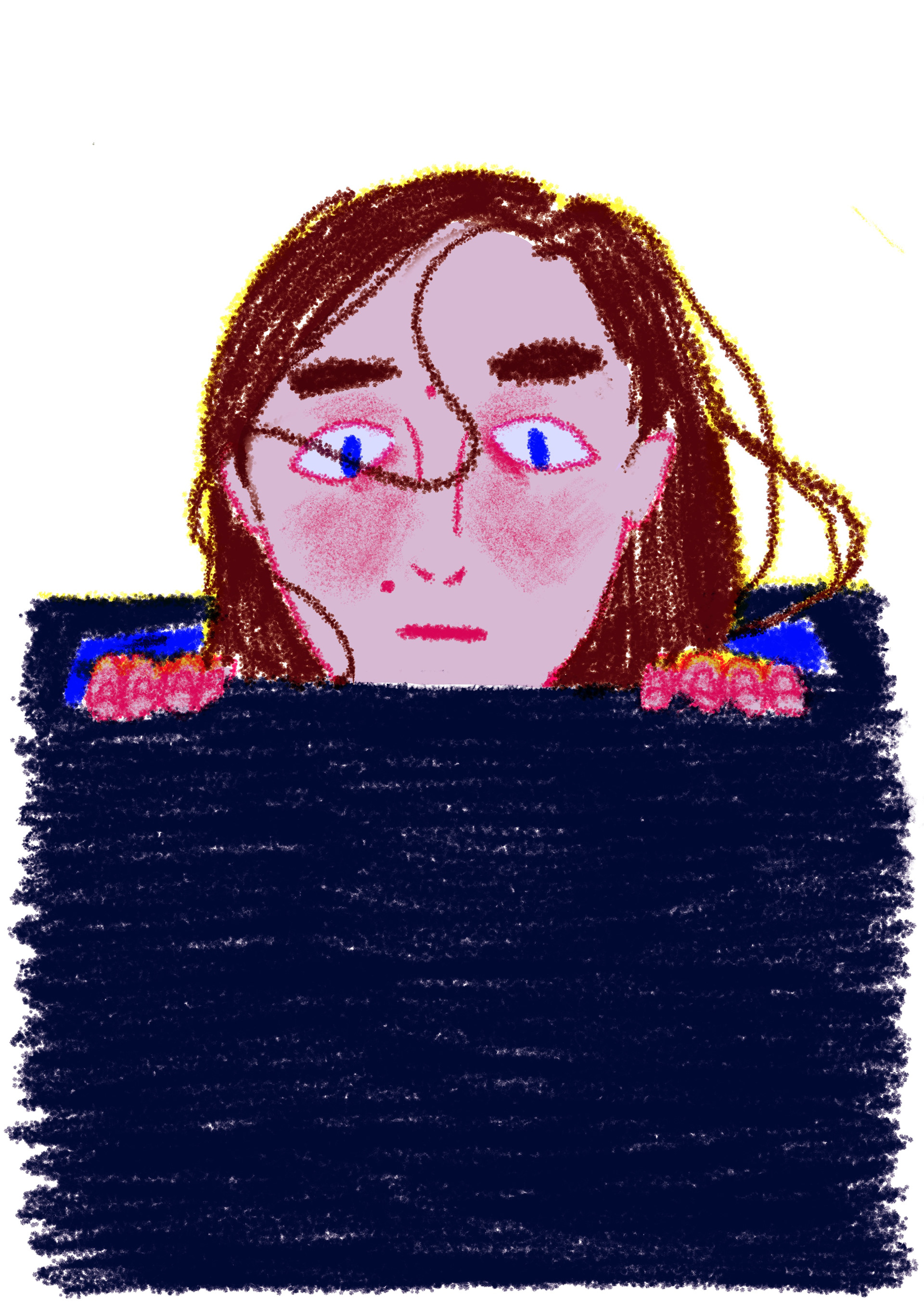
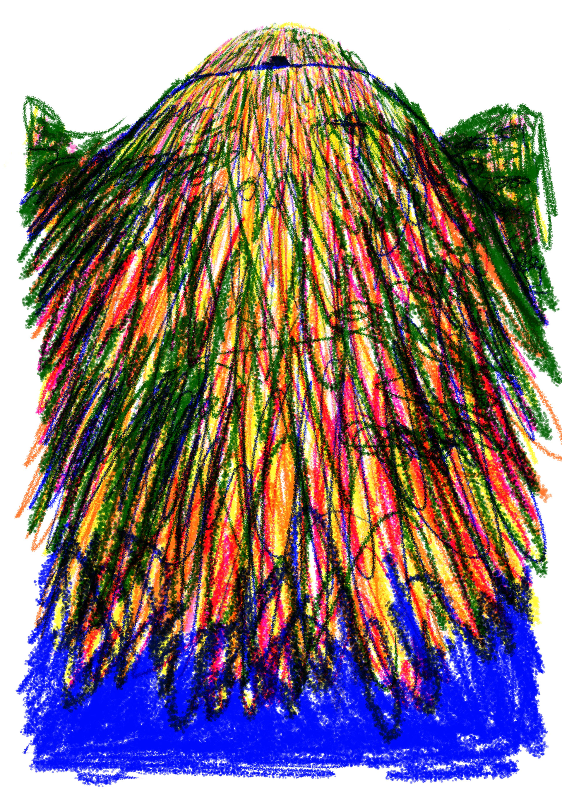
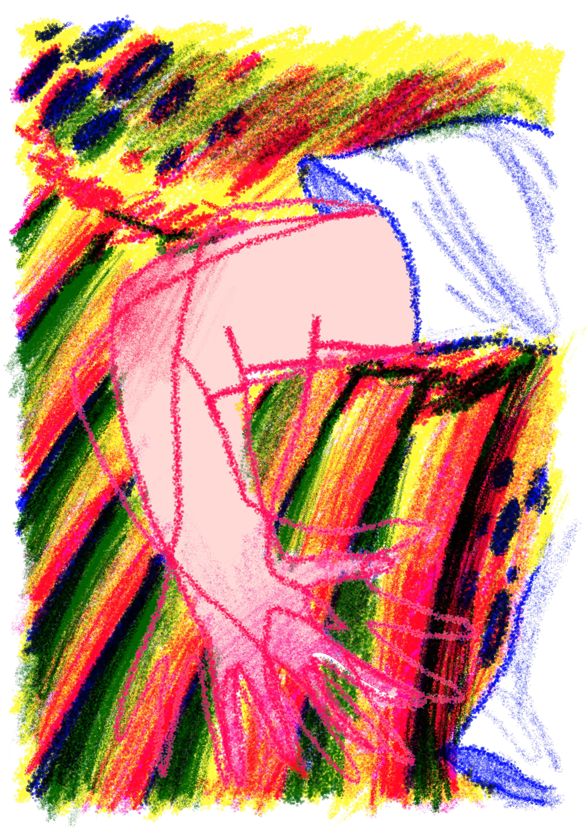

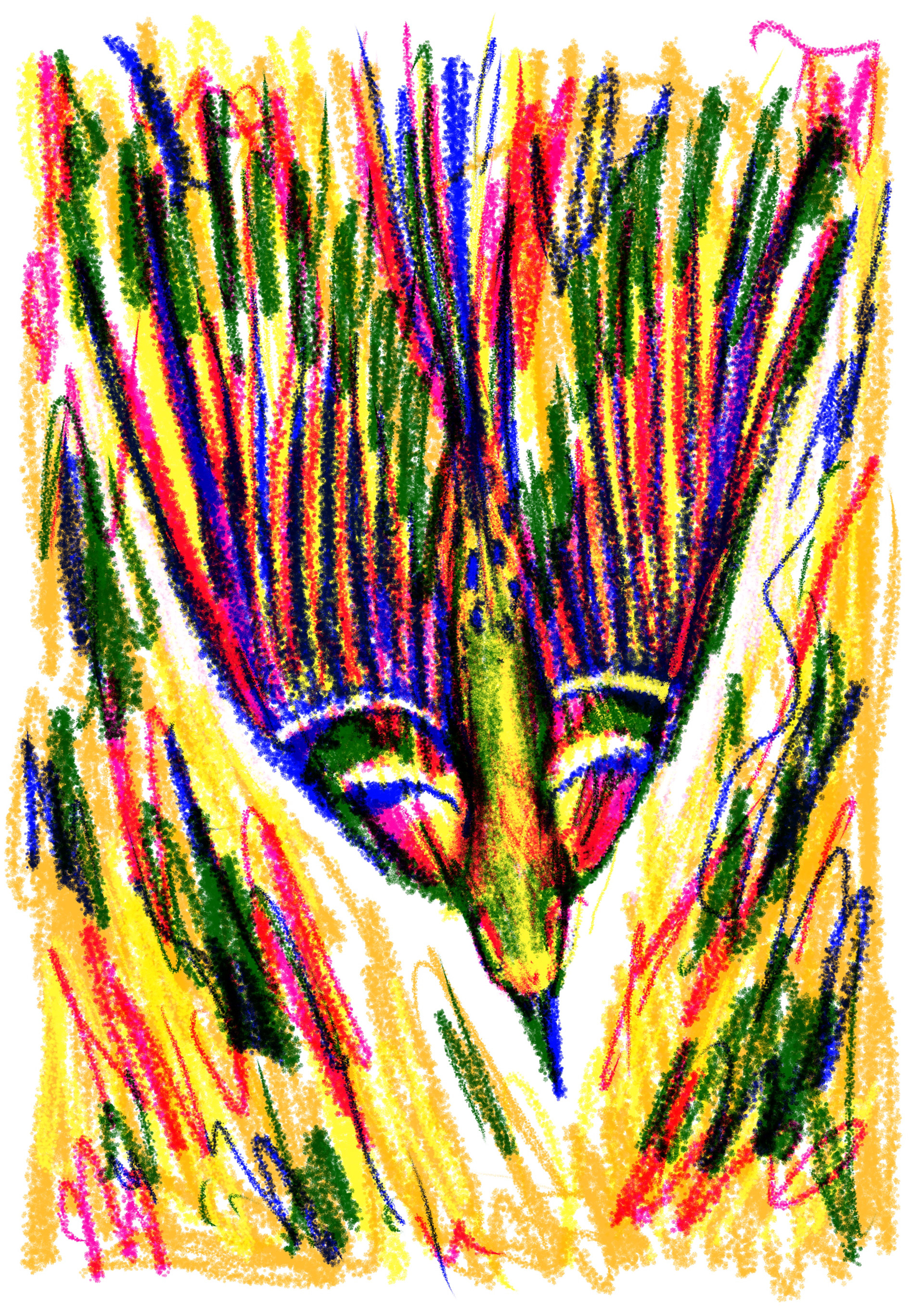
im getting roughly 5 pages done a week but i could definitely do more i reckon its just a motivation issue because ive been on my period and want to lie in bed and never leave so i think ill definitely have all my pages done and hopefully they are bound in a way im happy with fingers crossed!!! all my tats next week are flash so i dont have to draw anything up so that will leave me lots of extra time (atleast the whole of wednesday!)
my favourite page i did this week was the perspective page looking up from the sea at the van on the road!!! i love this one S O M U C H it came out looking exactly how i wanted and did exactly what i wanted it to do. i shows how fast the cars going, how big the cliff is, how little the van is, and all the lovely colours and textures. its the first page in the book where it gets abit scribbly and scruffy and i wanted it to foreshadow that something big was about to happen and that the story was picking up pace. its similar to the page of the bird diving, i like when the bird tail blends in with the background to show how FAST bird is going.


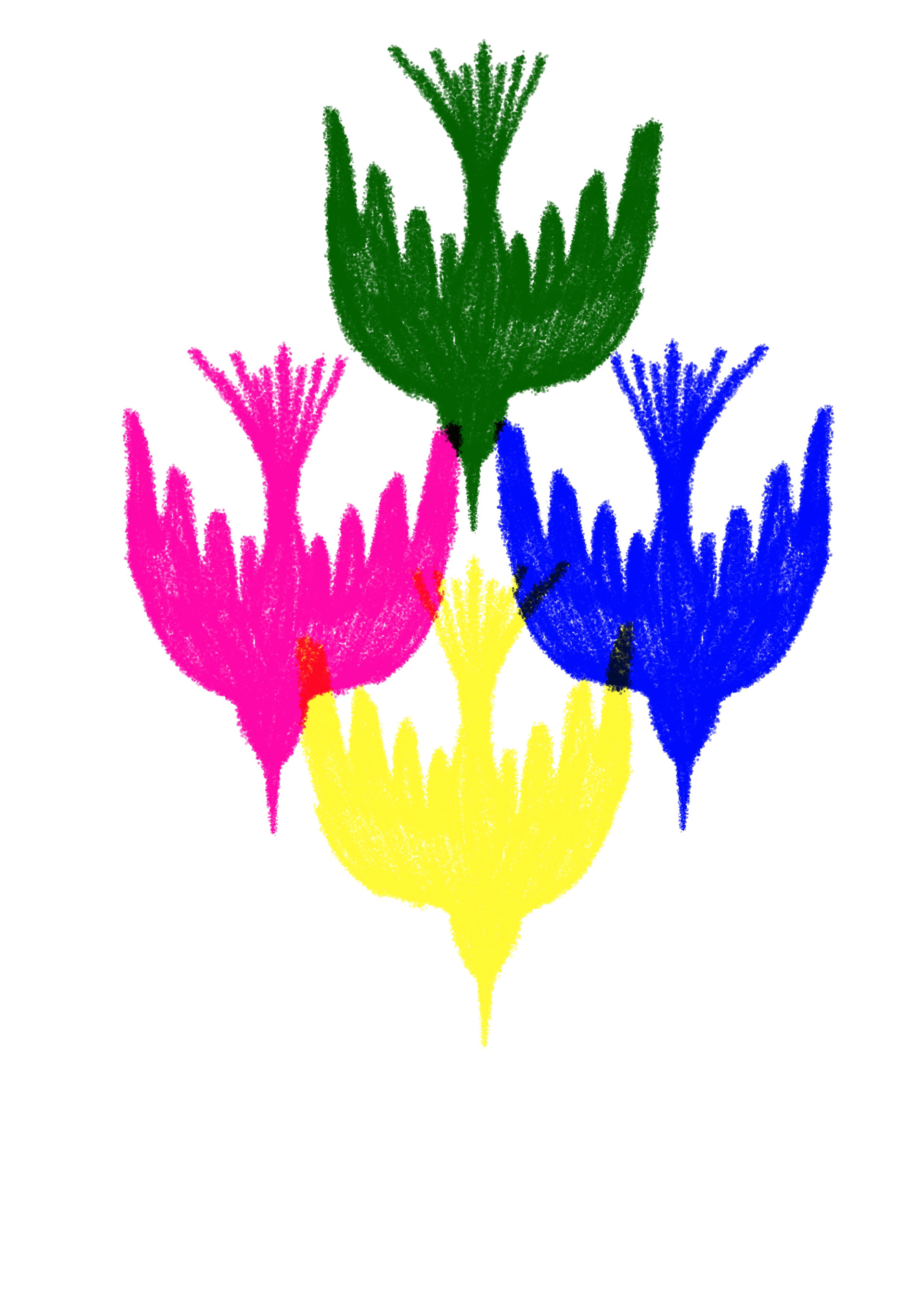
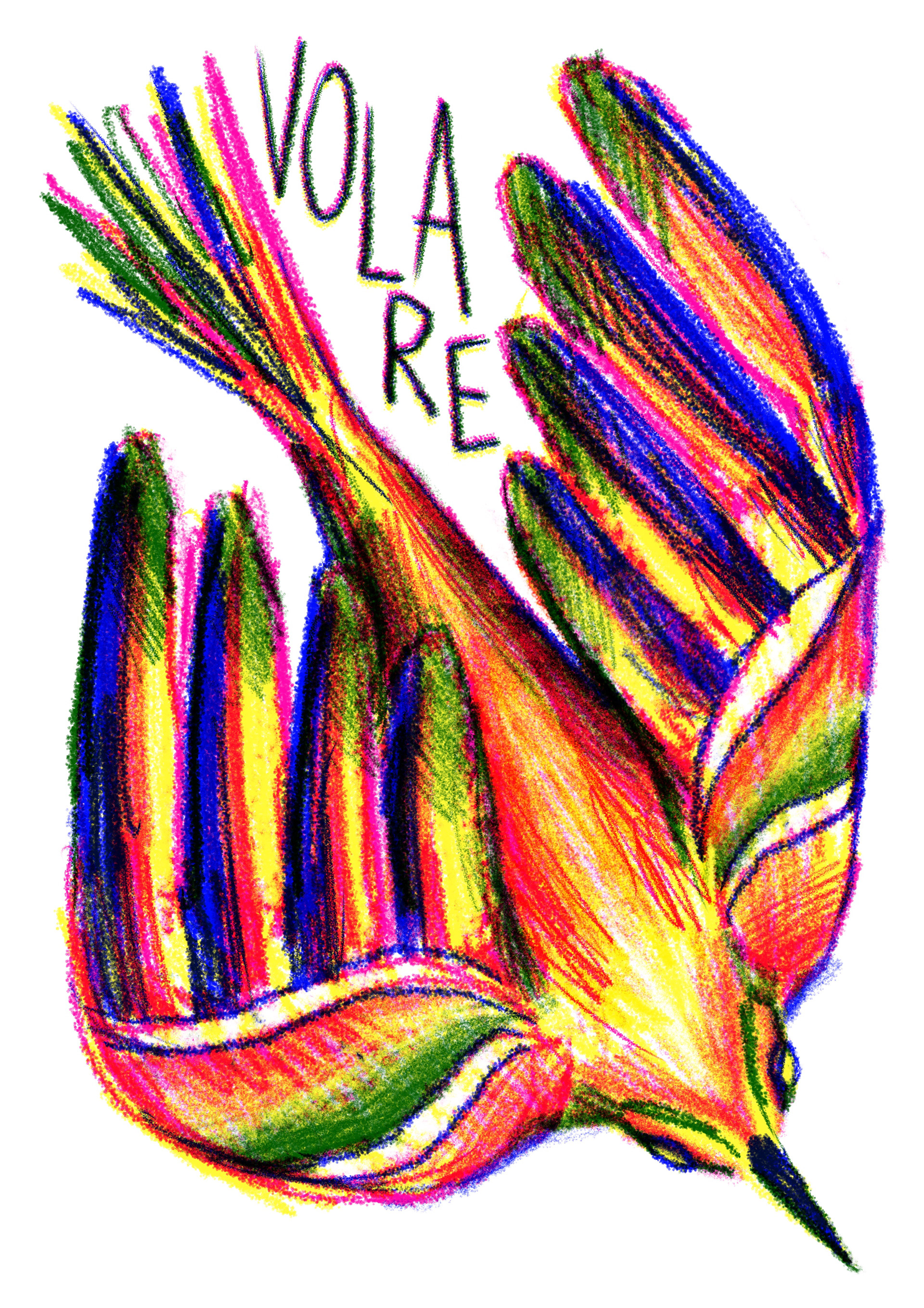
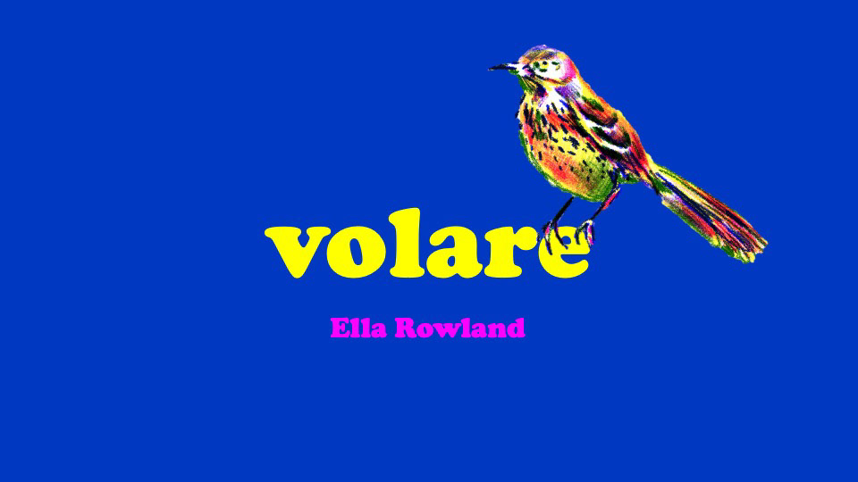
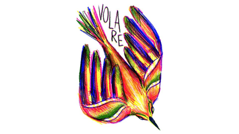
the front cover was trickay for me i love doing front covers normally i really liked doing the essex serpent one last year but i think because i had spent SO LONG on this story and all the singular pictures, making one that was all of them combined was harddddd and i originally wanted something simple that highlighted all the colours overlapping and i tried a couple but to me they all looked like logos and that is NOT what i wanted :( asked all the friends i knew that would give me good answers and everyone voted for the first one so i gave it a go and it looks okayyyyyyy i definately would have liked to do something more simple and stripped back but i was running out of time lol and i think it does work well as a front cover because its very bright and it catches your eye well i reckon if you saw it at a car boot you would pick it up and thats what i strive for.
volare means to soar in italian, the book and the inspiration happened in italy, its a pretty word, and i think SOAR is a much better word than fly and it fits the story better i think soar sounds more confident and less flappy which is what i wanted. u should thank eve moore for that one she came up with it THANK YOU MISS MOORE.

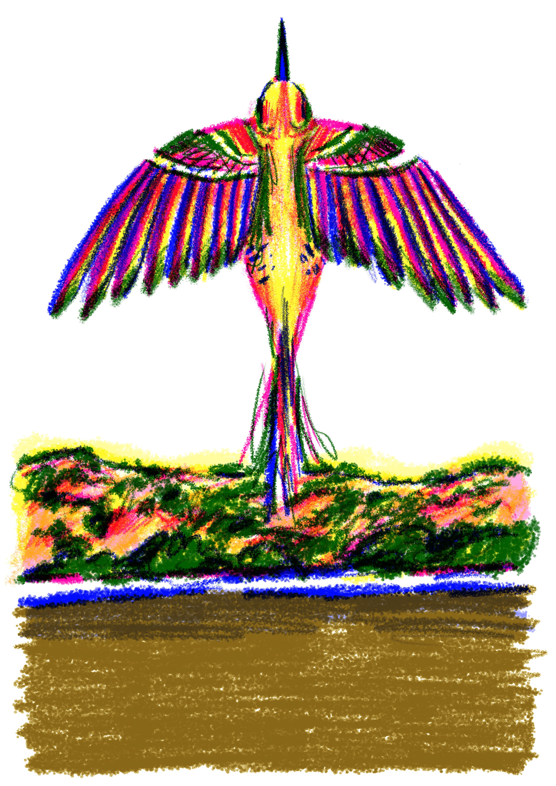


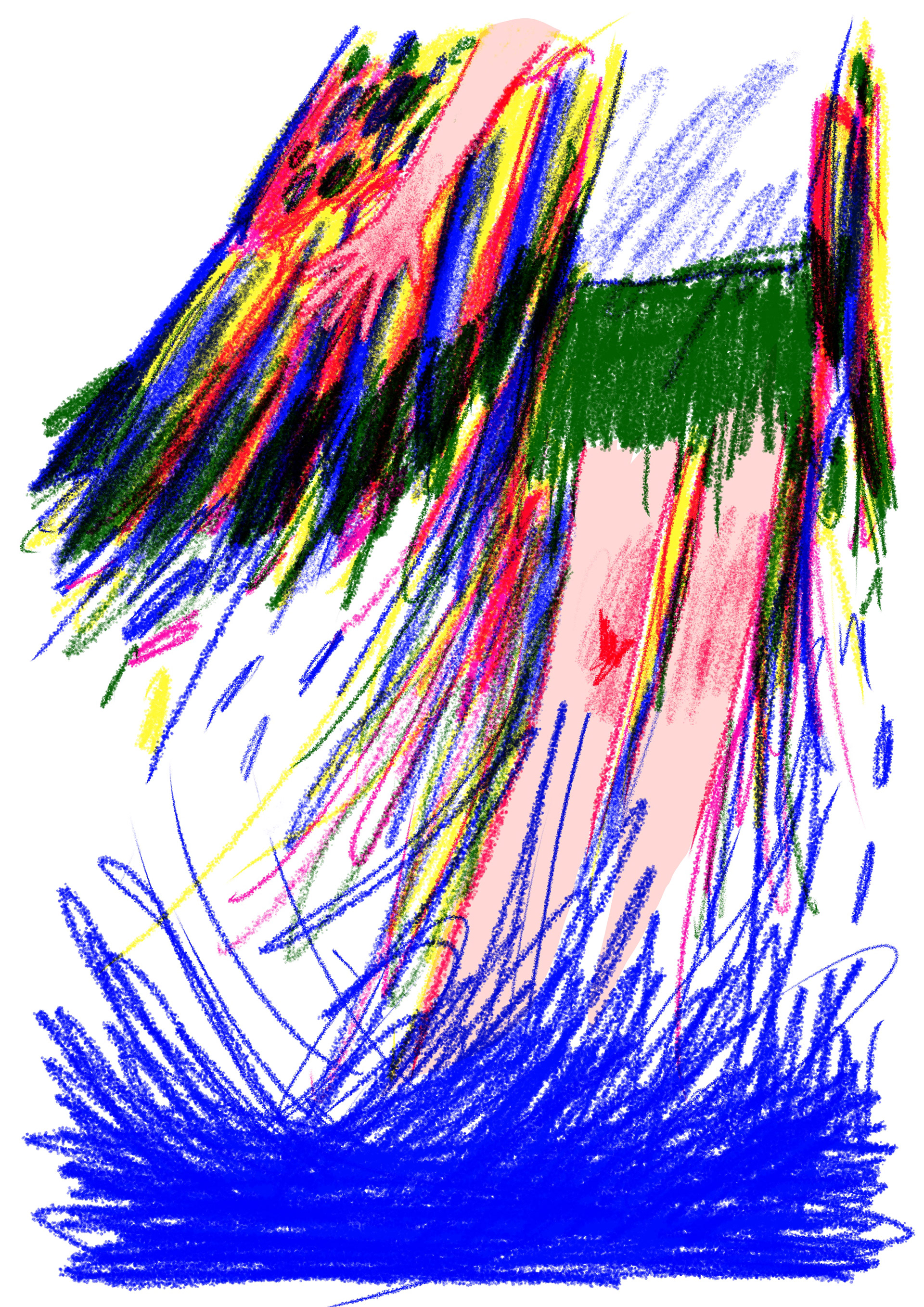
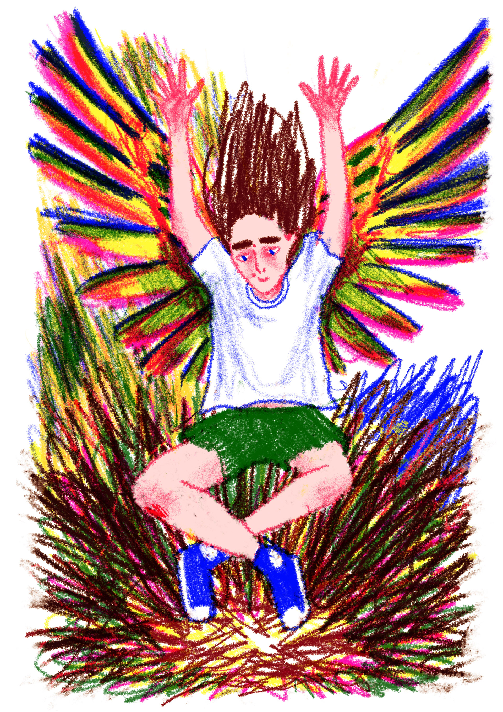
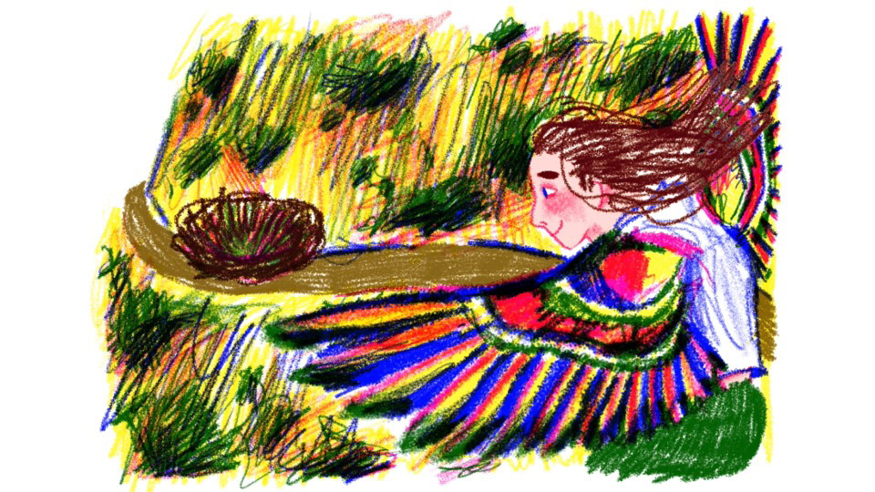
One page I really struggled with was this page. it had to look really good because it was a part of the story where it stops being realistic and run over into imaginary, so the bird needed to have its wings spread but because of pages were A5 and I want to show the size the bird the wings had to be really small and it wasn't giving the effect that I wanted and it annoyed me for weeks :( this was probably the one that took me the longest make because I couldn't wrap my head around how I could make the bird look big. I tried a couple of techniques and I thought if I stray away from the actual anatomy of the bird and go off what my head wanted it to look like it would look a lot better so on the third and fourth picture you can see that I have made the wings a lot longer and more square rather than a realistic wing and you can't even tell because that looks like how humans imagine birds
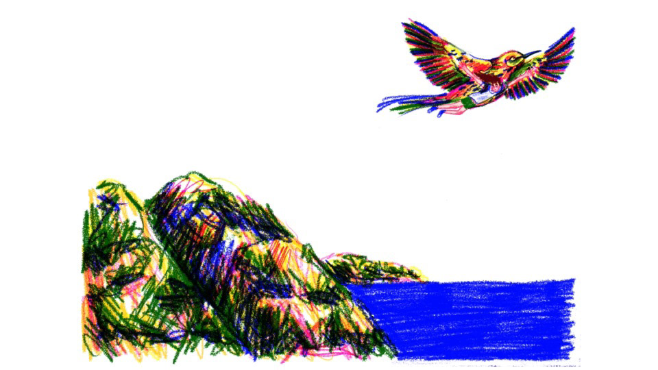
This changed how i was illustrating this book for me because I realise that not everything has to be realistic. You can see on the fifth page which is towards the end of the book, the lack of anatomy is what makes of movement looks so real because the legs are just sticks they dont have a lot of detail and the wings or scribbled on and the water has no texture other than the pencil scribbles, and I think realising this made my book a lot better.


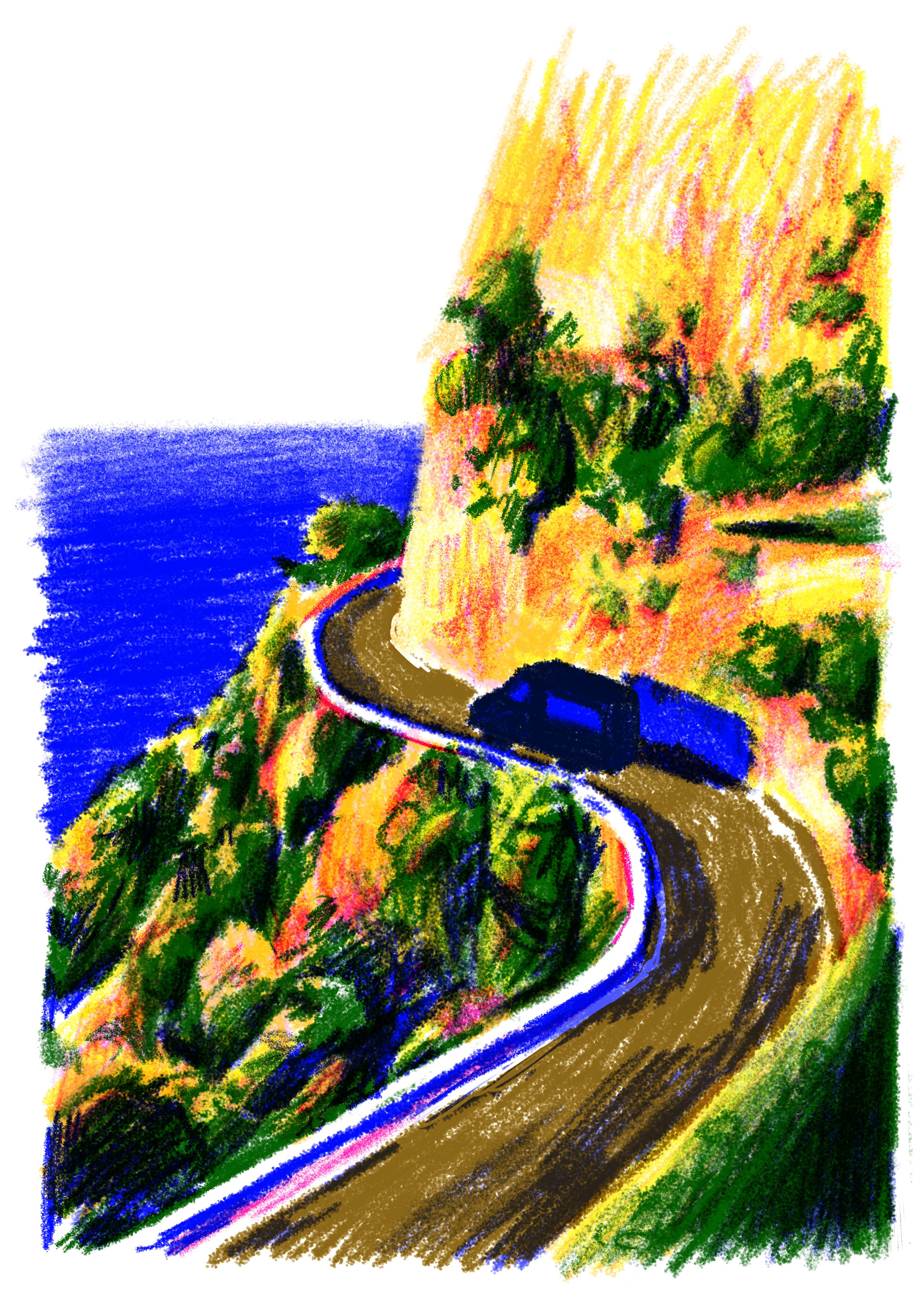
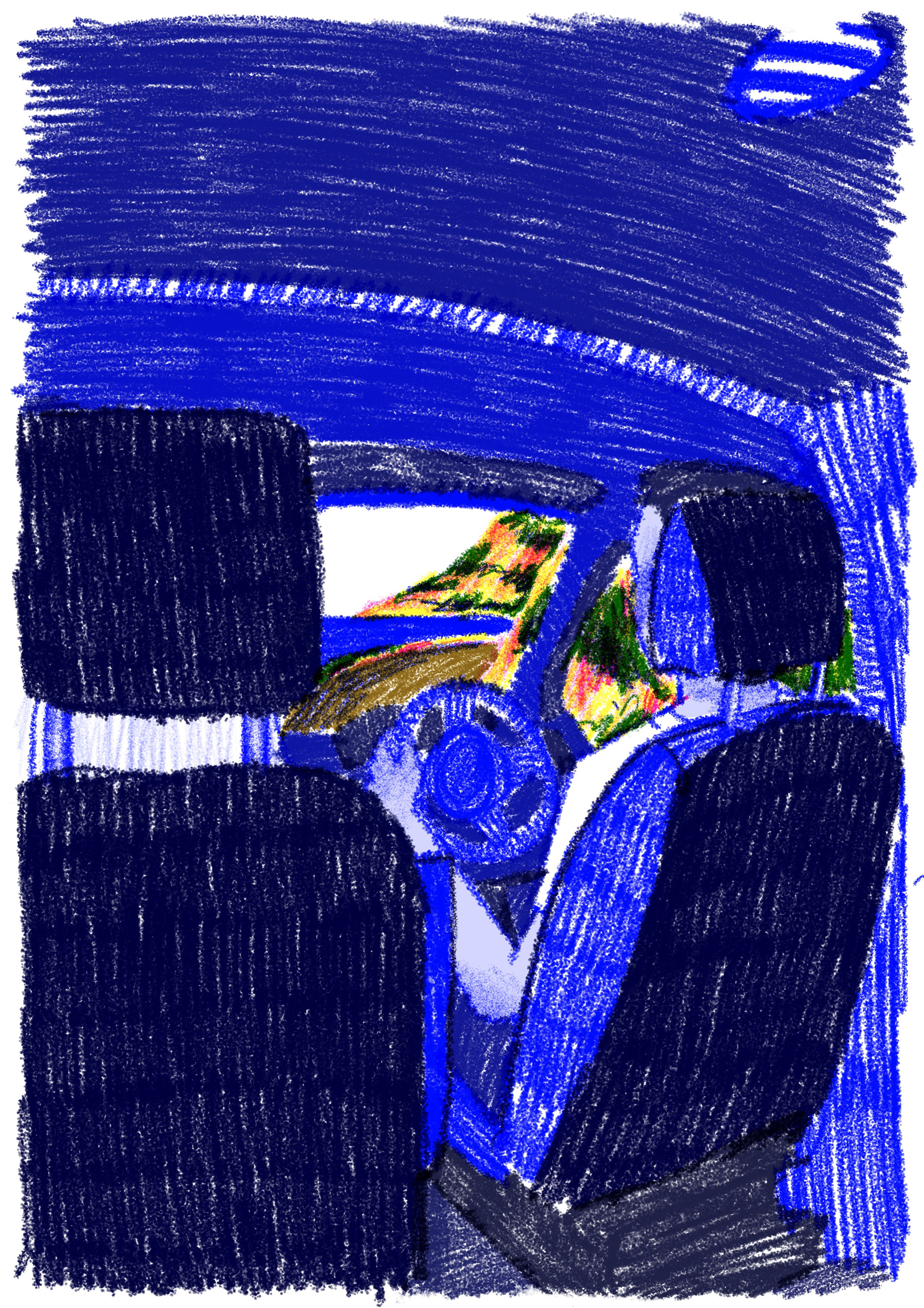
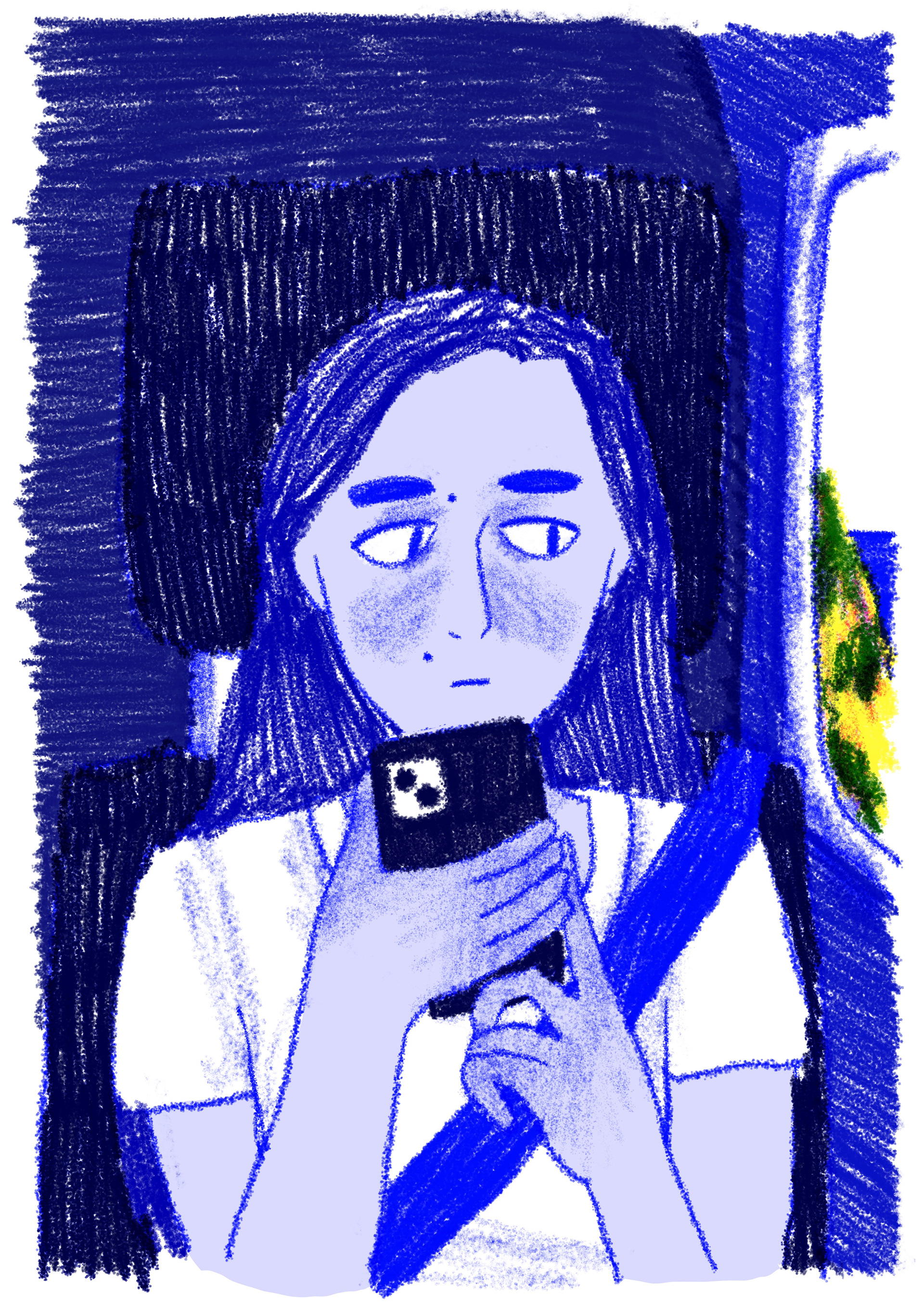
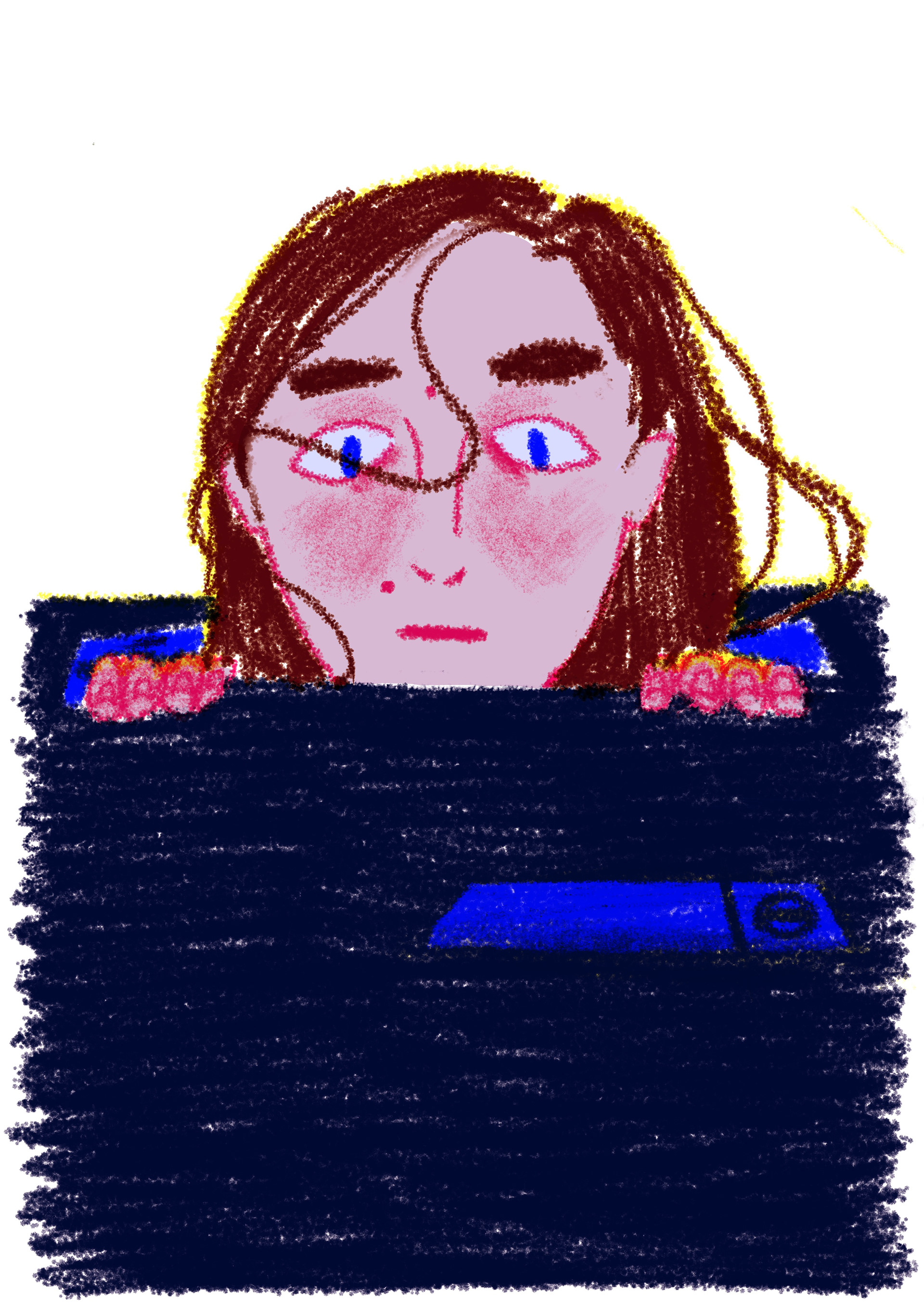

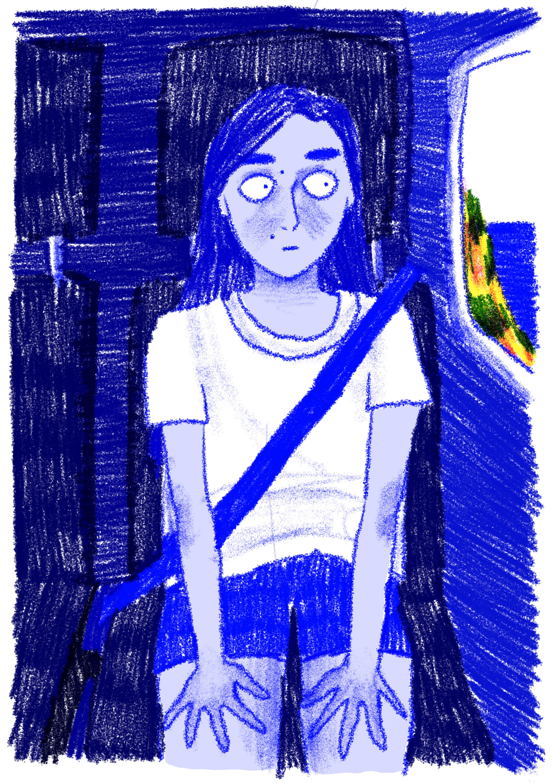
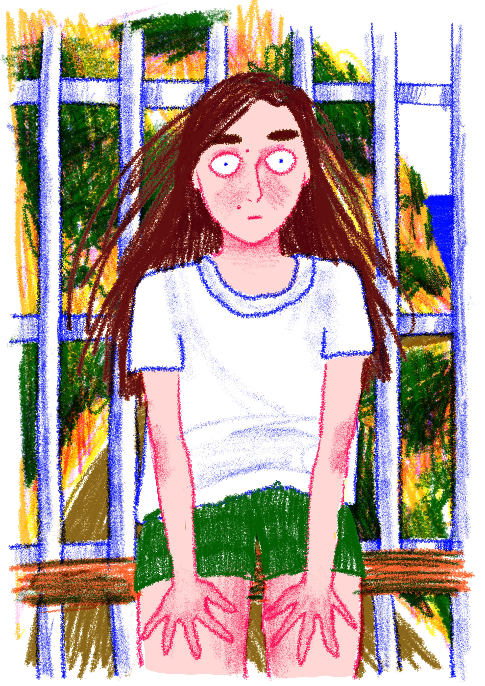
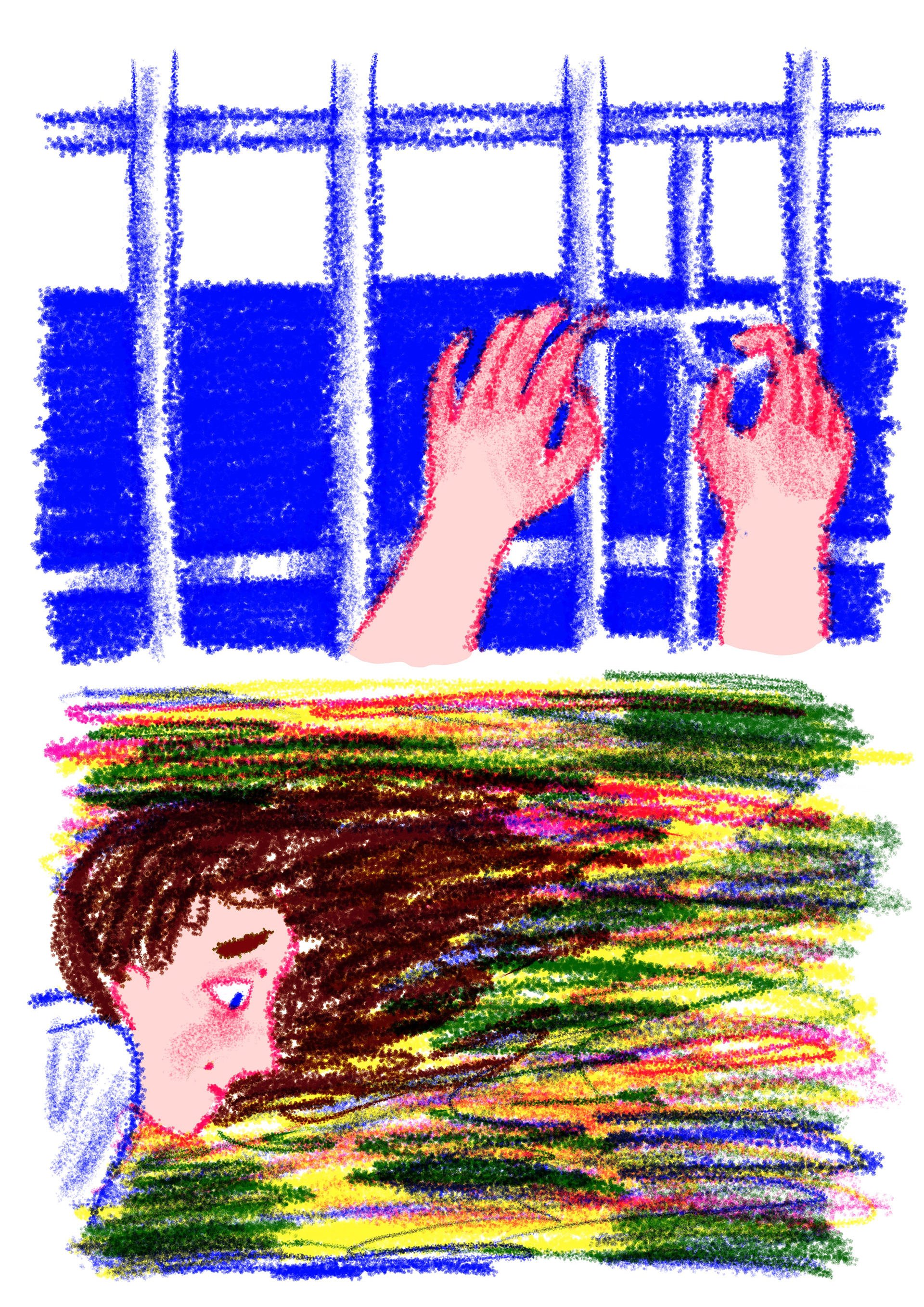
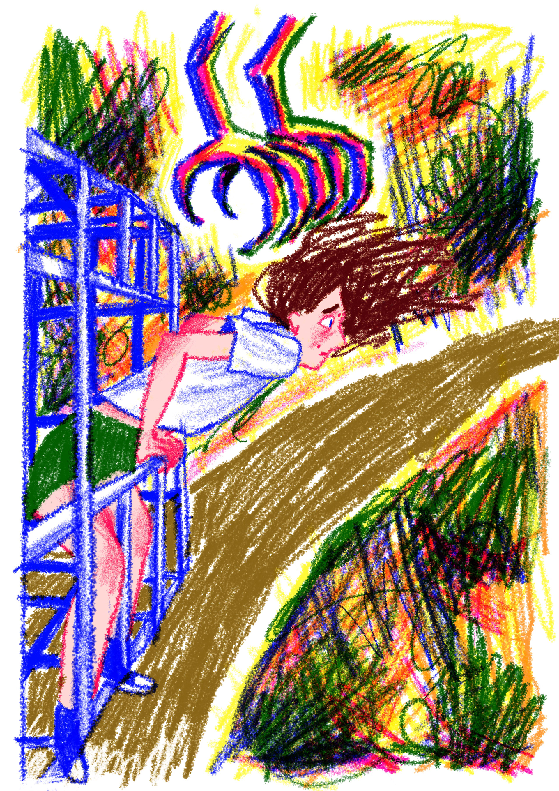
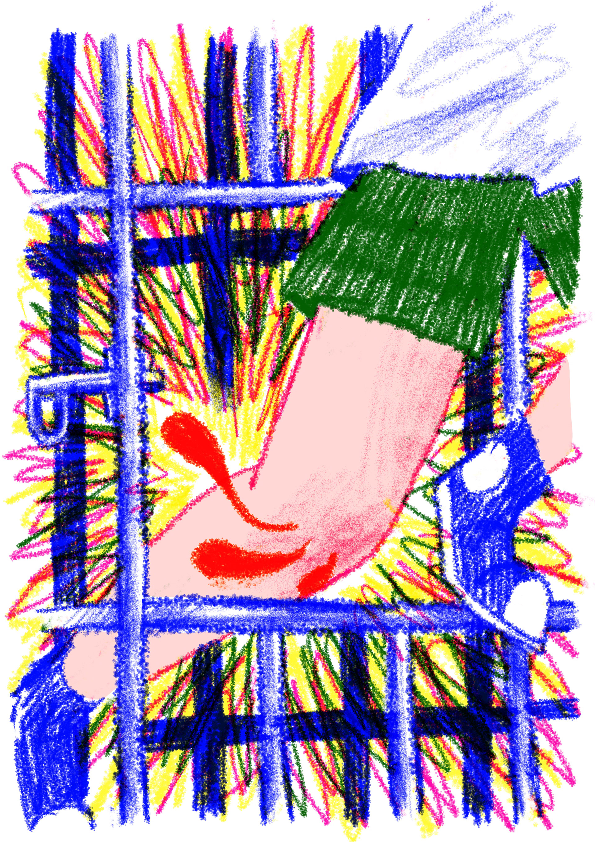
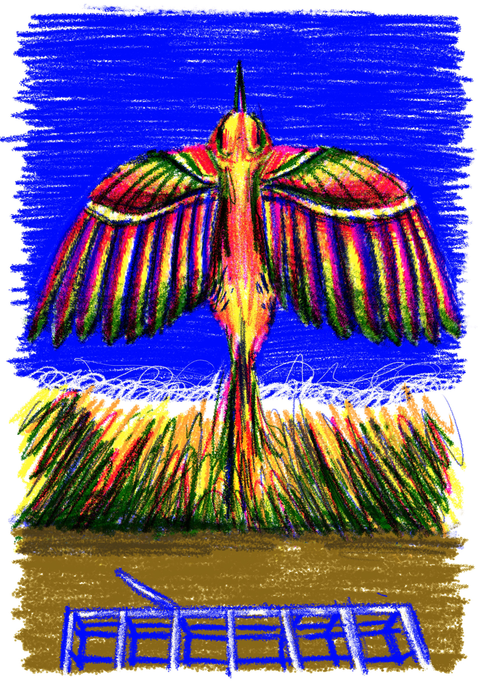
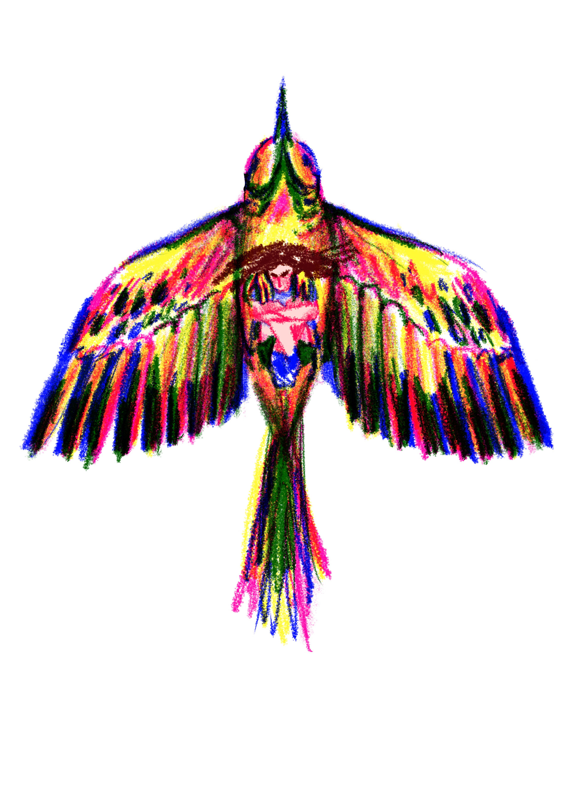
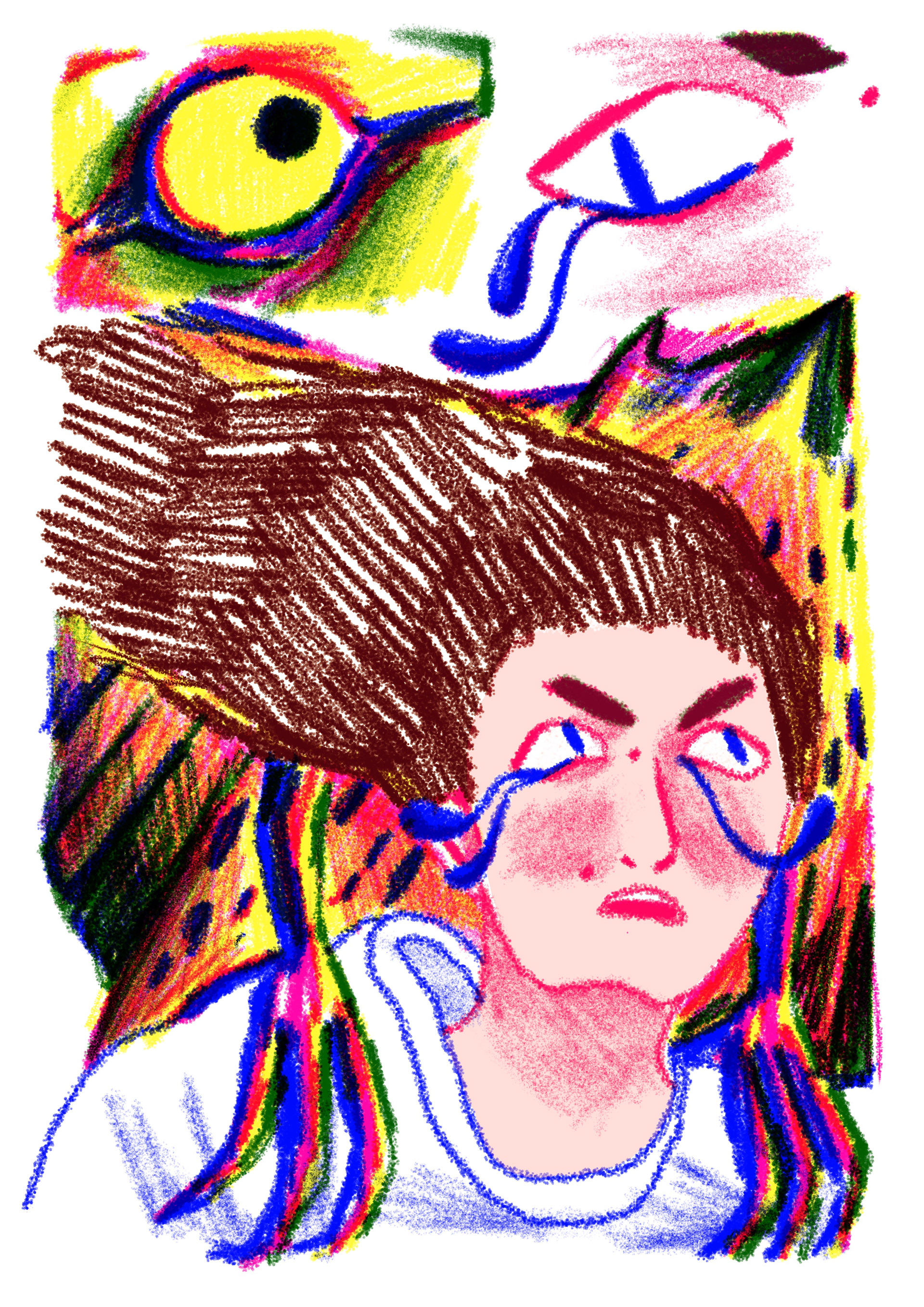


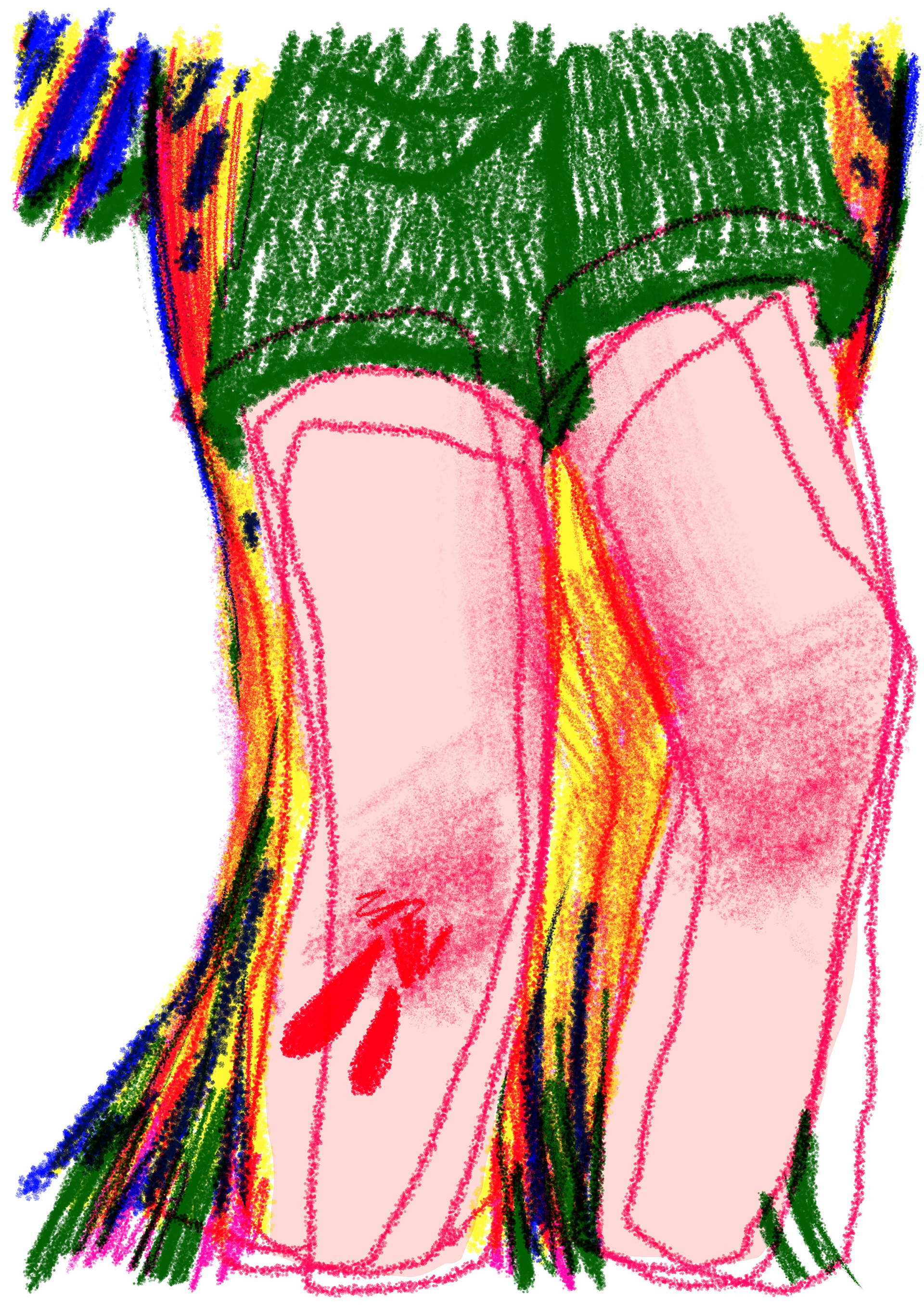
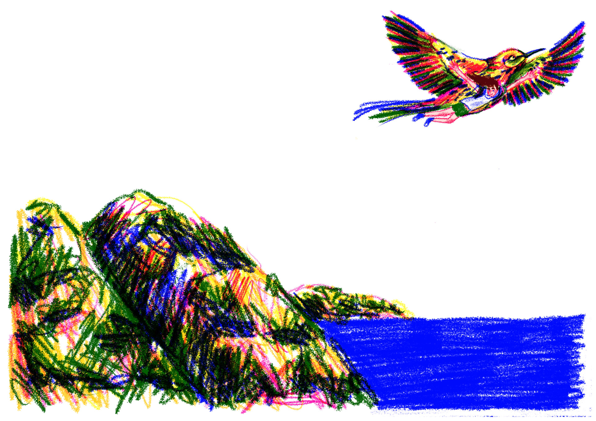
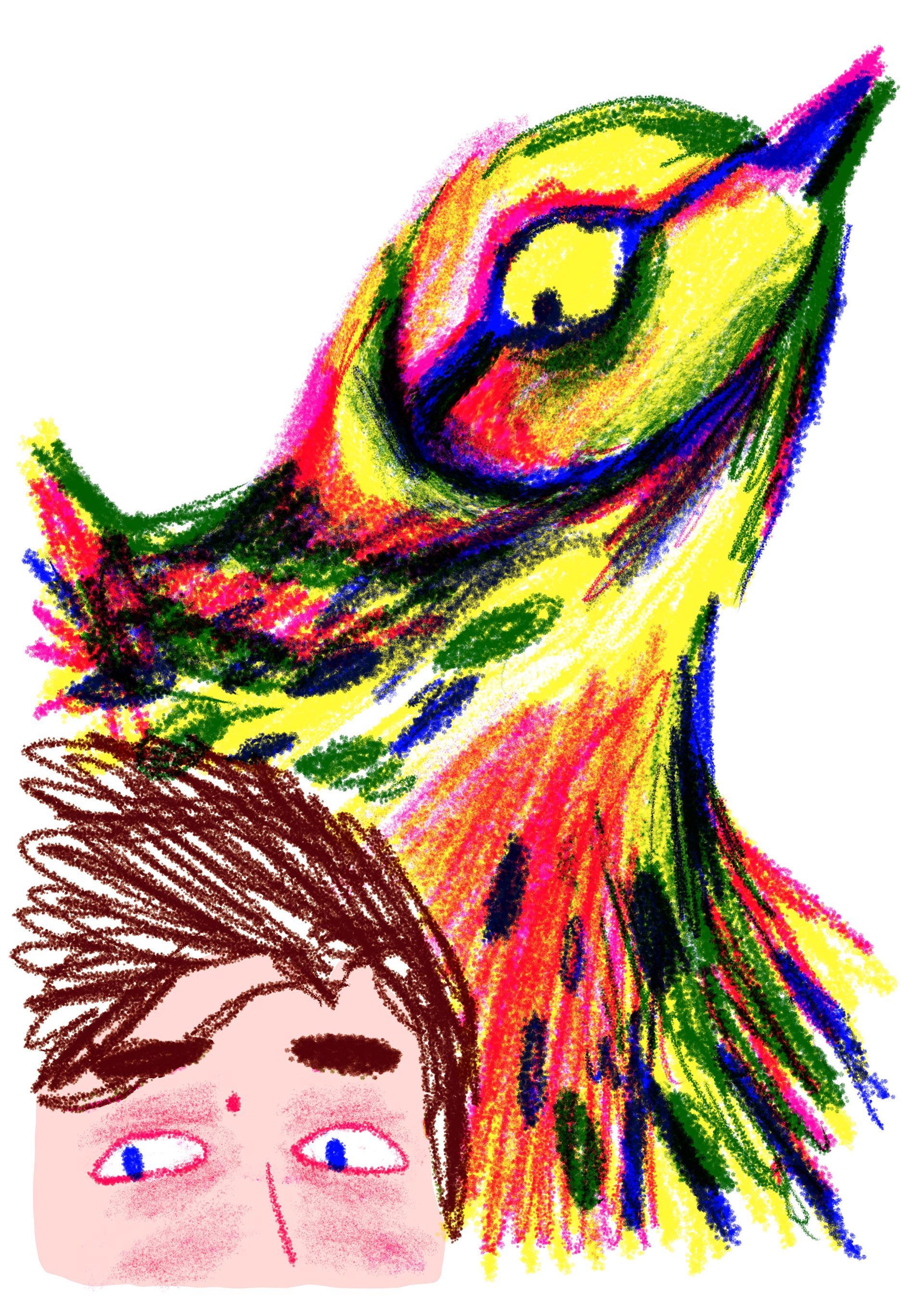

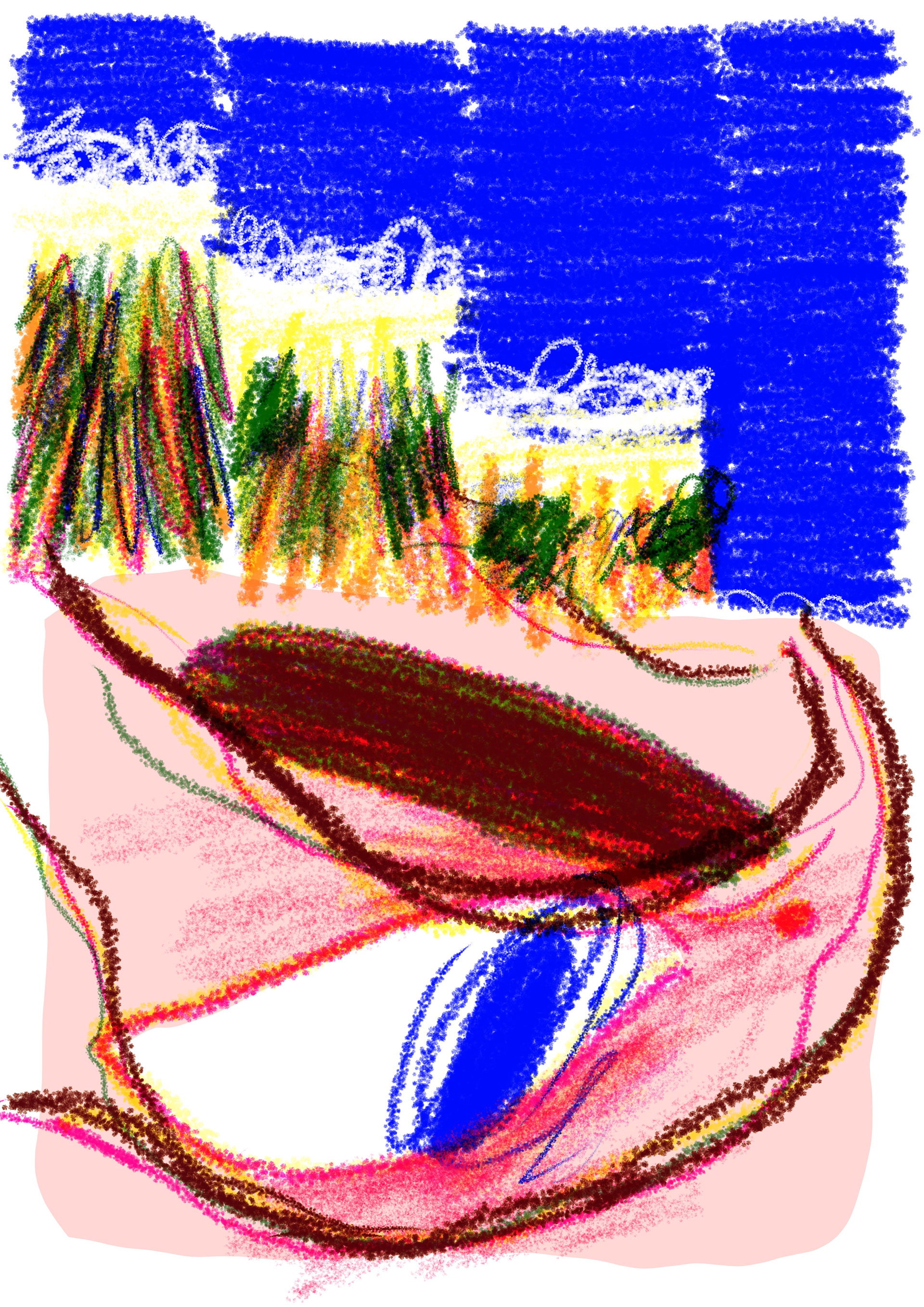
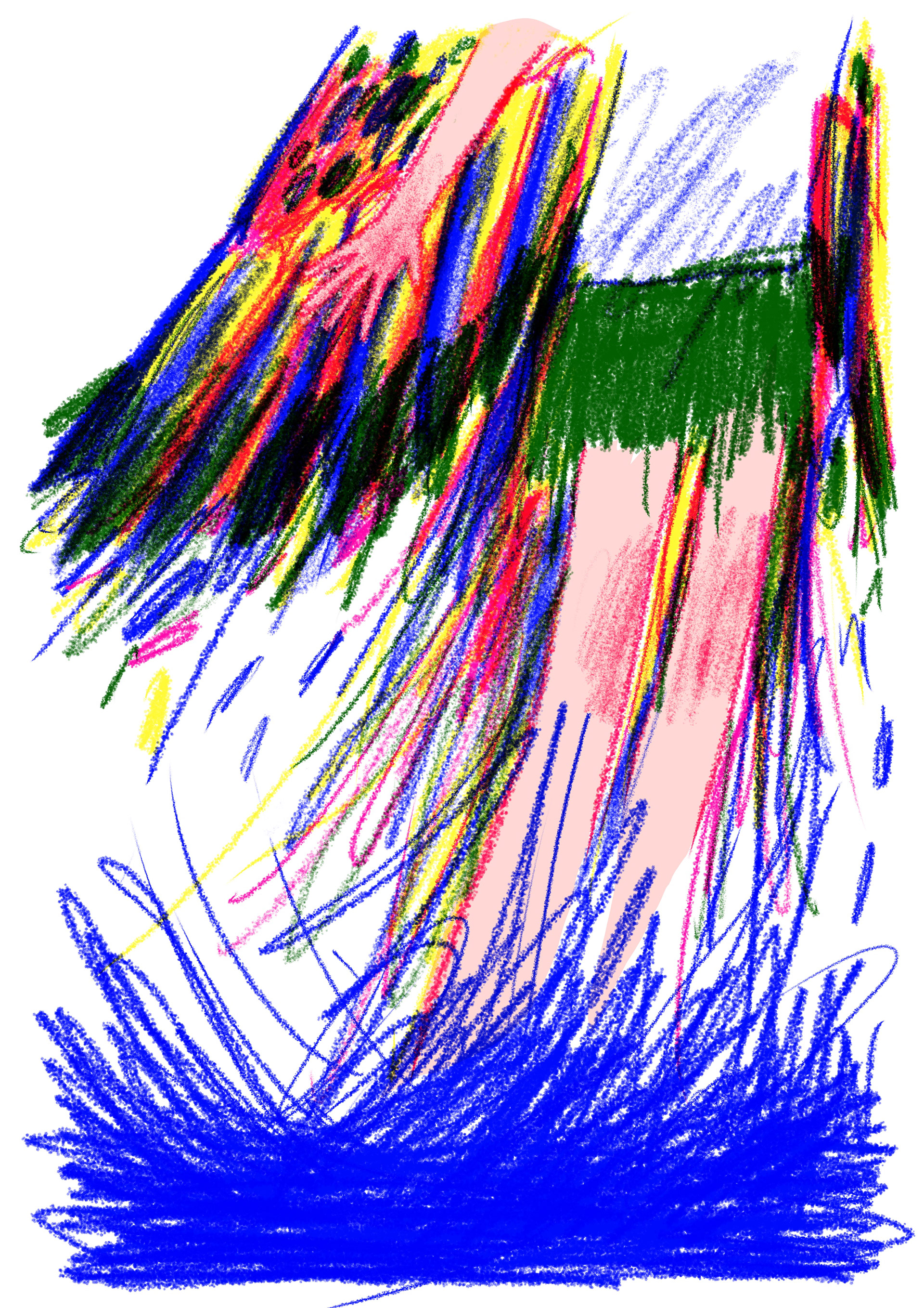
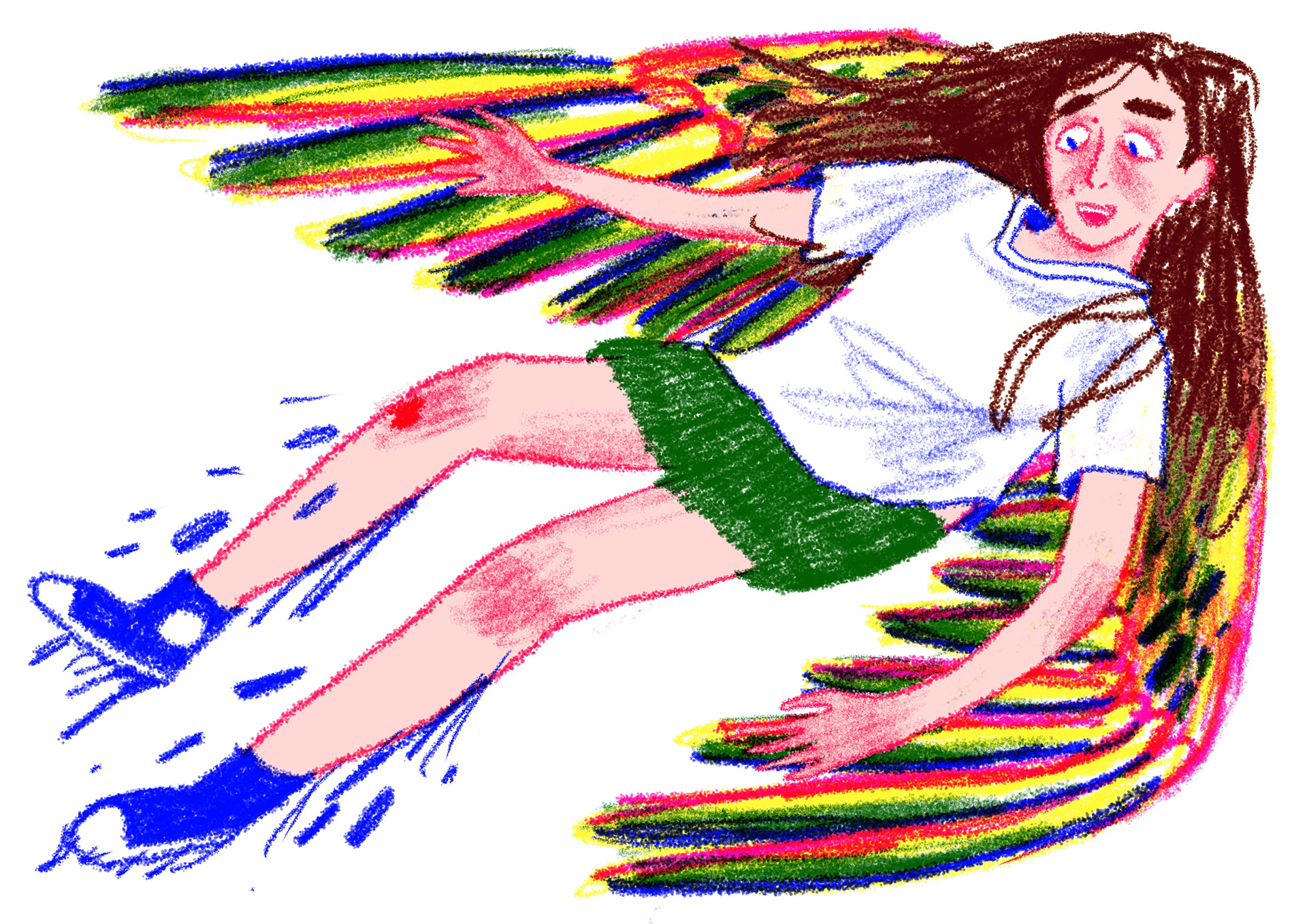
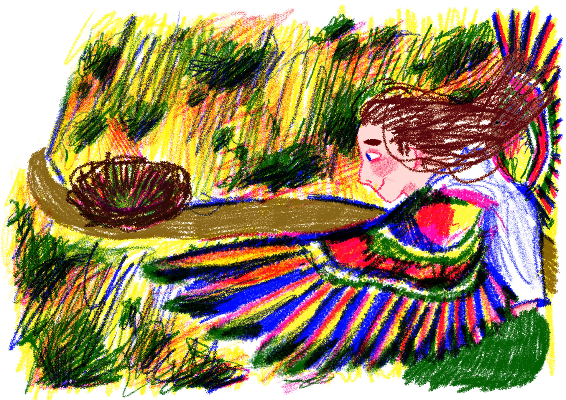
and this is all the illustrations in order!! i got the rest of the pages done in a week took lots of brain power but it helped keep my style consistent because i was doing them all back to back. i felt abit strange about the final thing, but i think its because to ME it feels like a really really personal project so i was nervous to show people, but to everyone else its about a bird lol so they wouldn't know the meaning of it which is what i want. i want to give of a FEELINGGGG rather than a really obvious meaning to the story.
to put the book together ready to print i used the indesign template from the amplify project and then because indesign exports as CMYK, i popped the pdf back into procreate to turn the saturation up and then printed through the laser printers !!! i love the laser printers, especially the ones in 205 bonington because theyre really cheap (i can get the whole 32 pages done for £2) and they print all the colours really nice and BRIGHT! i would have liked to print a copy on better paper, i had cut out everything id need but i could find a laser printer that could handle the 100mg paper and i really didnt want to go to the print shop because i didnt think theyd let me use my paper AND i thought i would be sacrificing the lovely bright colours, so i reckon if i need it in better quality ill get it done at a later date :)
and this was the final storyboard :) i simplified some pages down to being one double spread, so it was only one illustration for me to do rather than two. i also added the scenes that Joe suggested but in the way that I wanted to portray them, and i added the front and back cover and deleted the page of me holding my heart, I didn't think it was needed and it was a lot more seamless to just go straight to the shaking legs and arms because the reader already knows that I must be feeling scared because I'm being kidnapped by a bird so don't feel like it was necessary and I'm glad I took that one out UNNECESSARY PAGEEE
I figured out over the year this is how i normally arrange my projects. I always make a stroyboard of all the pages as I go and play with things on my little storyboard scanner into my iPad so I can move pages around, rearrange, and make things double spread. this works better for me compared to writing down a list and checking them off or having the storyboard in person. I've done it for every single project subconsciously and it works really well for me so maybe this is how I work. Maybe this is the secret code to all my projects and I will probably do this all the way through third year and it's just how my brain does it I don't even try to it just makes it happen so good for me.
i made two copies of my book, one stapled and one bound saddle-stitch with bright blue thread to match the blue in the book and im SO HAPPY I DID IT it was an idea that i mentioned in the interim crit and it always makes me happy when i have time to add all the little details i think of right at the start of the project and i really enjoyed looking into binding as book making so hopefully i can have a go at making some of my own sketchbooks in the summer out of scraps and fun stuff like that!



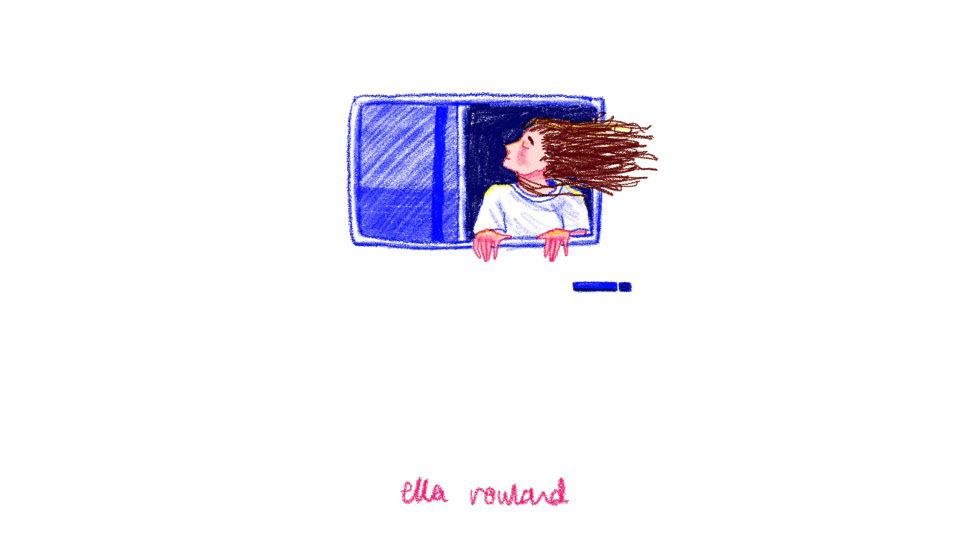
yippeeeee final pitch woo!! for my presentation i used my interim crit powerpoint but refined it slightly and added pages of my story broken up into parts because i thought we would be presenting to a massive group and not everyone would be able to look at my book. Luckily there's only me and Sam and Lucy from graphics in there with Joe and Luke so, because I had two covers of my book, everyone could have a look!
it was a lot more relaxed than I thought it was going to be and I was really nervous I think it was because I tried so hard on this project and it felt like a big turning point for me because I don't normally do comics and I was scared of what everyone was going to say and I thought Joe was going to rip it apart lol but he DIDNT and it went really well. i was worried about people not understanding the story, I didn't need them to understand the meaning, but I just understand a metaphor of being forced out of your comfort zone and then you come back and you have a change of perspective. the colours came out really well and Joe was really impressed with how much id done and that i had explained the story in a way that left some parts in the animation, but it wasn't too broken up and clunky.
Some feedback was that, because I was using the iPad because of work and it made it a lot easier for me to get more pages done rather than working traditionally like I normally do, he said it would've been better if I do use a brush on procreate that was obviously digital rather than using a pencil brush so that it look like I was mimicking analog work. I think he meant if I do you something like an airbrush pen or a monoliner it would've had the same impact but wouldn't like I was trying to fake doing traditional work. He also said that i drew one of my hands the wrong way round, but I was using my hands as a reference, and I have the fattest party sausage size fingers in the world so I don't think that matters too much and he also said he would like to see it on printed on better paper, which I would've liked to do as well if I had more time and maybe knew how to use a laser printer better which I do now because I printed my whole book on them!!
I understand all my feedback am I critiques im really happy with everything it's a really good experience, I really enjoyed looking at Lucy and Sam's books and Joe took a print which is very nice because I was giving Luke one anyways! He said that I probably could do well in comics in the future which is nothing I've never considered but i'll have to look at my third year because I really enjoy doing this one but I think it's because it was a personal topic to me, and I'm not sure how well I'll be able to make comic based off other peoples experiences or chosen topics.
I have love this project so much it's felt like a big part of the course for me I've tried something that I've never tried before and something I feel comfortable with with comics because I feel like it's closer to a storybook and has to be a narrative and I don't like the restraints of a narrative. I thought I normally enjoy stuff more like the amplify project where is my like a collection of pictures that told a story without a very consistent narrative or linear your direction, but turns out I really enjoyed this one. I think personally though that was because I got to choose the topic it was meaningful to me and I don't know how well I would be able to make a comic if it was based on a topic or narrative that I was given, but I like to try it so I think that's something I'd like to look into in third year.
This topic also tested my digital skills because I only ever really use my iPad for a tattoo work and I don't like using at uni. I don't want to use it when I don't have to but it was really convenient, normally I work analogue and then scan it in and make any final touch ups on my iPad but I think if I was have a really big project like this again, or project that had a very short time span I would use my iPad more because it was a lifesaver and there is a lot you can do without many materials.
TRAGICALLY there are some limitations, the brush that are use was just a procreate pencil brush and it was very repetitive I also found it a little boring just sitting in my bed drawing on my iPad even know the whole point of me using it was so I could do that and I prefer working with loads of different mediums and getting the page to go all wrinkly so I've slept that much material on it and then scan it in and seen how it looks on the computer, but for this project, I'm really glad I used it and I'm glad I didn't try and pressure myself into working analog because I wouldn't have been able to get all the illustrations done and this time and to the level that I was happy with.
I wrote this project has been great for me I loved the joke is a brief I really like olives your classes work as well so that might be why I was so nervous and it's just been really good to try something different something that went against everything that I normally like doing mixed with it being personal and bright and colourful which of things i normally enjoy!! It's been a really good challenge for me to give myself a lot of work to do and I think this project and really useful for me for third year and for possibly think about what I might want to do in the future :0
