BRACKENHURST YAY !!! i love brackenhurst campus so much, i used to go to all the open days when i was younger because me, my mum and sister enjoyed wandering around the beehives and the big gardens. i also really like the area where brackenhurst is (Southwell) and i used to go on walks around there or we'd park my caravan nearby. good memories and a really pretty posh part of nottingham. id never previously considered doing murals until the past few months looking at the area where i'm from and identity, but i think its something i'd love to do because i like the idea of leaving a lasting impact on people's homes and its nice to think of my work improving a space. i love staring at murals and seeing the brush strokes and imagining the artist plopping the paint on. this whole project is my idea of a fun time :) this page has all the basics that i have to remember during the project or i'll get CarRIED Aw ay in the whimsy of it all :0
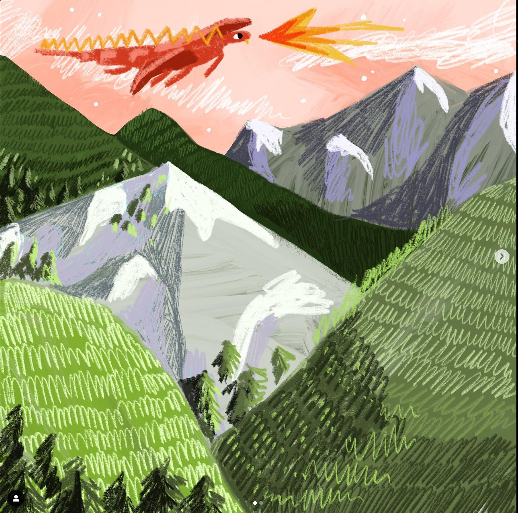
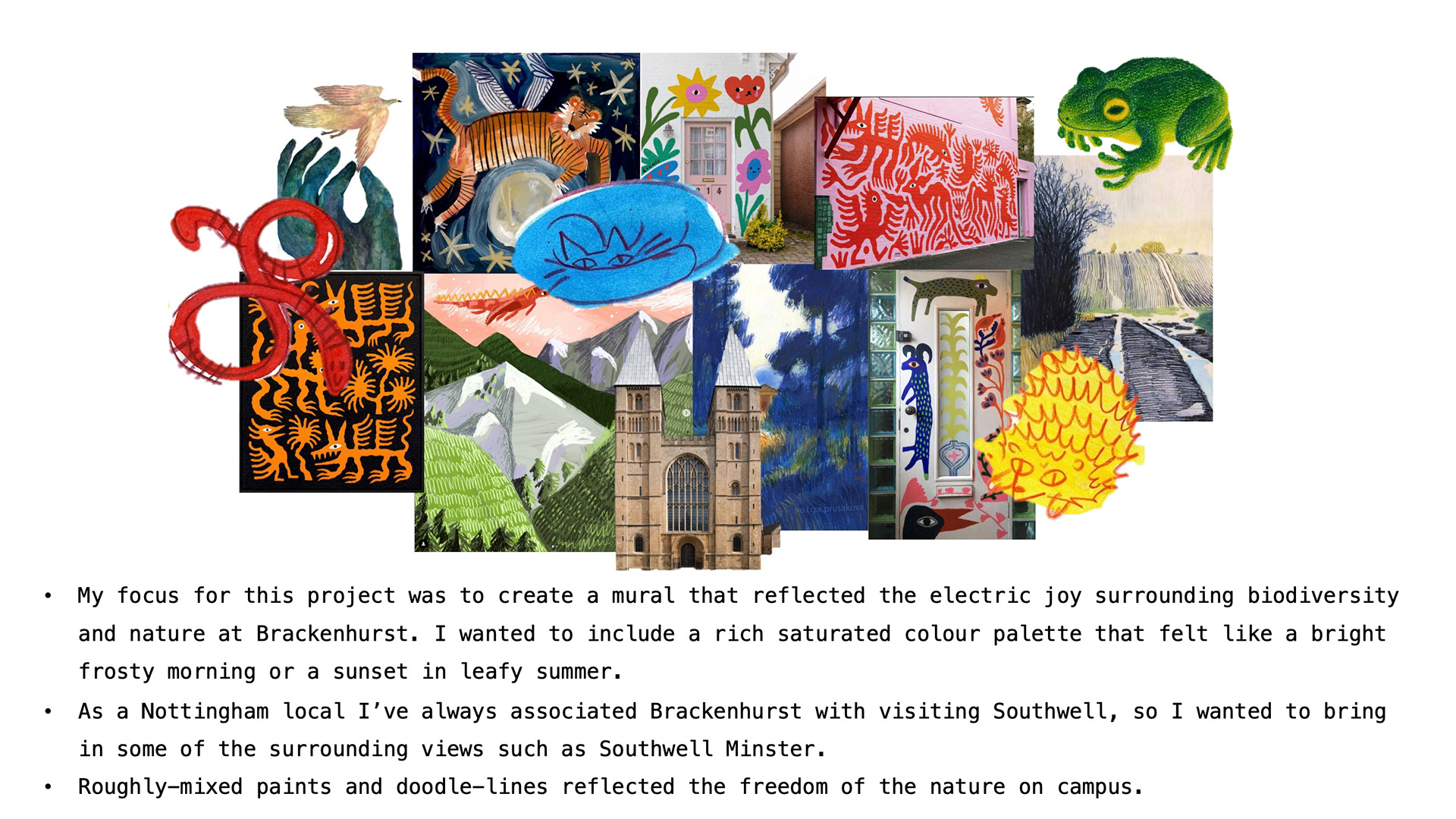
one of the first artists i thought of as soon as i knew that the theme was flora and fauna was Florence Waters. shes an artist ive been following during her masters and shes done some really beautiful murals. i love how you can see the blending of colours in her murals, im a bit of a hater of flat colours because why WOULDN'T you blend them but maybe thats because im a very colour-oriented person. i love how she uses so many textures in her work, especially on the grass. i want my mural to me FULL of movement and suck people in to a lovely world of horses and fields, which is a big bonus of the wall being curved because it means its like a curved tv :0 i want it to be a nice happy break from all the dissertation work people will be doing in the library.
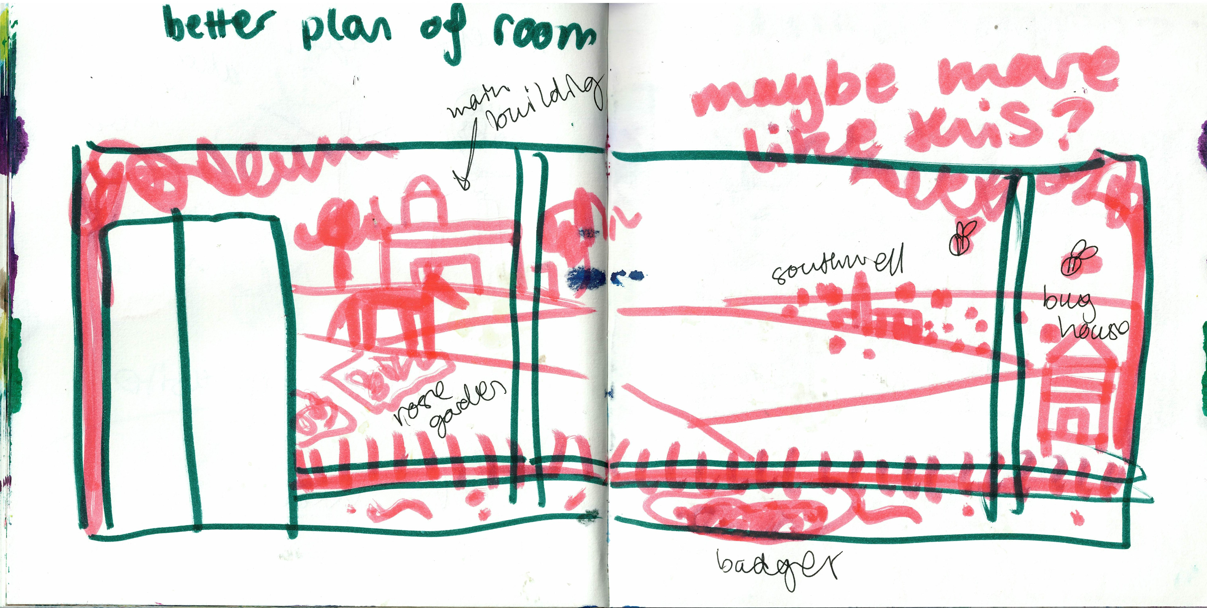
i also really like when murals work around the space, like they frame a door or a window, i think it makes the mural feel like it's part of the room rather than a big sticker, and it makes me happy to think the artist used the space to the maximum. it feels PERSONAL !!!! by the looks of it i'm going to have to fit my design around a double door and two power pillars, but that's FUN and i like a challenge. we're going to brackenhurst next thursday so ill be able to have a proper look around and take some videos of the space!!
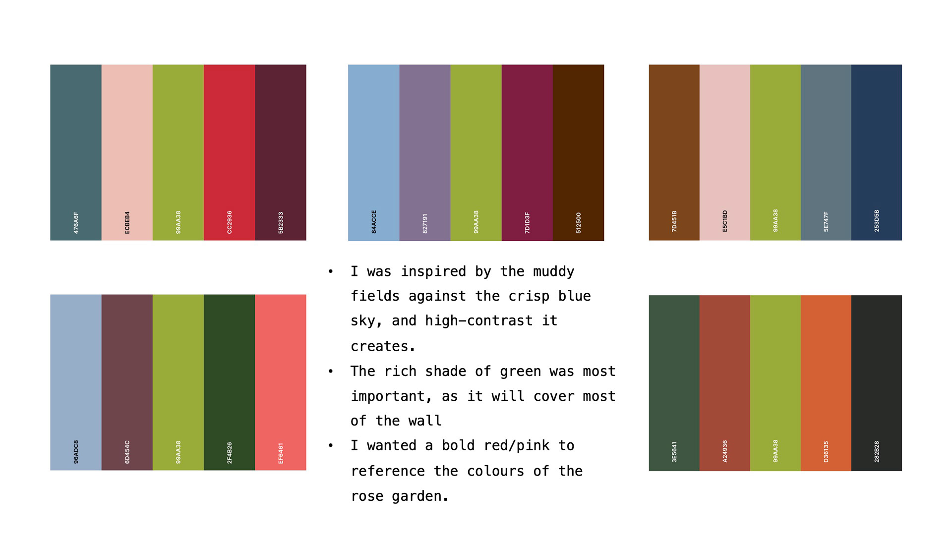
I care a lot about the colours that go on them. I know I need to use a restricted colour palette to keep it looking cohesive, and I normally work better with a strict colour palette; otherwise, I get too excited and do too much. I want the colours to look like a cold, crisp, frosty day—so light blue and a peachy orange, like the sun on snow, and bright greens. But I don't know if that works with people using the library all year round, so I don't want to show multiple seasons. Or, should I just go with something more like a spring colour palette, which would show off the flowers better and keep is as more vague so it doesn't look weird during the year
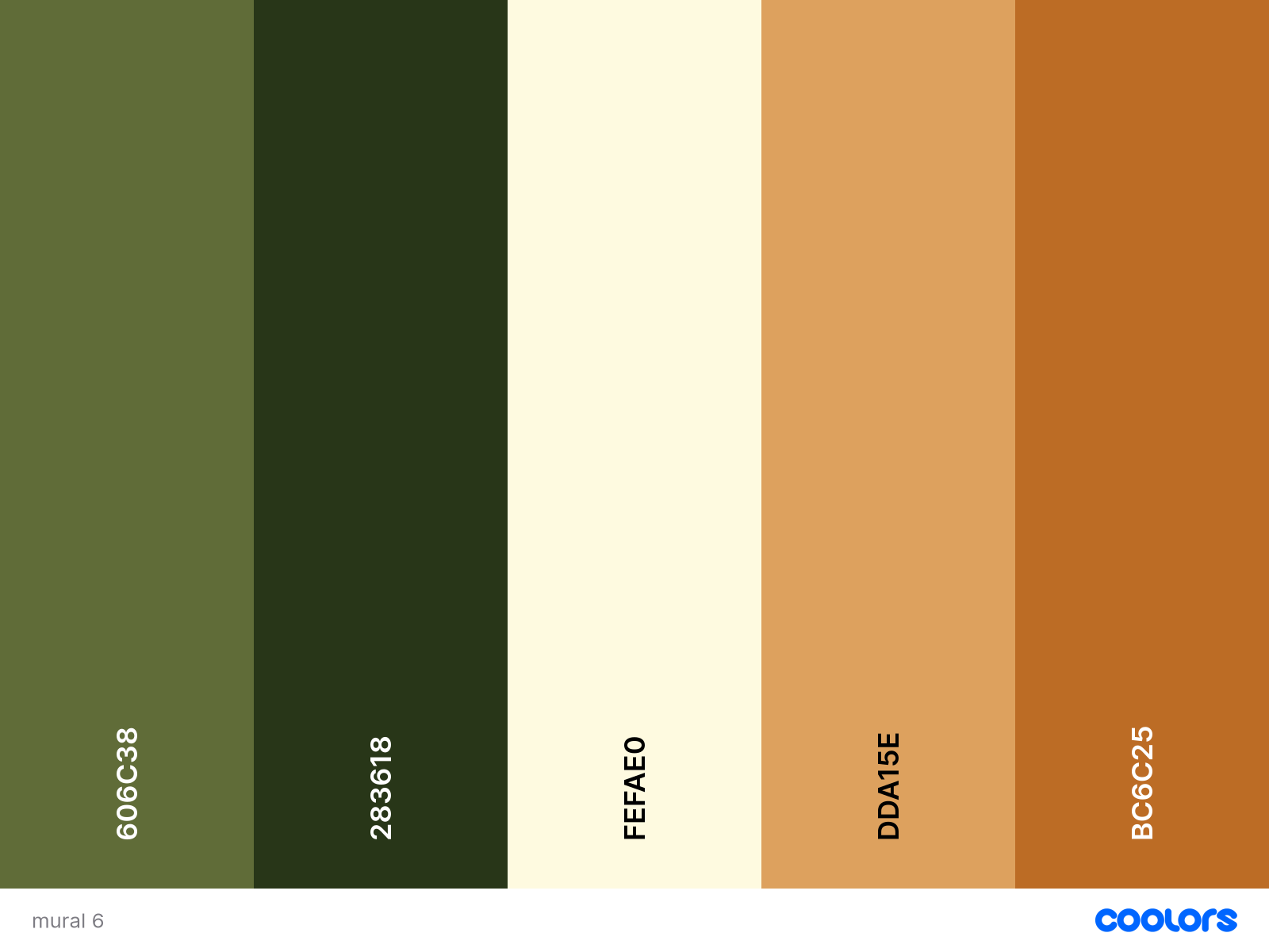
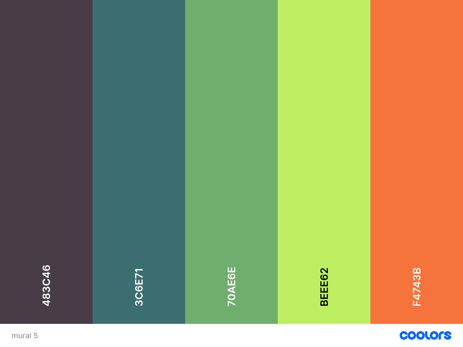
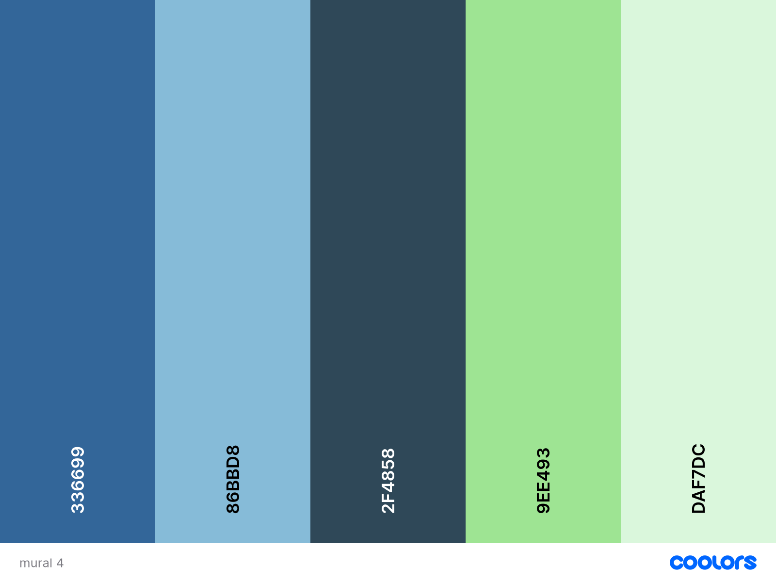
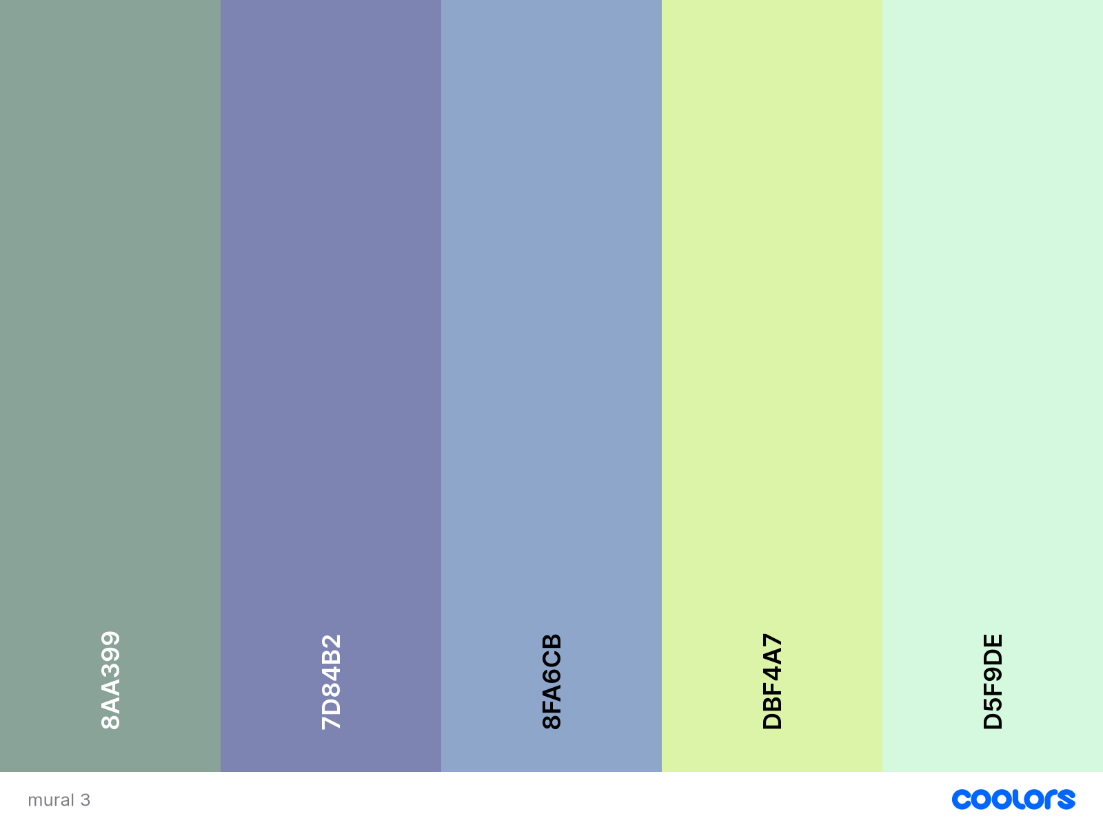
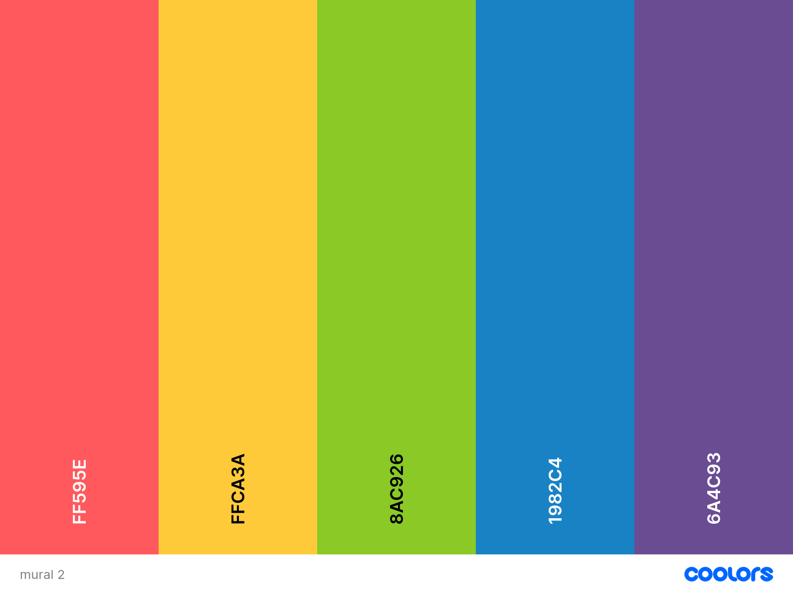
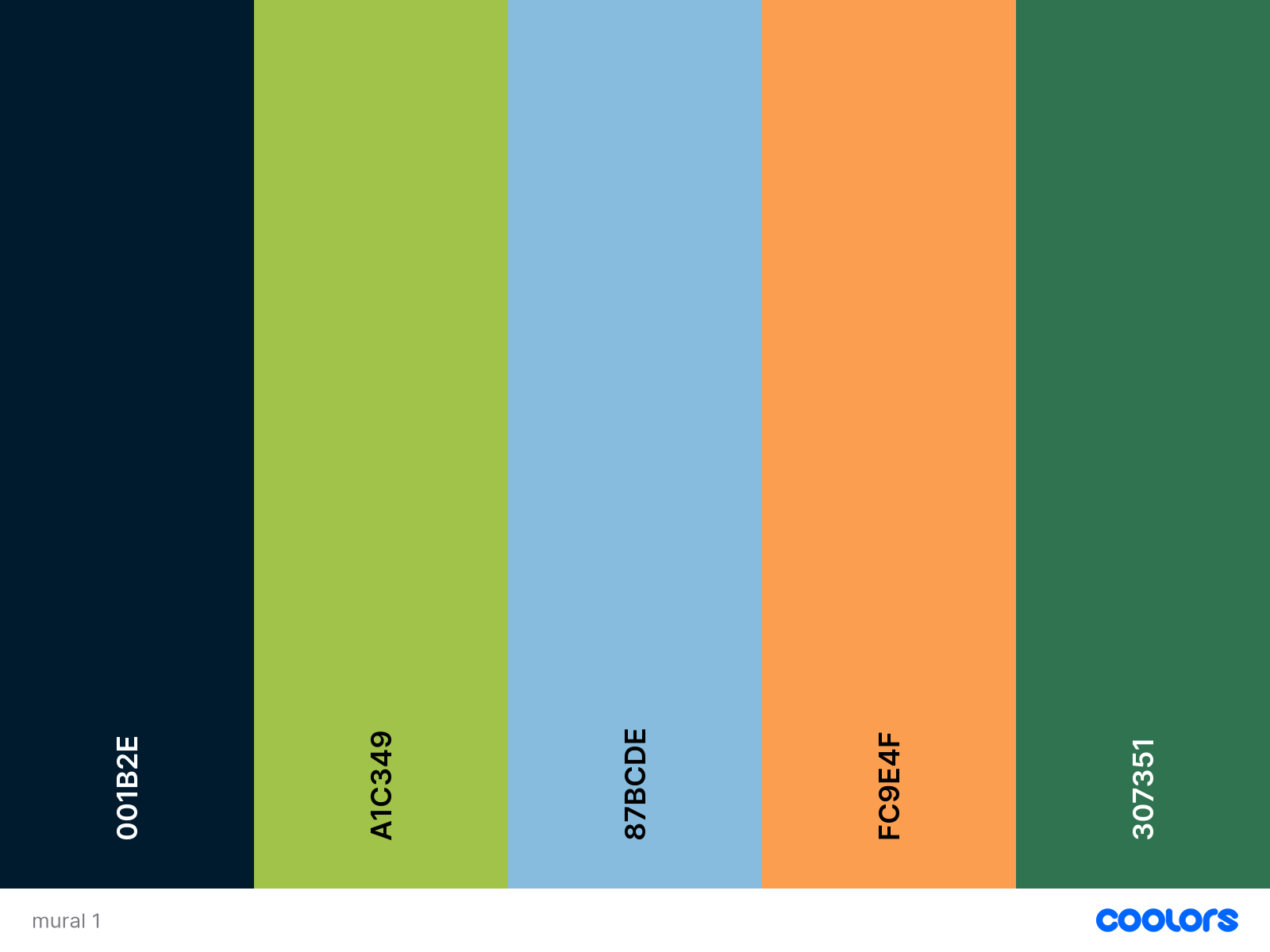
I went onto coolors to have a look at making up some colour palettes. Normally, I just try to make up my own color palettes or create one from photos, which I still might do when we go to Brackenhurst on Thursday. I could take some photos of the surrounding area so the mirror looks like it fits in at Brackenhurst. But I want cool colors and have made a few palettes of the kinds of colours I want to use, like the crisp blues, greens, and oranges. I think the rainbow one is a bit too full-on, but I'm not going to write it off yet because I could do a more muted rainbow. I really don't want to use a lot of beige. I want to brighten up the library rather than make it seem darker, and I want it to make people feel refreshed, bright, and like a cucumber.
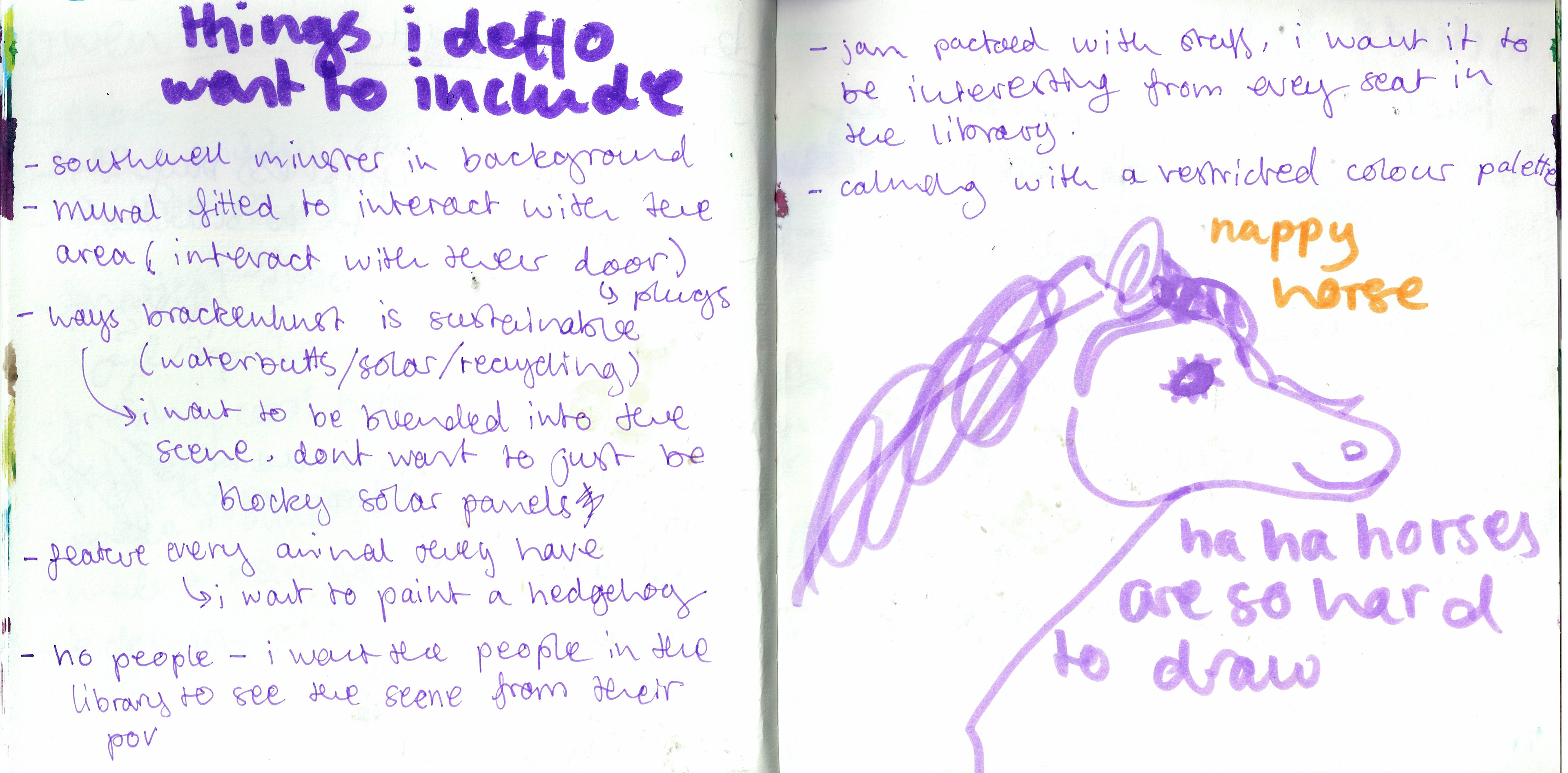


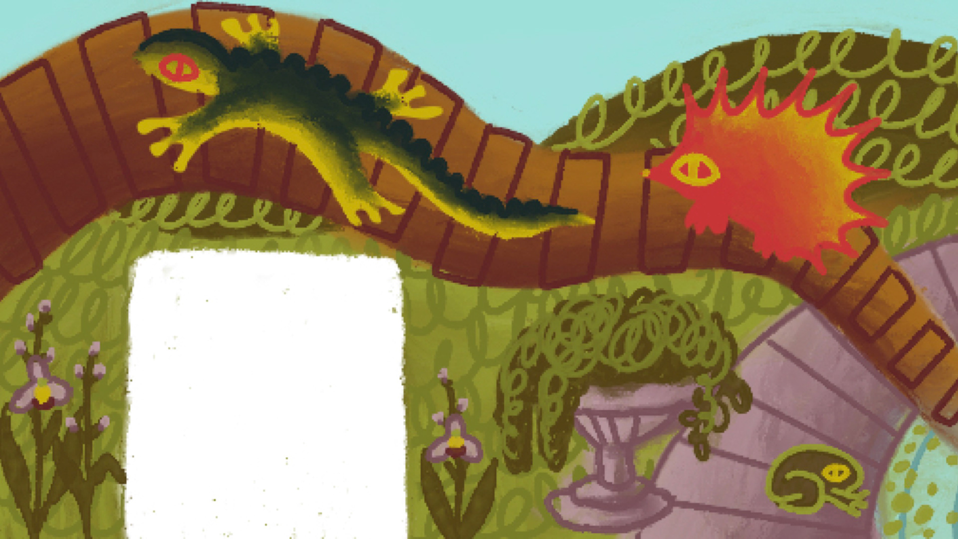
i had to get the first idea out of my head or i wouldn't have any room or the good ideas. the idea i had was very storybook whimsy magical because that's what i like even if it doesn't fit the brief very well but i needed it out my SYSTEM. i like the owl tho i love owls so much their one of my favourite animals i like their spinny heads and i like drawing apples and cats so hopefully i can include them in my final painting too. i think badgers r hated more than they should be so i want to include them too, they are the pinnacle of english animal to me and im sure theres some at brackenhurst so i'll have to ask about where they live on campus. i also like turning doors into trees because it helps absorb some of the awkward spaces and i think it's fun if the doors made of wood big added bonus. very desperate to include southwell in the background too bc i dont think anyone else will do that with a scenery mural.
i want to include the Nottingham county flower, which is the catchfly. Even if it doesn't go in the Brackenhurst area, I like putting in specifics. I want to include them all because it’s nice, and it makes me think of time with Sylvanian Families when I was little. They had all the little details, like bread in the toaster, and it makes it exciting for me to hide these little details like specific flowers and landmarks like treats.
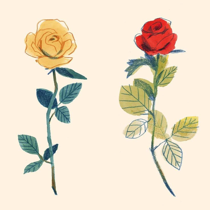
I think for the way I paint the mural, I don't want just flat colors. I really like when things have a smooth gradient to them, a little like how you can get on illustrator when using vectors. I think it highlights texture and movement on objects without making it look too painted, but still keeps it looking clean and crispy and easy to understand. It also eliminates the big need for really dark lines and means that you can play around with the colours, much like I shared in my tattoo flash designs. I'm used to this style, and I think it looks great in contrast with colors, especially on a bigger scale.


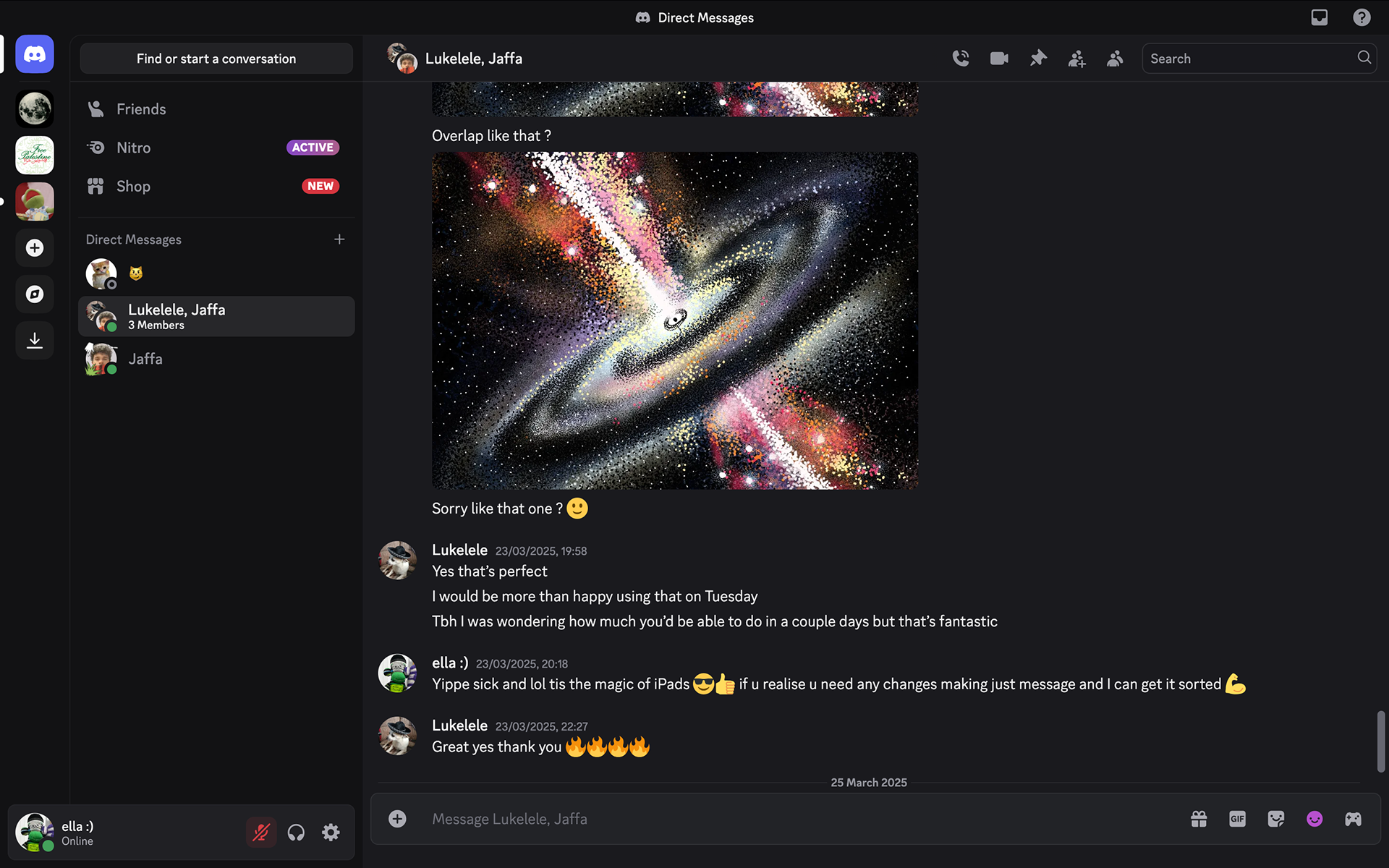
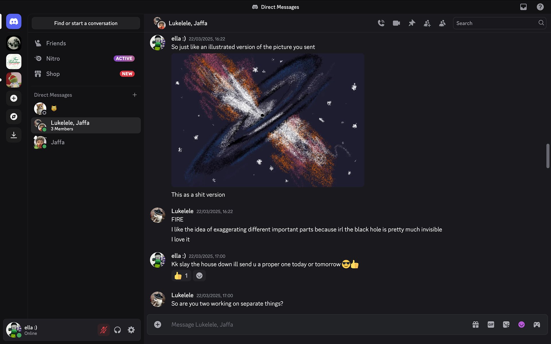
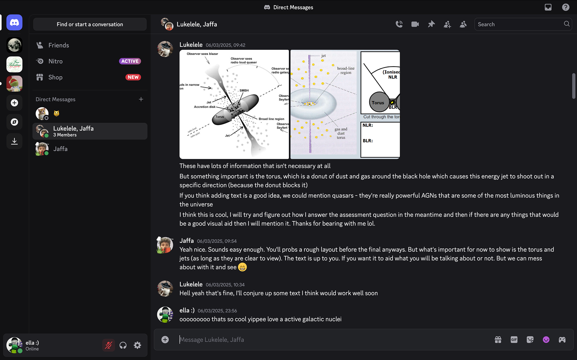
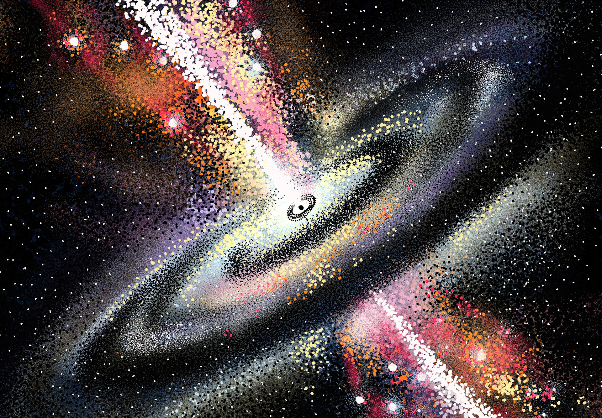
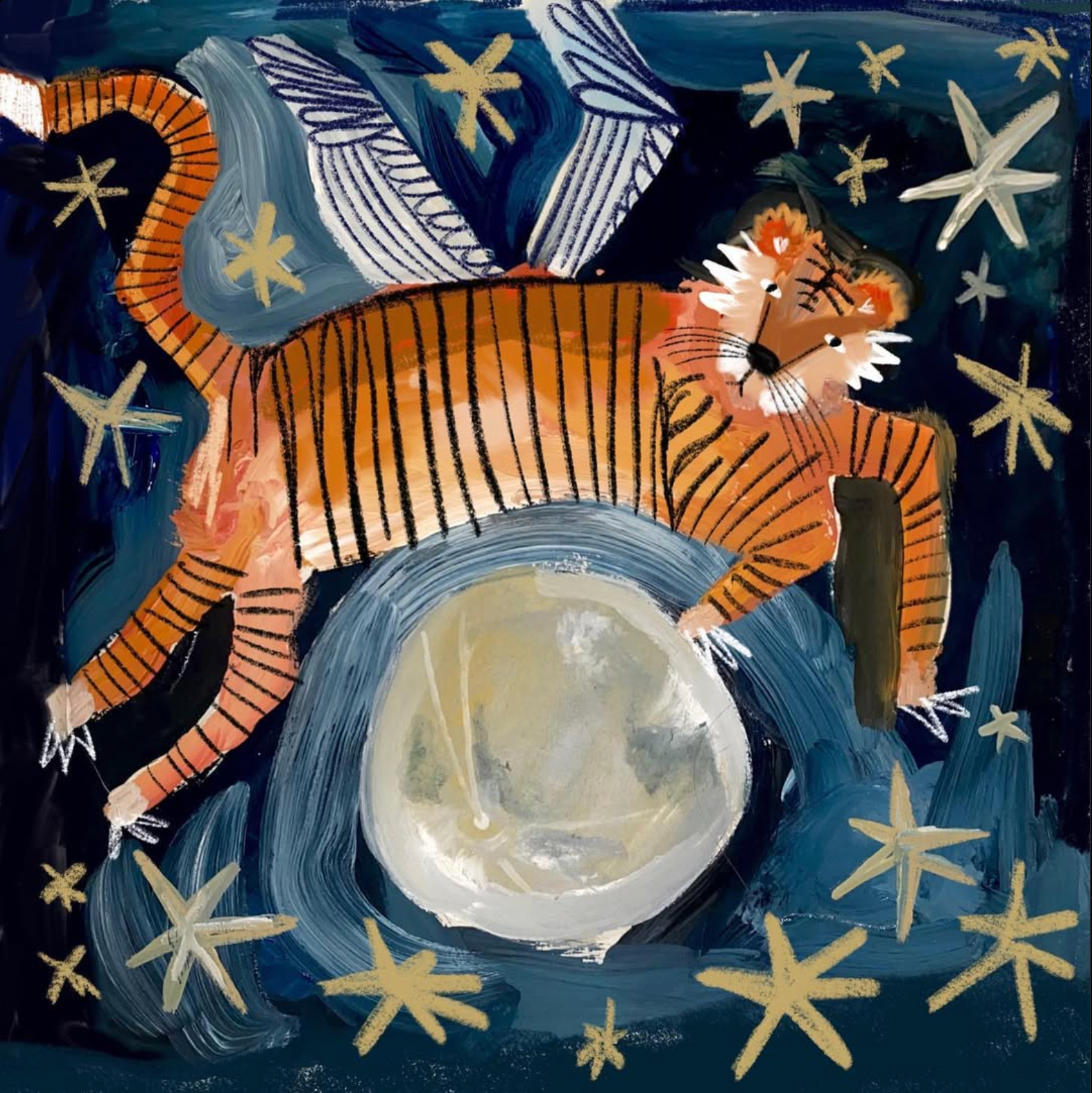
we did a little mini editorial brief mid project with the astronomy students to make them an illustration to go in the background of their presentation. also got to run around derbyshire dales so that was a bonus too but of torrential rain bit of giggles. me and jack teamed up with luke from astronomy he was cool and because jack had some mega projects to sort out so i took the fall on this one. it was fun to do something random though and i liked drawing space. was fun to piss about with procreate and i always love a good speedy little editorial brief.

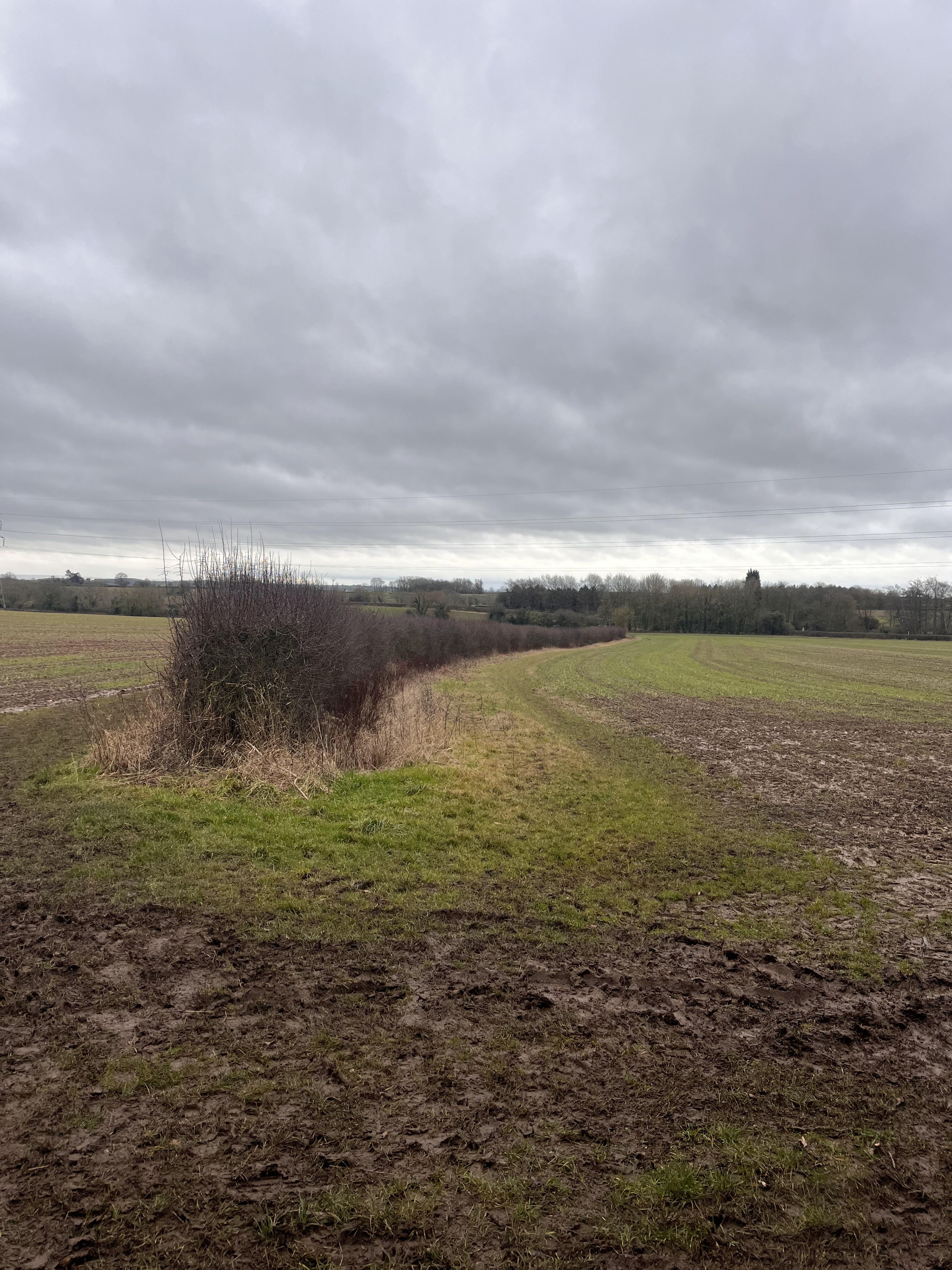
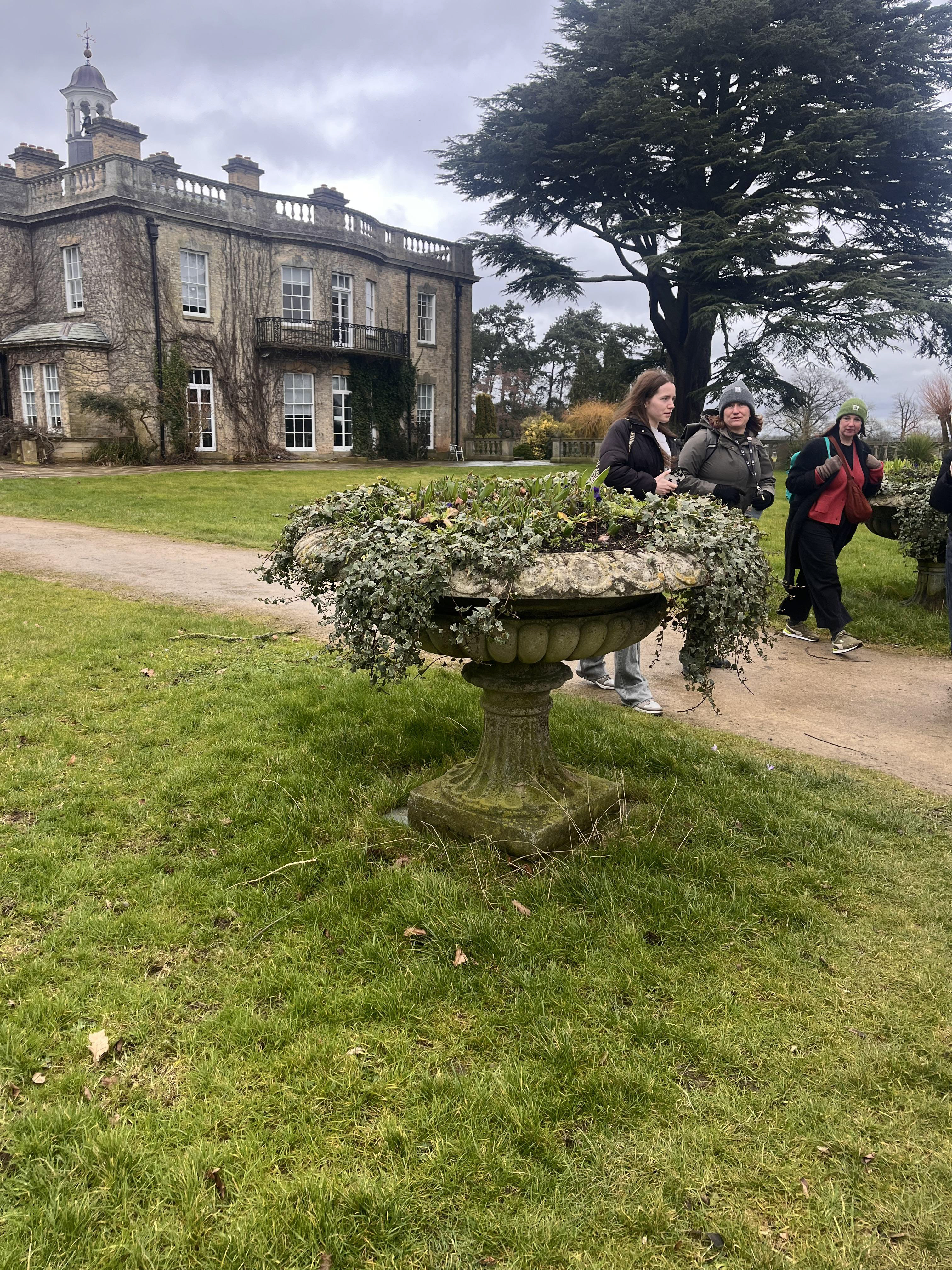
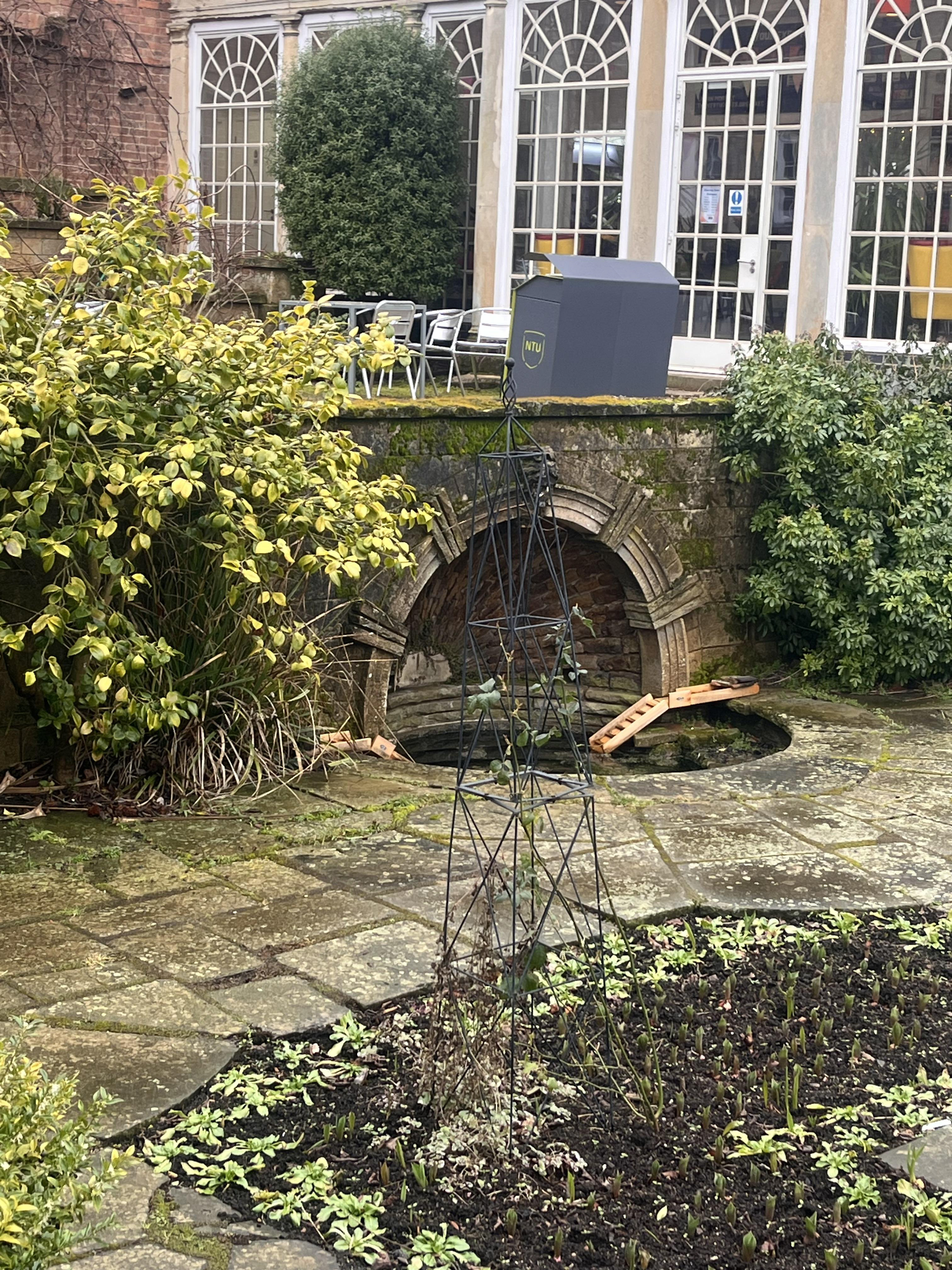
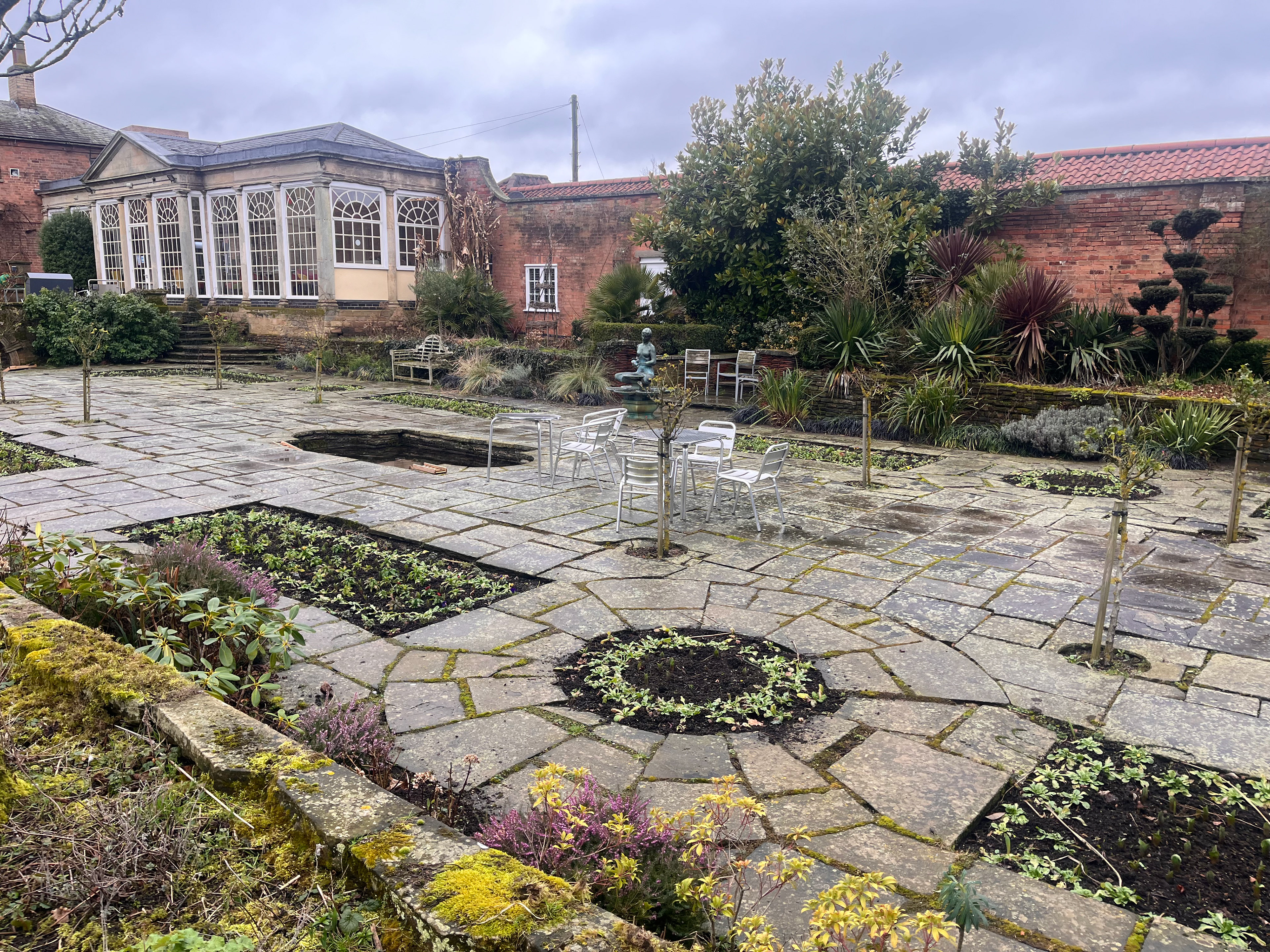
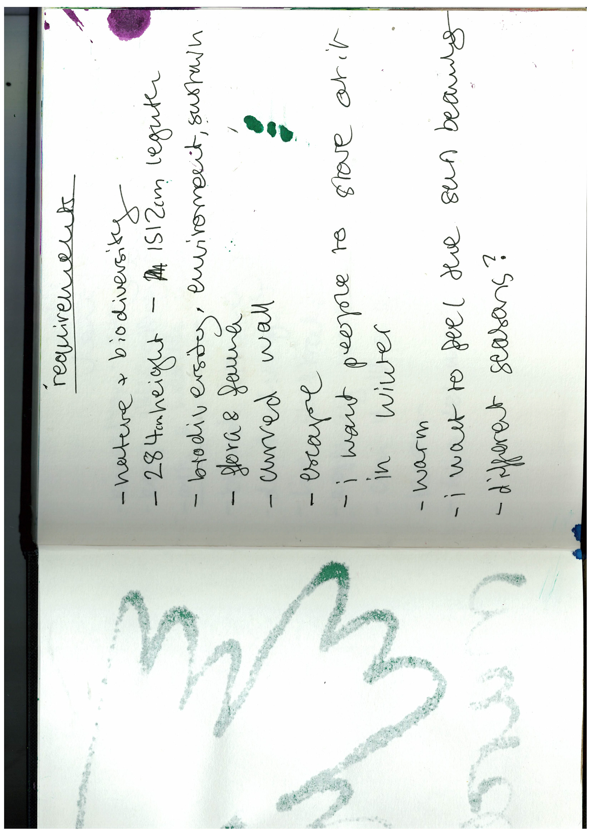
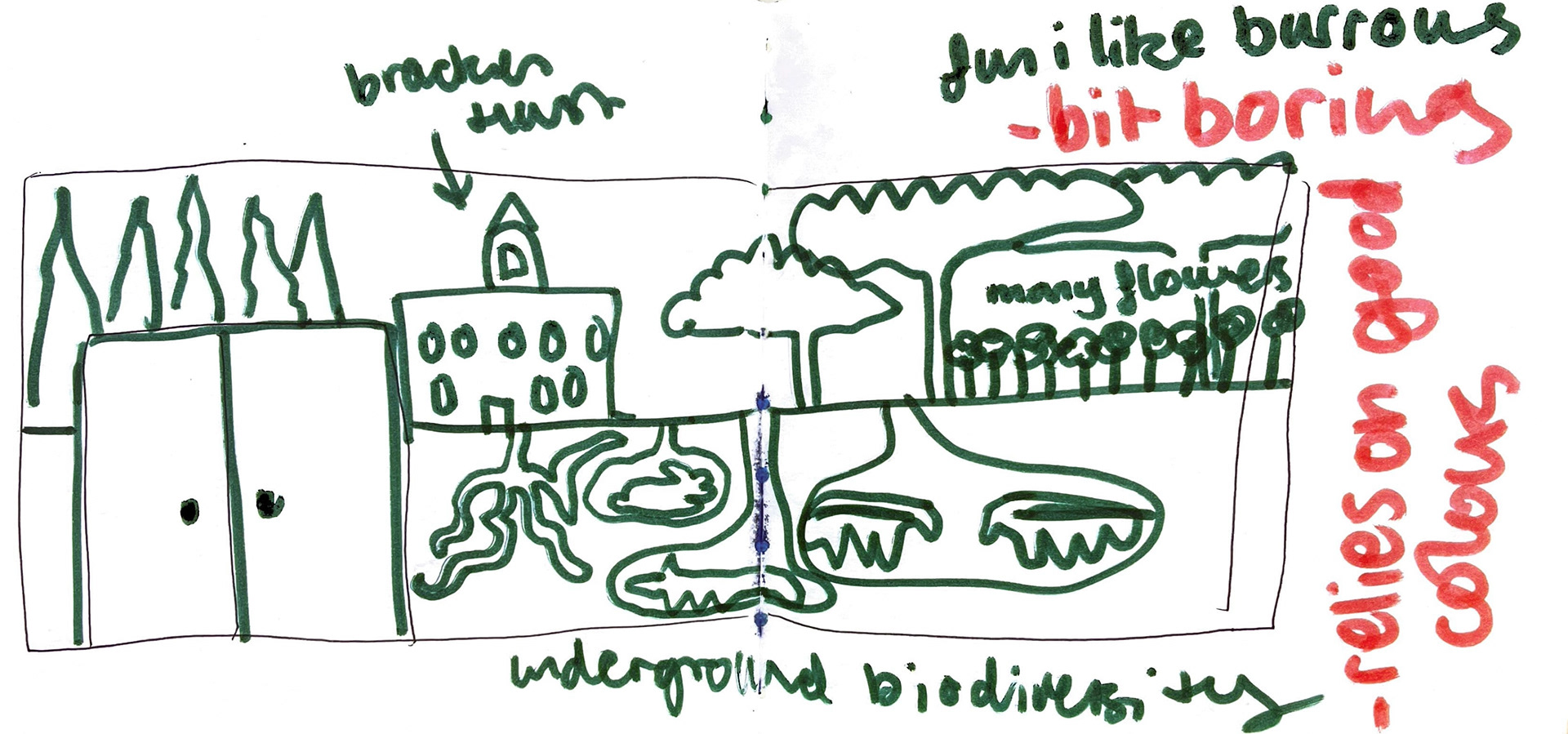
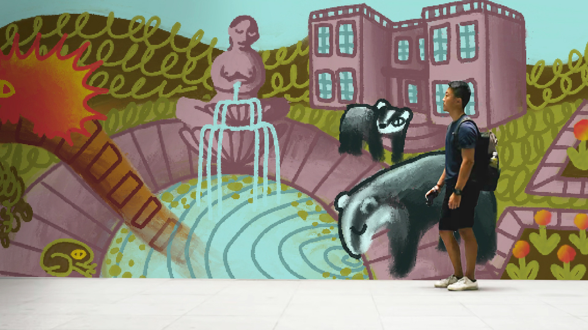
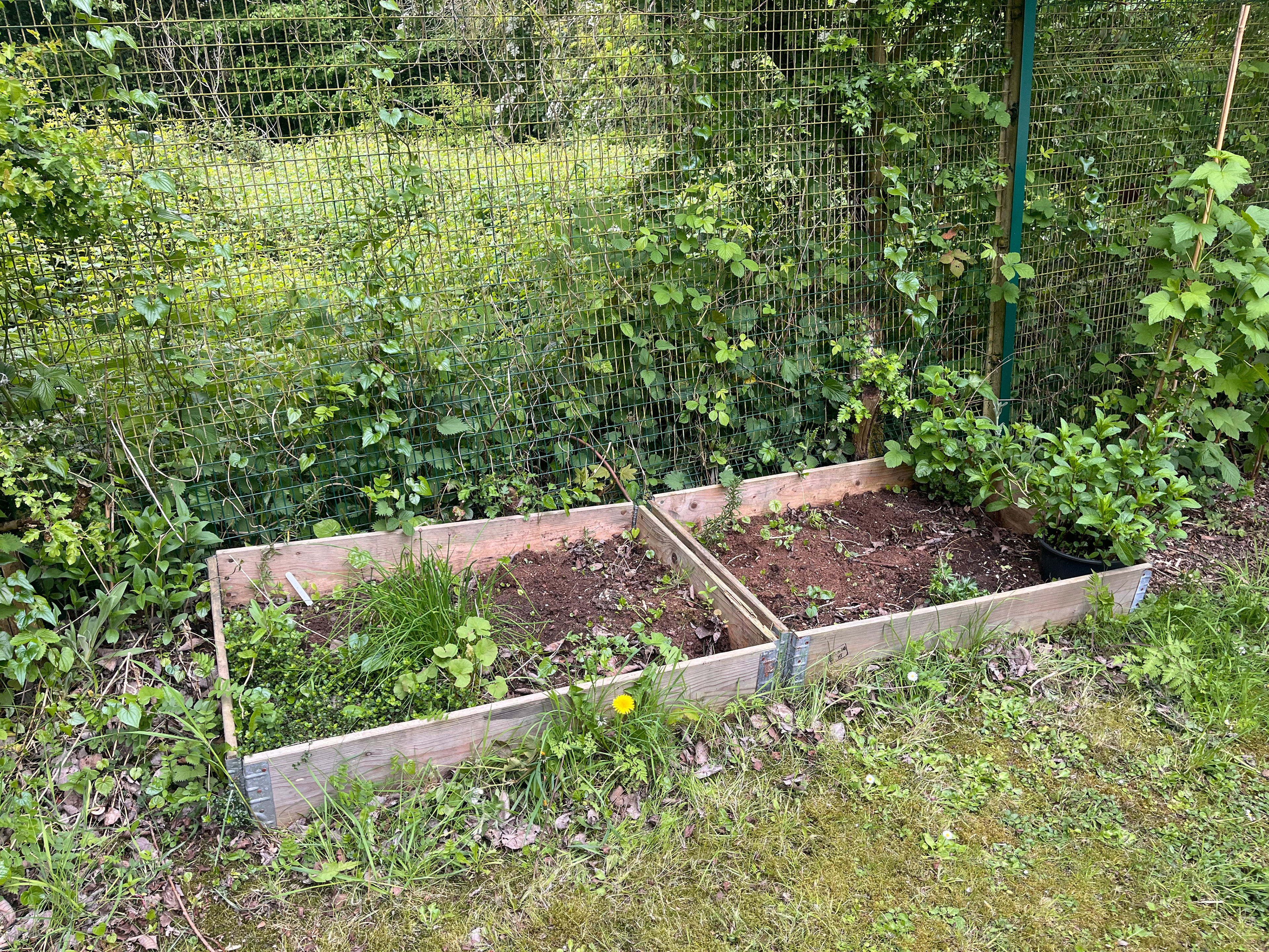
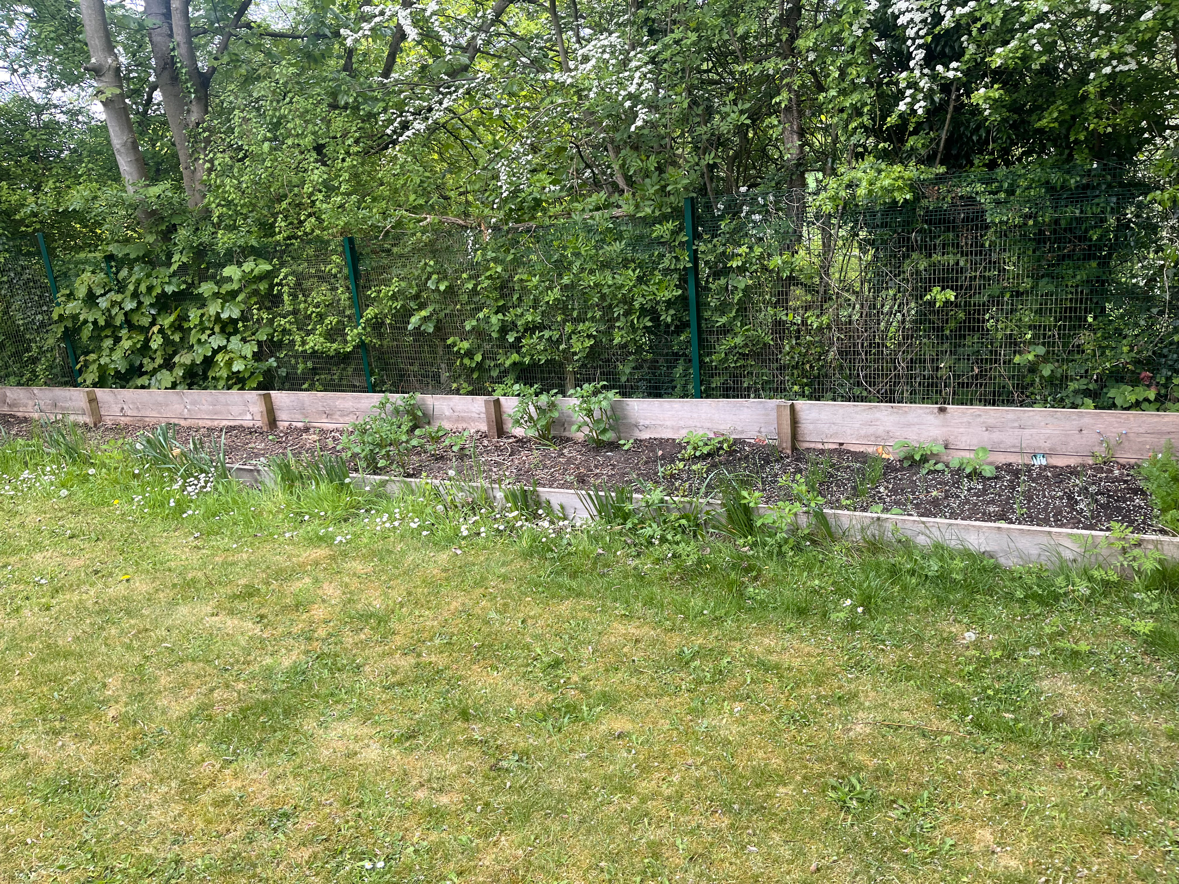
BRACKENHURST TRIP! It was really nice because the woman who showed us around the campus was lovely and really knowledgeable she knew a lot about plants. The space isn’t as big as I thought it was. When I had looked at the brief, it seemed like there was a door in the middle, and the wall stretched out in a big semicircle. However, in person, it’s more of a quarter circle with a door in one corner. I’m not sure if that’s better or worse because, although I have a smaller area to work with, it will be quicker to paint. There are also some pipes along the wall—one runs horizontally along the bottom, and two come down vertically.
I think a way for me to get around this is by incorporating one of my original ideas. I'd like to include the underground world and how biodiversity looks in the mud, with things like plants, badgers, and voles. If people can’t see them, I think it’s important to signal that there’s a lot of biodiversity in nature underground. So, anything below the horizontal line could represent that hidden world. I really like the idea of showing what’s happening beneath the Brackenhurst campus, including badgers that are hidden on campus, worms, rabbit dens, foxes, and lots of insects.
Since the space is smaller than I originally thought, fitting everything I want to include will make it feel a bit crowded. So, I think I need to think really carefully about the layout and how it will look with all the components up against the wall.

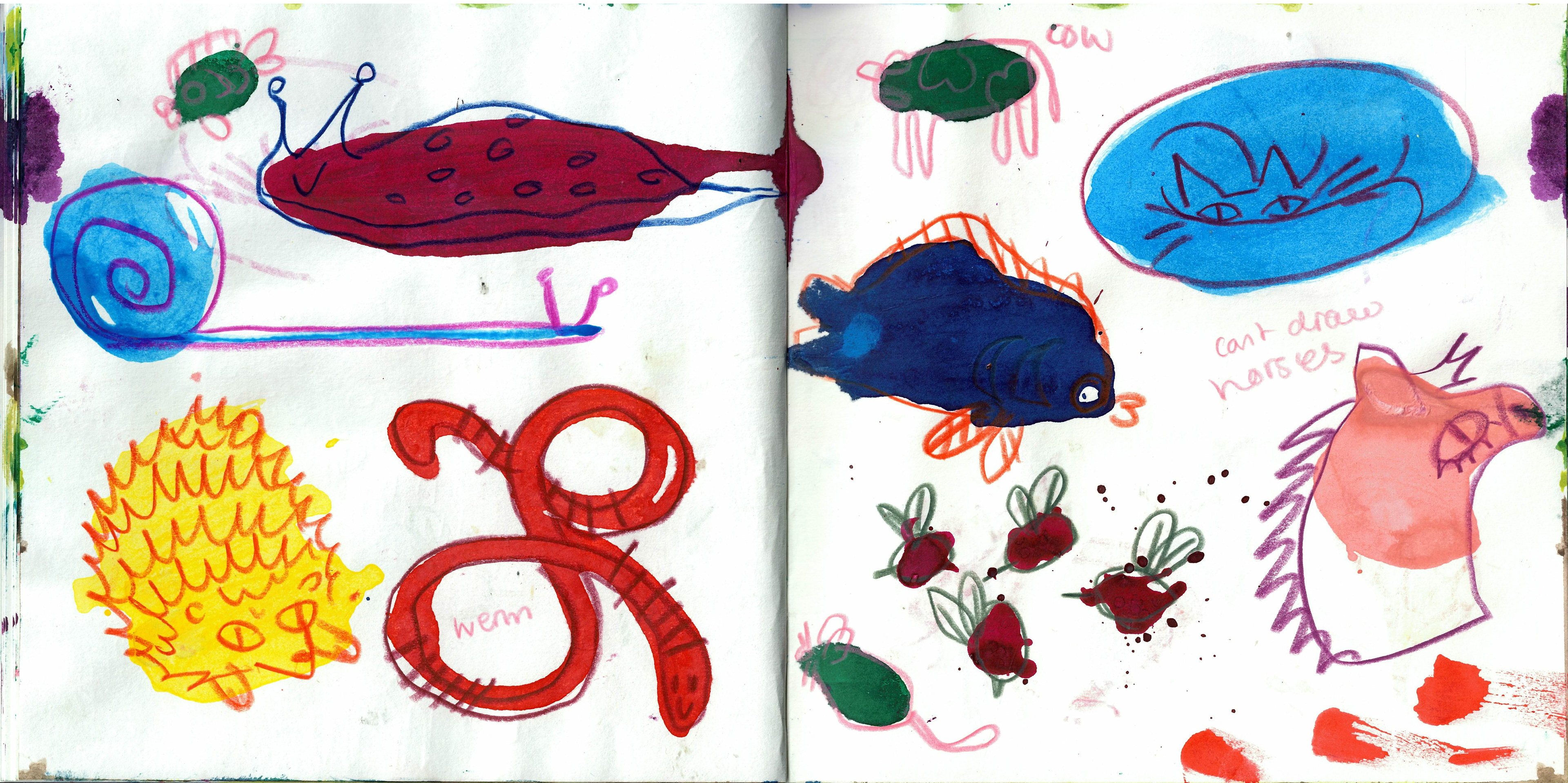
messing around with making shapes with ink and then turning them into animals !!! ive missed drawing lol the last two projects have been textiles so its nice to do somat that isnt fabric. is also nice to do things quick because textiles take alot more planning. hedgehog and worm is my fave i think he'd make a cute little print. kristian spoke to my about how some of my work from this project, bc its so cut and dry final piece is a big painting, i can turn some parts of it into prints to get some use out of all the illustrating. i think this projects going to be my happy brain empty project when i can draw my happy flowers and then do my other projects with the whole of my brain.
these are my new possible plans for the mural now ive actually seen the wall and bonus points we get PAID ABOUT 1200 BLOODY QUID hazar hazar hazar even more reason to try and get the brief yippe. i think if i did my orginial idea but chopped in half it would get way to crowded if i wanted to fit everything in so im going to have to think about the composition v v carefully. the other way i was thinking of doing it feels more graphic designy but then that means i have the power of both GRAPHIC DESIGN and illustration ON MY SIDE.
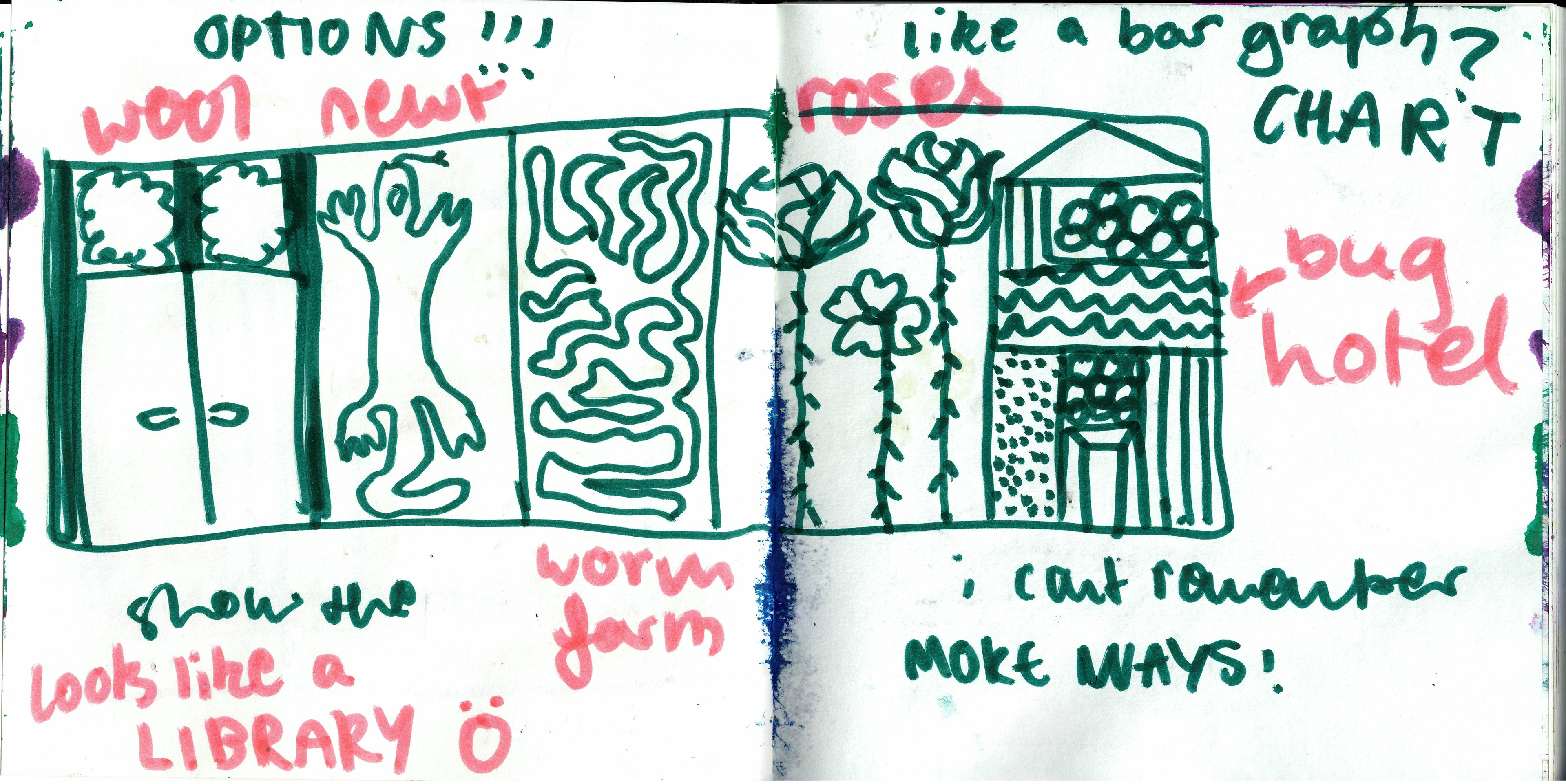
i wanted to show slices of some of the ways that brackenhurst is being sustainable and biodiverse. the best ones i could think of were the worm farm, the greater crested newt project, rose garden, bug hotel, and the wool insulation. very big fan of drawing a massive newt think of the delicious COLOURS I COULD USE!!!! and think of all the massive bugs i could draw in the bug hotel!!!! also the vertical pipes could add to this because it will be following the same direction. horizontal pipe BOOOOOOOO but it's okay i love a challenge.
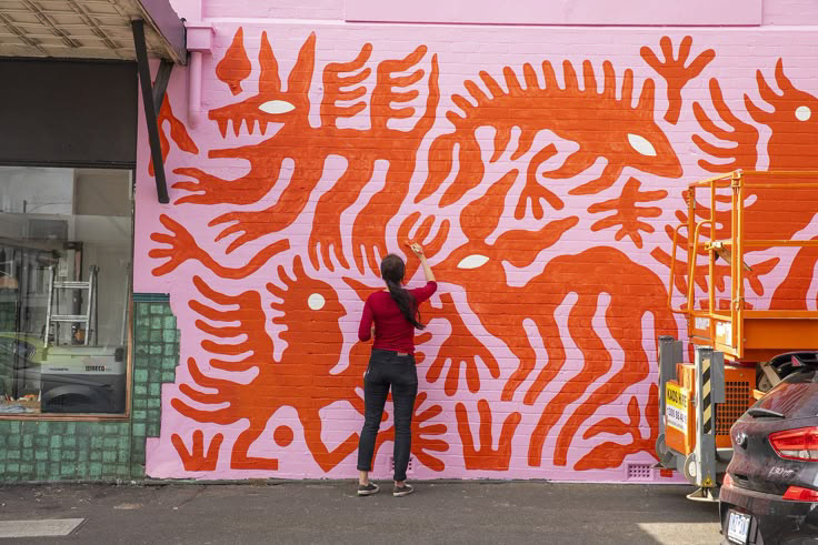


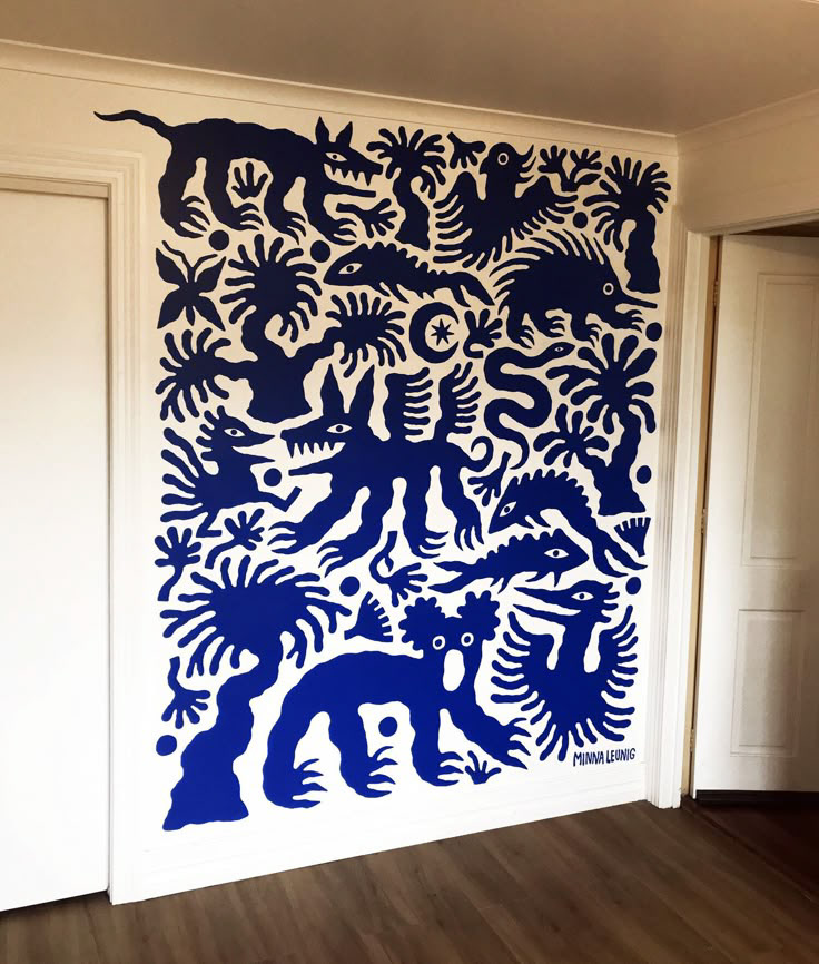

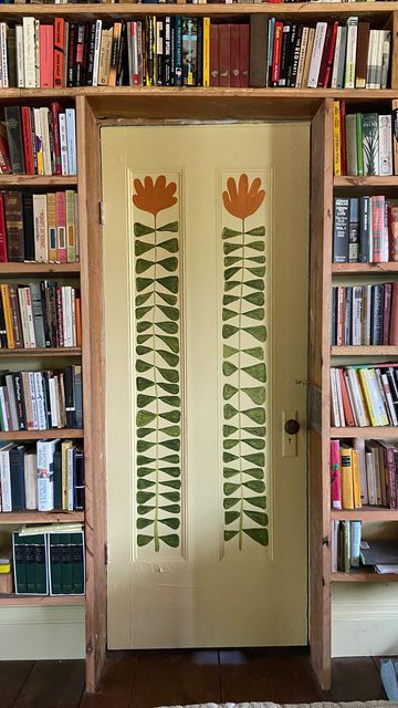
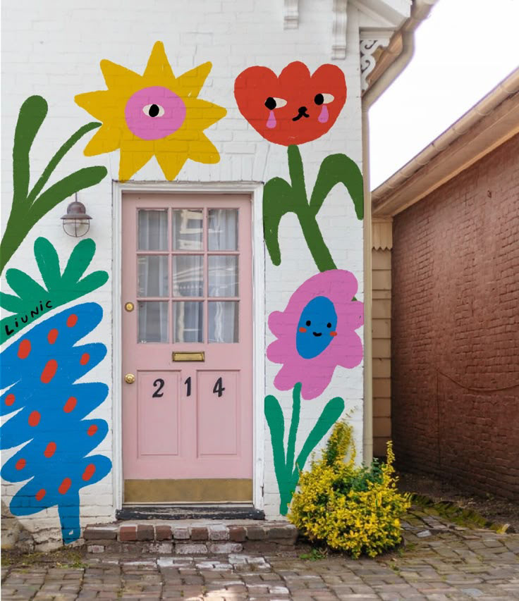
I also really like these murals by Minna leunig. I love that there is a simple colour palette—probably just three colors maximum—and there's a lot of space within the shapes. I’d really like to include facts about the campuses, like how many pieces of flowers there are, how many, and so on. It won’t look like the final design is missing anything because it’s more like a pattern than a big picture. I’m trying to think of compositions more in terms of graphic design. It seems like we're going up against graphic design students, and I don’t want to be trapped in the kind of illustrative scenic image that I was originally thinking of.
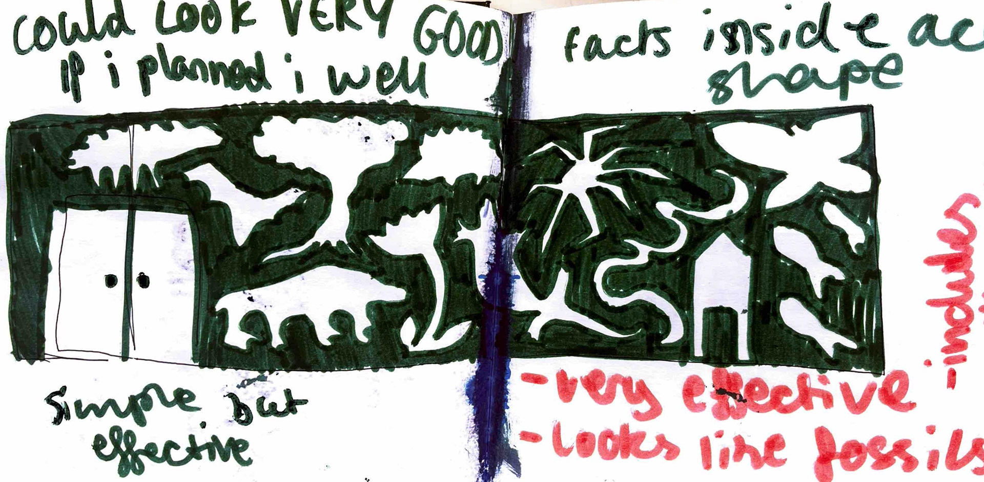
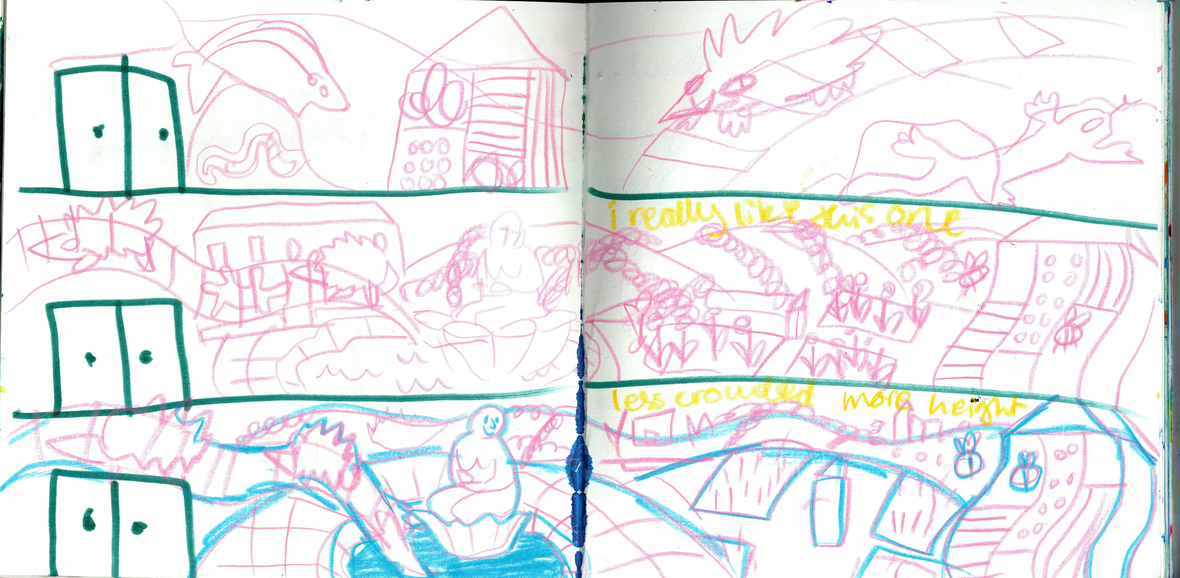
some more ideas !!!! i like the underground one but it's a little bit static :( could be BETTER and have more movement.
uggo little mock up of the wall that the mural will be on with the orange being things in the way of the final design. my sketchbooks not big enough to draw my ideas to scale, so this means i can take any other the little ideas i have and plop them onto procreate to see them relative to the canvas size. much easier :)
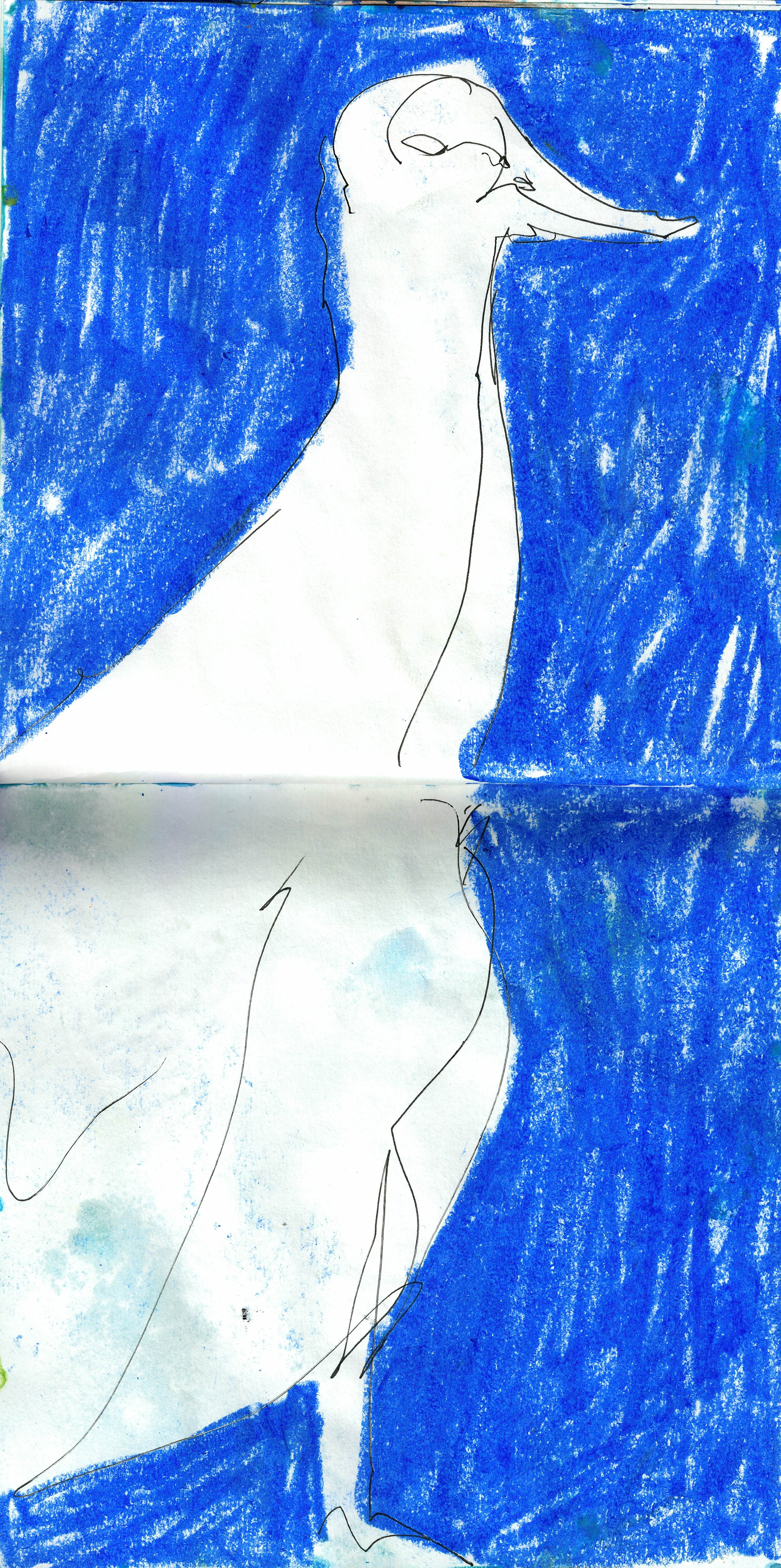
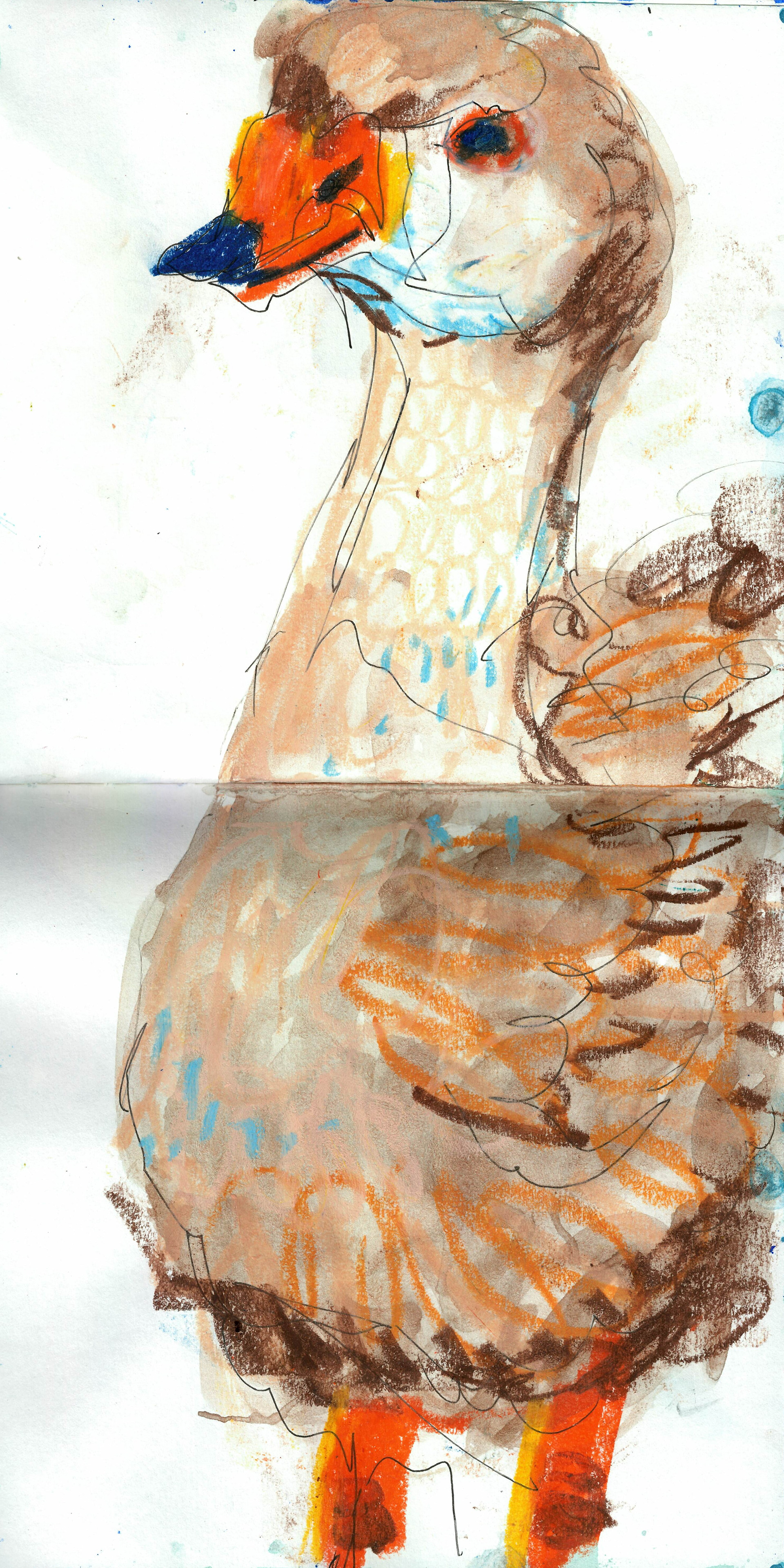
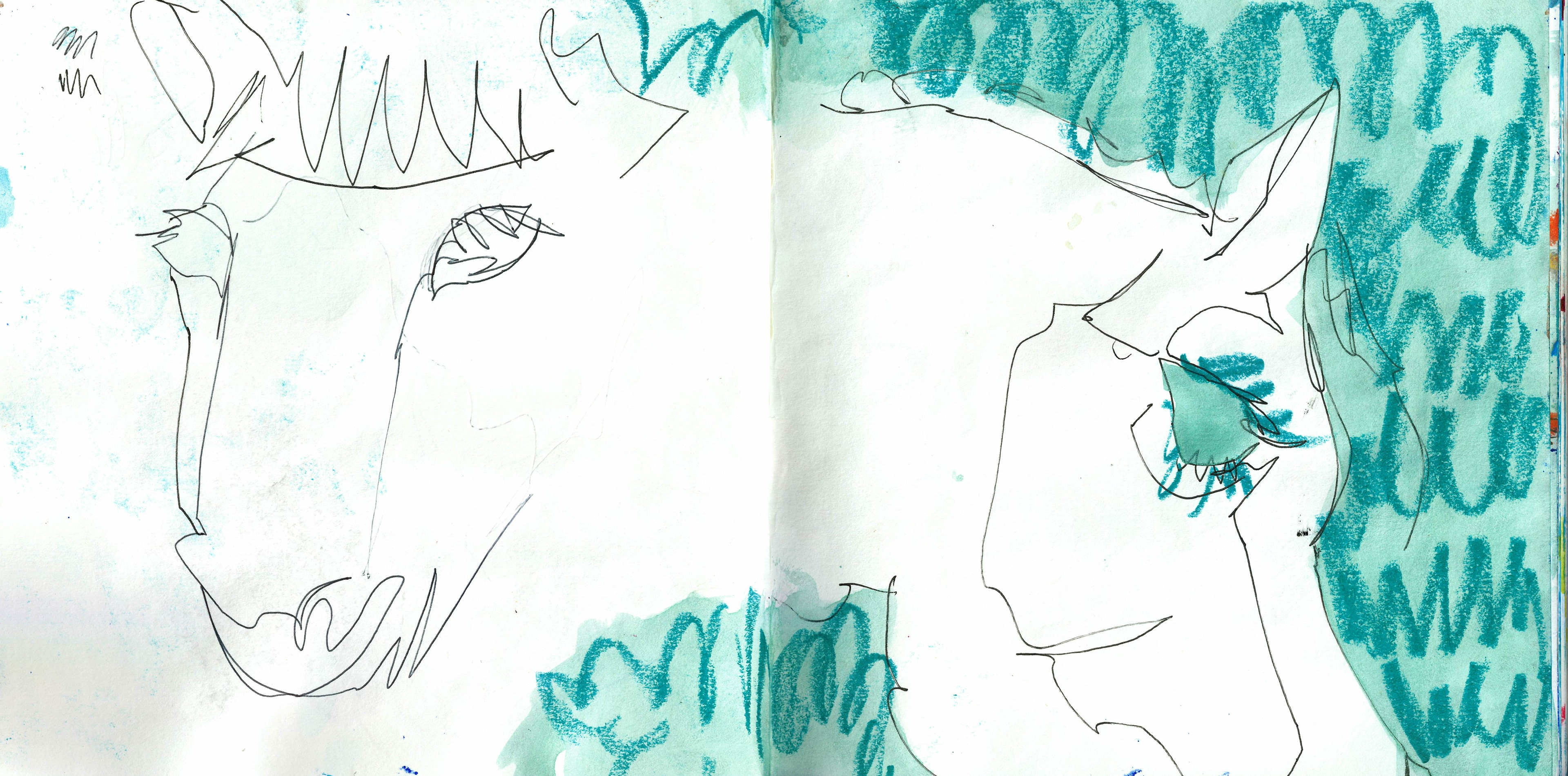
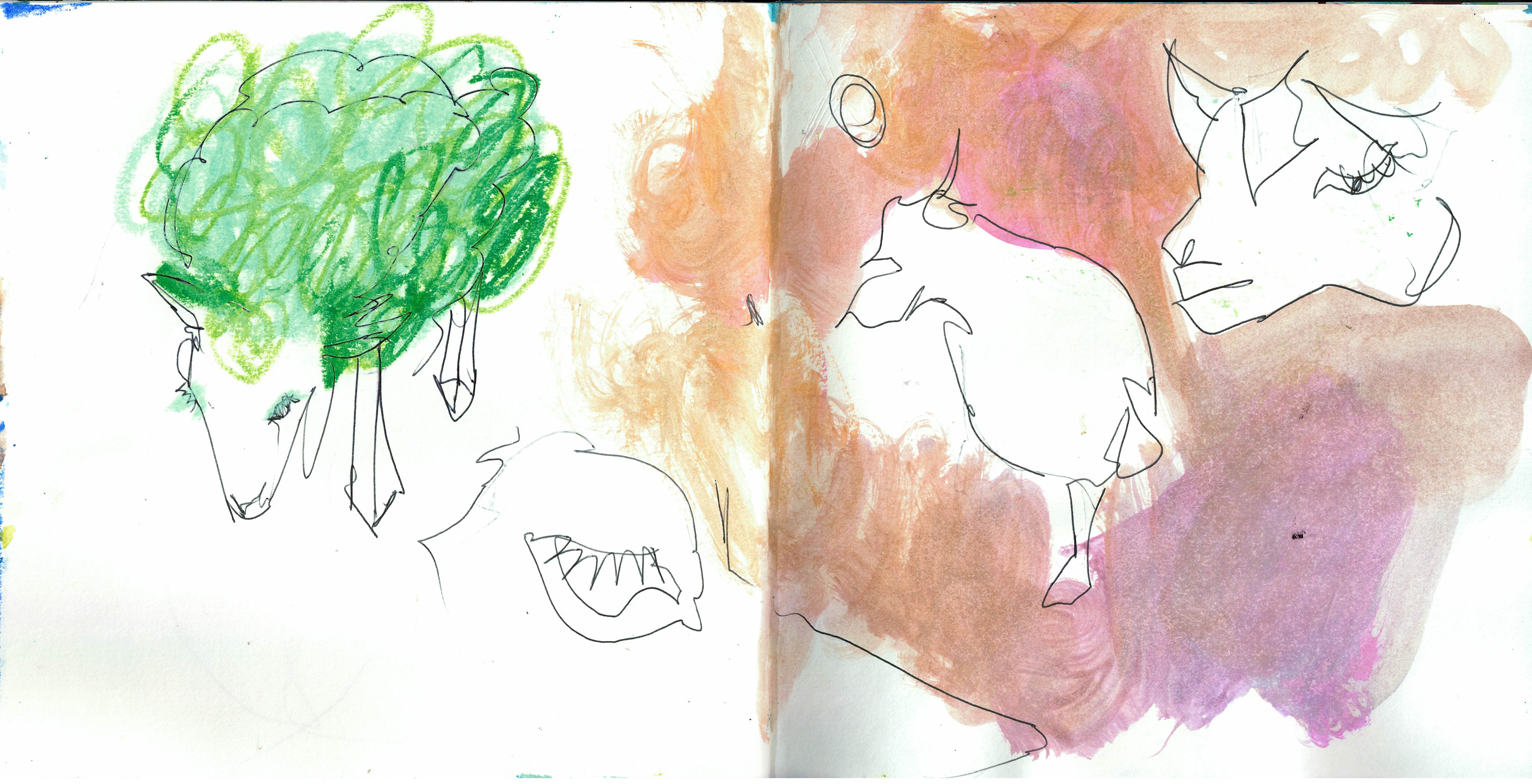
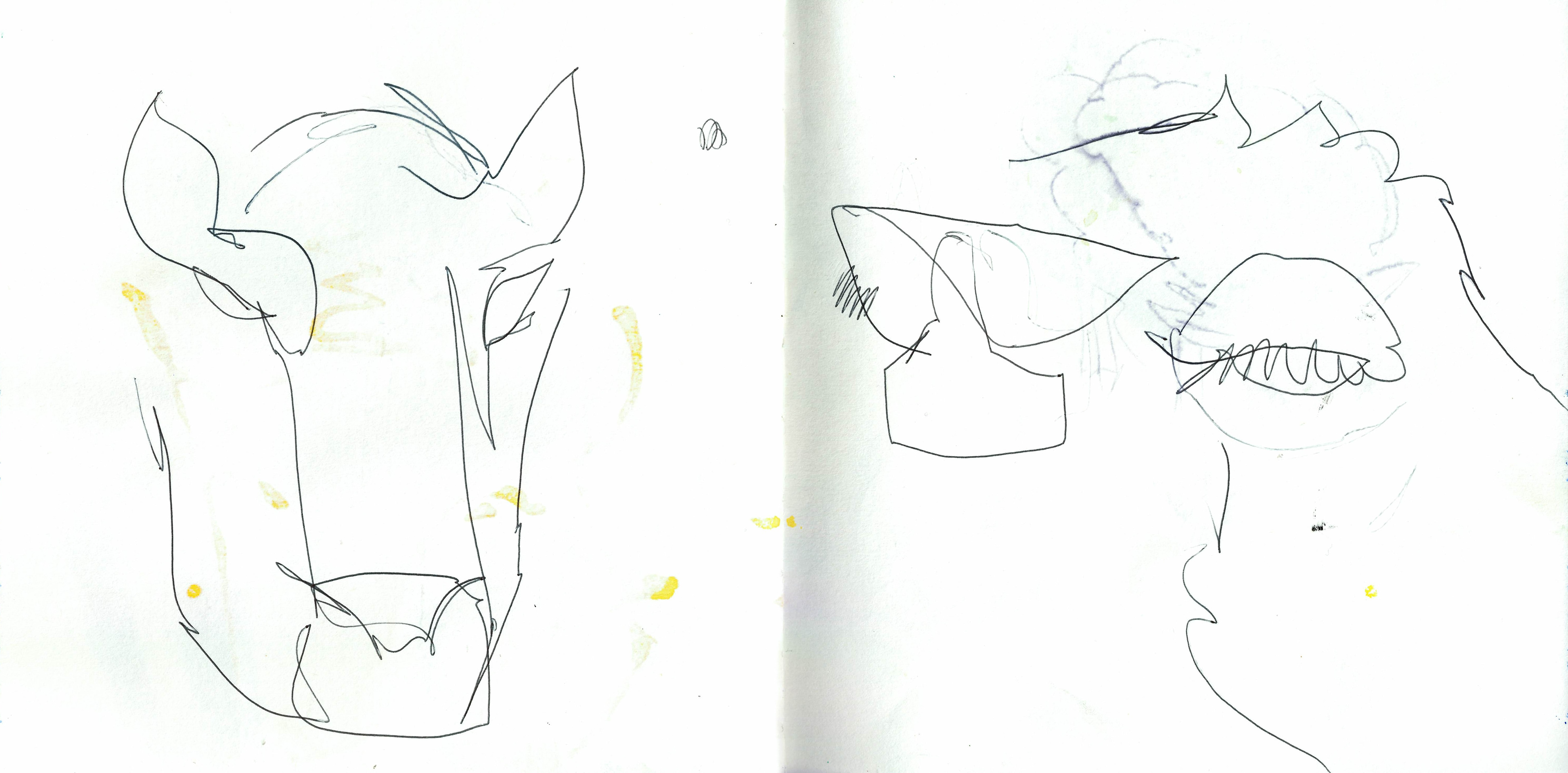
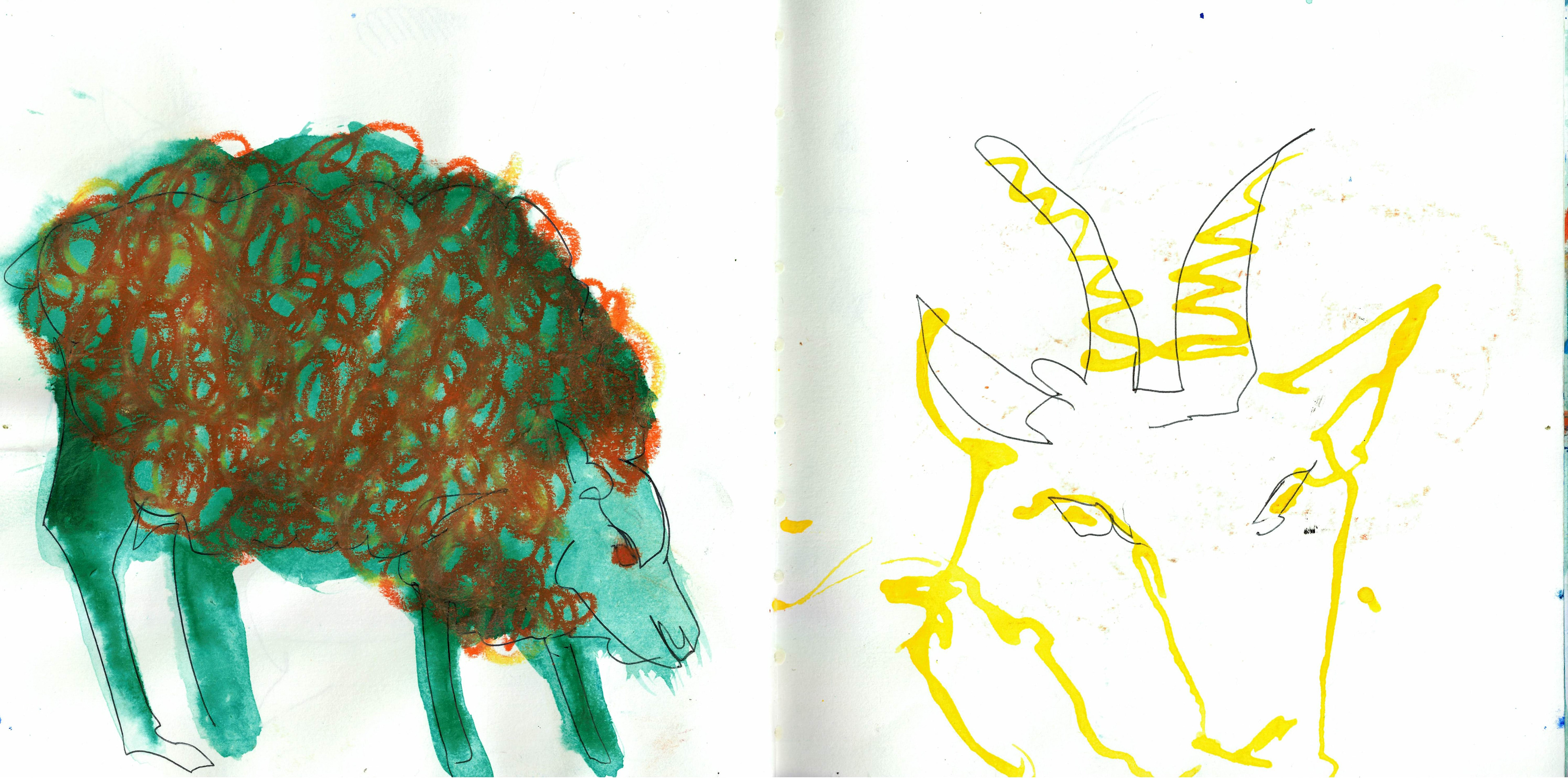
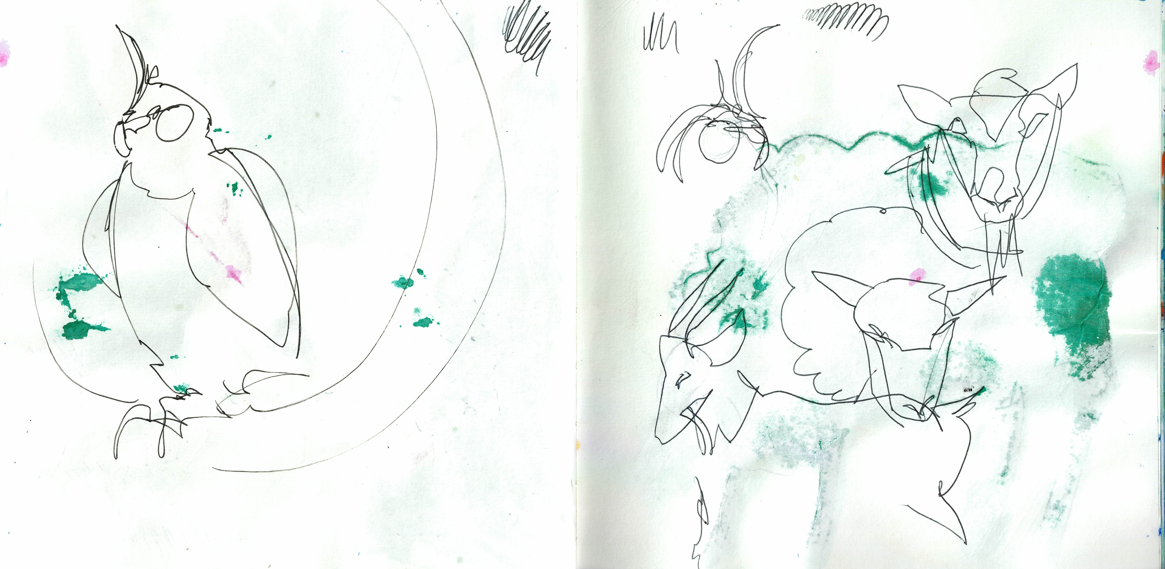
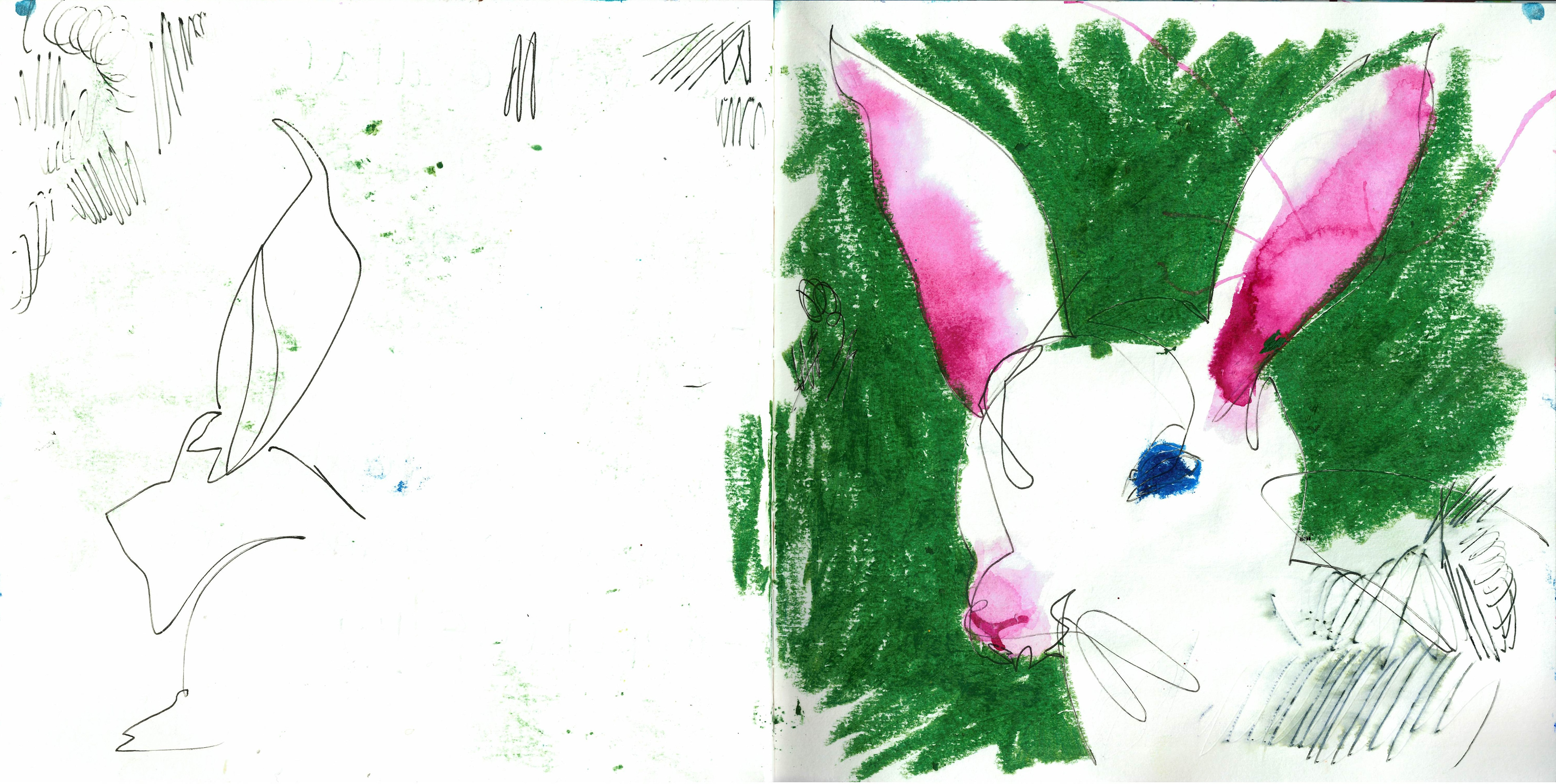


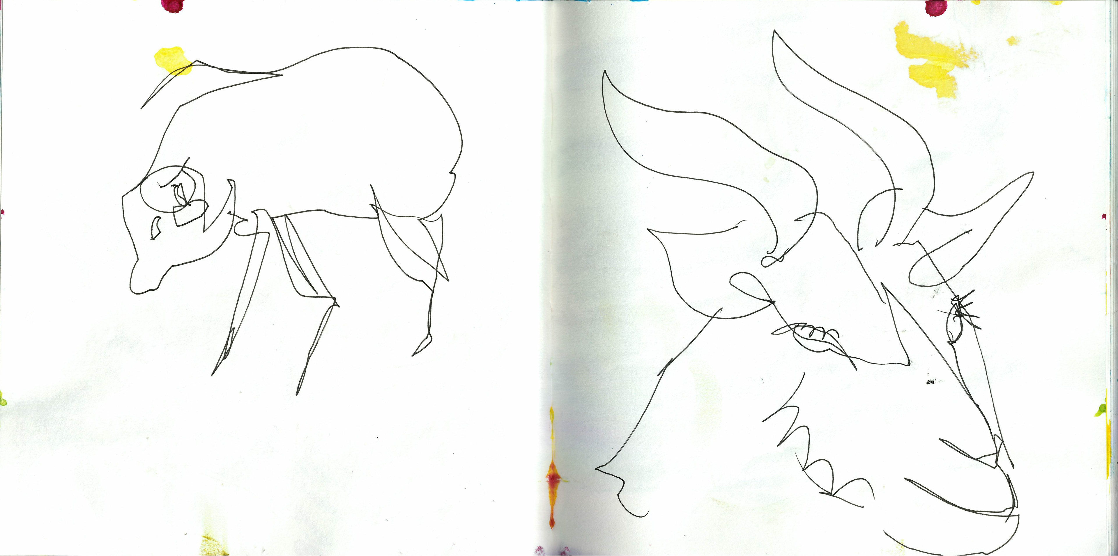
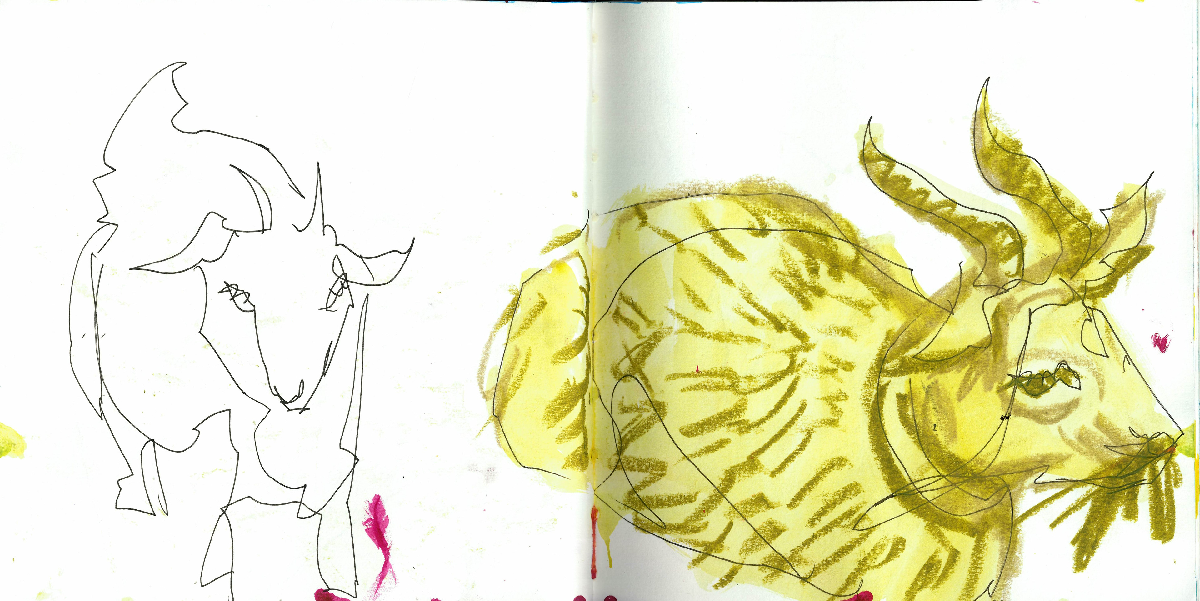
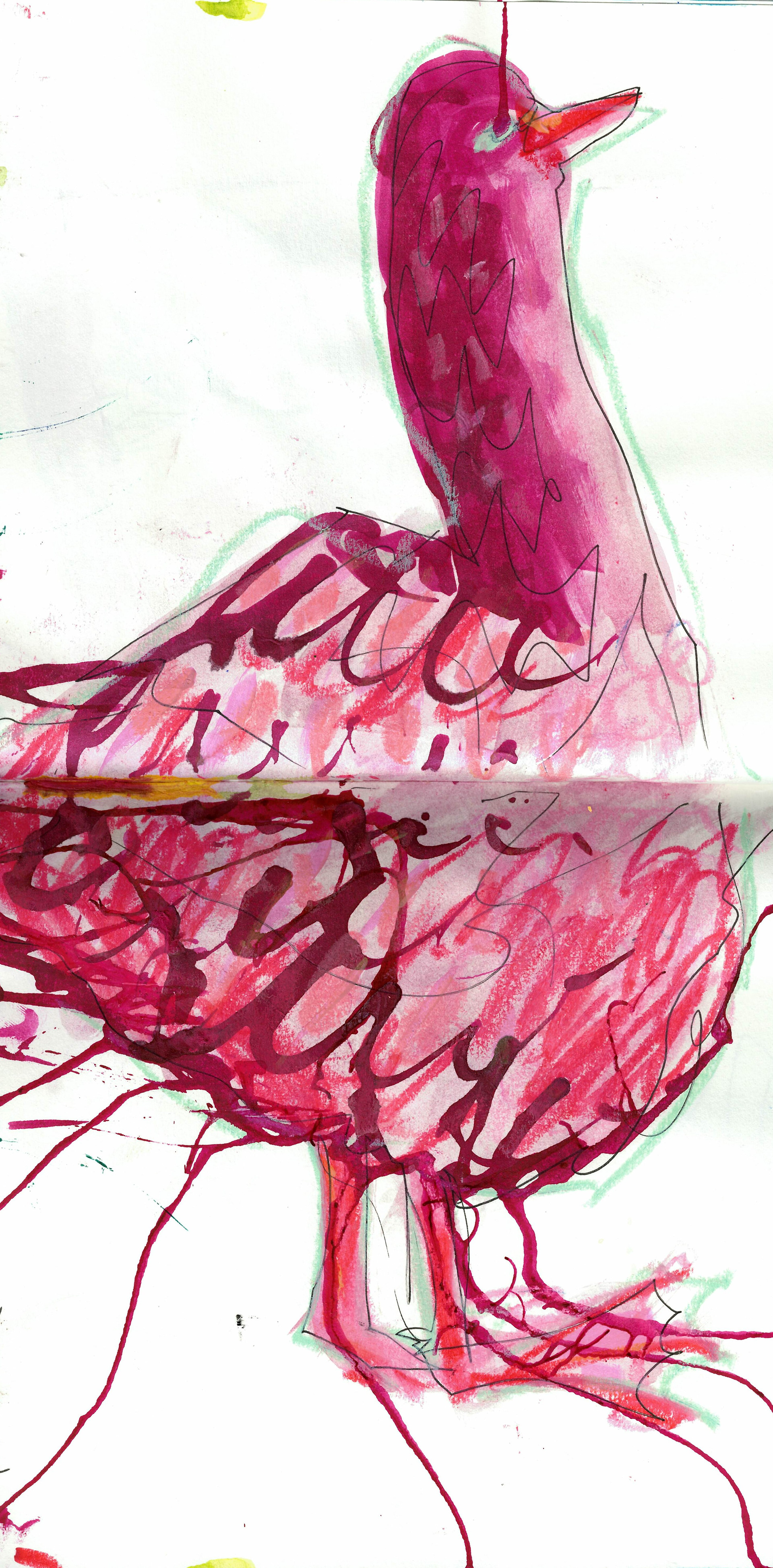
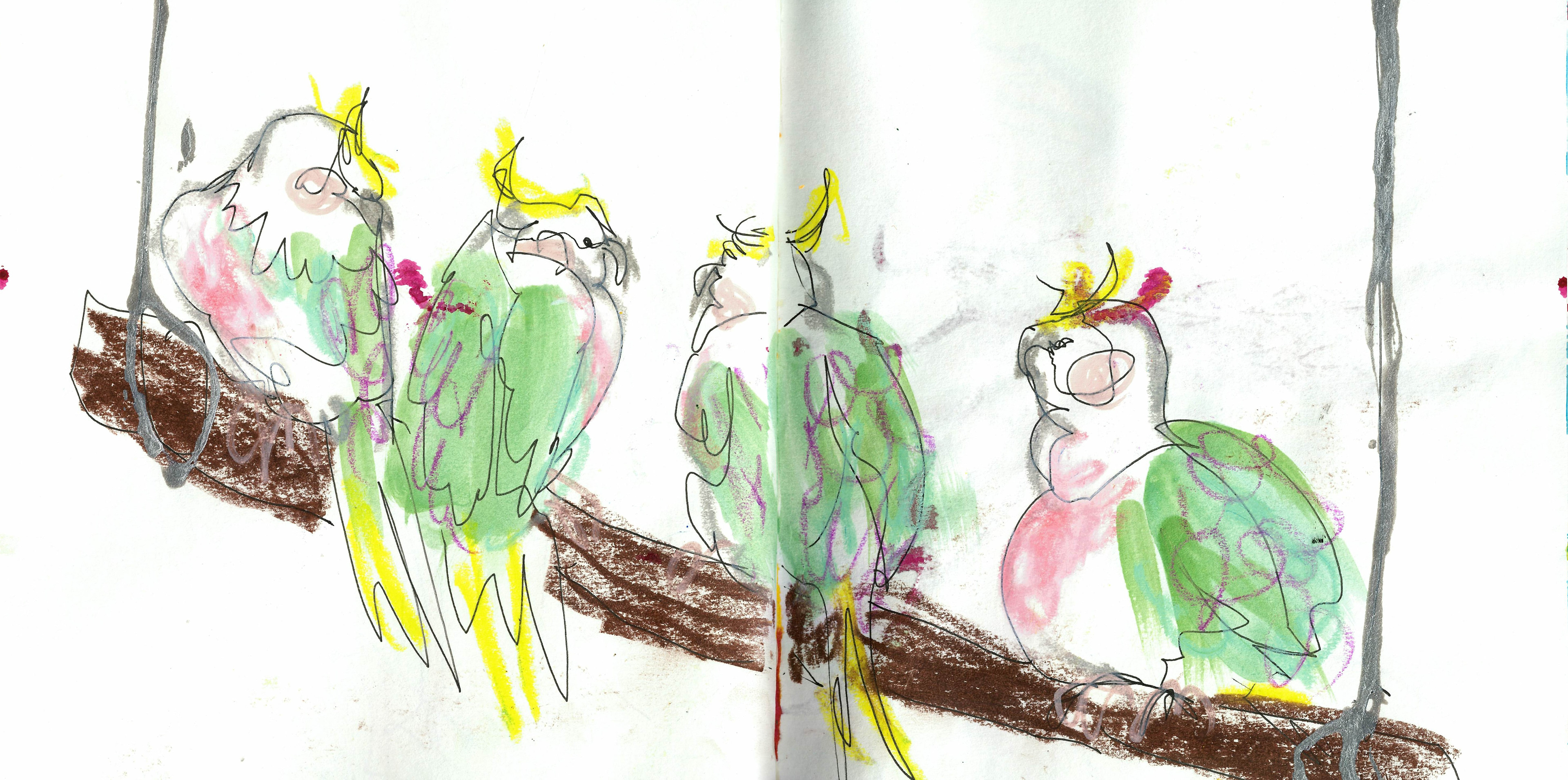
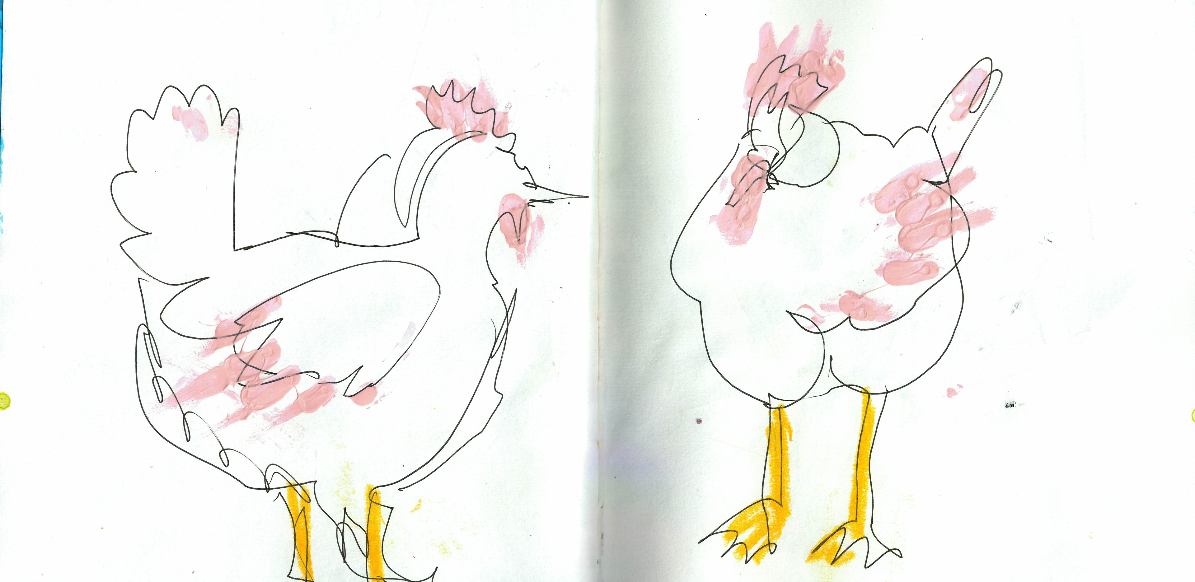
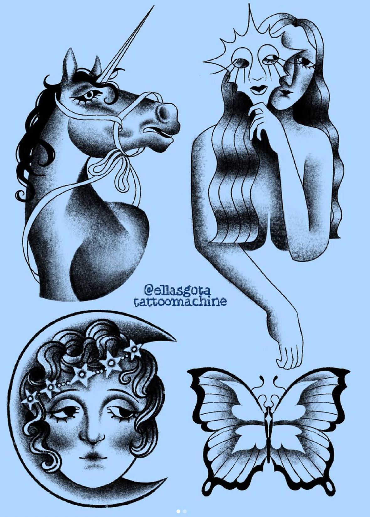
I went to city farm to do some life drawing because I wanted to try and do the mural in my normal style, which is loose and messy, and it involves a lot of mediums. I need to find a way to translate this into wall paint, so I want to do some sketches and have something to refer to throughout the project for the style that I want the mural to be in. I drew some cows and sheep and i LOVE GEESE. i'd like to make some prints on this project and I also want to make some flash designs because if I don't get the mural project brief, I want to have rinsed all my drawings as much as i can. I think I'm going to turn the cockatoo drawing into a print of some sort and maybe a bigger flash design, and then some of the others. I've turned the chicken and the sheep into small flash designs and I'll include them with some from the flash designs that I've drawn at Kew Gardens.

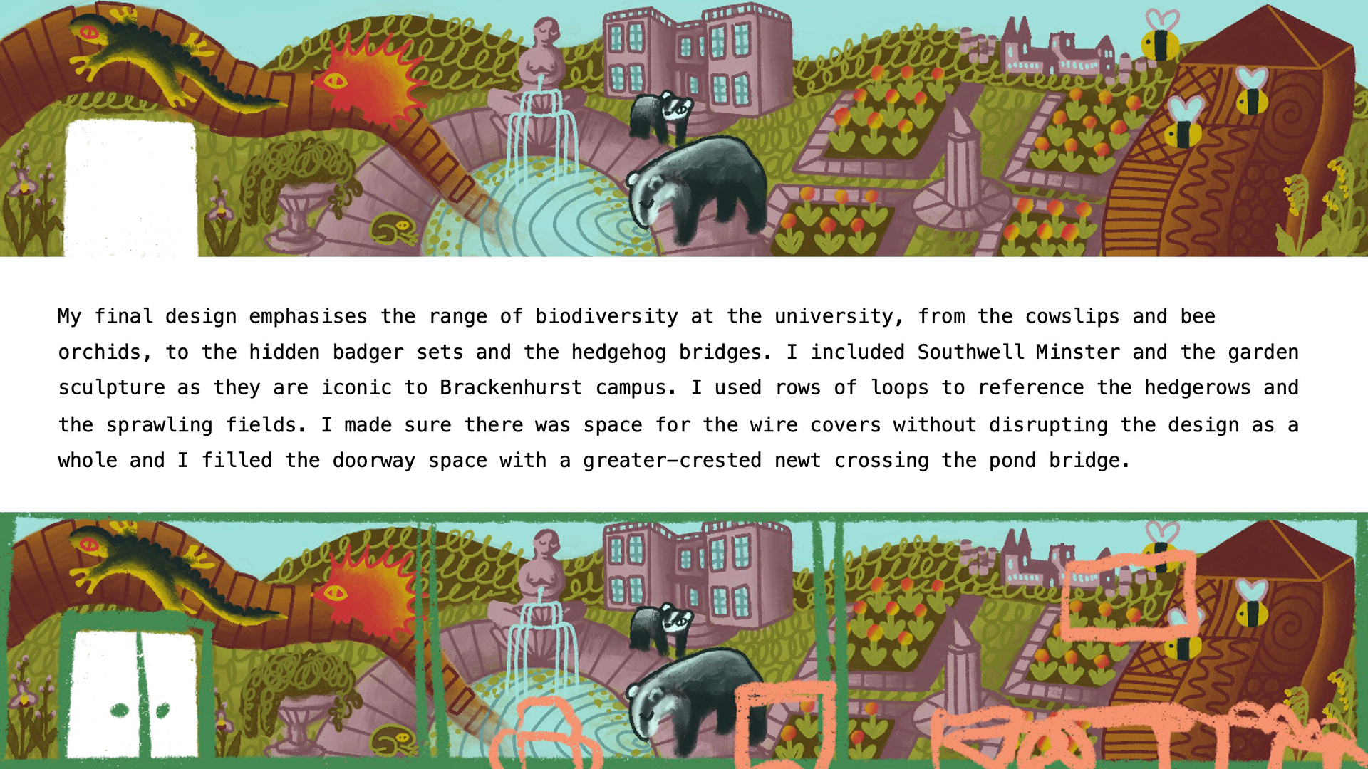
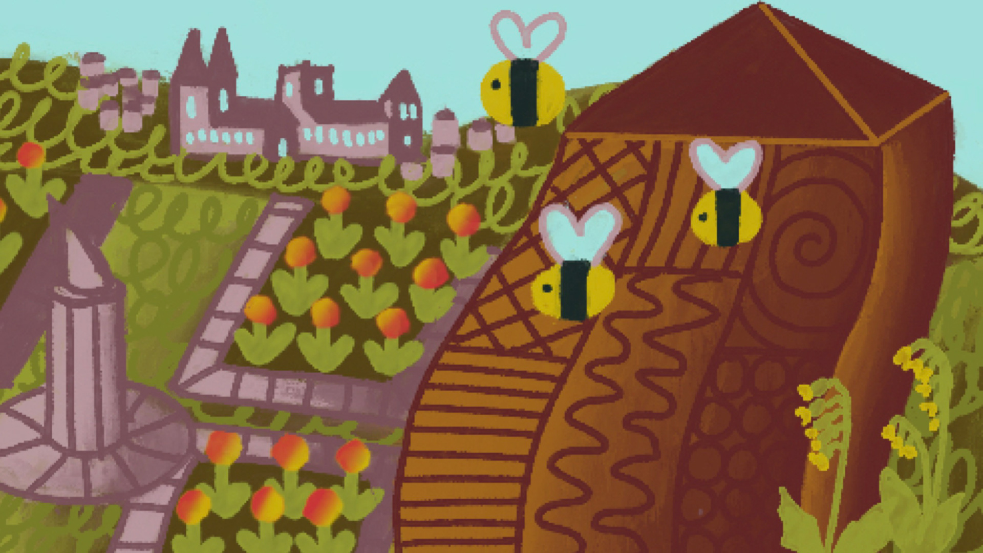
After talking with Kristian, we decided that I needed to play more with the movement of my mural, because that’s what the murals I was using for inspiration had, and it wasn’t translating into my own compositions. I didn’t have to stick to the laws of nature—I could make the mountains move or make the hedgehogs massive, and walls didn’t need to be straight. So, I started messing around more with compositions and landed on this one as my first to take further into looking at colour palettes and adding more detail into the parts I’ve recognized and included, which are:
-Bug hotel
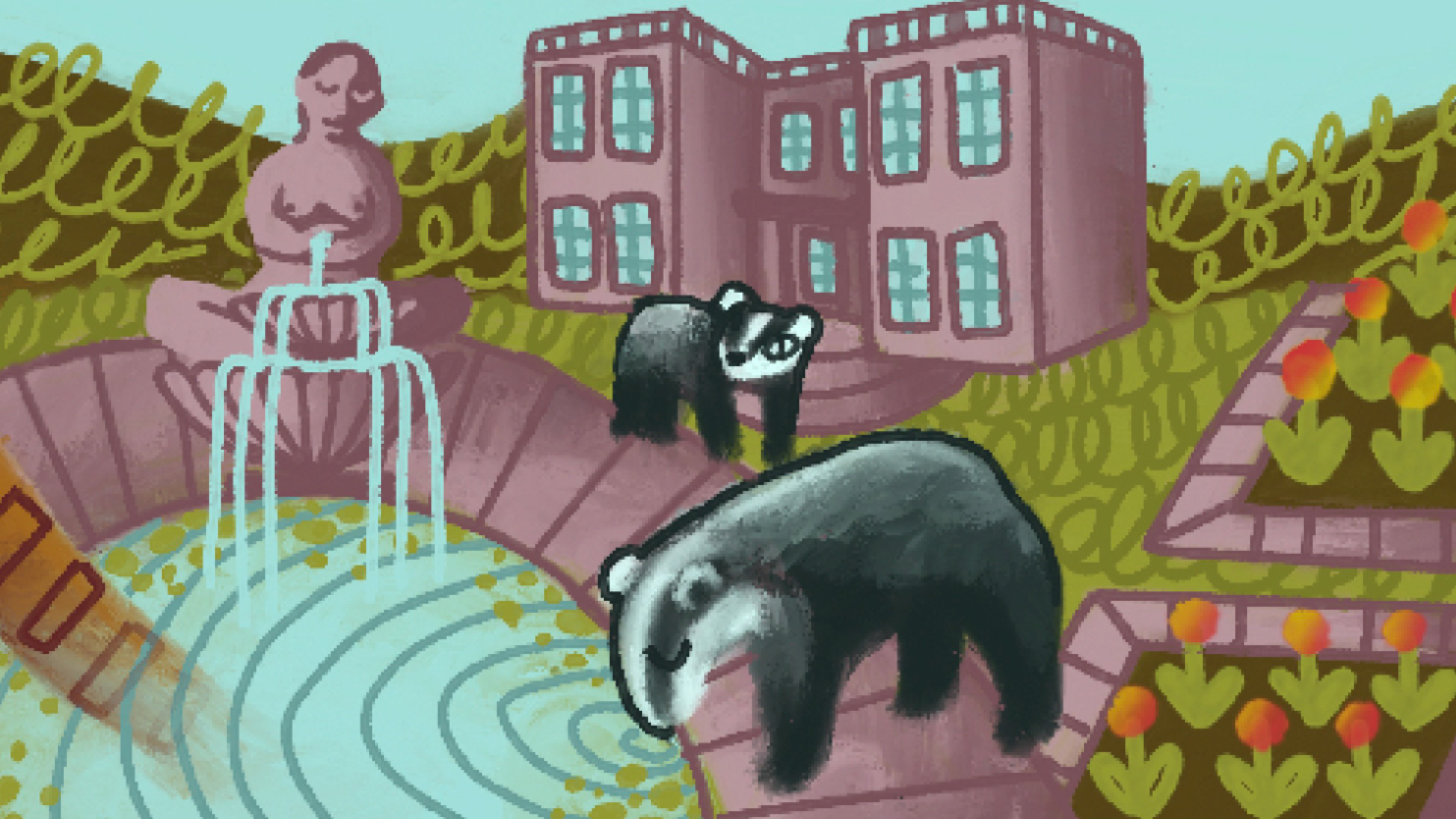
-Hedgehog bridge
-Greater crested newt
-Badger sets
-Rose garden
-Hedgerows
-The sculpture
-Southwell in the background
This would be my final design, because there are things I could change to make it flow better. I think the top design is still one I really like; I like how big the animals are, and i think it's a more fun layout, it just doesn’t include as much of the diversity factors I’d like to. Maybe I can go back to that one and look at ways I could adjust it without making it look to crowded.
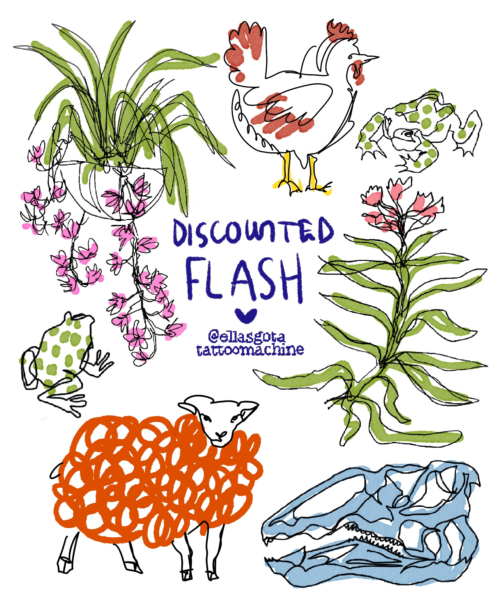
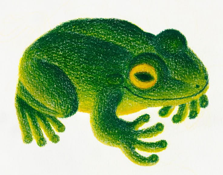
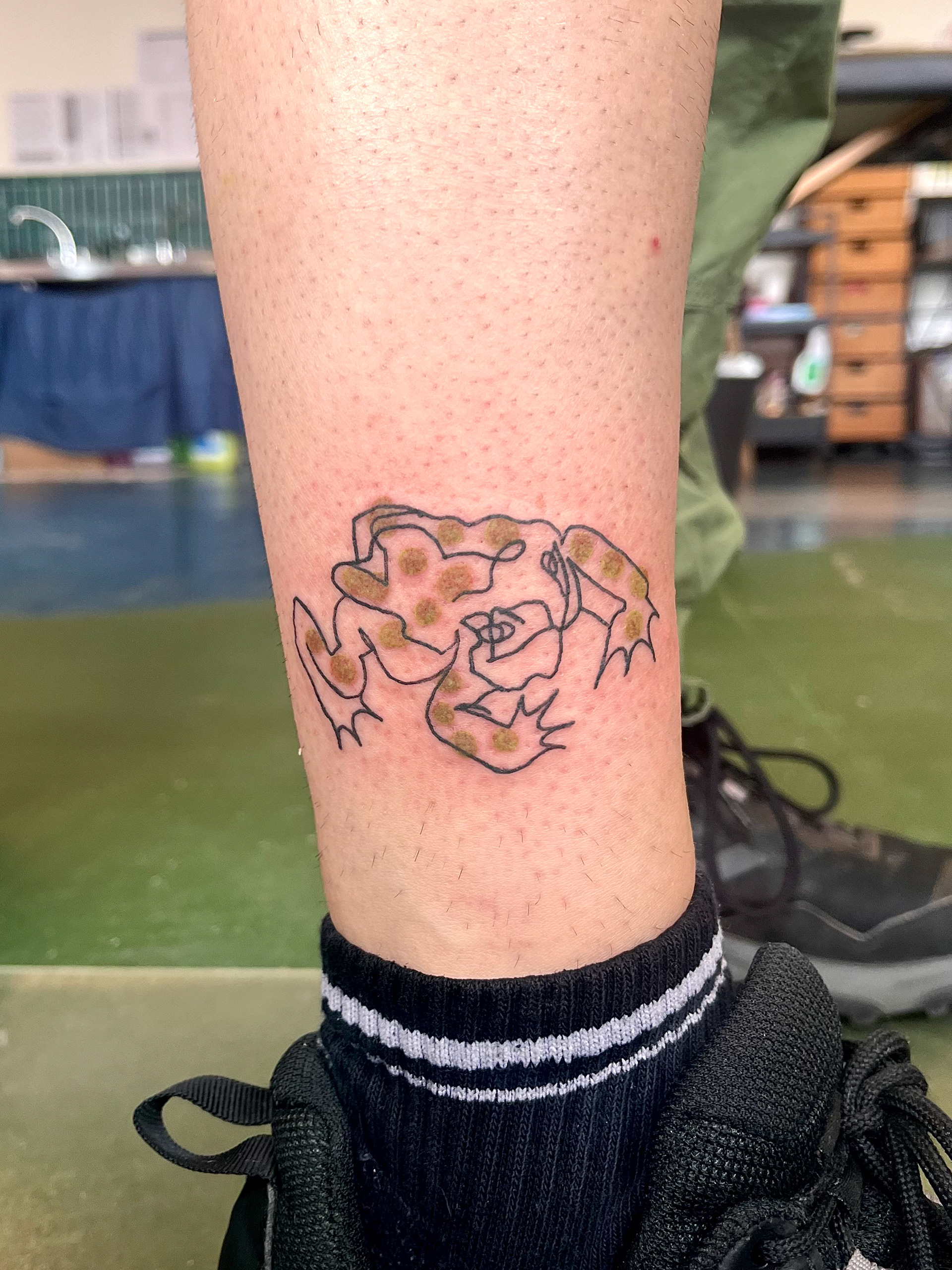
This is the flash sheet that I made from some of my sketches at the farm, and then some past life drawings included in the way of colour that I did from the first set of sketches i did. I don’t get a tattoo colour a lot, and I thought this was a nice way to introduce colour into my tattooing outside of uni and show how I can take sketchbook drawings and turn them into something profitable. So far, the dinosaur, the flower basket, and the chicken are claimed, and I was really hoping people would choose frogs because they’re MY favorite. I’m really happy I’ve been able to include some of this project in my tattoo work, and then I’ll be done by the end of March. I’ll be able to include them in my final, and then I just won’t be able to show them when I pitch the mural brief.


You have to excuse that I'm bad at digital art, but I wanted to test out the colour palettes with the first composition that I really liked. I'd made all the color palettes with some coolors, and I just went with my favorite one to test out first. It just looks cold in comparison to how I wanted it to look. i tested the other ones just using the recolour on Procreate. It’s not perfect, but it does what I needed it to do.
Originally, I was using a dark brown to shade the lighter brown areas. I really like the burgundy colour a lot with the light brown i LOVE when different colours are used next to each other o yes. I probably wouldn't have done the sky that light without doing this, and I really like the shades of green I’ve got for the grass in the last one because I think it looks warmer and more muddy. Normally, I don’t really want colours to look muddy, but I’m happy for it to look muddy in this case because Brackenhurst is muddy. I think for this composition, I’m going to move the main house around because I don’t really like how it looks, and I’m going to include the hedgerows in the back fields just because that was a part that’s really easy to include, and is a bit part of brackenhurst biodiversity schemes.
TO DO LIST !!!!
-I need to find some scrap wood planks and test out what techniques I can do on them, especially with medium is like a motion because I want to be able to have the freedom that I would do in a sketchbook and make it scruffy and loose, I just need to find a way to translate that into a wall.
-I need to look into getting some designs printed out as prints that might be able to sell at markets and maybe look at what I could do with these prints because I like the idea of using them in textiles and things that I can sell. maybe I could have a look at doing some of the continuous line drawings from the farm on quilts and fabric.
- I need to mess around my compositions until I can finalise one and the colours I want to use so I can start really understanding where things are going to go. I can go to Brackenhurst and sit in the library and be in the actual room where the wall is and see what gets in the way of the mural while I'm there.
- I need to look at some ways that I am able to present my pitch that are interesting and up to standard with the graphic design presentations
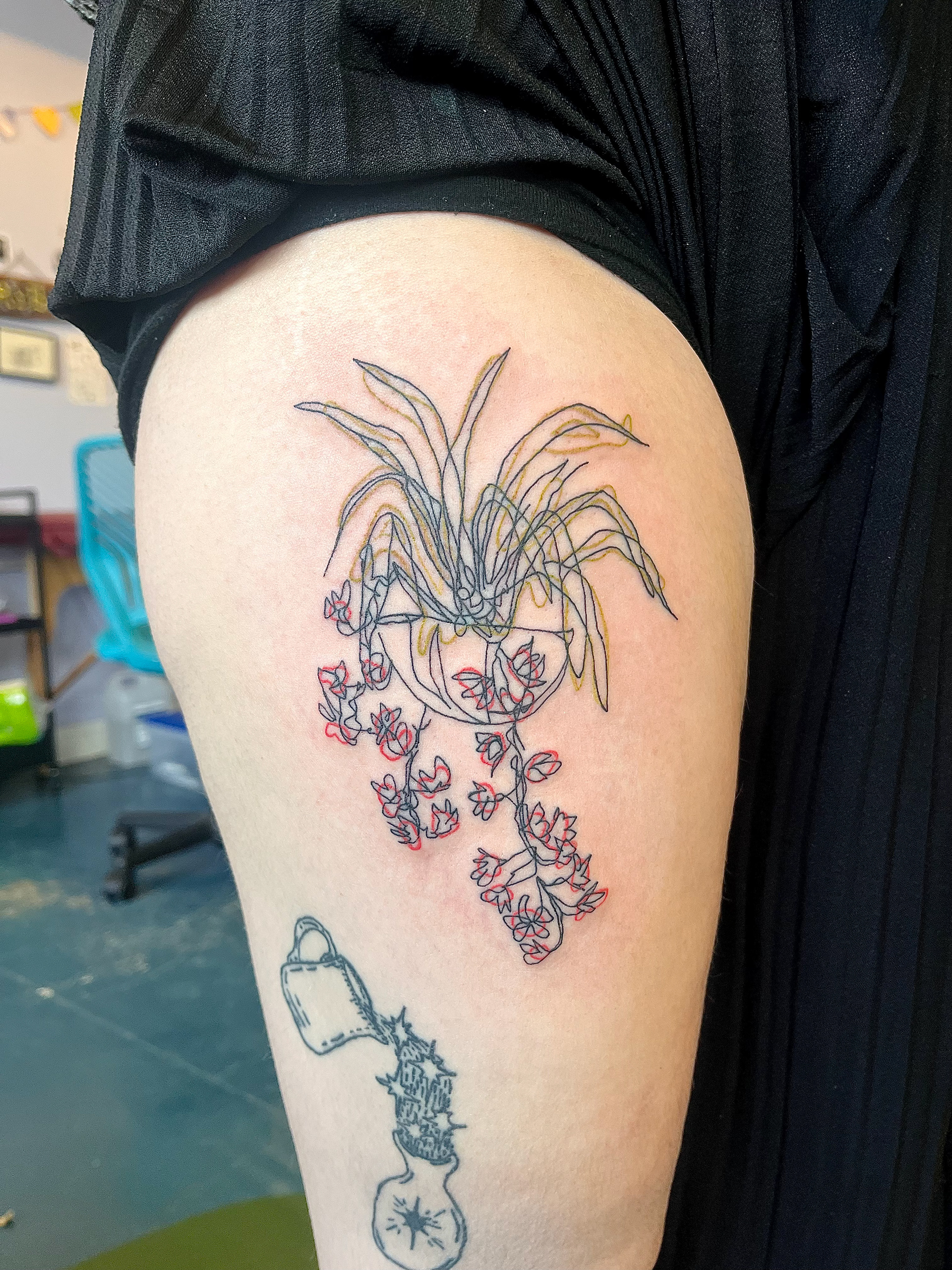
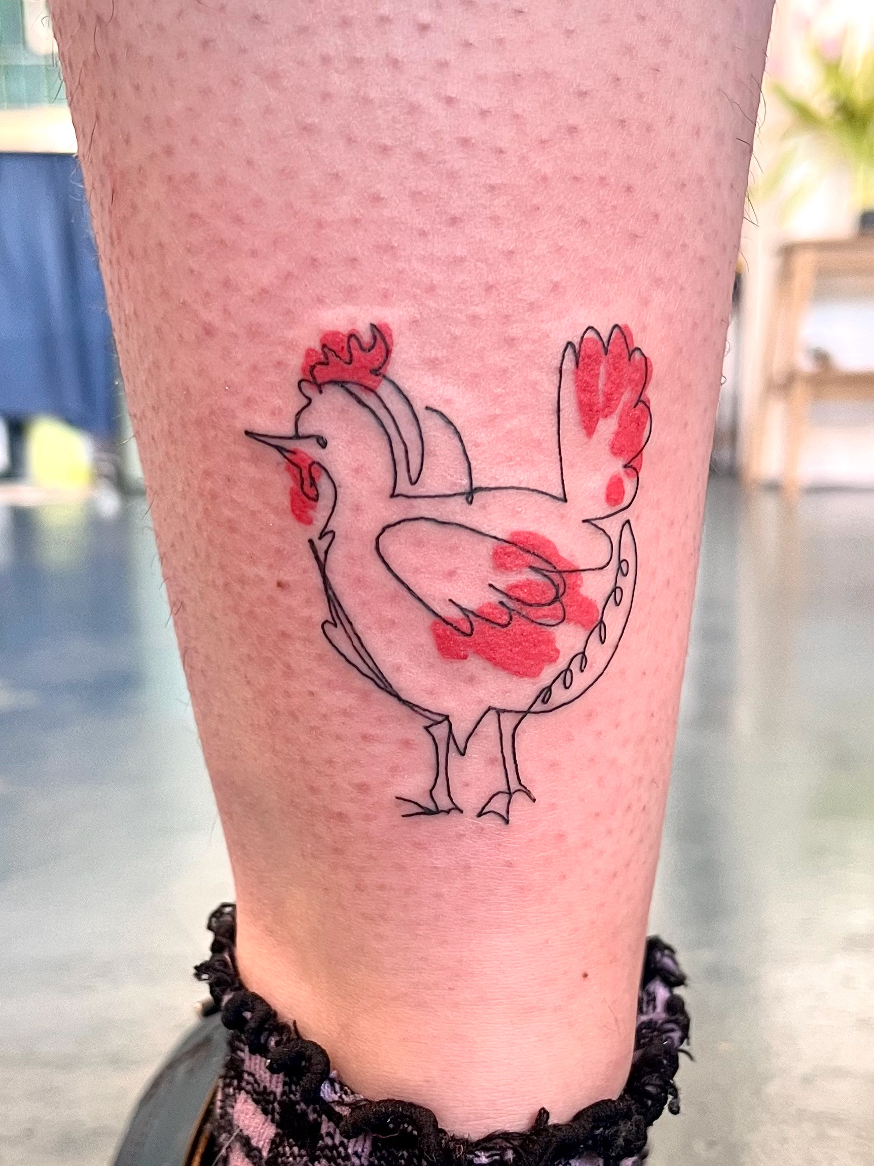

some of the flash designs!!! I'm really really happy with all the chicken looks it's probably my favourite I've ever done and I love the shade of red that she picked it's called tangerine and it's a slightly lighter orange shade of red, but it looks really good on the skin. for the flower pot I outlined the colours and she said she really liked how it looks and if she decides she wanted it fully coloured and then we can do that for her. I'm hoping that I can do more in the future because it's really fun and I think it's a nice way to introduce colour into in the styles of tattooing, because a lot of people stick to black.
I'm also really surprised with how popular the flash was too. It's probably the first time that I've ever posted flash and then had people booking straight away. Normally they stay on my Instagram for a couple months before I get some interest in them, so I'm hoping that I'll be able to practice the style more and see how far I can push it with it, being outlined in the kind of ink splatters of paint style. IMAGINE A BIG MERMAID :0.
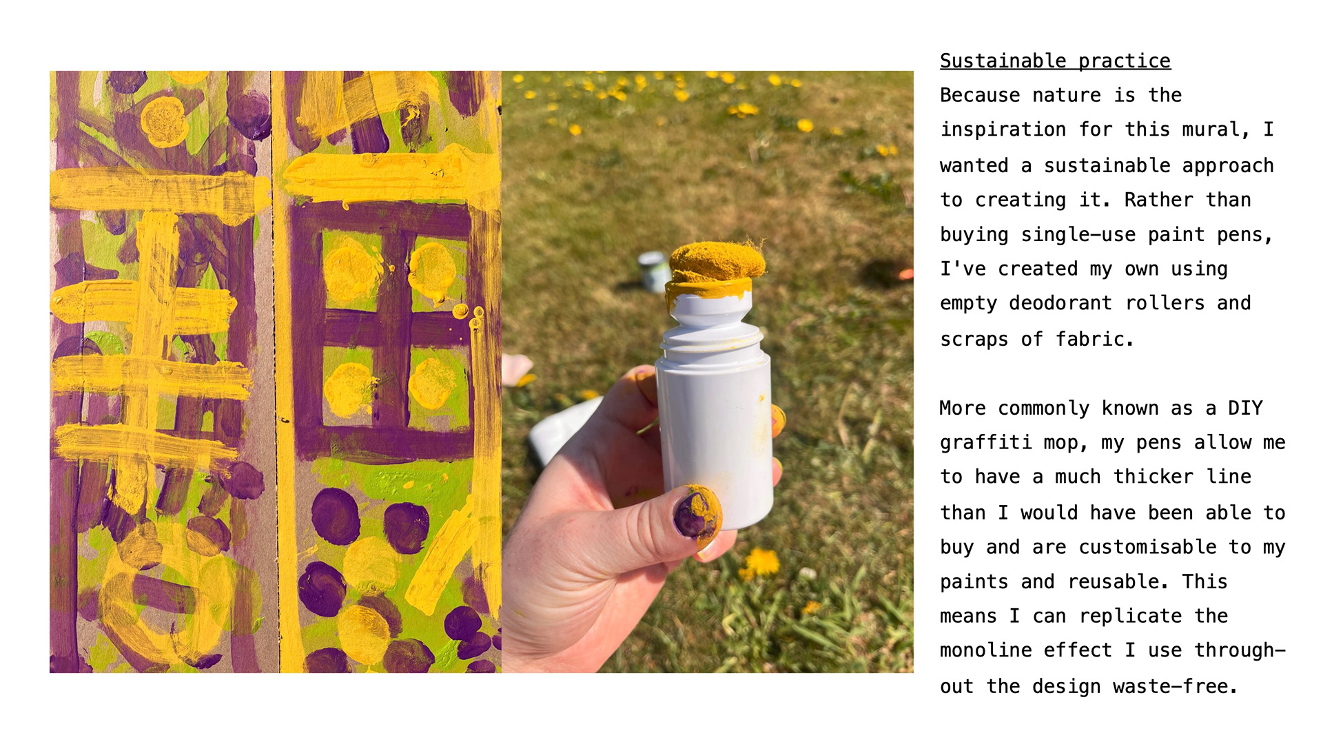
because i wanted to replicate the style of my flash designs on the mural i needed to find a way to get the freehand look naturally rather than imitating it. My brain immediately went to the posca mop, but then I realise that I have to buy lots of colours and I won't be able to mix my own colours and because i'm using a restricted colour palette. It would be a lot easier if I made my own mops, I knew about making mops with deodorant rollers, but this video probably explains it the best. it will probably have a little bit of dripping on it but I don't mind that and also it be interesting to bring that graffiti style into a place like Brackenhurst and make it more palatable for an area that doesn't necessarily have a lot of graffiti.
so my plan is to go to B&Q and buy lots of emulsion samples in one of the colour pallets I plan on using and then making some up since it's now on the spare wood that I got from the woodworking room.
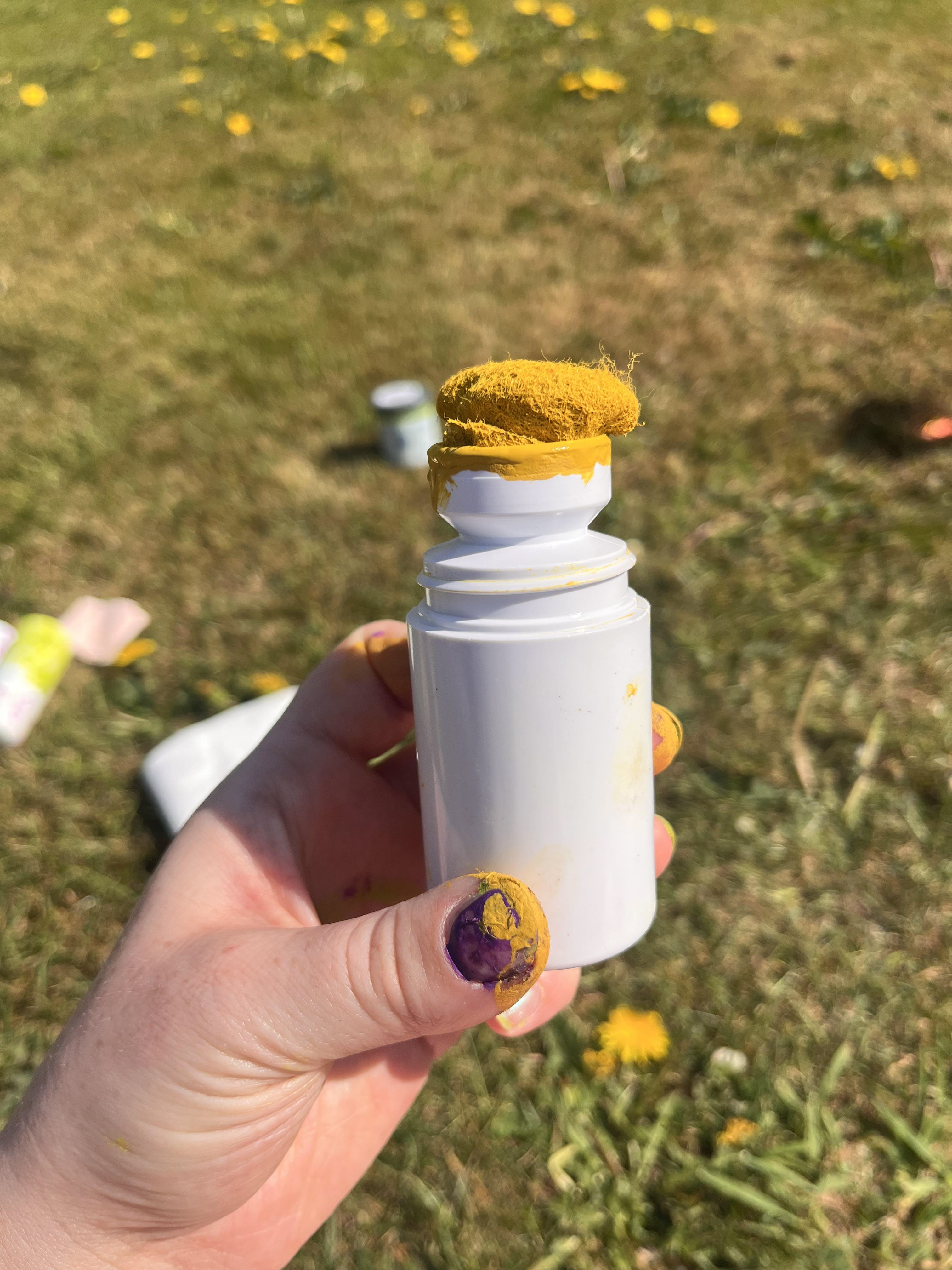
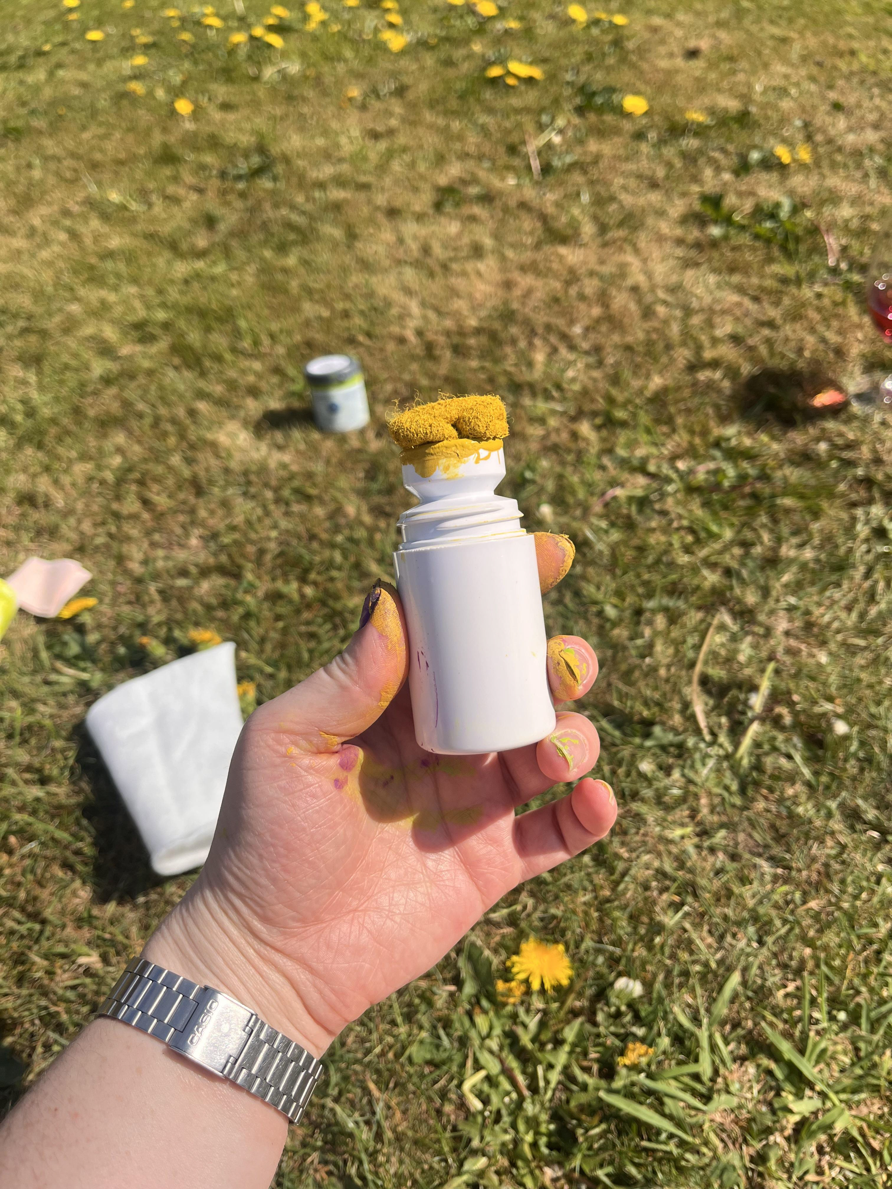
I managed to find a woman selling 50 empty deodorant bottle on vinted for £8 so I bought them because I know that murals are something I wanted to go into after uni and I knew that I'll be able to find a way to use them even if I don't win the brief for this project. I tried a couple different kinds of fabrics in the end of the nozzle, like a rag from an old tshirt and some quilt interfacing, but i found that felt scraps were best because they were thin enough to have a consistent flow of paint. i had to thin the paint samples slightly using some vinegar but i know that if i used actual paint thinner or ink it'd get less streaky results. the thickness of the line is exactly what i was looking for and stays nice and consistent.
it looks similar to the monoliner i use on procreate too so it means that i know for nearly definite that i could replicate the design i made if i was picked in really life.
sorry for the abba but look at the lovely smooth line ooooo
because of both my other projects being so big i had alot less time to send on this one, because the deadline was two weeks earlier than my final hand in :'). if i had had more time, i would have sent in a couple different versions, with one in the looser style like my first drawings and the ones i did in city farm.

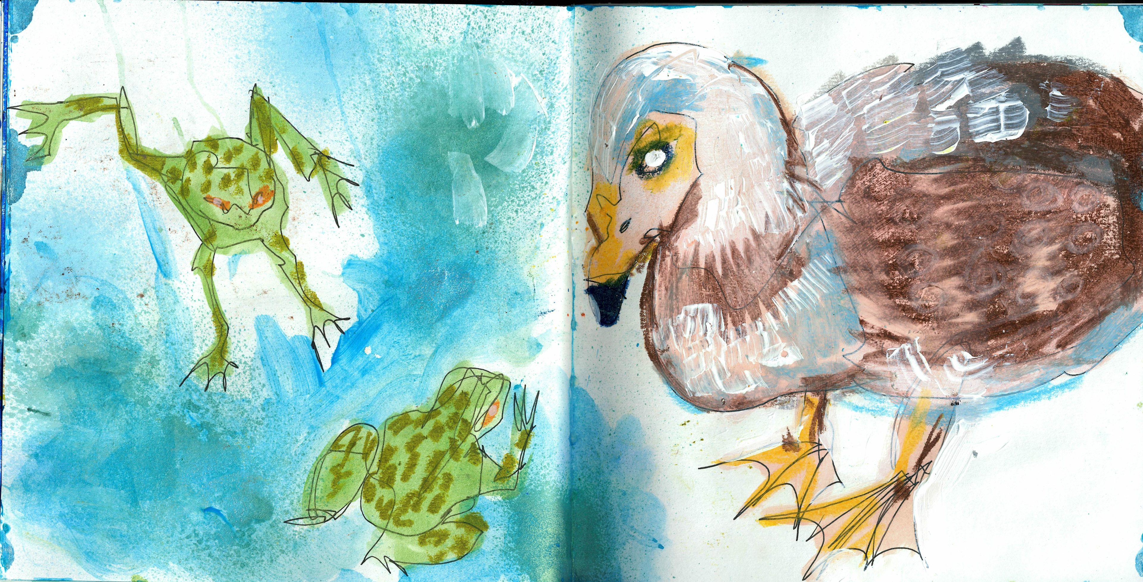
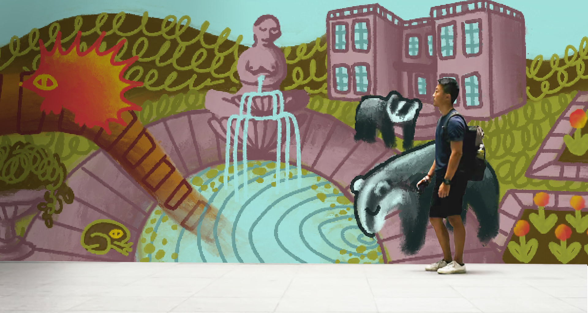
i followed the tutor WHOS NAME I CANT REMEBER IM SORRYS advice to not necessarily go really light with colours in a dark space, so i stuck to my idea of having a muddy green colour as the main focus. i wish i had used a cooler, brigher blue but i like how this blue looks like its glowing slightly against the purple stone sections. i included a few extra nods to biodiversity specifics on campus too, with the bee orchids on the left and the cowslips on the right. AND THE BIG FROG WE SAW he was my favourite bit so i plopped him next to the pond even though he lives inside. when i started trying to make the final design i H A T E D I T i think i was just pissed off that i hadn't been able to take my time with this project and this was the brief that i R E A L L Y wanted to win really really bad. now i look at it and i'm happy with it!!! i'm glad i got to use my smooth shading mixed with the monoline, and i really like how the newt looks. im happy i got to include southwell in the background too :)
this was the first mockup ive ever had to make so its abit rubbish but at least it puts into perspective the size of the mural and how it would look on a big scale. it also make me like the monolines a lot more because on a bigger scale they make more of an IMPACT. i like how the flowerpot and the gardens look when lined up with the floor too like they are growing out of the ground. all in all im happy with it and what i was able to whip up in a short space of time and that the colours worked as well together as i hoped.
because i knew i was going to be handing in work with graphics students, i knew it was important that i have a good presentation. My sister is in second year graphics, so i used some of her pitch presentations as a guideline. i tried to keep everything really simple so that my design stood out, and included some of my sketches in the moodboard because everyone likes them :) feeling more relaxed about this project now because i know i've handed in something im proud of, and it means i can do all the fun parts of the project with another two weeks until the deadline!!! o yea :)
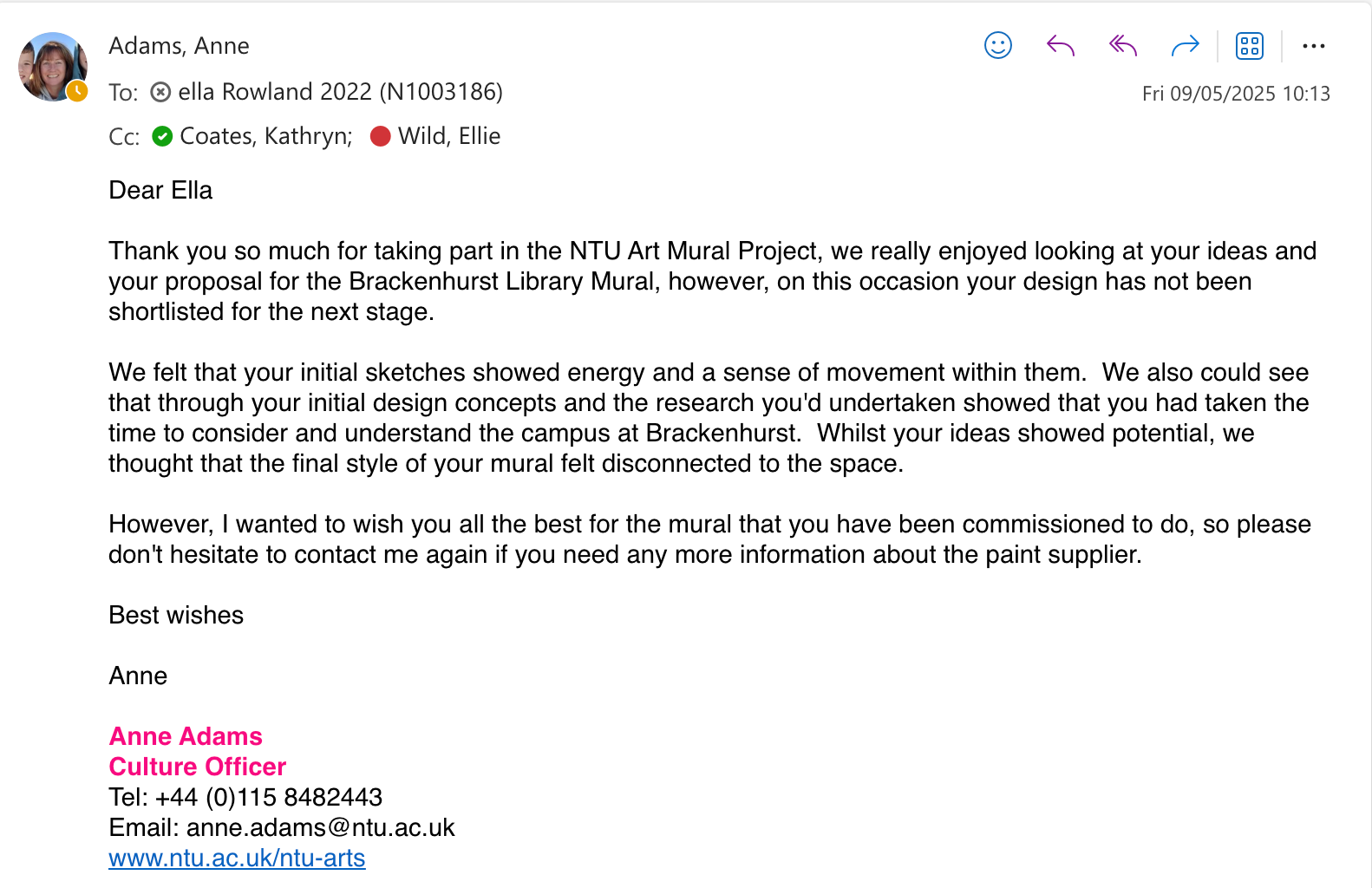
didn't get shortlisted :( o well we live and learn but i do agree with all their feedback, i definitely need to figure out how to transfer my style on paper to digital. i also think my colour palette was too broad and i would have benefitted from having a more restricted palette, maybe 3 colours rather than 5. Looking at the designs that did get shortlisted, they were more simplified and had two main focus points whereas mine had about 600393985205, so simplifying my ideas would have helped too.
cause i didn't win this brief and i had finished my other projects abit early kristian set me a CHALLENGE to try and get a mural done before the deadline (one week). i went out of a cafe and charity shop crawl to try and find someone up for a free mural at very short notice but most places either had stuff up on their wall already, or weren't able to let me do it that soon. i was all sad that id have FAILED but my last stop was the Tin Hat centre in my village and they said YES!!!
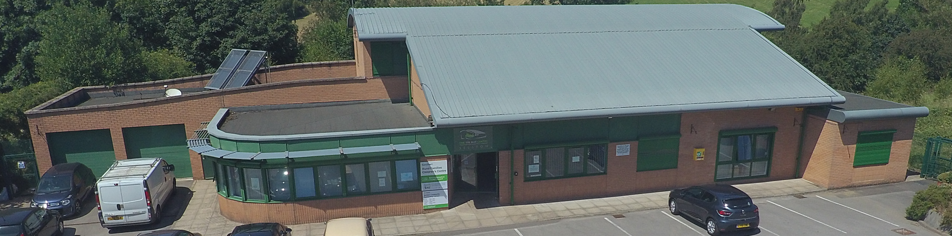
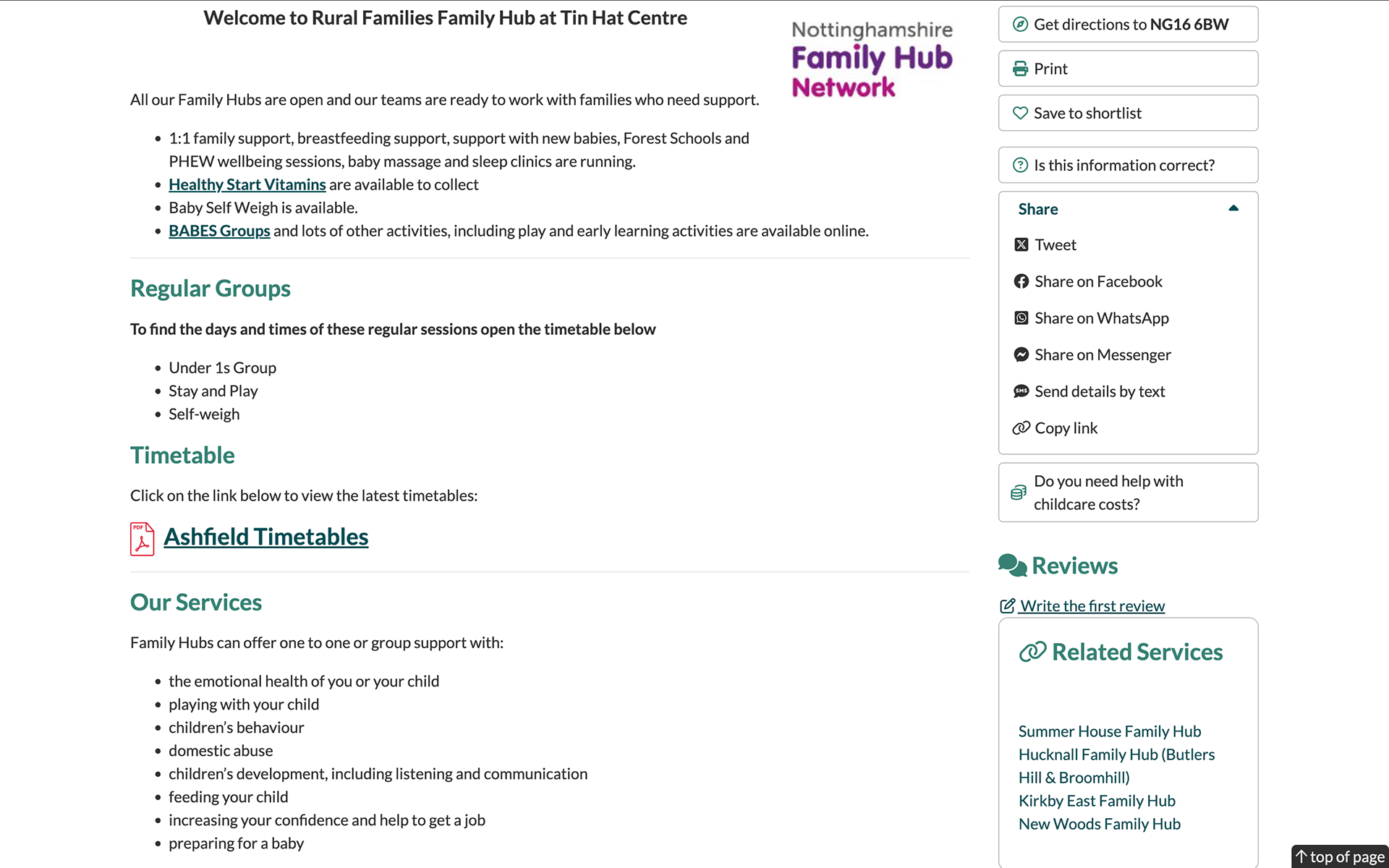
the tin hat centre is probably the best thing about selston, its a charity-funded community centre that runs a library, cafe, sure-start, foodbank, community garden and creche. it also offers loads of things like free childcare and help for parents. i really like this place, my mum used to take me and my sister here so she could do first aid classes and stuff while we were in the creche and they gave us pink panther biscuits o simpler times :'). this is possibly the BEST OUTCOME from going round all the places because it's perfect for a free mural, i get to give back to a really cool place, and they're as excited as i am about the mural.
this is the space we decided on seen as ill only have a day max to get the mural done! its in the cafe but in a corner so everything can stay open, and all they told me was that they want it to show off the community garden, but other than that free reign!!!
they had lots of other walls that they wanted doing so after this ill hopefully be able to work with them again :)
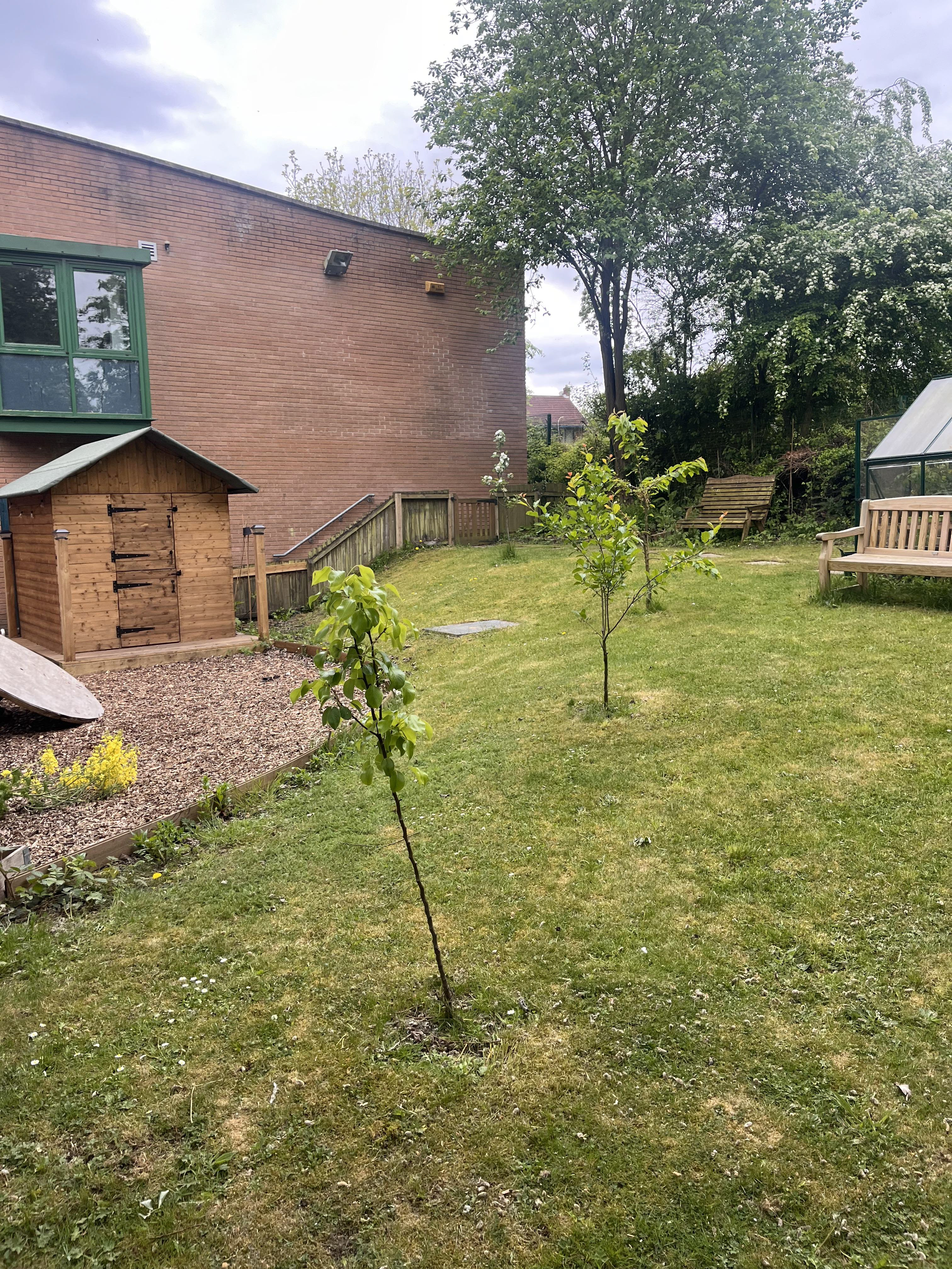
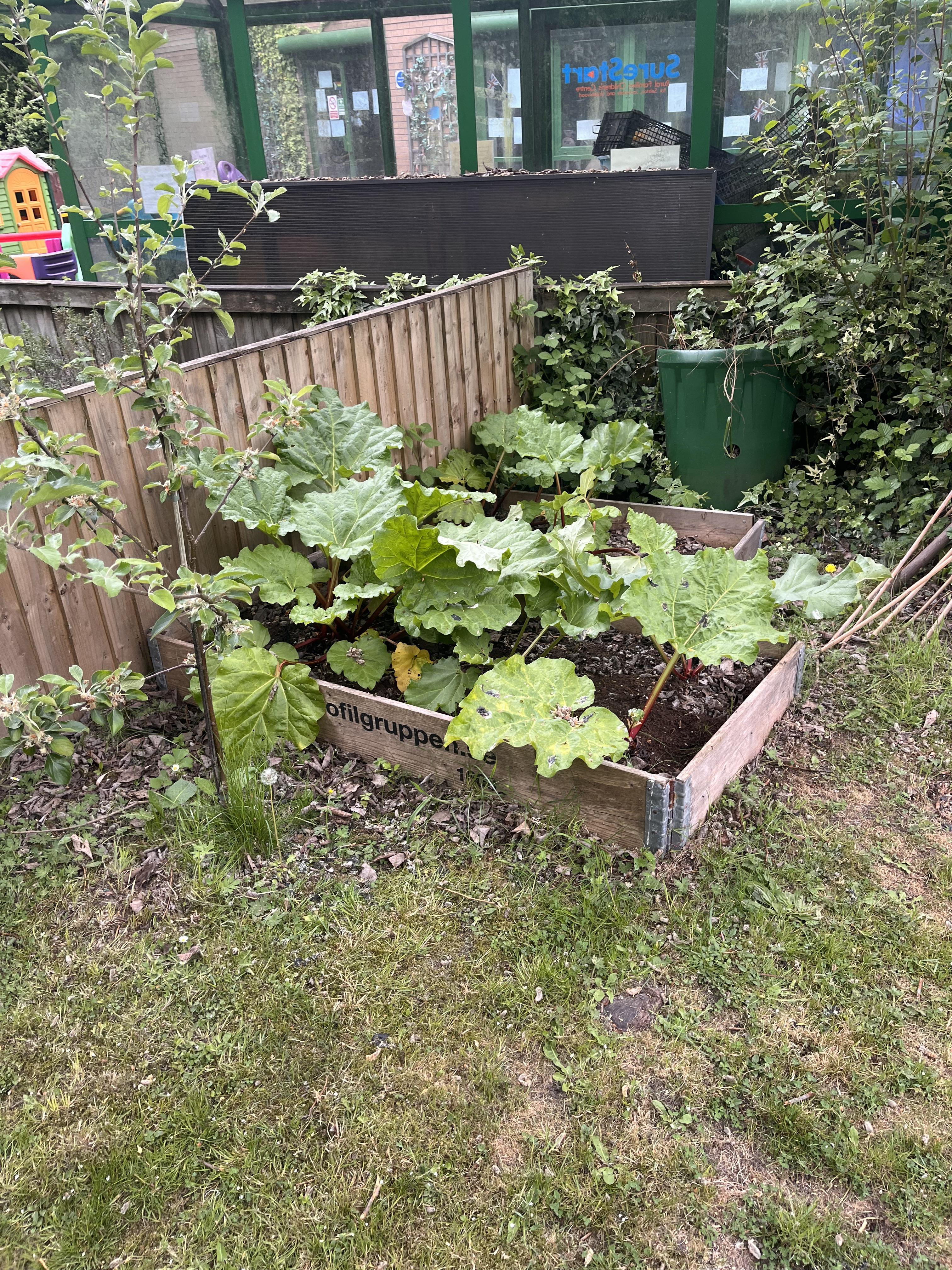
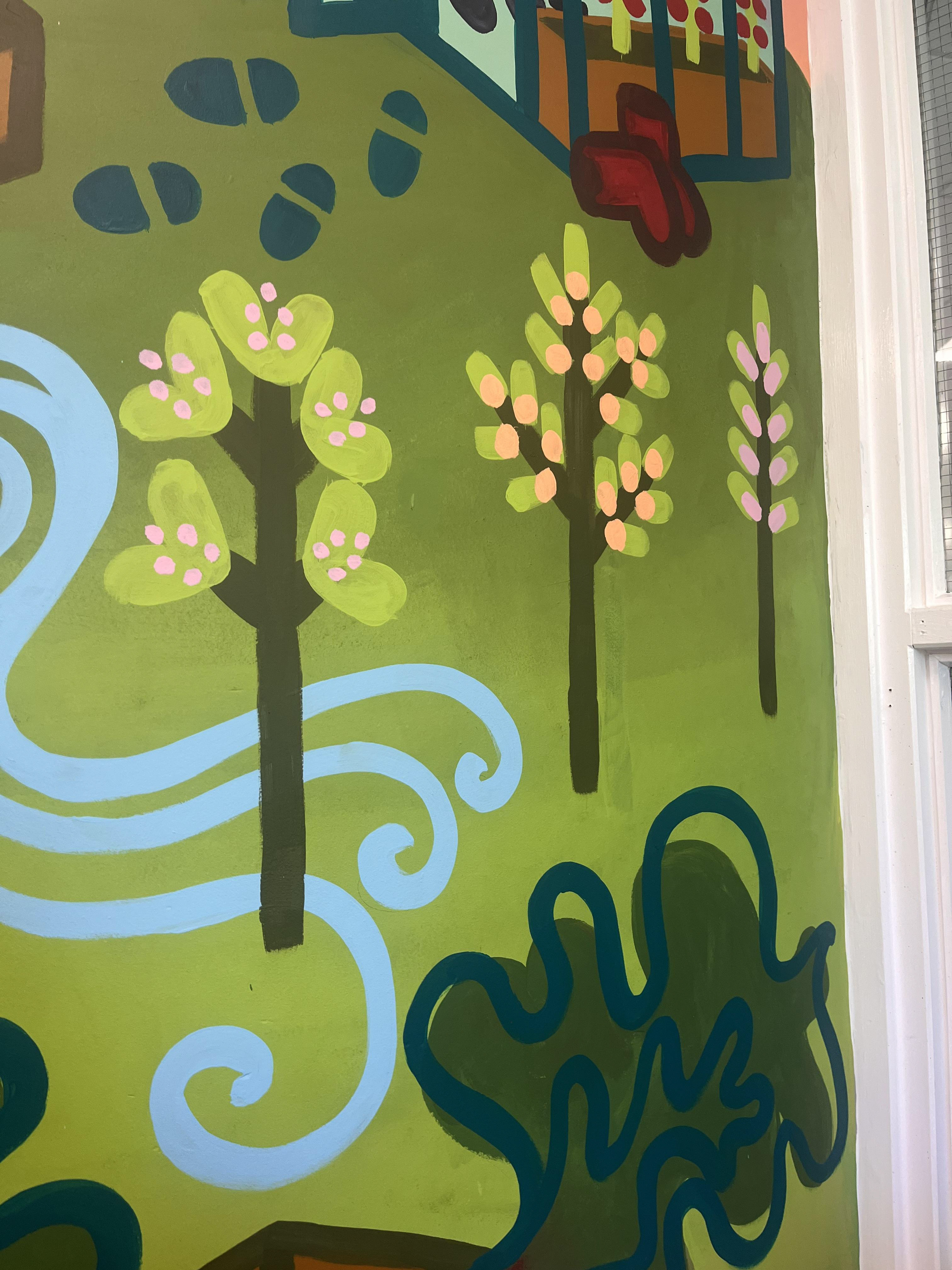
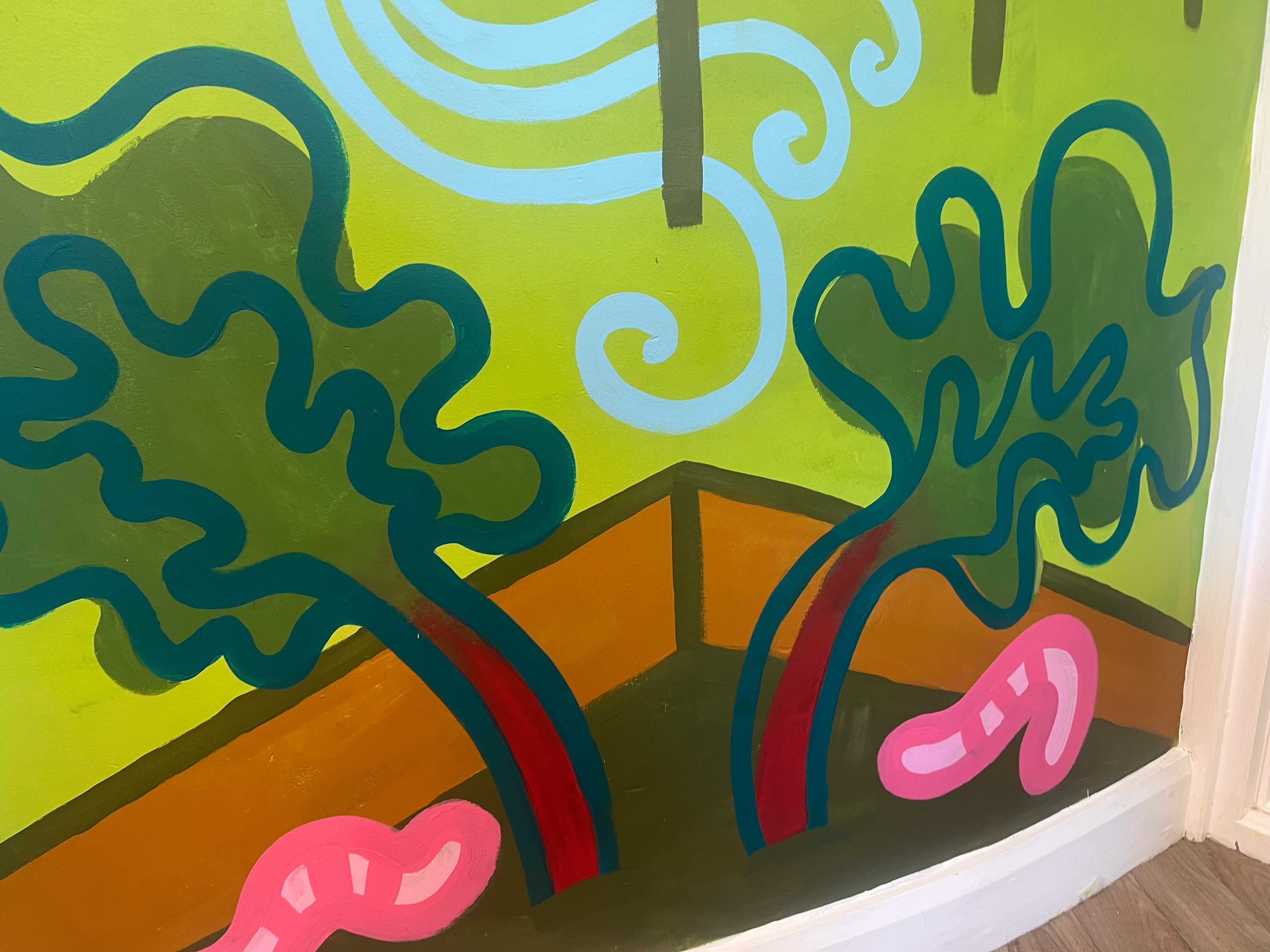
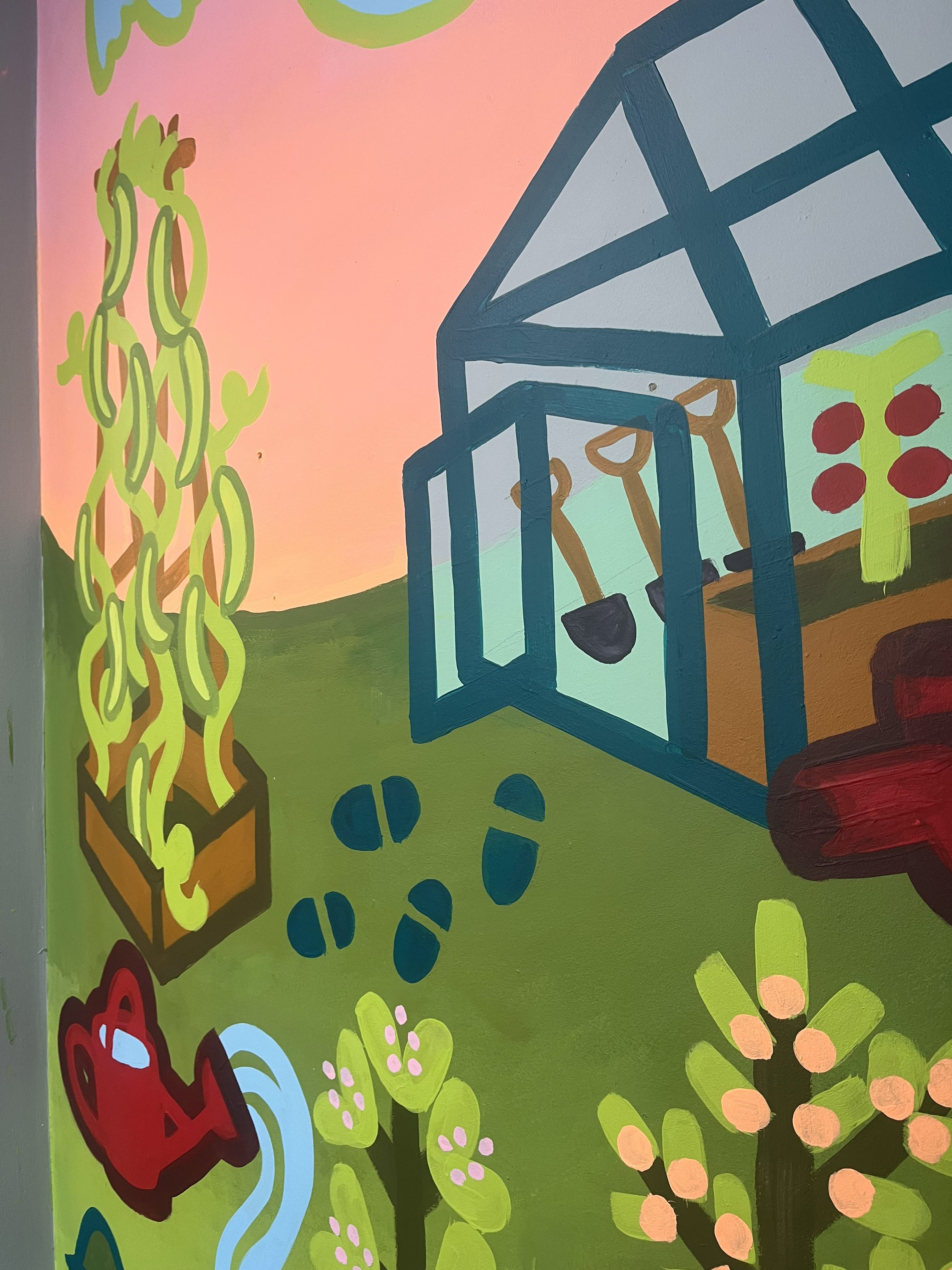
this is the garden, they've got rhubarb, green beans, little greens, and tomatoes in a greenhouse. i like specifics so i told them i'd get all these in the mural. they said it would be nice if they could use it to point out to the kids that these were what they were growing. because the rest of the cafe is really grey, they were up for lots of colour.


these were the roughs i sent, the first and last ones were my favourite, but i thought i better include one with a person in if they fancied it.
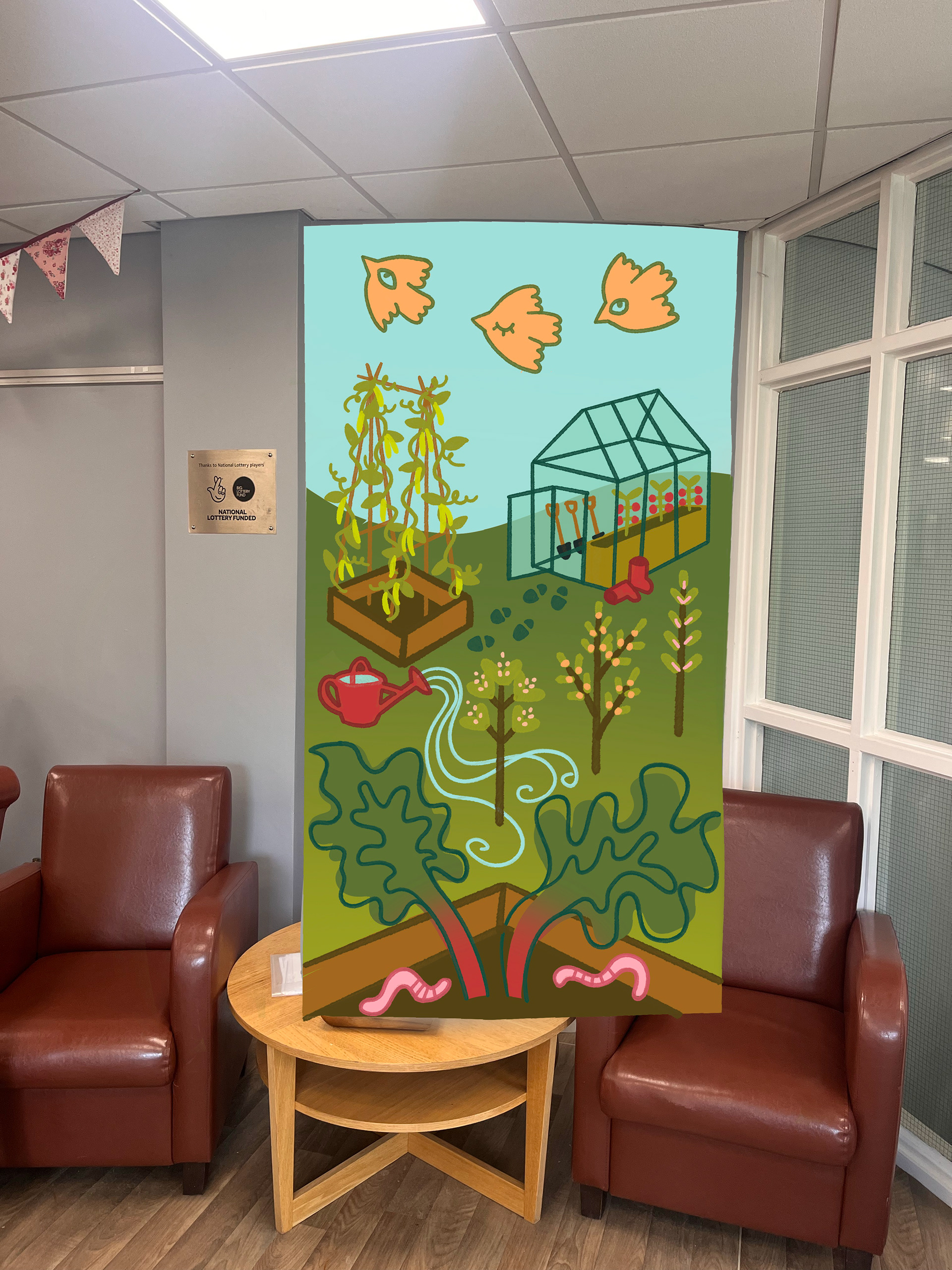

these r the two colour mock ups i made!!! pink sky is obvs my favourite because its PINK. and it makes the greenhouse stand out. they did a vote at the centre and PINK WINS!!! HORRAY any excuse to get neon orange onto a wall.
i had NO CLUE what paints to buy, everything online was saying acrylic or normal emusion but i was scared about spending too much money because i was doing it for free so it was out of my hard earned c a s h. ellie gave me the email of a past student called millie who does loads of murals now and she helped me out LOADS!!!! big up millie love you
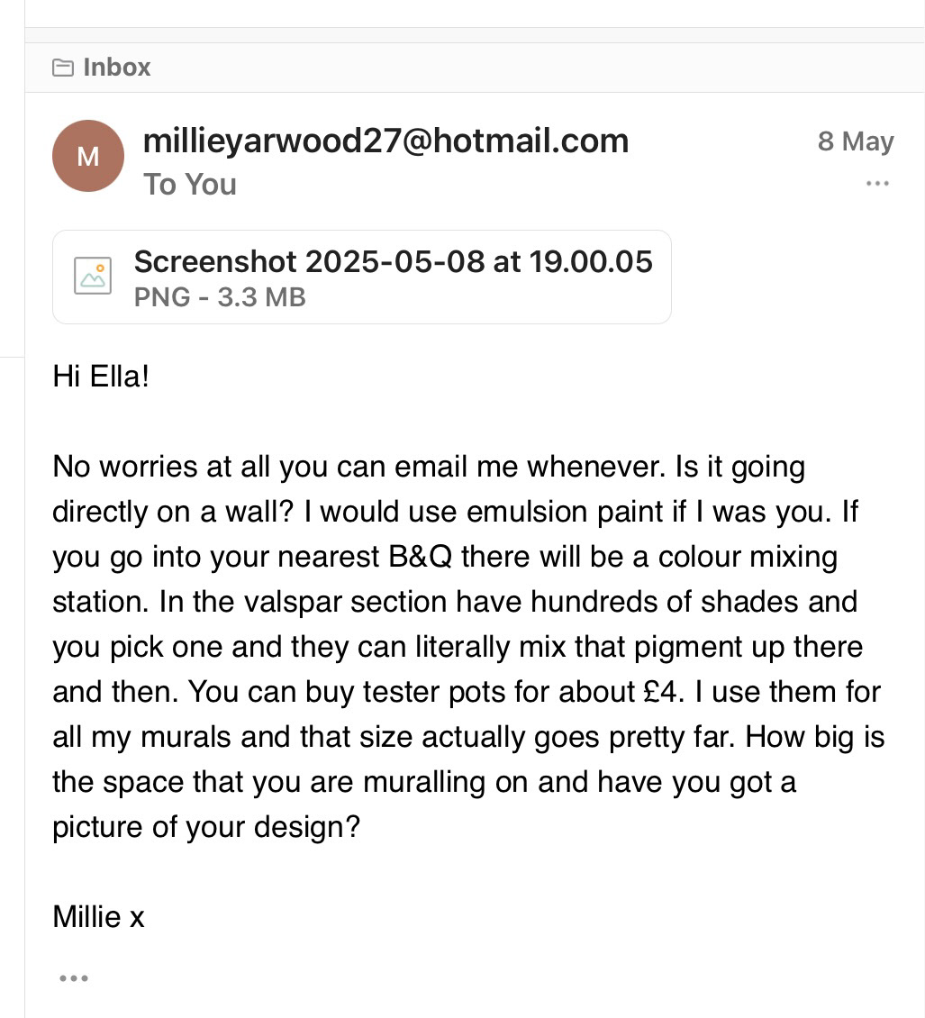
And then trekked it down to B&Q to get my paint samples. I took my iPad and hold up the tester papers to screen, and the people at the mixing counter made some up for me. I explained that was doing the mural for free and the lady who mixed my paints was from Selston so she knew that about the tin hat center it so she give me loads of the old tester paint pots that people don't need any more and got me loads of discount off everything so managed to get 10 sample pots of paint for about £25 not too shabby. people are kind
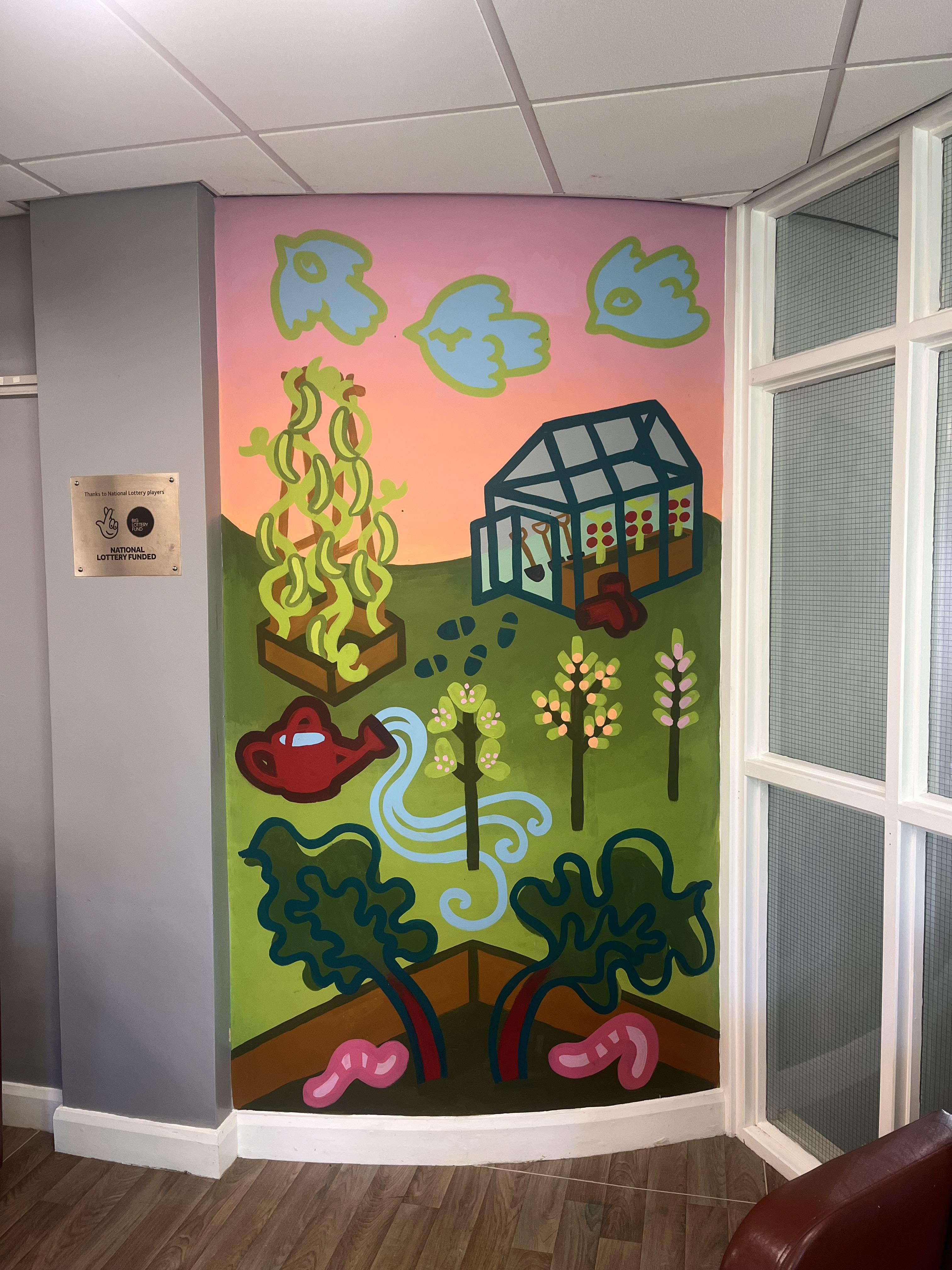
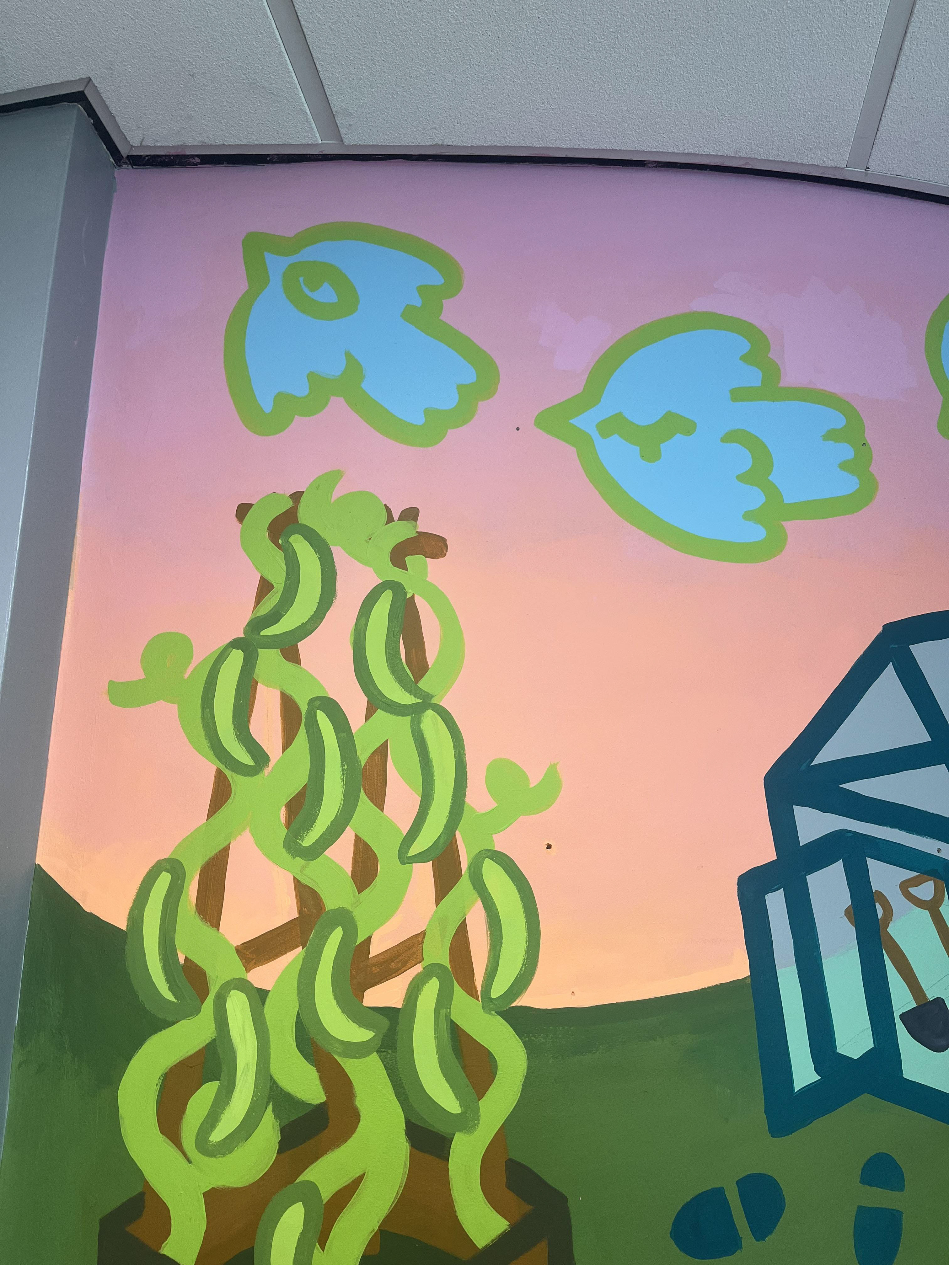
It took me about 9 hours to finish the whole mural, and i was SO NERVOUS at the start i was sweating to bad going up and down the step ladder.
- ombre walls was a bold move for my first time painting anything.
- picking colours slightly ligher than what i thought i needed would have helped, because the green and the pink part of the sky were darker than what i had planned for
-take empty containers to mix with. hard to mix on walls.
-It would have definitely gone quicker if i'd primed the wall before, because i wouldn't have had to spend so long layering up the background.
-I also know now that if i had done two strips of frog tape next to each other i wouldn't have marked the other walls.
-circular brush is much more consistent than the deodorant contraption i made when using emulsion
other than that i LOVED IT!!!! i got to talk to loads of friendly people in the cafe and it made me happy giving back to a really good place for selston. also got a free scone big win. It's definitely a tiring experience but if i was doing this paid i would do it across two days so i could pay more attention to detail. im very happy with the final design too, it fits the space well and bring lots of light and colour to a boring little space. i have been told by the people in the office to come pick up some cider for doing it HORRAY!!!!
i'm really happy i chose to do a life brief this year and had a go at something i'd never done before. It's definitely made me what to do murals and i'm going to look at trying to find some more in my local area over the summer (I am very set on the idea of doing one in either my old primary or secondary school it would be very cool and fun and full circle). i'm also happy this project made me start doing colour flash designs, and i'm going to keep going with them until everyone in the world has colour tattoos.
i'm so excited to leave uni with loads of things that i want to do, and with some experience in working on large-scale projects. I'm happy i didn't win the brackenhurst project too, the money would have been nice but it's good to get rejected fuels ur motivation and it also means i got some good feedback from the uni. i'm going to focus on bring my sketchy, relaxed style into my murals and figure out a way to translate it onto a wall. I'm still proud of this project even though i couldn't dedicated as much time to it as i did with IDENTITY and PLACE.