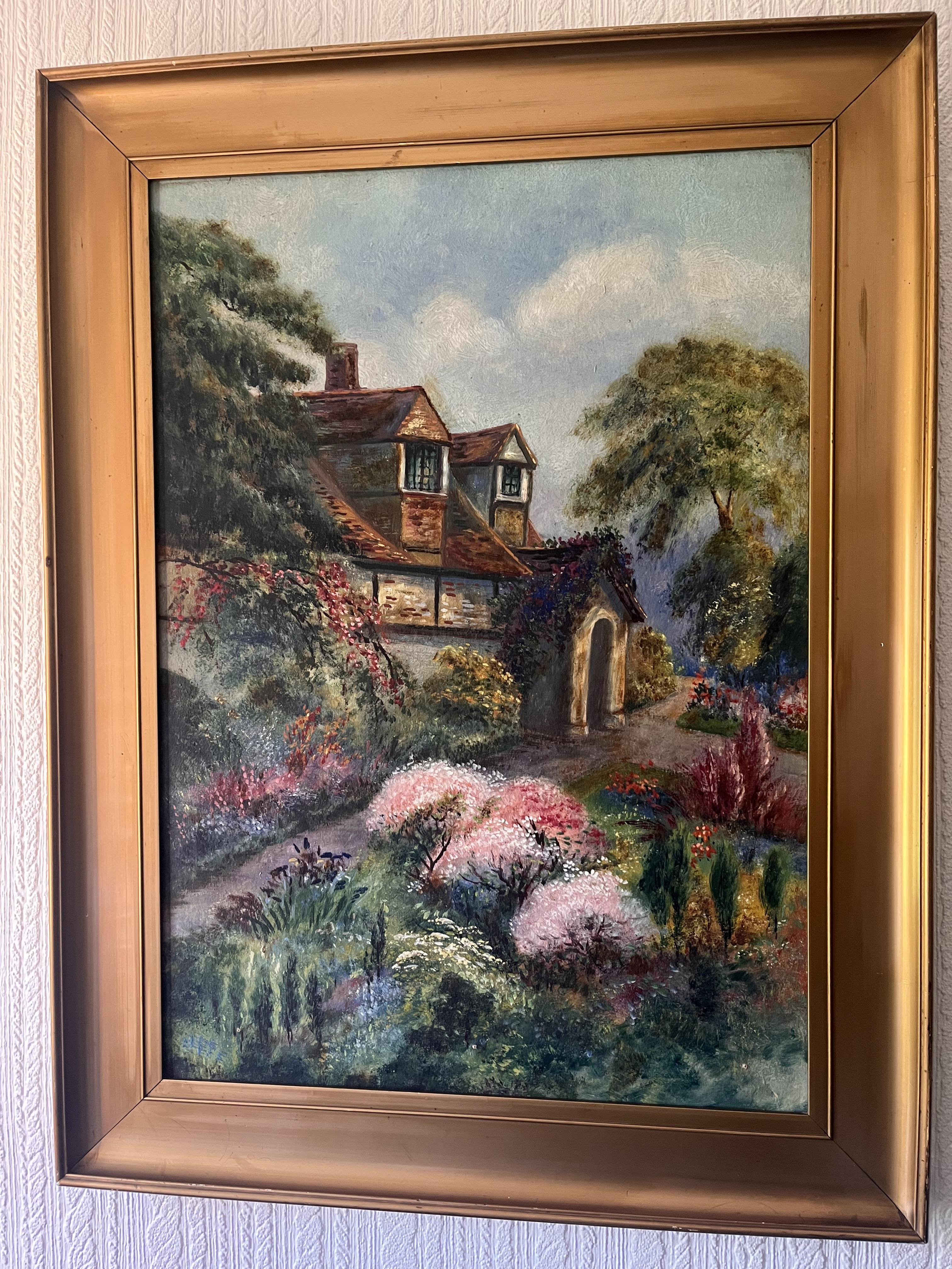
LOCATION LOCATION LOCATION
i had 3 options for what i wanted to do, i wanted to look at the galapagos because it is a magical ecosystem place, traveller communities near me because its a whole group of people that have been involved in my life that never get discussed especially not in a positive light.
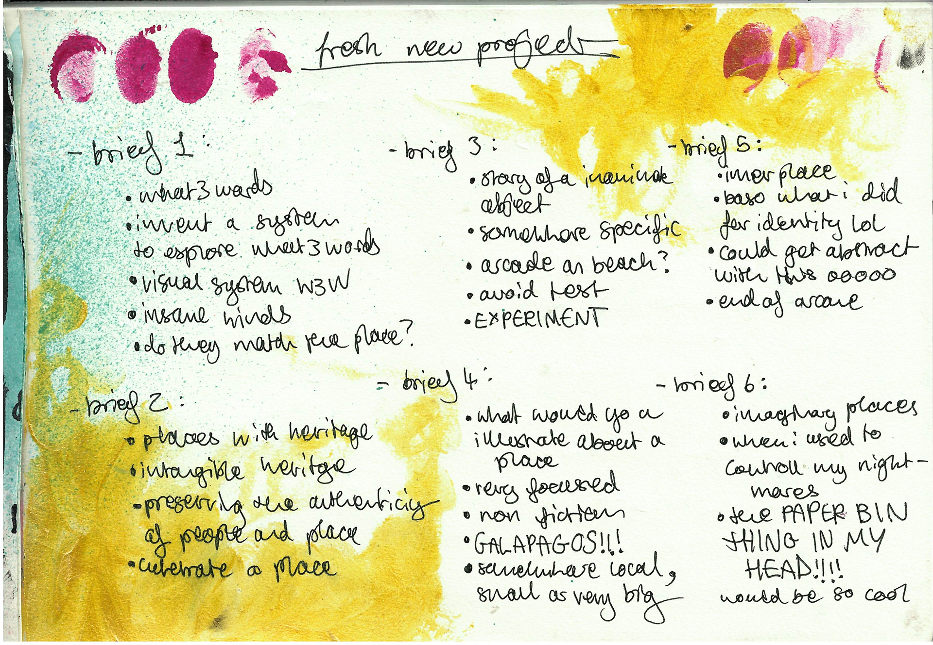
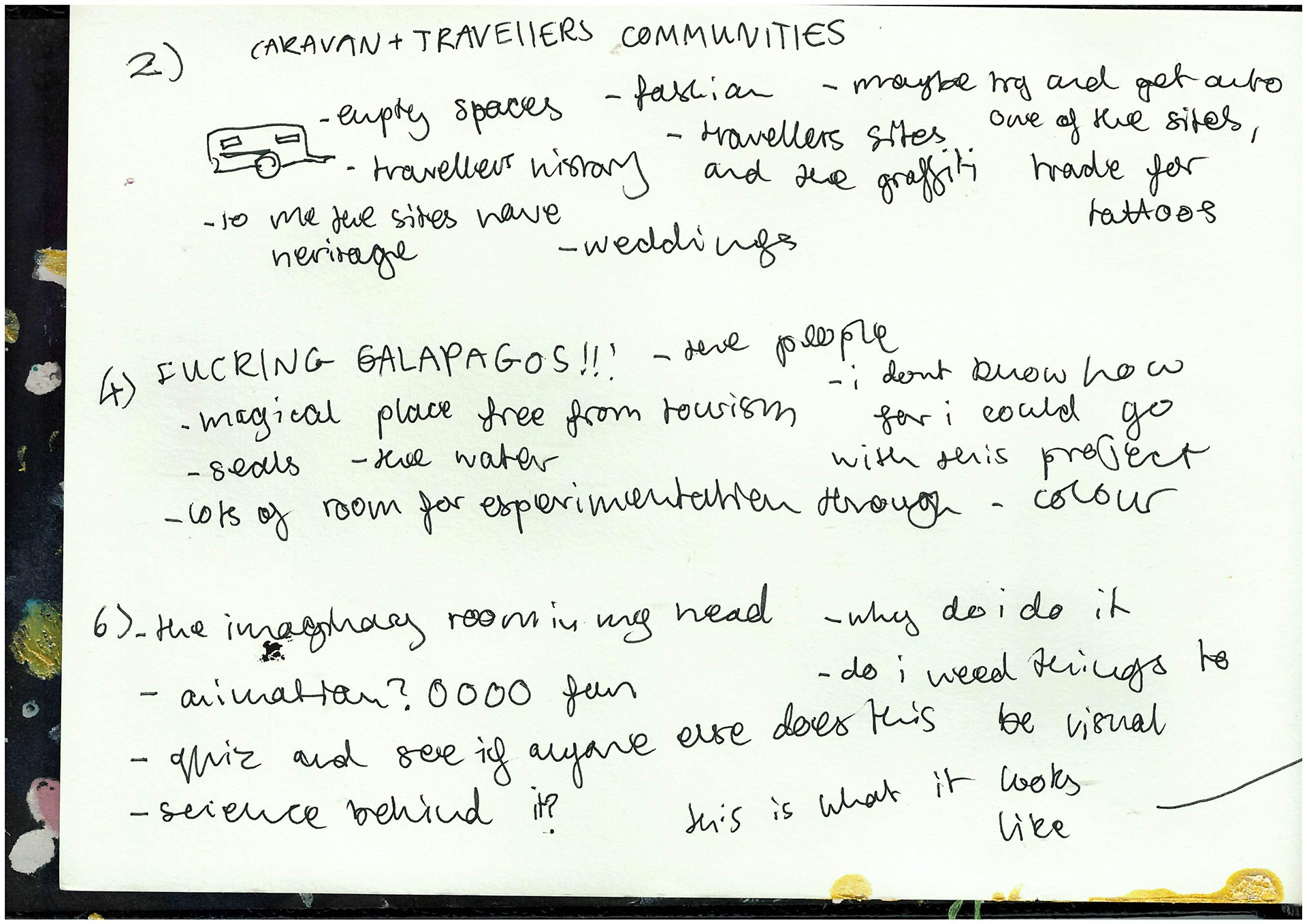
i spoke to everyone in tutorial about all of my ideas and we all agreed we think id bored just doing illustrations of the galapagos (100% correct i would be bored out of my mothertrucking mind), the imaginary paper bin idea was cool and is baso a solid idea but wheres the fun in that ive got nothing to figure out AND i can image myself doing something with that idea in the future! we decided that looking at travellers communities and the area where i lived was my best bet. id already dabbled in this when i did the animation for the summer project and i really enjoyed it and i think i could go further with it. i links in with my disseration well because im wanting to explore mending within the working class too.
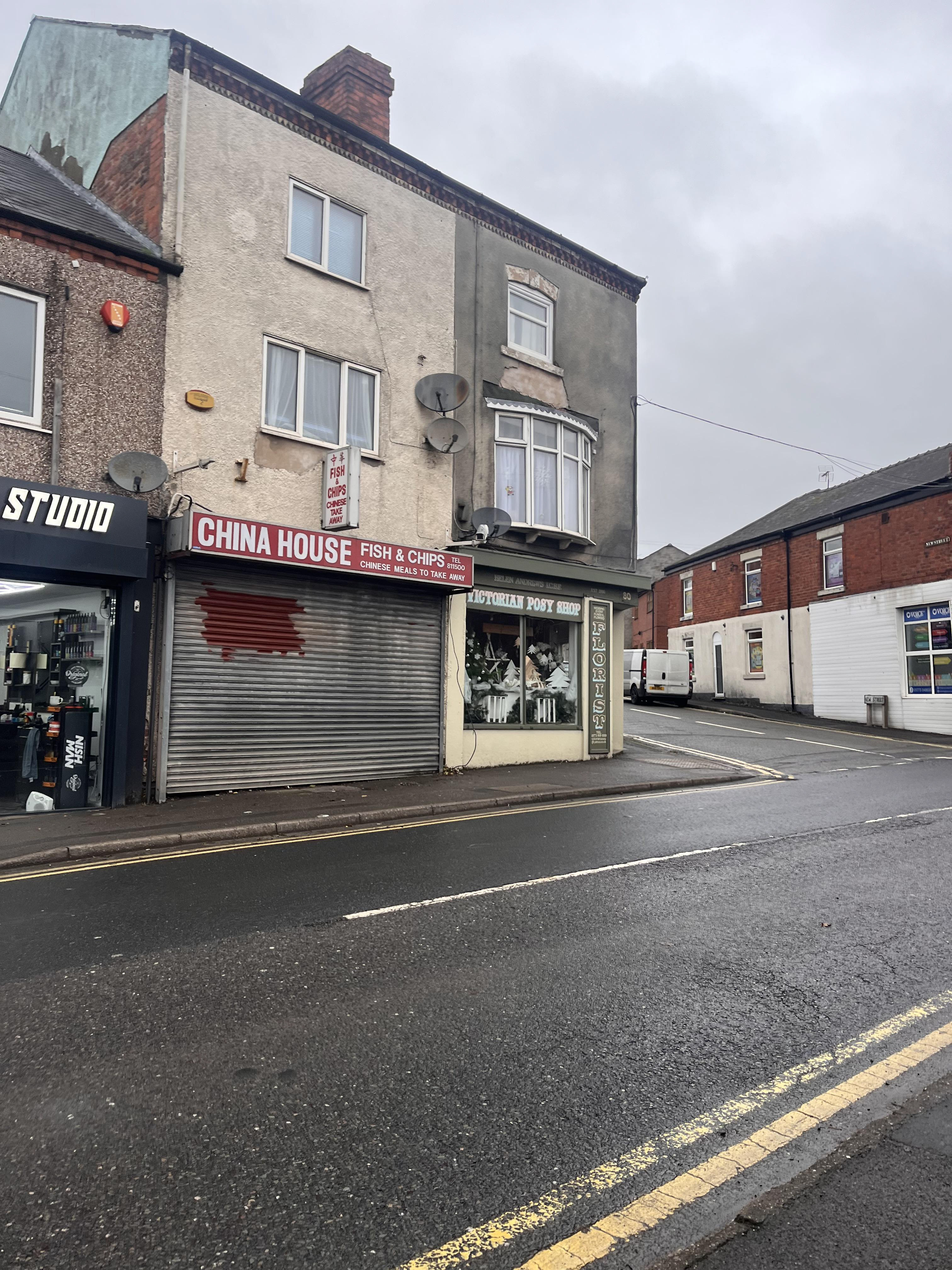
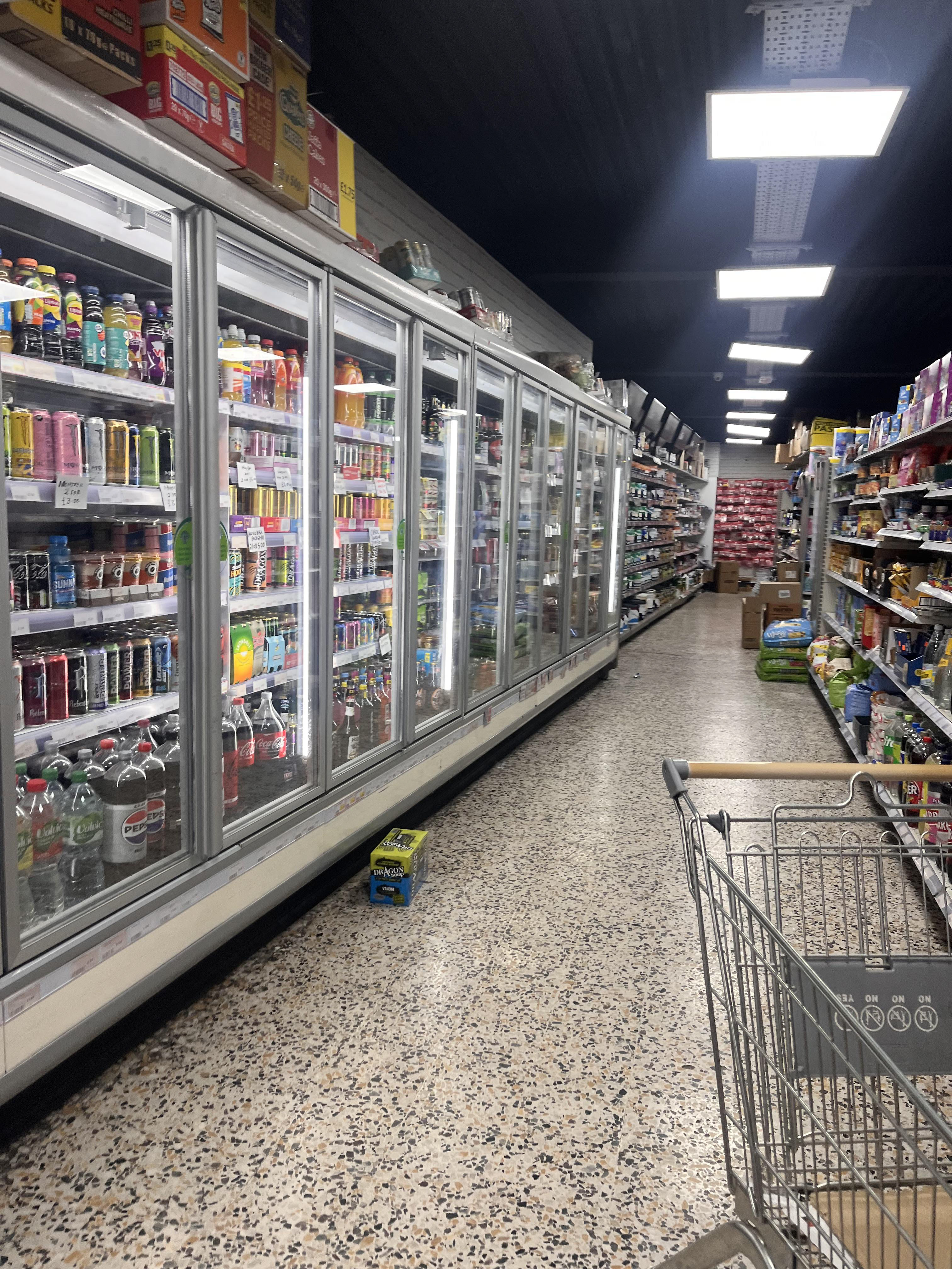
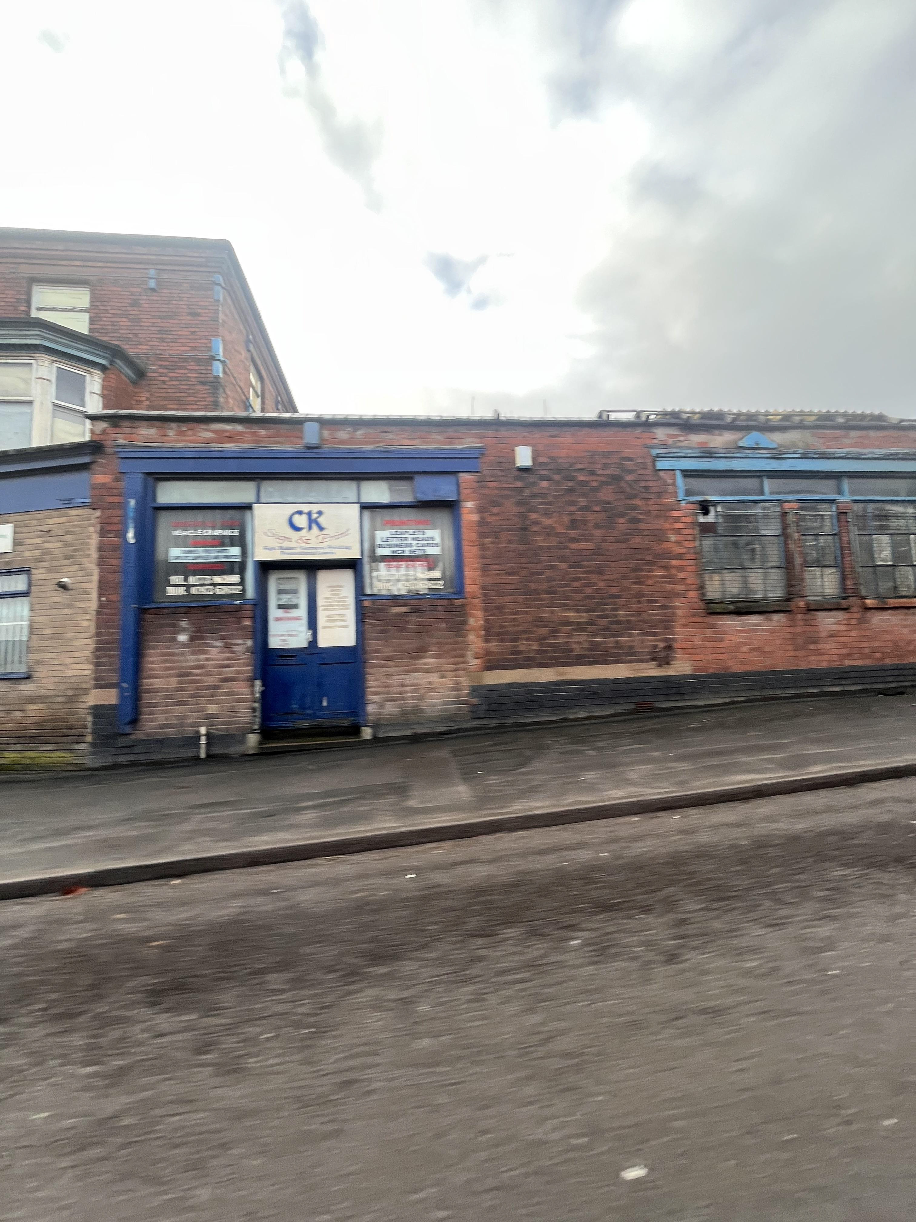
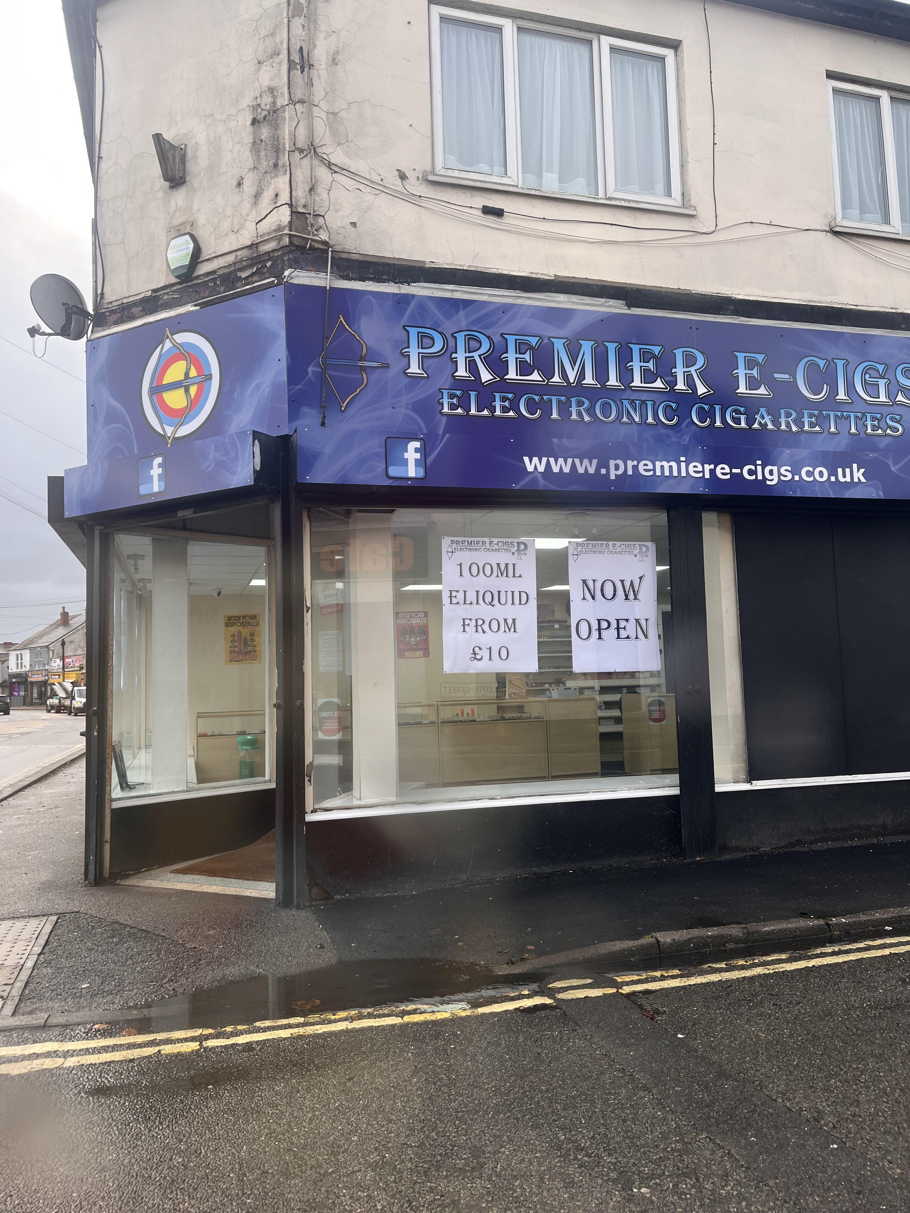
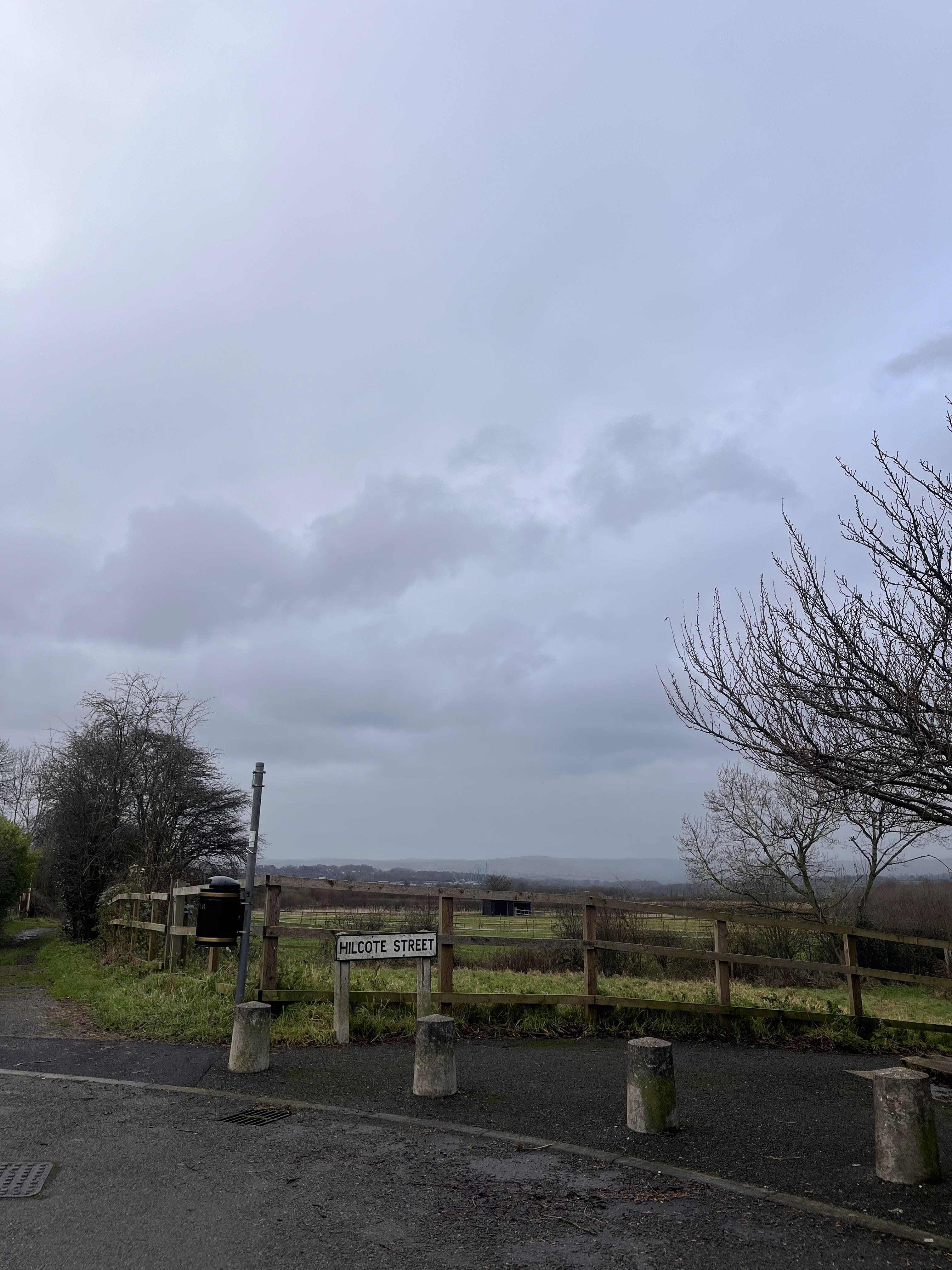
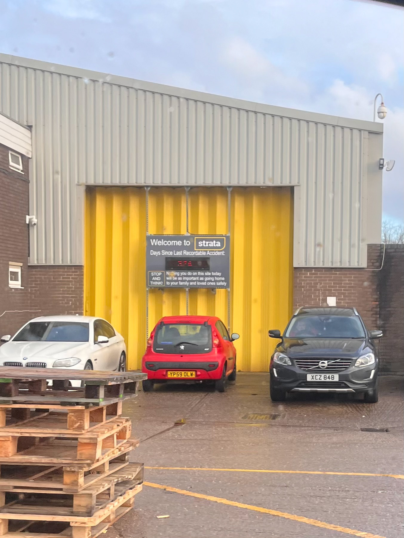
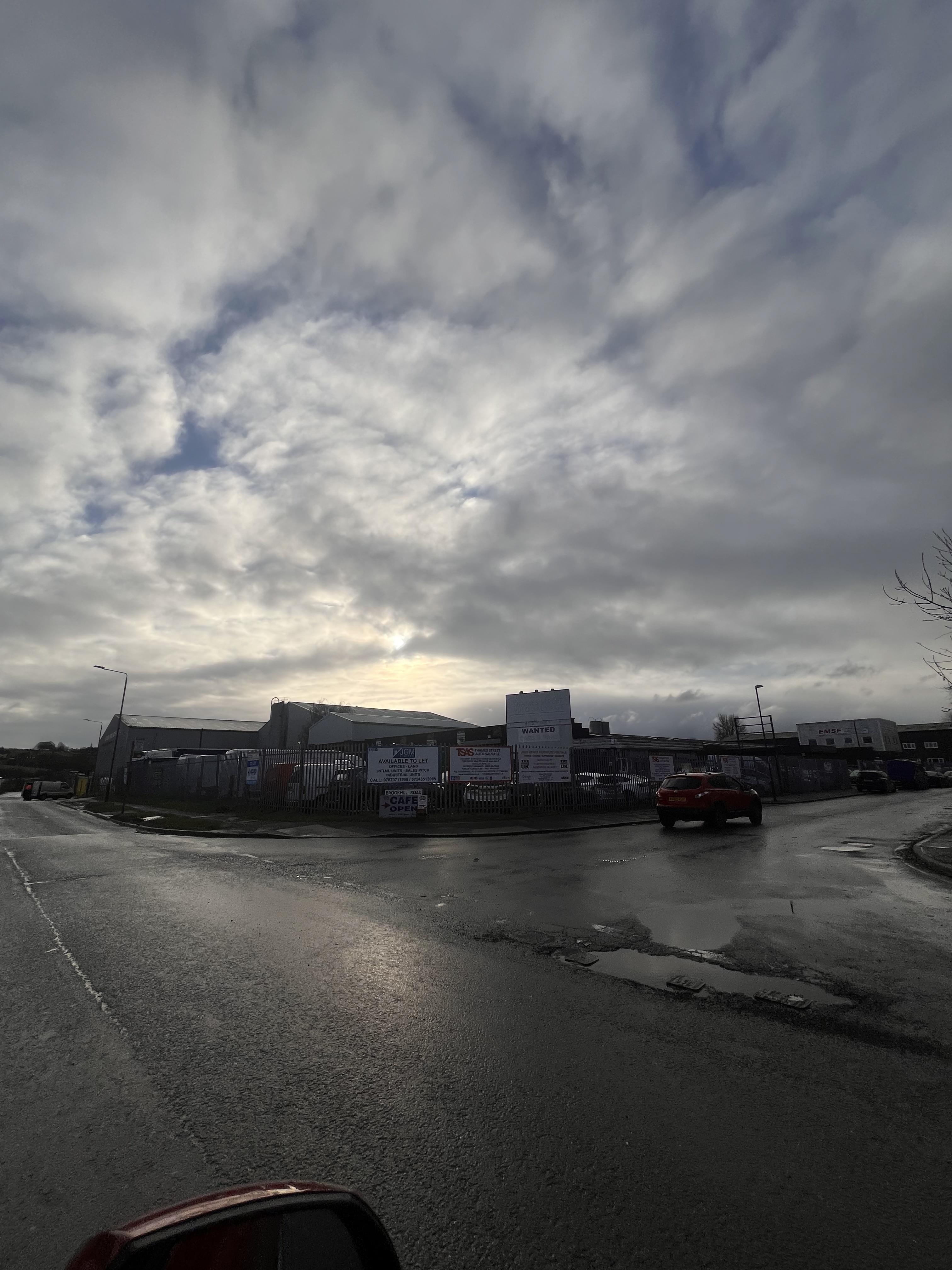
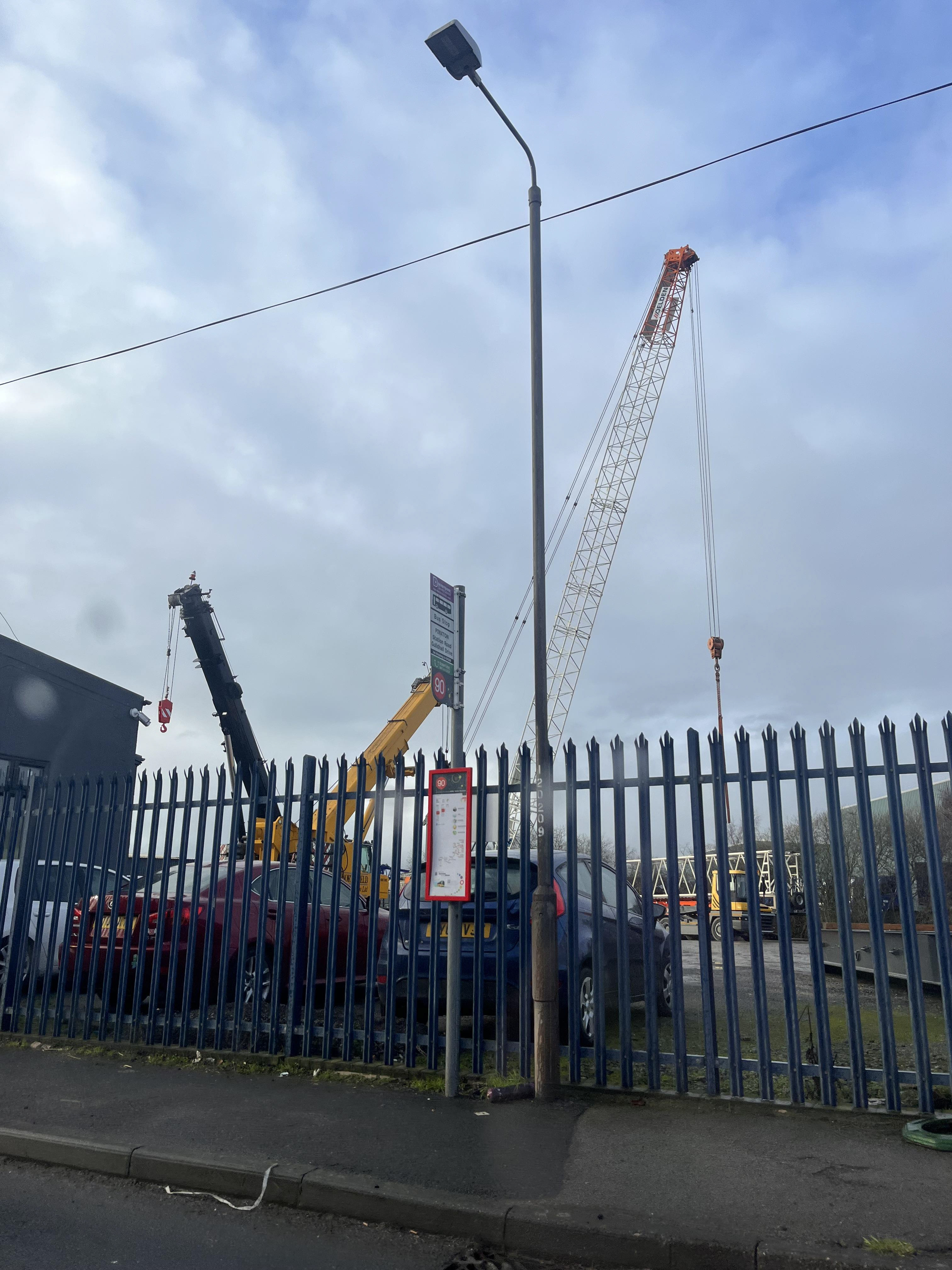
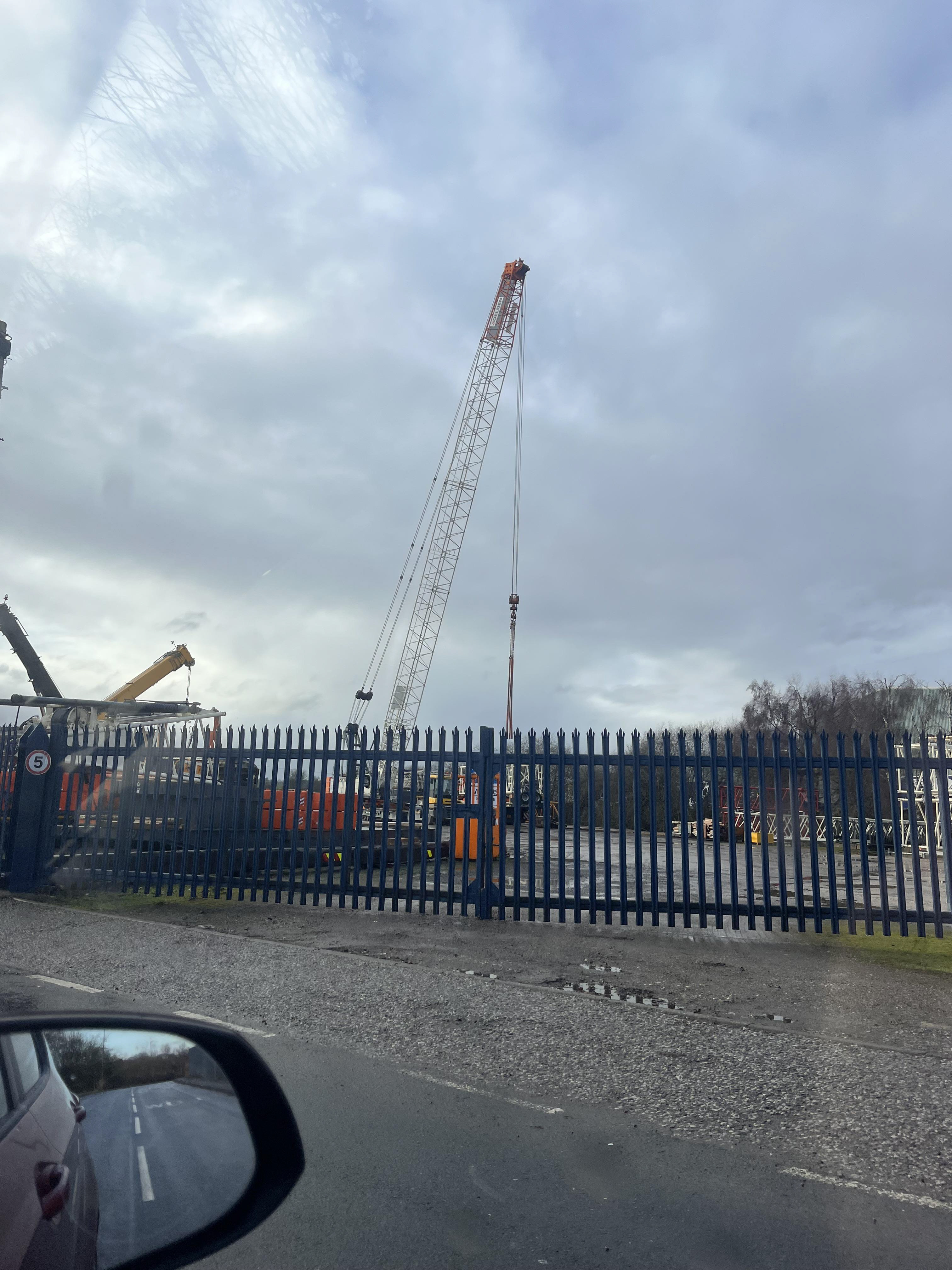
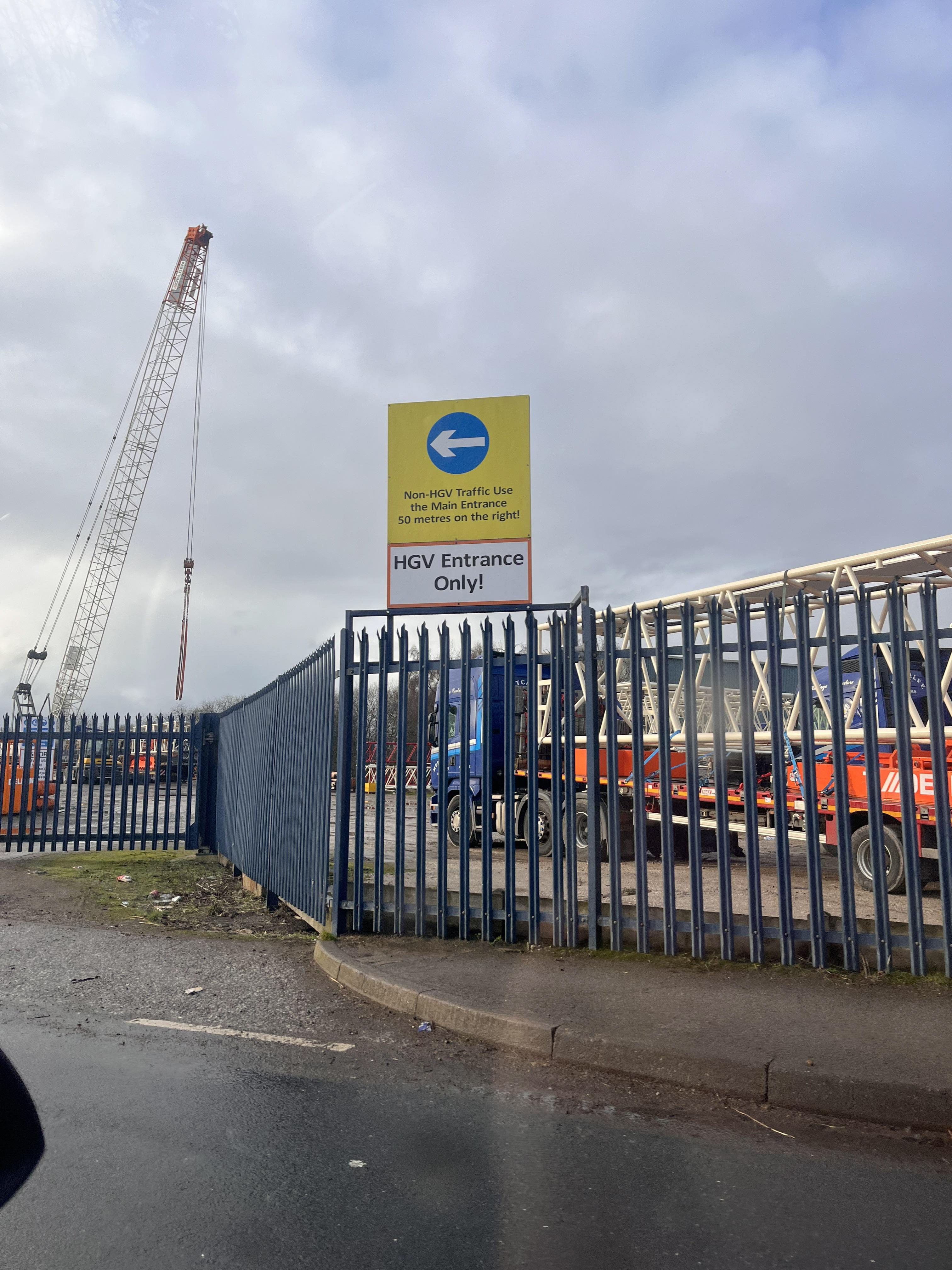
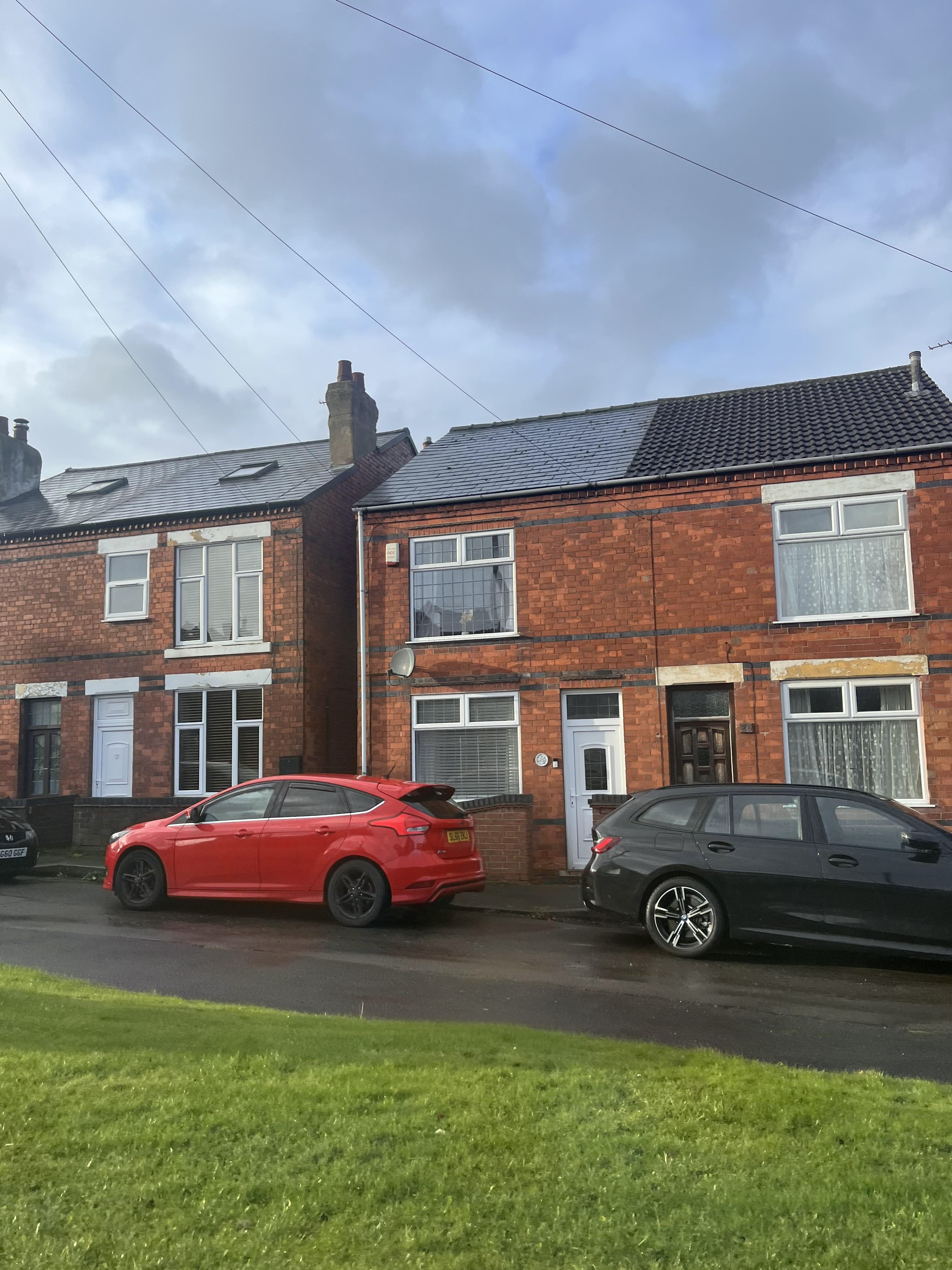
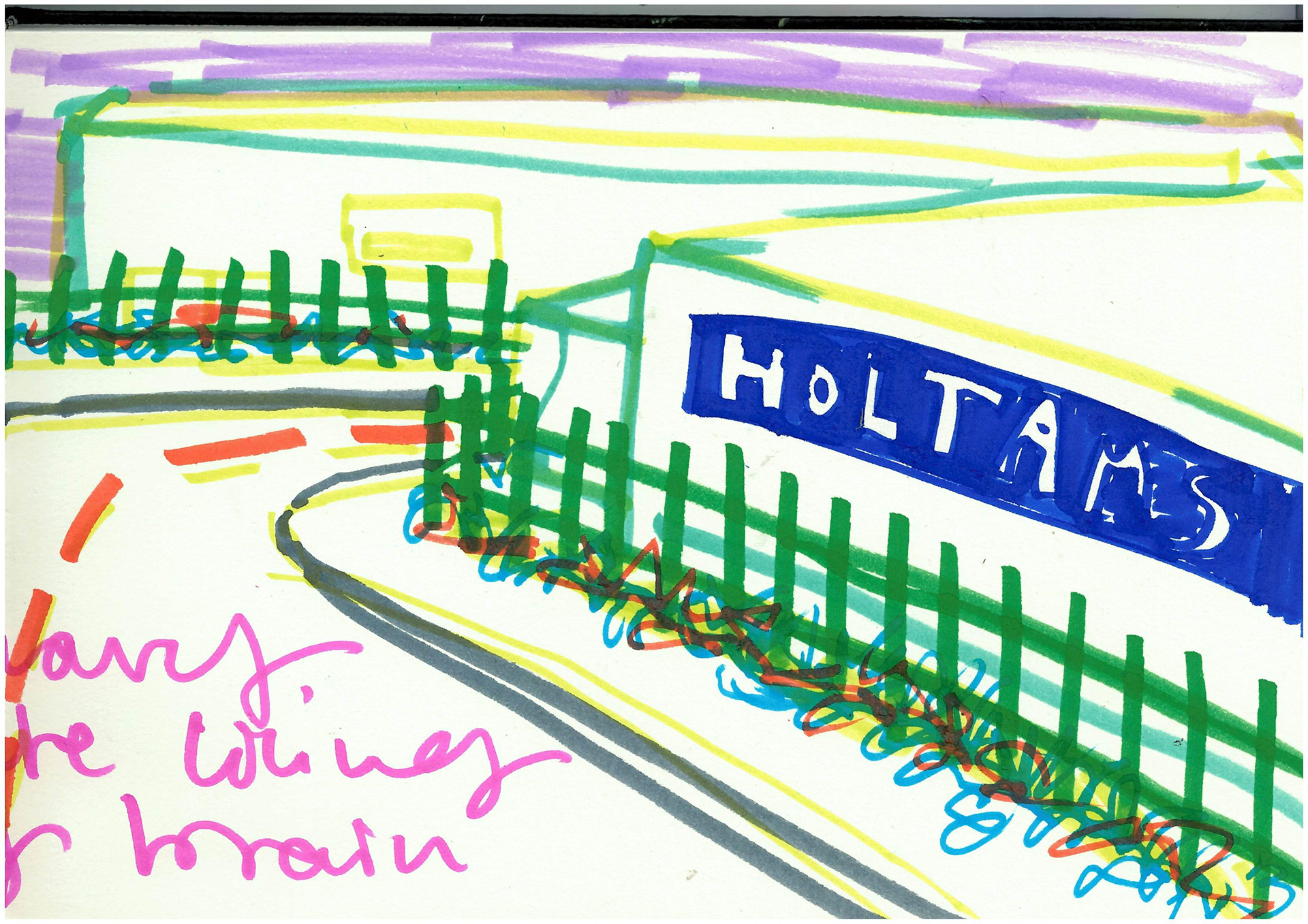
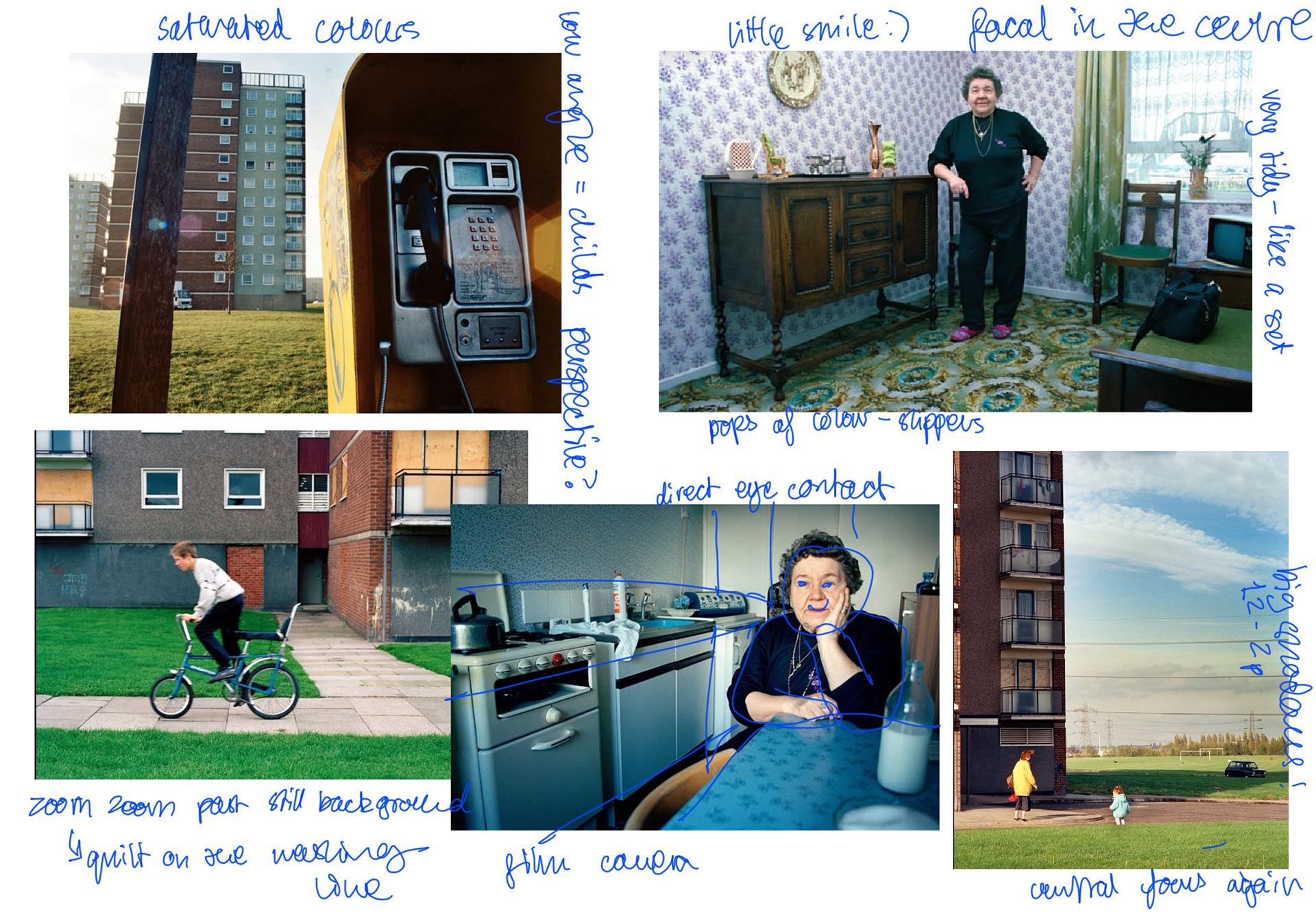
i went on a little photo trip on my way home from work and took pictures of places that seemed very specifically ASHFIELD to me and theyre some of my favorutie places. ive always loved the cranes i used to look at them when id drive past in the back of my car when i was little and i would think they were MASSIVE SKYSCRAPER CANES. i love how the insides of the one stop shop looks and that the lights make the drinks look neon compared to the grey floor and ceiling i like the lonely trolley too.
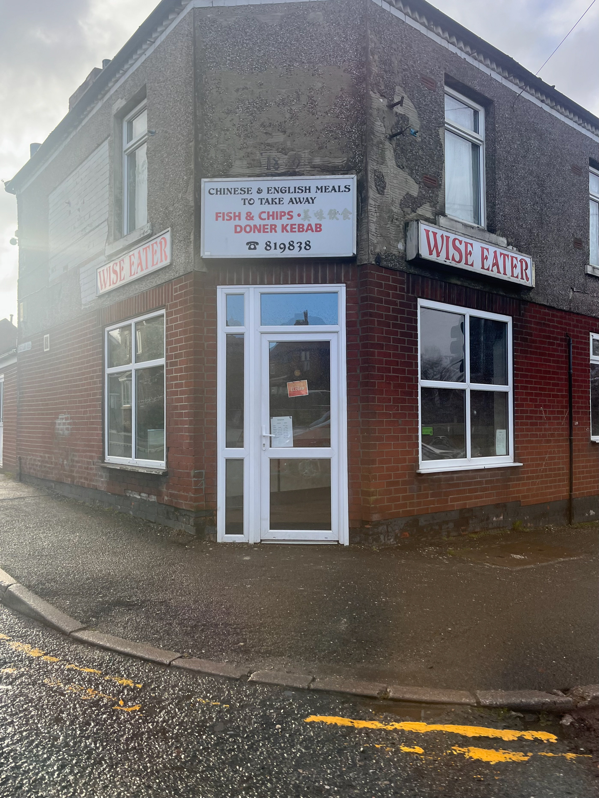
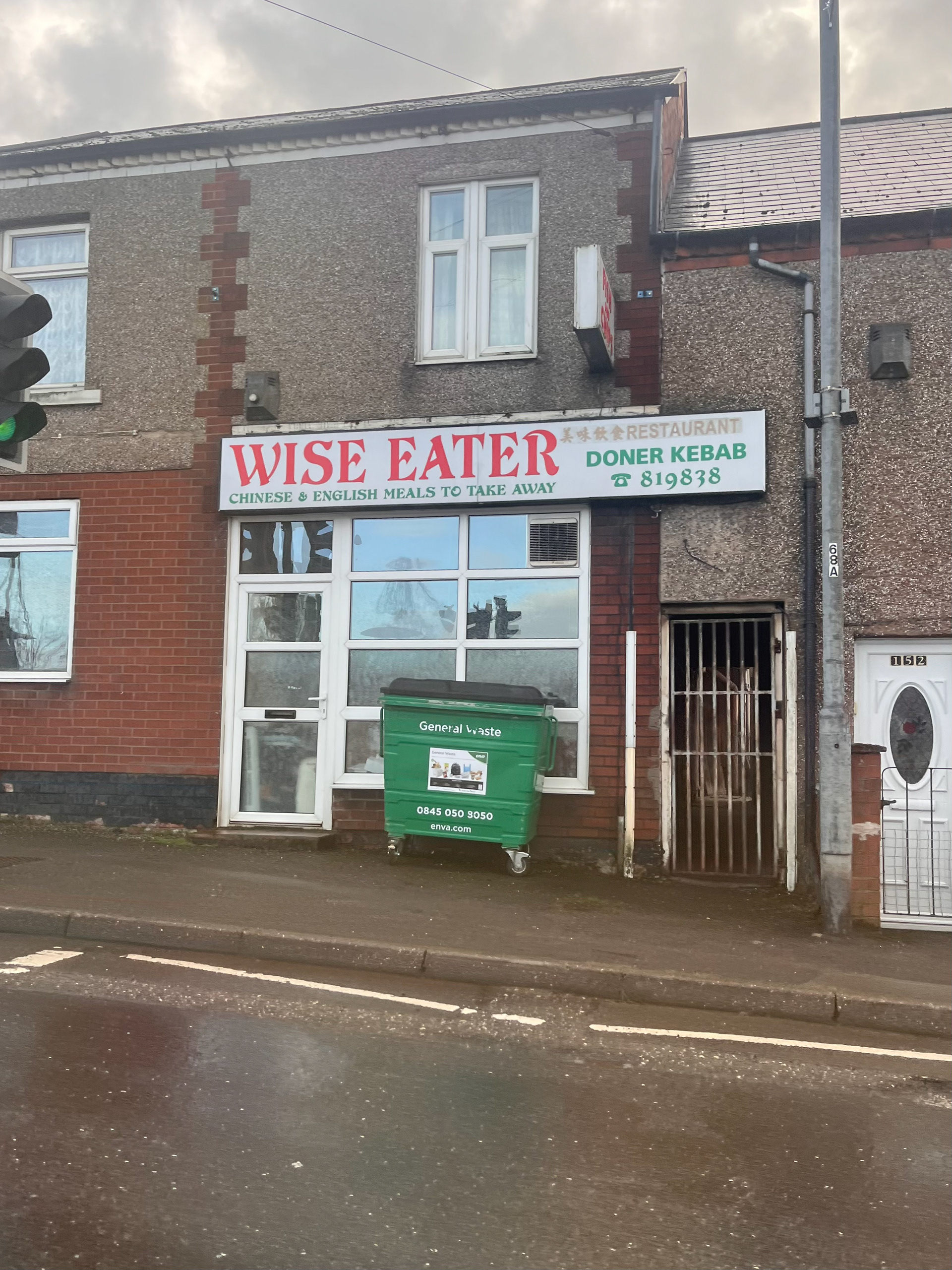
the chippie is my favorite its at the end of my road and i like how the green writing matches the wheelie bin and the inside lights are so old and orange that it looks like tits glowing at night. the text on the walls is still done with the old magnetic letters and letrasets and the kids menu is done in multi-coloured ones PRECIOUS.
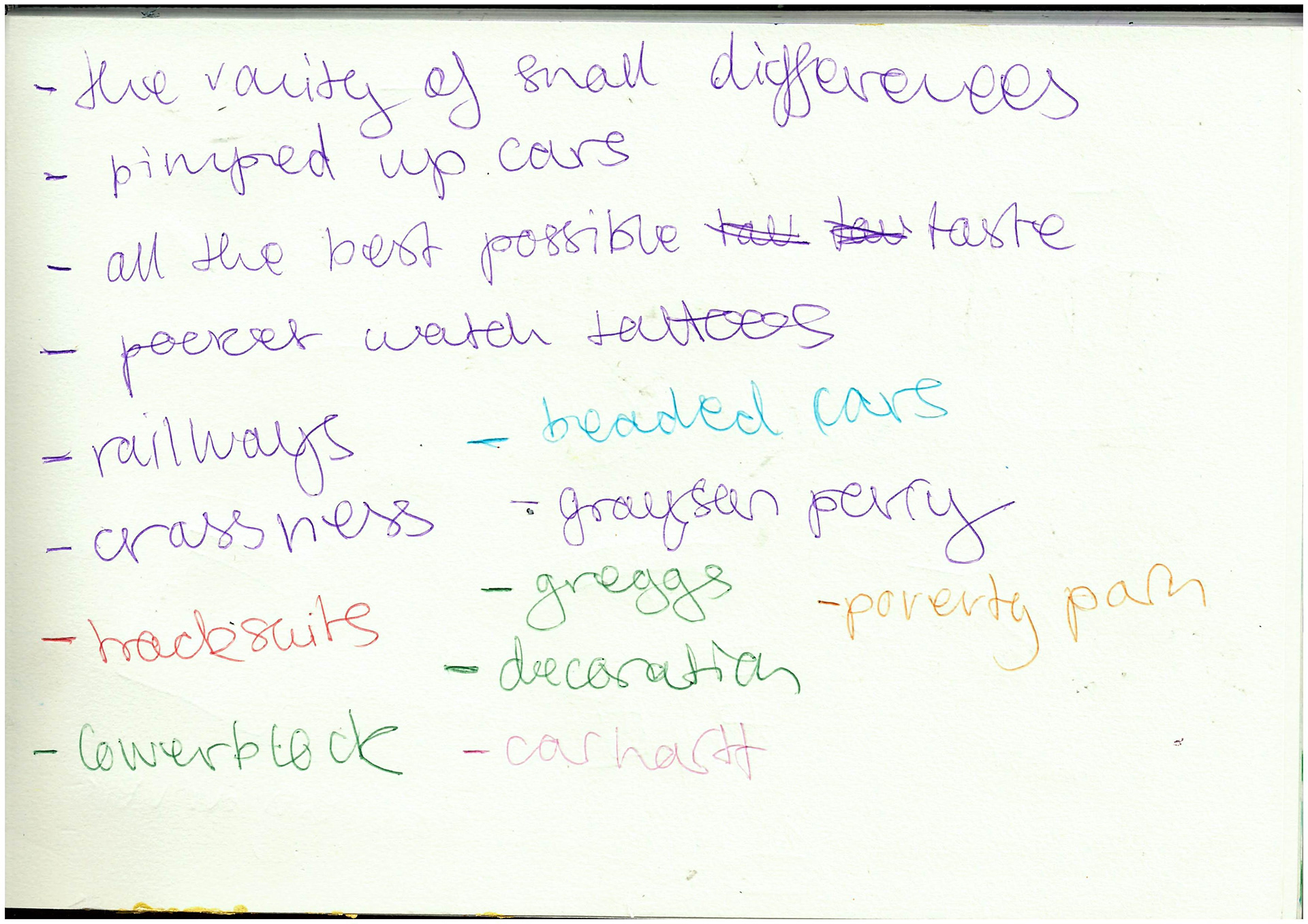
i took these pictures into the next tutorial and me and kristian remised about the dodgy places where we grew up and i explained that i like all the things that everyone thinks are crashy like pimped up cars and travellers sites. he told me to get out the CHAV book from the library and gave me lots of things to look at like the grayson perry documentary 'all in the best possible taste'.
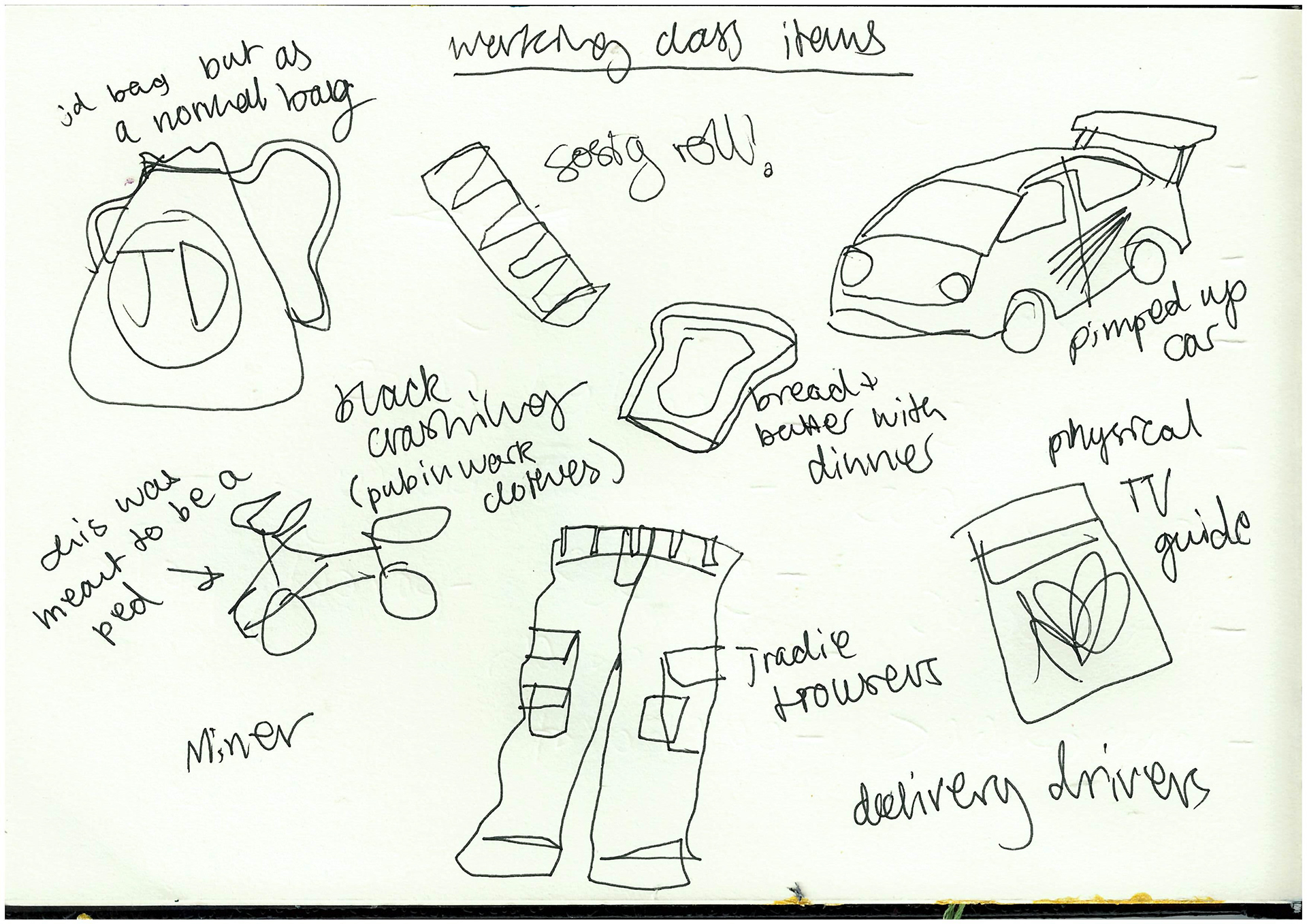
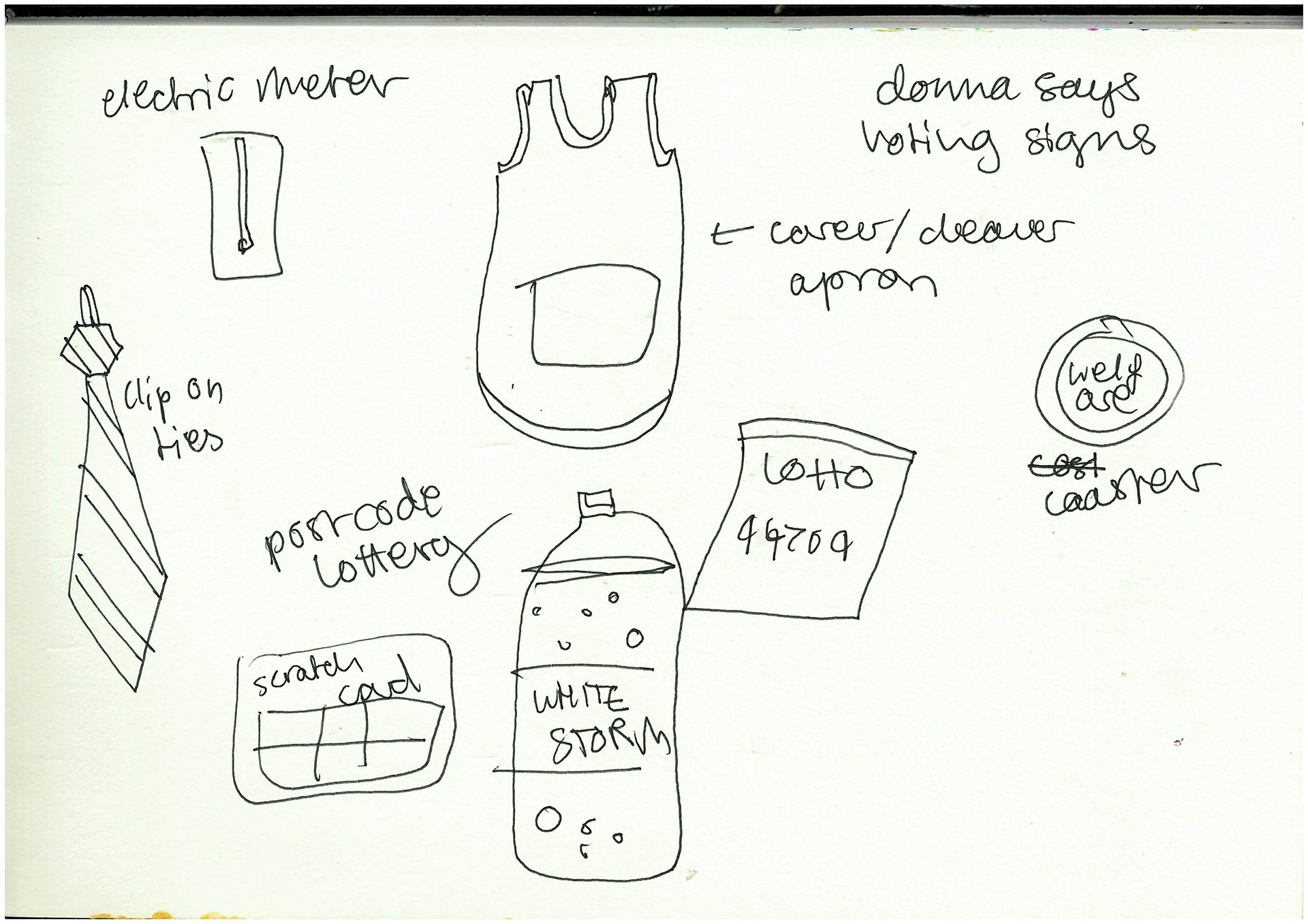


over the holidays (i didnt do much lol bc i was moving studios) i got my mum and dad involved with items we assosiate with being working class. drew said himself but that isn't useful to research. some of the main ones were the national lotto and scratchcards, specific clothes (tradie trousers and cleaners aprons), and specific foods like sausage rolls and freezer meals.
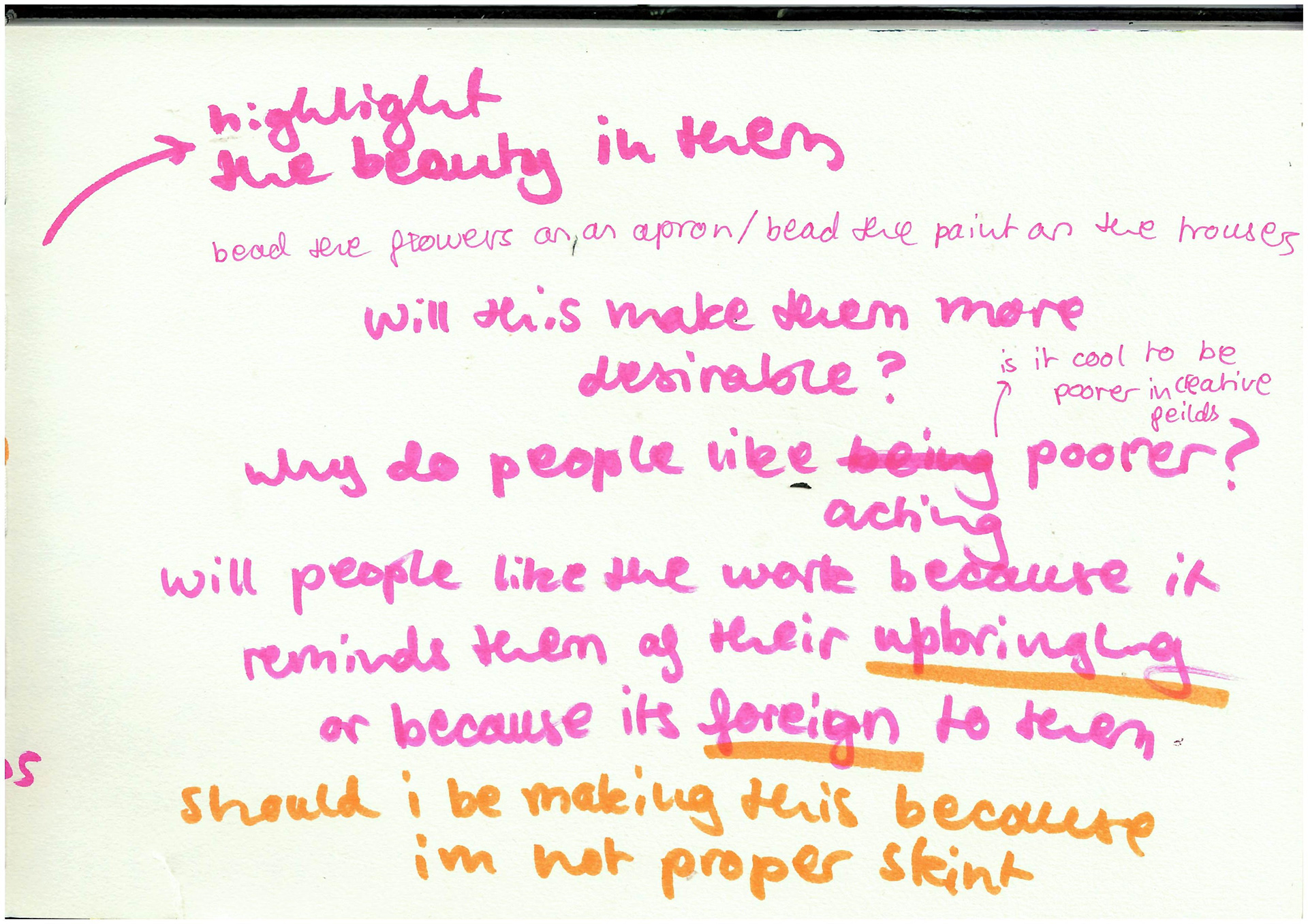
this led me to the idea of embroidering and beading these clothes to highlight the beauty of wear and stains. i was interested in the idea of them being more desirable because they were prettier or because people liked that someone had spend alot of time tediously working on them. does that mean people like things that have had alot of work put into them? especially if they were not paid. working class people dont have many other options than buying second-hand or fast fashion, but often spend their lives working in underpaid jobs. do they appreciate the work more or are middle-class people more appreciative that it is one of a kind.
i also liked the idea of making a fabric version of a JD bag. when i was at school they were a status symbol and are very recognisable because of the colours, but i think like its definately an item that is looked down on even though its very sustainable to re-use a plastic bag even MORE sustainable than buying a tote bag lol bloody posh people. i would use all secondhand materials obvs because its too spenny not too and it defeats the object of it being sustainable. i want to make it fabric, with lots of pockets, and all beaded and sparkly to highlight how the resourcefulness of the working class is seen as trampy, but then is adopted by the middle-class and seen as educated and impactful. very strange.
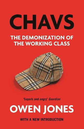
i also did lots of tests half for fun and half because i was worried i was going to be seen as a knob. i didnt know if i should be making work about the working class because even though i am, im not on benefits or living in a council house which people link with working class people. i was reading the CHAV book by Owen Jones, and he talks about how society views the working class as only the stereotypical criminal white-trash families in rural areas, and that the middle-class is miles away from this. in reality its more of a gradient that everyone is placed on, and most people can identify with some middle-class AND working-class characteristics. the middle-class media dont think about it this way as they want it to seem like there is an impenetrable wall between the classes. so REALLY it would be a piss take for me to NOT feel like i can make work about being working-class, ive been given the privilege of being able to go uni and i want to make art about the things that matter to me.
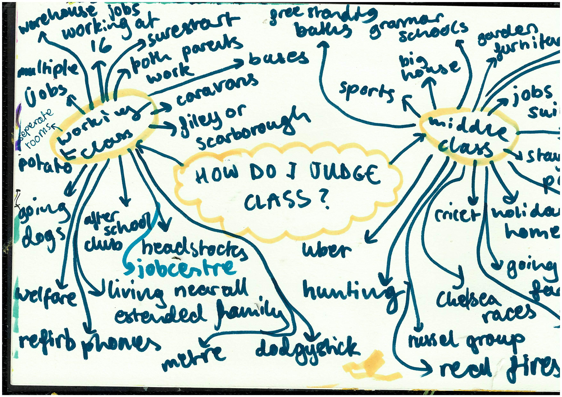
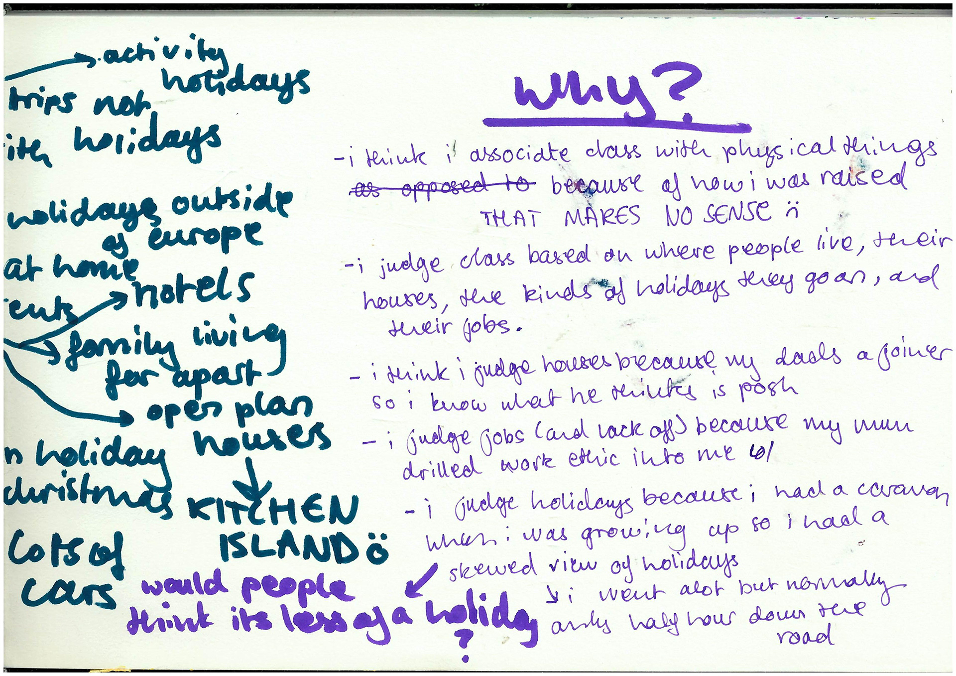

I wanted to explore how I personally understand class, especially as a creative. I feel like I associate people with physical things they own, things I can see, rather than how they act or what they do. There are certain things that immediately come to mind when I think of different classes. For example, open-plan houses to me scream middle-class, as do freestanding baths, going on holidays outside of Europe, and having lots of disposable income. On the other hand, things that seem really working-class to me are holidays within the UK, especially the Midlands coast, or even just any time you're away from home for one night or more.
A lot of this comes from my childhood—when I was younger, we had a caravan, and every weekend, we’d go away, usually just half an hour from home. To me, that was a holiday, and I felt like I was spoiled rotten because we were going on holiday every weekend—even though we never bought anything extra. We’d just take food from home and eat in the caravan, and I was never really leaving Nottingham. But when I got to uni, I realized that people consider holidays in the UK as just "trips," because you’re not leaving the country or staying for an extended period of time.
It’s strange how these seemingly small things, like what kind of holiday you have or where you go, can really describe what class people come from. I think this project works well for me because it allows me to distill the working-class experience in my mind into tangible objects, things that feel meaningful to me and others. It’s almost like I can see class in physical form through these things.
I couldn’t for the life of me find that Grayson Perry documentary or any good pictures of the tapestries, but this video from the gallery was good enough. Perry gave his own description of each one—thank you, lord, you saved me there! I love the multicoloredness and ugliness of it all. The colors clash and it’s almost grotesque, which makes it even better. The one I identify with the most is the second one, where it's looking over Sunderland. It's very football-oriented, plus there are pimped-up cars and a social club—hooray. I love all the hidden symbolism, and the fact that it’s a tapestry—ugh, delicious, more lovely textiles! I also love that there’s not a single bit of unused space on the tapestry; it’s jam-packed with details, like a Where’s Wally. The religious inspirations are cool too—it's like the ginger man is a class-climbing Jesus. I wish I could see these in real life; they make me so happy and excited to make art.
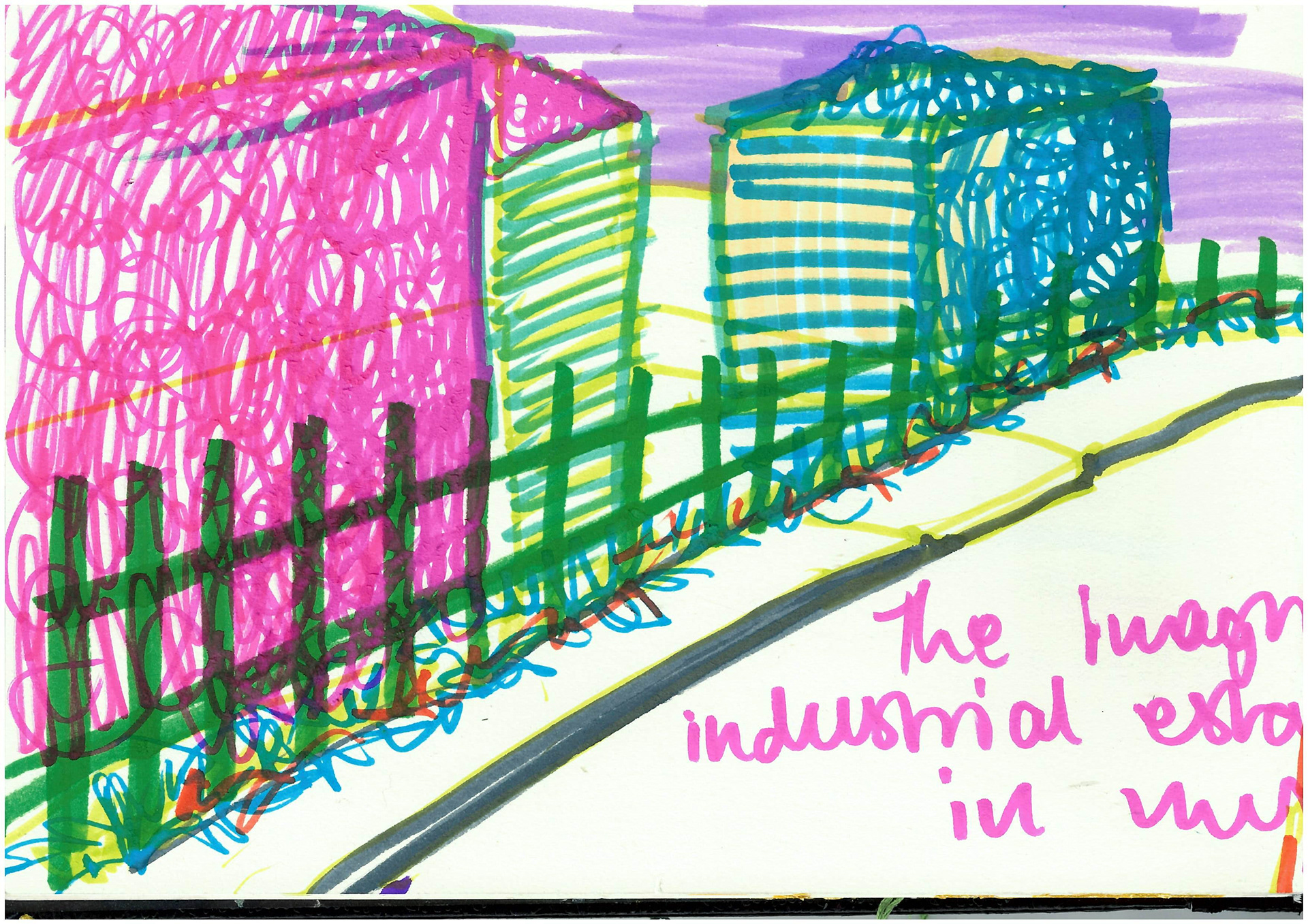
I made an imaginary industrial park. I wanted to combine all the ones I’ve seen and then make it rainbow and dreamy. It didn’t work oops, but I tried, everyone. I think it would be fun to make a textile version of it, but better. I like the idea of making it massive so that people would feel like they were standing on the road. I want people to be surrounded by all the colors and sounds (I’d get a little speaker) and just transport them there.
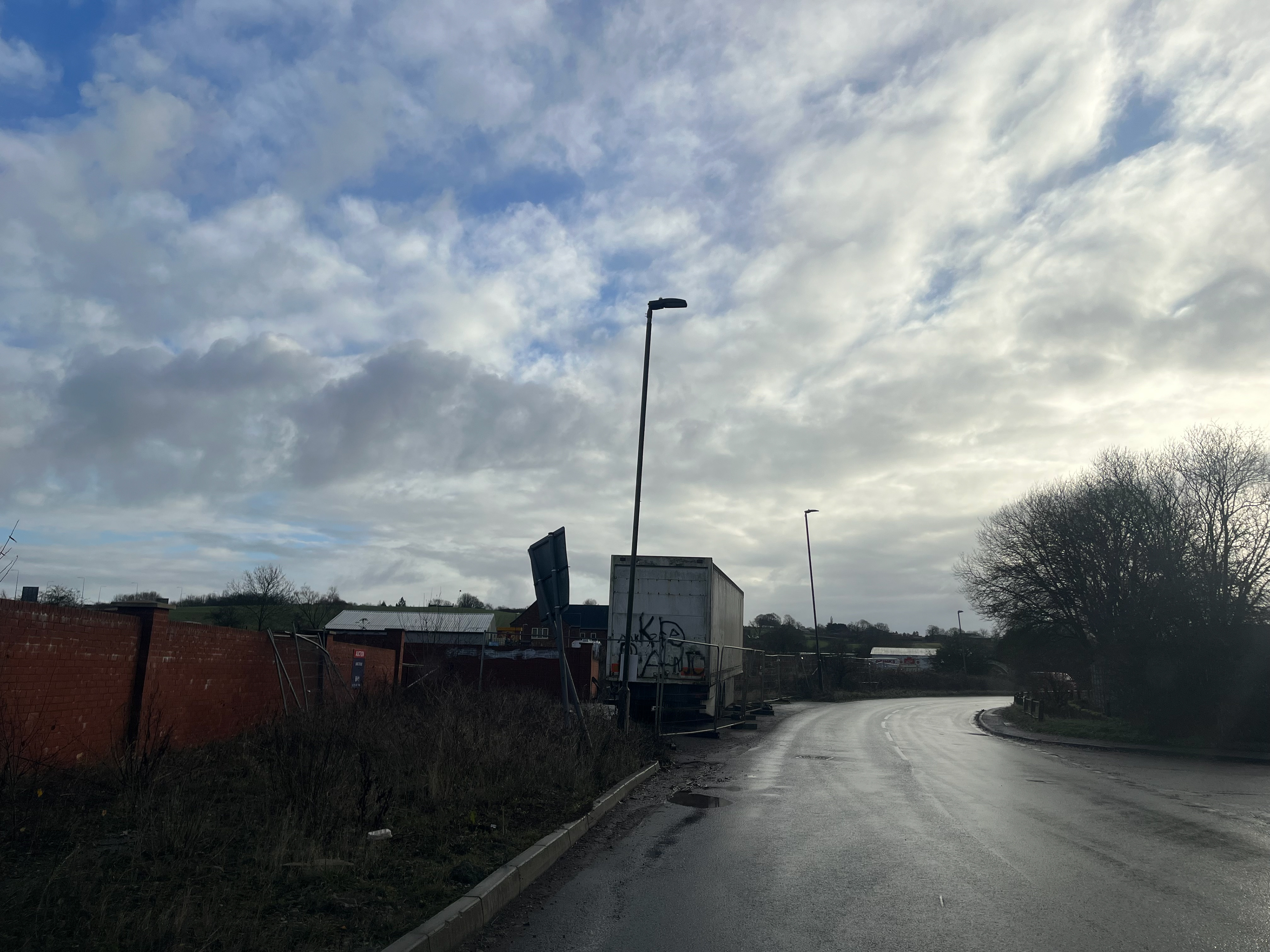
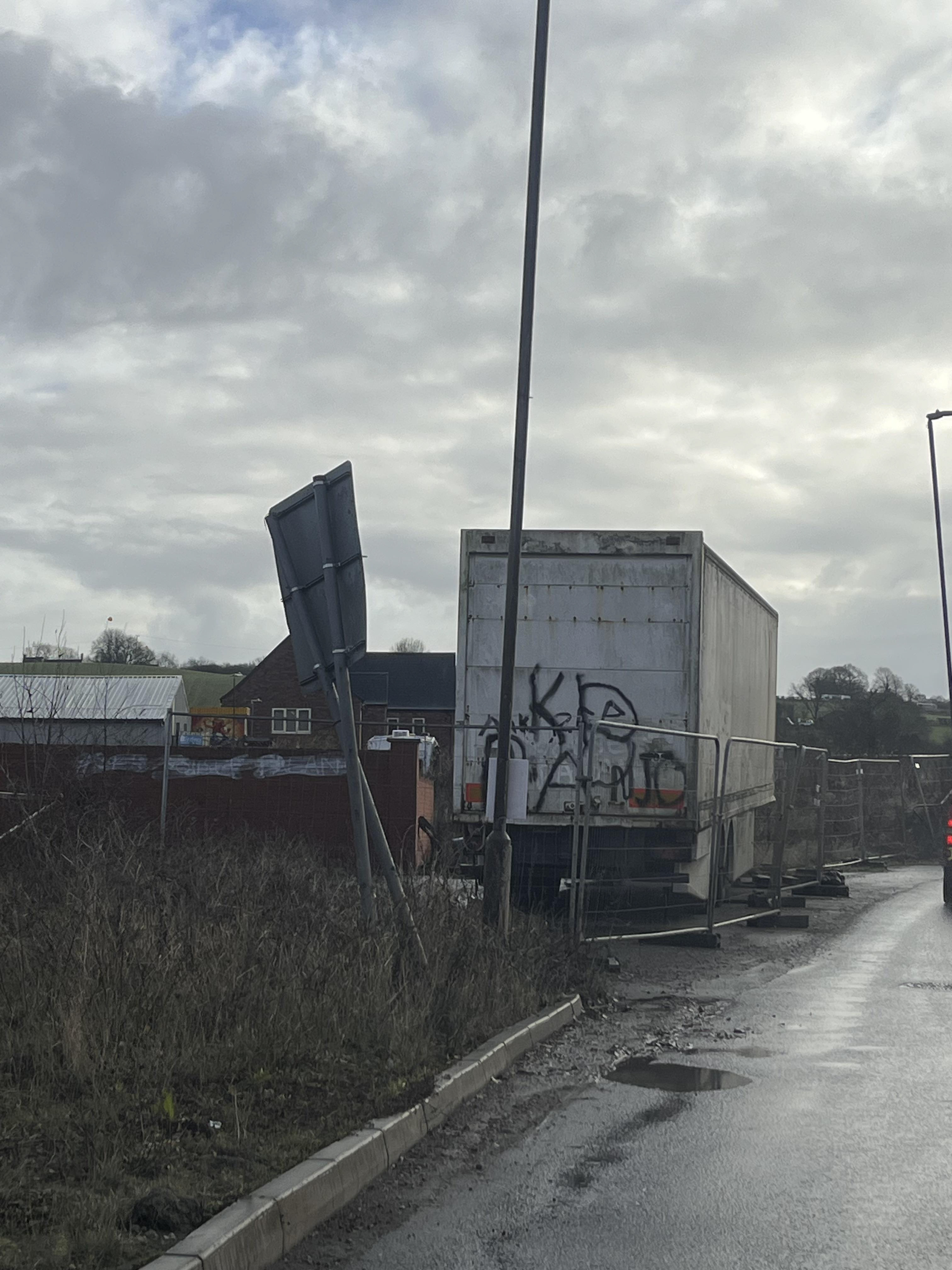
I like and hate industrial estates. They take up so much green space and look ugly against the grass and trees, but they've been there so long that, to me, it's like they've merged with nature. Grass grows around them, they’re all mossy, and now they’re like a new thing that’s happened in rural areas—where nature and industry have made friends. I don’t even find them an eyesore anymore, and I have lots of good memories of getting drunk and sitting on pavements on industrial estates. When it’s sunset, all the light hits the big grey sheets of metal and makes them pink and blue
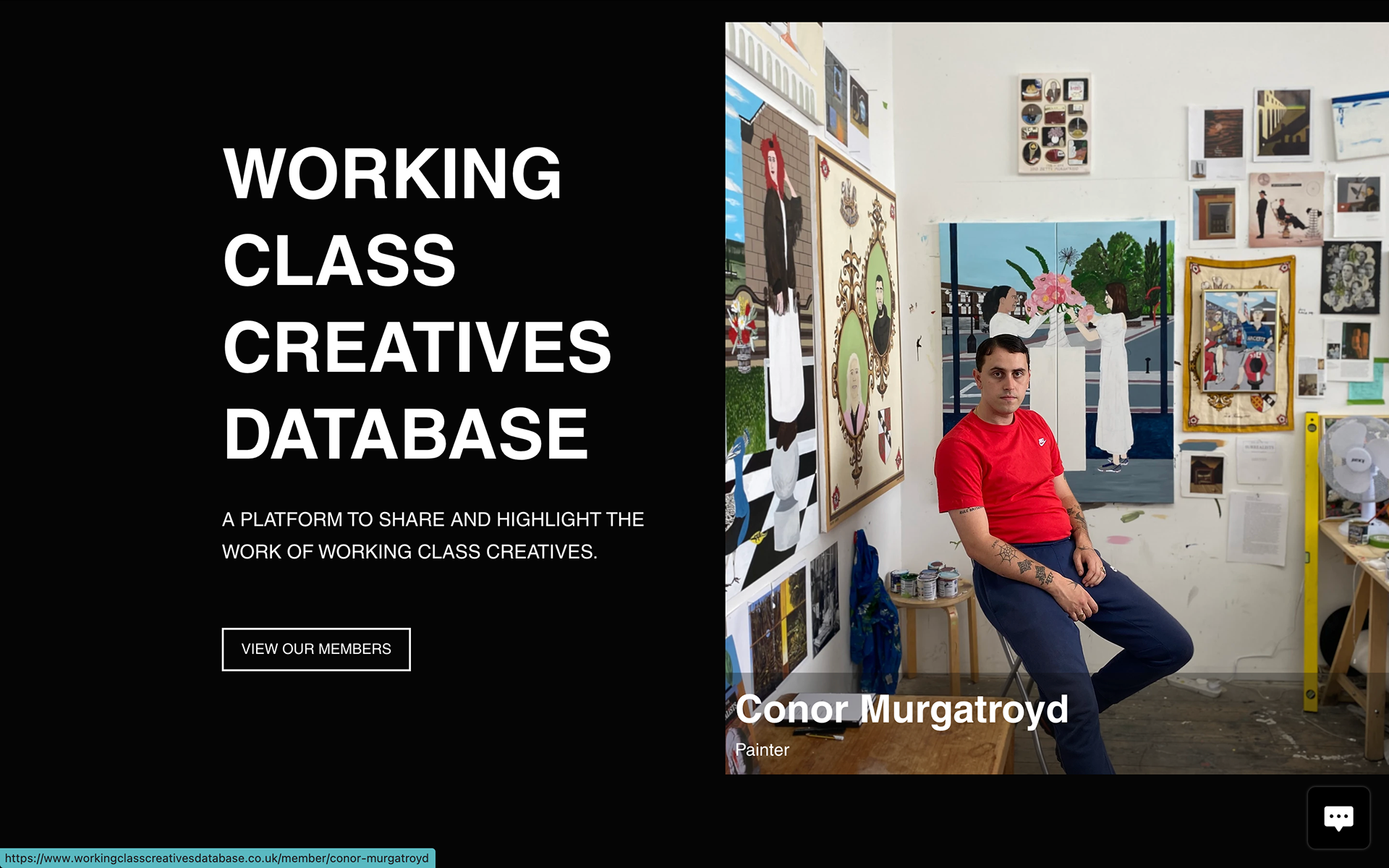
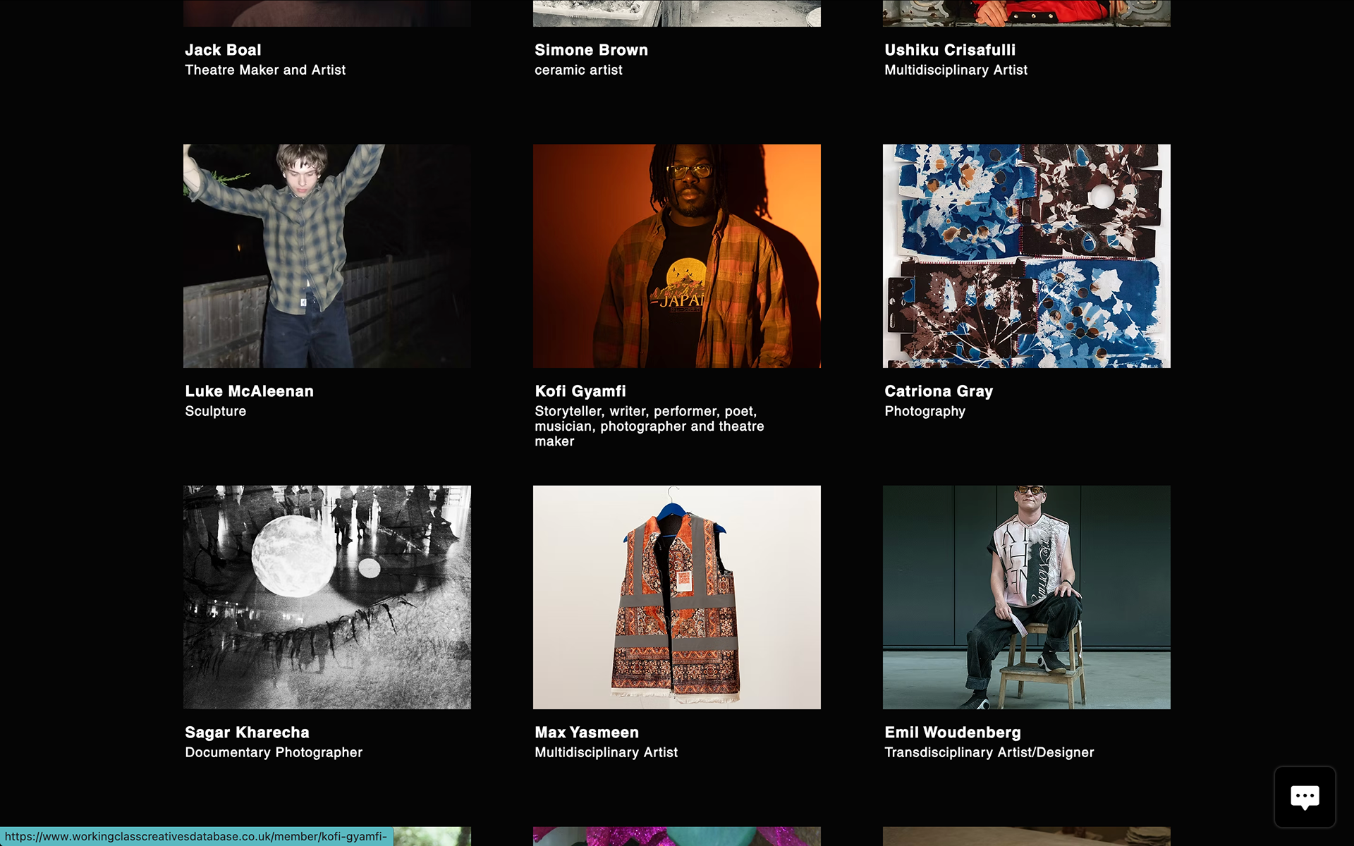
I also had a look at the Working-Class Creatives database. It's really nice to see that someone has created something to try and help more working-class people get into creative careers. What seems to be the highlight of being a working-class creative is how you have to fight for opportunities that others are often just given. At least this database helps working-class creatives and it also makes me feel a bit better knowing I have a chance. People are doing so well, and I think maybe when I leave uni, I'll try and add my name to the database—I'm not sure depending on how it works. But the fact that the database exists and that there are artists on there makes me feel hopeful and like my work is worthwhile.
I think knowing that this exists would give working-class people on the course a bit more of a chance. It would also show people on the course from different backgrounds how they have privilege—going to uni isn’t as big of a deal for them, it's more of a rite of passage. I do feel like in working-class communities, going to uni is massive because it's not something everyone gets to do so theres more pressure to succeed
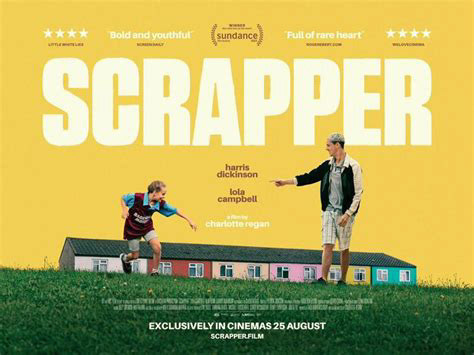
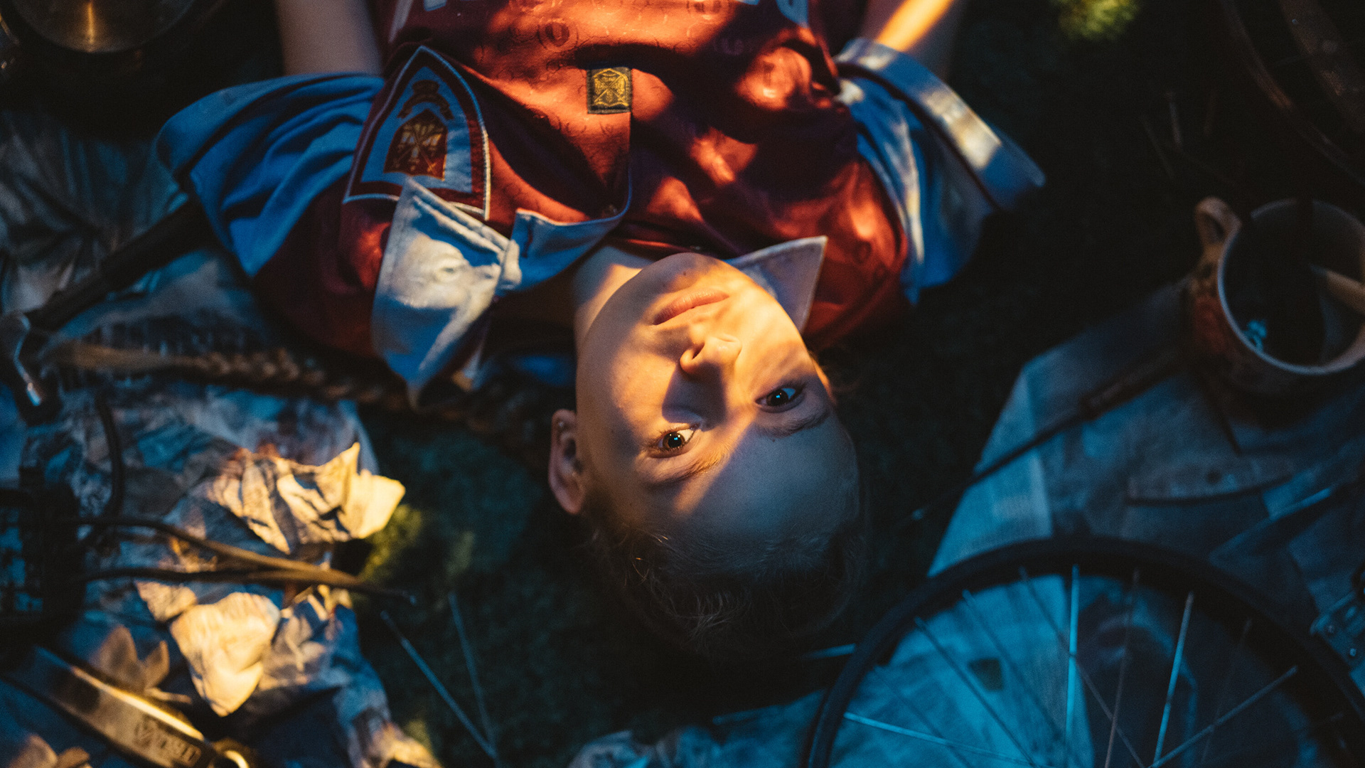

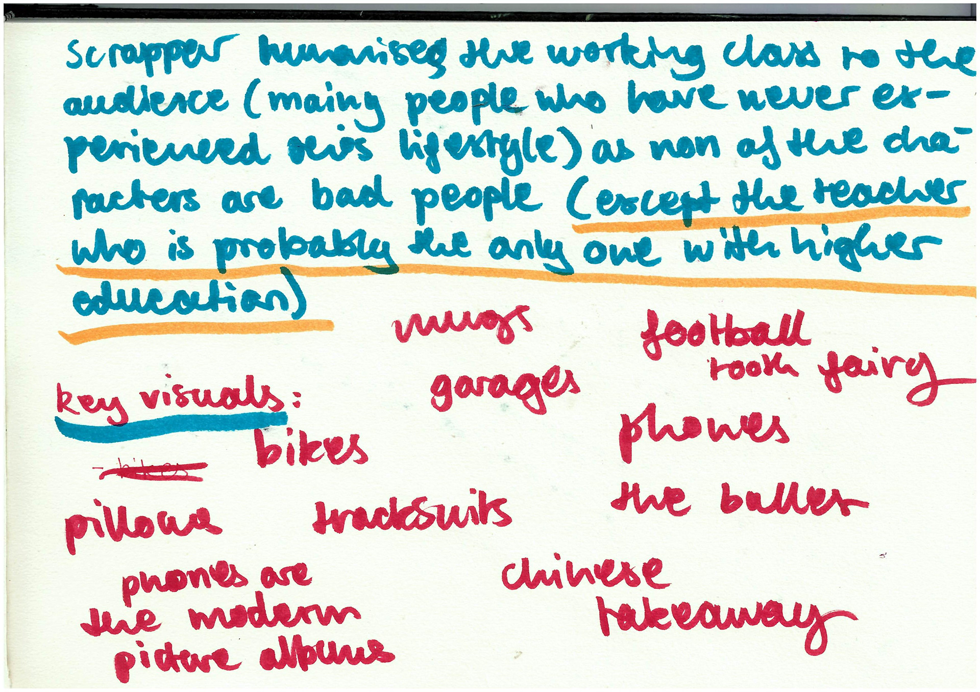
because ive been busy with work i wanted to watch something for this project while i did other stuff, so i found scrapper and i did NOTHING ELSE while watching it was CAPTIVATING it gets the feeling of being a kid down so well because everything is saturated and beautiful and your imagination bleeds into reality. i cried alot it was such a good film and i feel like it breaks down the barrier that middle-class people have tried to build that makes it seem like all working-class skint people are criminals and wrongens and living on benefits just because they dont want to work. everyone in the film has a understandable reason to why they might act out or do something bad, and the only character show is shown to be mean for no reason are the social workers and teacher (who are the probably the only characters with a uni education tehe). i feel like it should be mandatory viewing in private schools. its captures what i want to capture in my work, i want to magnify the beauty and love and character of all these people and places that are written off by society as being rough or hopeless or a lost cause.
SORRY KRISTIAN THIS IS SO MUCH TO READ
I started reading a book again for this project because I really enjoyed Why We Make Things and Why It Matters for the Identity project. This new one I've been reading is Chavs by Owen Jones, and so far I’m loving it—it’s one of my favorite books I’ve ever read. It’s explaining a lot of things I’ve known my whole life but never fully understood. I never really got what happened with Margaret Thatcher and the whole shift in British society. The book’s also been really eye-opening in explaining things like Hillsborough Park and how the disaster happened mainly because the police categorized the fans as hooligans, which stopped ambulances from getting through. My dad was at the Hillsborough match the day it happened, and he still talks about it—he saw them drag bodies out onto the pitch while the police were trying to fight him off. I think he had friends who were Liverpool supporters who died that day but i could be chatting shit. I've always wanted to know more about it, and it’s interesting to understand the social impact of the disaster.
It’s also interesting reading about how the media separates the middle class from the working class, painting the working class as a tiny percentage of people who are broke, living on benefits, and don’t want to work. I was worried about this project because I’m working class, but I go to uni, which a lot of working-class people don’t get to experience. I have a car, and I’m not on benefits, so I felt like maybe I’m too close to the middle-class line to be making work about the working class or speaking on behalf of it. But then I realized that class is more fluid than the media would have you believe, because middle-class people don’t like the idea that if they lost their house and had a really bad year, they could easily slip into the working class. That fear is part of the divide.
I never really interacted with that many middle-class people until I started uni. The majority of people in my area are working class, and I think a lot of people in Nottingham are too. The only middle-class people I really knew were my mum's customers, because her job was to look after people's bank accounts, especially if they had generational wealth.
It wasn’t until uni that I realized how different people’s lives were from mine, even though I didn’t necessarily have a bad life. They had different opportunities and different ideas of what was normal. I found it really interesting how family dynamics are so different in middle-class families. For example, when I came to uni, I lived at home because it was cheaper. But I knew that if I had decided to live in accommodation and was really skint, my mum would probably lend me the money to get by. From what I saw in the middle-class families I met, their parents didn’t want to give them money—they wanted to force them to fend for themselves, to be part of the "real world." I think that’s because, if you’re middle class, it seems like life is easier, that you get more opportunities handed to you.
When you're working class, you spend a lot of your time just figuring things out on your own. Maybe that’s why working-class parents are more likely to help their children when they’re at uni—they probably didn’t get the chance to go themselves and understand how hard it is to fight for those opportunities.
I also find it really interesting how many middle-class people are ashamed of being middle class. It’s almost like people want to be working-class because it’s seen as more respectable (especially in creative fields), but then they have these really judgmental views about people who are poor. For example, if you call someone middle class because they went to private school or have a holiday home, they’ll give you reasons why they’re not—like, they went to a public primary school, or their parents worked hard for their money. It’s like they’re refusing to accept the privileges or the opportunities they've had in life compared to someone with a working-class background. Honestly, if I were really rich, and my parents were CEOs of their own companies, I would absolutely take advantage of that. I’d seize every opportunity they could get me. If people accepted the class they truly belonged to, I think they’d be able to educate themselves better on the privileges they have.
Luckily, I’m not friends with any arrogant people, but I’ve met a few at uni who are really out of touch, and it blows my mind that people get into uni with that mindset.
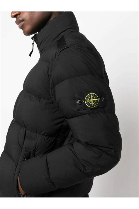
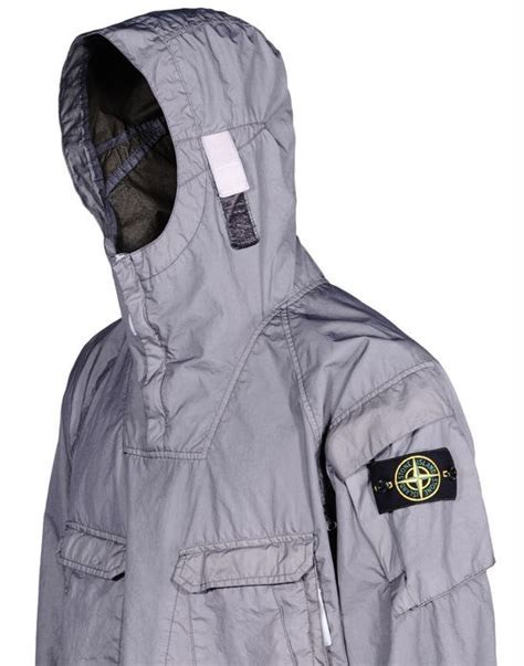
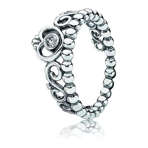
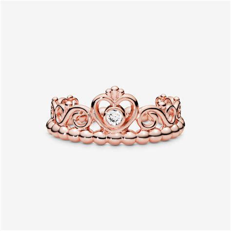

these items are all specific status symbols i remember from being at school! specifically the pandora crown rings and the stone island coats. i remeber how the stone island labels could be unbuttoned when you washed it, so people would buy only the label and get it attached to their normal clothes in secret though because GO FORBID. i would have sold my kidneys on the black market for one of those pandora rings. every few months the status symbols would change, and normally it would be based off of the style of grime and drill artists. from 2010 that was THE MUSIC OF NOTTINGHAM and it had a massive impact on the nottingham music scene and youth culture because i think it made people feel like they weren't going mad. there's a really good vice article from 2016 (read it here) talking about how the working-class communities in nottingham were fuelling a massive boom of grime artists in town and how the the crime and poverty in the roughest areas were inspiring new music.
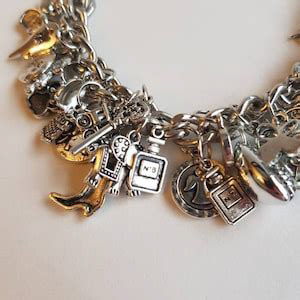
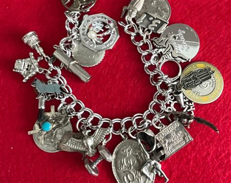
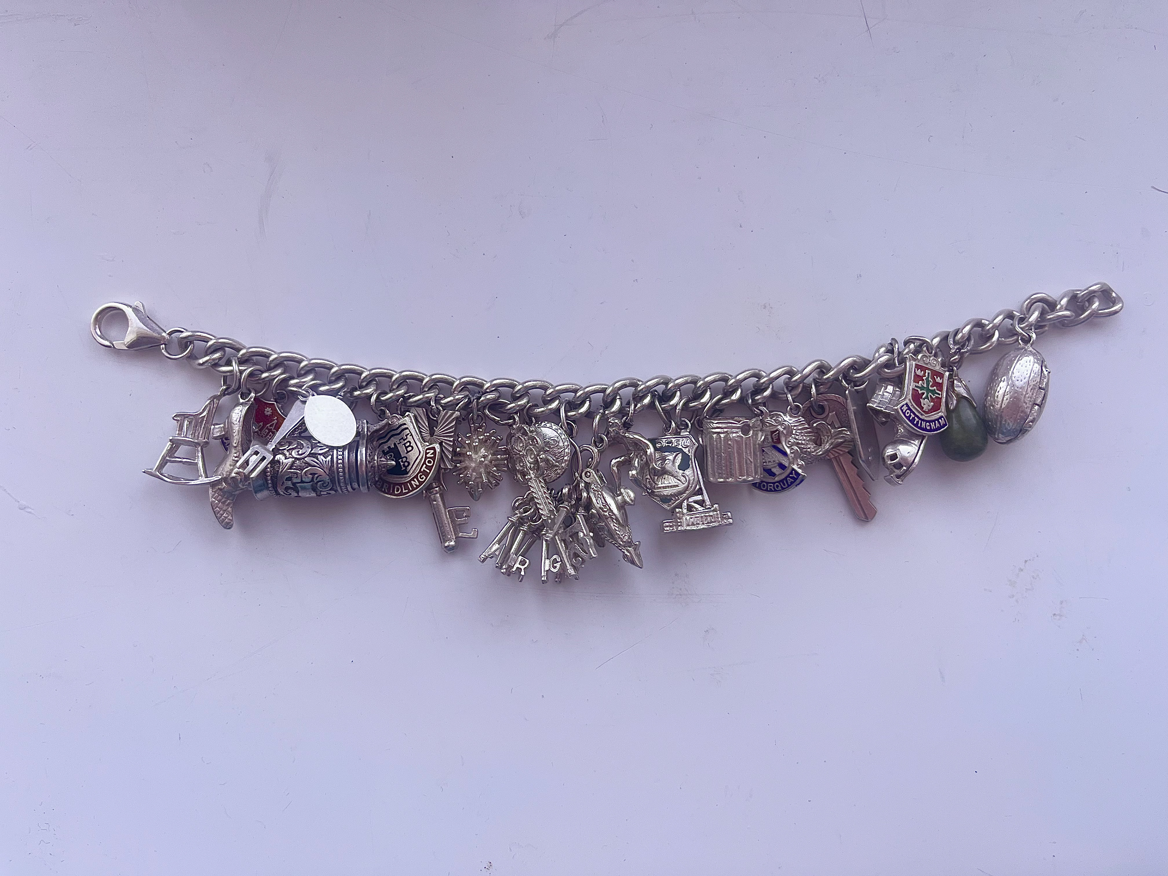
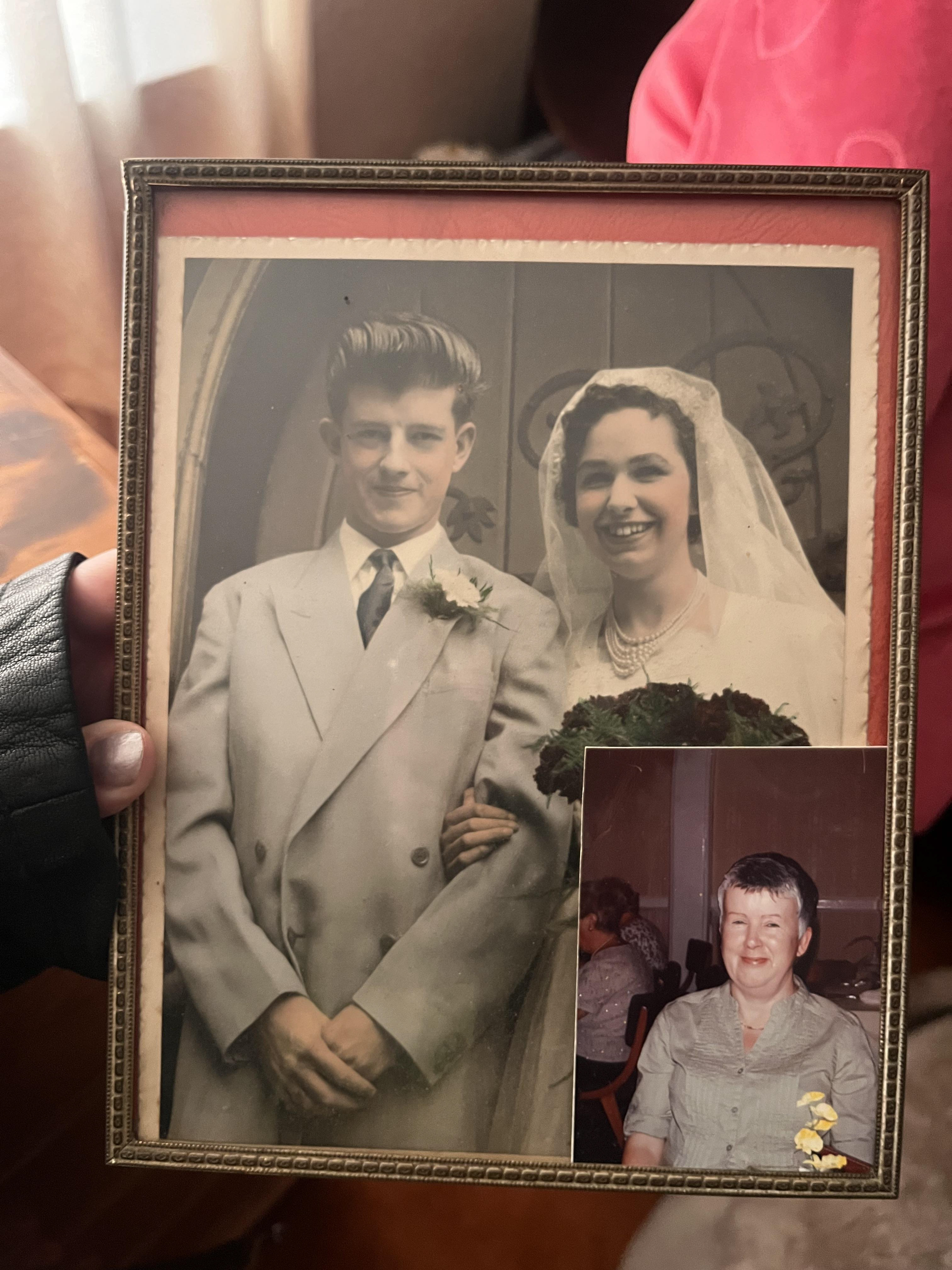
I’ve had this charm bracelet from my mama my whole life. I used to play with it when I was little, so she gave it to me when I was about 11, and I’ve kept it in a washed-out cranberry jar ever since. Because of this project, I decided to get it cleaned and fixed—it’s a symbol of my mama’s life, and it’s turned green with tarnish. I took it to my mama’s to show her (I normally try not to go around too much because she loves reform oopsie), and I asked her to tell me about it.
Turns out, it wasn't actually her bloody bracelet :) She told me that her mum and uncle had gone to Skegness and found it between the rocks on the beach. Since it was silver, they waited to see if anyone came back to claim it, and when no one did, they took it to the jeweler to get the clasp fixed and brought it back for my mama. She had it from the age of 16 and added lots of the charms on it.
Turns out, it wasn't actually her bloody bracelet :) She told me that her mum and uncle had gone to Skegness and found it between the rocks on the beach. Since it was silver, they waited to see if anyone came back to claim it, and when no one did, they took it to the jeweler to get the clasp fixed and brought it back for my mama. She had it from the age of 16 and added lots of the charms on it.
One of the charms says 'Corfu,' so I asked about when she went, but she said that one wasn’t hers—she’d never been abroad. It’s fun to think that the original owner of this bracelet had a completely different life, probably a richer one, and was able to go to Corfu in the 60s. I wonder how they would feel if they knew my mama had kept it throughout her life and added charms from places like Bridlington, Nottingham, and Skegness. It’s like a combination of two women’s class experiences. I wish I knew more about which charms were my mama’s and which ones were from the original owner, but I like that I’ll be able to wonder about it for the rest of my life.
My mama also said she never really wore the bracelet, except for her birthday. It’s weird because, in my head, I always imagined it was a family heirloom, and she’d be really happy to see it cleaned because it meant so much to me growing up. It’s strange how we associate symbols and items with people based on their backgrounds and life stories—things they might never associate with their own lives. Like how middle-class people might associate objects with working-class rural communities, but we might never make those associations ourselves.
Something taken becomes a new thing altogether, now it’s a piece of history about the class differences in the Midlands during the 60s!!!!

Kristian asked me a lot about intent in the tutorial, and I’ve been trying to find a way to put it into words because im struggling to explain it. I knew that I wanted to make middle-class audiences look at my work and question how it makes them feel. I like the idea of a middle-class person looking at my work and thinking, 'It looks so much better now shes many it pretty.' Then, I want them to realize how ridiculous that sounds. I like the idea of catching my audience off guard, making them actively think about how they judge the working class.
Because of this, I think it's easy for me to understand my project as changing working-class symbols to align with middle-class tastes, and then examining how the audience reacts. Ultimately, I want to see if it highlights how misguided and ignorant some of the judgments and misconceptions about the working class can be.

GOOD OLD CORRBIN SHAW
I really like SOME of corrbin's I think he’s great. He’s from Sheffield, which is a working-class area, and he highlights parts of the UK that people often overlook or try to ignore. It’s both the good and the bad that make a place whole. I love his work with scratchcards, for example, because they’re such a statement item that I associate with being working-class. At Christmas, we buy scratchcards instead of crackers. Another example is that my mum says she’ll only go on a specific holiday if she wins the Set For Life lottery. We buy these things with hope, believing they’ll change our lives, because we’ve seen it happen for other people, and we feel like it’s the only way we can achieve the lives that middle-class people are born into.
I also really like how he works with flags, which are such a statement item in working-class areas. People fly them in their gardens or at their windows, especially during the vote or football season. It’s interesting that he’s doing similar things that I feel, noticing the same things I notice. But that could be because we’re both from very similar areas.
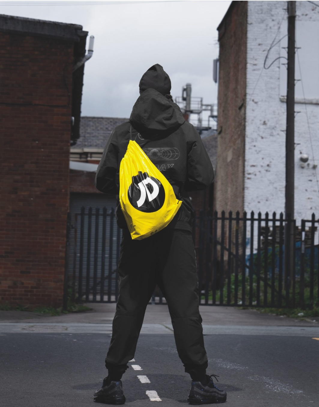
After talking with Kristian, I decided I just had to start making things rather than keep planning. The first thing I really wanted to make was a JD bag. They were really important when I was at school, and I think most people on the course will be able to relate to the desire to have a JD bag for your PE kit instead of a Tesco or Aldi bag. It was important because it felt like proof that you had been to JD and bought something. I'm also interested in how reusing plastic bags is a sustainable practice that a lot of working-class people do, but it doesn't get enough respect and is often seen as 'trampy'.
I also really like that the JD bags are so recognizable because of the yellow, black, and white. They're multipurpose, so they can be used with actual function rather than just being a piece of art. I think there are a lot of ways I could be creative in making them beautiful, especially since they already have such a recognizable design. I also really enjoy incorporating materials I already have into my textile projects, and I know I have a really nice gold, silky material that would work well. I think it really hammers home the idea of this being an elaborate, decorated, upscaled, middle-class item.


These are my plans for the JD bag: I really want it to be thick and sturdy to contrast with the plastic of the original design. I’m thinking about adding pockets or a lining so it feels more like a real handbag. I also want to knit the black cords for the drawstring, and I know I want the logo to be beaded. I want to tweak the JD logo a bit—I thought I could do something more interesting than the original thick black letters. I think the font and the style of the logo is that it’s so recognizable that changing it elabourates that this is for a new audience.
The pattern for the bag is a basic drawstring pattern. I looked at some free patterns, but none of them were the right size or had the same drawstring style as the original JD bag, so I had to make my own. I wanted a lining and ive got some some basic sewing skills. I really wanted the lining to be black velvet, but I don’t have any in my fabrics, so I used the closest sturdy material I could find, which was a green upholstery fabric. I had some black washing machine dye, so I dyed the green fabric, though I had no idea how it was going to turn out,i t didn’t completely dye, only what I imagine are the synthetic fibers in the material but I really like how it looks. It’s got a tweed look to it, which matches middle-class tastes anyway. For the pattern, I just cut two rectangles out of each material hence them and then make the drawstring at the top. I have to leave the bottom unsewn because I plan on beading the bag and I want the lining to protect any of the threads from the beading from pulling.
GO WHITE GIRL GO
I had an issue with the cords for the bag. Originally, I was planning on knitting the cords myself, but then I thought I’d use a cord maker (AS SEEN ABOVE), which is a machine that makes long cords really quickly. i made my cord but when I threaded it through the bag and tried it, it was too stretchy to make the drawstring work properly. I had to pull really hard to get the bag to scrunch up, which was mainly because the lining was so thick. After trying it with the knitted cords, I went to the craft shop and picked up some curtain cords I’d used in past projects. I knew they were the right thickness. Once I tried those out, it made such a difference. They looked way more luxurious, and I really want to make this project feel as luxurious as possible to big up the idea that it’s for middle-class tastes


After the conversation with Kristian when I showed him the bag, I realized I needed to fully understand my intent, which I wrote about earlier. I needed to understand why I wanted to provoke a reaction from middle-class people. I feel a lot better now that I’ve figured it out, and I understand that I want to make people question their internal judgments of the working class.
I was also struggling because since January I’ve moved tattoo studios, which has been really good, and I love my new studio. But it’s the first time I’ve been properly booked up, and since I’m self-employed, I work two days in the studio, and then one day is dedicated to drawing designs and doing admin. So, I’m working three days a week and not having as much time for uni work. It’s mainly because I’ve had to be in the studio for licensing and to help set up and open, but it’s been making me feel overwhelmed because I love this project so much and want to dedicate all my time to it, but I physically can’t because I have to earn money. I also love tattooing and want to commit to that too.
I’ve been struggling to stay on track because it’s been hard to manage everything. Sometimes I just want a day to relax and sleep. I’ve been feeling like I’m drowning in work. I made a checklist of things I want to do before the presentation on Monday, and just listing them out has made me feel a lot better. If I can’t check them all off, it’s not the end of the world. The act of checking something off keeps me motivated. If it’s not written down I sometimes get lost in one task and never get around to the others.
This method has really helped and for February I don’t have as many bookings, so I think it was just a busy start with the new studio. I have full faith that I’ll be able to focus more on uni now and I’ll catch up on everything I’ve been wanting to do. Hopefully in reading weeks I’ll be able to get ahead on the projects before we start the new brief.
kristian also suggested I try other methods in textiles for a bit before I finish my current project. I’ve always done textiles because it's what I’ve always wanted to do, but he suggested I should try other mediums, like painting again, sketching, or maybe even animation. It would be interesting to see how I can put my work out into the world in different ways and whether it leads to different outcomes. I still really enjoy working with textiles, though, because it links back to the textile mills in my village, and I feel more connected to the project when I use textiles. I think it’s because drawing comes so naturally to me—I usually do it quickly and don’t like spending a lot of time on drawings or paintings. With textiles, though, I have to plan everything out, make charts, and take my time with the project. It helps me slow down and really understand what I’m trying to do.


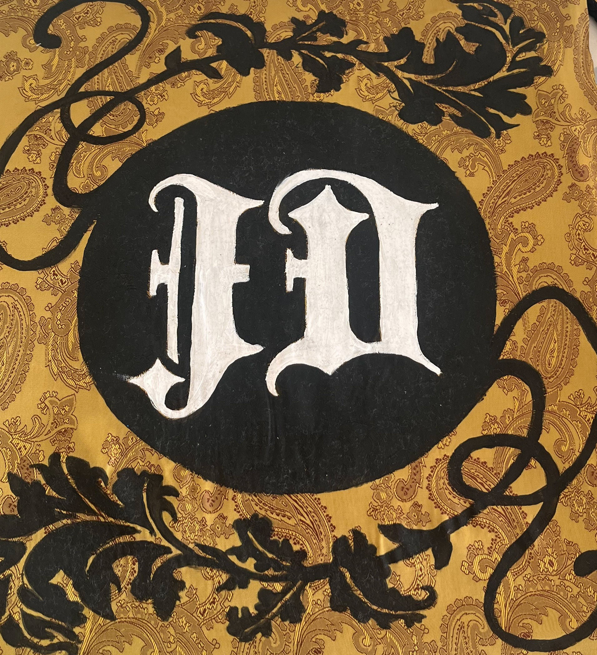
For the logo, I had a clear picture in my head—I just had to try a couple of combinations to get the best fit for a bag. I knew I wanted to use flowers and leaves that kind of looked like wallpaper, and I wanted to keep the original circle. At first, I thought about using cursive writing, but since I was beading it and it needed to be readable from a distance, cursive wouldn’t work unless it was really thick—and that would defeat the point of using cursive in the first place. So, I went with a Gothic, old English font. It fits with my idea of what middle-class is like, even though that’s probably a warped view of it, like me thinking all middle-class people are lords and ladies with generational wealth. Plus, I’ve always liked this font because it’s the classic tattoo style lol so it makes me HAPPY.


I knew with the floral design, I had to keep it pretty simple since I was going to use fabric paint before beading. It saved me some time and meant I didn’t have to be super picky about filling every little gap with beads, especially since I already had a black background. That way, it would still look good, and the contrast would be high. Originally, I wanted the whole front of the bag covered in black flowers, but I spoke to Christian about hazy fabric and out. I'd accidentally use paisley fabric because I like to go on a pain, but it has symbolism to it as well so I added bonus! because I knew that the fabric now had meaning I didn't want to completely hide it when someone was looking at the bag with the logo on the front so I decided to tone it down a bit. I figured I can always add more filler flowers later if I don’t like how it looks.
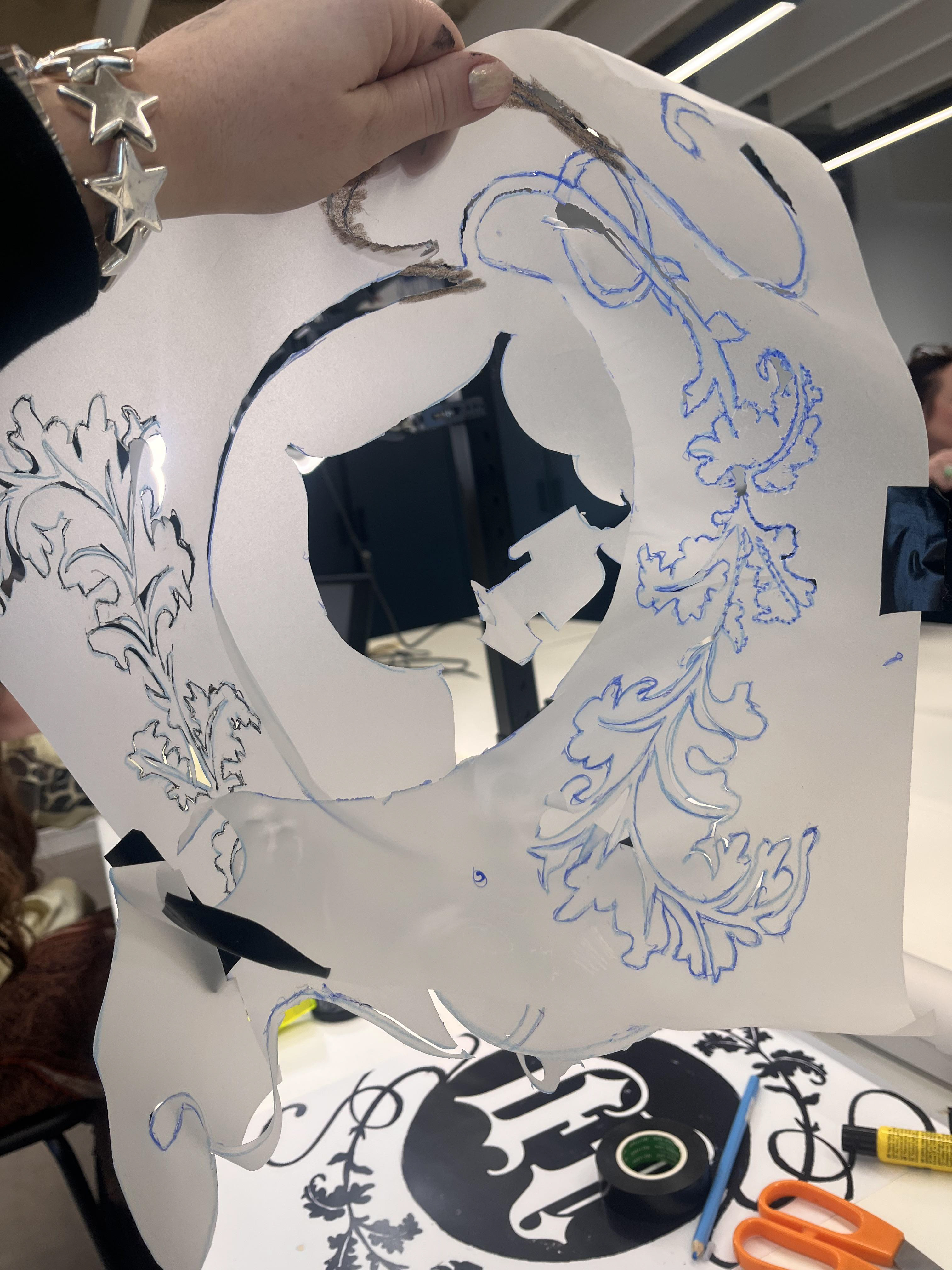
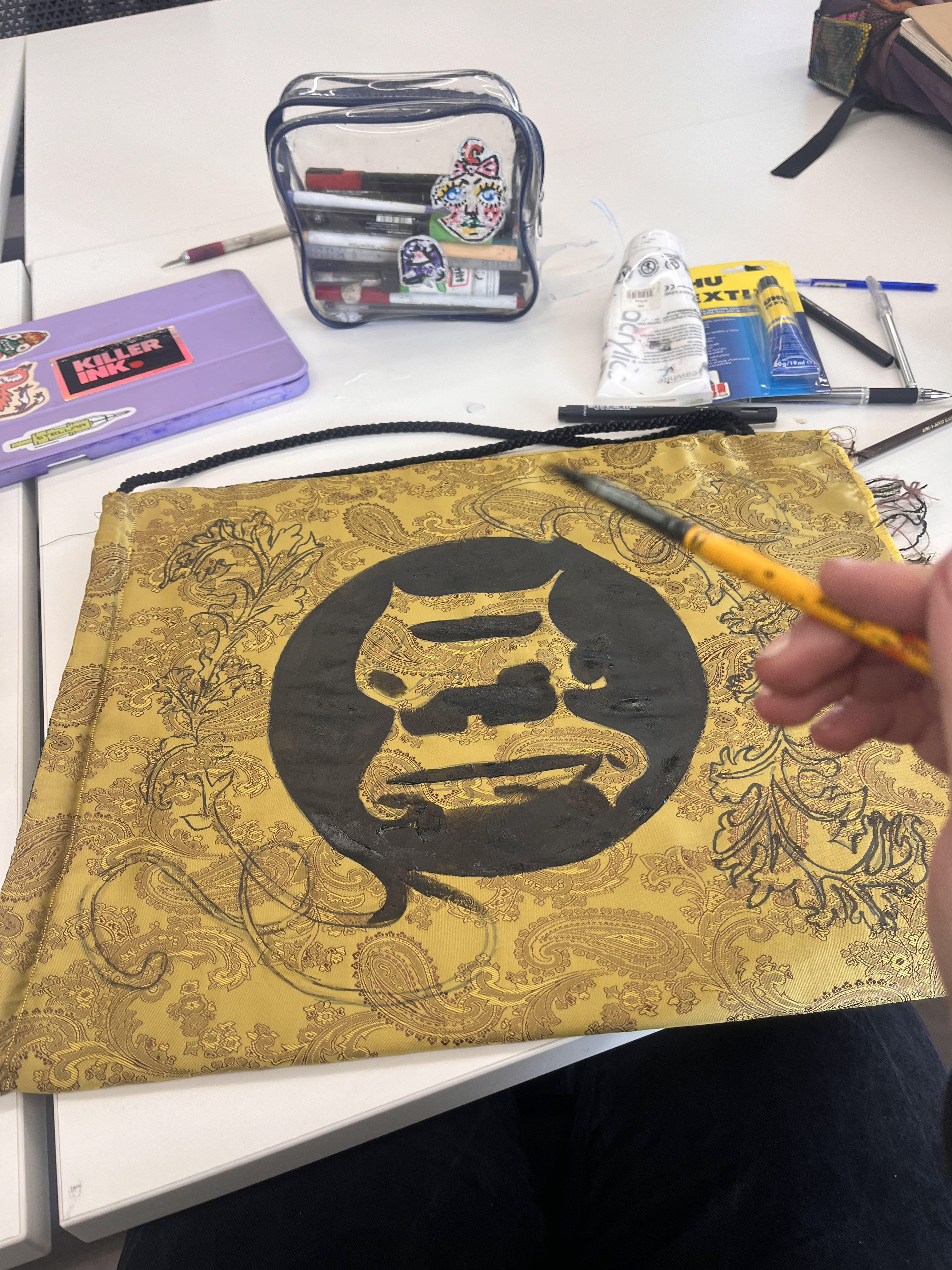
I had to figure out the best way to transfer my design onto the bag without damaging the fabric too much and ruining the effect of the beads. I looked into using carbon paper, which is similar to what we use in tattooing to transfer stencils onto skin. You can get carbon paper for fabric, so I went to the craft shop in town, but they didn’t have any. They said they’d get a new order in next week, but I didn’t want to wait. So, I made my own makeshift stencil. I printed out my design, flipped it, and copied it onto tracing paper. Then, I used a small swivel knife to cut around the lines, so I could get my fabric pen into all the details. It took a while and it made me a bit frustrated, but it worked really well. I was able to paint the design on, which made me feel a lot more confident about the bag and the project. Now that I know it works, once I add the beads it will look SO COOL !!!!
Ellie also told me about using heat transfer and screen printing, which would've been a really good idea for my bag. It would’ve looked great, especially if I used flocking because it would have a velvet-like finish. However, I wasn’t sure how well the beads would sit on top of the flocking. I could’ve used regular heat transfer instead, but it would’ve been more expensive to pay for the screen printing, and it would’ve taken me a lot longer to screen print the pattern onto my bag. Plus, I wasn’t sure how well it would’ve worked because the fabric I was using was already patterned. But if I were making multiple items, or if I was making a bigger fabric piece like the reduced stickers I was talking about, I might have been more tempted to use heat transfer.
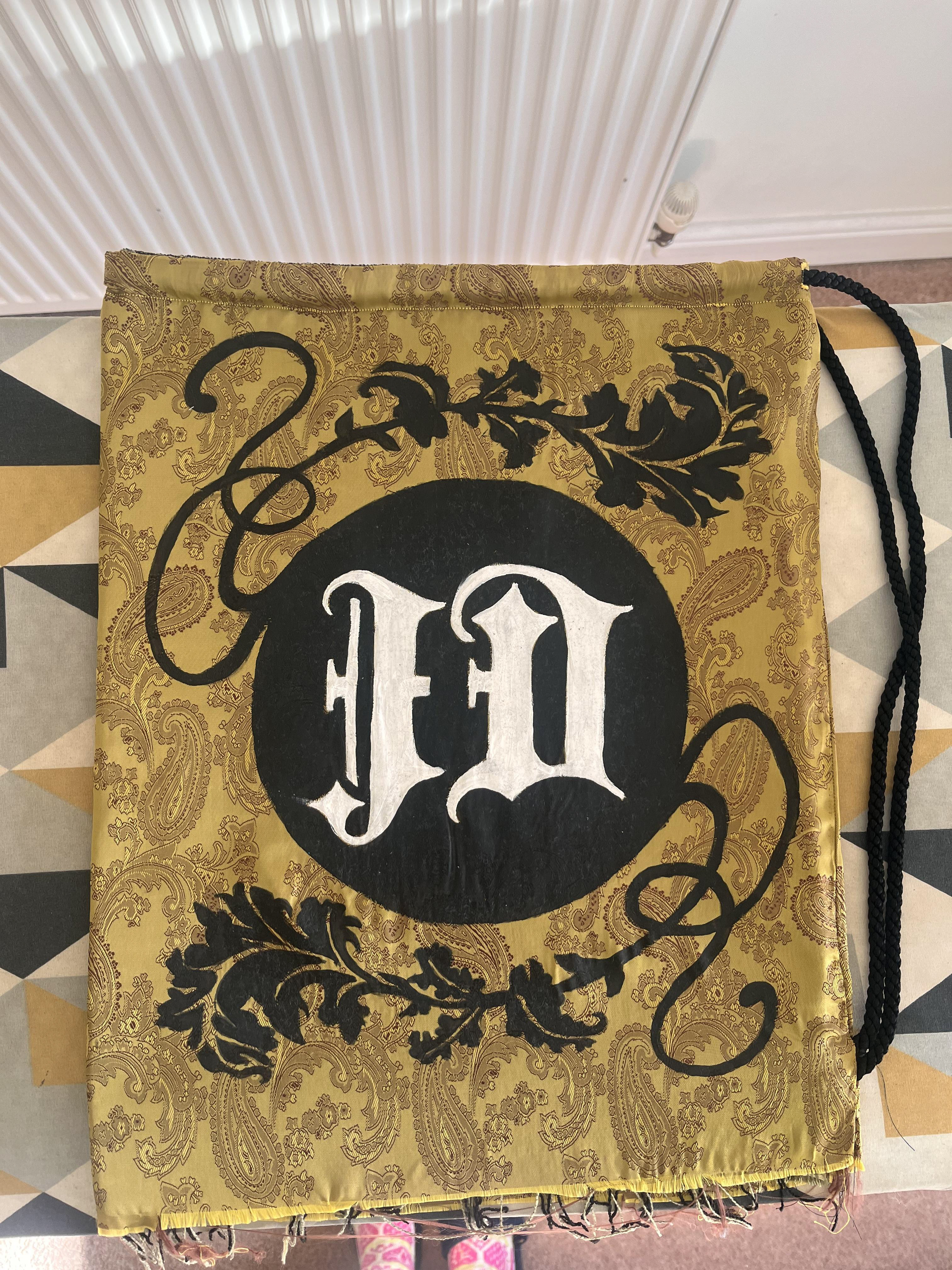
And this is what it looked like after I had ironed the fabric with the fabric paint on. I’m so happy with it YAYAYAY! It looks how i pictured it, and I’m relieved because I was really stressed. I didn’t have enough of either of the fabrics I used to make another one the same. Now, I’m just really excited to add the beads. I’m thinking I’ll only do beads as an outline, though, because I’d rather create lots of different pieces for this project—kind of like a collection of items, a little bit like a junkyard—rather than just one piece that’s completely bedazzled. Also, if I just do the outline, that means if I have more time closer to the final, I can add a few more beads and adjust where I think it’ll make a difference.


I really want to make a greggs bag with a steak bake to go inside. I think it’d be cool to make it a functional bag similar to the JD one, so it would have a zip along the top. I specifically wanted it to look like the little paper ones rather than the big plastic ones, just because I feel like you see the paper ones a lot more. Plus, they fly away from you easily, so you lose them all the time. That’s my next thing I want to make, along with possibly a quilted scratchcard, while I wait for my canvases to be finished.
I tried to make a chart for the Greggs logo but when I tried to turn it into a knitting chart, the chart was too big to include all the detail of the text. I like the idea of knitting it and getting it printed onto the fabric in the textiles section of Bonington. Another option would be to just sew the bag similar to the JD bag, but it's less fun, and I can’t play around with the texture as much because I have to make sure it’s a steady enough fabric to go through my sewing machine. I like the idea of the material feeling crinkly and thin when you physically touch it, and also, I think it would be fun to knit the steak bake to go inside and then do a photoshoot of them on a plate with all the knives and forks in that special order left to right. just somat for me to play around with as another idea

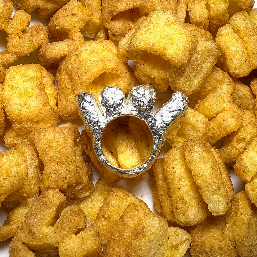
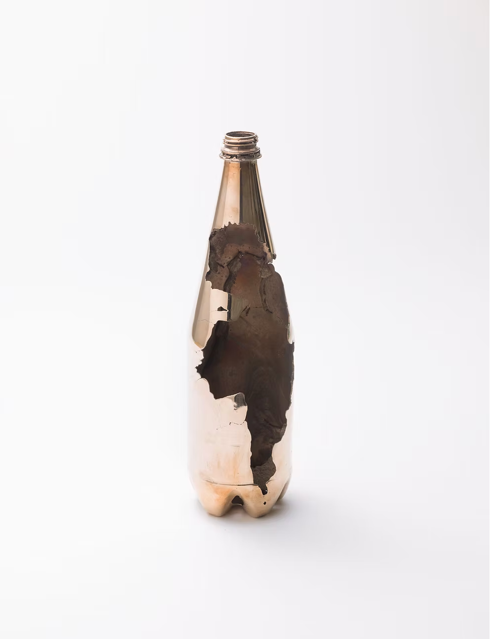
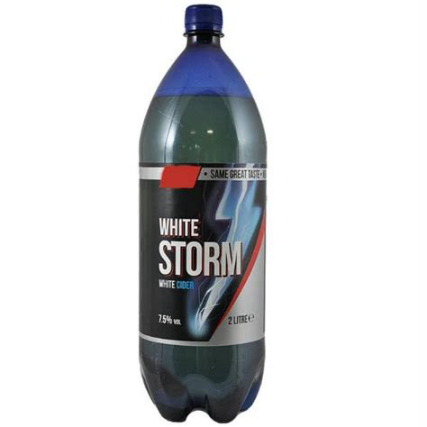
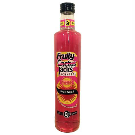
I also started looking at Dion Kitson’s work that kristian showed me at the start of the project, and I really liked his Monster Munch rings but I never actually looked at any of his other projects. I really like his Greggs jewellery and imagine if I could put the Greggs story into my little knitted Greggs bag. Obviously, I can't spend 100 quid on a Greggs charm bracelet, but it’s still fun to think about. I really like his bronze Cactus Jacks bottle as well, because the Jack’s bottle looks a lot different from the one I remember. I don’t know if they upgraded it, but the one from when I was younger looked like a gin bottle, and that’s what I was using for the canvases. It’s doing a similar thing to what I want to achieve which is to put a positive light on lots of things people associate with the working class. It also highlights that people want to own these things, especially if they’re working-class creatives who can now afford fine jewellery and stuff. It's a positive light on some of the negative descriptions of the working class. What I'm more interested in, though, is making things for middle-class people that are so notoriously working-class and trying to make them question their perspective on why they like or dislike it
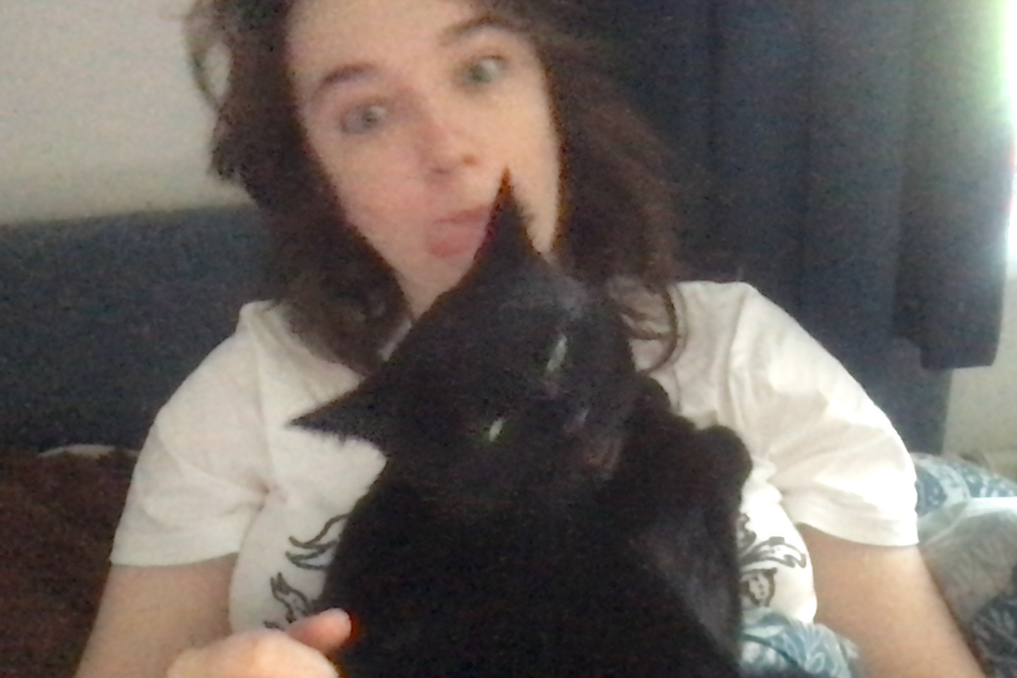

Bonus points that my cat Elsie comes and lies on me while I write for the website because she purrs and she’s really chubby. shes like a big fishy blanket, and it makes me enjoy having to do website stuff more. i took these pictures on my mac writing this part :)
After my feedback, Luke made a valid point, middle-class people don't care about how they feel about working-class objects because it's above them. Me trying to get them to look inside themselves and understand their prejudices towards working-class objects just feels like begging for attention, which I don't need to do. One, it should be deserved anyway, and two, is there even a middle-class interest in my work? it's just going to look like to all the working-class people that I've decorated a JD bag.
kristian also mentioned a valid point about my original idea, and we discussed the original motivation. Most of my work is usually about providing hope, warmth, and optimism. But I've gotten to the point where I wasn’t thinking about that anymore. Now, I want to focus back on it. So, if I’ve made a scratchcard, is it just a scratchcard quote, or does it have some meaning to it?
corrbin shaws work is often made with the purpose of putting working-class symbols into a gallery, which is a middle-class space. But I don’t just want to create something to be displayed in a middle-class area, I want it to convey hope for the working class. I need to dig deep and understand what each of these things means, and how where I display it matters.
Scratchcards are more than just a game of chance; they are a symbol of how the working class views the potential for escaping their circumstances. For most people, it’s the only way to feel they could break free and enter a different world, a middle-class world, one that feels unattainable through any effort other than pure luck. It’s not about hard work or ambition; it’s about hoping for a miracle, a sudden windfall that shifts everything.
I want to embed this feeling in my work, so when people see it, they don’t just understand it intellectually, but they feel it like the weight of longing, the frustration of knowing that social mobility seems more like a lottery than a reality. It can’t be grand or obvious, though. It should be something that lingers, something you can’t avoid once you’re in front of it, like the reality of a scratchcard. You can’t escape the possibility of winning, but you can’t escape the odds, either.
So far, with my JD bag, I've been parodying middle-class opinions and taking working-class items, reinventing them. But the parodying of it isn’t saying what I want it to say; the parody feels pessimistic. What I want is to inspire optimism. I can look at this big list, see how things appeal to me, and choose which methods I can use to represent hope and optimism in my work.
Because I wanted to fully understand what I wanted to achieve with this project, I wanted to look more into why I thought textile was the best way to tackle this.
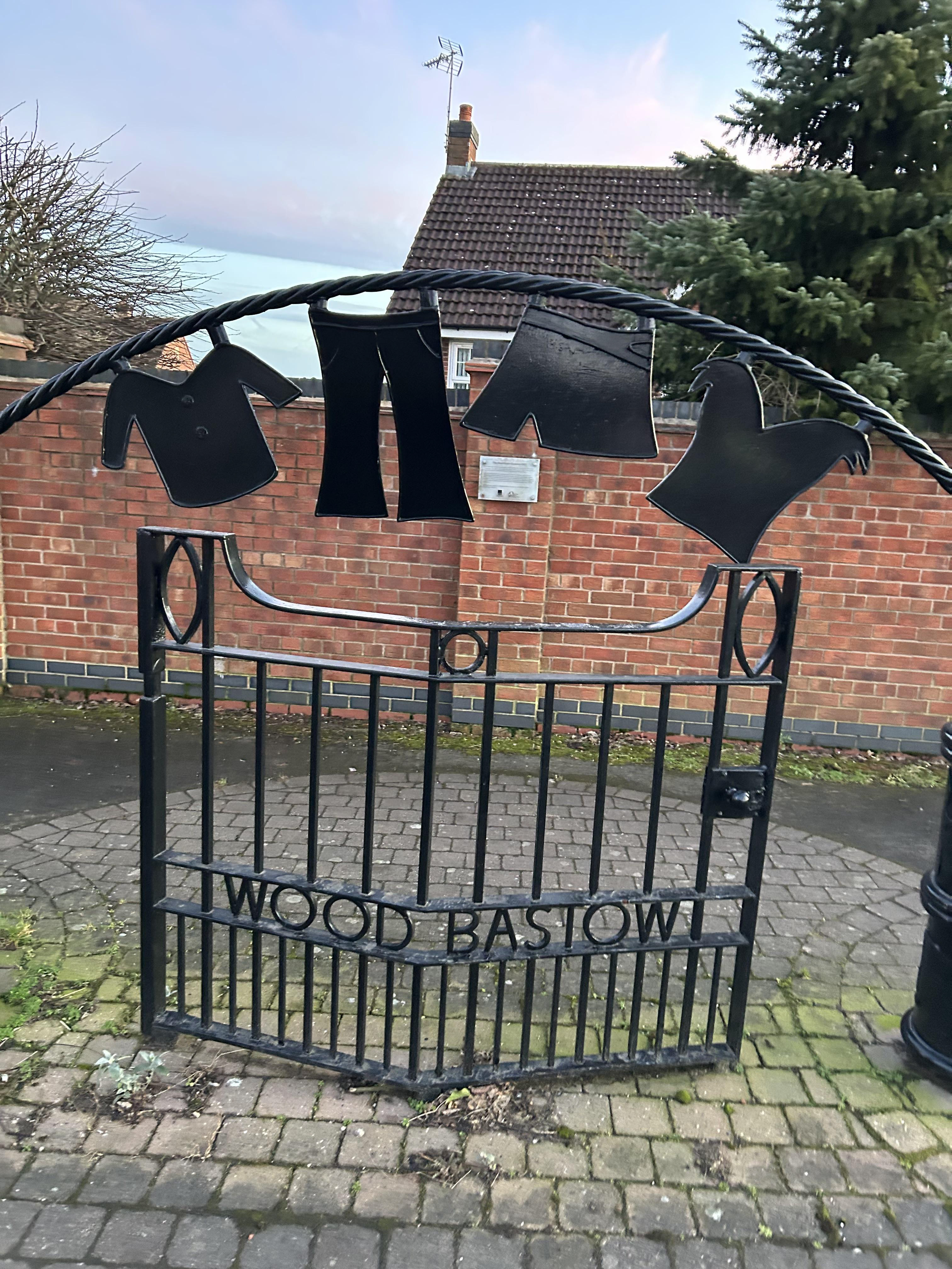
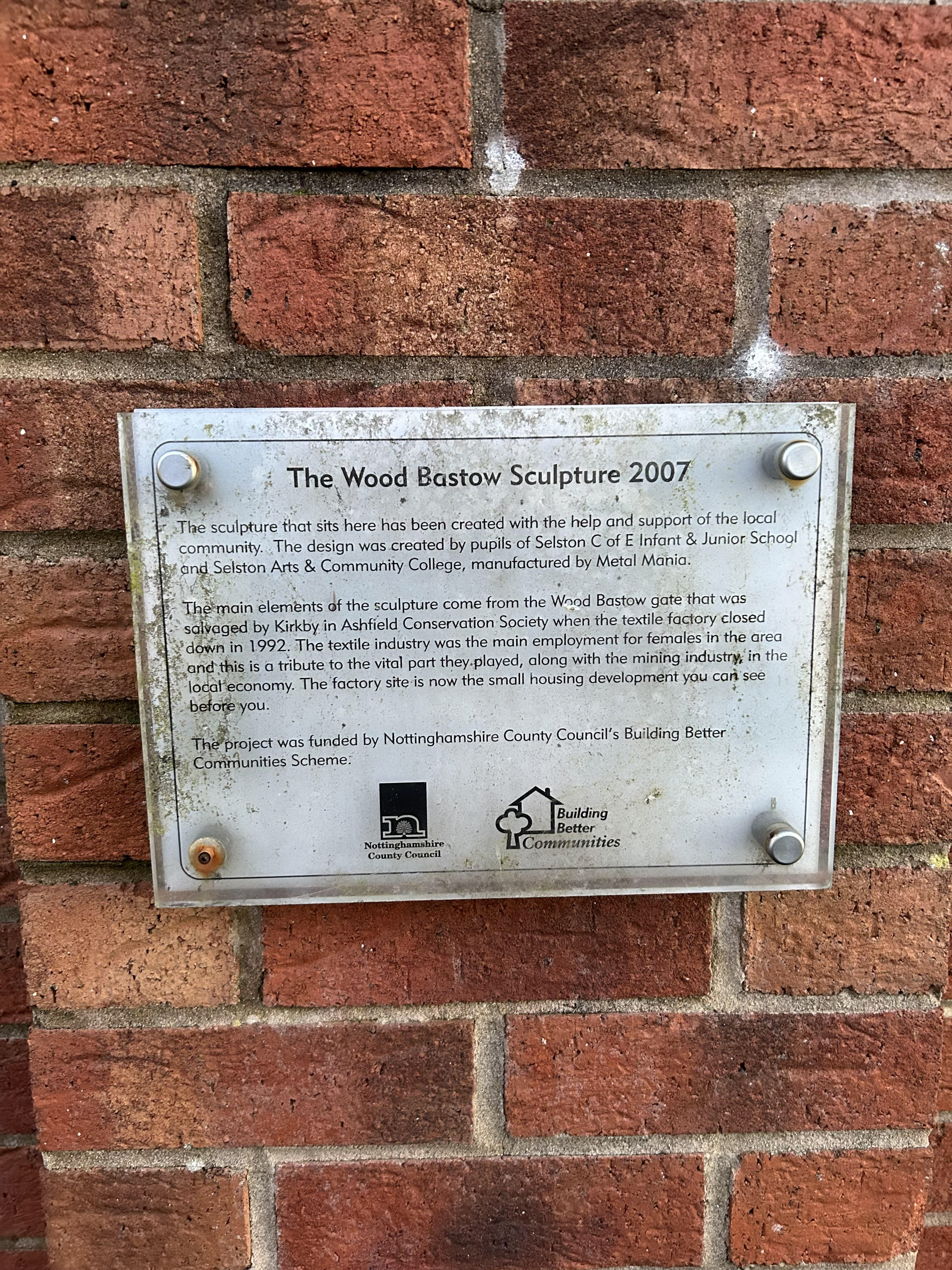
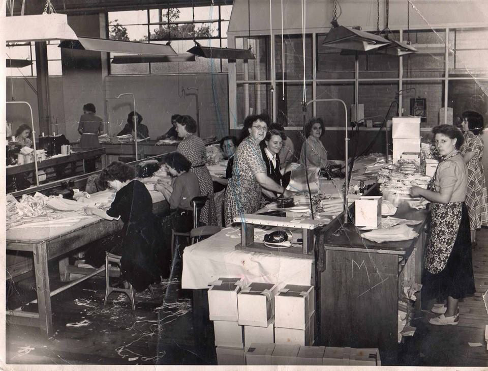
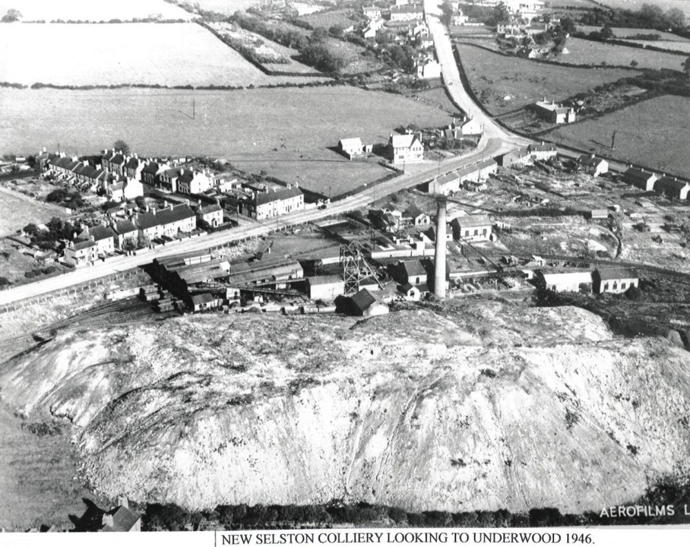
I wanted to use textiles, but I didn't understand why I thought this in my head at the time. It was because I associated textiles with home skills,skills that women had to have to save money, as opposed to knowing how to paint, sculpt, or do pottery. In my village, there is a sign and a metal clothes rail outside my school. I wanted to have a look at it because I’d never read the plaque before, and it turned out that on the estate opposite my secondary school, there was a big clothing factory that made women's upholstery, underwear, bras, and swimwear. I went onto my village Facebook group, and people were sending loads of pictures of their parents or grandparents working there. The factory had changed names a couple of times, and my aunt actually worked there when she was younger and my mama did too
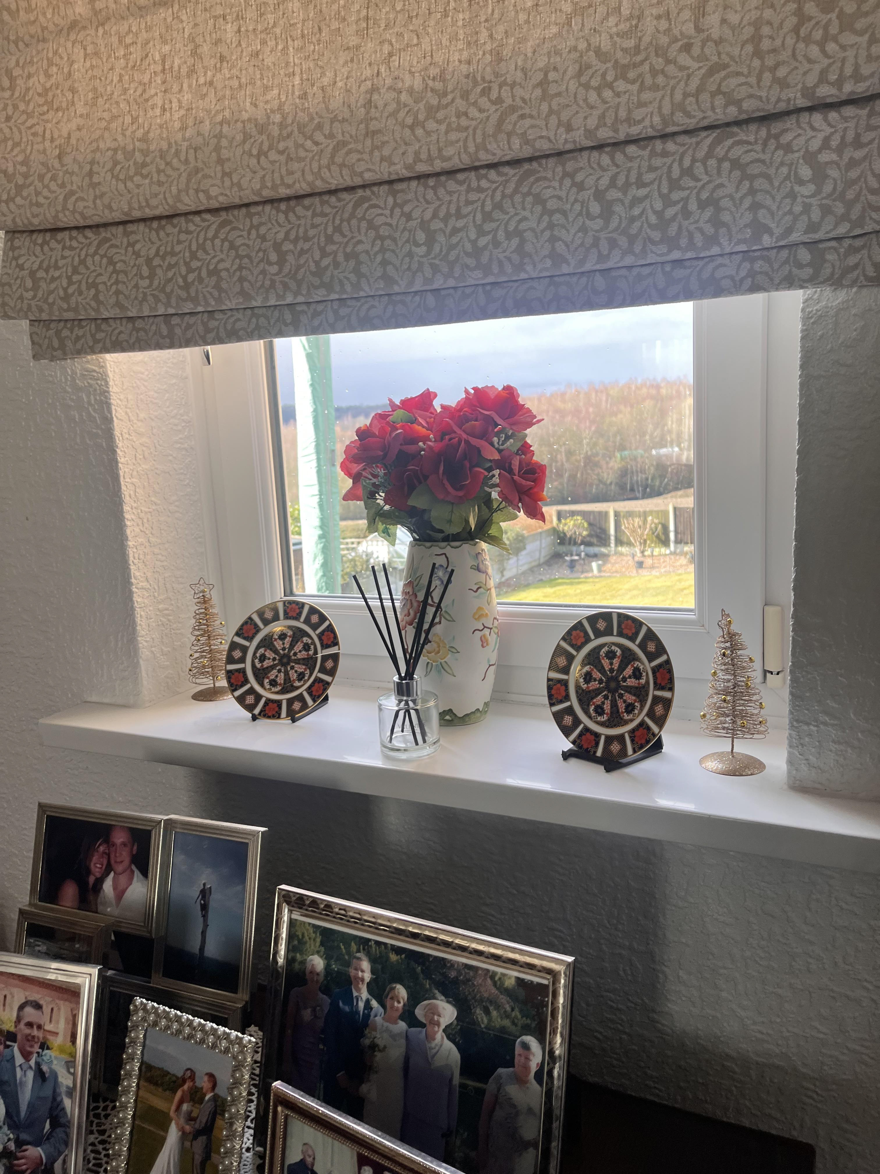
. I think I subconsciously associated my project with the women working in textile mills during the mining strikes to keep the areas afloat, and I didn't know why I was making this connection. But now I know I want to try and incorporate the things they were making into my work. When I was younger, my aunt worked in underwear factories and businesses, and she would give me all the scraps of fabric and lace she had in big bin-bags. If I still have some of these scraps, I want to use them. I want to incorporate the lace into my textile projects, and I think I’d like to get my mama involved in taking the pictures. She lives about 10 minutes away in a bungalow that still looks like it’s from the 70s. So, when I take pictures for my project, I’m going to take them in her bungalow SO EXCITING.
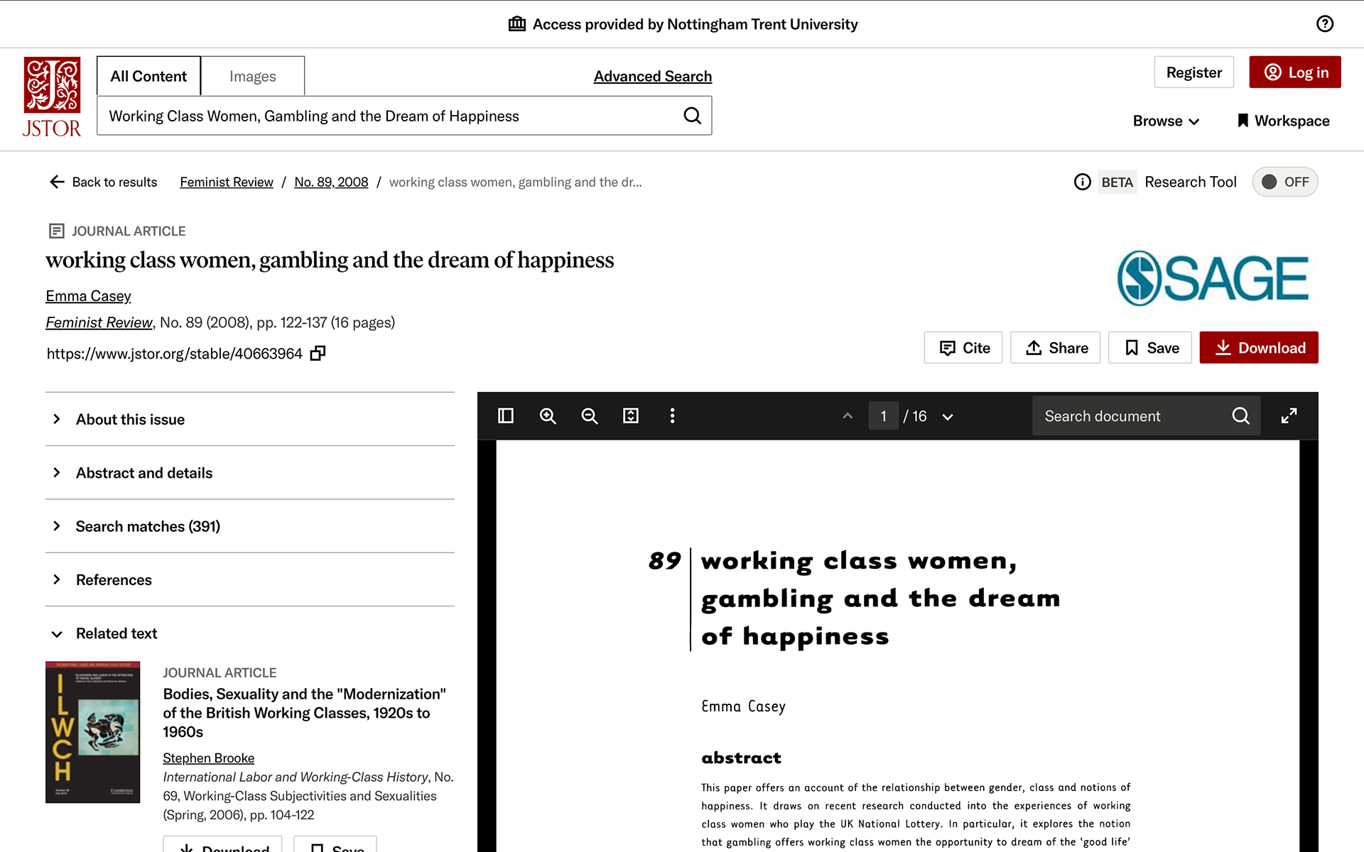
I read a really interesting journal article by a woman named Emma Casey, who looked at working-class women's connection with the National Lottery. She found that the researchers themselves were instilling their own views of working-class women onto the answers of the women they were interviewing LIKE THIS QUOTE HERE THATS VERY SMALL-MINDED
My instinctive moral horror of the Lottery is re-lived every Saturday in newsagents
throughout the land as the worn-out, the elderly, the shabby and the desperate queue up in the hope of their only escape. Is this really all there is on offer?
(Bleasdale, The Guardian, November 1995)
throughout the land as the worn-out, the elderly, the shabby and the desperate queue up in the hope of their only escape. Is this really all there is on offer?
(Bleasdale, The Guardian, November 1995)
its interesting to read about them trying to prevent themselves from thinking that these women were unhappy, deprived, and living in poverty. Casey described how she tried to fight against how they thought these women should feel, and instead, actually listened to how they did feel. Many of the women who regularly played the National Lottery didn’t strive for material needs. Most of them just wanted to move out of the council estate, move to a nicer area, or be able to buy their kids and family members the clothes that other people had. one of the women interviewed said
"i dream about finding the back door of Marks & Spencers open and going in and just picking up all the things I want ... this will do for Jenny, and that for Darren ... I'd like to be able to give them what other children have without having to juggle and make them plod on, but there's no choice"
. One of them also said they just wanted to be able to quit work so they could be a full-time mum and feel like they were a better mum for their kids. Casey called this the "caring self." They played the lottery not because they were unhappy or desperate, but because it was an efficient way to amplify their ability to be what they deemed a better person. Casey also pointed out that people were scared of what would happen if they won the lottery. They thought that if they won, they could pretend to be middle class and do middle-class things, but they still wouldn’t actually be middle class, and it wouldn’t change who they were but just make them feel isolated. They feared that if they won, their life wouldn’t be better, and they’d still be unhappy. this was a really good quote from the article that explained it well:
Class is something beneath your clothes, under your skin, in your reflexes, in your psyche, at the very core of your being. In the all-encompassing English class system, if you know that you are in the 'wrong' class, you know that therefore you are a valueless person - annette kuhn
It showed that we understand economic capital doesn’t equal cultural capital, despite what many middle-class people think about the working class trying to move up. I found the article dead interesting because it helped me identify the exact niche of society I’m trying to highlight: the connection between working-class women, the National Lottery, and how it's not as desperate or fanciful as people make it out to be. The lottery isn’t an escape, it’s just another way of getting by. god i love sociology
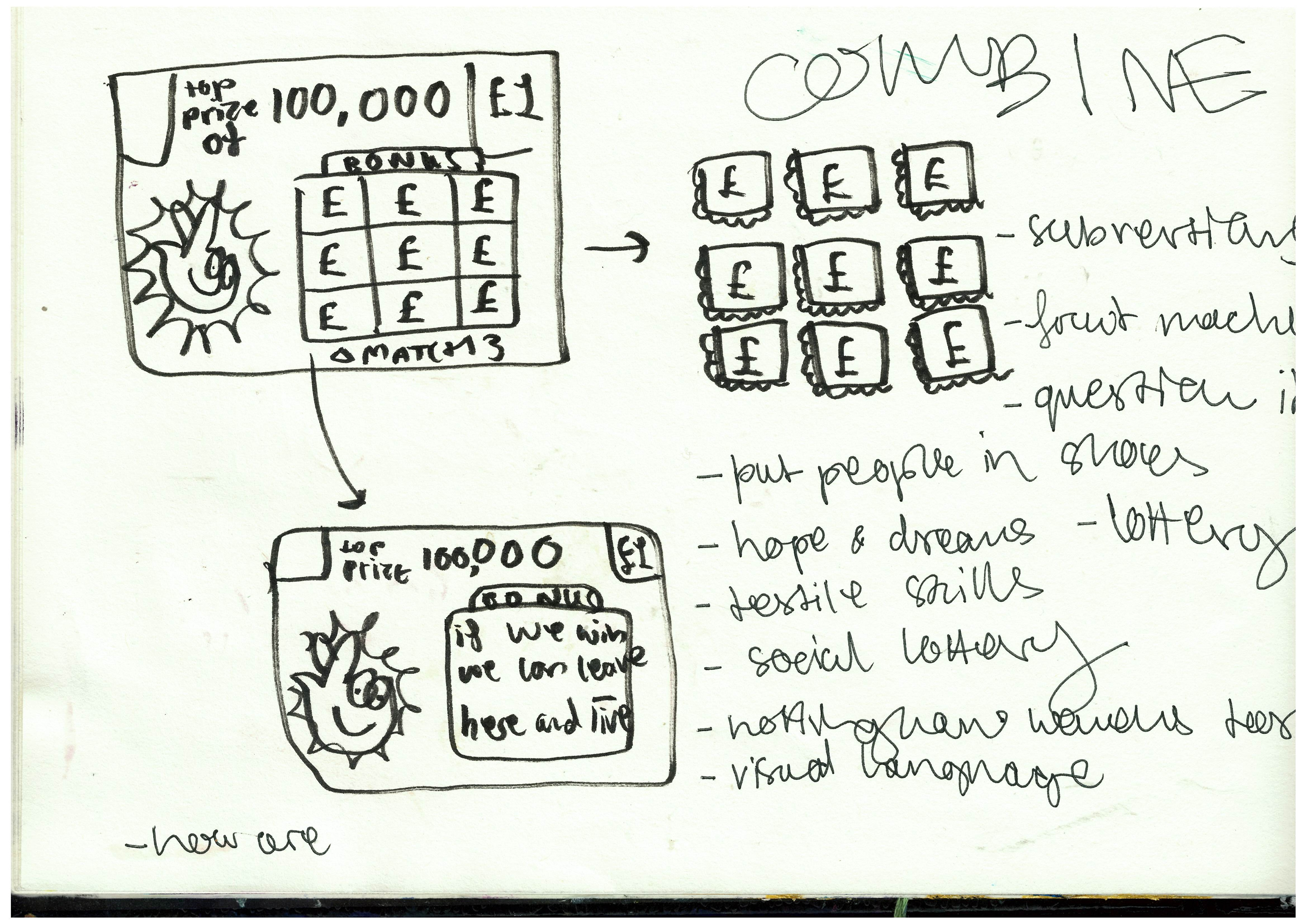
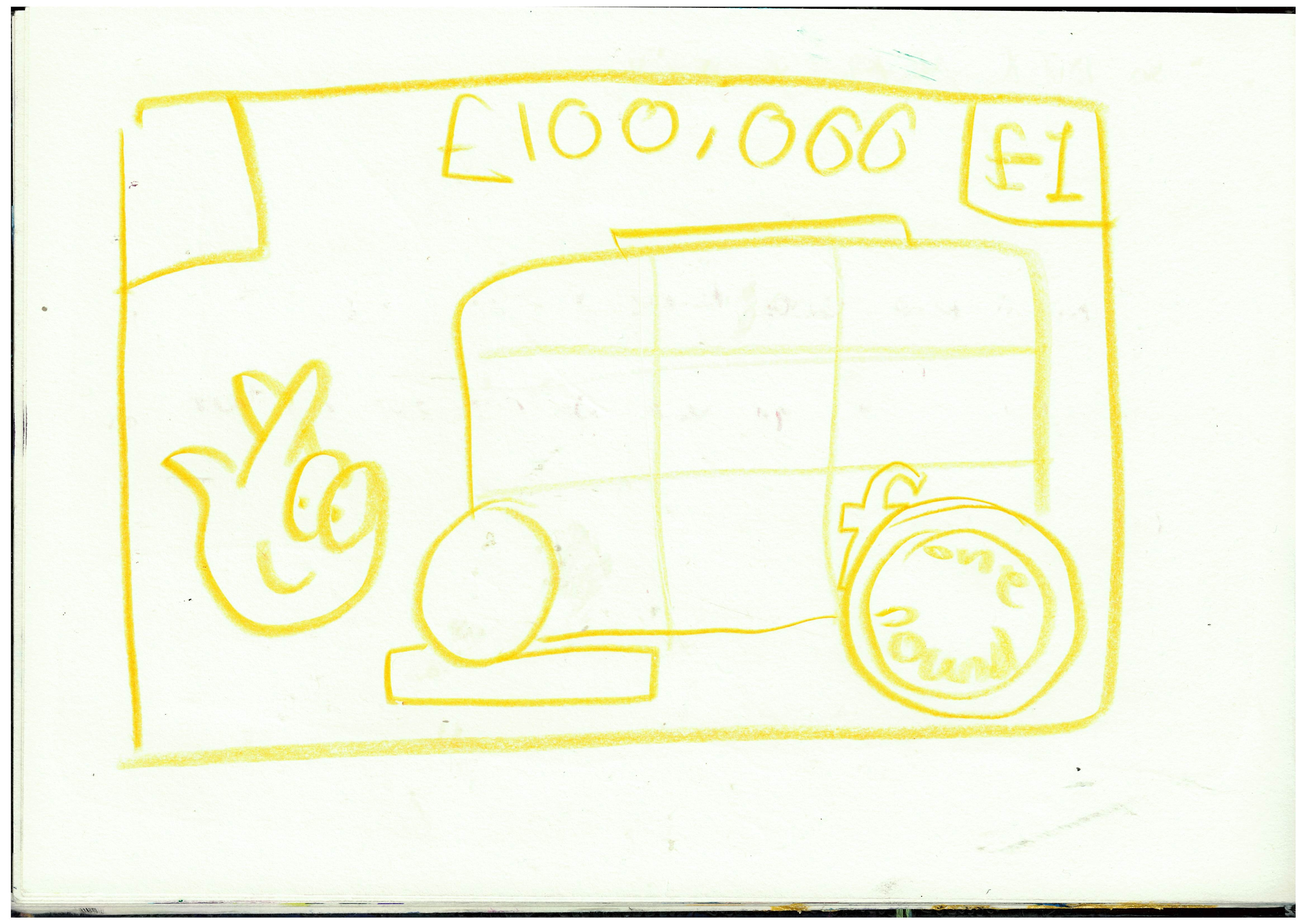
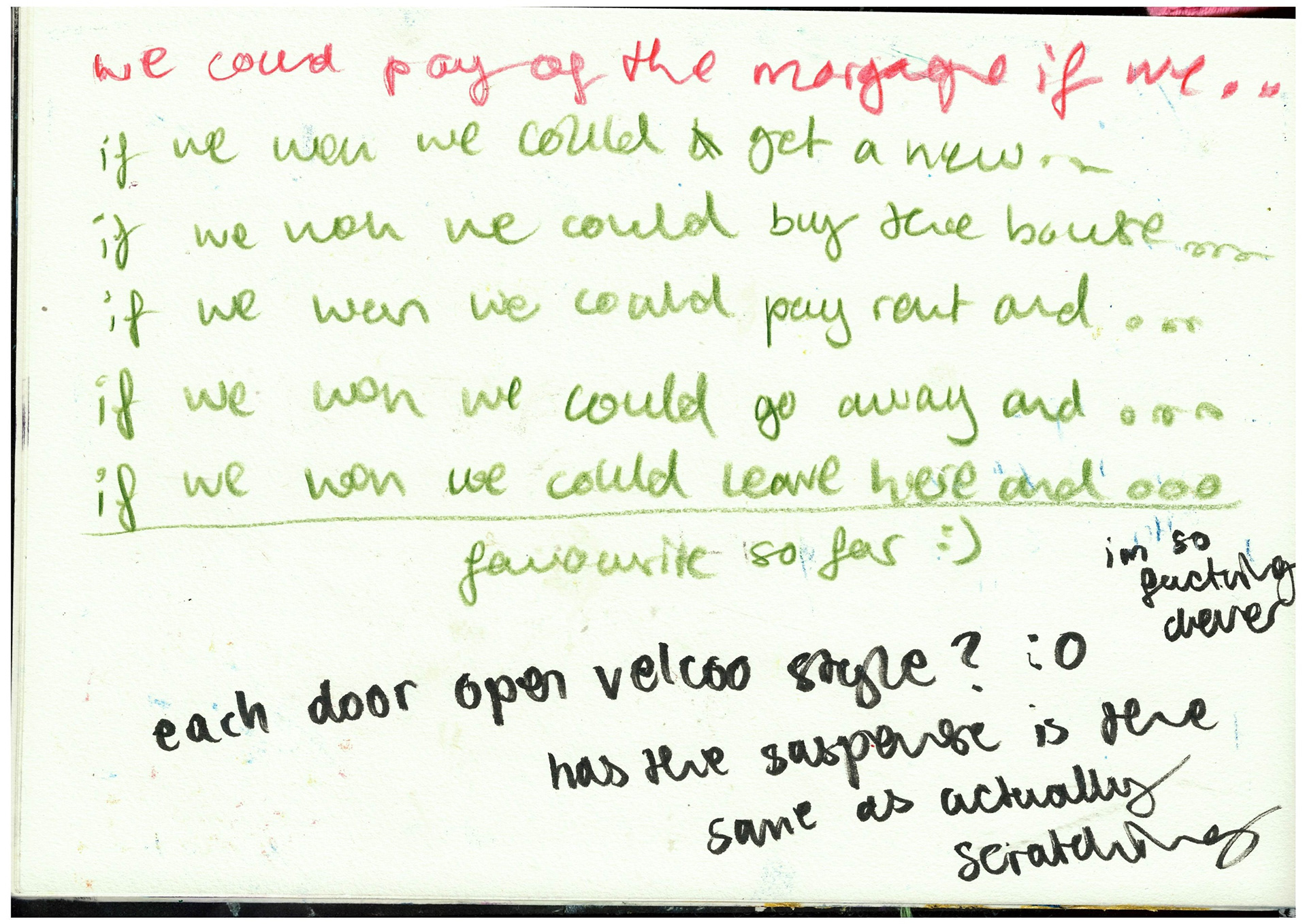
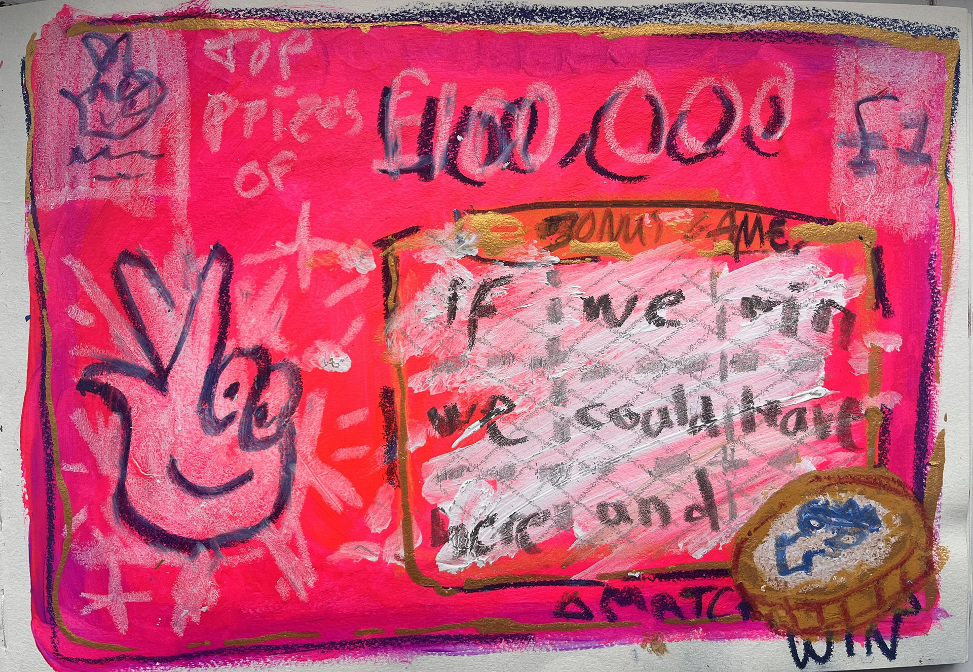
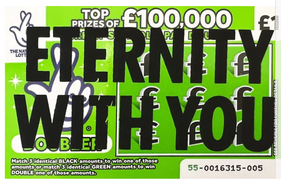
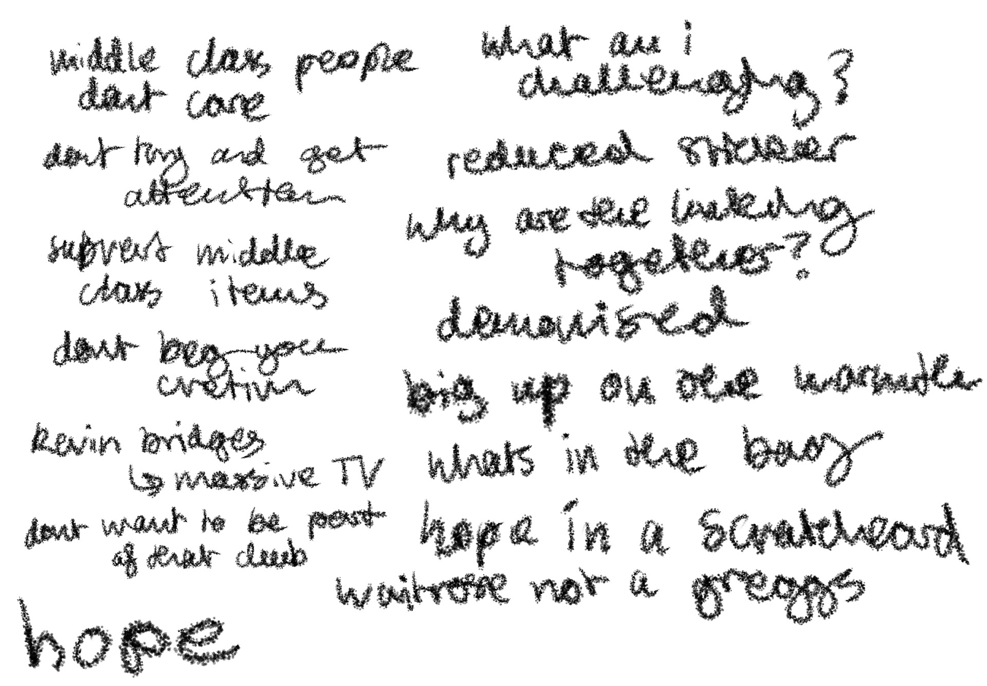
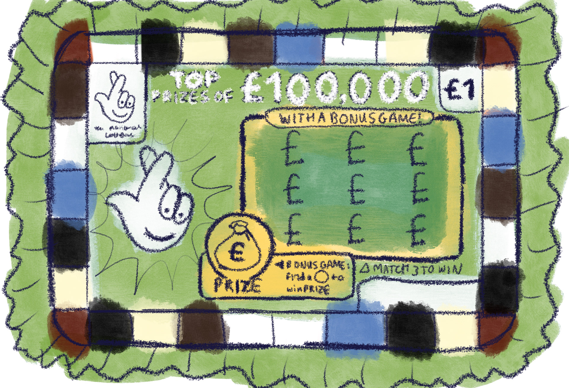
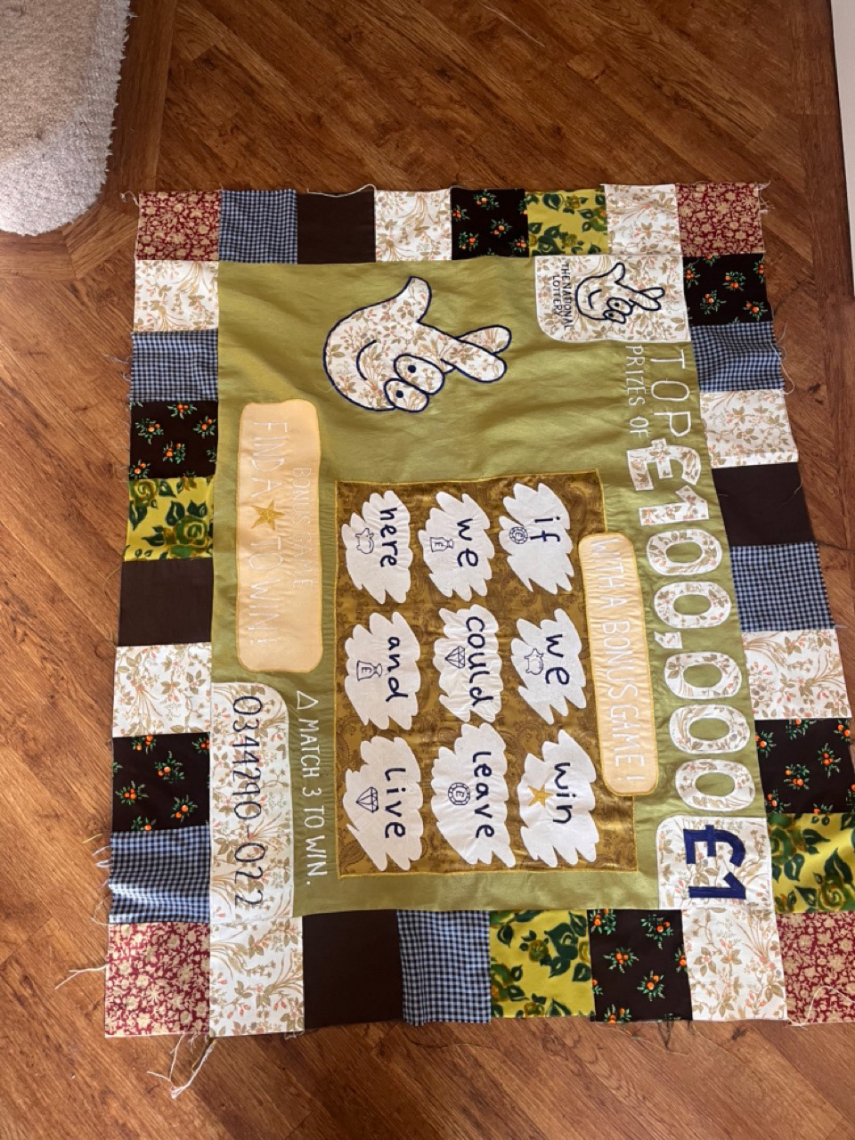
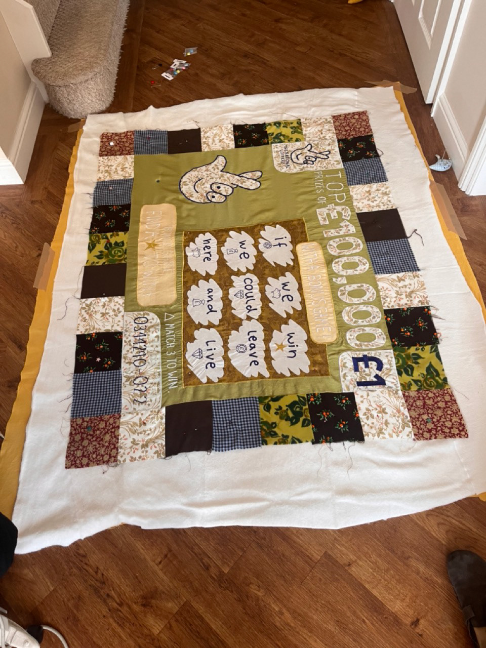
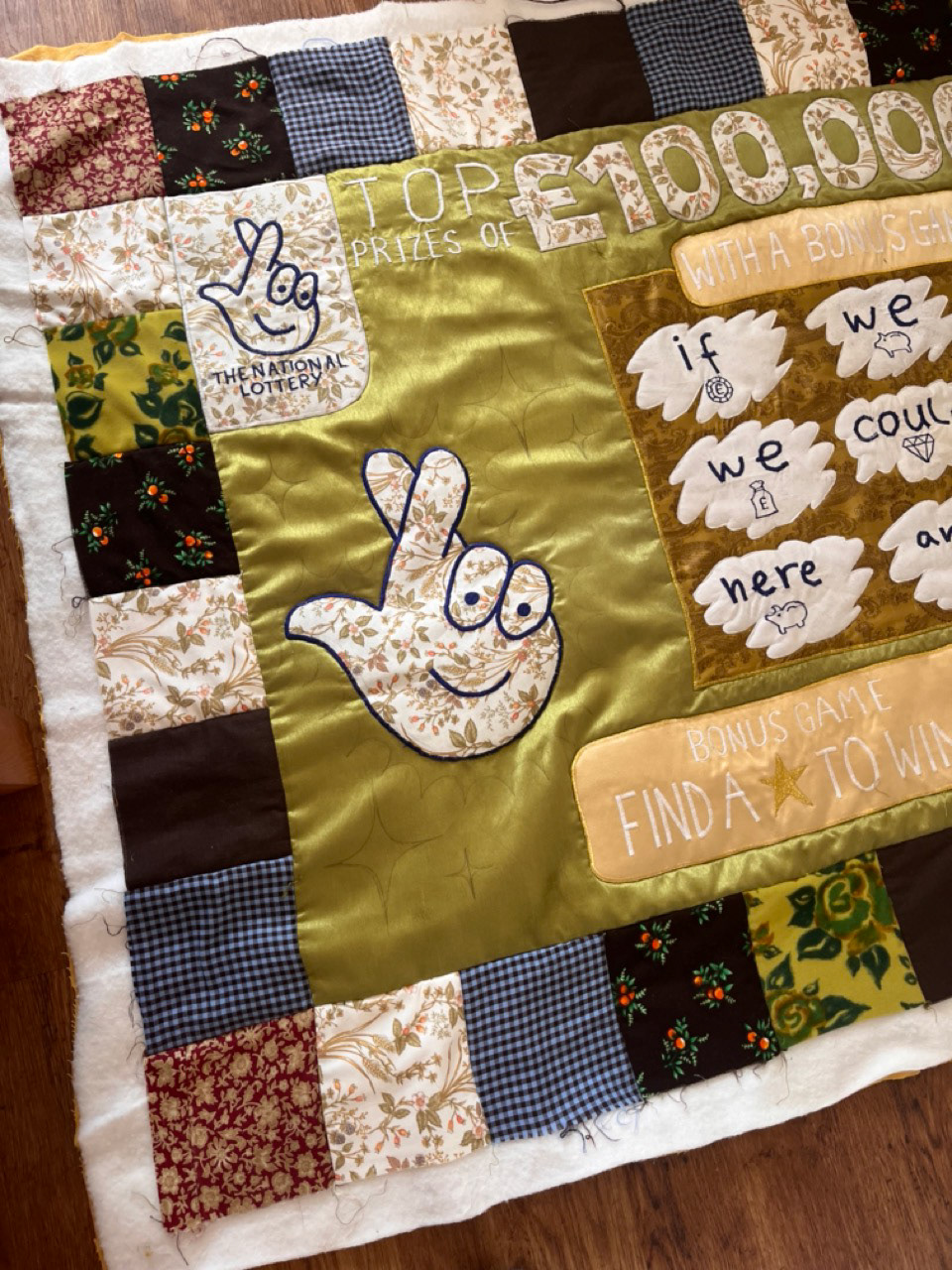
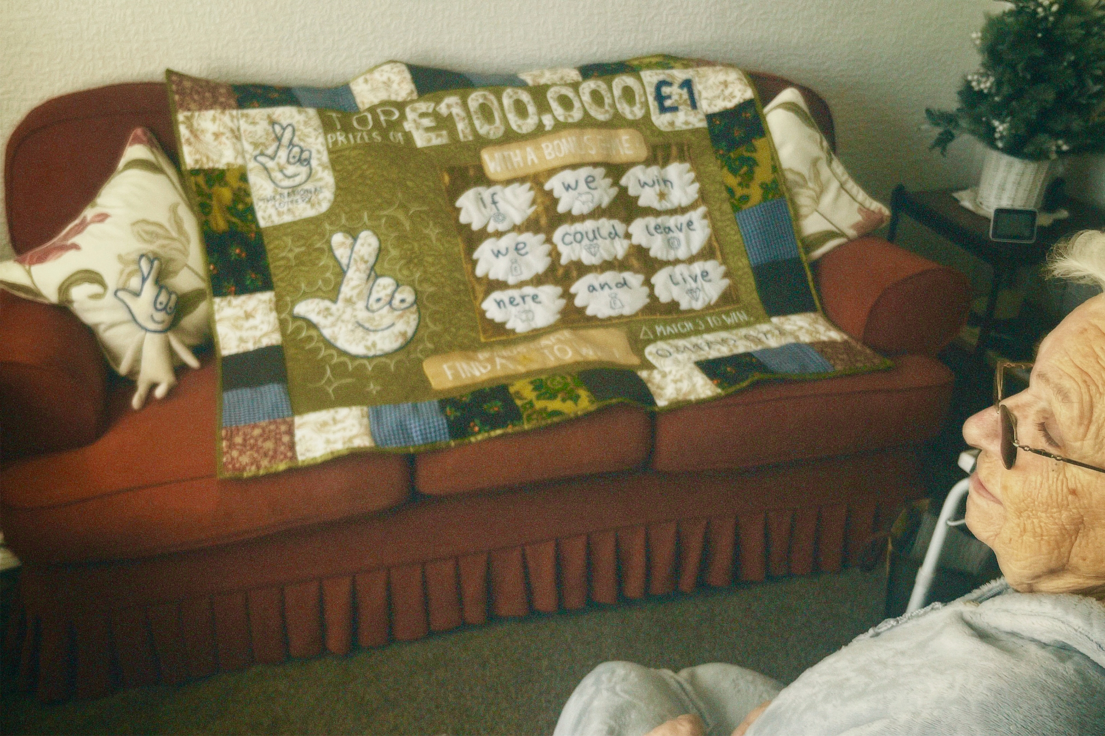
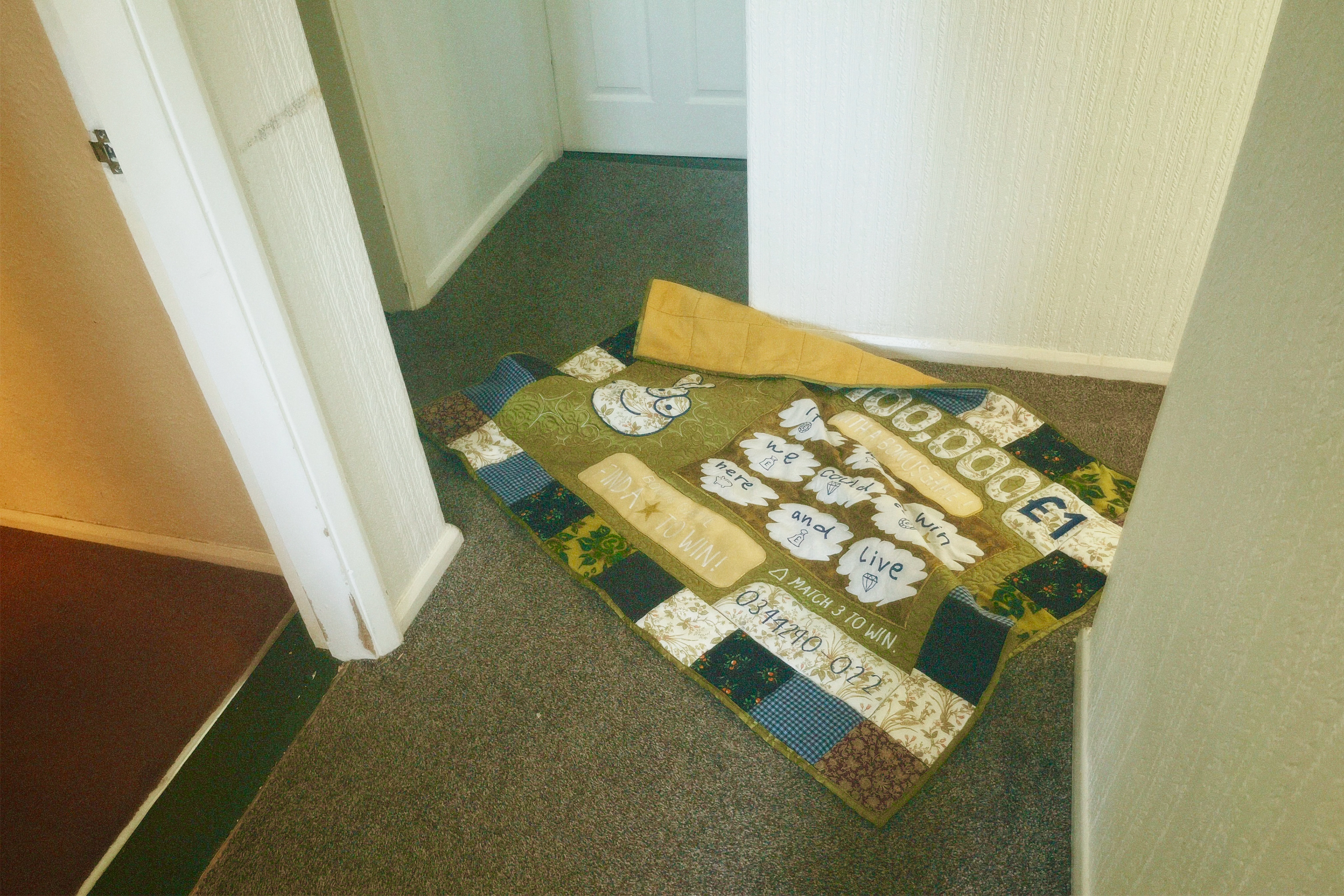
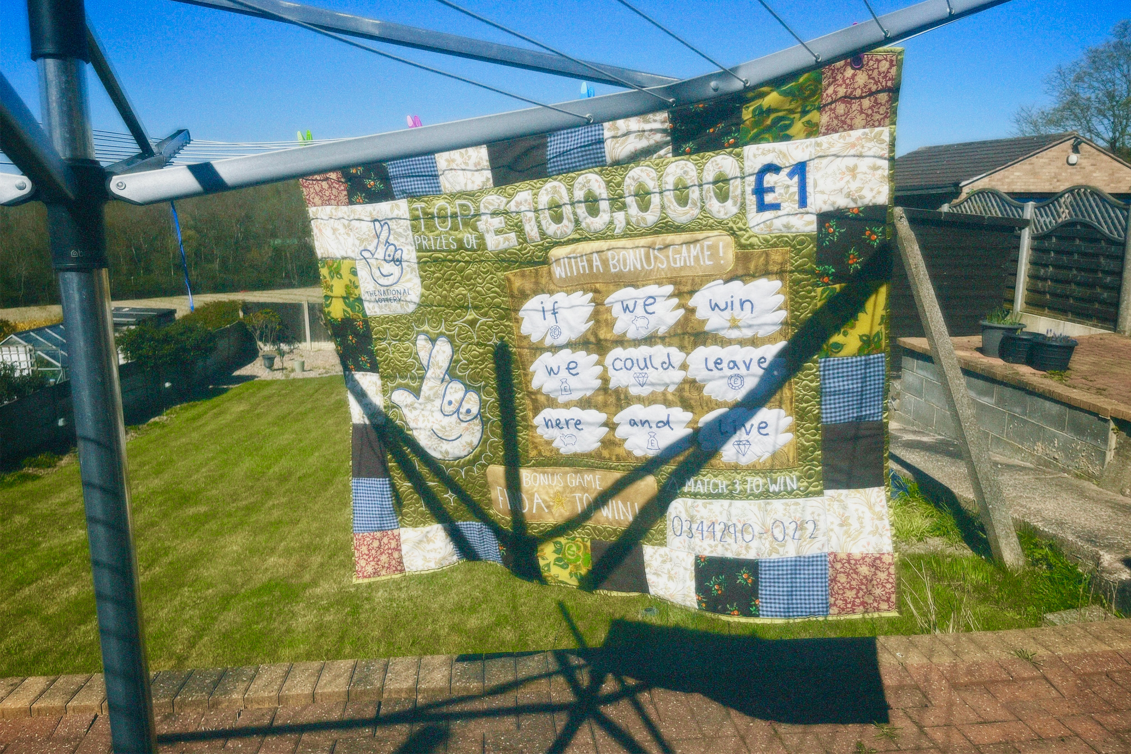
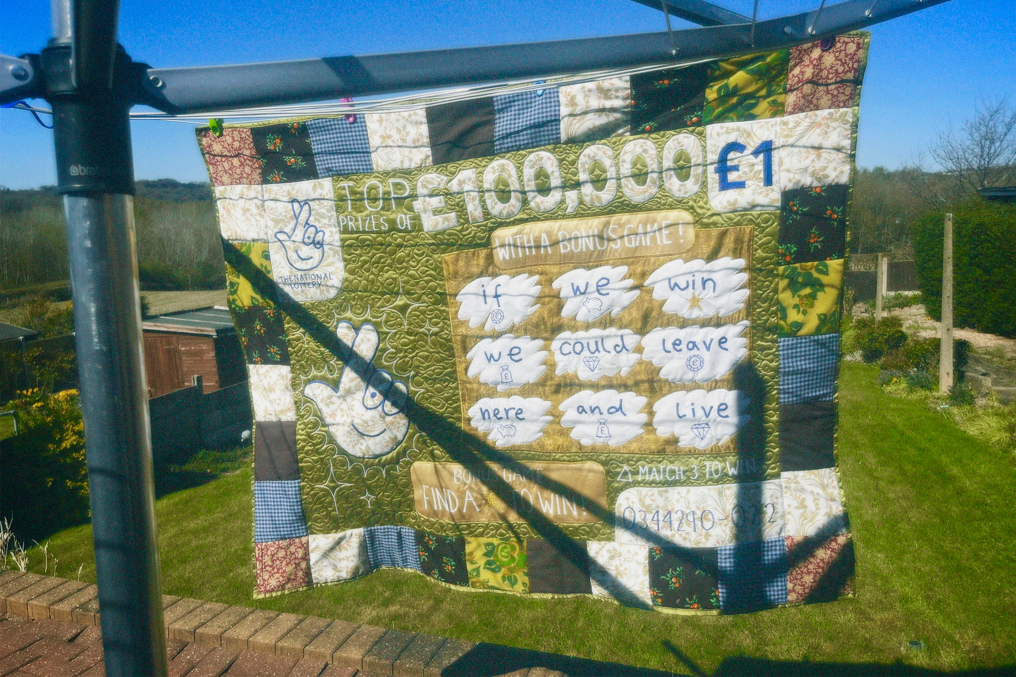
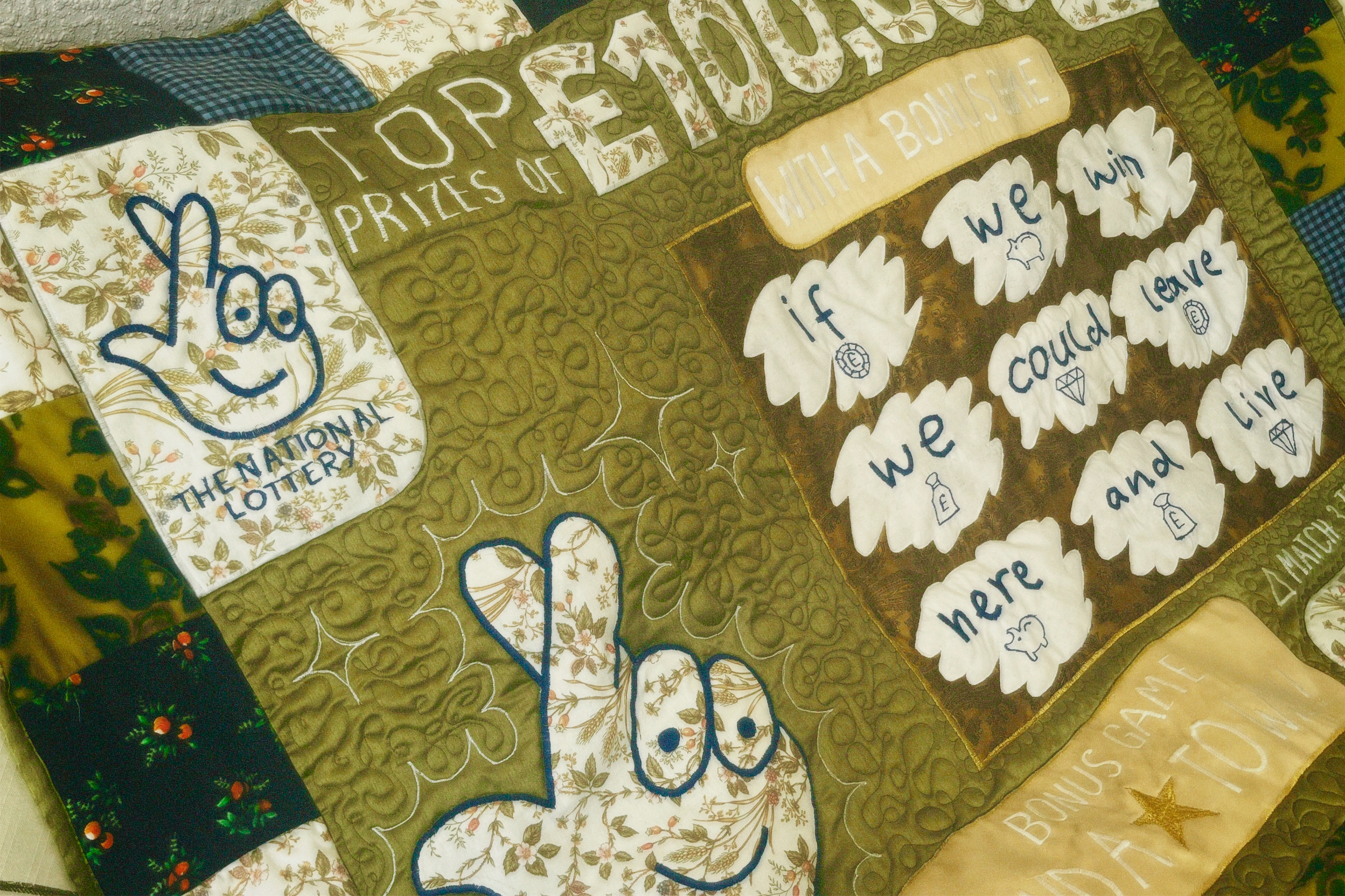
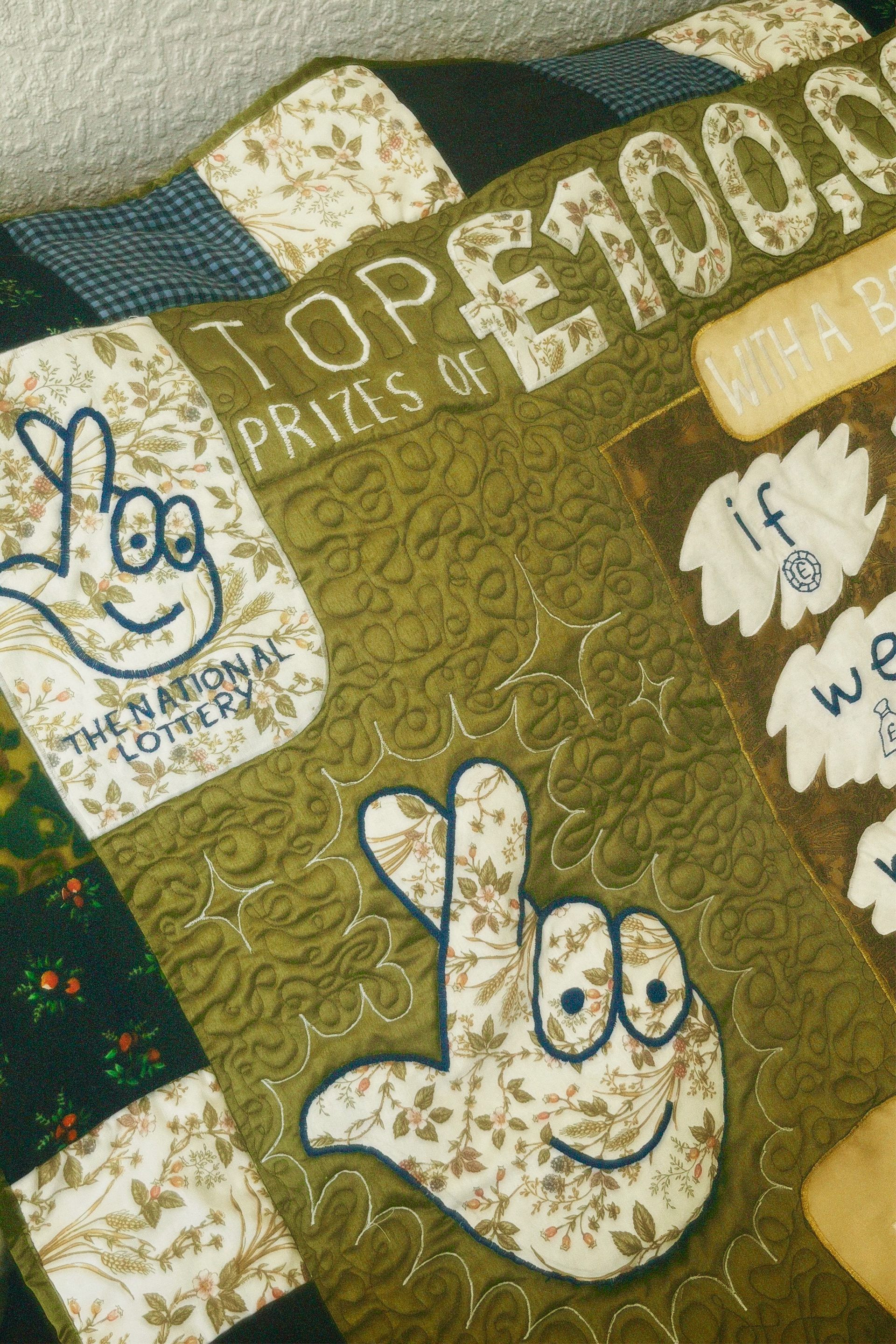
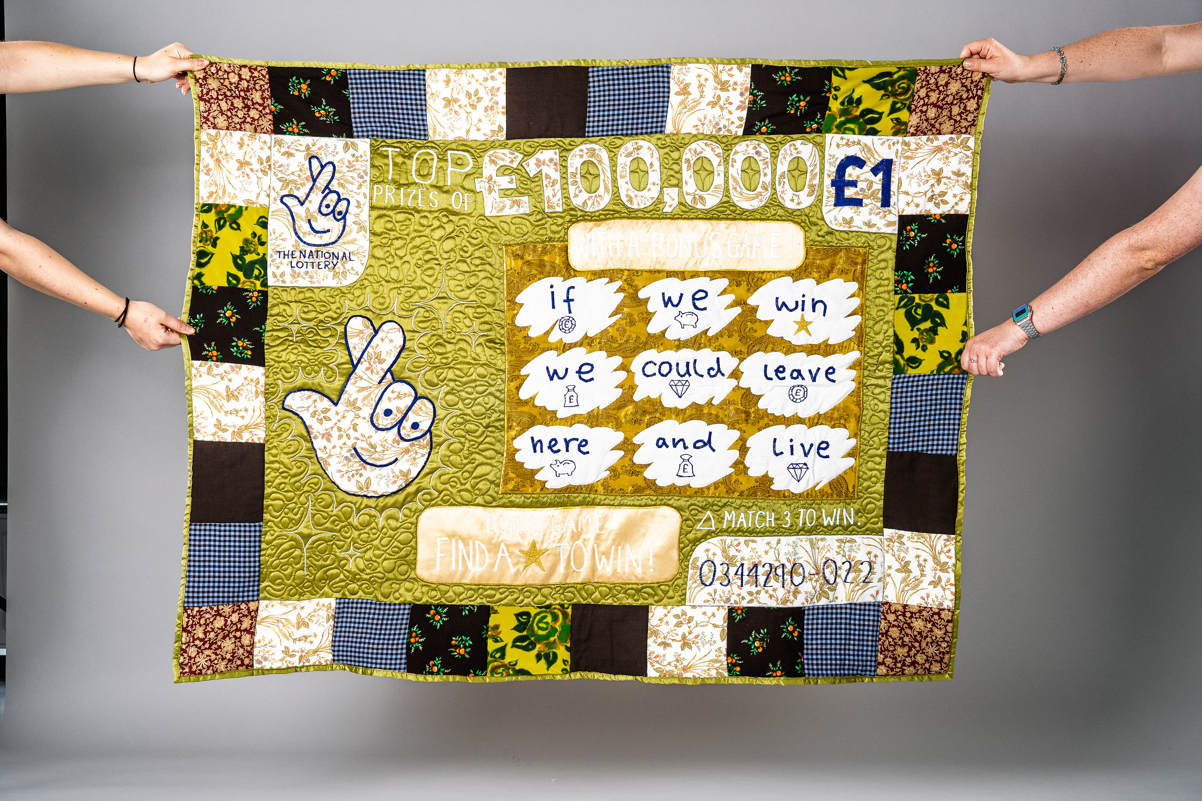
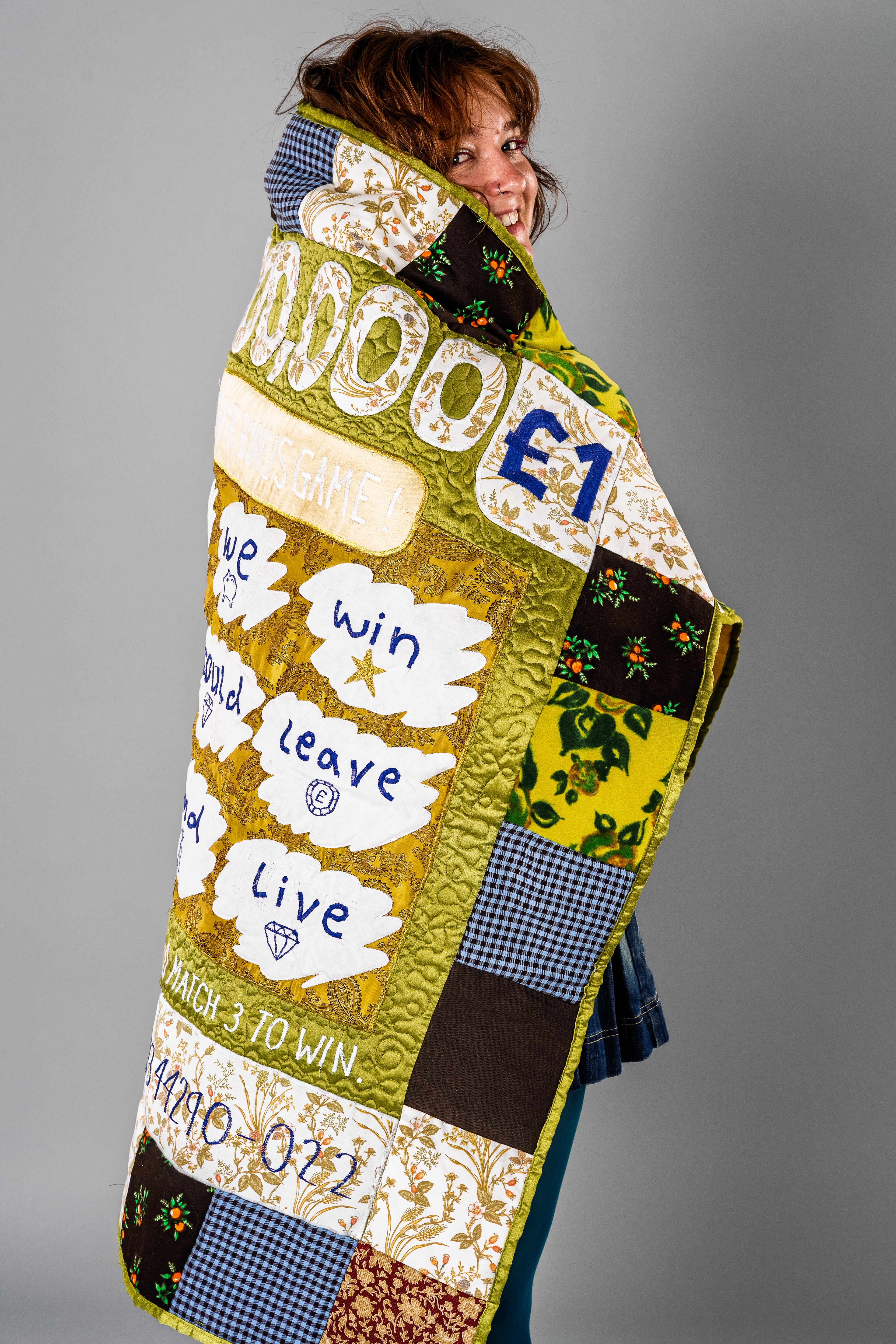
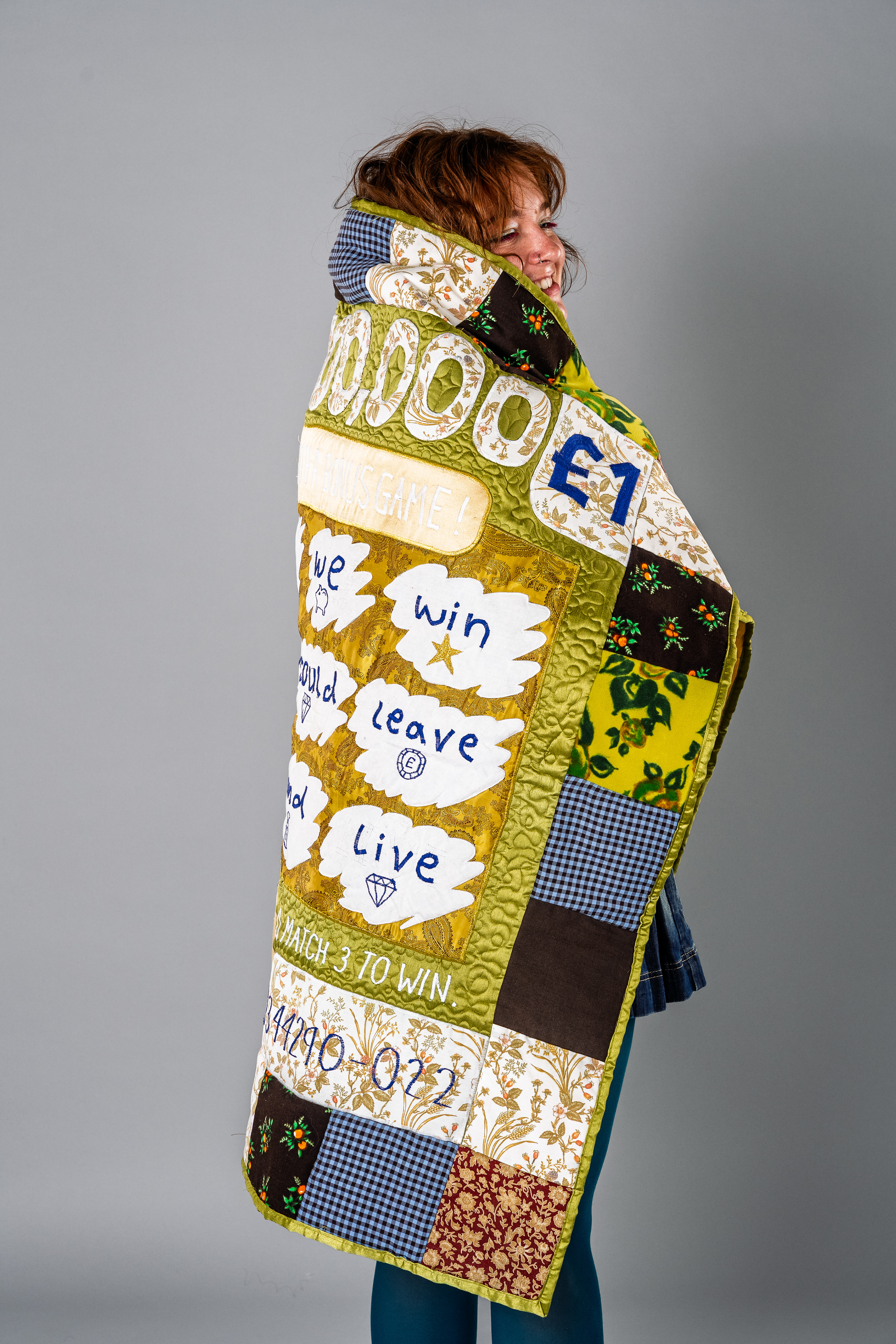
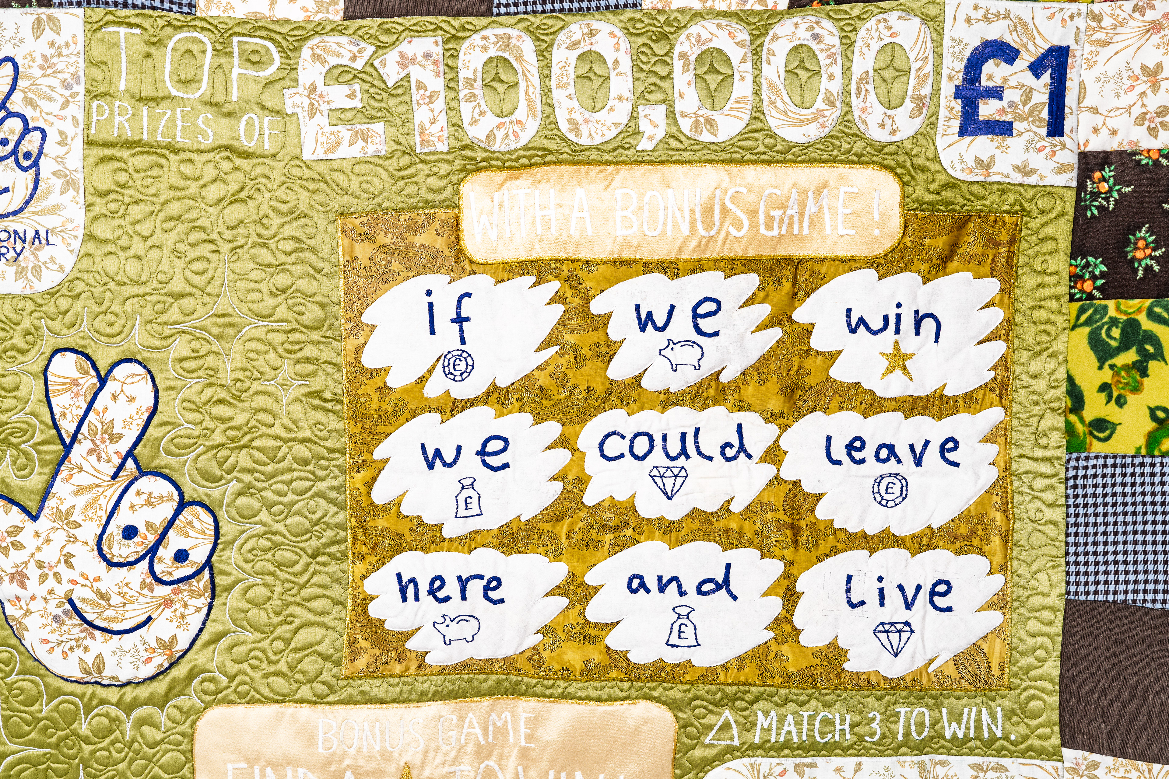
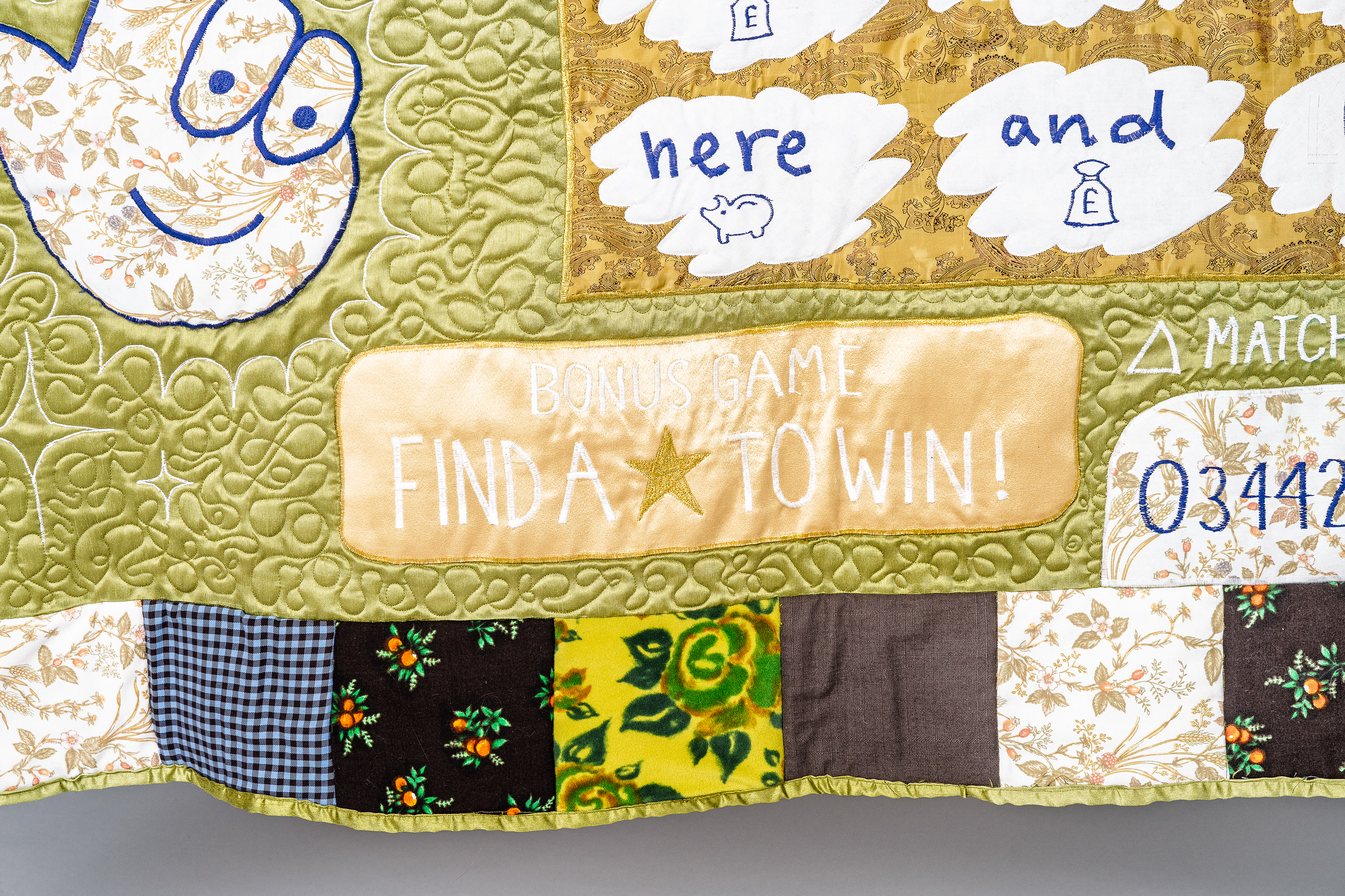
i started planning a scratchcard that had more meaning than just a message. i knew i was going to need specifically a nine word sentence so i had to do lots of scribbling to figure it out. i also wanted the scratch card to function, like you could actually reveal the numbers so people were put in the situation of waiting to see what it said, like someone waiting to win. i decided magnets were the easiest and least likely to affect the look of the object, because they could be hidden on the inside of the fabric.
i hadn't drawn or painted anything in a while so i mocked up the little scratchcard with the coin to show that the last word is open to interpretation. i love this little painting, i used oil pastel and acrylic ink, and it made me feel better about this idea but if this was impactful then a fabric version would deffo be.
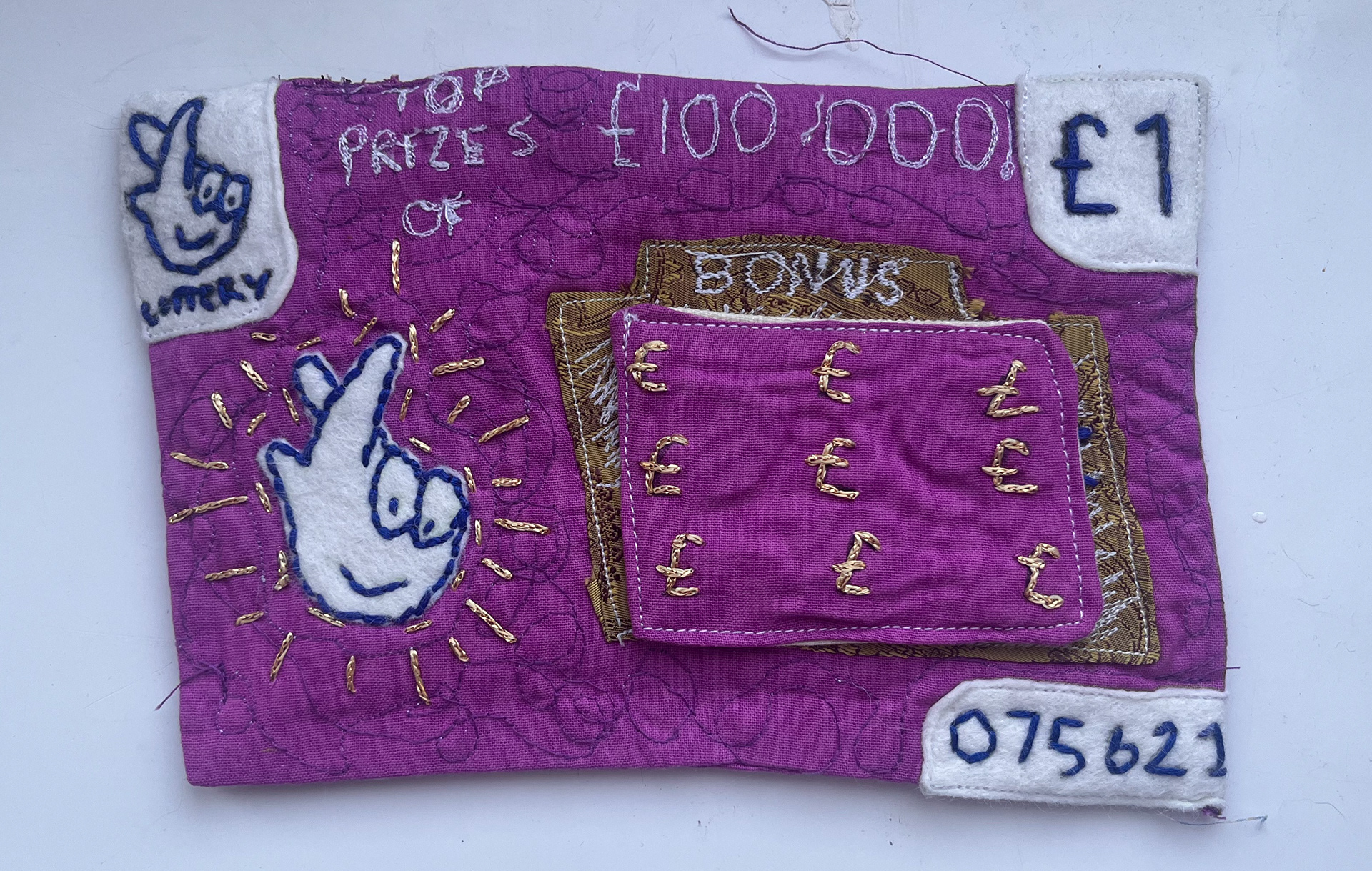
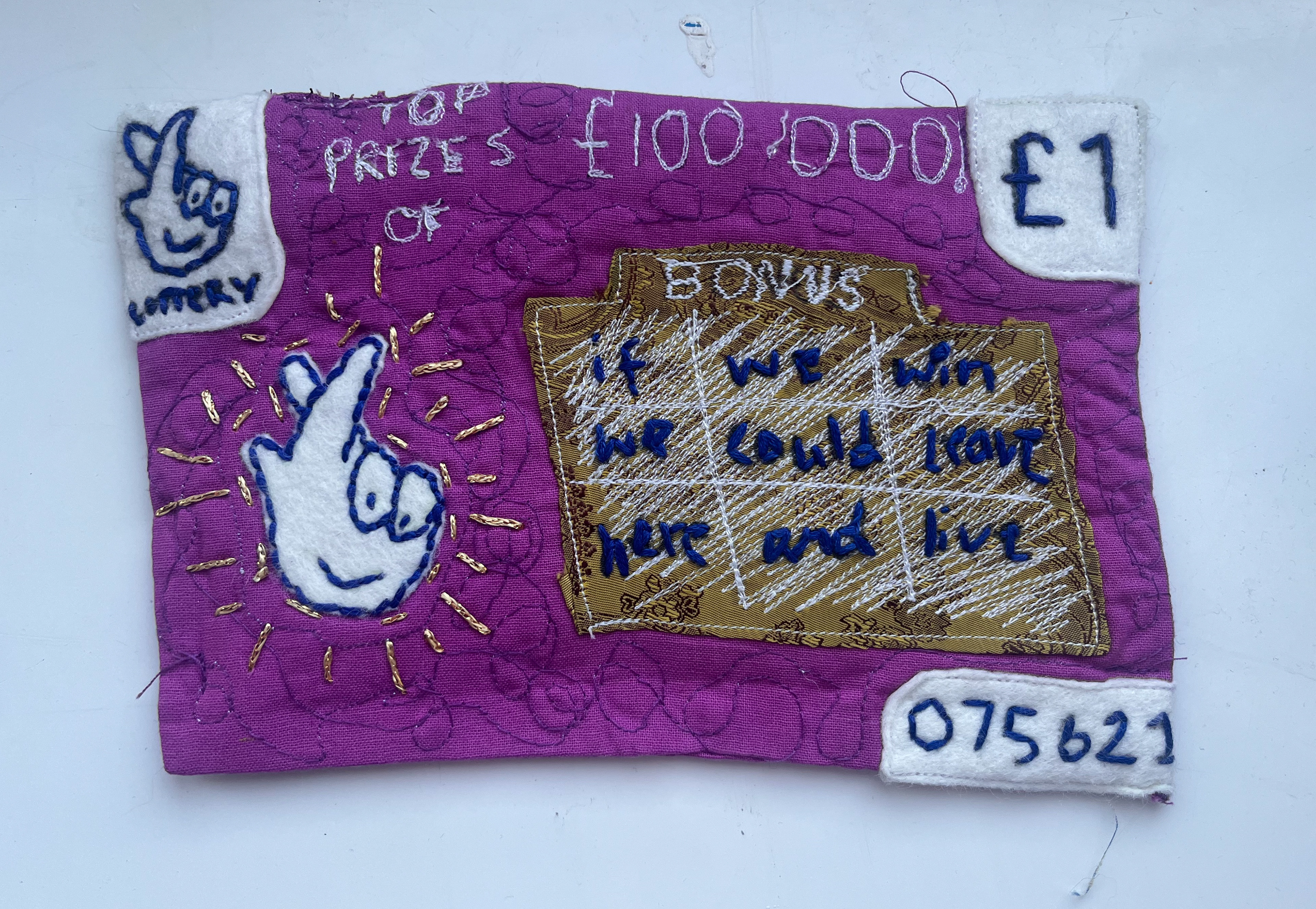
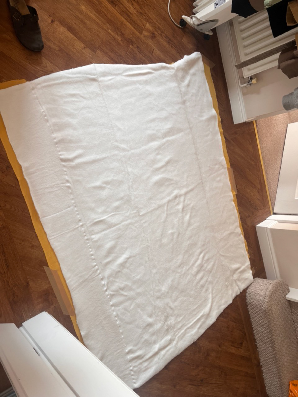
this was my first attempt at making a fabric scratchcard. take it like a test run. the magnets worked well on this mini version, but if i was to make a bigger one i would put a magnet in each box so that it was a gradual reveal. you can tell from this i have no fucking clue on how to quilt something, so if i am going down the big tapestry/quilt route im going to have to watch lots and lots of quilting tutorials :0
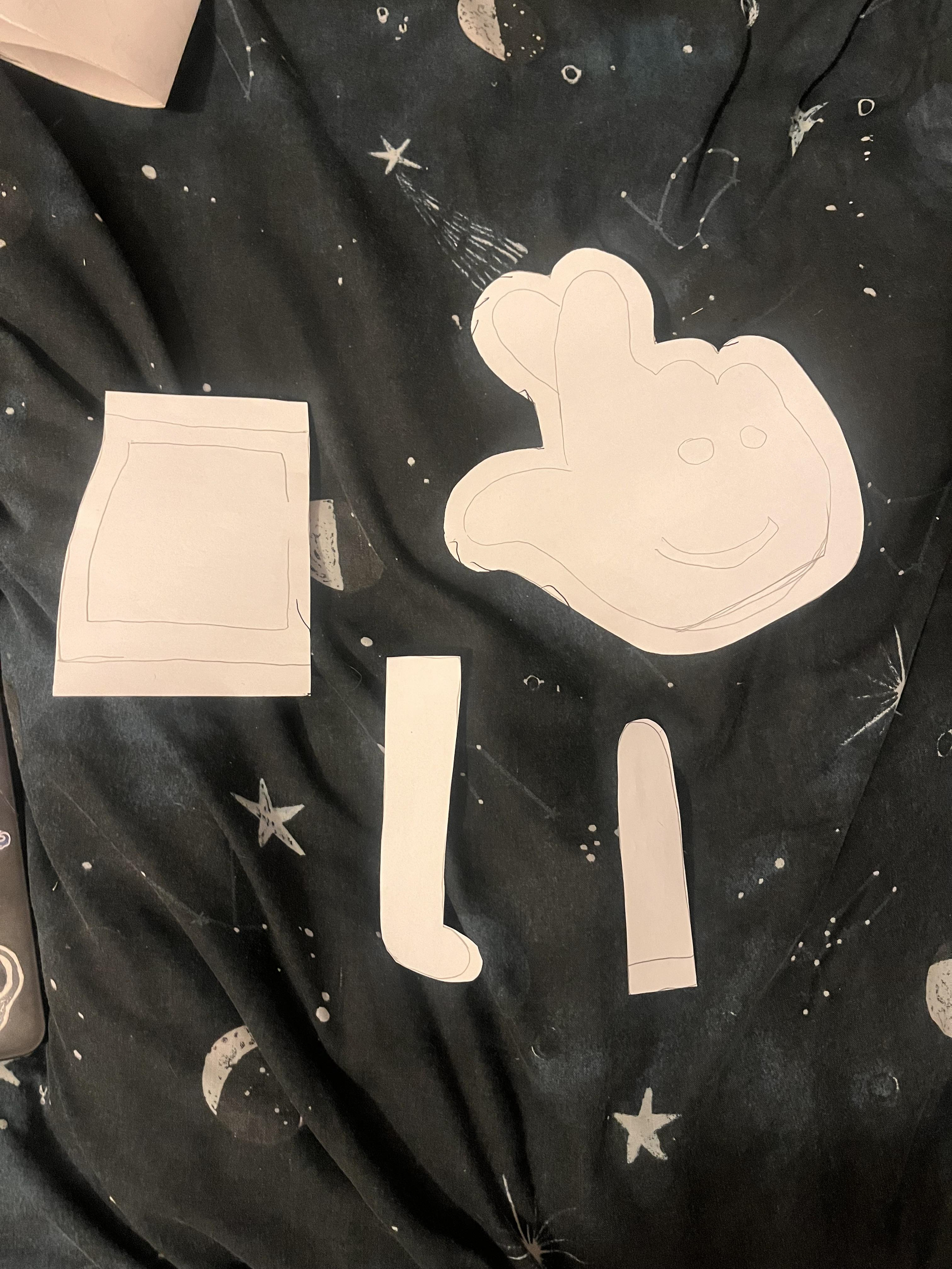
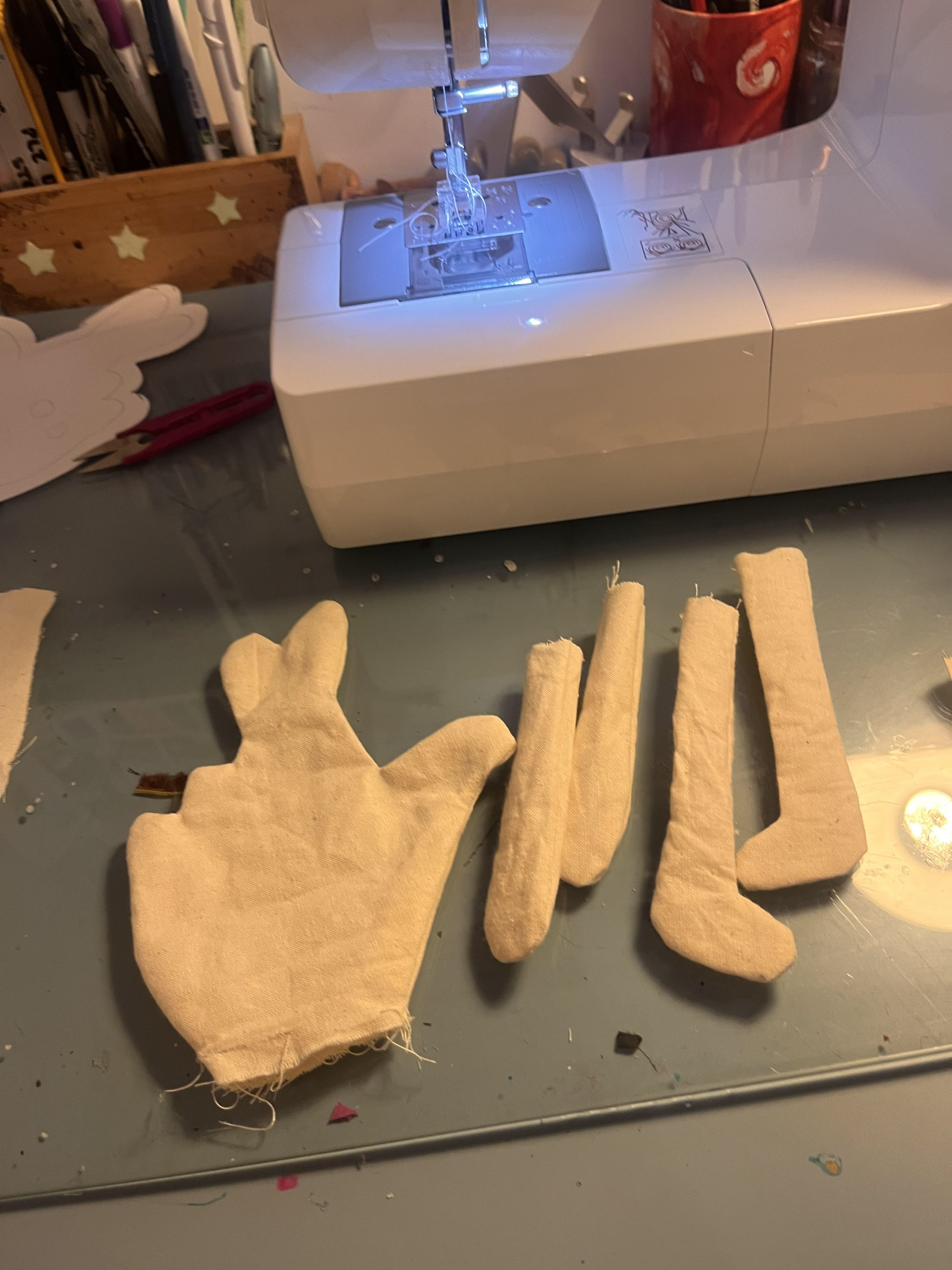
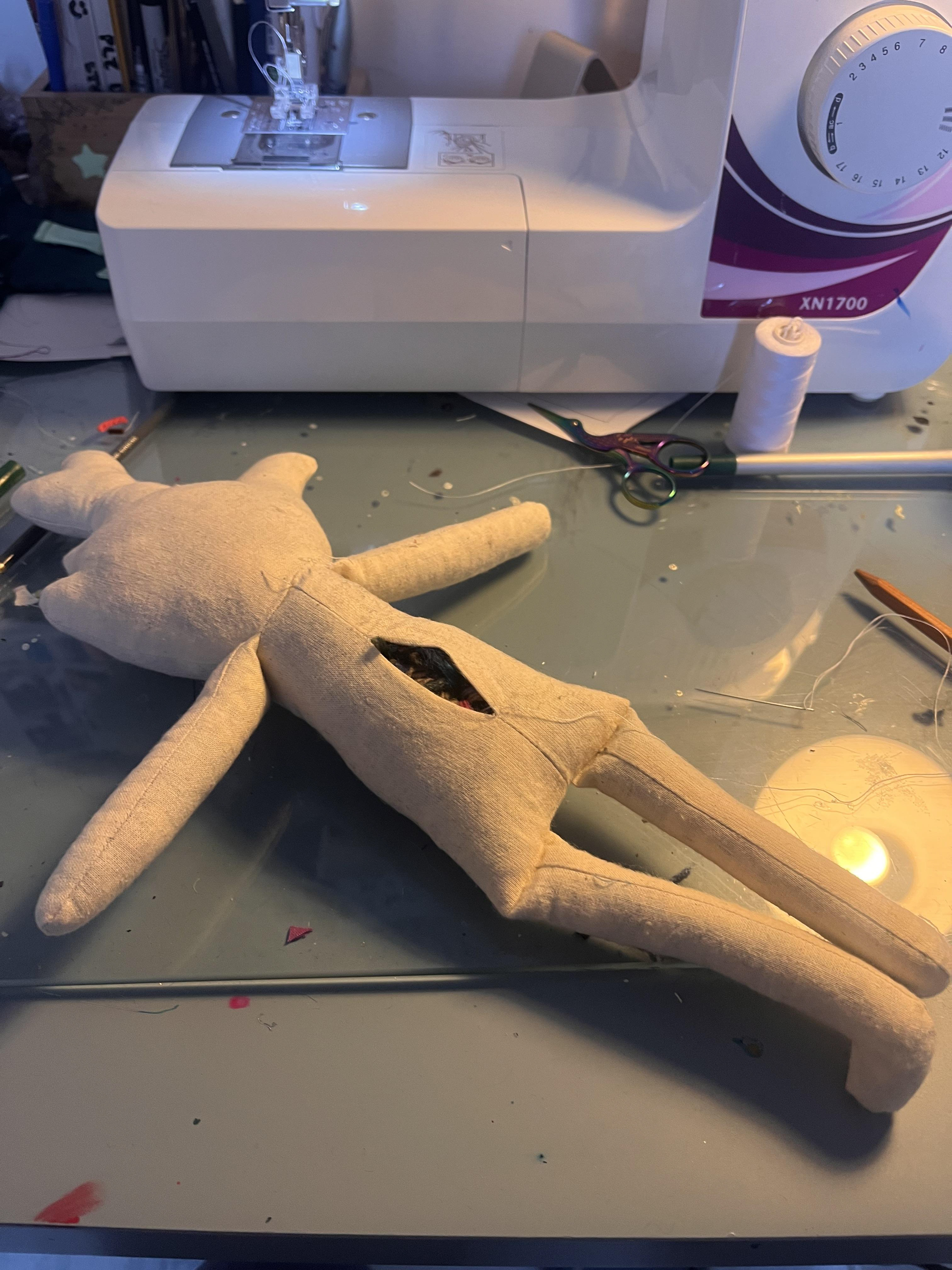
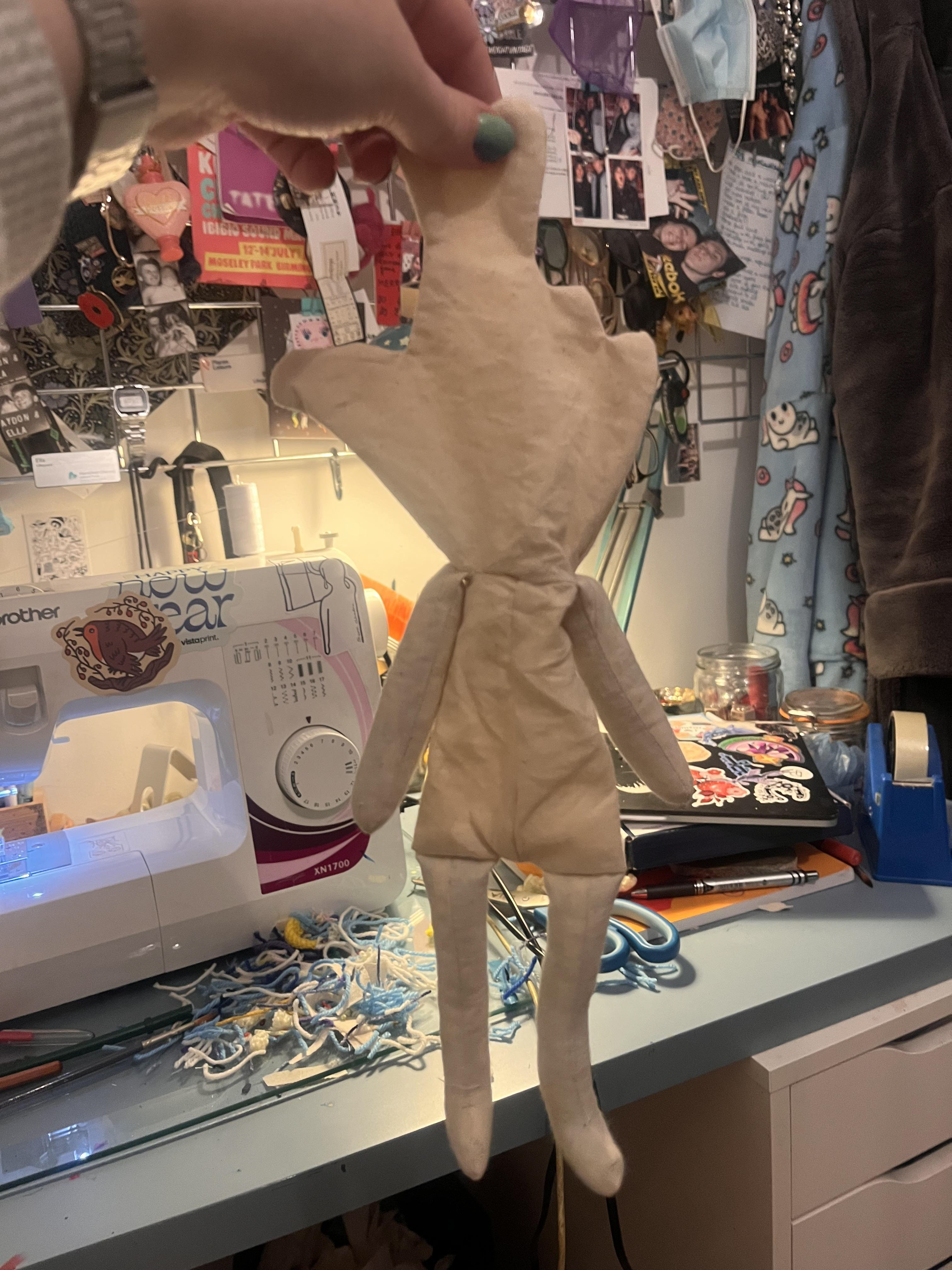
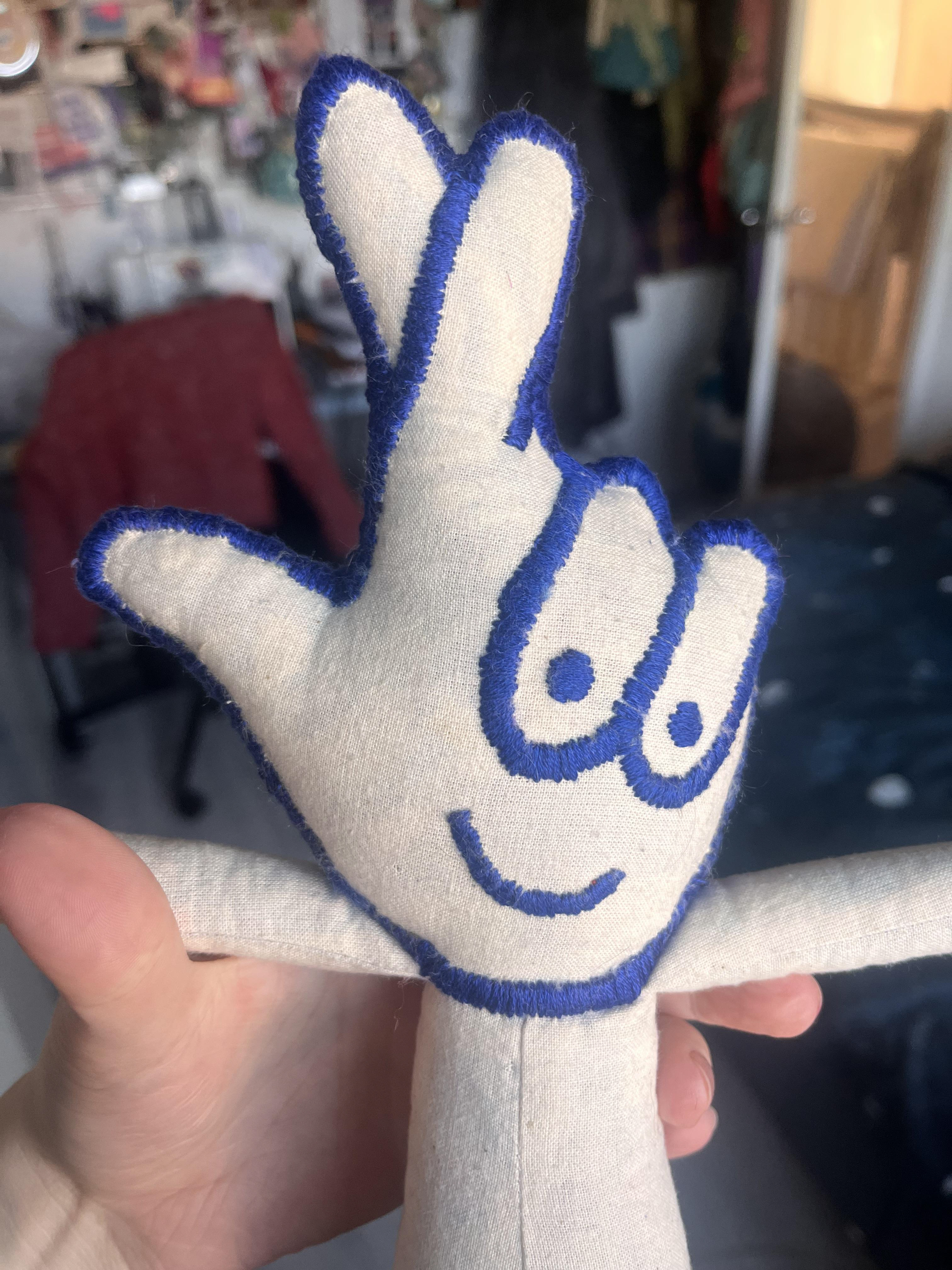
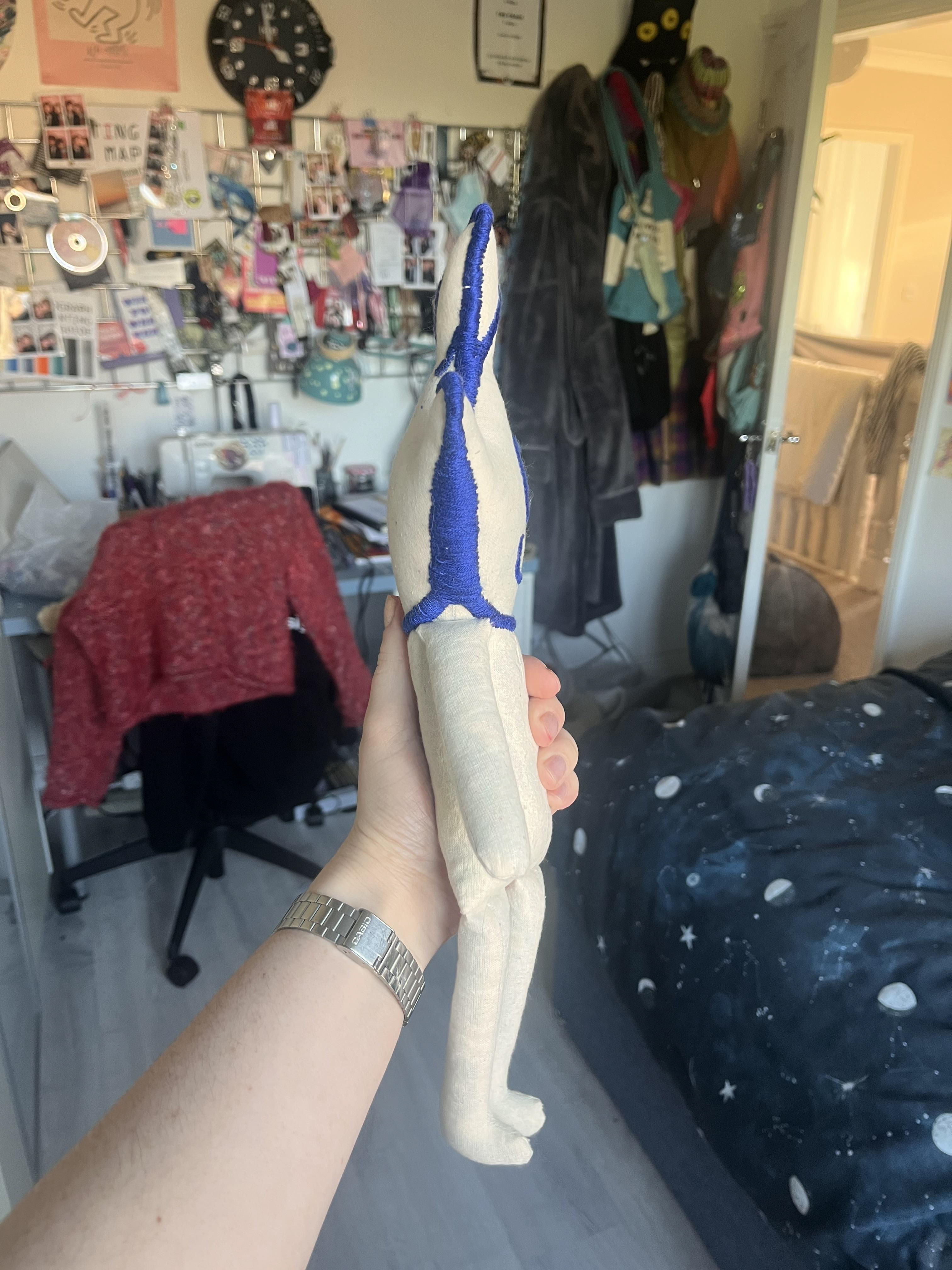
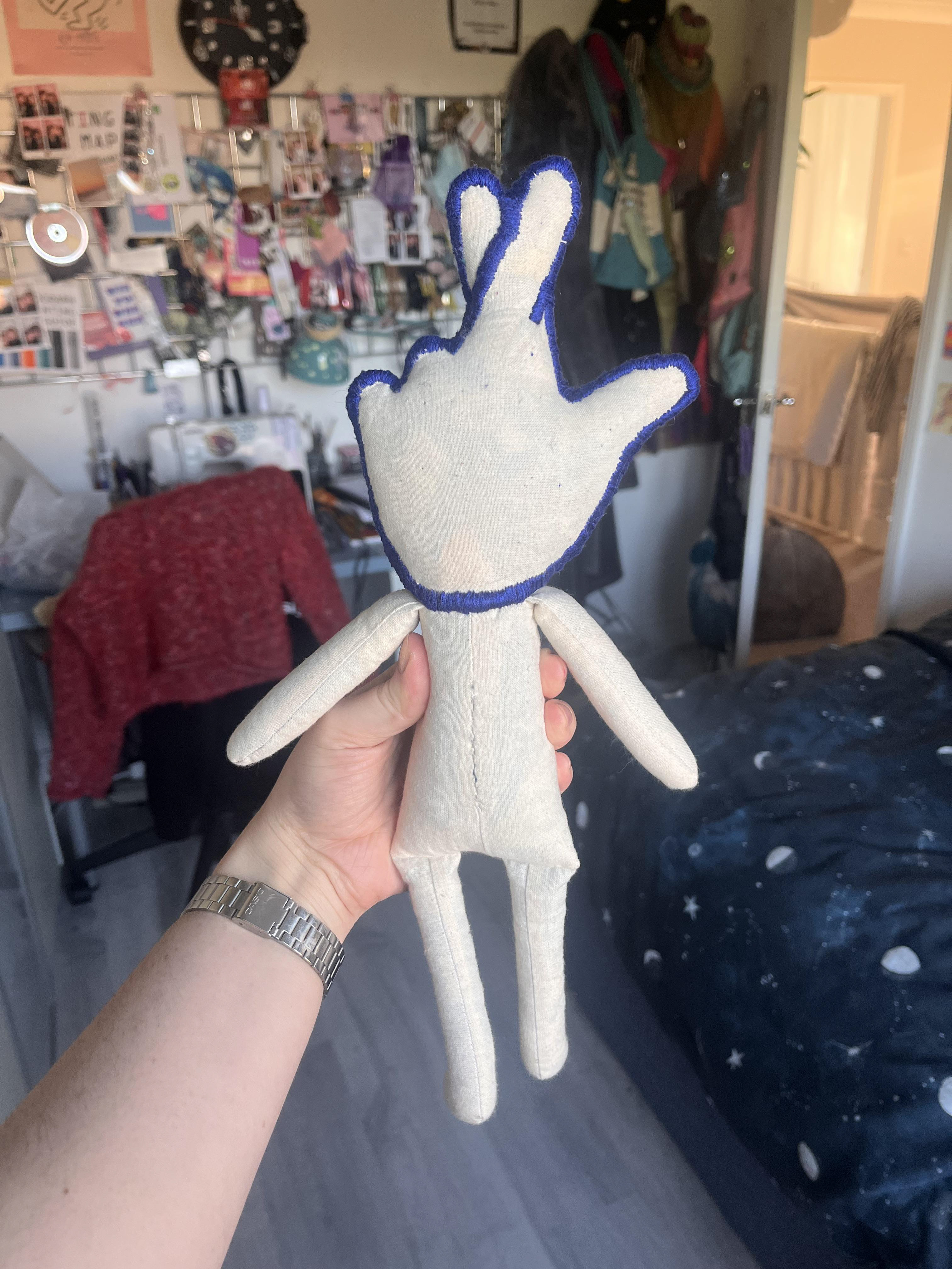
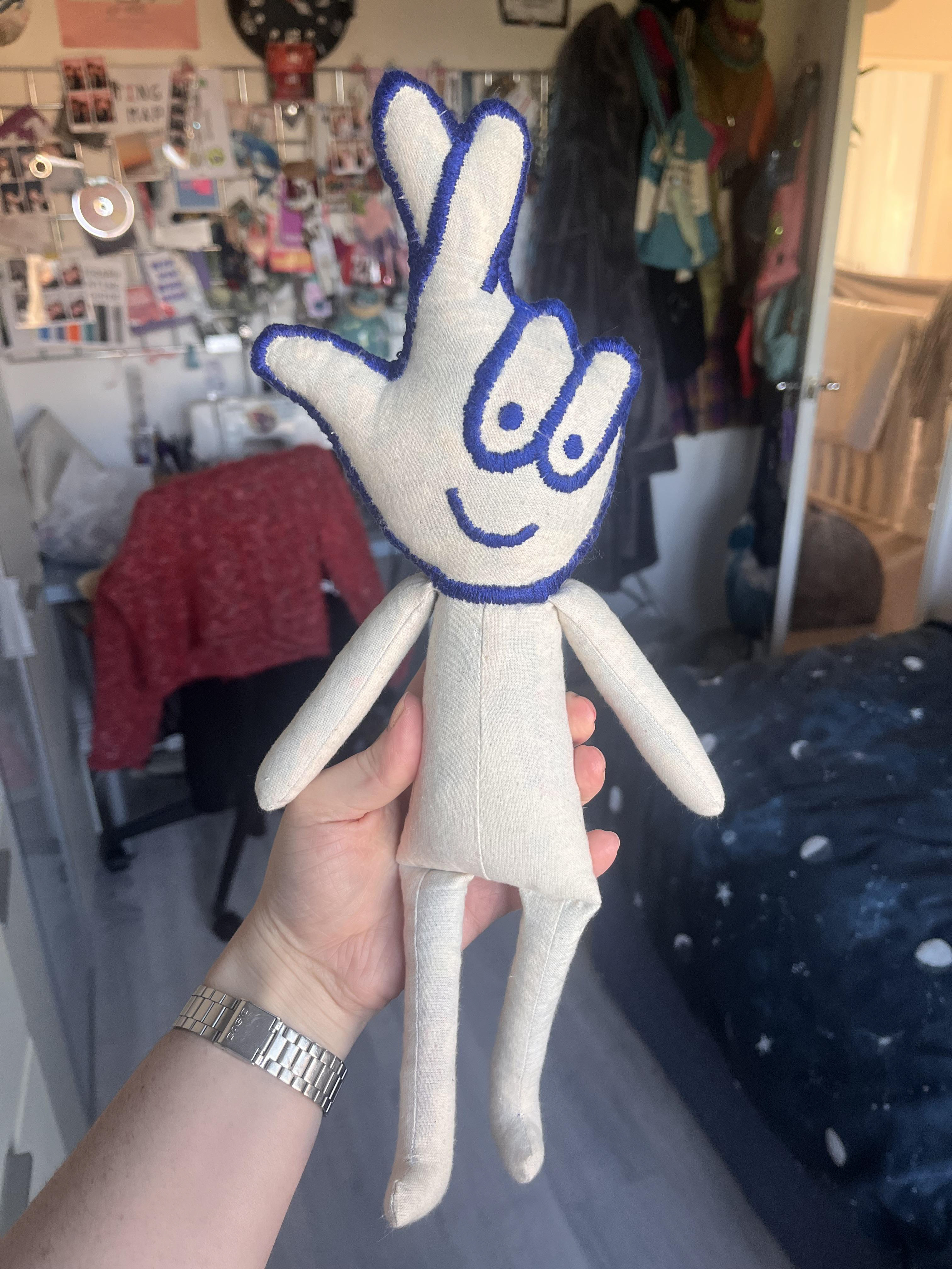
I bought a pattern and made two mice for Ruby and Annie. This opened up an entirely new kind of sewing that I had never done before. I understood the construction of a toy, and I've been wanting to make a toy or a teddy bear but wasn’t sure how. It just seemed to link up really well now that I knew the basics, so I made a toy of the Lotto logo
I want to make a toy because I think it hits the hopeful note on a miserable topic. I like the idea of reflecting people’s childlike dreams and fantasies, and the nostalgia you feel when you're a child—even though you didn’t really understand it at the time. Like people loving Barbies when they were little and then striving to be tall and blonde and thin but still having a deep connection with those toys they loved when they were younger. I wanted to capture that feeling of bittersweet nostalgia.
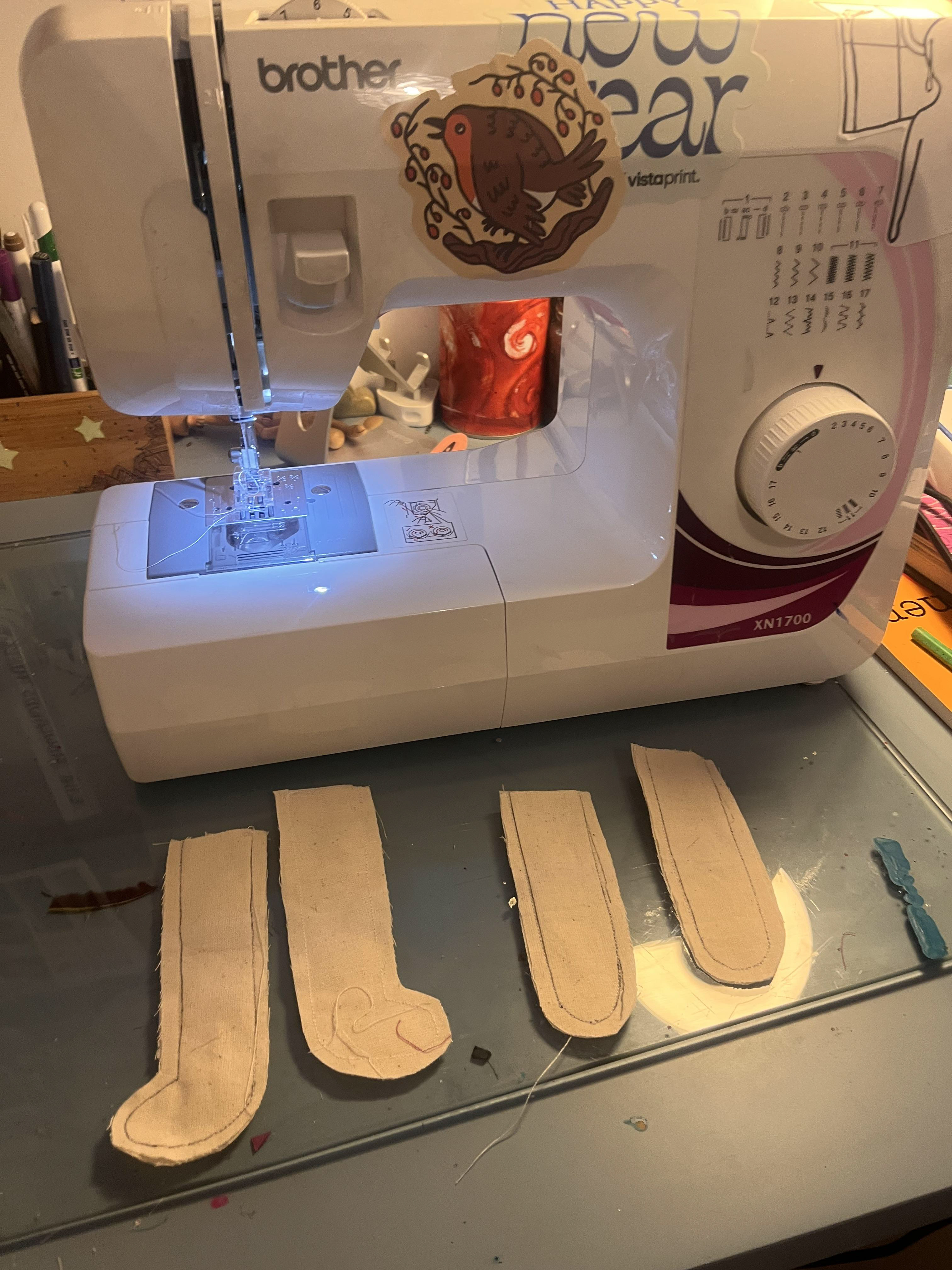
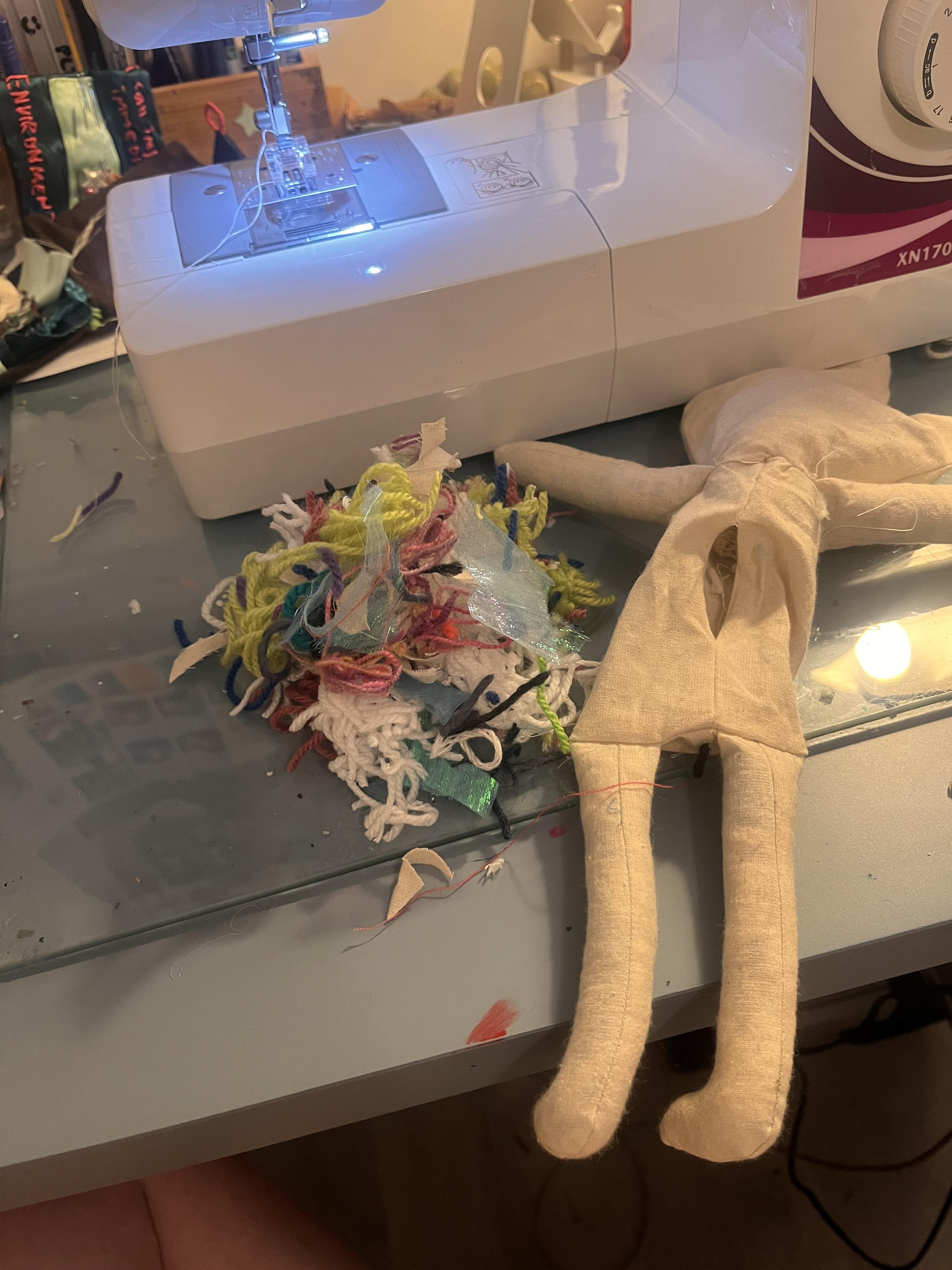
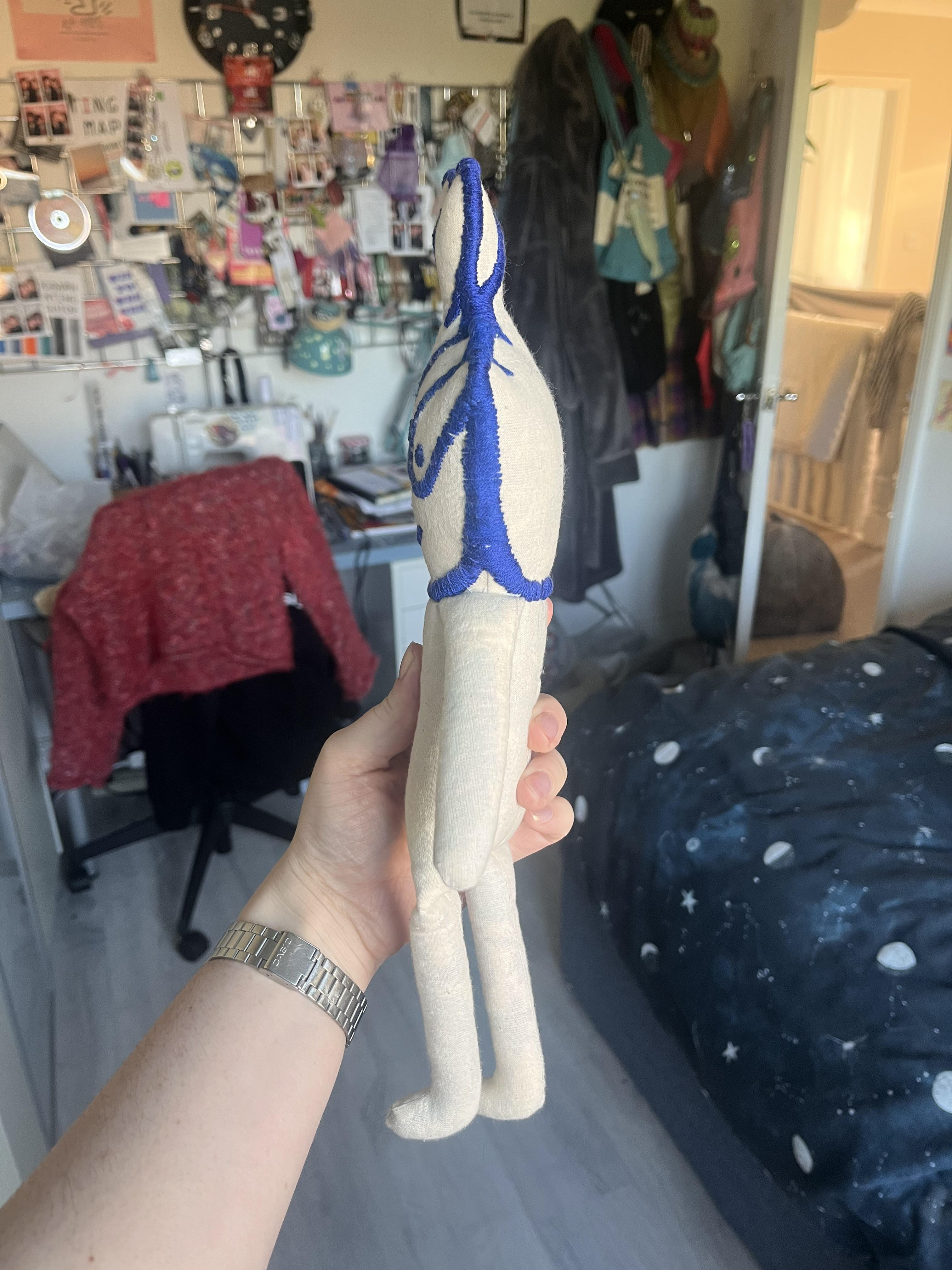
It took a while to make the pattern because, on the mice I previously made, the heads were part of the pattern, and the seam ran all the way along from the body, along the front of the face, and around the back. For this one, I had to make the head separately and then find a way to join it because the seams had to be in different places for the head and the body. That was a challenge because my normal sewing machine isn’t specifically made for toy-making, so it got a little fiddly. I ran my fingers over a couple of times :(
I wanted to use plain, cheap linen because I didn’t want it to look mass-produced. If I had wanted a polished finish like something from a factory, I would have used bright white cotton. But I think the linen was recycled from past projects, possibly from working-class women of the '80s and '90s. They probably worked with the fabric scraps I was using. I also wanted to use old wool scraps and fabric scraps to stuff it, because the linen is slightly sheer, and you can see the patterns of the yarn and the fabrics underneath. It gives it a mottled look, almost a little bit iridescent.
i used satin stitch for the embroidery because its neat enough that the toy looks finished, but it still has enough imperfections from human error to make it look homemade. It's also the easiest way to make it look like something else because it replicates the the lines of the logo the best.
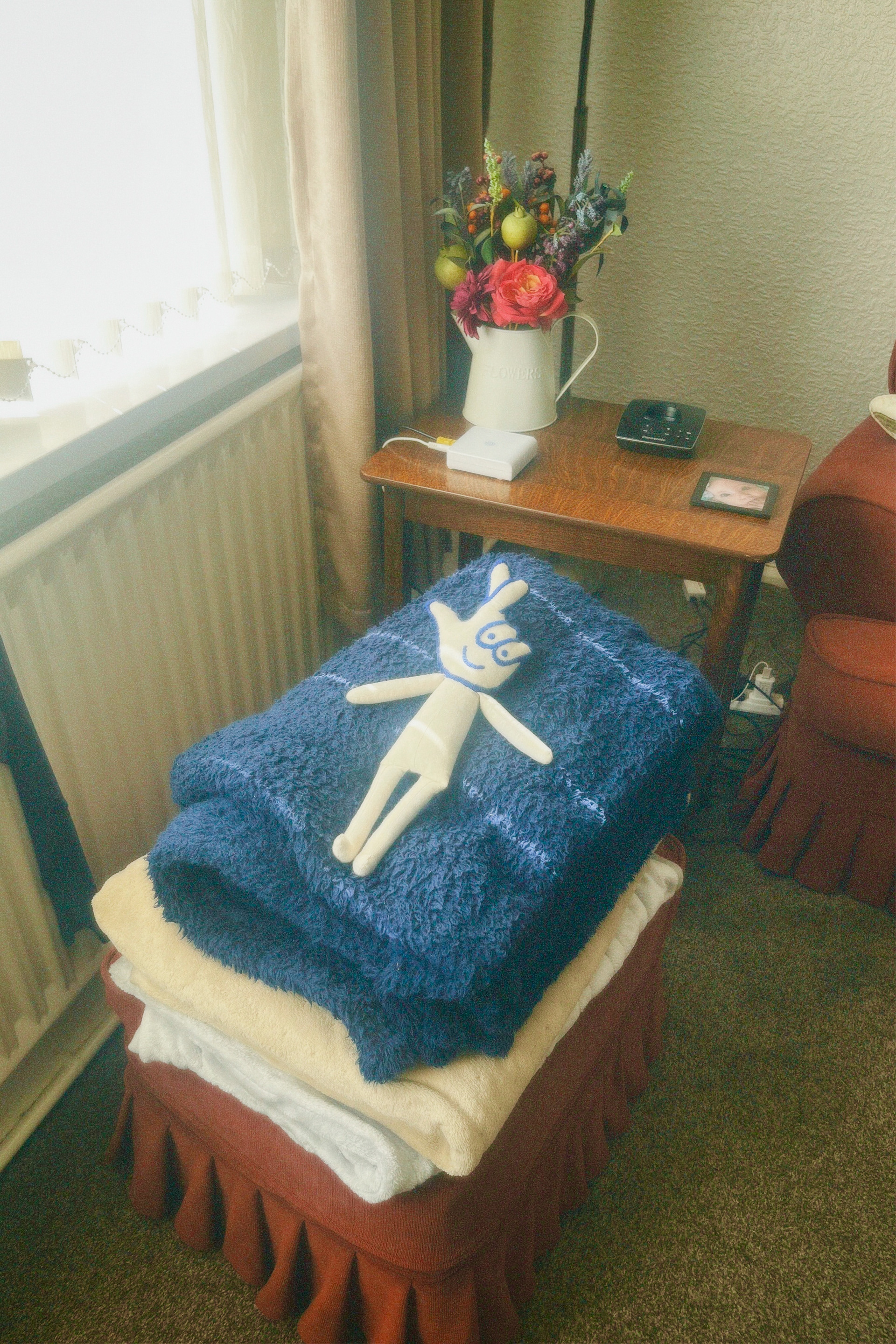
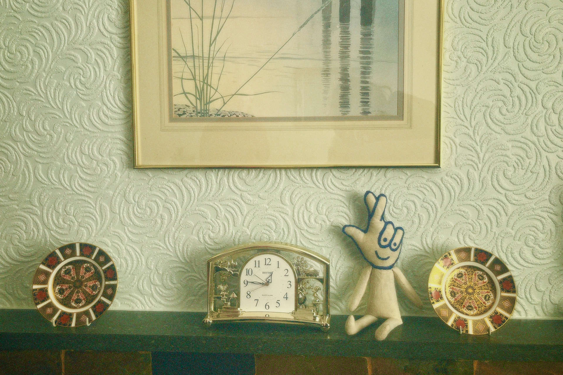
I’m planning on making Lotto Man a little jumper for something to make him look loved. I’m planning on doing a photoshoot at my mama's house, and I can imagine him sitting on the bed with a little homemade jumper on, one that I’ll probably knit. I think it’ll get across the idea that the fantasy of winning the national lottery is treasured, as opposed to just being owned.
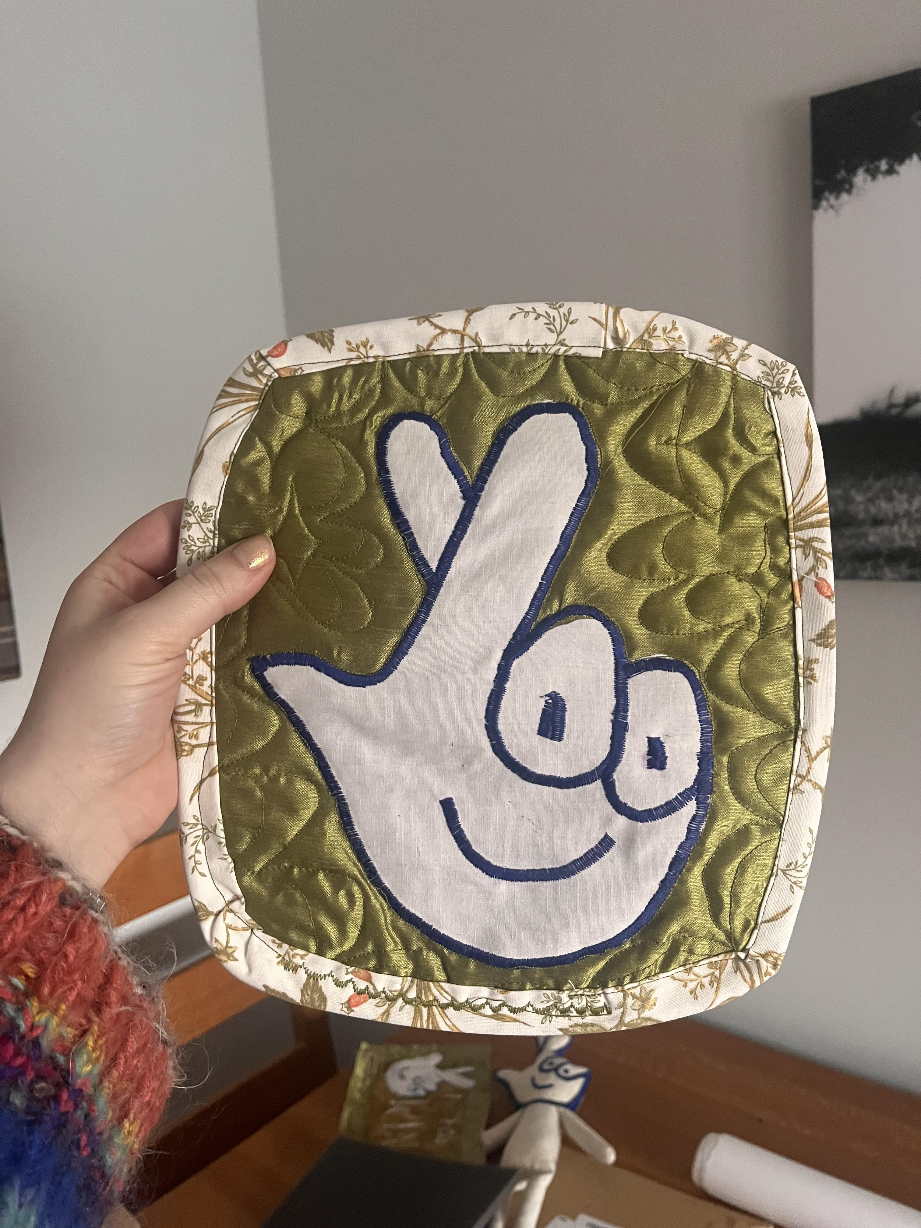
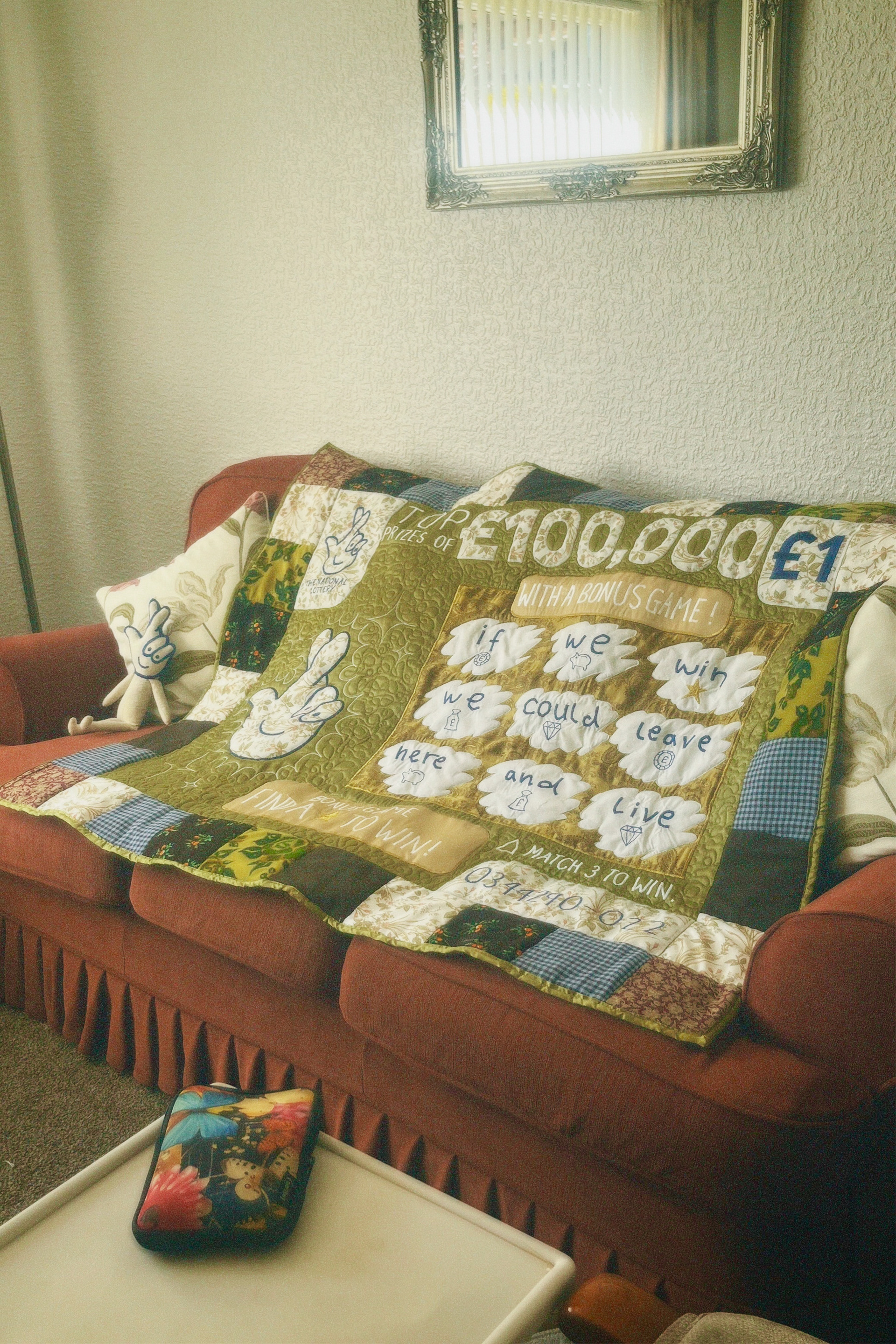
when i started the year i wanted to make a big tapestry and making a massive scratchcard quilt fulfills that DREAM sadly ive never made a quilt before and have no idea how to do it so i had to do LOTS of research and watch lots of videos. luckily its more common sense than learning a new skill, its just learning how to use new features on my sewing machine and using it in a different way. im definitely going to be using the shimmery green fabric because i have lots of it (its a pair of curtains from the charity shop) and because i l o v e how the light catches it when its quilted it looks like a rippling pond. i think for the quilted squares around the edge im going to use a mixture of a couple different fabrics, some patterned some plain. i want it to be a mish mash so that it looks like a real quilt made from scraps. the backing fabric won't be purple either, i'm going to dye it once i've made the quilt top so i can match it to the colour i think suits the whole quilt the best.


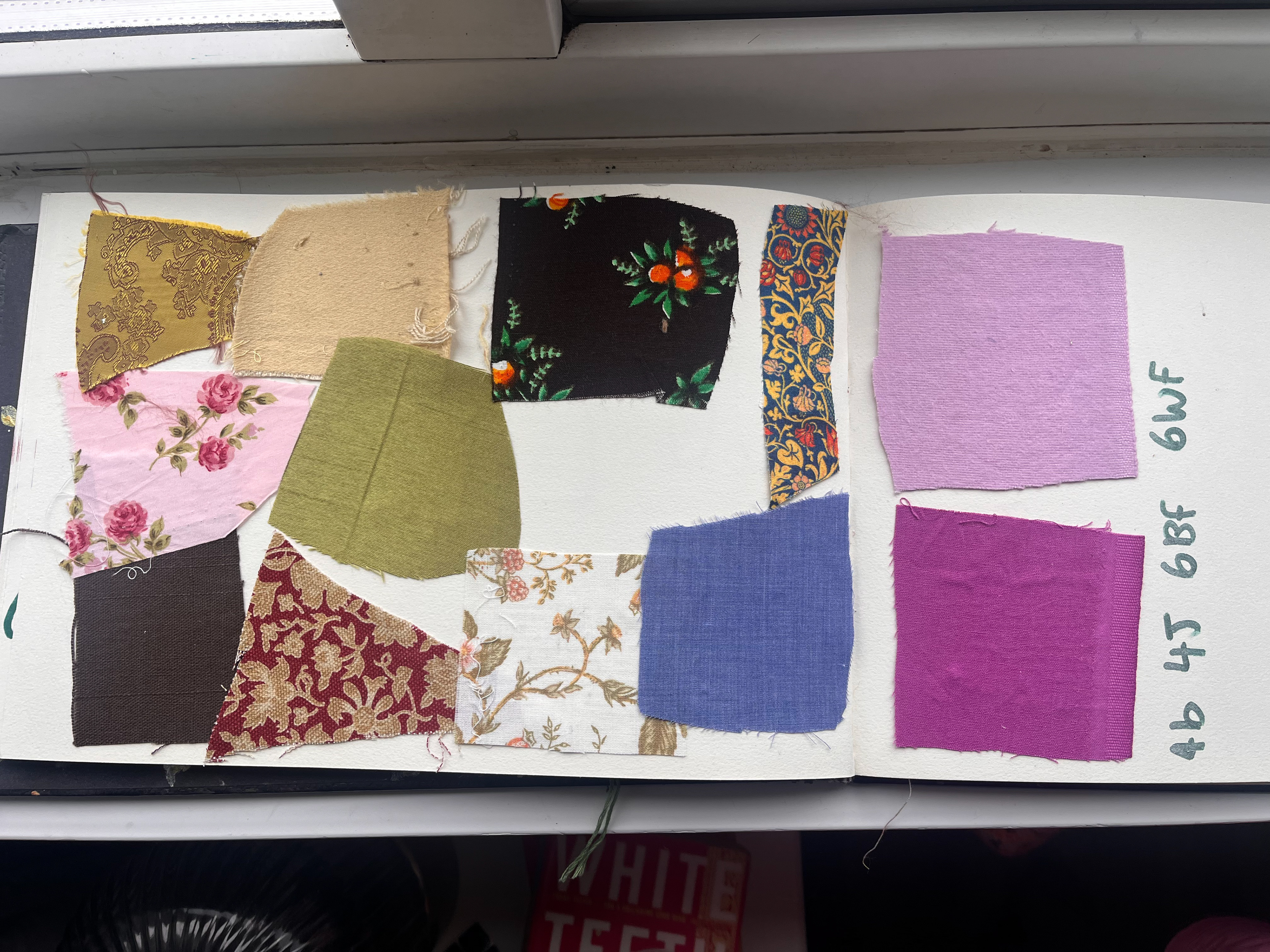
i took a long time picking the colours because I want to the whole quilt to look cohesive while also having a scrappy enough of mix pattern and texture it to make it seem home-made. I played around with pinks and purple a lot but I found that all the greens, browns and reds fit where I would be taking the pictures better because they're the colours that my mamas interior walls are. I also had to think a lot about texture I don't want the quote to be to stiff and I needed it to be light enough to be able to drape like a normal quilt. I also needed fabrics that worked well with the shiny curtain fabric that I used for my test run because I loved how that material caught the light once it was quited.
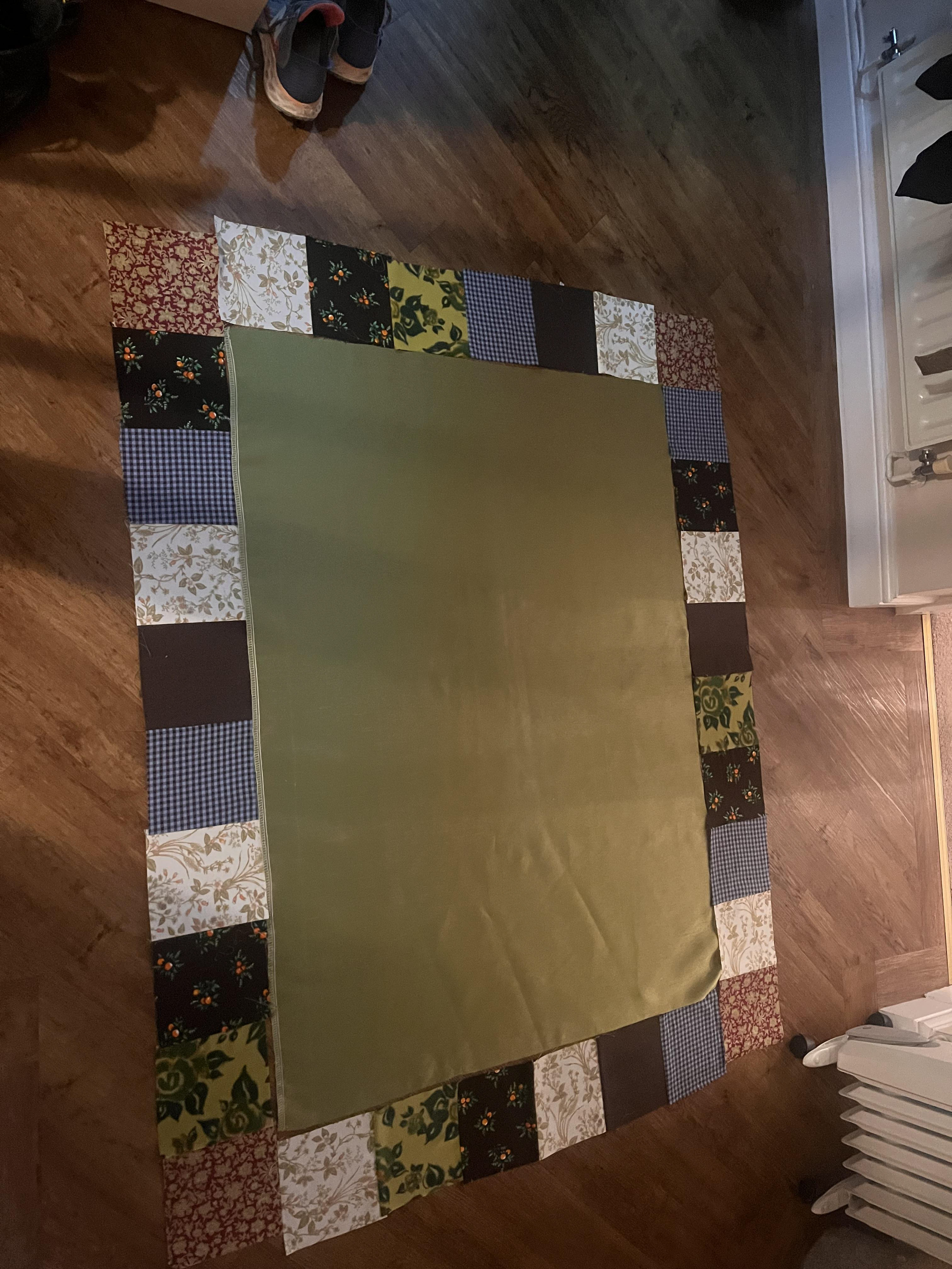
this part with all the cutting and the squares was an absolutel pisstake because im not big on measuring, but it was REQUIRED and i did enjoy organising all the square combos to get the best final result. the lovely green velvet was a nightmare to work with, so if i was to do this again i would DEFINITELY not use it in a quilt but the texture is lovely so im willing to sacrifice a few of my brain cells for it.
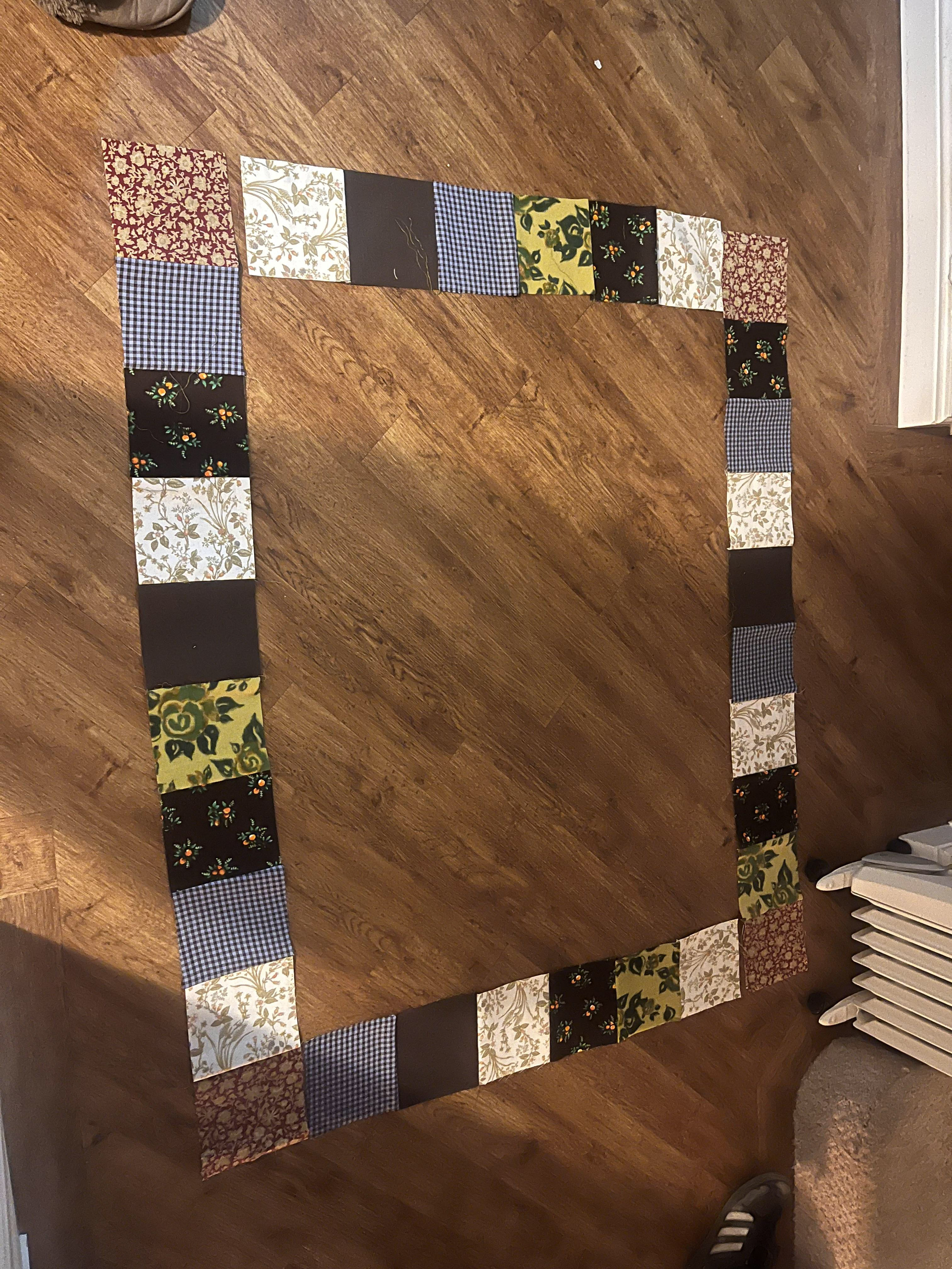
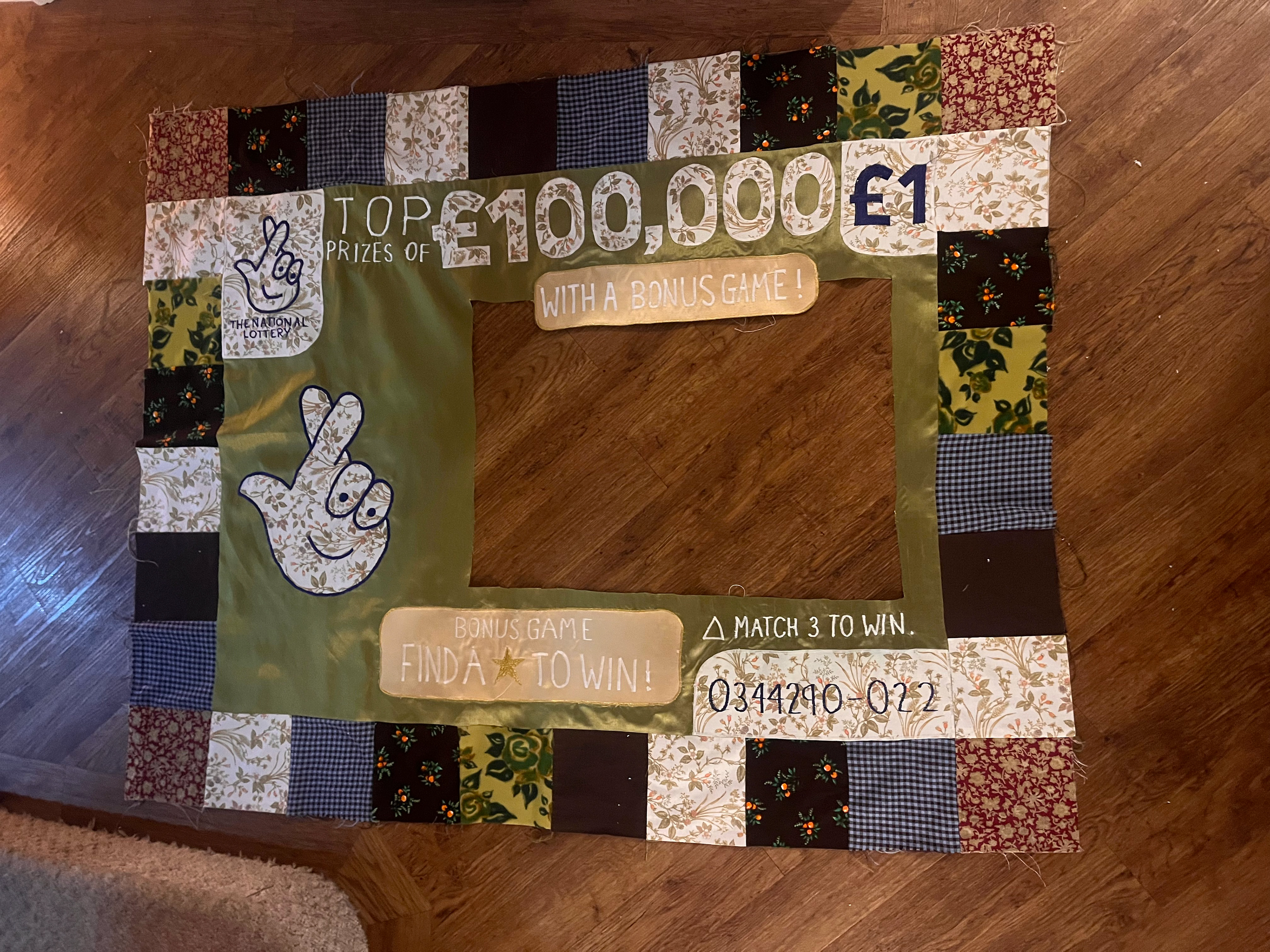
all the fabric i used were second-hand or from the chazza, other than the gold paisley fabric because i needed the to be specific (paisley to reference the fabric mills all through the midlands and yorkshire). the green is from a curtain, light gold is a scrap of pillowcase, white floral is from curtains, and all the little squares are chazza scraps or cut offs from my old clothes.
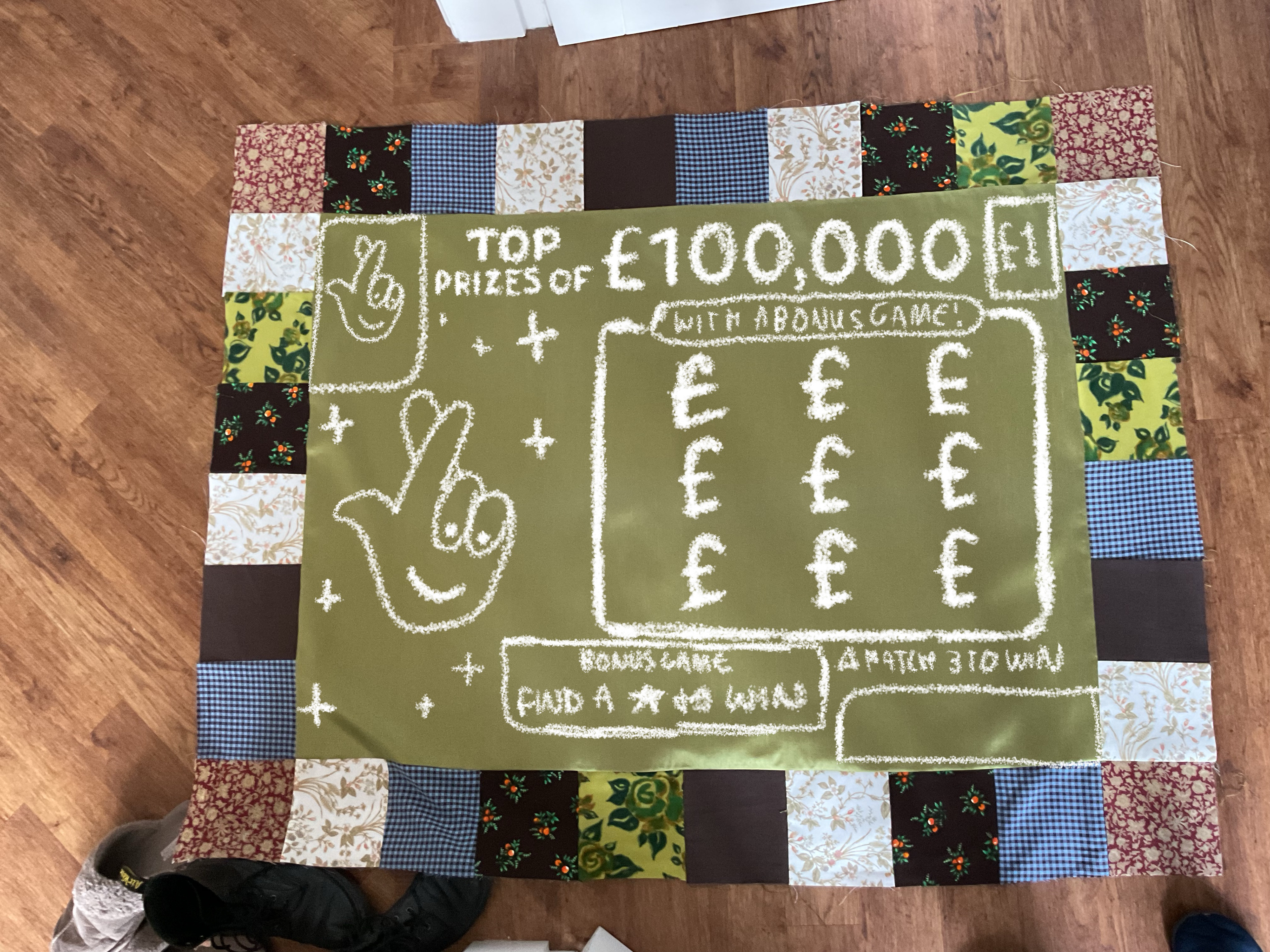
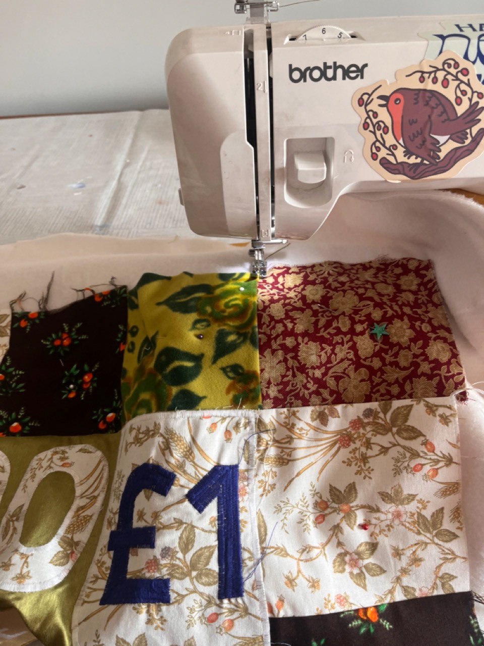
for all the motifs like the logos and the numbers, i used A LOT of iron-on applique paper to attach them to the quilt. the paper is abit like sewing prit-stick that holds the shapes in place while you sew around them without the need for pins, pins can make the fabric all bumpy and are a nightmare. i used the satin stitch on my sewing machine to go around all the edges and to make sure its locked onto the fabric well enough to get through quilting.
had to cut a chunk of my quilt out of the gold HEARTBREAK but i had enough fabric to fix it, and while i prefer the texture of of the embroidered scratches they alter fabric way too much and would ruin the shape and neatness of the quilt :') also the applique version is a lot easier to embroider on top of.
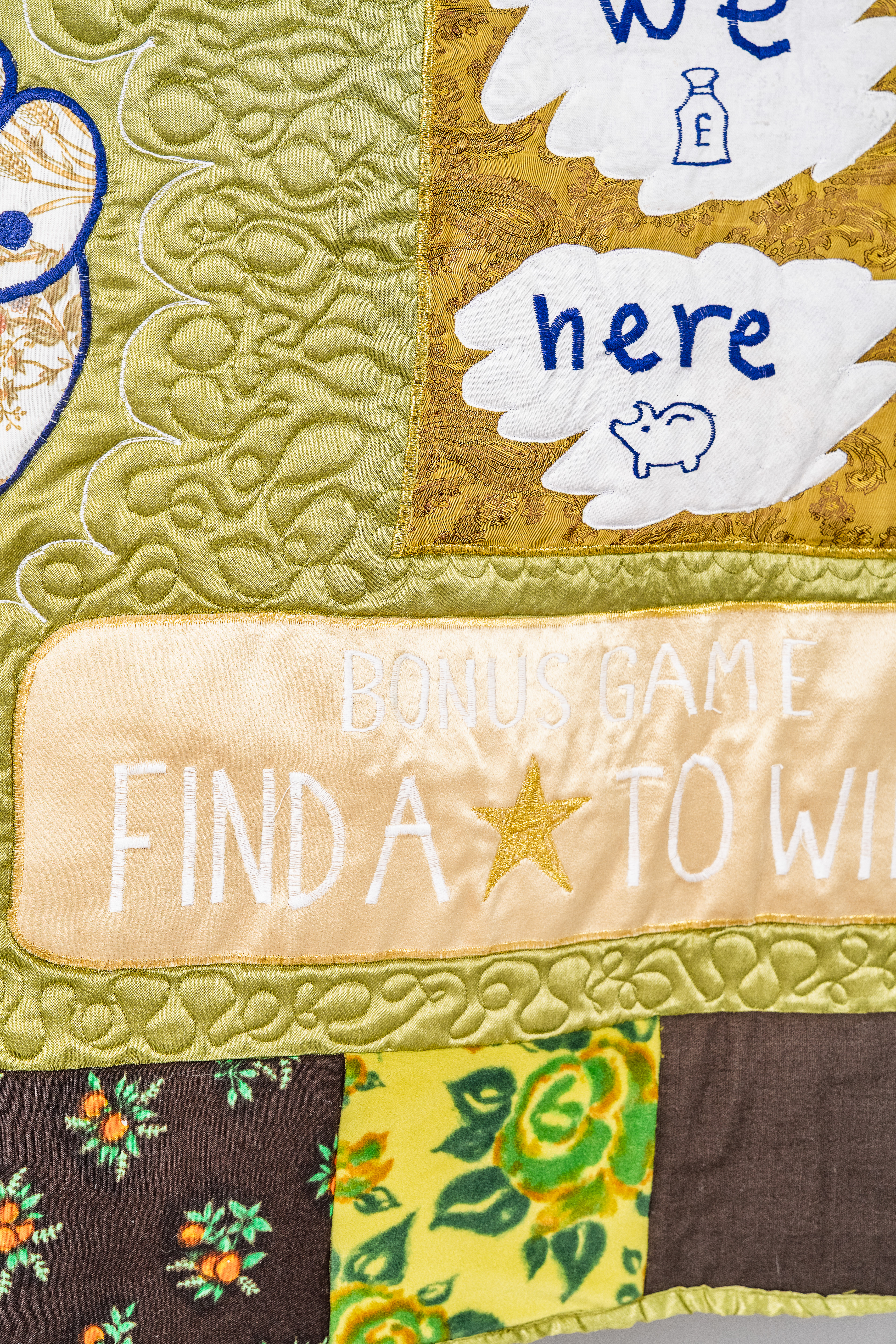
by this point i was feeling s l i g h t l y more chill about the quilt because i knew i had all the fun stuff left to do. doing applique for the scratches makes it much easier to embroider on top of and it doesnt alter the nice silkiness of the gold fabric underneith like when i did them only embroidery. i was also happy with the size of the quilt now because it was big enough to drape over a settee or bed but not too big that it was hard to take the whole thing into your brain at once.
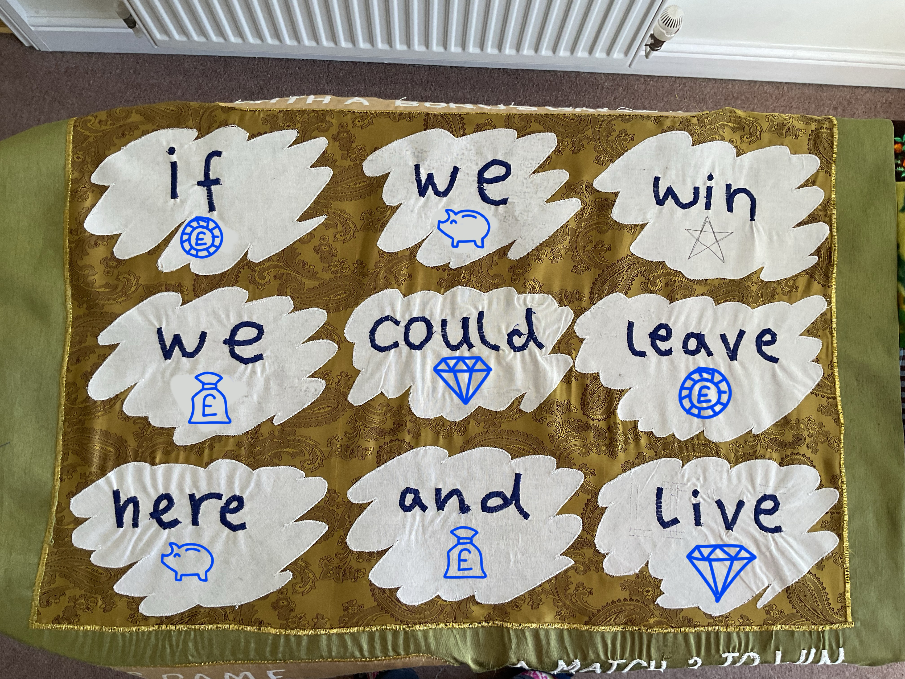
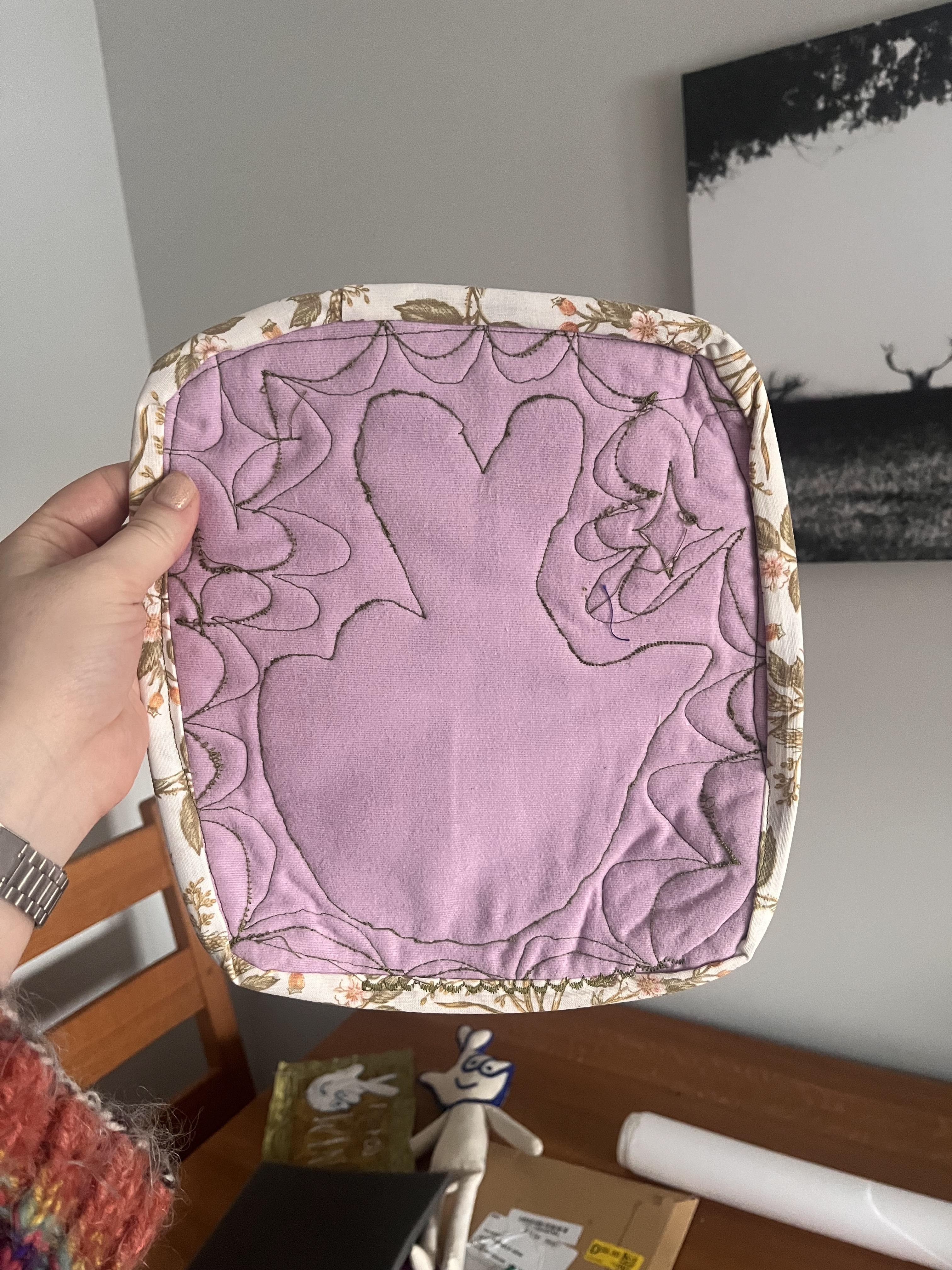
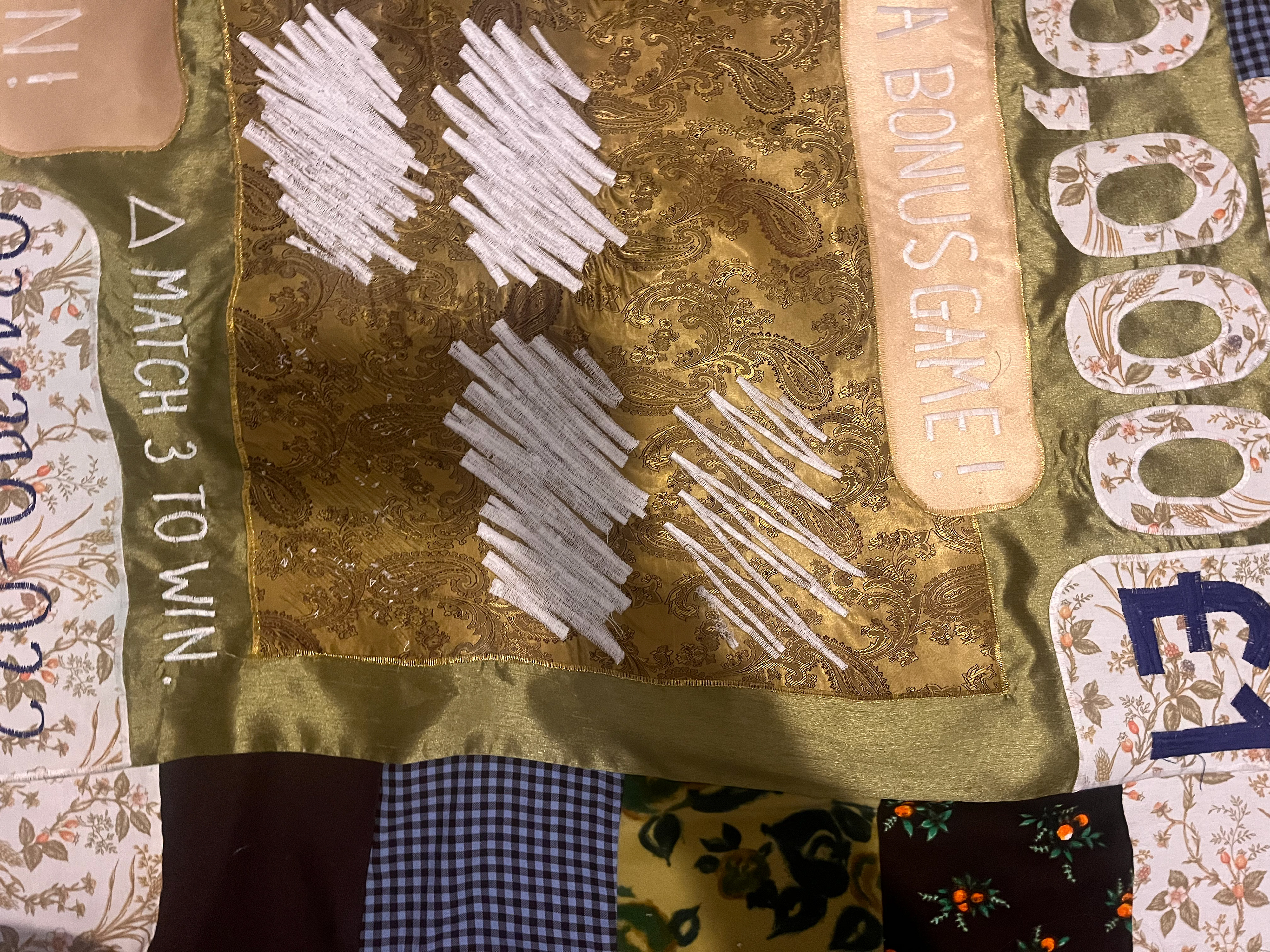
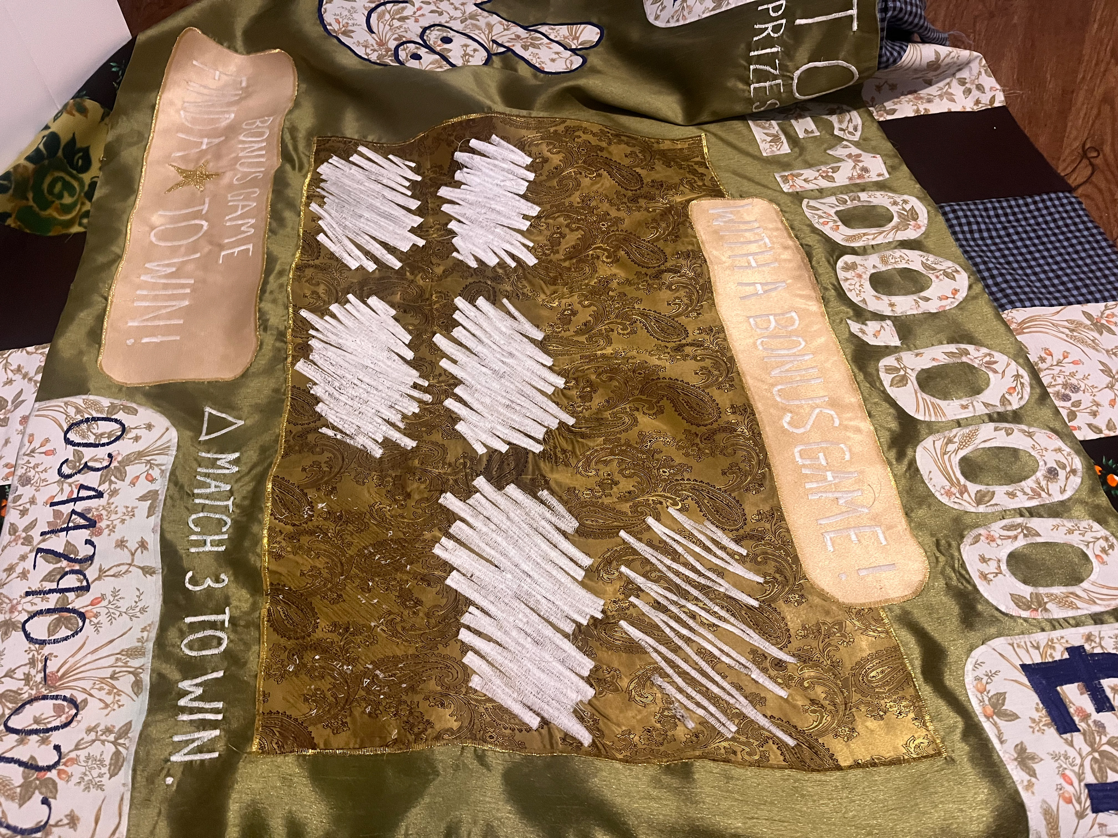
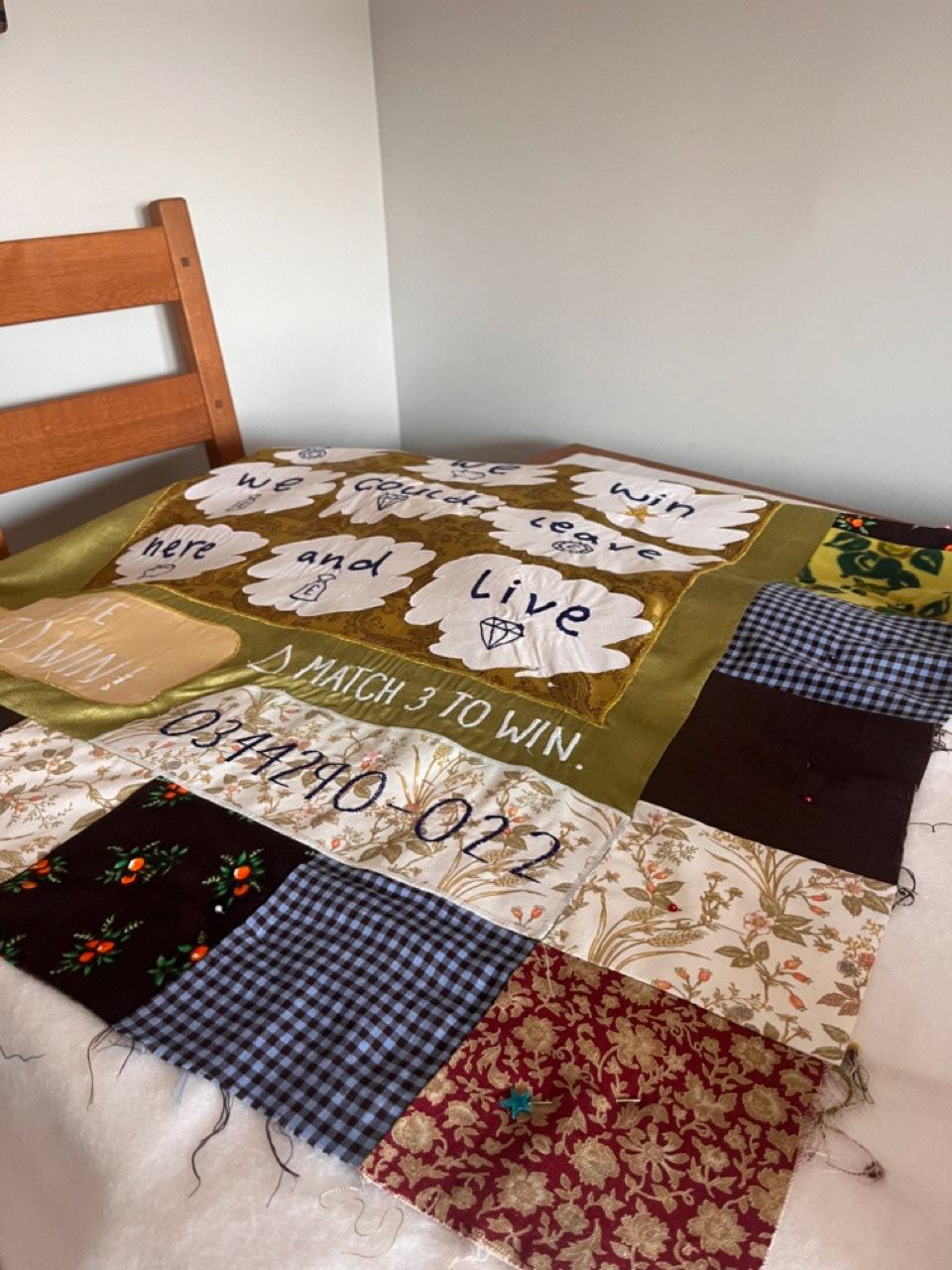
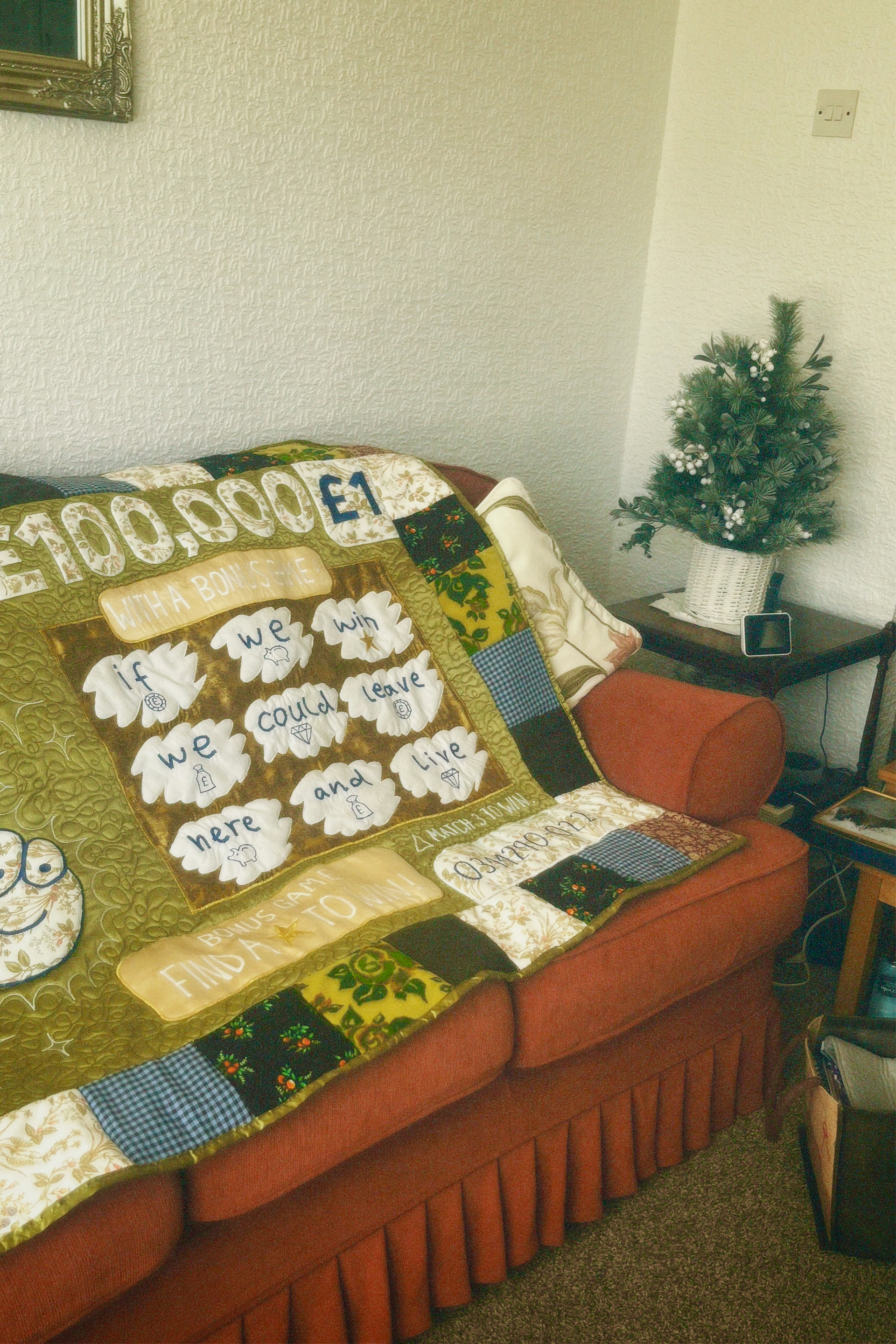
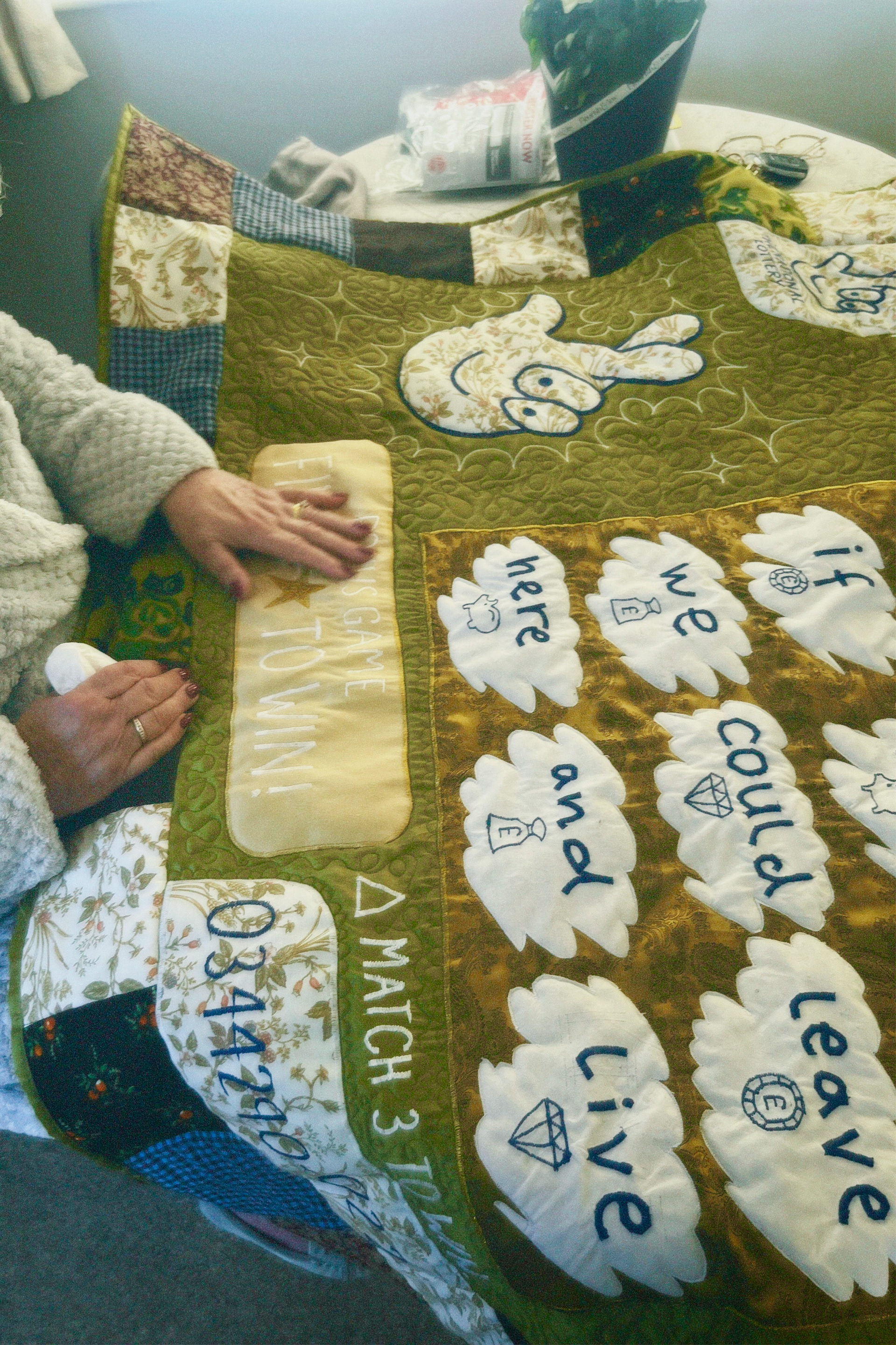
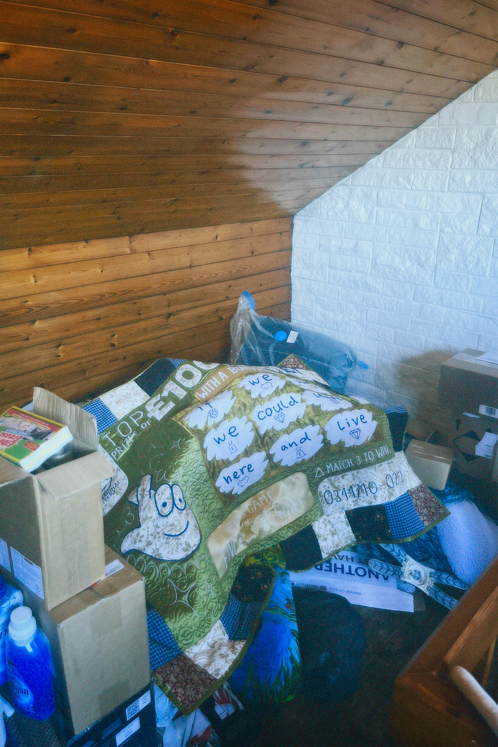
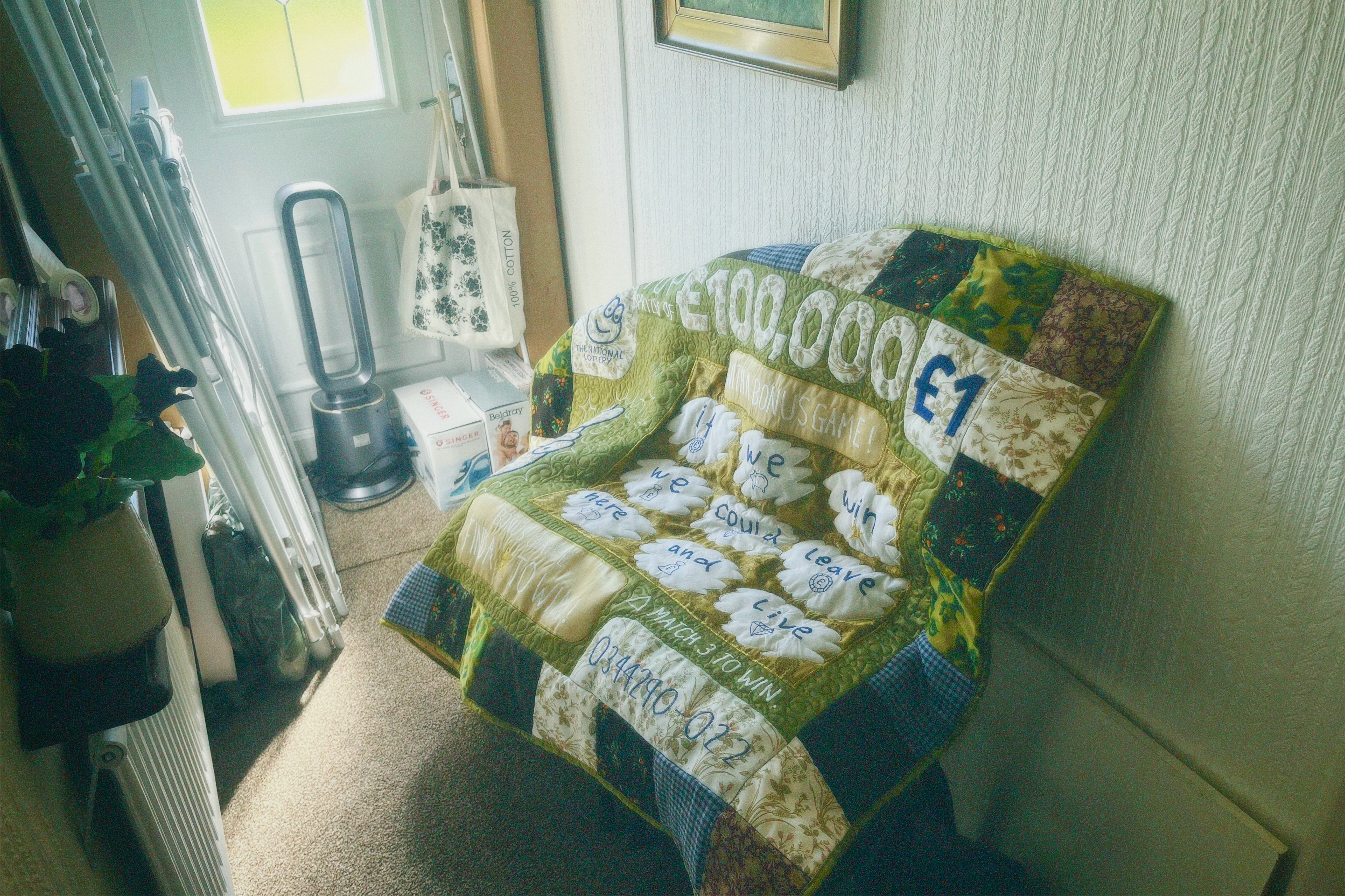
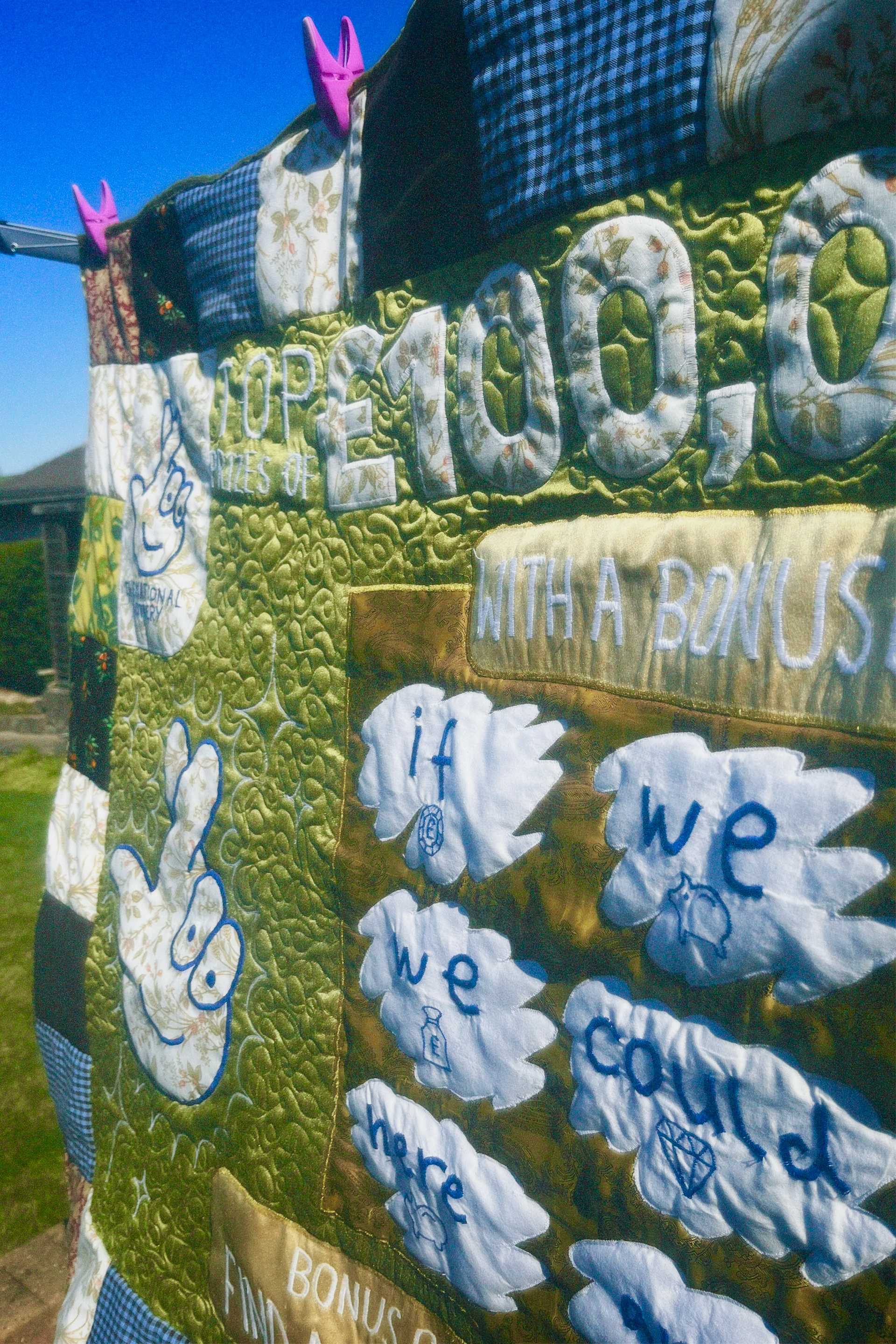
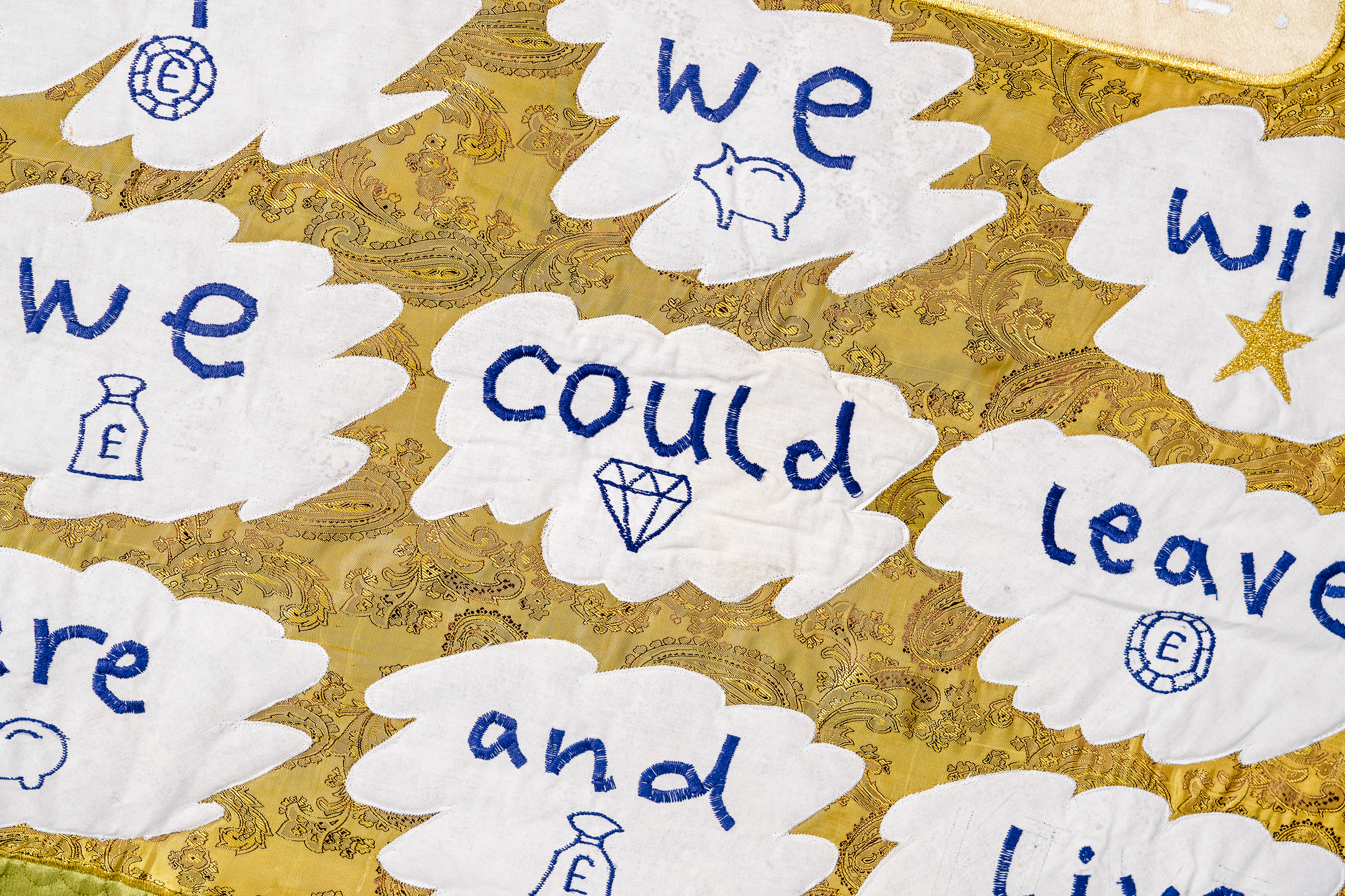
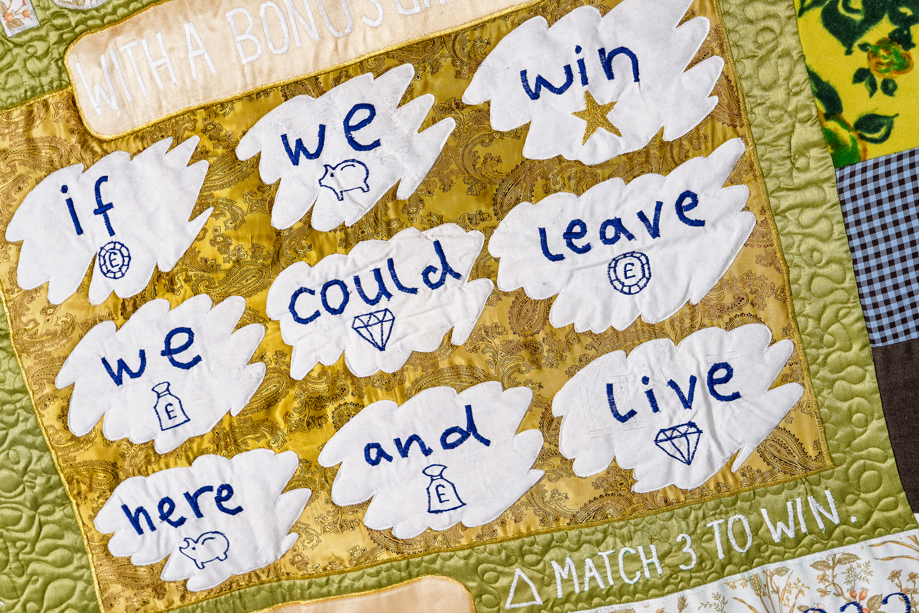
i had to do alot of planning for the scratches because its the most important part of the whole quilt and its the bit that gets my message across. i tired all cap-locks but it seemed too aggressive and it didn't look like a scratch card, and i tried a couple different fonts too. i found the best way was too use a different font to the rest of the quilt and use my own handwriting. that way it was obvious that its a person projecting what winning on the scratchcard would mean to them rather that what it actually on there.
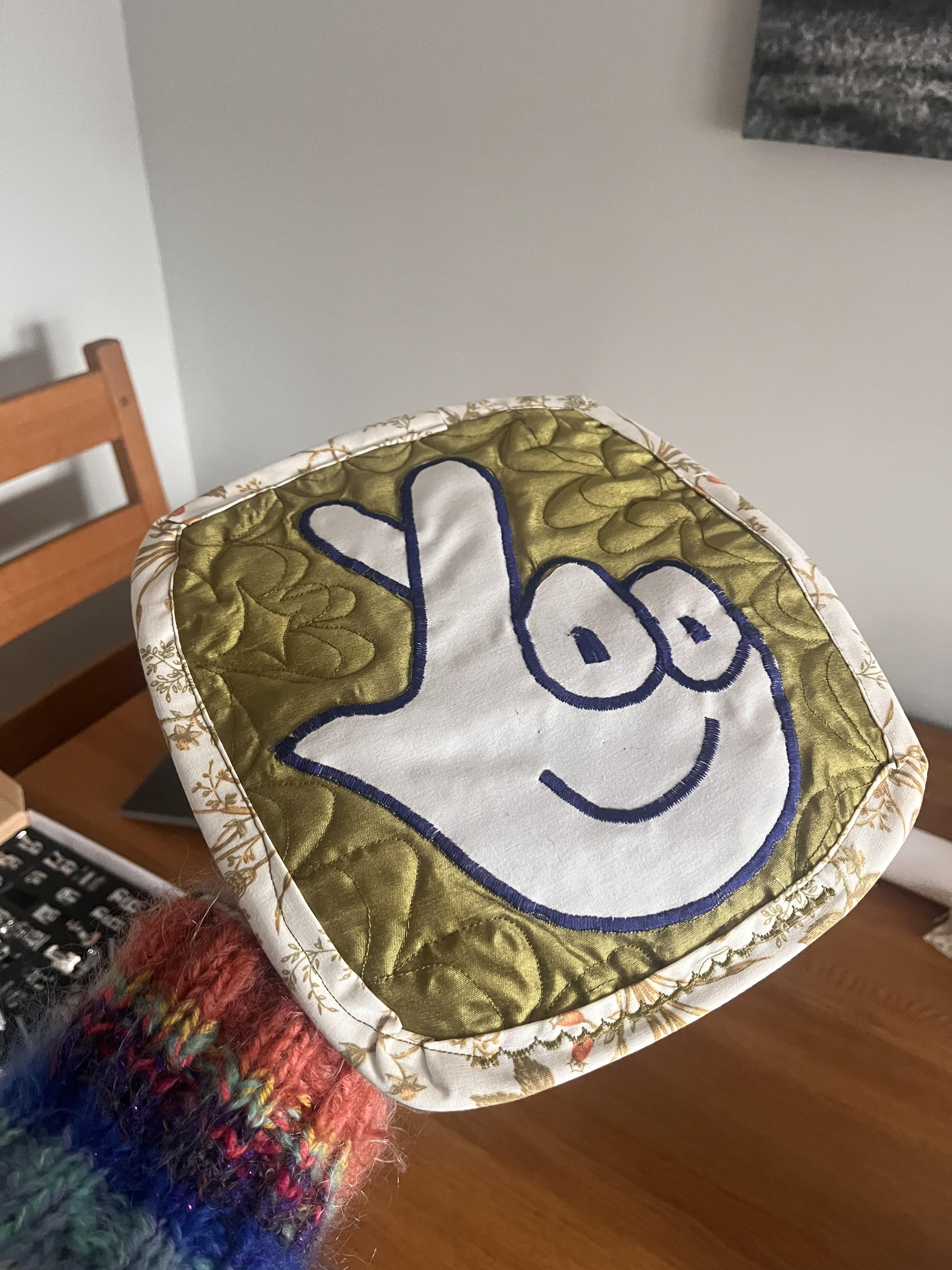
i also decided to include little scratchcard symbols because i wanted to use the blue embroidery thread evenly across the quilt to make the combo of colours look more consistent. ALSO MEANS I COULD MAKE THE STAR GOLD HOORAY SO ITS LIKE THIS SCRATCHCARD IS A WINNER.
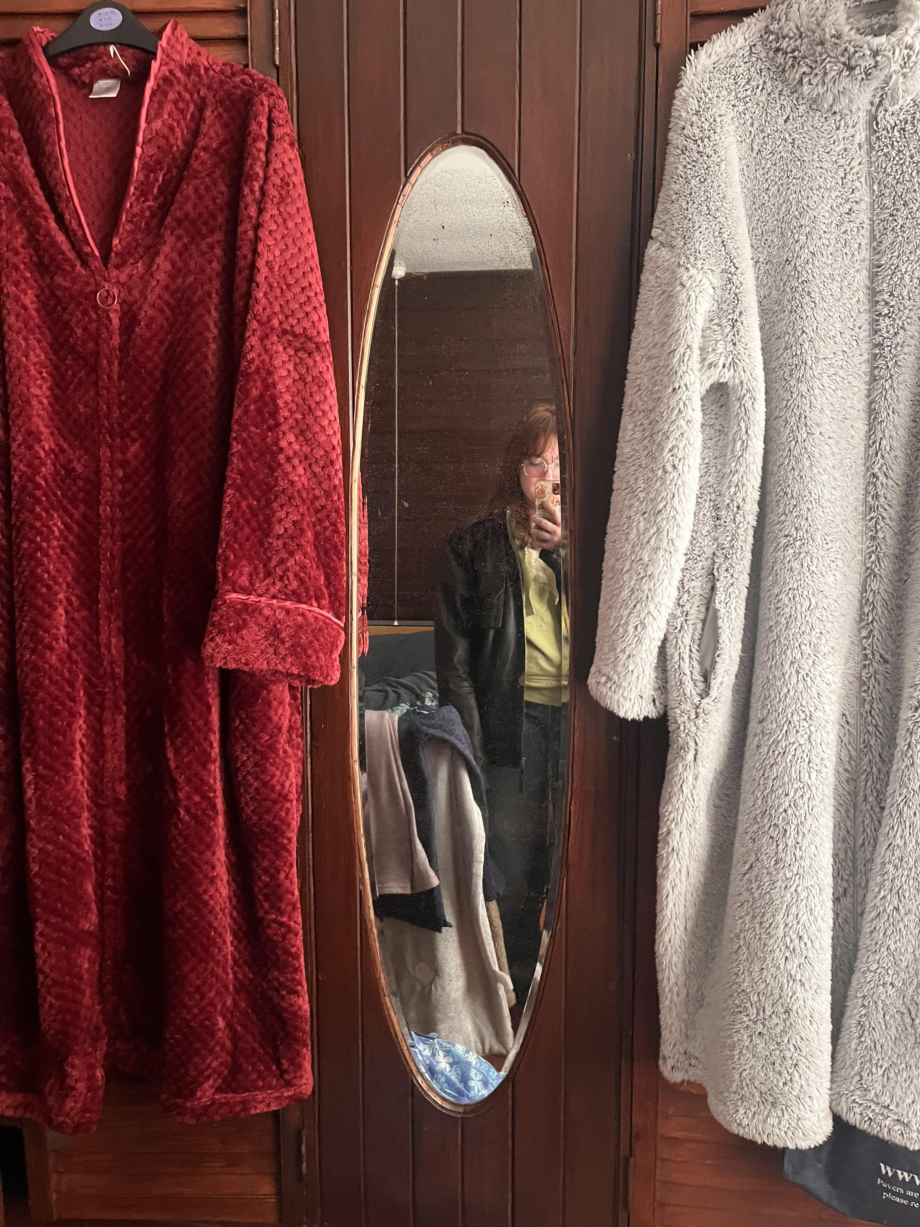
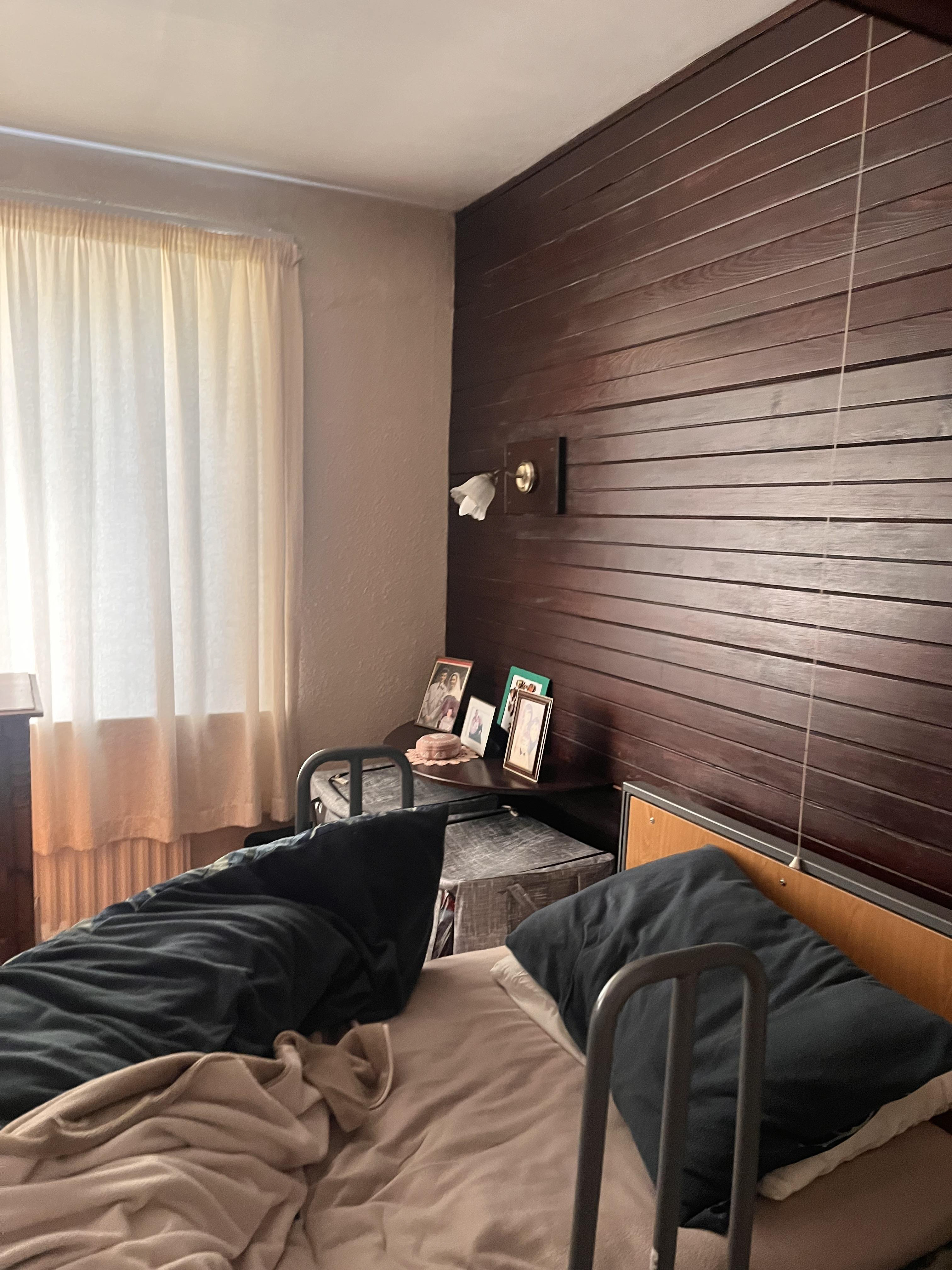
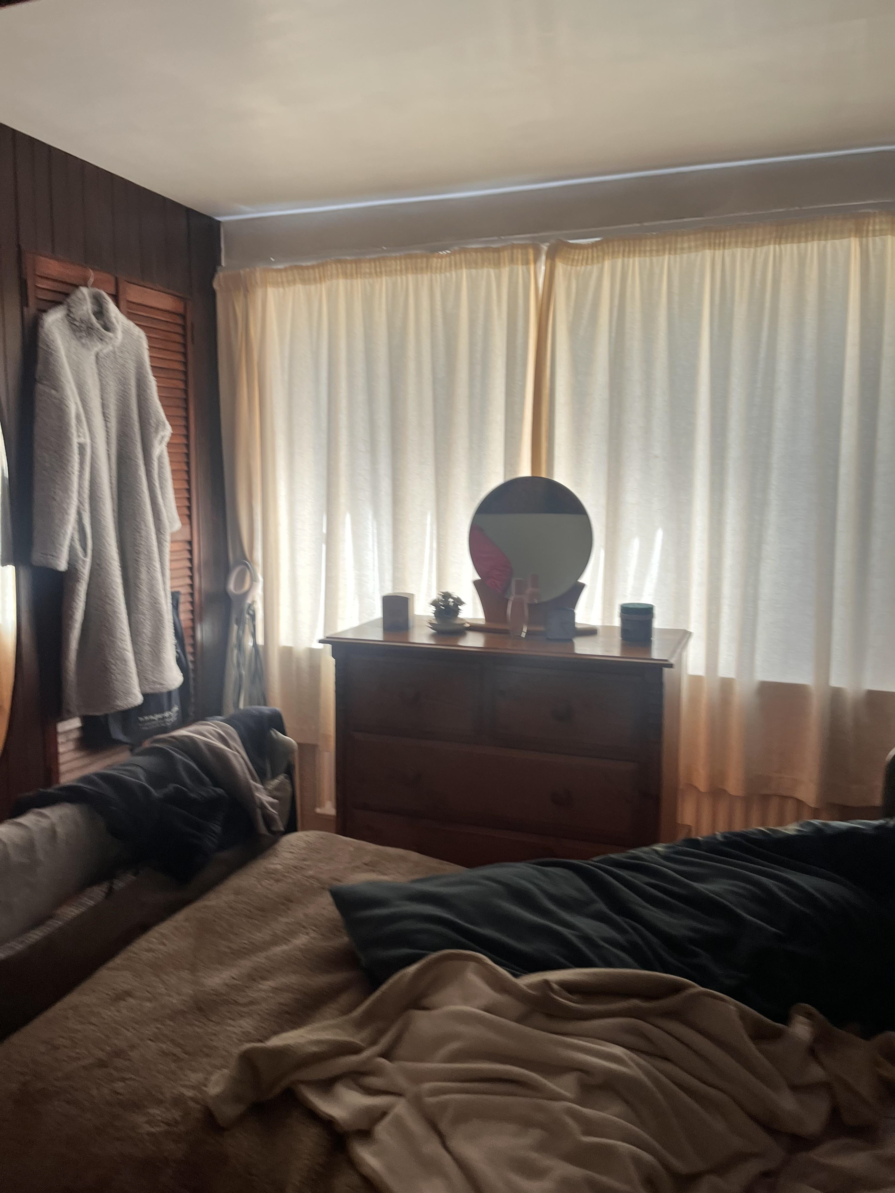
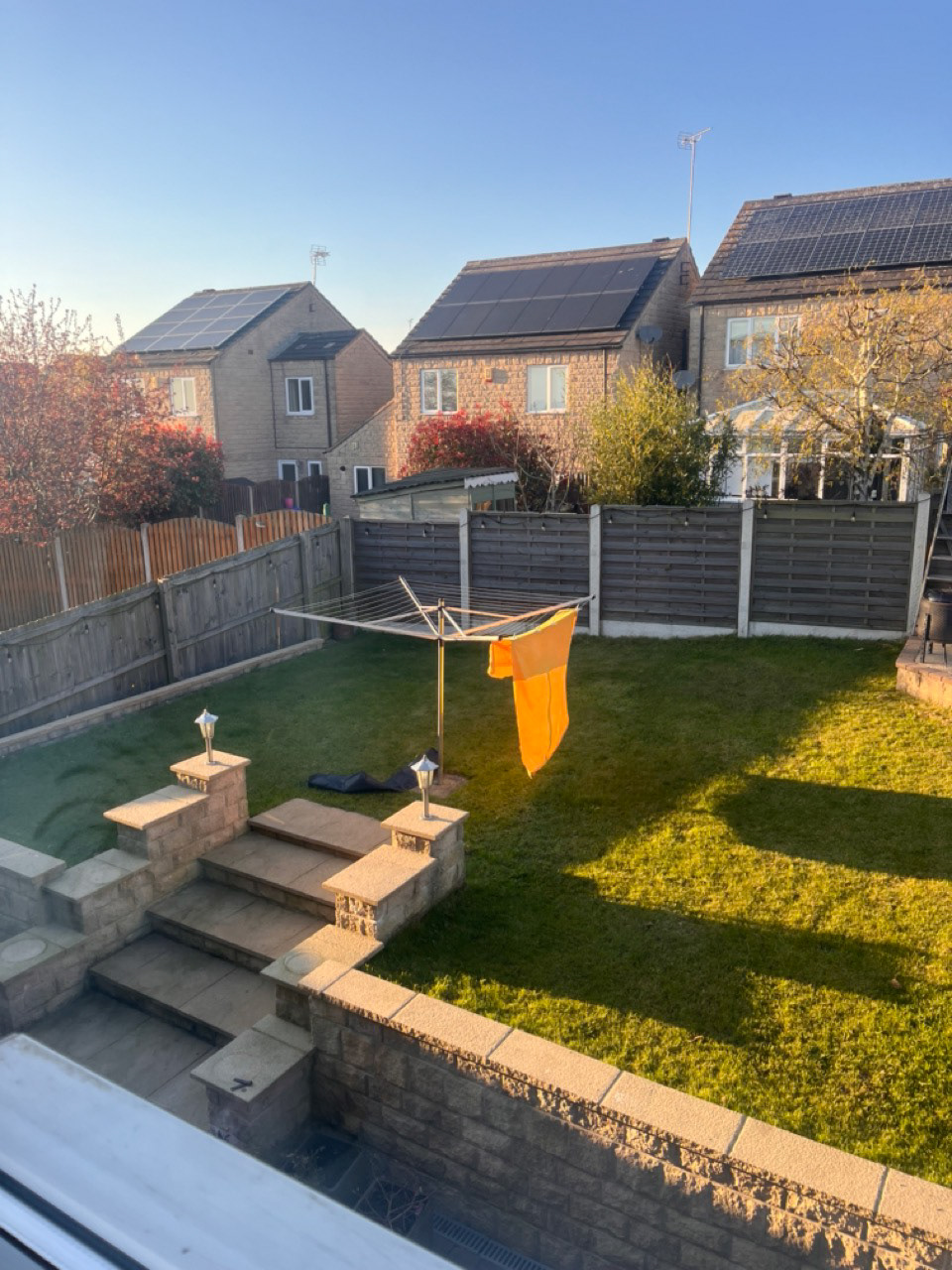
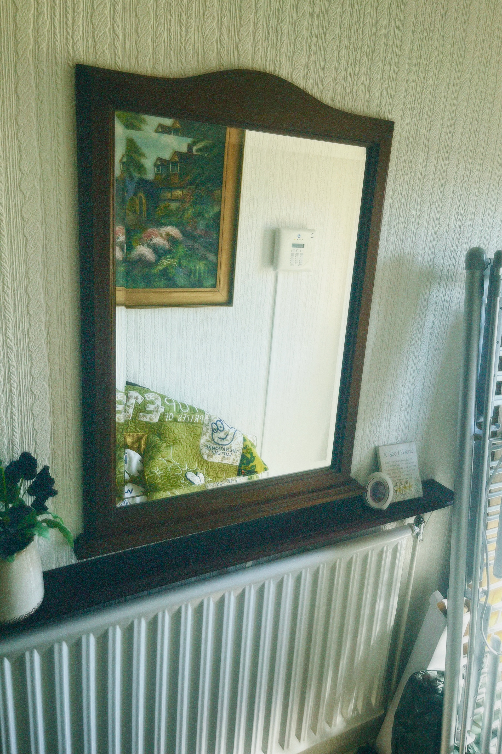
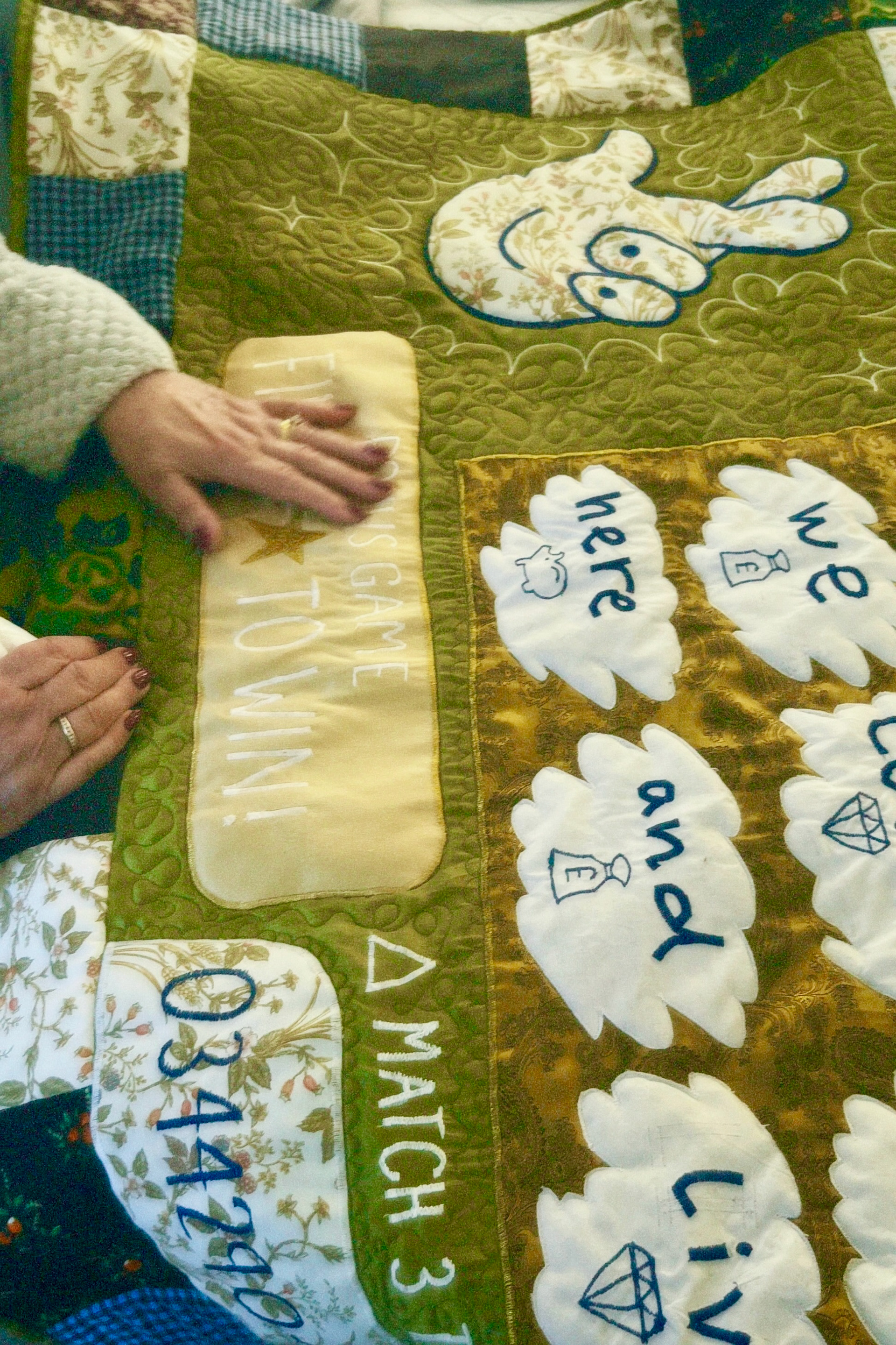
i went to my mamas house to check on some of the places i could take photos. her bedroom was the place i was planning to take the most because i knew the green quilt would go really well with the wooden plank wall don't ask i don't know why that's there and also she has really thin curtains that let the light in all diffused so the room glows. she's also got a good view of the woods out of her back garden that idf like to include somehow too, she used to have a washing line which would have been PERFECT but now she's got a whirlygig so ill have to figure something out :)
now that my quilt top was FINALLY BLOODY FINISHED i could get to the bit i was excited about :) once you have the quilt top done, you need to find a fabric for the back, sandwitch it all together with quilt interfacing, and then trace around all the lines you've made. because im cheap i wanted to use a massive sheet i had found in the charity shop because it had a fleecy texture and it was soft and warm AND PURPLE BOOOO (same fabric i used to make my bones on big ella). didnt want purple because didnt fit the colour scheme, and went driving round trying to find the right colour of dye but that didnt work eiTHER and then as if by magic i found half a bottle of yellow dye under the kitchen sink. id used it to make my sisters otley run outfit a couple of years ago and VERY CLEVERLY SAVED THE LEFTOVER DYE. i didnt have many options so i just winged it and dyed it over the purple and it came out SO WELL
i was so happy because the fabric looked like gold and it glowed in the sun like the gold star on the quilt.
here is quilt sandwich. gold fabric, quilt interfacing, and then scratch card on top. i used some scraps of the interfacing (got it off facebook marketplace) sewed together to get a big enough square, and very rigorously pinned it all together so that i got no lumps or bumps in the final thing. this big bastard was a task to drag through my sewing machine but it was the most rewarding bit because i got to see all these scraps of curtains and pillows become a big mega piece of art. most of quilting is just following the lines you've already done, like on the far right, but you can also free-motion quilt and use the sewing machine to draw patterns straight onto the fabric.
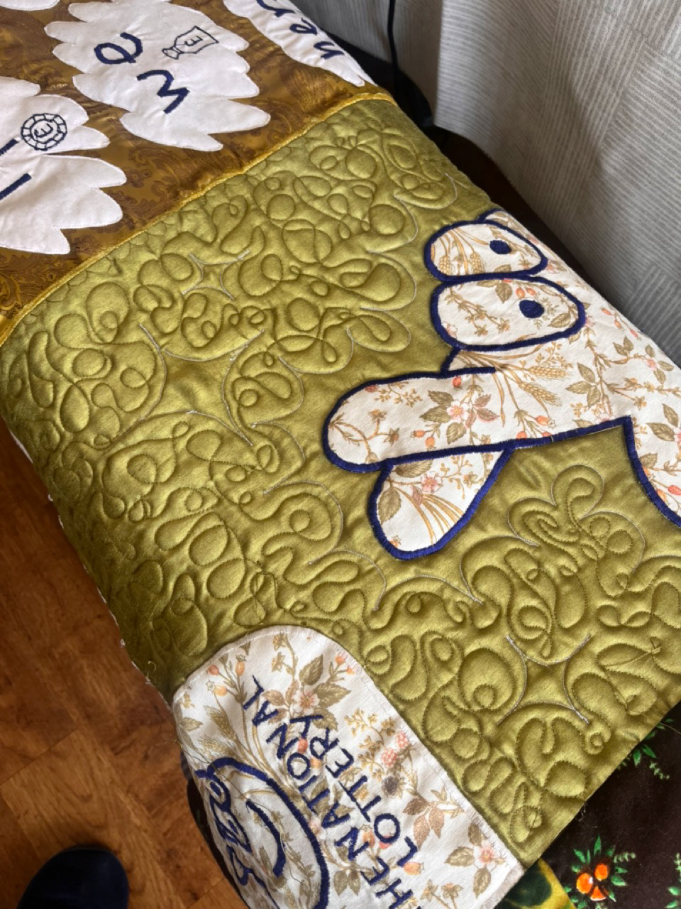
this is free-motion quilting and its abit like doing a continuous line drawing. i didnt know i was going to end up filling the green sections in, but i kn ew i was always going to do the little stars. i got really bored at half 10 one night and went and smashed out all the wobbly lines in an hour and then i was happy. i think the metallic fabric looks good with textures and it also made the stars stand out alot more. now it was a PROPER QUILT.
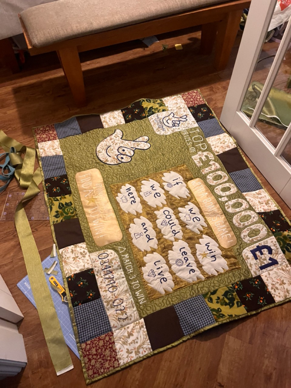
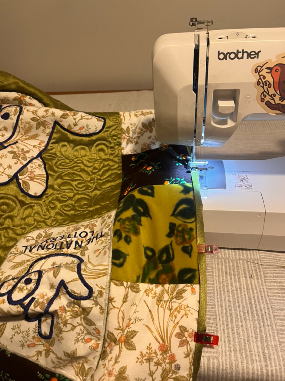
LAST STEP!!!! just had the binding to sew on now. imagine it like the crust of the quilt sandwich. i used the metallic green curtain fabric again and binded all the edges, its deffo not perfect but its only my second go at it AND it does the job so i don't mind. i know that if i had more experience measuring and using very tight seam allowances it would have been a perfect rectangle, but maybe the rough and readiness adds to the homemade look i was v e r y o b v i o u s l y going for :) once it was done i nearly threw up with happiness because all my quilt torment was OVER and i could be free to roam the world again rather than staying inside like a vampire. all complaining done i have loved making this even though writing this now 2 months later i think i've blacked most of it out. spending every minute learning a new skill to end up physically holding an item i had been dreaming about making was cool i felt like a mini jesus.
i looked at Rob Claytons photography as inspiration because i remembered his work from the working class exhibit in bonington that made me EMOTIONAL so embarrassing but id never stared at photos for that long. i really liked his lion farm estate project, the saturation make it look all dreamlike and nostalgic and thats what i was going for with the pictures of my quilt. i broke down some of my favourite photos of his so i wasnt going to my mamas with no clue what i was going to do, and tried to layout some of my pictures with his in mind.
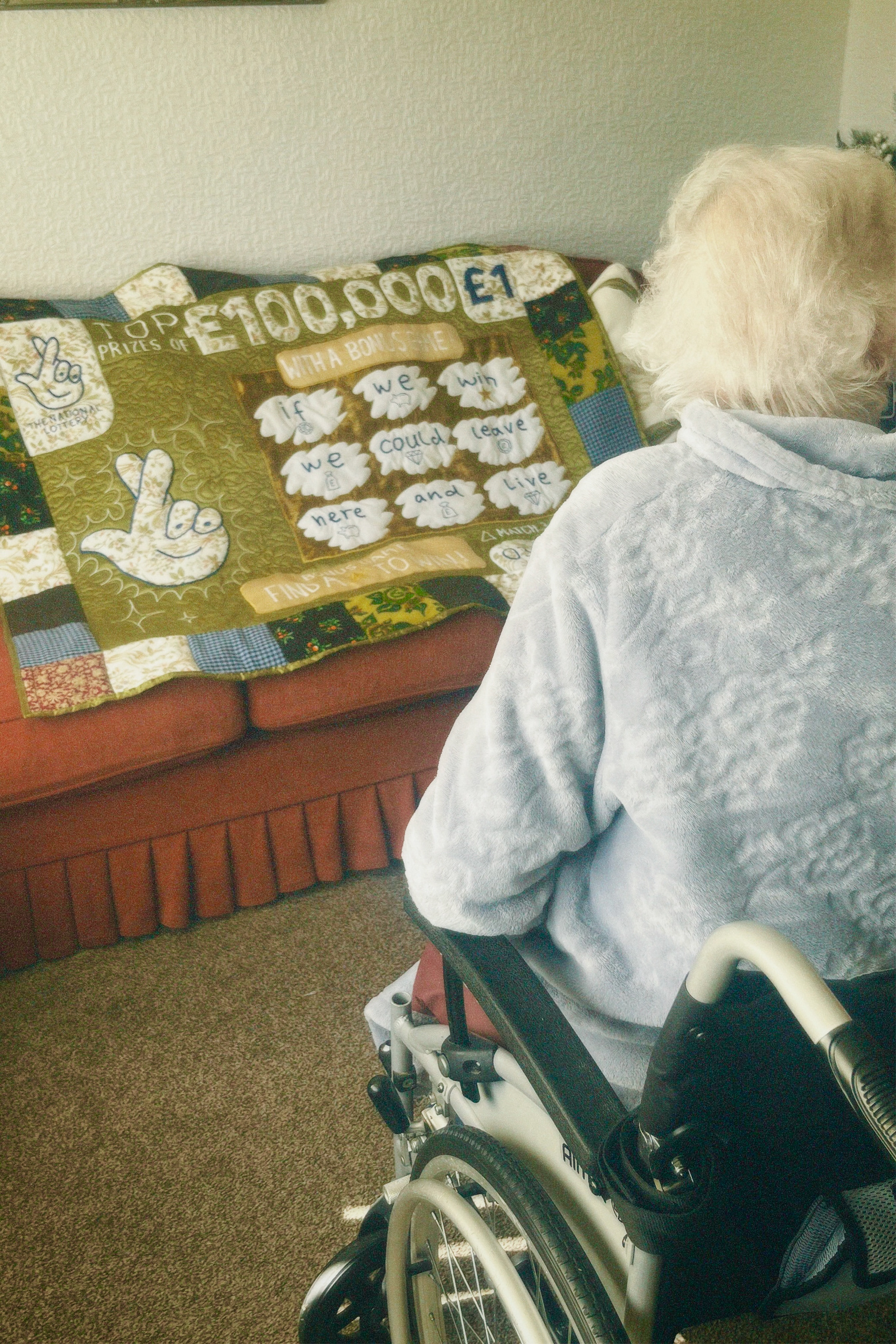

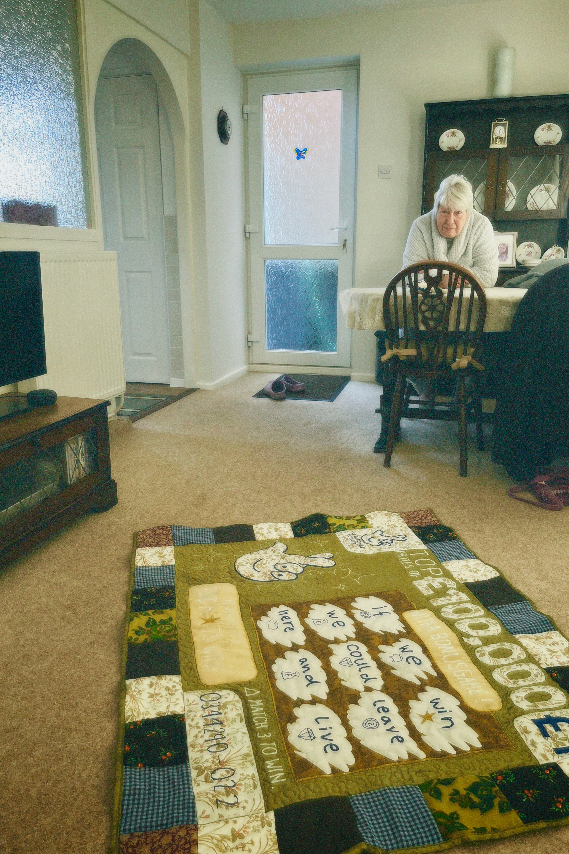
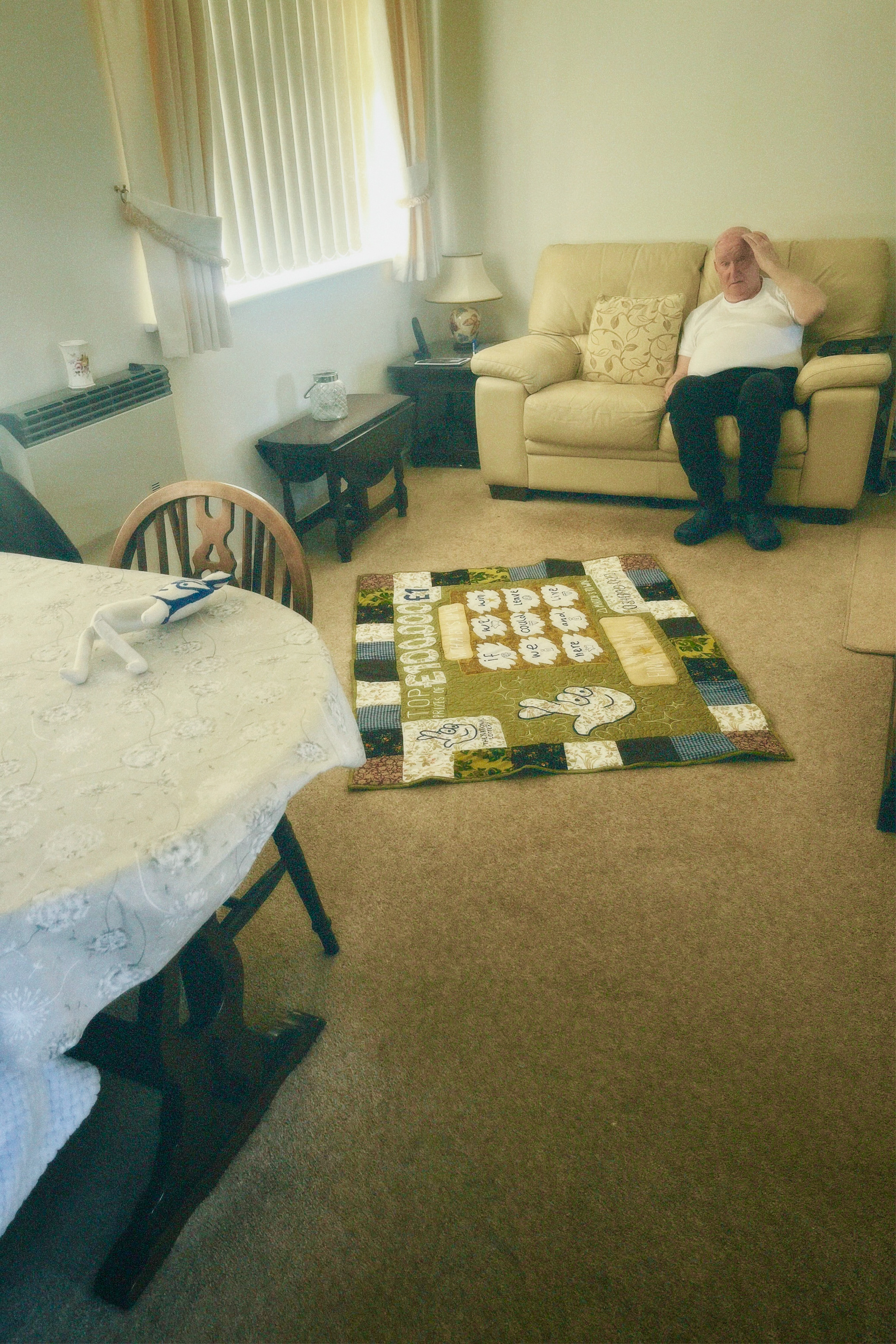


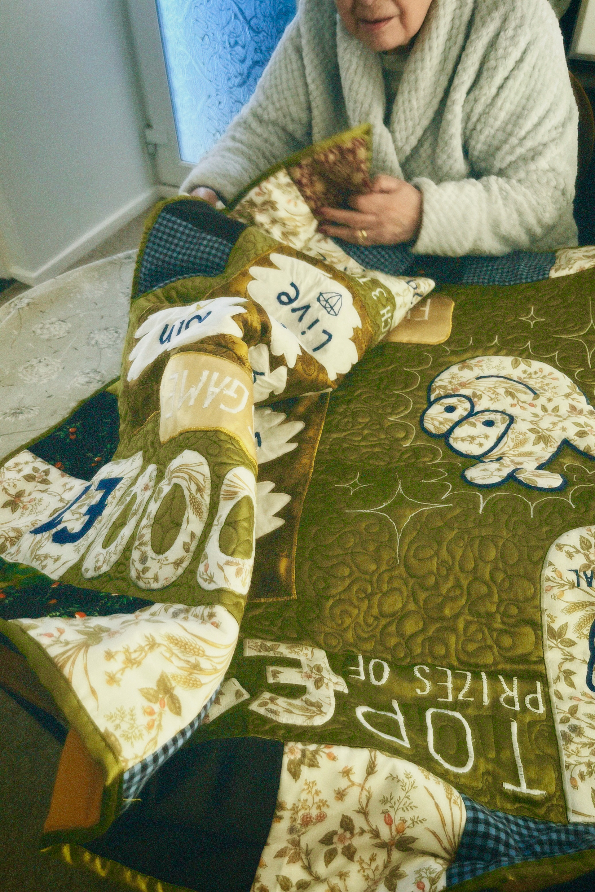


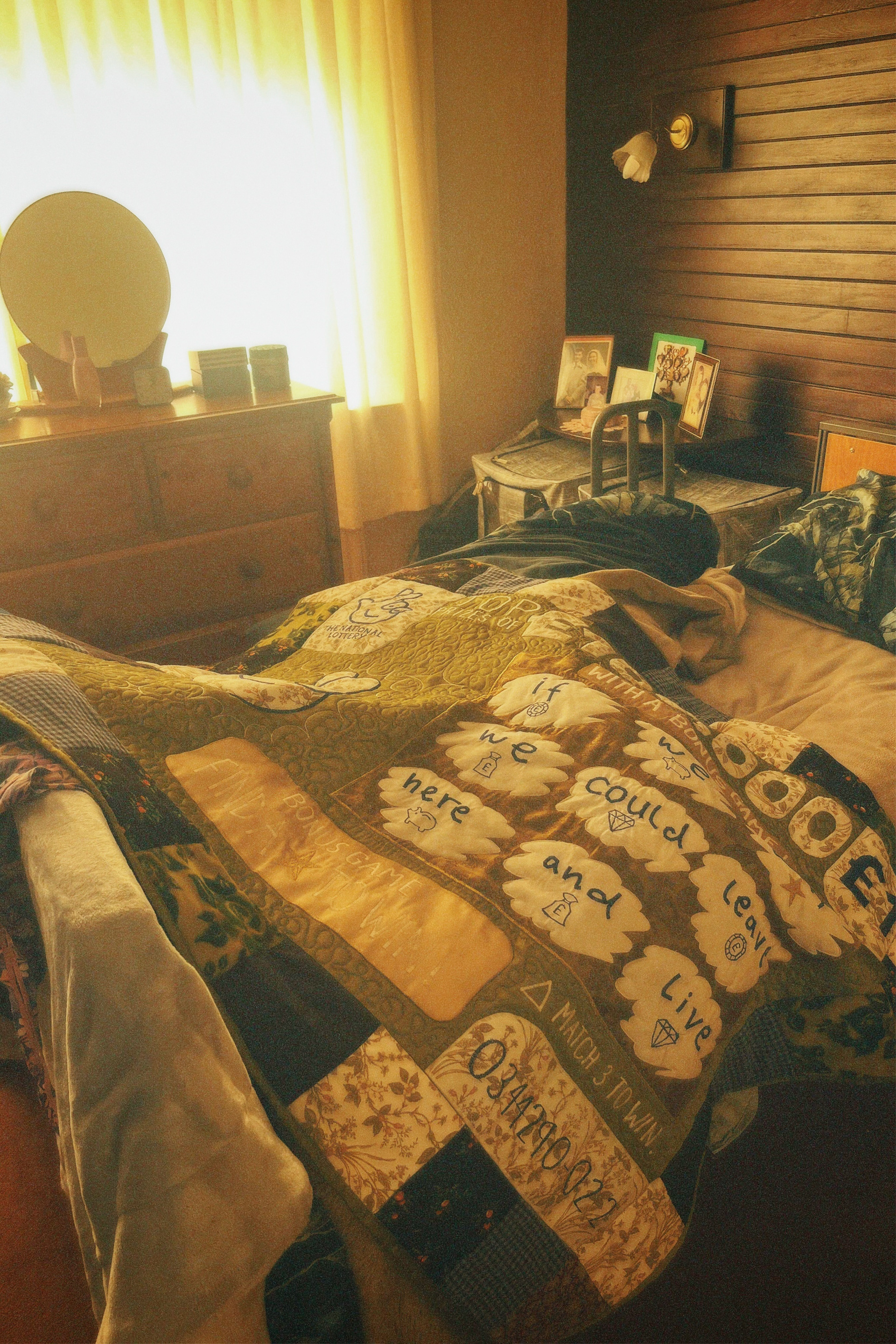
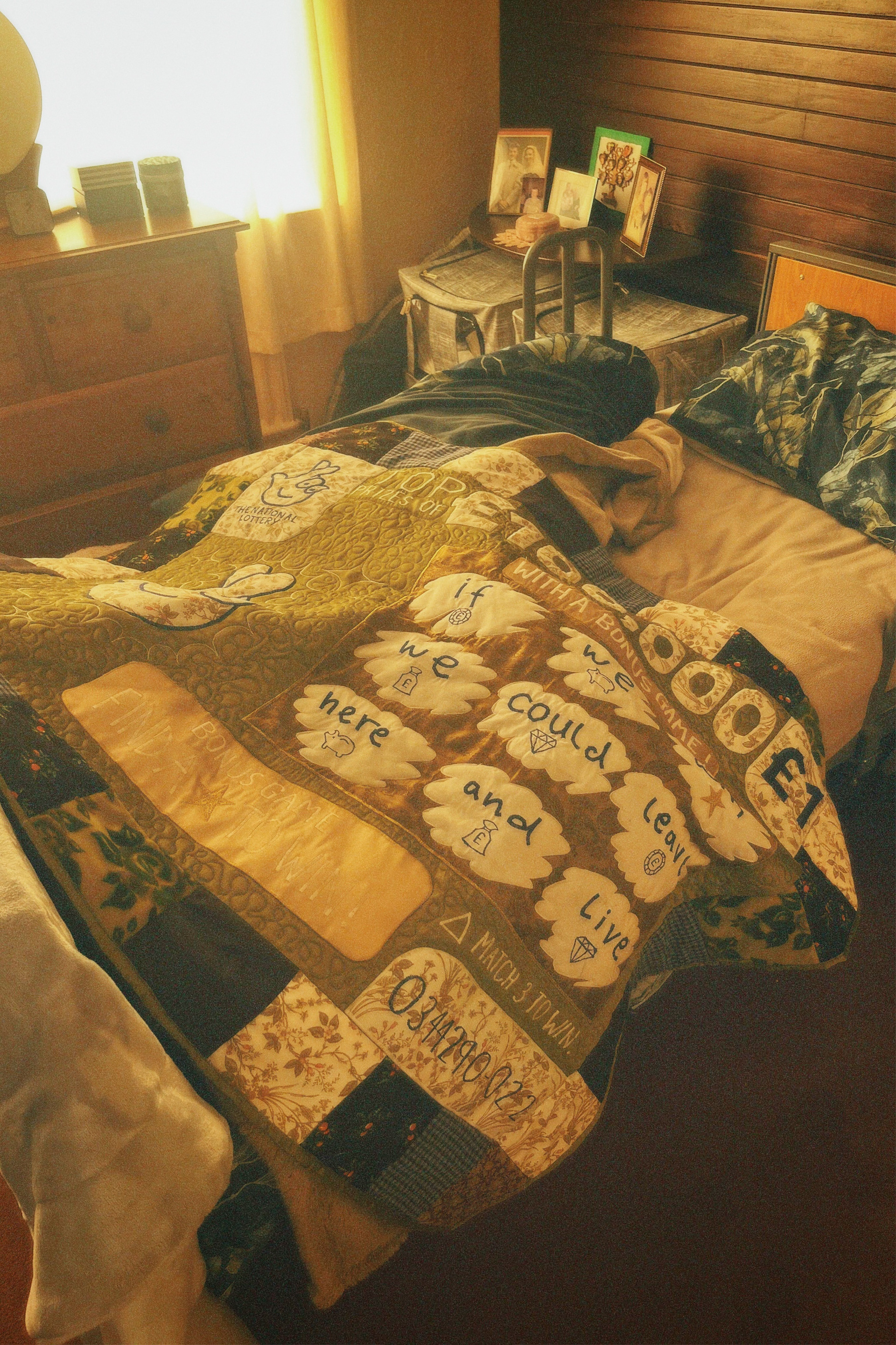


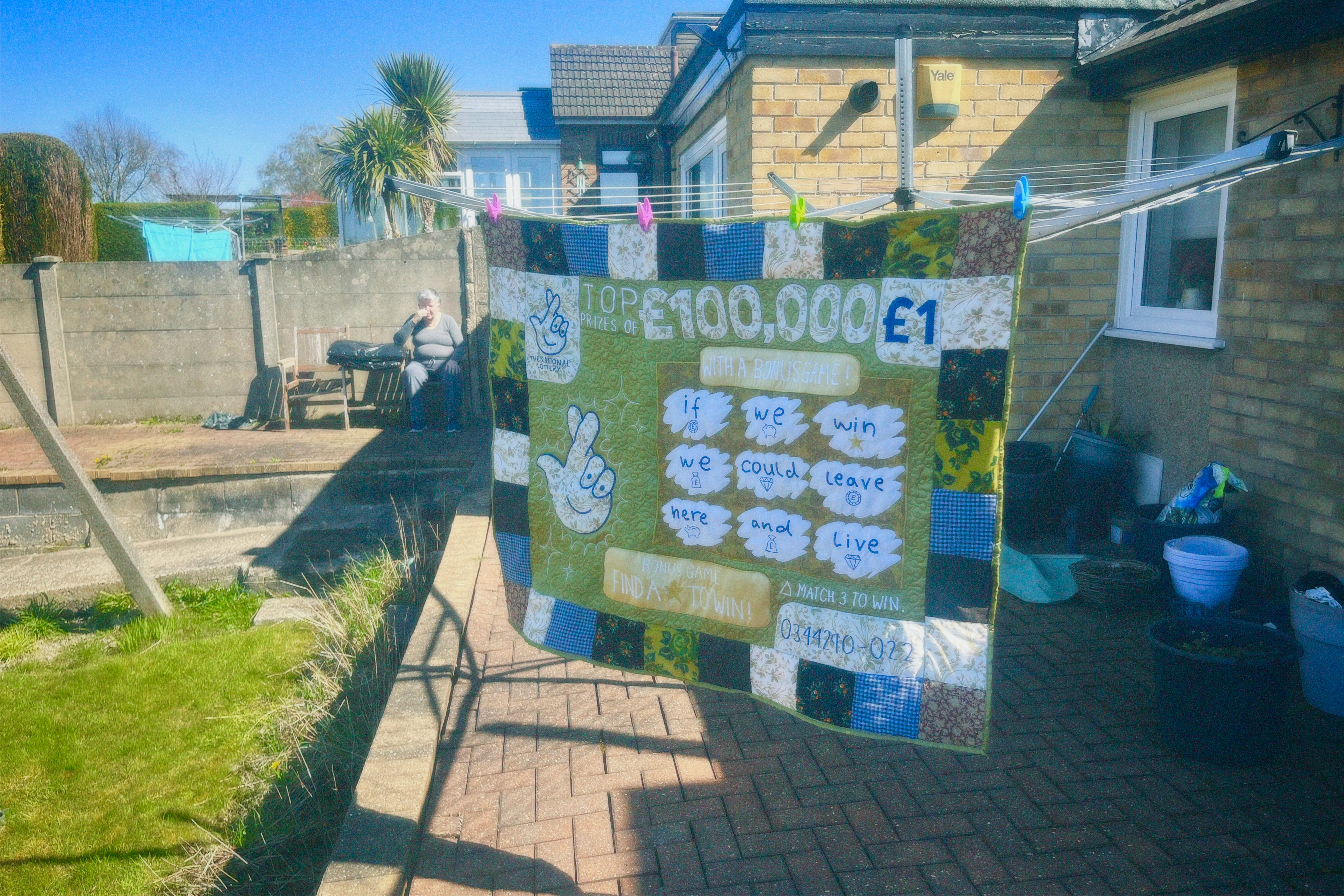
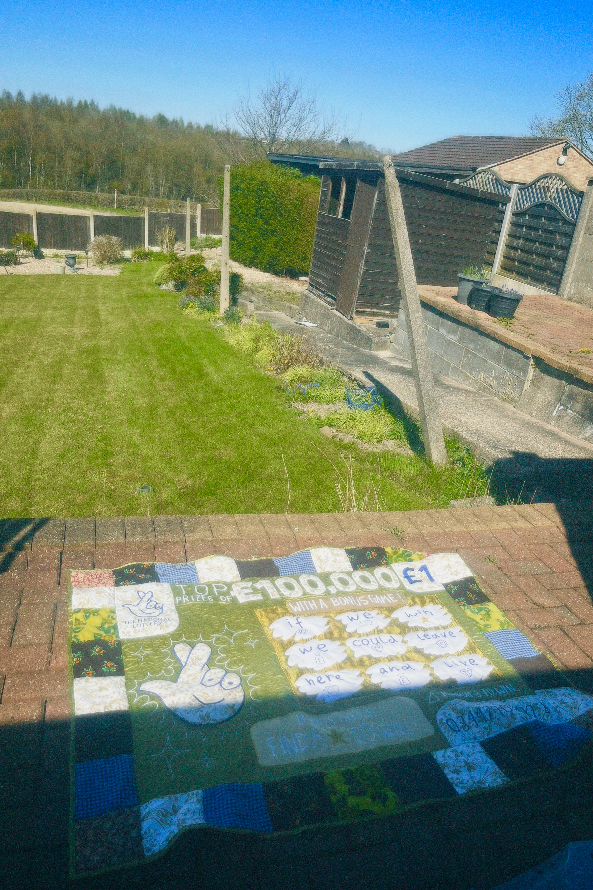
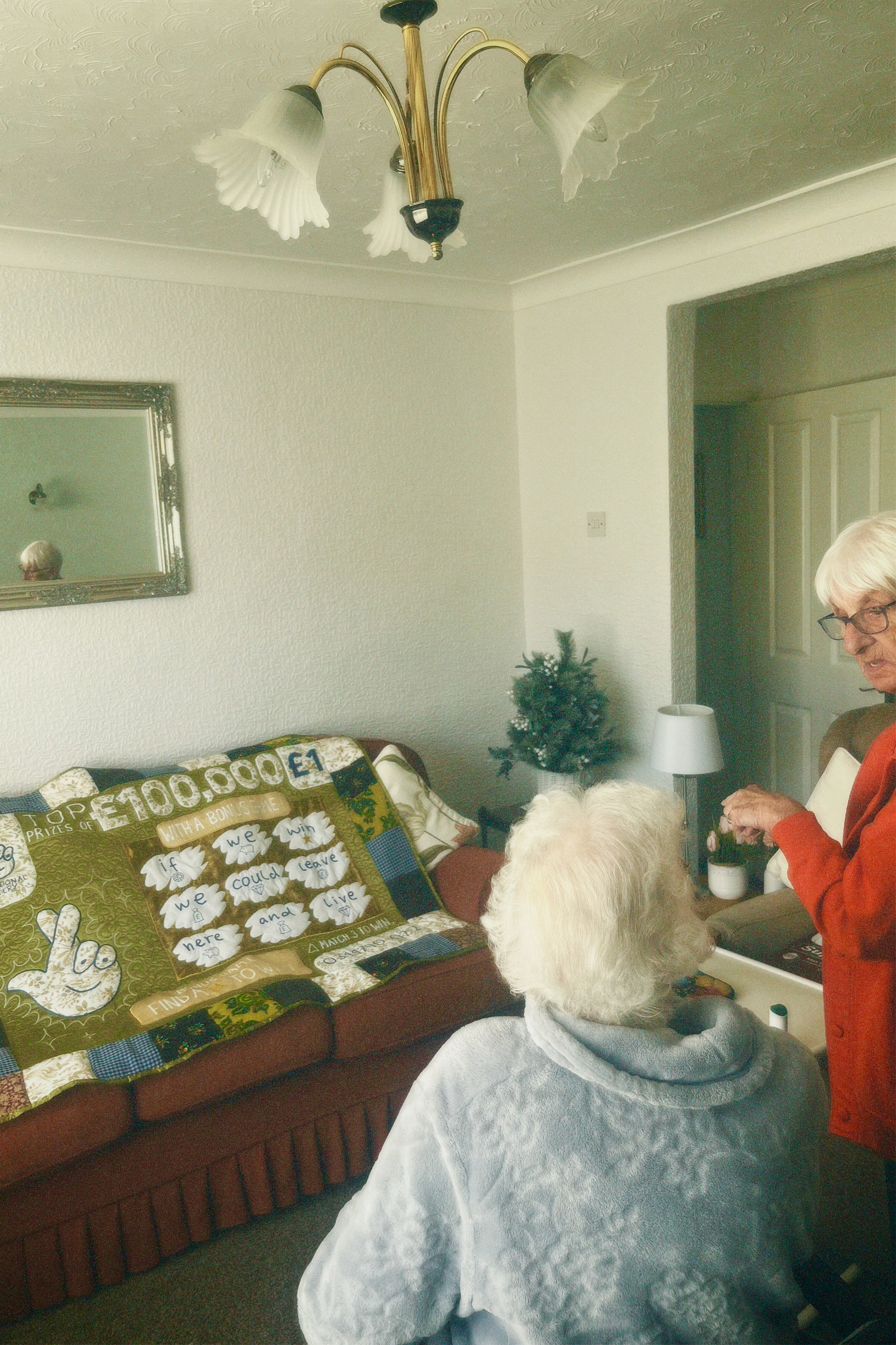
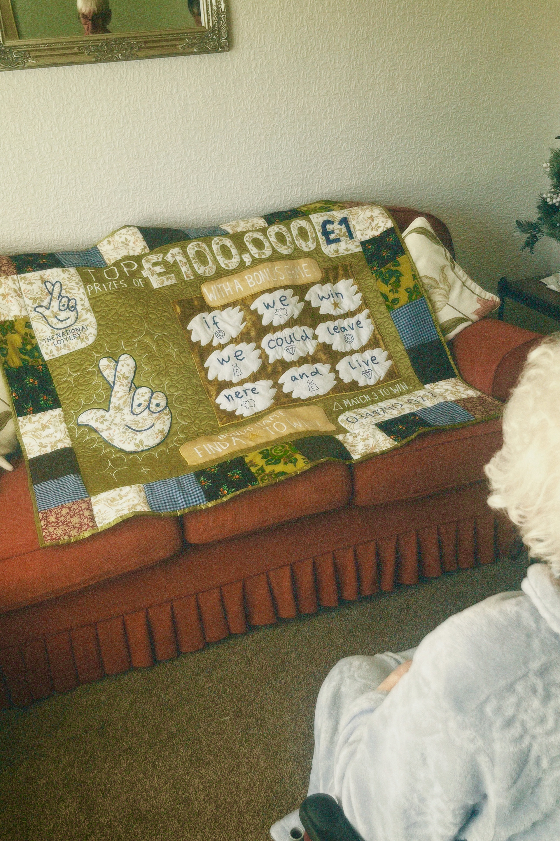
i went mad taking pictures and i used my app that makes it look like film which worked really WELL very happy with it. the filter gave everything a warm saturated effect just like the photos i analysed. neither of my mamas fancied posing for the camera but i was able to sneak a few candids of them my mama whos house it was rang her friend to come and look at the quilt too so i had a little audience :) she reckons i should auction the quilt off to raise some money for charity or but it on display on the high street.
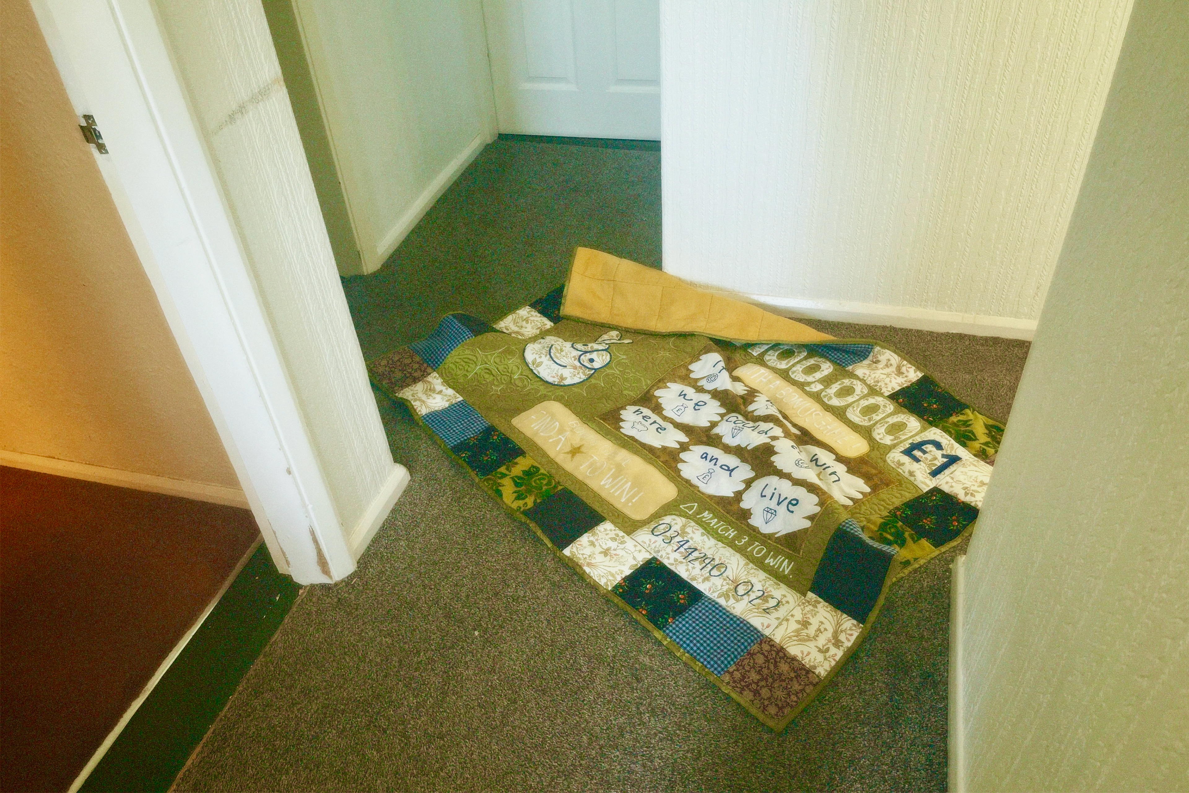
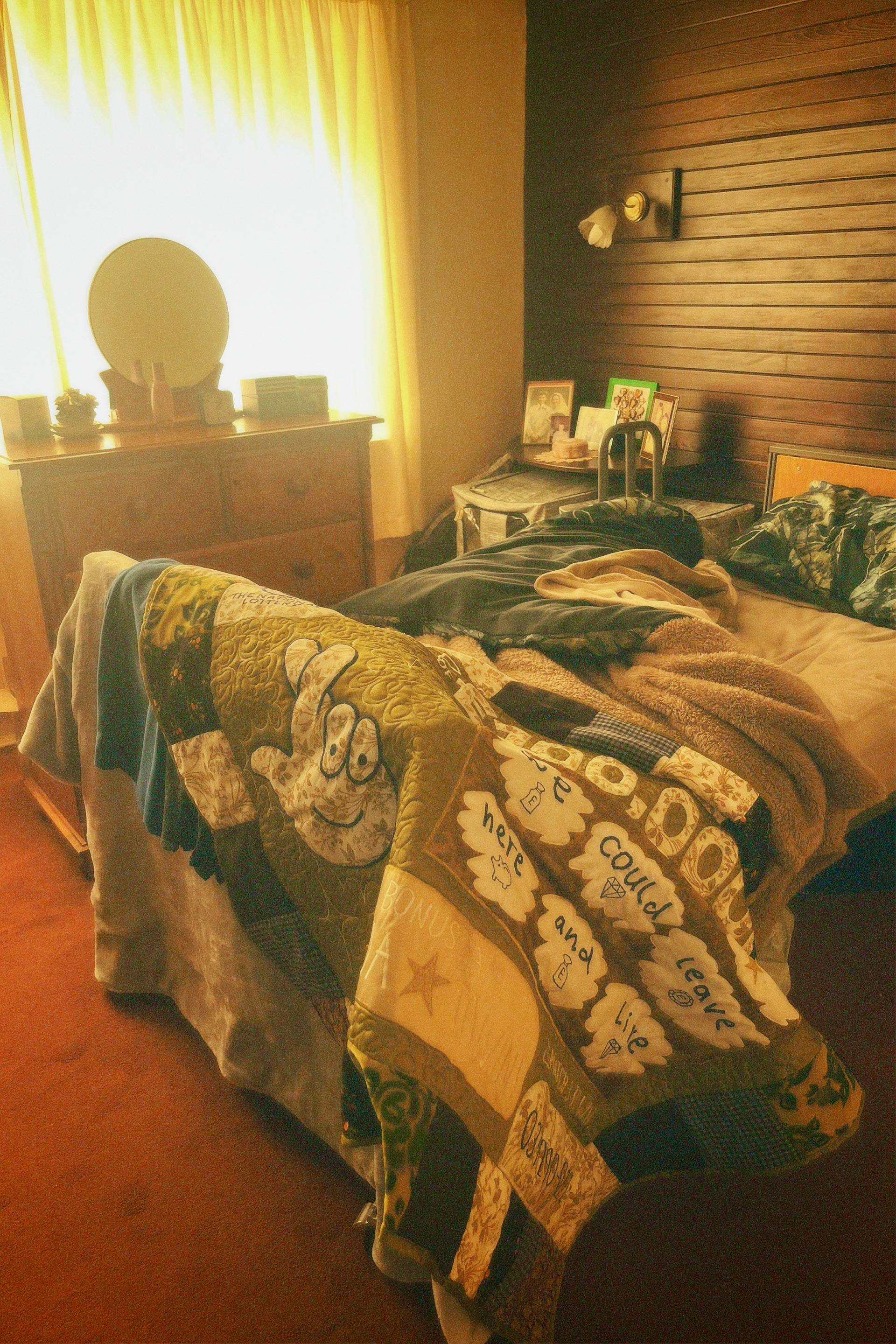
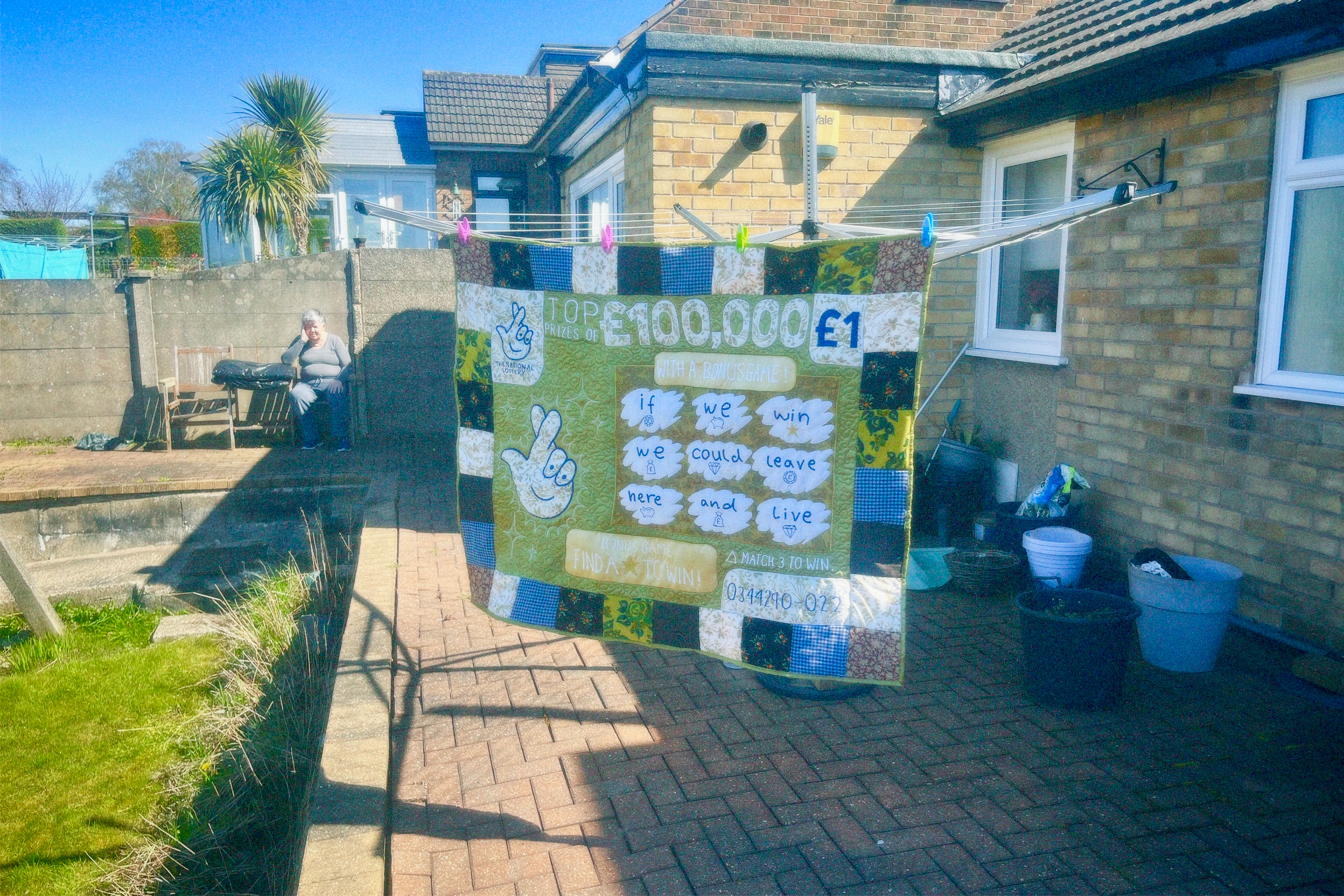
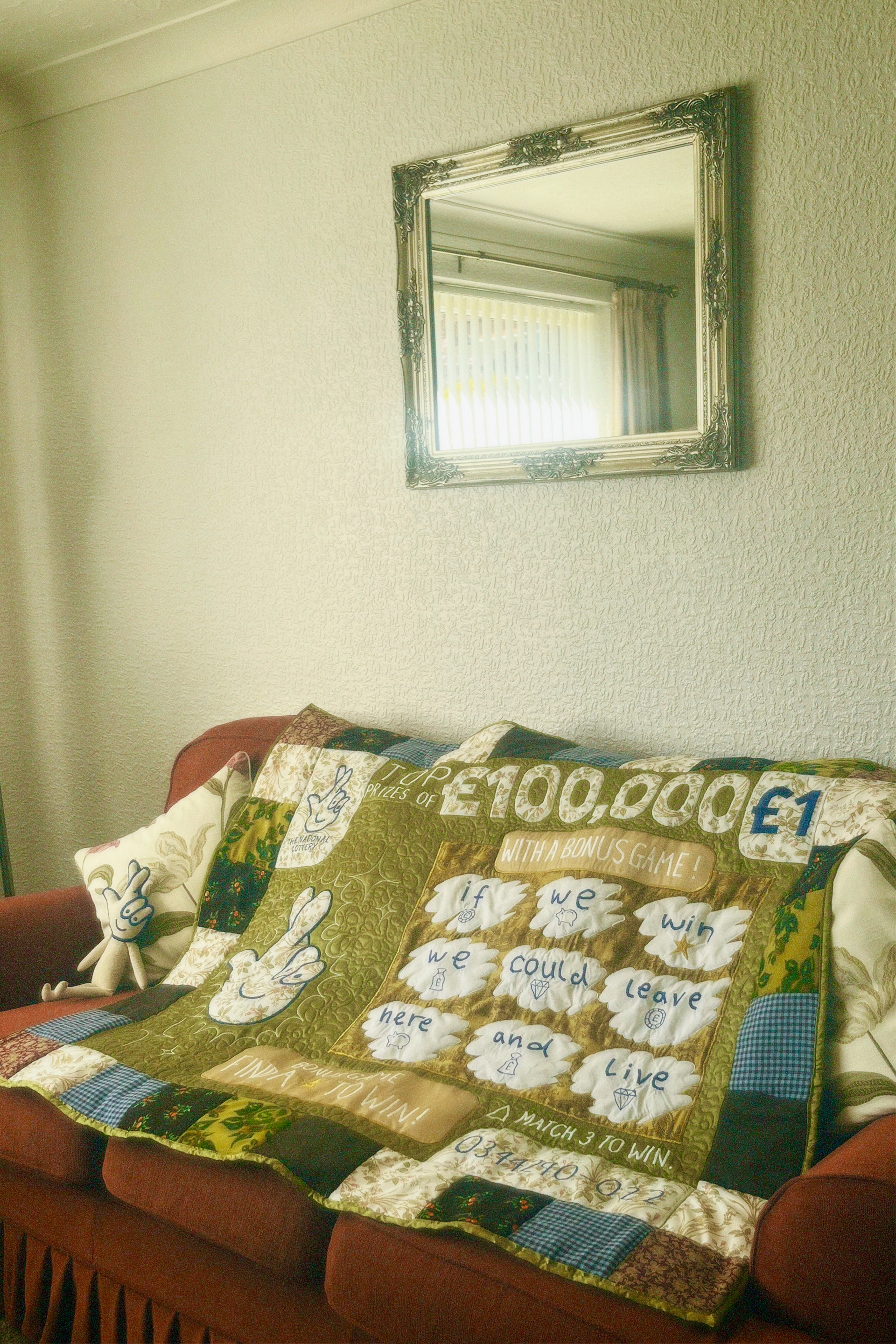
these are my favorrite pictures i took, i love the outside one wish my auntie wasnt in it because now i cant use it she would NOT be happy lol but the one in the bedroom with the light shining in came out exactly how i imagined it would. i love these grainy pictures, and i turned up the saturation to make them more nostalgic and dream-like, like remembering a memory. i'm also going to take some proffessional pictures of the quilt in the studio as more detailed shots.
i also have uploaded an account onto the working class creatives database!! YIPPEE. it should get posted next week, so i'll start getting open call notifications from galleries and their newsletter too. big help and im happy im on somewhere that does what my project was trying to highlight.
This was a dream project for me because i was able to tackle an societal issue im passionate about AND at the same time make a big textile piece like i'd gone into the project wanting. Im going to send this to some gallery open calls, because im proud that i've been able to capture the specific emotion i was trying to explain. i wanted to get across like a wistful melancholy feeling of pride for being working-class but wondering what it would be like to live a different life. I'm going to keep quilting, because this is the longest i think i've ever spent on a project, illustration or otherwise, so it made the finished outcome a lot more satisfying than knitting a jumper or a pair of socks.
i definitely want to make more political work, like my summer project animation, this, and my palestine posters, because it makes feel like i'm using my skills for a purpose. its similar to how mending makes me feel. if i can continue to earn enough tattooing to keep making work like this i can see myself being very happy, and then hopefully my illustration work can earn me abit too and ill